A new iteration of the redevelopment of the Hotel Pennsylvania has surfaced from Vornado. The design has been updated from the one that debuted last year, which placed Facebook as the anchor tenant of a 2.8-million-square-foot supertall. Located at 401 Seventh Avenue, the site of the deteriorating hotel was first re-envisioned by Pelli Clarke Pelli as 15 Penn Plaza, and then re-conceived by Rafael Vinoly as “Penn15”. Facebook subsequently took up residence at another Midtown building, the James A. Farley Post Office conversion, leasing 700,000 square feet, evidently resulting in yet another re-imagination of the site and its potential.
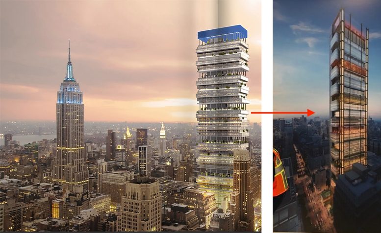
The previous design featured irregularly stacked floor plates cantilevered atop one another with amenity spaces distributed throughout. The new concept is largely the same in terms of massing, though with a more orderly shape. Stacked floorplates suspend overlooking 34th Street, yet the interspersed green spaces appear to have been eliminated.
It’s very likely Penn15 will still have outdoor space, a much sought-after Class A office amenity by tech companies. The sleek glass façade is depicted with what looks like illuminated glass columns along the corners of the tower.
During the Vornado Realty Trust Q4 2019 earnings call in February of this year, president Michael J. Franco expressed the company’s focus on “the transformation and repositioning of our Penn District holdings as a new epicenter of New York. Our redevelopments are now in full construction mode. 2020 will mark an important step in the district’s transformation as the majestic Moynihan Train Hall at Farley and our 850,000 square feet of office and retail space at Farley will be substantially completed at year end.”
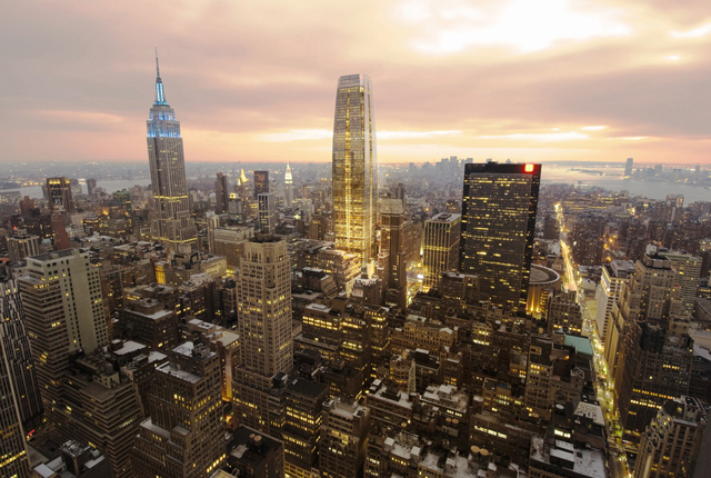
Pelli Clarke Pelli’s old plan for 15 Penn Plaza
The redevelopment of the Hotel Pennsylvania will come secondary, following the redevelopments of Farley, PENN1, and PENN2,. Whether the site could expand to include Manhattan Mall remains to be seen.
Hotel Pennsylvania is currently closed and is unlikely to reopen, as reported by The Real Deal, and the shutdown has Vornado rethinking its strategy, calling the hotel a parking lot for a development site. Following the reveal of the plans for Facebook’s Penn15 tower, it had been rumored that the Hotel Pennsylvania could be turned into a Nomad Hotel, however, it now appears demolition and redevelopment is back on the table.
Subscribe to YIMBY’s daily e-mail
Follow YIMBYgram for real-time photo updates
Like YIMBY on Facebook
Follow YIMBY’s Twitter for the latest in YIMBYnews




From horrific to just a monstrosity…
Forward and onwards, onward and forwards: Thank you.
new design looks better
IMHO: Open space (and ventilation) are going to be the number one request for commercial tenants in the post-pandemic real estate market.
Who is designing these horrible buildings and who is saying, ‘yes, that looks good. Lets do it.’? Just awful.
my thoughts exactly…how does a collective group sign off on these monstrosities? it’s embarrassing…
All of these new designs r chasing the sexy big firm that is willing to pay for the latest funky locker room smell.
All dry clean locker rooms smell generally the same.
But for 40 percent more we can make it smell like a freshman college locker room.
Its insane. But everyone wants that new funk:
Outdoor deck 600 ft up?
4 helipads?
24 elevator banks?
Anti glare bird safe glass?
Leed titanium certifcation?
Organic composte steel fibers?
The wonder is really in the marketing and strippers. Because how else does someone pay a premium for fluff?
Their designing what will sell.
A tech firm spending 650k in rent wants its own private reefer patio. Give it to them. They want a 6k sq foot zen community yoga stretch bar? U design it for them.
This vornado. Not principled old abe building his famed cottage for 40 yrs and 12 million dollars.
Seems like architect egos these days are driving them to make things that are “distinctive” than “beautiful” – they just want to be recognized.
There is the arguement that there is not more to be innovative with.
Farley post office is innovstive — an ugly old post office the size of wisconsins downtown district -lol is being repurposed.
Thats ancient becoming modern a blend of old art and new fabric.
Nowadays its the most expensive steel clad and the same old empty dry fart smelling office space .
The honesty is these drawers r scamsters with sexy last names ending vowels.
As their designs r already molded by budget. Component inputs. And perhaps most sadly expected facade maintenance costs.
Put another way:
Dey selling u a nissan altima with porsche trimming and exterior design.
Altima engine. Brakes. Navigation.
But the exterior sexiness of porsche and a coveted 100– zip code.
Same bland crap. Great marketing and a sharp tongue.
The bestest. The greatest. The hugest. The most magnifcantly stupendous —insert your noun.
In a word, “UGLY.” I’m almost 72 y/o. I remember my mother taking me to Penn Station during the 50s. Had the McKim Mead White building been kept up with frequent steam cleaning of the exterior and interior, with touches of interiror modernization as needed, it would have remained as grand, or grander, than Grand Central is today. I know that things have to change in NY. But this?
Yeah. Dats the new hustle. No more acutal brick edicides. Real pipes. Real ac vents.
Sadly these old buildings r like boats.
They will run if u manage them good and maintain upkeep.
But the resale value or leasing fees diminish.
Everybody eants the newest pink red speedster.
And here u are renting a boat slot that raises in cost 4 percent a year.
Wadda u do. Trqsh the old boat. Sell the boat slip. Lease the boat slip.
These old fart buildings are architectural beauties. But ideally not what a 27yr old two degree nyc transplant wants to work in.
On your 1950s penn station — must of been fun — skirts u had to winder what was under them — more suits and ties on ppl.
Not that all for suits. But today u dont if the metallica shirt guy with a ugly beard makes 100k or 10 cents an hour.
But the real money aint made face to face. Least not the meats of it.
Would writing in English be too much of a stretch?
God these proposals are awful. The Penn is/was such a landmark and for it to be replaced by either one of these joke buildings is appalling.
Nobody told this guy that his name of the building was terrible ?!?!?! PEN15 / PENN15 ?!?! what an idiot thats so embarrassing
Its just like
Soho
Noho
Sobro
Nolita
Fidi
Silicon alley
These brand agencies r little different than pimps and drug companies —
You name product on what runs off the mouth easier
Candy or mary louise johnson
Viagra or peepee xl
Slap a good name and half decent product.
Ur half way to oz.
Both designs are horrific. Not a good future if that is where we are headed in design today 2020.
There is nothing left to design.
We aint got no bendable alloys that take us 4500 ftin the air.
The best we can hope for is a 350k sq ft residential called
The Homer
And
Aptly shaped like a frost jelly donut.
Boy that would sell and certainly be a finalist in the austrian fortyear award period.
This is nyc. There is nothing left to design.
If want to see design i propose this….
A wood and mudclay 1r story residential complex with leed certification.
Mudclay homes are great fuel costs wise. The. Foundation would be wood. As the columns and what not. The exterior is an organic clay, resin, sediment compound.
Now that my friend will win an award.
As the mudclay would be compressed. Watwr leakage and element exposure should be minimized.
But then again they can build 1700 ft towers in countries with less people than nyc.
So hey lets go back to the rustic native and modern 3d cad.
Keep renovate and clean the old building looks much better than the ugly plan building.
The building is idle. I see what ur saying.
Spend 200 million and do a new spit waxing of the floor and exterior.
But what then. Raise the rent by how much??
Or u can destroy it spend 1 billy and get 40 firms with combined revenue larger than all midwest states combined.
U can charge a premium and get ur building 82.5 percent leased for a guaranteed 25 yrs.
Toss in some client freebies:
Underground petting farm
-Seedy gambling parlor with organic smoothies
-tubular mail chutes
-24/7 smoke shop with the ickyicky sticky
Provided u sign a 35 yr lease. With hefty buyout terms. And first right of refusal to sublease.
The building looks ugly, but more importantly, if anything happens with this site, Vornado better damn well renovate and reopen the Gimbels Passageway between Penn Station and Herald Square subway station. Sad that these projects happening at all is contingent on construction of buildings, but that’s the city we live in.
At what cost to maintain it.these mofos r in it for design and profit. Though i wonder what if any retail they would put in there.
Here’s a hot tip, related to this story: My office building, 421 Seventh Ave., has not offered renewal contracts this year. Please let me know what’s up.
Progressively revolting “design” develpoment. What was wrong with Pelli iteration?? Seriously, right next to the Empire State….. you’d think this venerable developer would foresee it’s very poor comparison would harm their reputation. I’m horrified at the vandalism this clunker will inflict on a once proud skyline….
From HIDEOUS To Saggy / Pimpley BUTT UGLY
+ Rapael Vinoly’s plan was interesting
+ earlier plan and Cesar Peli plan was also more inspired
The new plan? An overgrown chicken coup in the middle of Manhattan
Keep Making Supertall!! The Future Of NYC!!
Clearly undeterred by the jokes about the name last time around…
This is heartbreaking. The Hotel Pennsylvania was my absolute favorite. I could cry. What history. What heritage. To be so crassly tossed aside. My heart lives there. What will come of it’s interior fittings? Will there at least be a way to obtain a relic for cherishing?
Please correct my typo is you will!
I fear that no one will want to go to nyc in future to be among buildings like the proposed tower .Much else built recently is like mega trash barrel building East of London UK which is all is ever built there now but at least there is recognition there that heritage will never be equalled in term s of style in the lives of living people No sentimentality in these thoughts .Who cares to live work or take their leisure among sky high glass walls? might just as well a live in a UK blue collar housing project! New rendering looks like filing cabinet ill used.Hope it doesnt tumble on nyc’sbeauty as an attraction,but live in genuine hope!