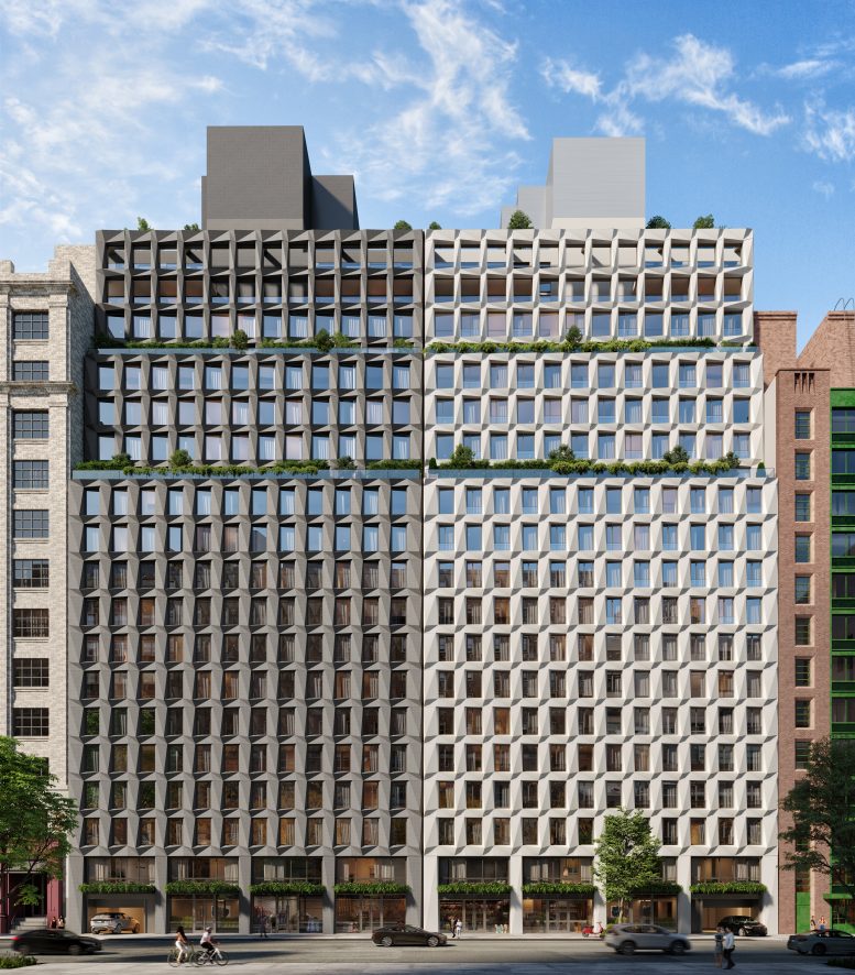
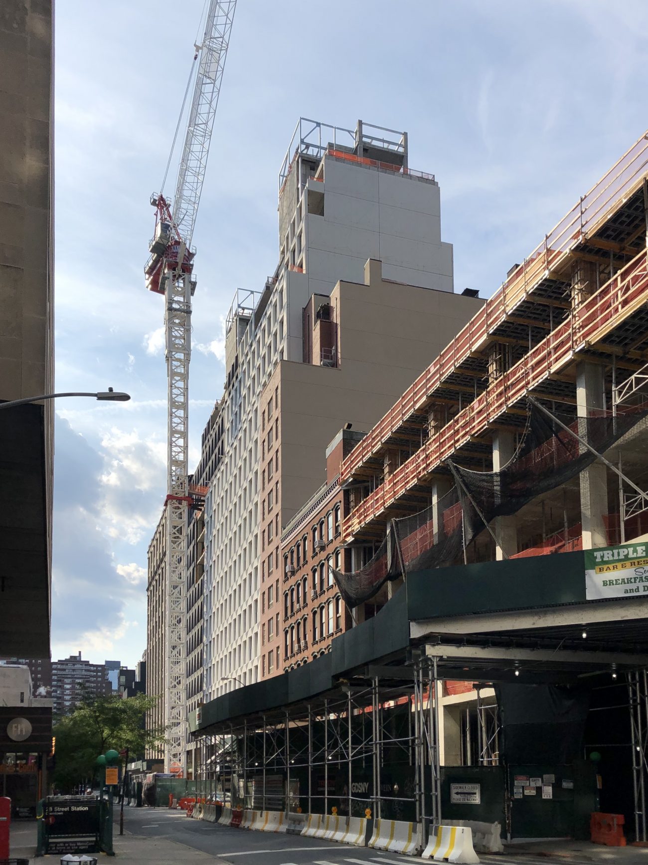
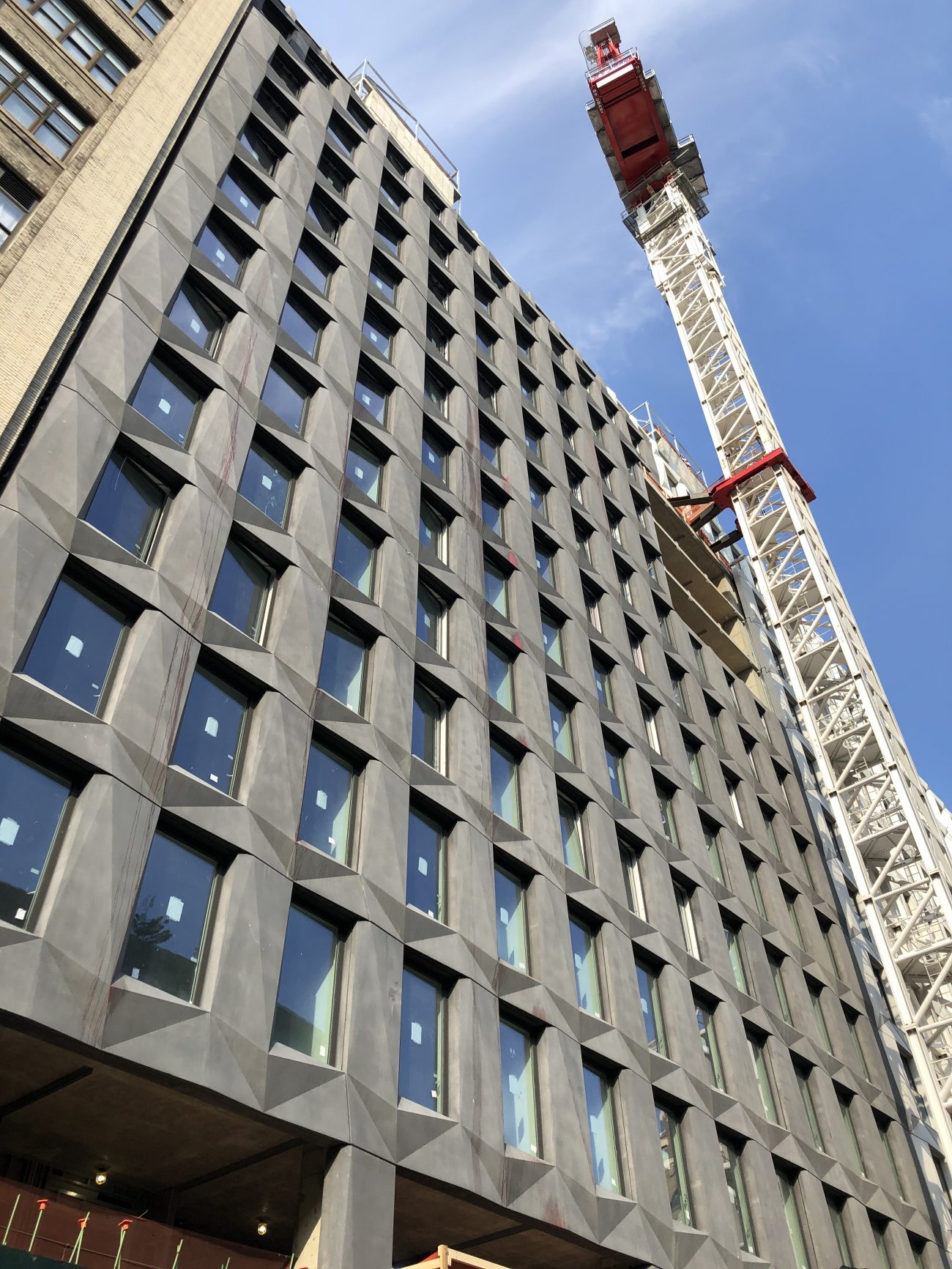
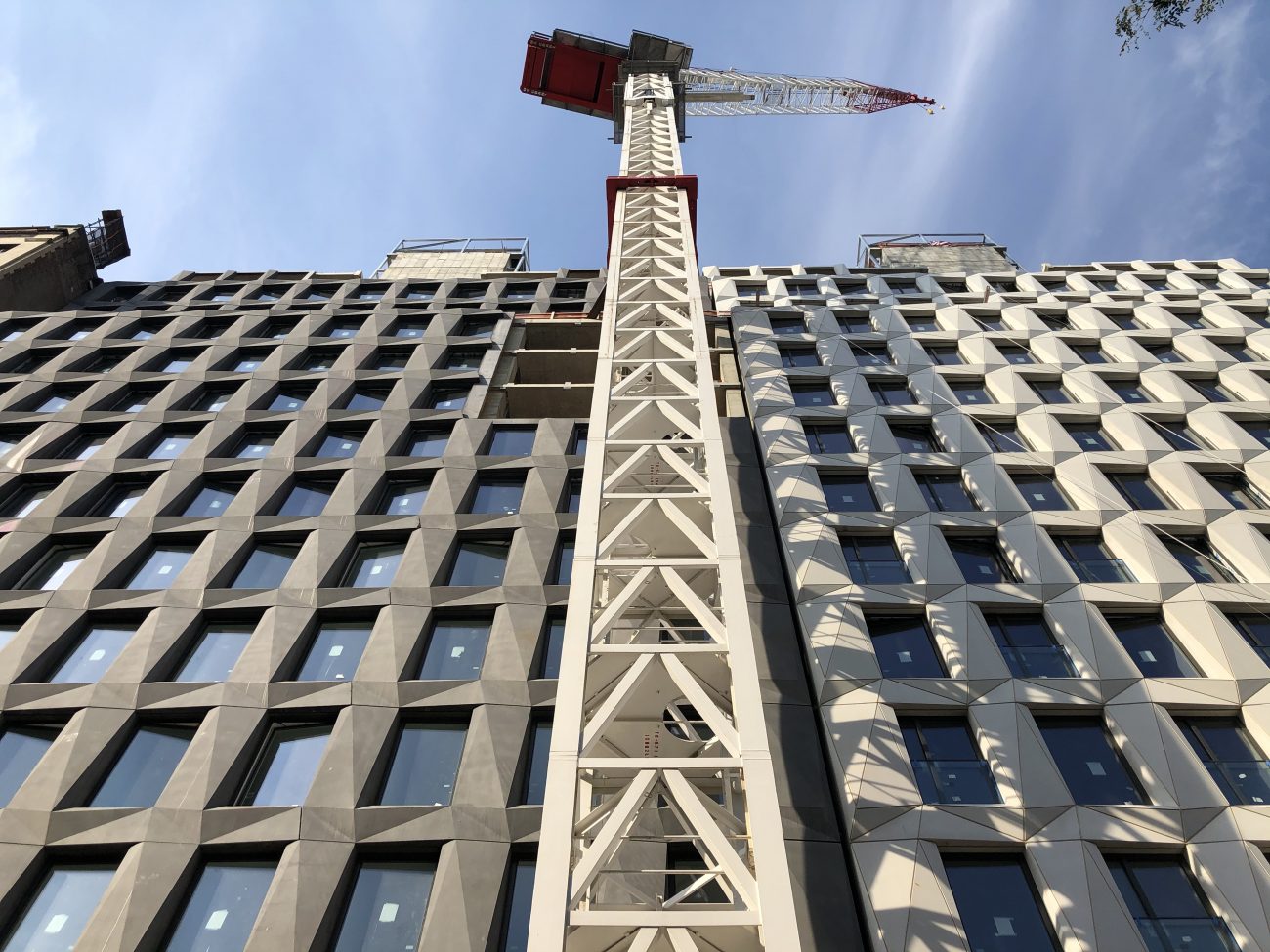
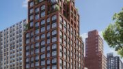
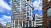
The charcoal and white curtain wall panels have made it to the top of Maverick, a 300,000-square-foot residential development at 215 West 28th Street in Chelsea. Designed by DXA Architects and developed by HAP Investments, the project consists of a pair of identical 20-story buildings that stand 210 feet tall. The property is located between Seventh and Eighth Avenues and is alternately addressed as 215-219 West 28th Street and 221-229 West 28th Street.
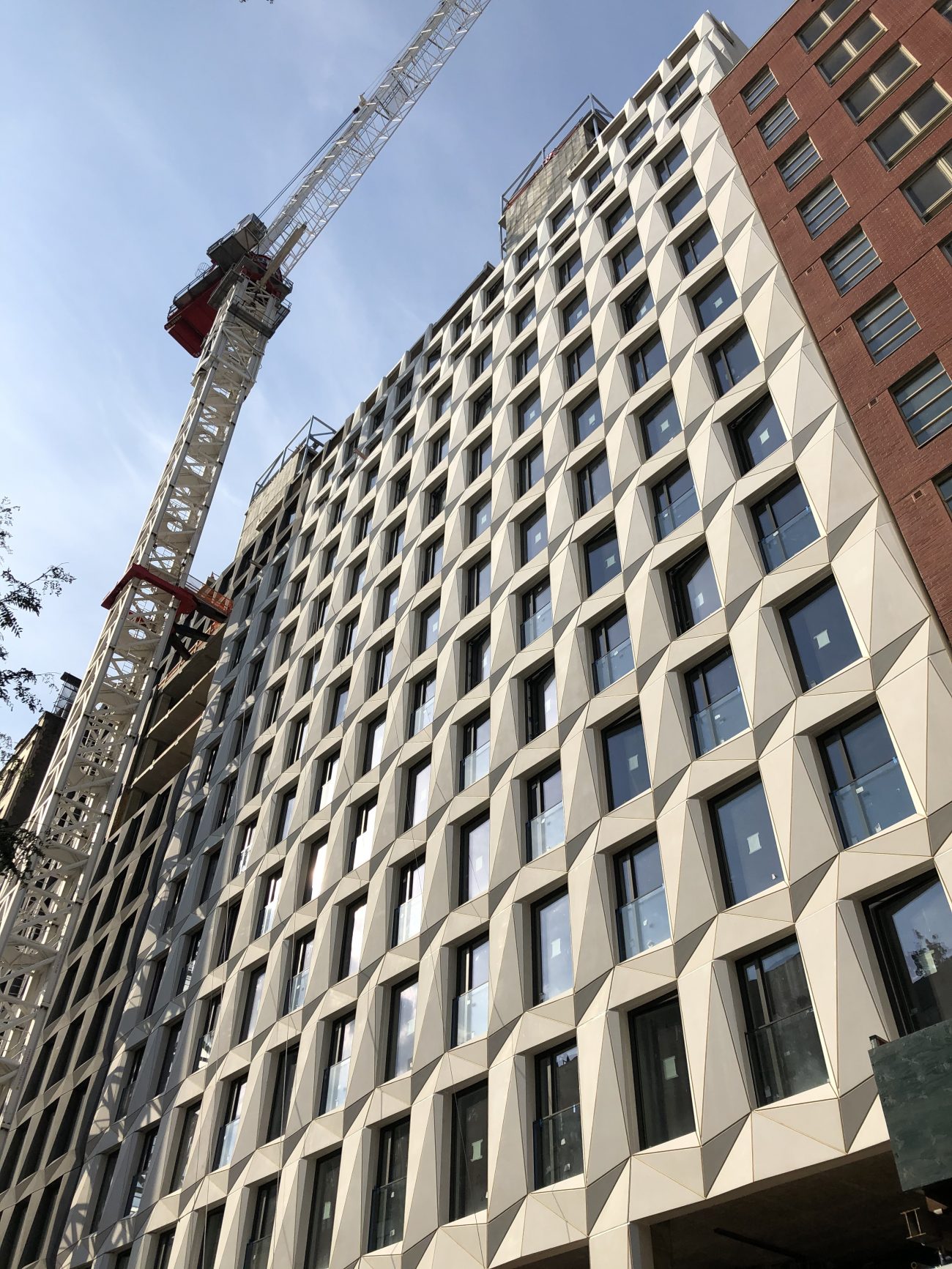
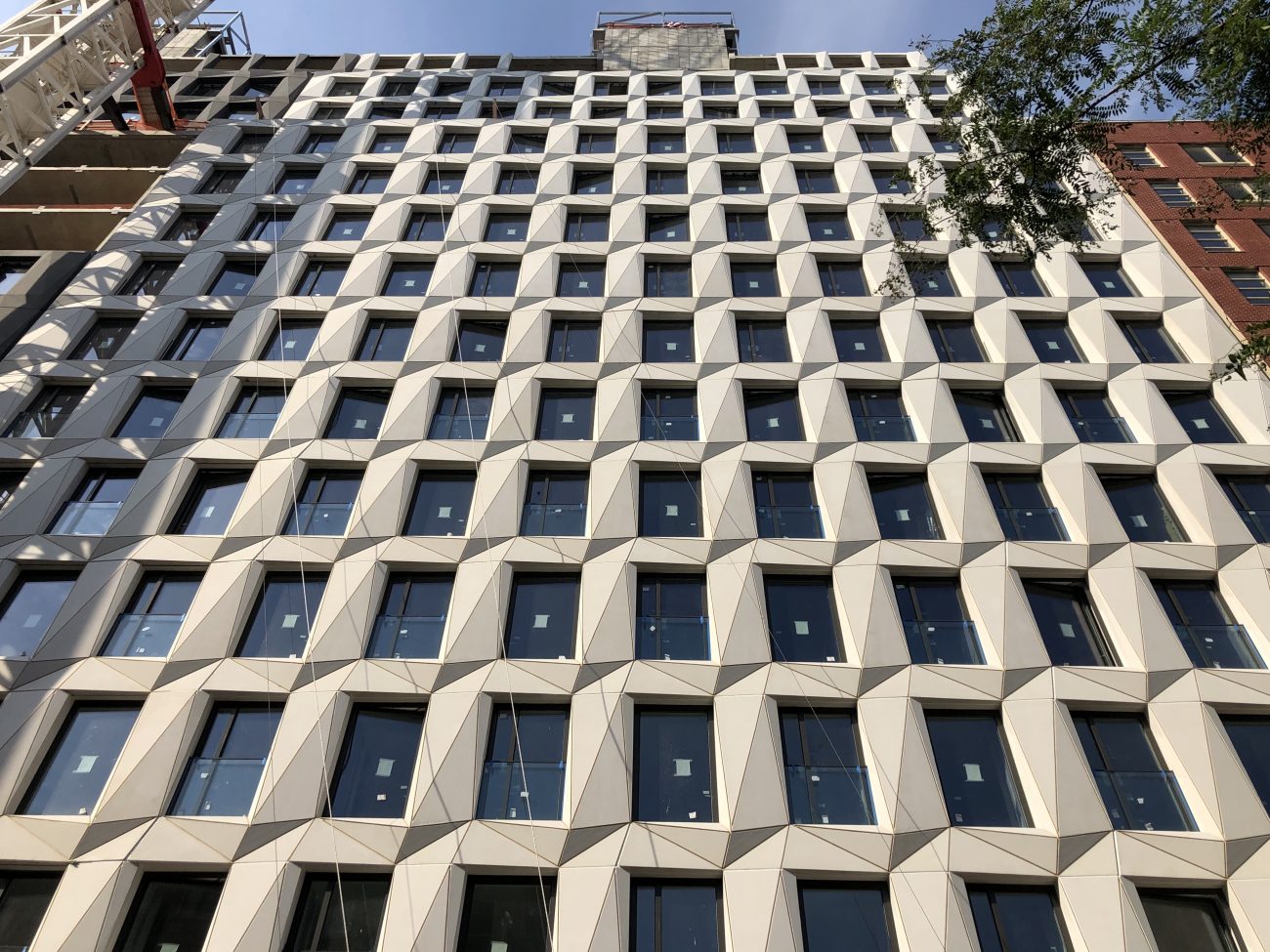
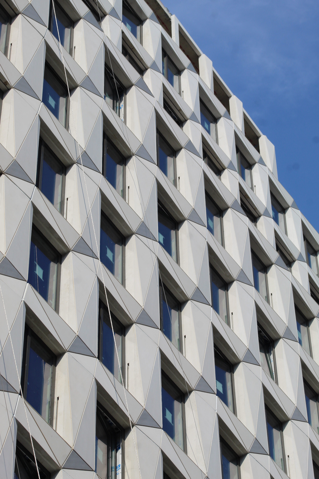
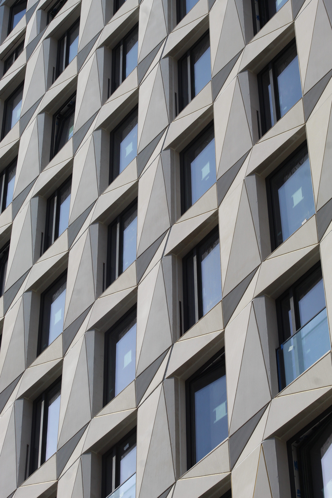
Recent photos show the detail in the geometrically sculpted panels that surround each window. The interlocking triangular elements, which are separated by lightly scored lines, create an interesting play of light and shadow in the afternoon sun. Once installation of the façade is fully complete, the final elements of the exterior to be finished are the mechanical extensions of the roofline. Metal structural frames and cinder blocks are currently forming the remaining cubic massing of each section and will be covered in their respective black and white panels.
Maverick will contain 112 rental units and 87 condominiums. Residential amenities include a fitness center and spa, a rooftop deck, and bicycle storage. The combined ground floors of both buildings will house 20,000 square feet of retail space. The closest subway is the 1 train at the 28th Street station to the east and the A, C, E, 2, and 3 trains are also nearby at Pennsylvania Station, six blocks to the north.
A completion date for Maverick has not been announced, though sometime in the first half of 2021 is plausible.
Subscribe to YIMBY’s daily e-mail
Follow YIMBYgram for real-time photo updates
Like YIMBY on Facebook
Follow YIMBY’s Twitter for the latest in YIMBYnews



I still do not really care for these buildings.
I dubb thee the
“Chelsea Ying & Yang”! ?
Great to use for landmarking…
I like the effect of light and shadow due to the angled elements. I think this comes off very nicely. I also think that spitting the mass into two pieces was smart. One uniform building in this location might have been overwhelming.
I also wanted to say that I’ve seen this “angle” approach done before, but with a crude execution. This seems more refined.
This ended up far better than expected!
This is quite nice. And I love the intention with the retail spaces. Too many building sitting on weird pedestals that I have nothing to do with the tower above.