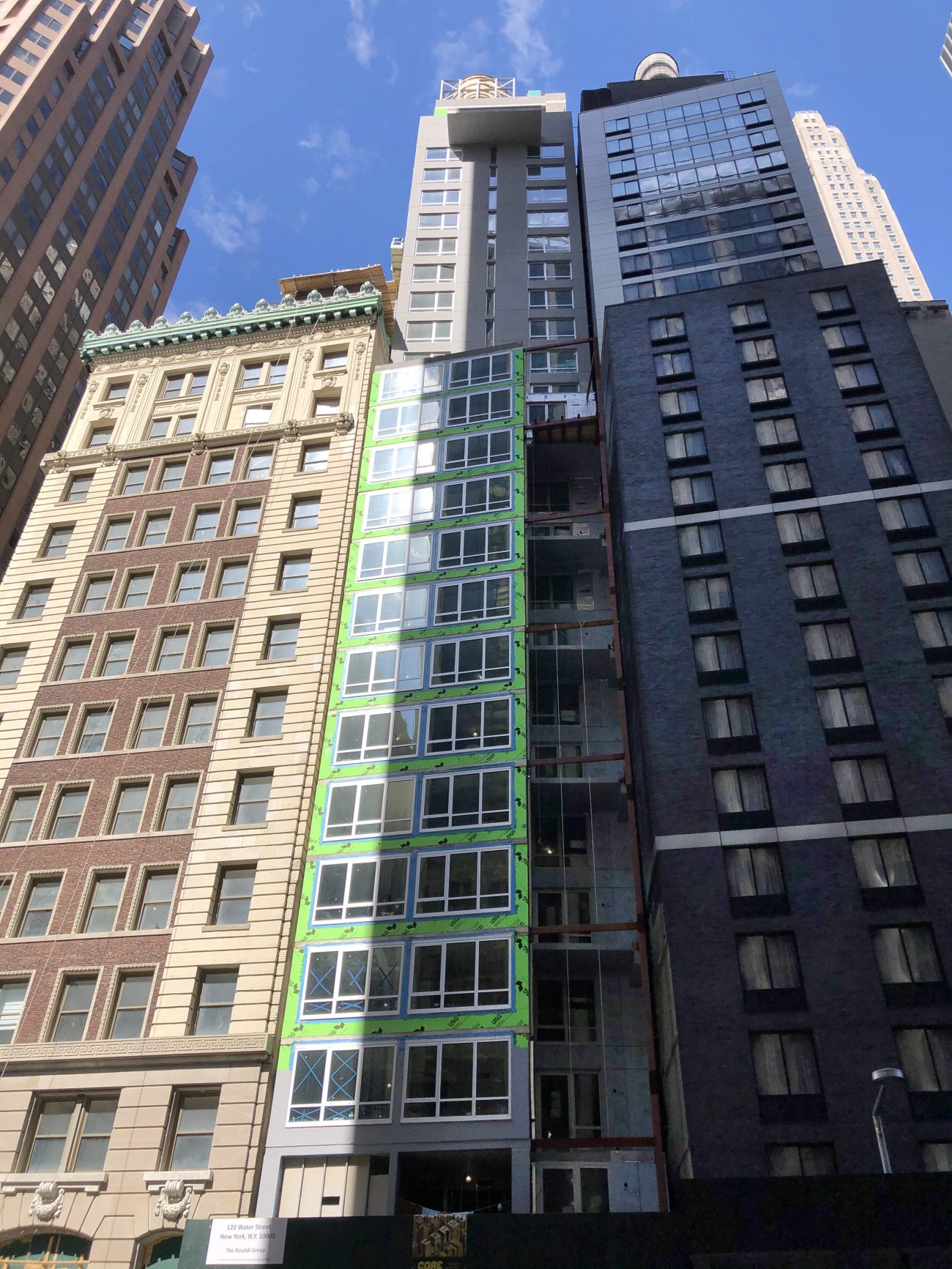
Exterior work is shaping up at 120 Water Street, a 28-story Hotel Indigo in the Financial District. Designed by Gene Kaufman Architects and developed by Atlas Hospitality, the 52,000-square-foot structure will yield 28 rooms managed by Fortuna Realty Group.
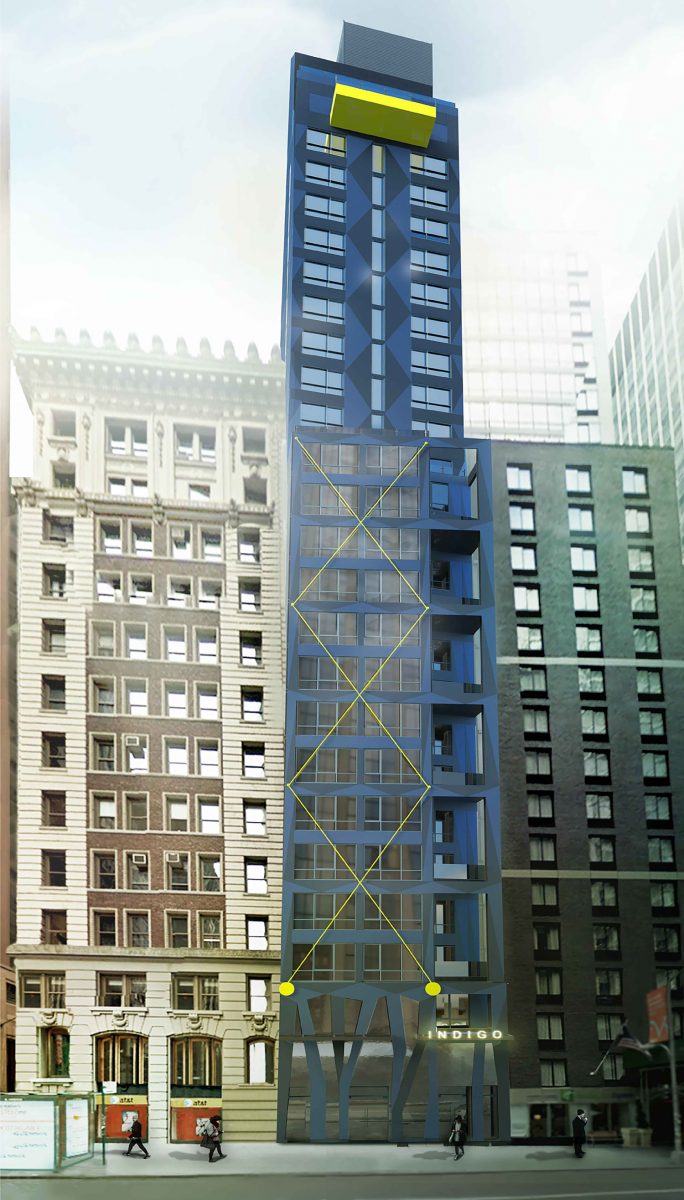
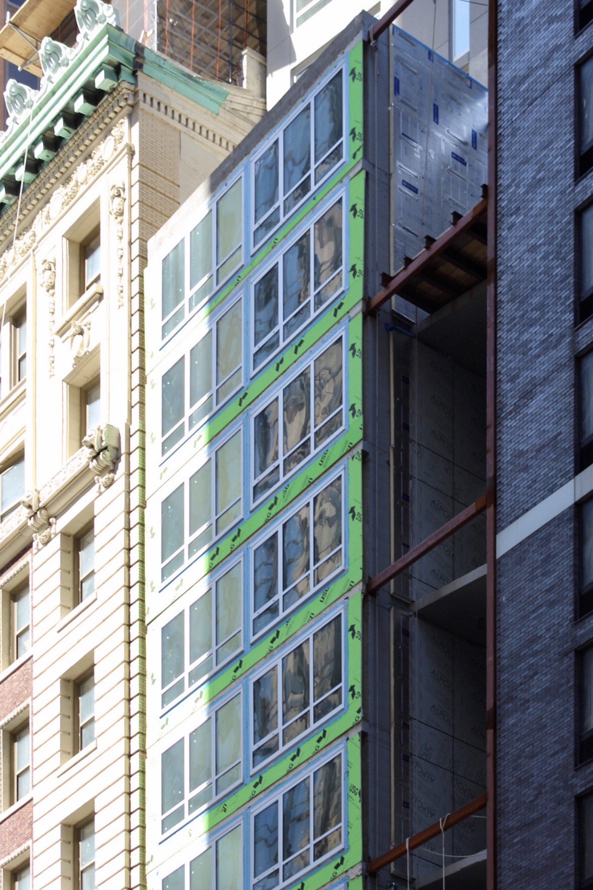
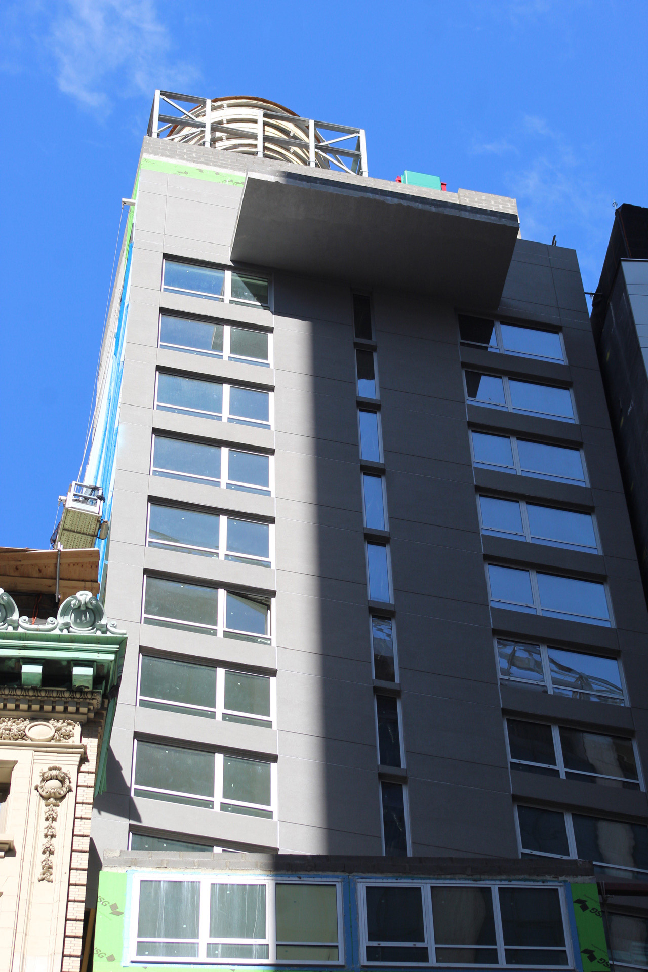
Recent photos show the upper portion of the tower clad in its final curtain wall paneling, which unlike the depiction in the featured rendering, is gray in color. This suggests that the remainder of the structure could follow suit, meaning the finished product would lack both the indigo coloring and the yellow accents featured on cantilevering balcony at the top and the cross bracing on the lower portion.
Amenities for hotel guests are set to include a cellar-level fitness center, a ground-floor restaurant, and a 25th-floor venue space, where the protruding balcony is located. The nearest subways are the 2 and 3 trains at the Wall Street station, which can be accessed via the nearby interior public space at 60 Wall Street. The J and Z trains are also a short walk to the west by the New York Stock Exchange at the intersection of Broad Street and Wall Street.
A formal completion date hasn’t been announced for 120 Water Street, but work is estimated to finish sometime next year.
Subscribe to YIMBY’s daily e-mail
Follow YIMBYgram for real-time photo updates
Like YIMBY on Facebook
Follow YIMBY’s Twitter for the latest in YIMBYnews





Total dreck. Especially next to that classic corner building. What the hell is wrong with this city?
amazingly, stunningly, bad.
one had hoped that the presentation of this project had just fallen victim to cheap and clumsy rendering, but in fact the photos show that this building is in fact an affront; a ghastly waste of resources, material and financial.
Someone take away Kaufman’s license. Clearly a mistake was made giving him one in the first place.
YIMBY yes, in general, but NOT when it involves Gene Kaufman “Architects.”
AGREED ON ALL ACCOUNTS!!! Kaufman has to retire, and call it quits. He is one of the leaders in destroying the aesthetic fabric of our landscape. Hideous hotels, one after the other – and just keeps getting worse and worse. Let him go.
Admittedly a lot going on here, and not sure whether intended or unintended, but, if we drop the snobbery, we can see a lively potential result nevertheless. Flash (and I do mean flash) recalls of Gropius’ Tribune Tower Competition entry and a smattering of post WWll UK Peter Cook / Archigram, plus a bit of DeStjl coloring and even some ‘harlequin pattern’ Cubism thrown in the mix.
Oh, and let’s not forget the touch of ‘unstable’ structural expressionism at the ground floor —so ‘of the moment’!
‘Modernist Eclecticism’, yes, but a lively presence to come upon and made all the more provocative there ‘squeezed in’ in the very tight quarters of FinDi, and cheek-by-jowl to the Classical corner neighbor. And all the talk of ‘pulling licenses’ of practitioners cranking out schlock? I would start with the likes (posthumously) of Zaha Hadid (whose bldg on the high line is beyond ridiculous and formally polluting) and a slew of numerous Eurotrash architects ‘flown in’ with a flourish to ‘do their hackneyed thing’ helter-smelter, here and there. As to the yellow accents potentially being deleted here: that would be a grave mistake. Stripping this bldg of all its ‘added features’ would definitely place the ‘denuded’ version squarely in the realm of banal schlock.
Dude. They got rid of the yellow. They got rid of the harlequin. They got rid of the ground floor expressionism. They value engineered the already value engineered. Which everyone here KNEW THEY WOULD.
Don’t know what you’re smoking FR.. but Zaha Hadid has created some spectacular buildings.Her work on the high line is beautiful.
Gene Kaufman on the other hand deserves all criticism thrown his way. ALL of his building designs are cheap, ugly, and lack basic foresight; Textbook visual pollution.
I hope his house is ugly too.