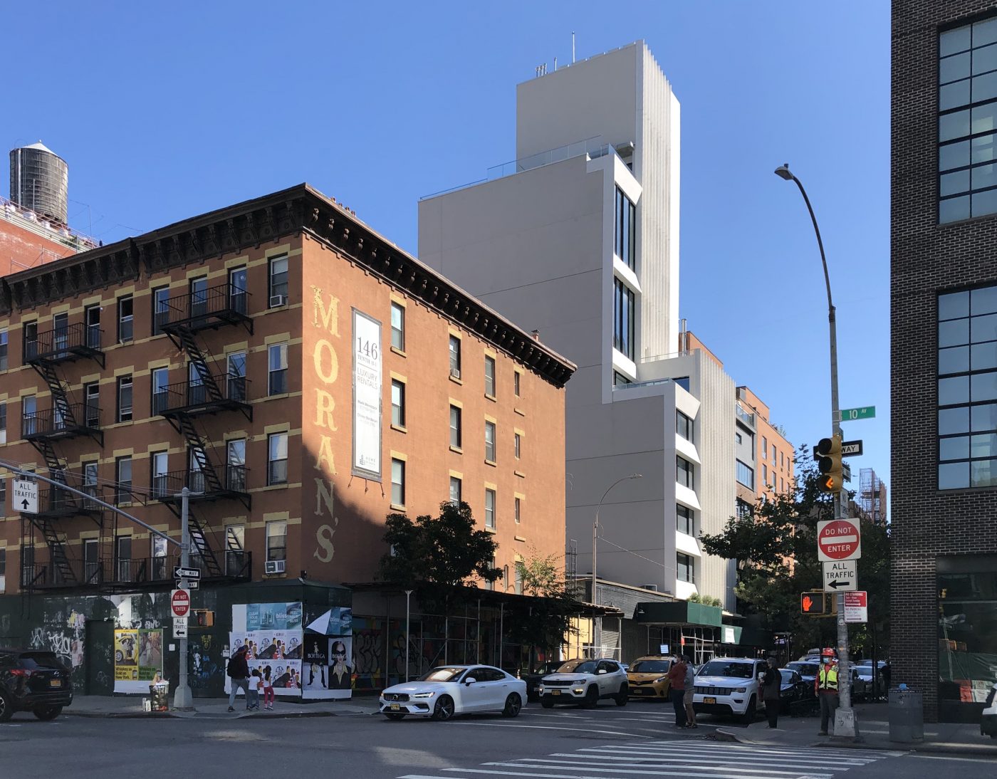
Construction is still finishing up on ABI Chelsea, a 10-story residential building at 455 West 19th Street in Chelsea. Not much has changed since our last visit in late January, with construction entirely complete with the exception of the ground floor. The project, which is located between Ninth and Tenth Avenues, is designed by Lebanon-based Raed Abillama Architects with Paik Architecture as the architect of record. Developer Al Amir Holdings is expecting a projected sellout of $77.5 million. Douglas Elliman is handling sales and marketing for the residences, which are slated to range from $15 to $25 million.
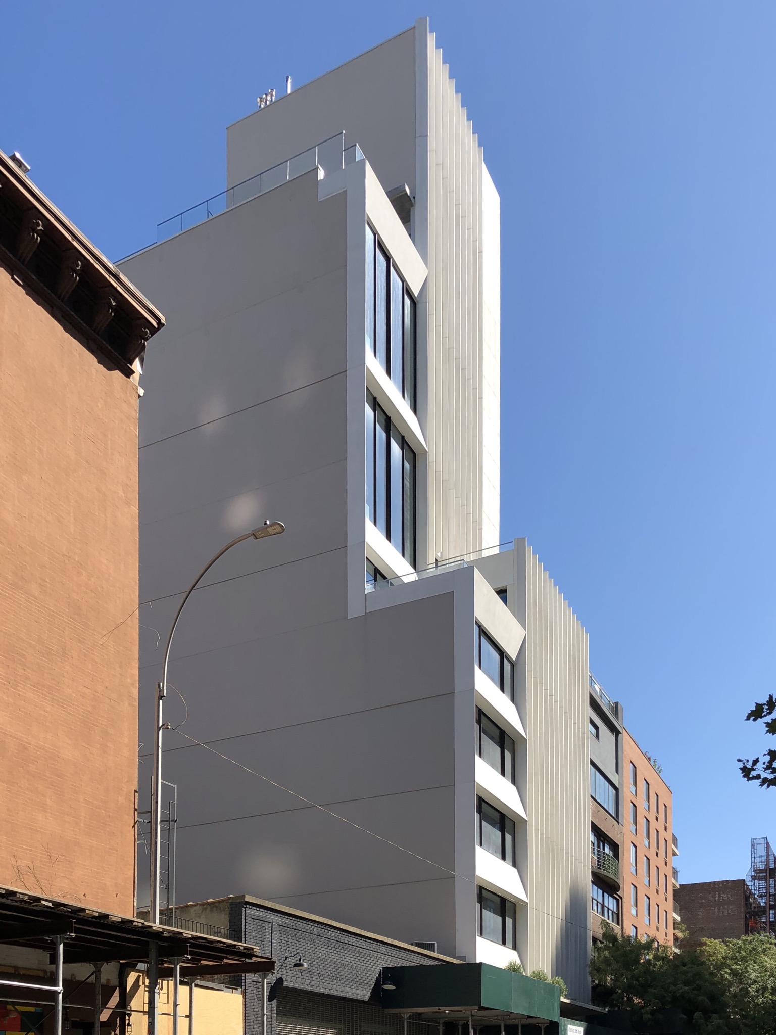
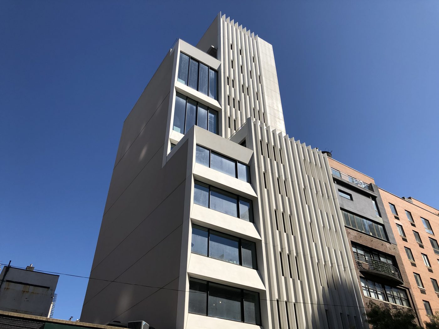
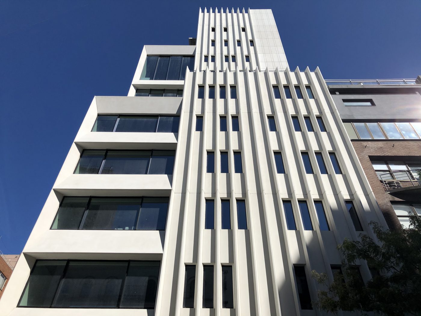
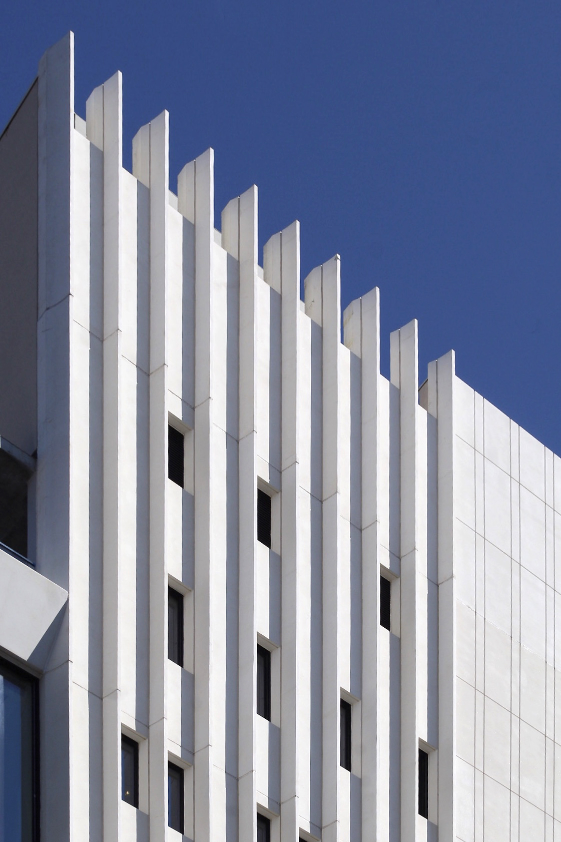
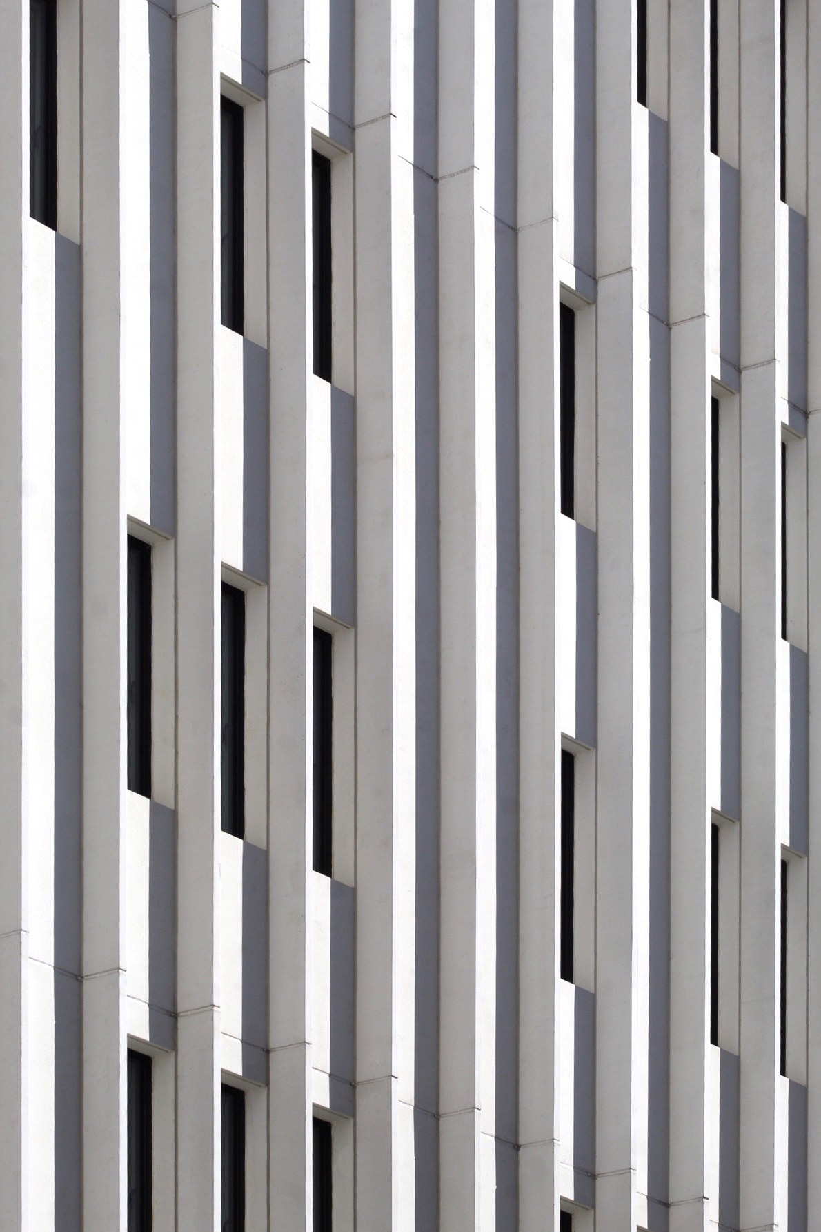
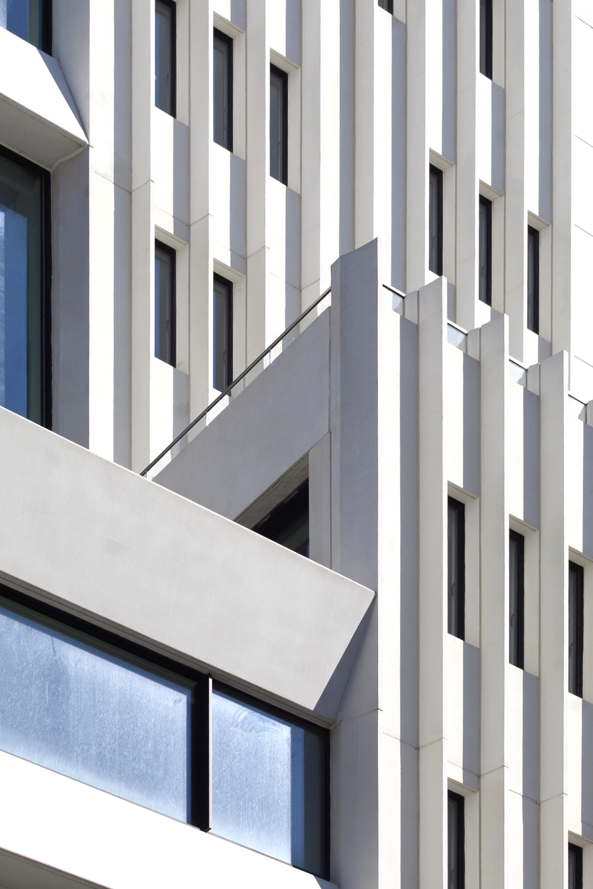
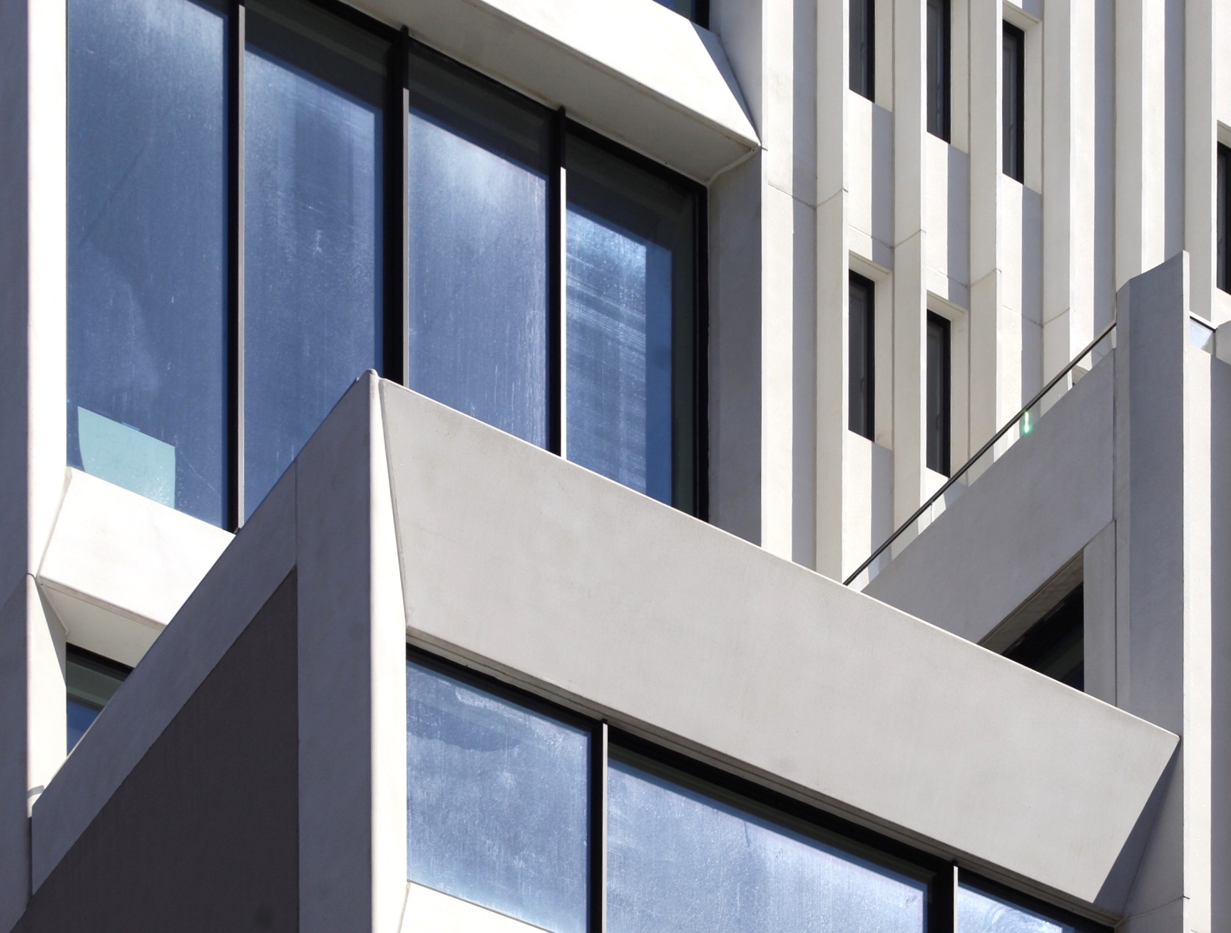
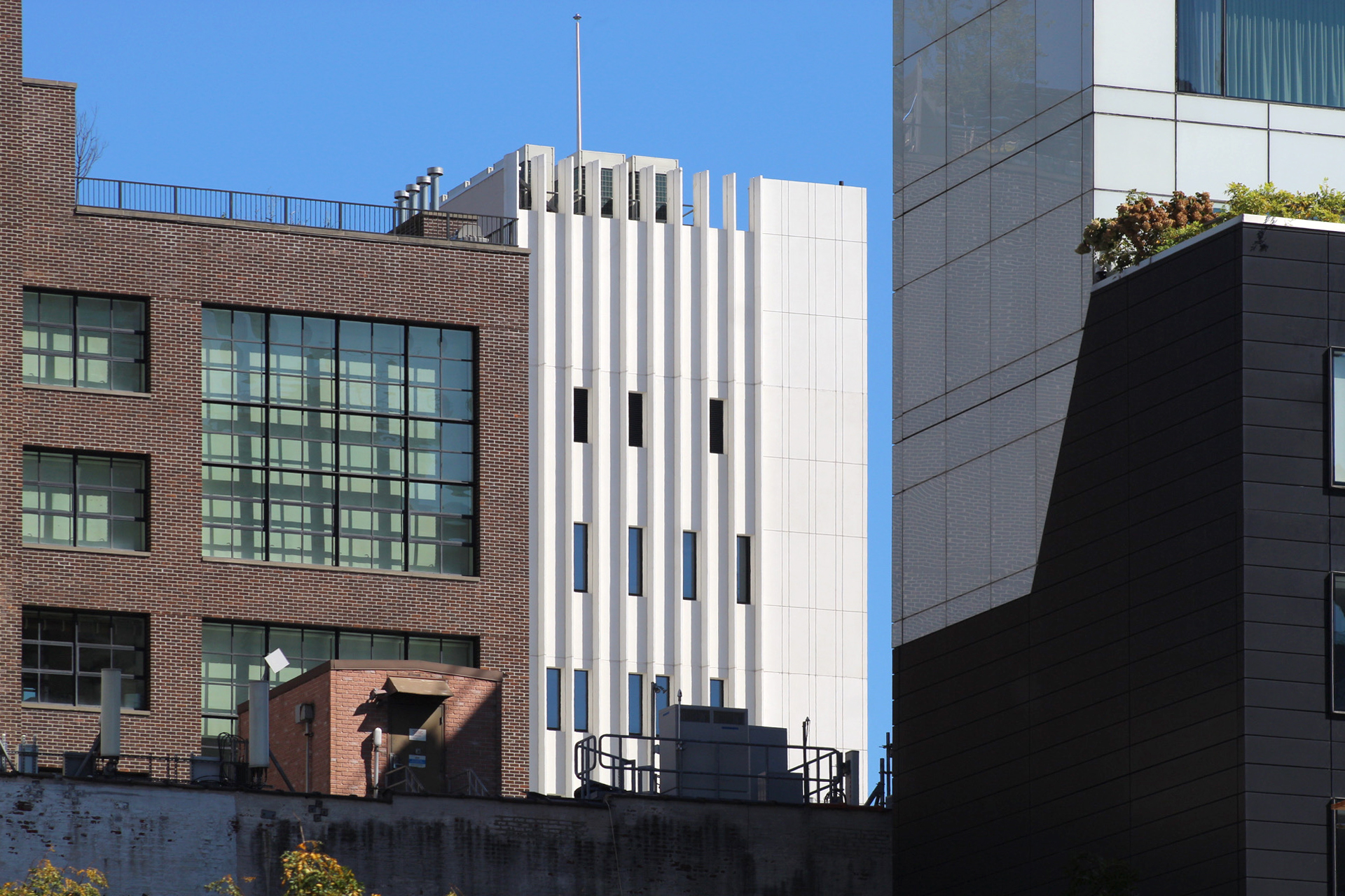
Photographs show the finished look of the exterior, which features distinctive white fins and panels framing windows of varying sizes. A setback near the halfway point appears to yield a private outdoor terrace.
The relatively slim and asymmetrical southern elevation that faces West 19th Street features an entrance canopy topped with shrubbery. This is currently situated behind construction barriers, metal gates, and wooden boards that line the sidewalk.
The below photographs give a closer look at the exterior details.
The structure incorporates a contemporary approach in terms of materials, but with a juxtaposition of linear geometry and solid planes, and openness and privacy. The western-most part of the main elevation looks more exposed to the daylight and the city, while the eastern half feels more tightly compressed with a narrow field of vision for occupants. All of these aspects add up to set the building apart from the rest of the neighborhood.
Amenities include an art gallery, a rooftop terrace, and a swimming pool.
A formal completion date had not been announced, though at this point ABI Chelsea could finally finish and open by the end of the year.
Subscribe to YIMBY’s daily e-mail
Follow YIMBYgram for real-time photo updates
Like YIMBY on Facebook
Follow YIMBY’s Twitter for the latest in YIMBYnews






“Prices ‘range’ from 15 to 25 million”
I’m not home on that range!
Yes, these homes are pretty pricey.
Maybe apart from a slightly plain concrete wall I do think this looks really good, especially those fins. The setbacks are really pleasing too.
It’s very refreshing to finally see some truly unique, new design that isn’t just more glass wallpaper. Perhaps the two sides of the vertical facade could have been better tied together, but this building is an elegant, modern addition to an old and eclectic neighborhood. The unit prices prove we desperately need to revise our tax code.
American architects…this is something to learn from, this is ARCHITECTURE !!!
This is geometry and light, this is Le Corbusier this is Richarad Meier… this is AECHITECTURE !!!
High Heel Park
looks like a parking lot. That white won’t age well….