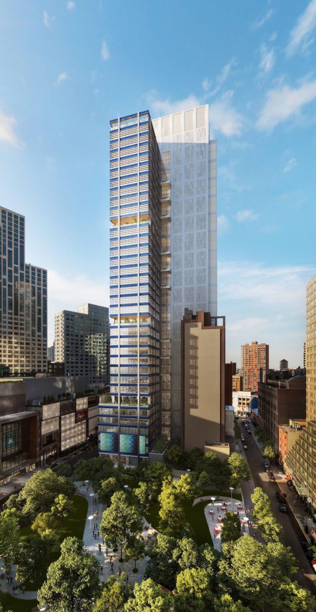
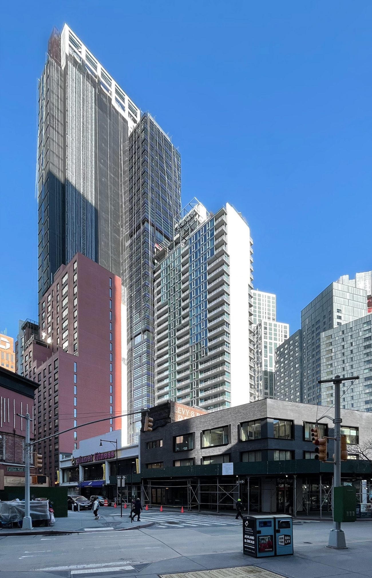
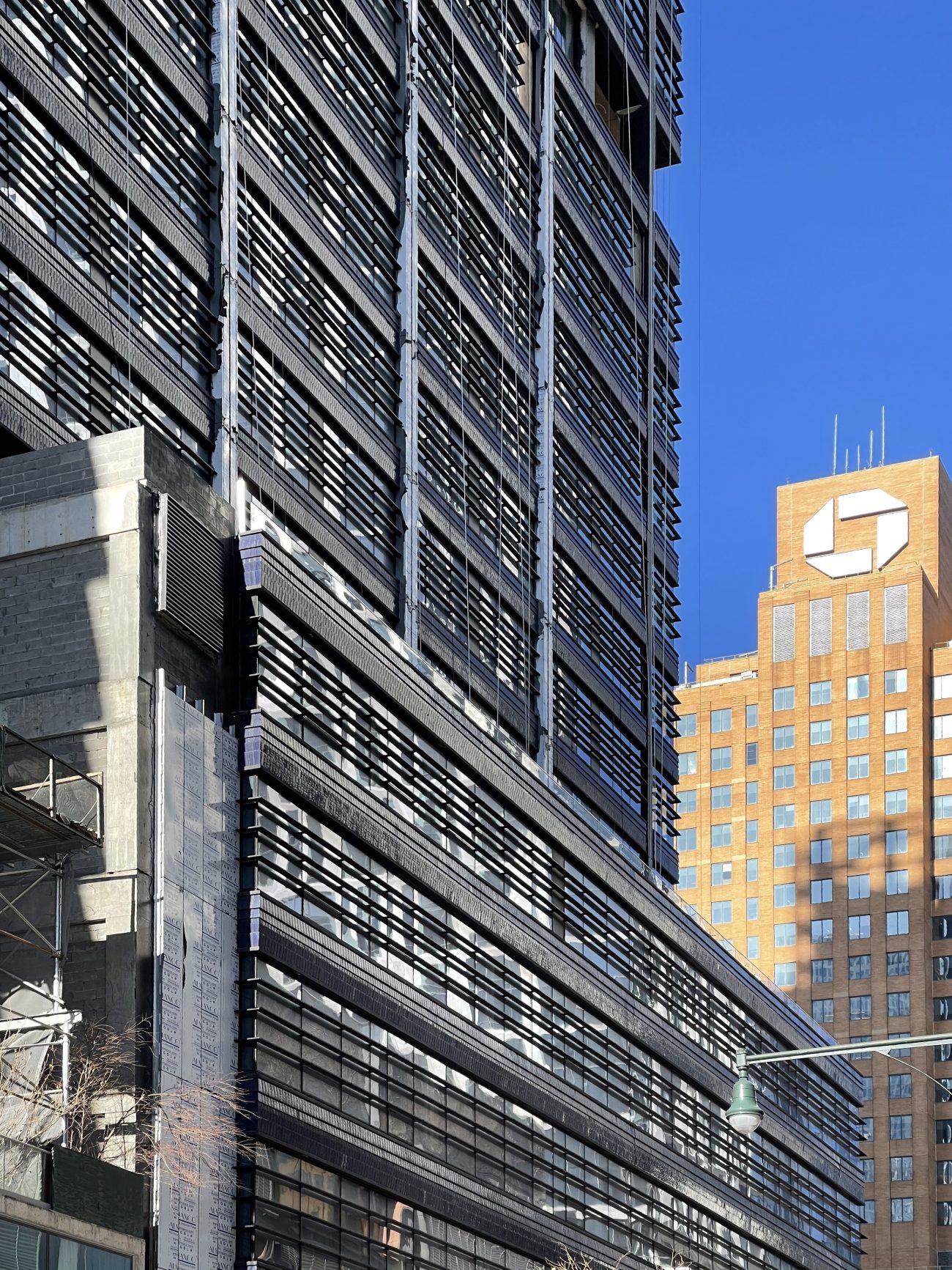
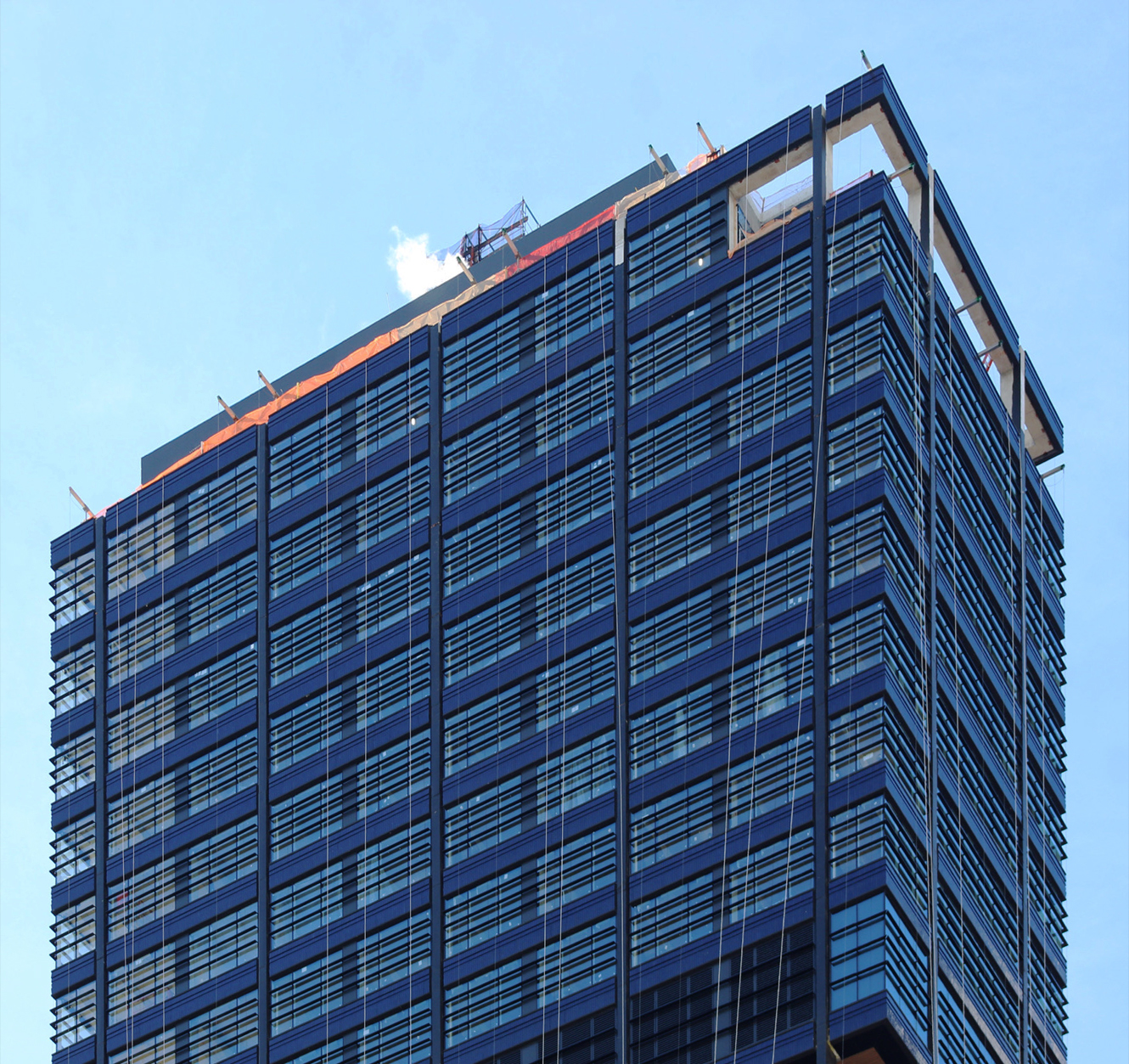
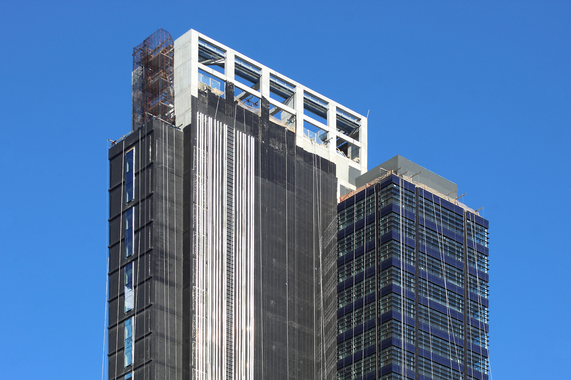
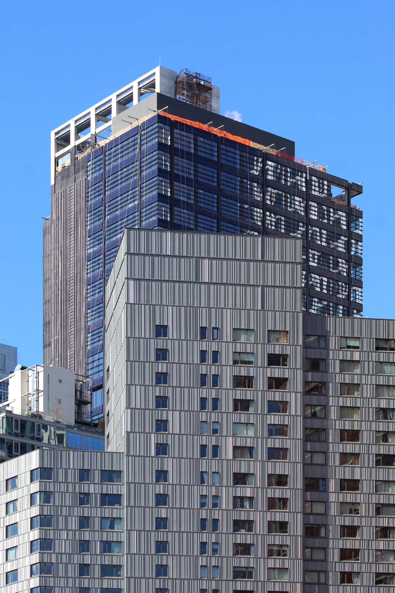
Exterior work is continuing to progress on One Willoughby Square, a 36-story, 495-foot-tall office skyscraper in Downtown Brooklyn. Alternately addressed as 420 Albee Square, the project is designed by FXCollaborative and is being developed by JEMB Realty, and will yield 500,000 square feet of Class A office space. One Willoughby Square is set to open as the tallest new office building in Brooklyn and is bound by Albee Square West to the east, Willoughby Street to the north, and Duffield Street to the west. Gilbane Building Company is in charge of construction on the project.
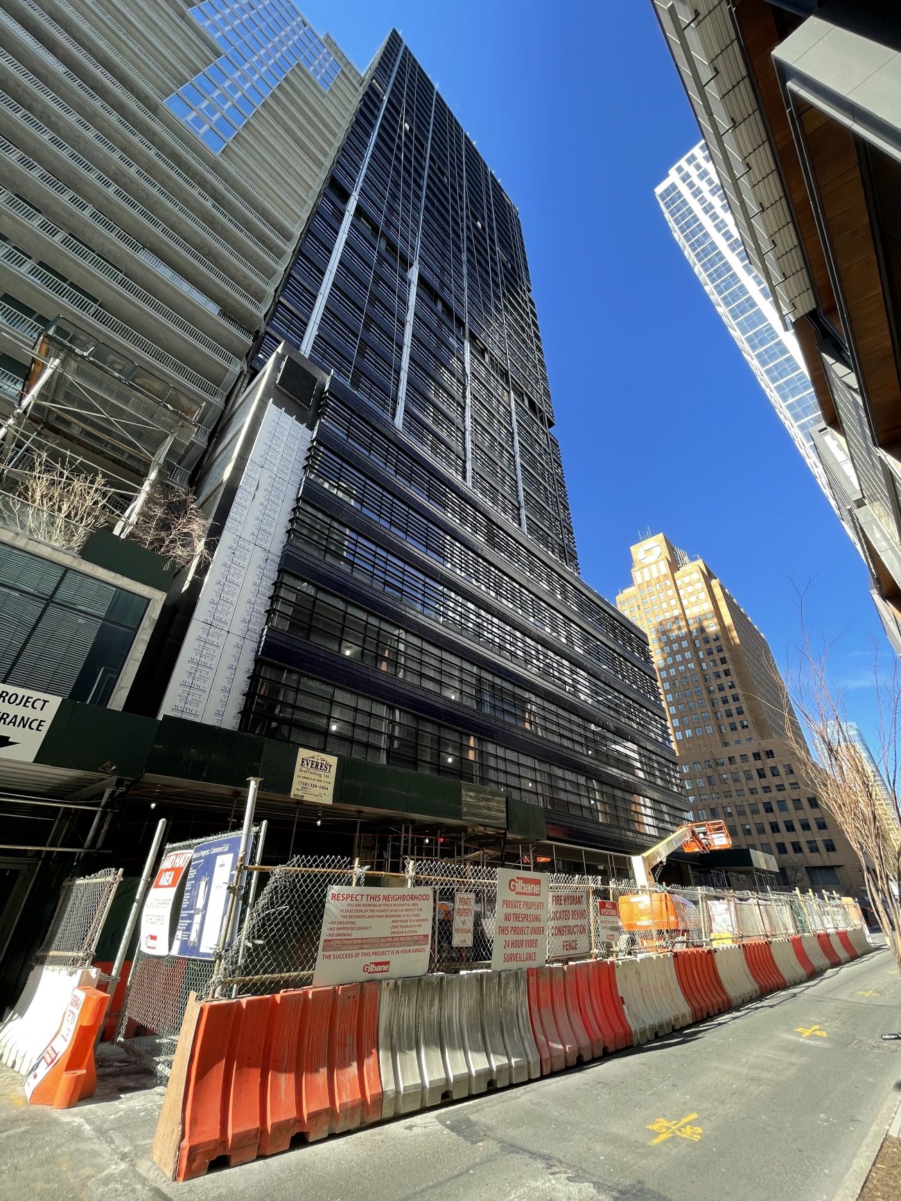
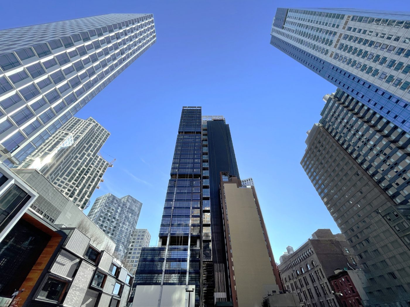
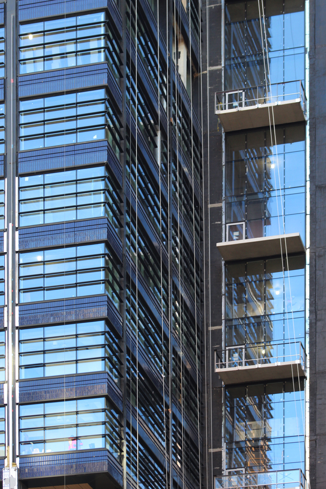
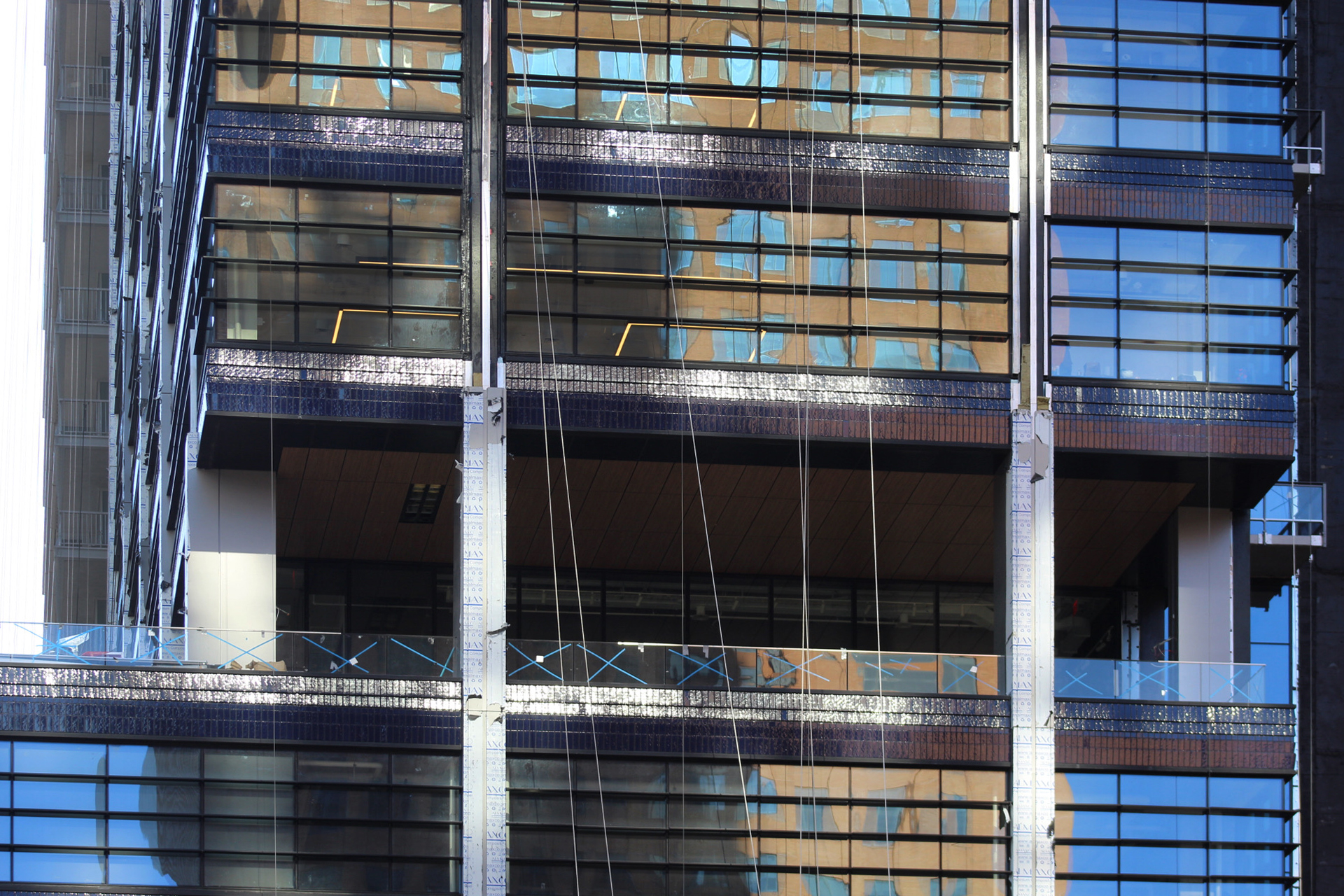
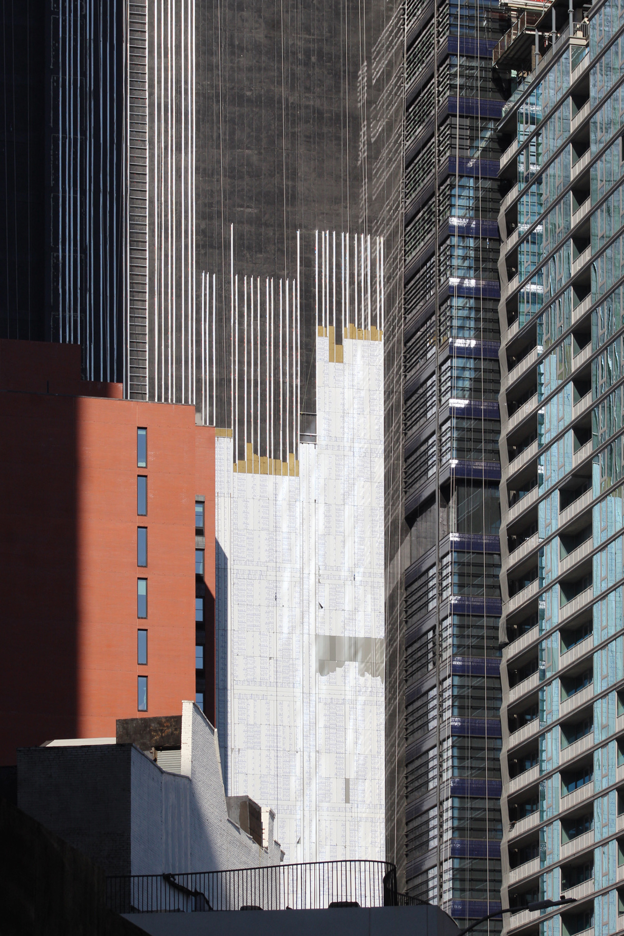
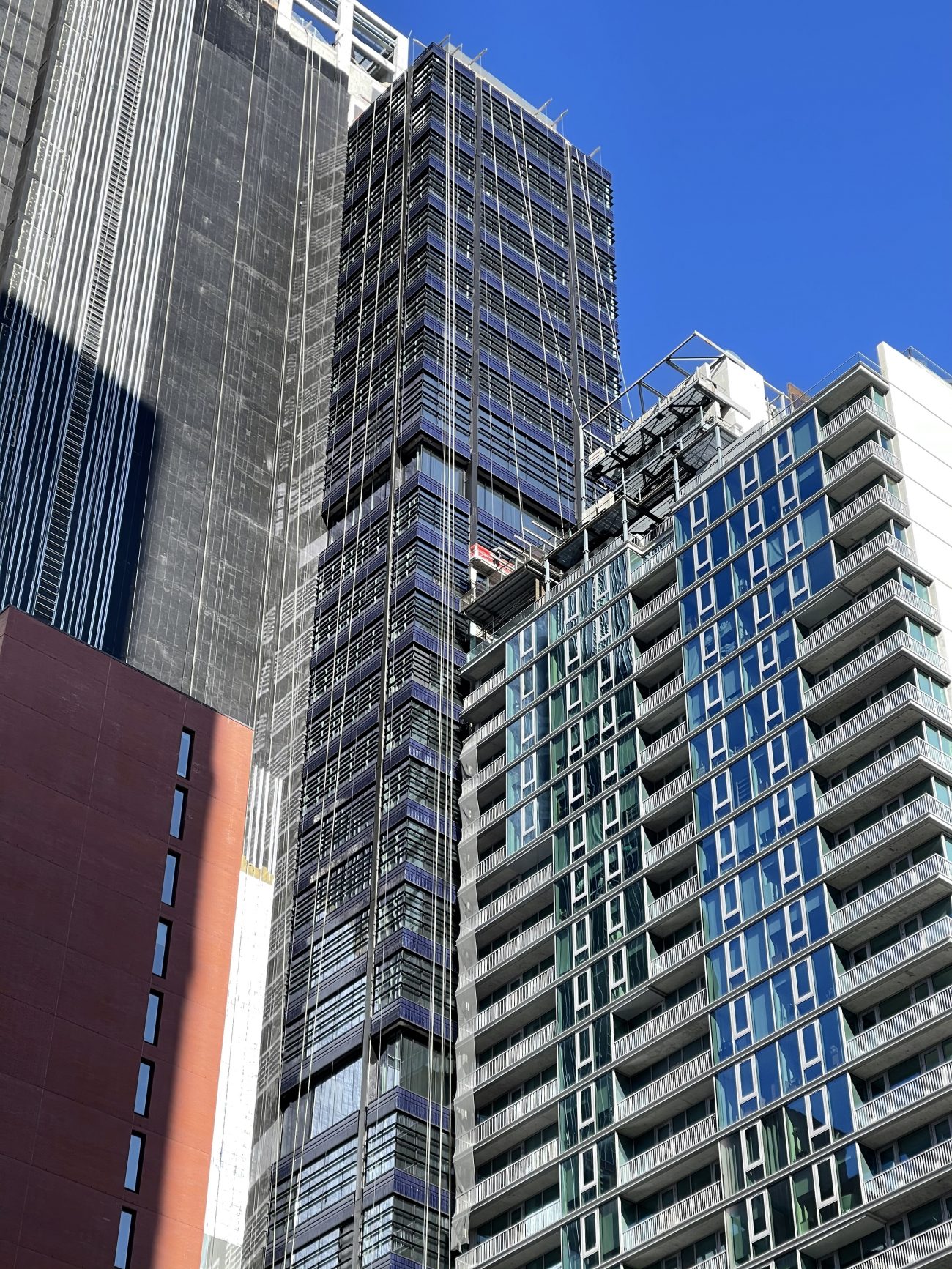
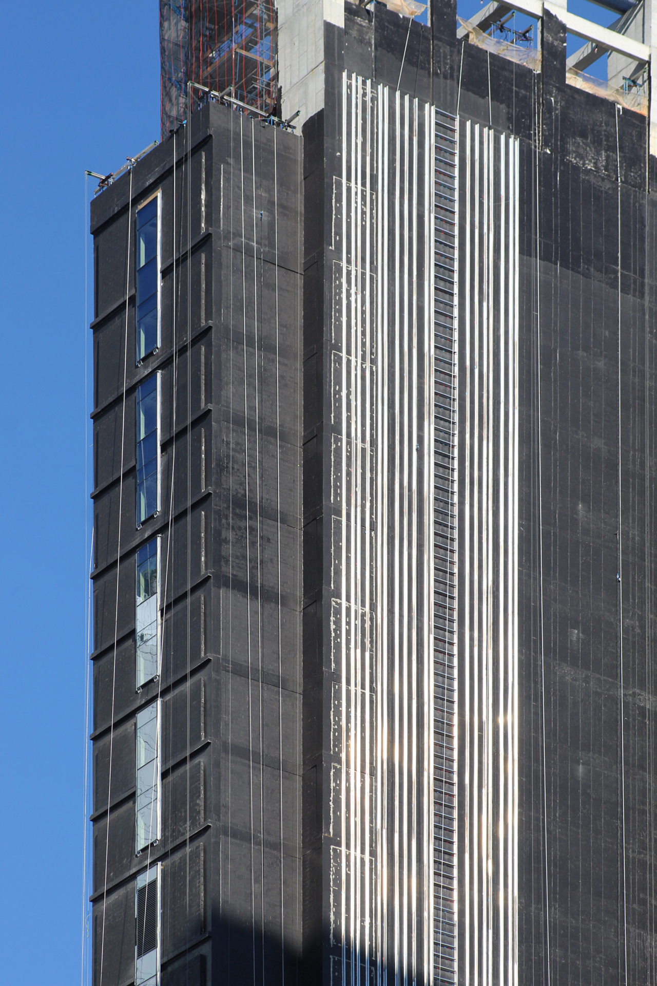
Recent photos show that the exterior on the eastern elevation facing Albee Square West has been substantially completed. The same can also be said of the northern profile, which is seeing a steadily climbing assembly of closely spaced metal strips attached to the blank concrete walls, which are painted black. This dense array will support a light blue grid of metal panels of varying shades, as depicted in the main rendering. This opaque outside surface is also going to repeat its subtle motif on the southern side, which is seeing the most progress on this secondary layer of the overall design. Meanwhile, perimeter columns are in the process of being installed between the glossy blue bricks and industrial-style ribbon windows. Most of these panels remain covered in their protective plastic film.
When finished, FXCollaborative is planning to occupy floors seven, eight, and nine. The uppermost levels of the office complex will feature 18-foot-high ceilings and a private outdoor loggia with expansive views over Downtown Brooklyn, the Manhattan skyline, the New York Harbor, and further across the city.
YIMBY predicts that One Willoughby Square could likely be completed in the latter half of 2021.
Subscribe to YIMBY’s daily e-mail
Follow YIMBYgram for real-time photo updates
Like YIMBY on Facebook
Follow YIMBY’s Twitter for the latest in YIMBYnews





After 9 DeKalb, this is my favorite new building in Brooklyn, which has escaped the silver glass box mania of Manhattan.
The renderings don’t do this one justice.
More of this…
Please send me an application for a two-bedroom affordable apartment by email.
STOP SPAMMING WITH THIS BS
A celebration of height. This skyscraper recalls Philadelphia’s PSFS Building and the McGraw-Hill Building on West 42nd Street in Manhattan. What a handsome triumph.
One Willoughby Square is just phenomenal. This is truly the best of the best!
What’s the point
Same old crap
I bet you have no knowledge of what previously occupied that
Location.
This is better. It’s a beautiful new tower. Cities evolve. Cities can’t sit mired in the past. This has character. It has texture. It is contextual. The materials are beautiful. Real thought went it to it and it’s a triumph. This site is called Yimby. Please take your NIMBYism to where it is more welcome. We are here to celebrate projects like this one. Bravo to the architects and developer.
It used to be a parking lot. Are you saying this space is better off as a single-story parking lot?
I agree w/ J. Korom Reminds me of McGraw-Hill. Not bad at all
The built building looks better and more beautiful, from its rendering. So completely clean as if just finished wiping: Thanks to New York YIMBY.
love that slick facade.