YIMBY spotted a new batch of renderings and diagrams that depict Project Commodore, Skidmore Owings & Merrill‘s upcoming mixed-use supertall at 175 Park Avenue in Midtown East. The 83-story behemoth is slated to rise at the corner of East 42nd Street and Lexington Avenue, on the site of the Grand Hyatt between the 108-year old Beaux Arts Grand Central Terminal and the 91-year-old Art Deco Chrysler Building. RXR Realty and TF Cornerstone are developing the massive structure, which also appears to have gotten a height reduction to 1,486 feet tall, as opposed to the 1,646-foot-tall architectural height previously announced. Inside will be 500 Hyatt hotel rooms on the upper floors spanning 453,000 square feet; 10,000 square feet of retail space on the ground, cellar, and second levels; new elevated, publicly accessible plaza space overlooking the surrounding Midtown neighborhood; and 2.1 million square feet of Class A office space.
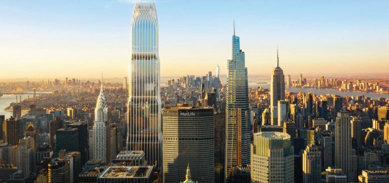
Aerial renderings show Project Commodore making a dramatic presence over Midtown, despite a slight chop in the final height of the superstructure. Also added to the future skyline perspective is J.P. Morgan’s new supertall office headquarters at 270 Park Avenue, while Kohn Pedersen Fox’s One Vanderbilt, the Chrysler Building, and Rafael Vinoly’s 432 Park Avenue are also prominently seen in comparison with SOM’s future project. Each of the renderings and diagrams were from a slide presentation that Global Strategy Group presented to the Public Design Commission at last month’s public meeting as part of the conceptual review for Project Commodore, which received a large amount of positive reviews and feedback from the commissioners.
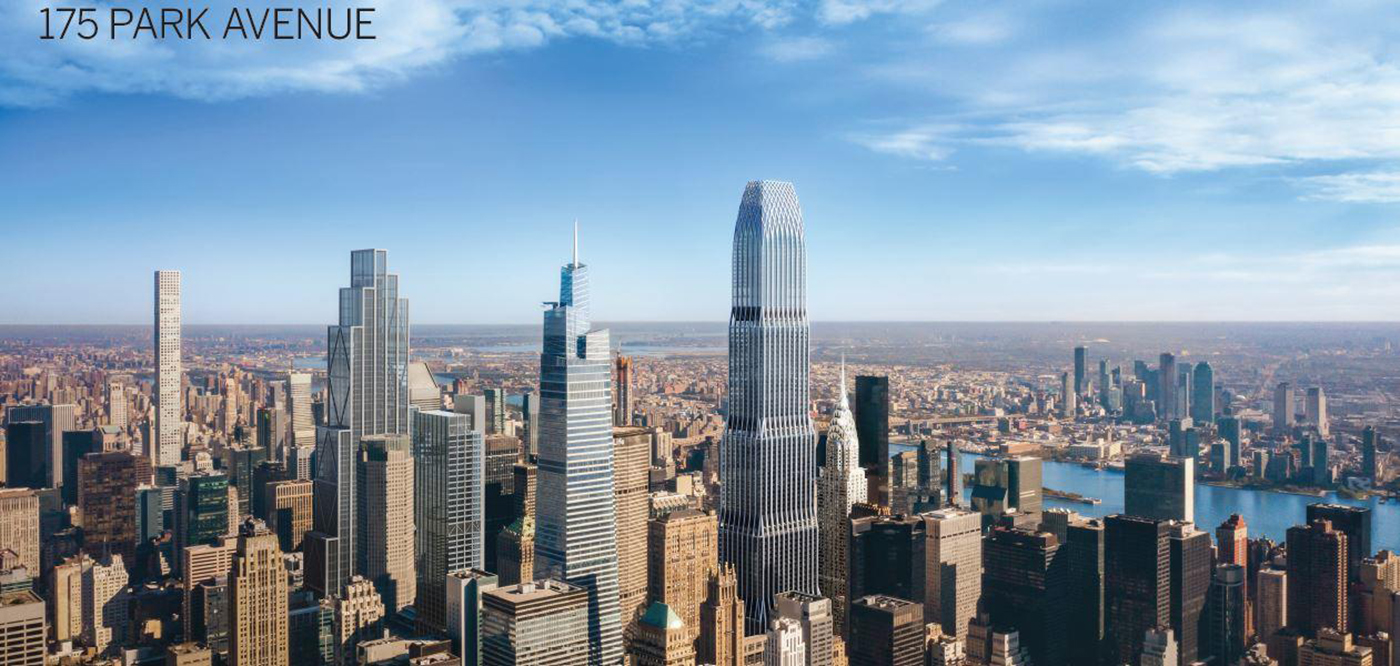
175 Park Avenue, aka Project Commodore, amongst the Midtown East skyline. Rendering by Skidmore Owings & Merrill
The intricate lattice crown would easily distinguish it from the rest of the nearby supertall rooftop parapets.
Below is a diagram that outlines the buildings along 42nd Street between One Vanderbilt and the Chrysler Building and how the scale between each edifice is seen. This also gives a true sense of how Grand Central will be surrounded by two equally mammoth 21st century buildings.
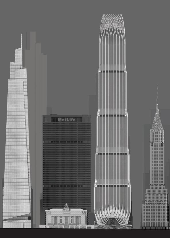
175 Park Avenue, and the surrounding buildings along 42nd Street. Rendering by Skidmore Owings & Merrill
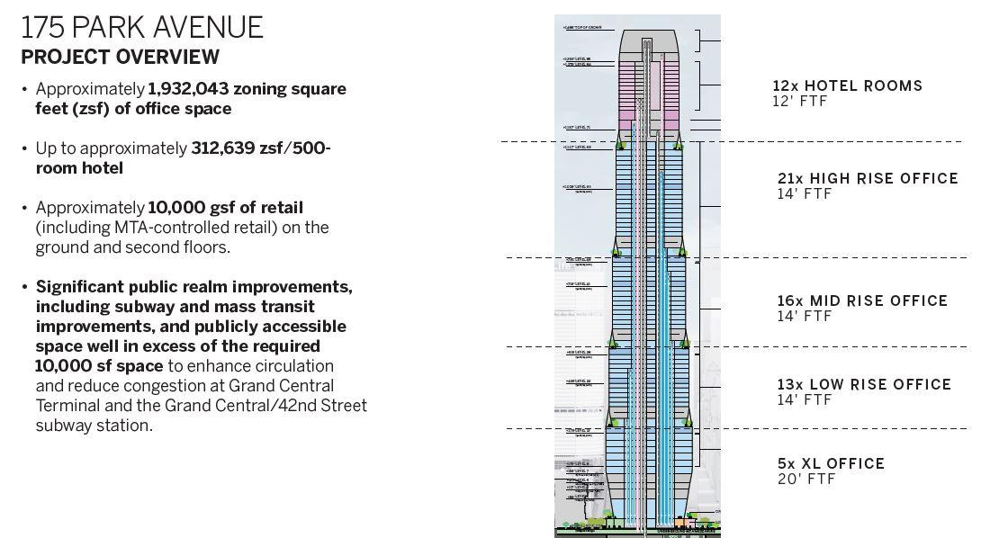
175 Park Avenue’s floor plates are substantially devoted to office space, while the hotel portion will be placed on the upper levels.
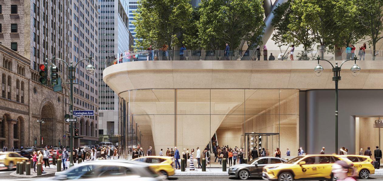
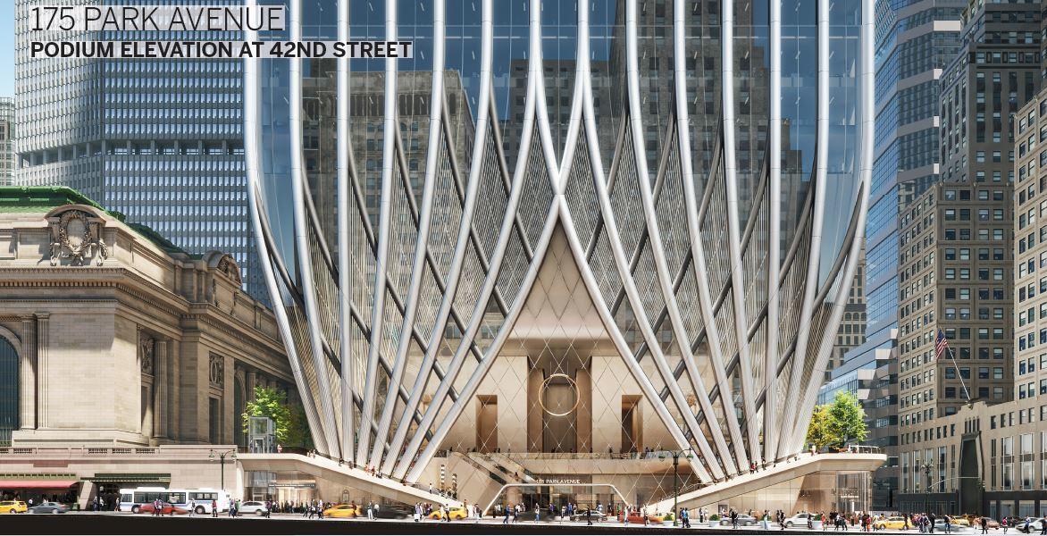
175 Park Avenue’s southern corner along 42nd Street and Lexington Avenue. Rendering by Skidmore Owings & Merrill
An updated rendering showcasing the base of the southern elevation gives us more details on the symertical façade and its components.
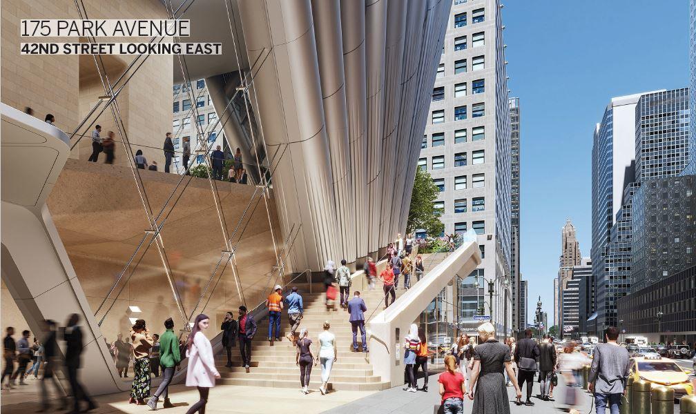
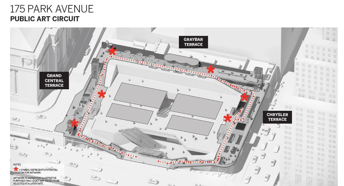
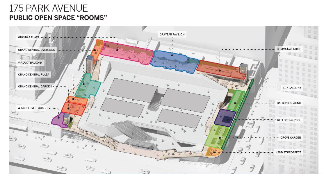
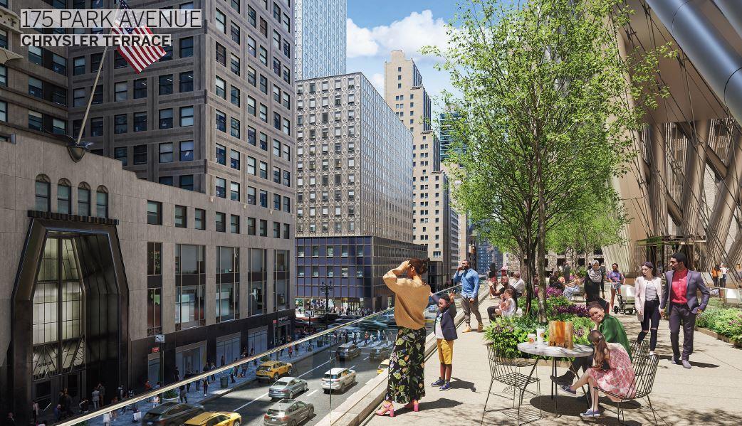
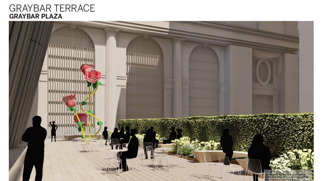
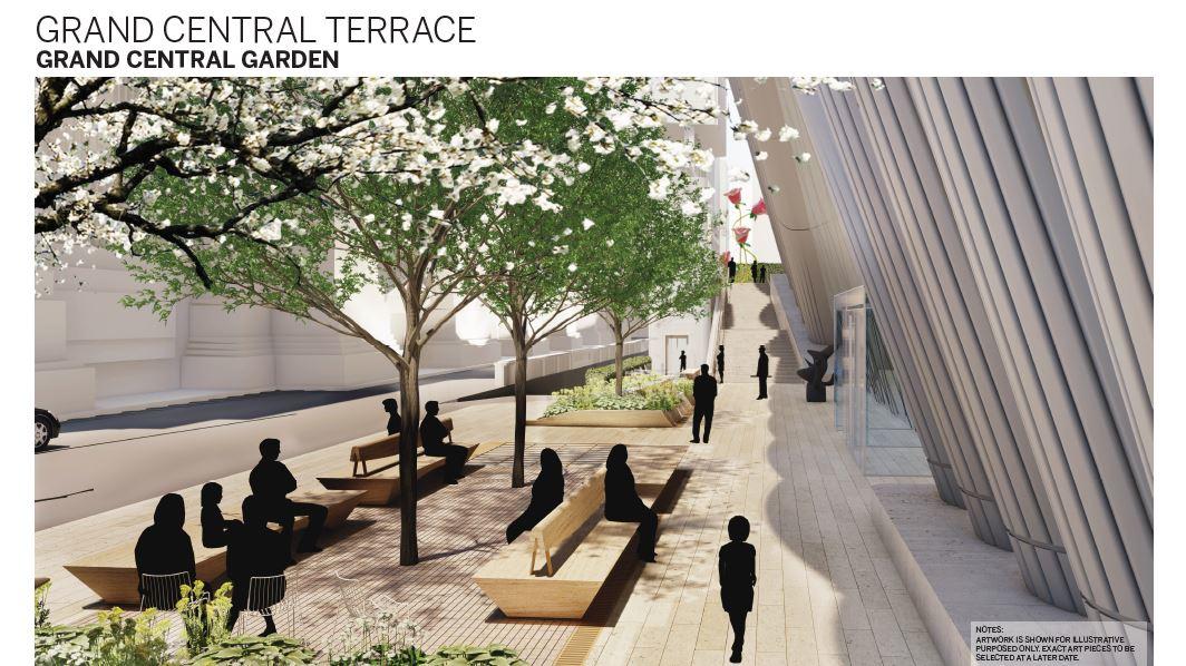
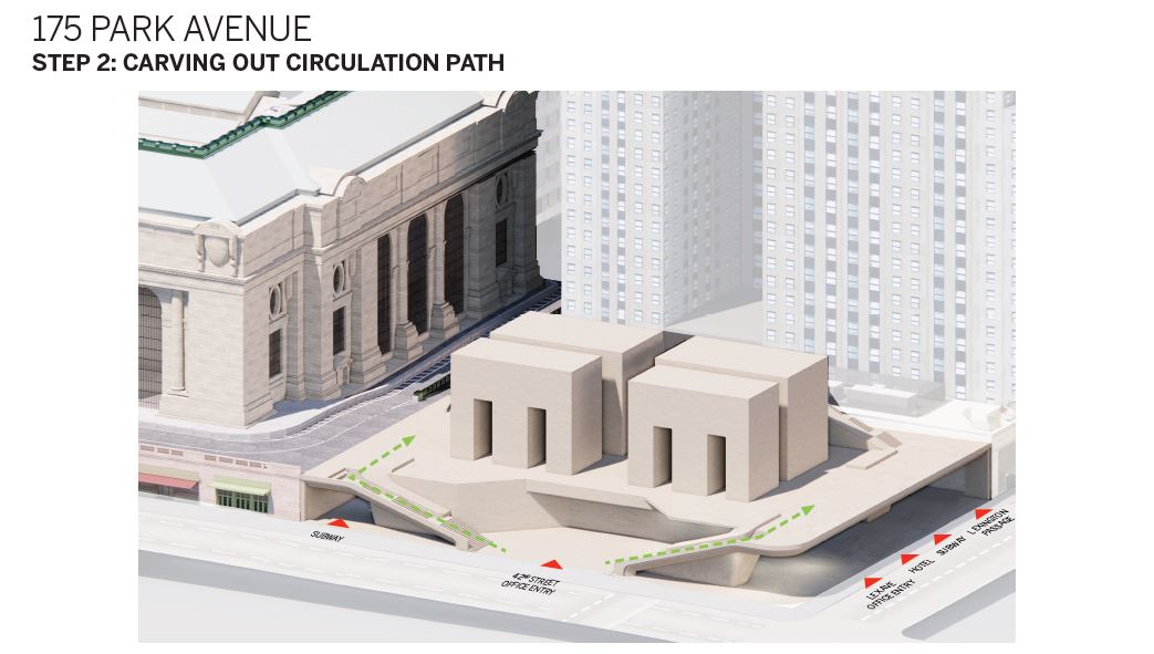
Steps would lead from the sidewalk to a wraparound elevated public terraces divided into three spaces: the Chrysler terrace, the Graybar terrace, and the Grand Central terrace. These three areas would then have a number of different aspects like reflecting pools, cafes, seating, landscaping and gardens, art sculptures, and overlooks.
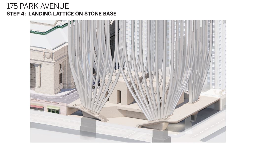
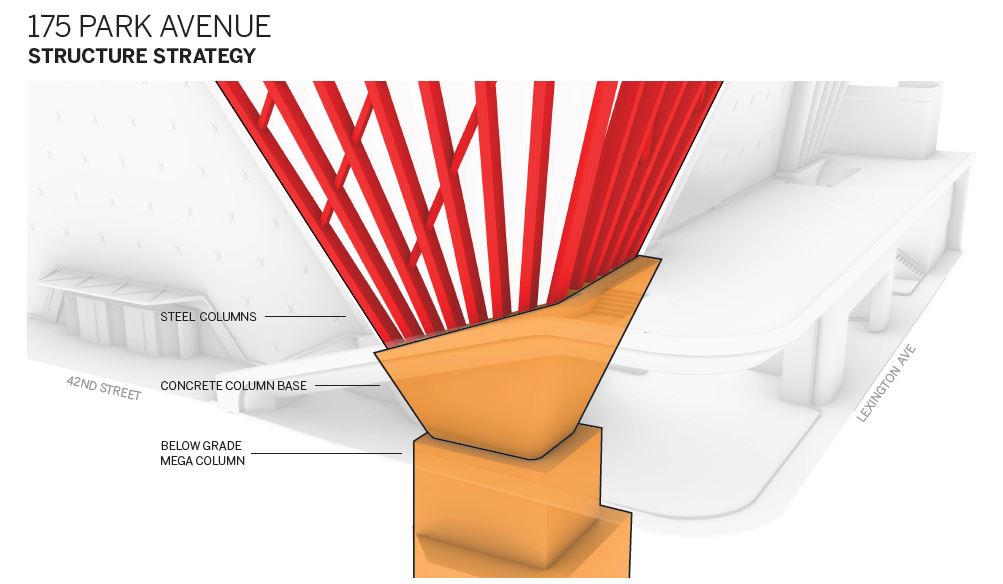
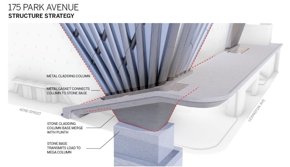
Other diagrams go into some more depth about the corners of 175 Park Avenue and how they will anchor the superstructure and connect it with the base.
The next major step in the development is Uniform Land Use Review Process (ULURP), which is expected to occur at the end of 2021. An approval would then be followed by an 18-month-long demolition of the Grand Hyatt, and eventually proceed with the construction of 175 Park Avenue itself. Click here to read YIMBY’s previous updates about Project Commodore.
Subscribe to YIMBY’s daily e-mail
Follow YIMBYgram for real-time photo updates
Like YIMBY on Facebook
Follow YIMBY’s Twitter for the latest in YIMBYnews






Gargantuan and graceless. It only diminishes the rest of Midtown’s skyline and overwhelms the iconic Chrysler Building.
This doesn’t help anything but maybe the developer.
It will help the 15,000 office workers who can now have a one seat train ride to work. I hope you don’t stay up at night worrying about how the tall skyscrapers in nyc are too big.
This is a fantasy, as businesses are reducing office space at any chance they get. Most major corporations in NYC are already benefiting financially from lease reductions, and CEOs/CFOs are very interested in making partial work-from-home permanent. Sorry, but “one seat commute” means nothing to those folks making these decisions – I’m living through that now.
Manu CEOs are NOT interested in making WFH permanent. Too many problems – for both employer and employee – that have now become glaringly apparent over the past year. And as, I believe, CEO Barry Diller said last year, “You can’t run a global corporation from everybody’s living rooms.” While the lockdowns have forced many companies to assess their office space (especially if they had pre-existing excess space), it does not automatically mean shuttering them.
“Commodore” is one of the aesthetically worst projects from 2015 to today. Although this is a rendering, Commodore is striking for the absence of an original shape that interacts and emphasizes the “One Vanderbilt” and the “MetLife” building, as well as obscuring the Crysler. The building occupies a volumetric portion totally out of scale for the MidTown of Manhattan. The city doesn’t need new Godzillas that arise out of nowhere. There must be an urban development plan in harmony with previous projects
Agree. Couldn’t have said it better.
The building is just too tall and too overwhelming.
There is no such thing as a building tall enough for Manhattan.
The state’s motto is “Excelsior”…”Ever upward”!
The buildings must keep getting taller and taller and taller and if they stop that means the city is dying.
Not a fan of this one – I have no problem with the height, maybe it’s the massing? It seems very bulky. And that height chop is not a good sign.
Exactly my feelings. It is massively ugly. I, of course, have no objection to supertall heights. However, the reduction here does not negate the buildings overwhelming mass, unlike the new Vanderbilt, which soars.
I hope you don’t stay up at night being conflicted over the bulk and height…
Thanks for details.
I think the base is very cool. Are the depictions of JP Morgan’s 270 Park just a “placeholder” rendering, or is it really going to be that dull?
Beautiful, but will never be built. The city is already massively overbuilt when it comes to office space, there is just no way this makes sense any time soon!
Hard to argue with that.
Take a look at the Group of 35 Report,decades old now.
Manhattan needs lots more class A office space!
Is that what your crystal ball is telling you about the 2027 Manhattan office market?
Developers also make money by developing; building new towers like this. The office floor area is similar to that of One Vanderbilt, which has high ceilings, fewer floors, and an emphasis on quality RSF over quantity. I suspect that will be the trend in the future; taller buildings with lesser RSF.
Why would you make the base two round ball with a phallic shaped tower rising above it and that top too…Horrible clearly these architects were not thinking.
I’m sure no businesses will be interested in their workers have a one seat ride commute.
The city isn’t overbuilt with offices, it’s underbuilt when it comes to residential units.
I like this design. It is a modern building that will define the skyline, but doesn’t get too crazy. It respects multiple eras of the past while creating the future, especially with the setbacks and crown. The interior core also respects the adjacent stone terminal.
Skidmor, Owings & Merrill you say? Really? Looks more like some hair-brained, half-baked cartoon that Skidrow, Owemoney & Perill would havecome up with – after an all-night bender. Could they not have made it more incongruously hideous? Back to the drawing board fellows. Try just a wee bit harder, and I’m quite sure you WILL achieve perfect imperfection. You can do it! Poor Grand Central Station – sitting there, still grand, and looking all the grander when surrounded on three sides by monstrosities masquerading as modern architecture. Did I mention that the surface banding, especially towards the crown, gives me nasty flashbacks to the fallen World Trade Center facade, albeit being a crazy-quilt fun-house mirror-image rendition of those far more graceful & balenced harmonies. To err is human of course, but this effort is one of the most exquisitely exaggerated exampes of human failure that I’ve see in a long time. If this is the beginning & the harbinger of New York City’s revival, heaven help us.
The ‘peak’ here might use a little more peaking..as it is now in the rendering it looks like the top was sliced off.
Hope this doesn’t get built though the design has virtues. It’s simply too big for the space it occupies, overwhelming the Chrysler Building. It’s actually a feat to make the large new presence of One Vanderbilt on the other side of Grand Central seem modest. Troubling how fast the city rubber stamped this. Memo to new mayor: kill the East Side special development zone and please show more spine to developers.
There is no such thing as too big for Manhattan,ever.
That the Chrysler Building is surpassed is something to celebrate.
I loved the original design…
the height chop has destroyed the proportions, it’s now too square and I think, it lost its elegance.
My question is why does it have to go through ULURP? I thought it was part of the midtown east rezoning?
The design is still in flux,we can hope it will get taller again.
This is one of the ones I’m most excited for, cant believe all the criticism. SO much better than a “glass box”. it has the classic NYC set backs, an actual crown and not a flat roof, and the base compliments the street and grand central really well. Not to mention the MTA improvements. Congrats to the architecture team and developers. Build it!
This is pretty dissapointing…the massing is totally off now with the height reduction *sigh*
The completion of this skyscraper may be some ten years away. Things will drastically change by then. All this working from home nonsense is simply a novelty, nothing more. Who, over time, will chose to sit in their dining room, dressed in their jammies and review sales projections? Who will choose NOT to interact/confer with others at a nearby desk, meet a client, or construct a massing model – alone (yes, I am an architect). We must guard against morphing into a nation of hermits (exaggerating only slightly) and insist the dining room be reserved for flower vases and coffee cakes.
EXACTLY.
So agreed! I run a decent-sized accounting firm. WFH remote technology allowed us to survive, but only that. And only for a few months, before problems (of all kinds) began to manifest, for both me and my employees. By late summer last year – all back in the office, and most were rather glad, and relieved to be back “at work”. (The only WFH benefit for them was no commuting expense/time, but over time the inherent problems of WFH overshadowed their commute savings.) I believe it was CEO Barry Diller who last year said something like “You can’t run a global corporation from everybody’s living rooms!”
The MetLife/PanAm building really needs to come down and not be replaced. It’s shameful not to have that corridor up Park open. As for the Commodore, I have to say I like it. While a hulk, it carries an elegance that we aren’t seeing in a lot of new big buildings, besides the AM Stern’s of the skyline.
Though I’m slightly disappointed by the height cut, this project still makes me smile every time. Everything about the design is nothing but pure elegance. Super-duper lovely.
Thanks for the renderings!
I love Nyc skyline it is the greatest in the world. No not Hong Kong. New York city. With this addition to the world’s greatest skyline. New York again will Sparkle at night again.
Yes!
People always talk down Nyc new projects but when it gets built then says Wow they like it
Slim it down, & build it.This is Midtown Manhattan, not Dallas
it literally just looks like a giant erect ribbed condom.
Make it taller and narrower.
There’s been no height reduction, whoever posted it did it to move the overton window that direction.
Reading all these comments one must conclude that YIMBY is not reaching their target audience. Too many NIMBY’s here… LOL.
This is a stunner and will greatly improve pedestrians experience in and around GCT significantly. It also will allow tourists to truly take in the beauty of the iconic Chrysler Building and GCT’s exterior in ways you haven’t been able to for decades. Reading the comments it make me wonder if any of you have walked around this area… ever. Seriously, between the improvements made to the West by One Vanderbilt and this it will be so much nicer and pedestrian friendly, there’s no argument.
Yes it’s bulky, but it’s gorgeous. This will be an icon for generations to come. Love it, love it, love it!