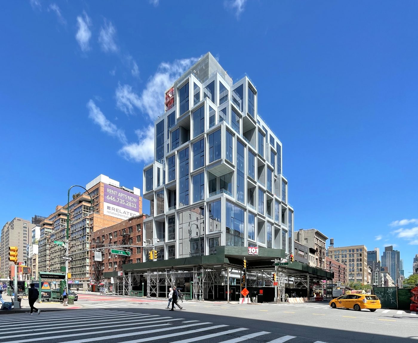
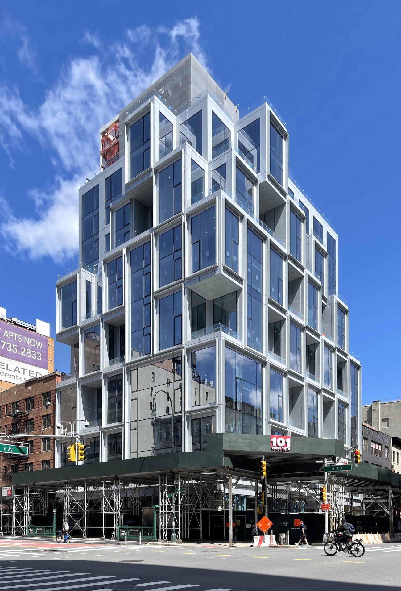
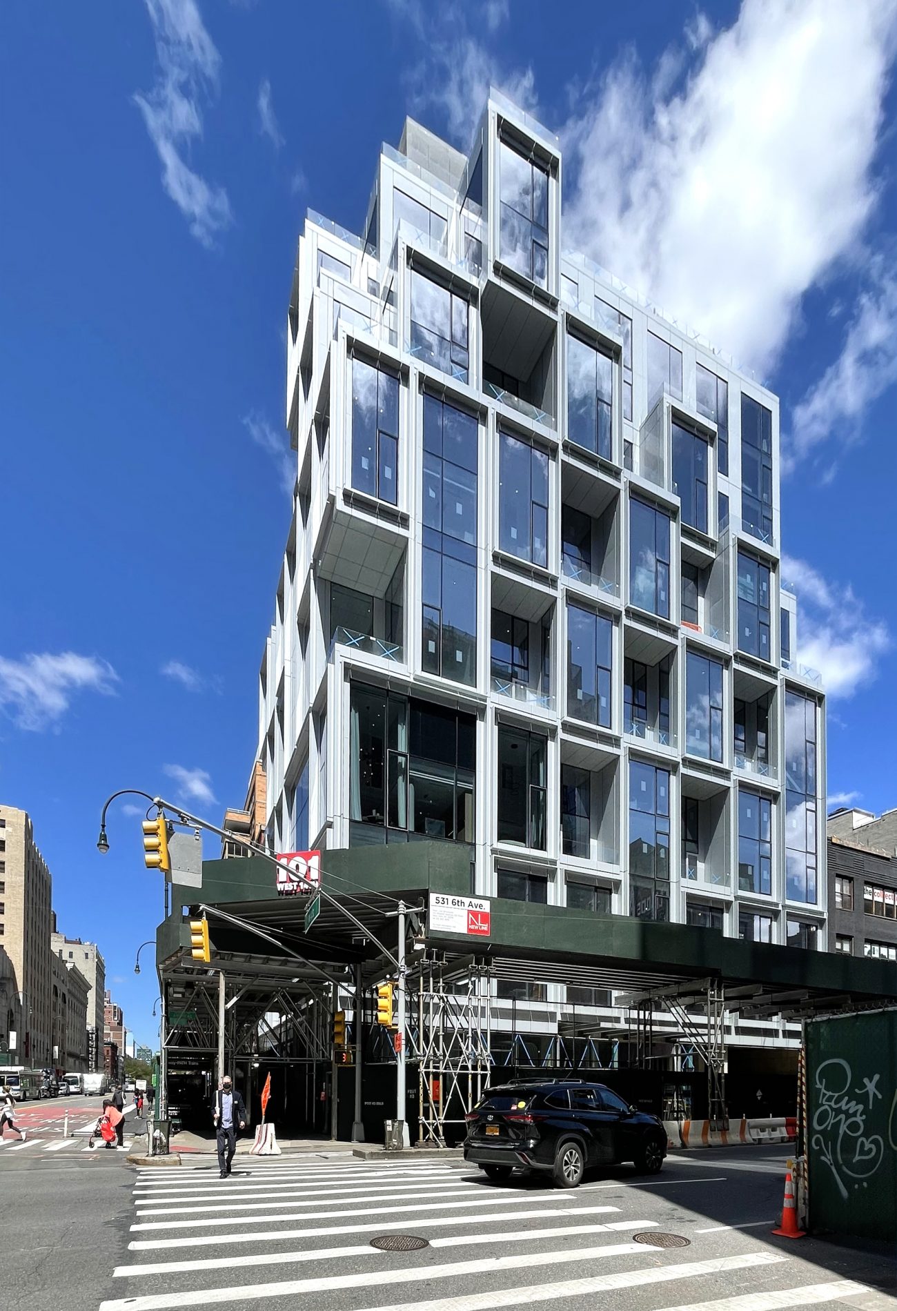
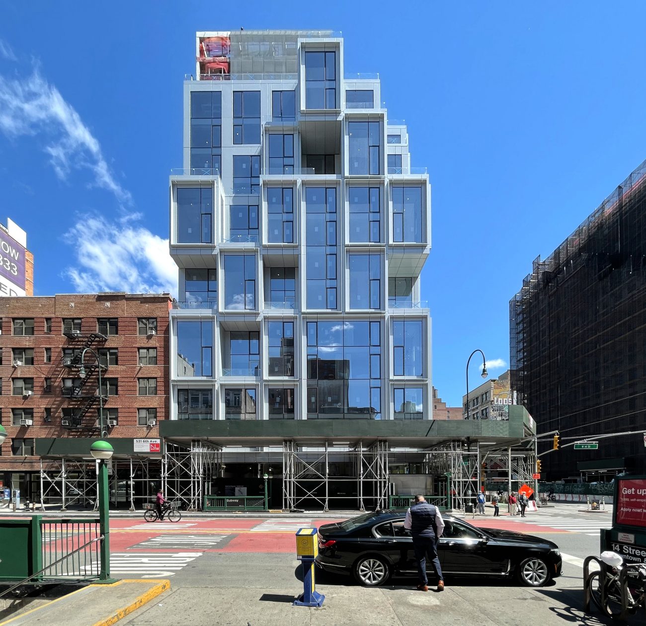
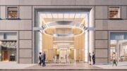
Construction is nearing completion on 101 West 14th Street, a 13-story residential building on the border of Chelsea and Greenwich Village. Designed by ODA New York and developed by Gemini Rosemont, the property sits at the corner of West 14th Street and Sixth Avenue and will yield 44 condominium units as well as 5,830 square feet of ground-floor retail space for two tenants. Sales have launched for the homes, which are being marketed by Nestseekers International’s Serhant Team and are expected to start at $1.35 million for one-bedroom units.
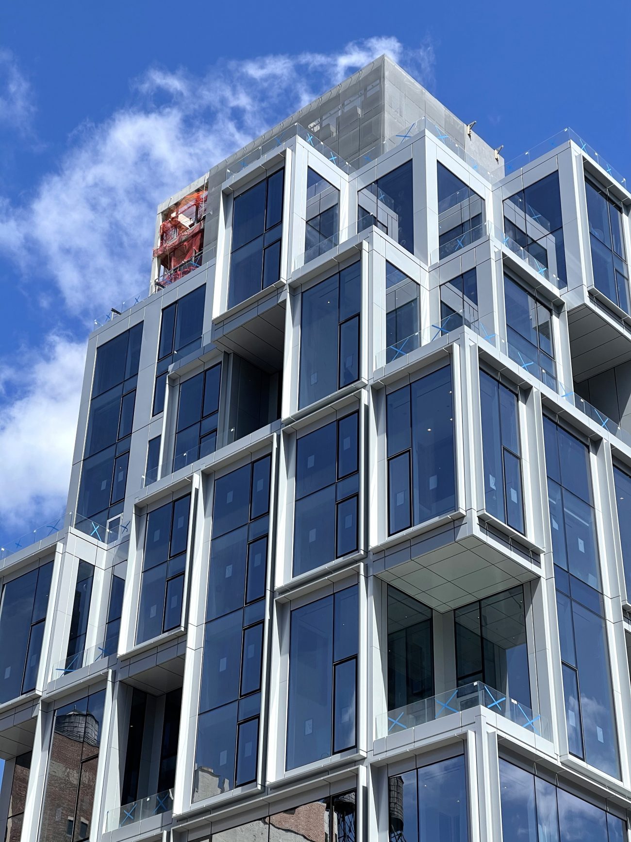
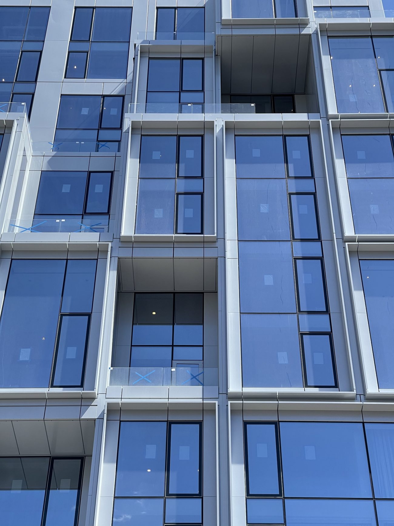
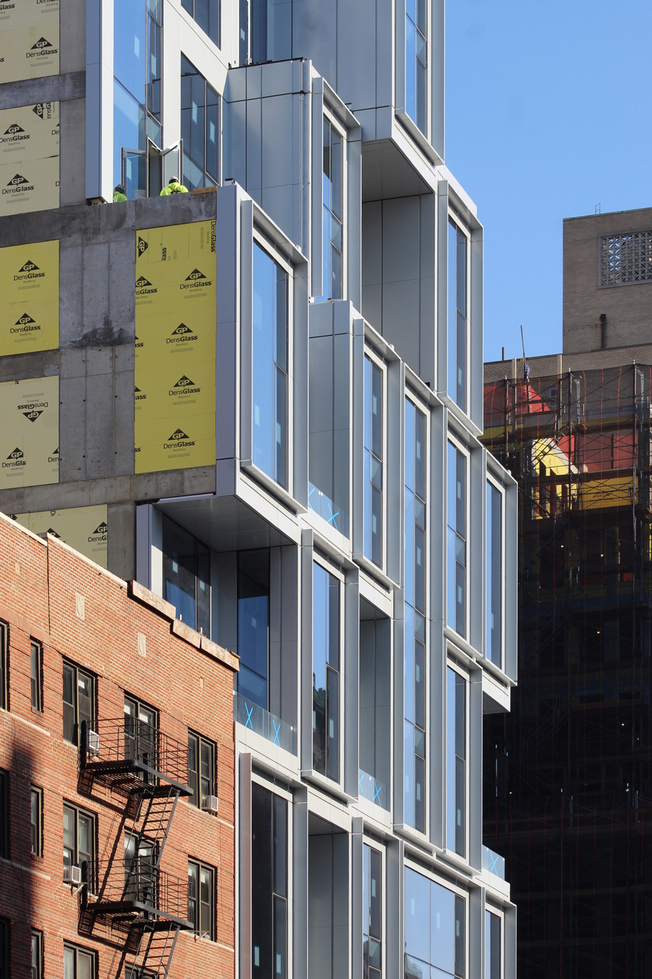
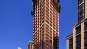
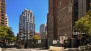
Recent photographs show the substantially completed look. Sidewalk scaffolding remains around the ground floor, while construction workers were seen installing some of the last metal panels around multiple edges of the punched-out corners of the upper floors. There are several cantilevering and recessed rectangular voids across the southern and eastern elevations that make way for outdoor terraces lined with glass railings.
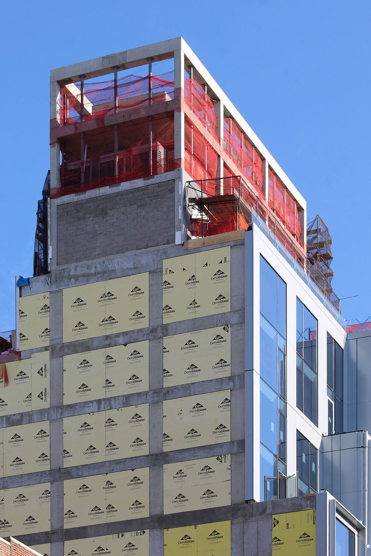
Several photographs taken this past winter show workers putting together several of the panels framing the glass. The mechanical unit atop the building was still exposed, whereas most of it is now enclosed behind a thin mesh translucent screen.
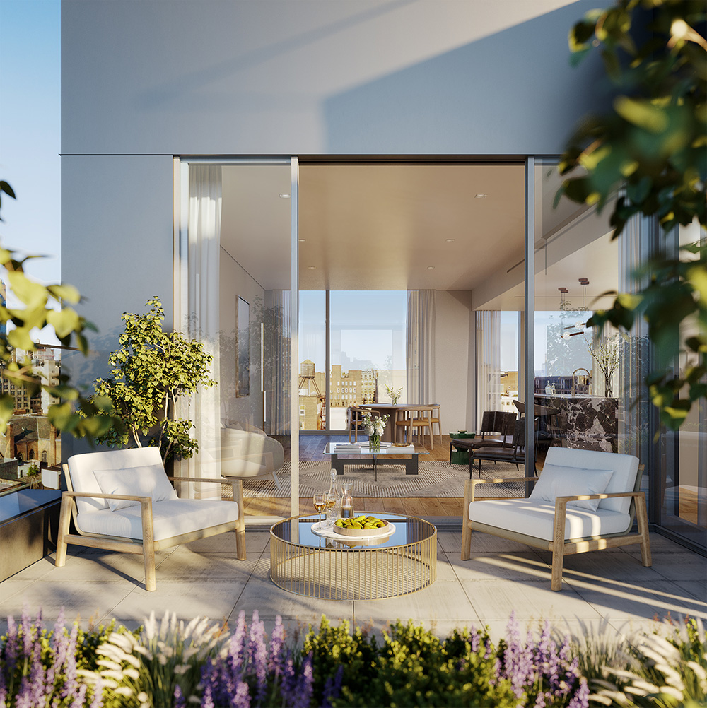
Below are two renderings that depict a typical living room interior and the penthouse terrace. Occupants will have views over the neighborhood and receive abundant natural light all year round.
About half of the residences will include double-height living spaces, which will be designed by Whitehall Interiors. Residential amenities are set to span 10,000 square feet and include a fitness center, round-the-clock concierge services, a communal lounge space with outdoor area, a full-service bar, a garden, and a landscaped roof deck. The 14th Street subway station is located directly outside the property, with access to the 1, 2, 3, F, M, L, and PATH trains.
101 West 14th Street is currently planned to open within the second quarter of 2021.
Subscribe to YIMBY’s daily e-mail
![]()
Follow YIMBYgram for real-time photo updates
Like YIMBY on Facebook
Follow YIMBY’s Twitter for the latest in YIMBYnews




Though it is a bit of a controversial design, it still pleases my eye. I think it looks very nice.
It’s a memorable building and defines the corner well.
Streeteasy has the floor plans and the over $1m units are tiny.
At least you’re on a busy street.
All out of proportion for its setting!
This is a utilitarian design, there are both corners that are exposed to sunlight. And not exposed to sunlight, comfortable views according to its renderings: Thanks to Michael Young.