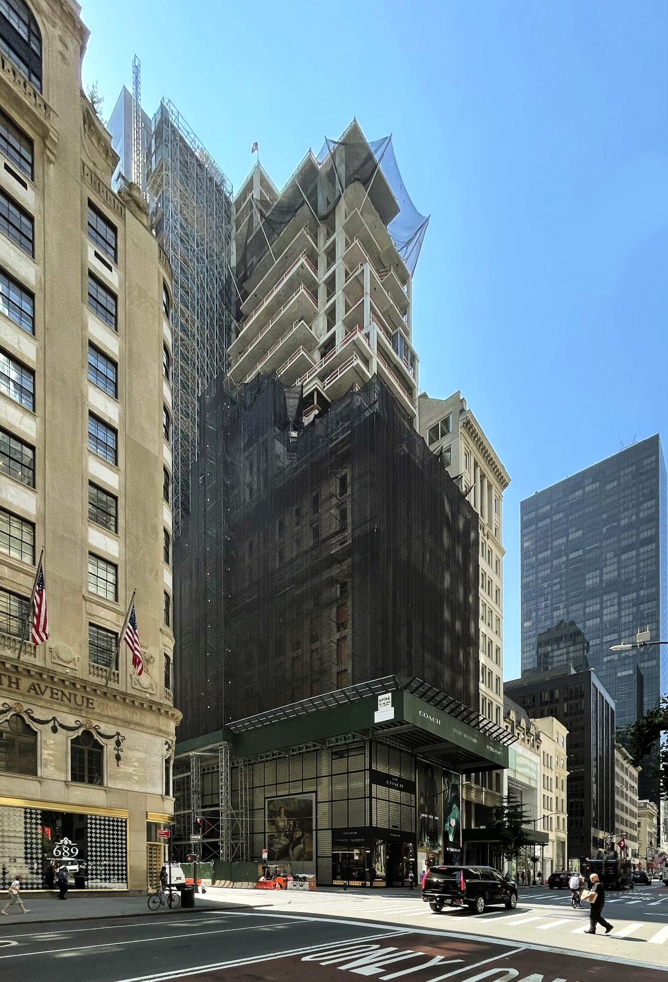
Construction has topped out on the ten-story addition atop 685 Fifth Avenue, a 100,000-square-foot office-to-condominium conversion in Midtown, Manhattan. Designed by Marin Architects and developed SHVO in partnership with Deutsche Finance, the $135 million project will yield 69 condominium units designed by March and White Design and managed by Mandarin Oriental Hotel Group, as well as retail space with Fifth Avenue frontage marketed by Brookfield Properties. Coach, Stuart Weitzman, and TAG Heuer currently operate their stores on the lower floors of the edifice while work progresses above.
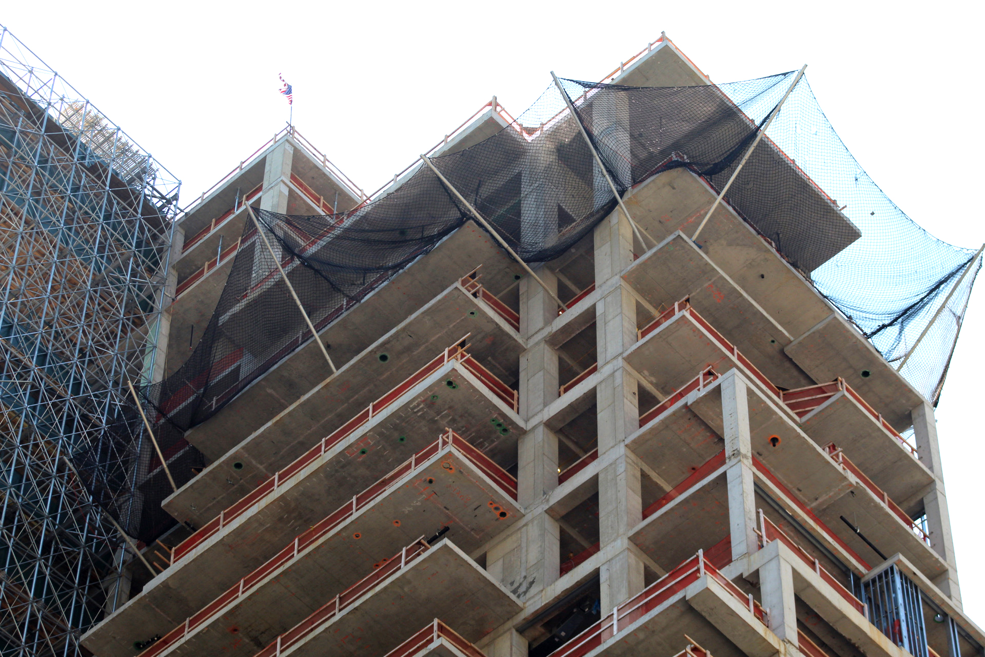
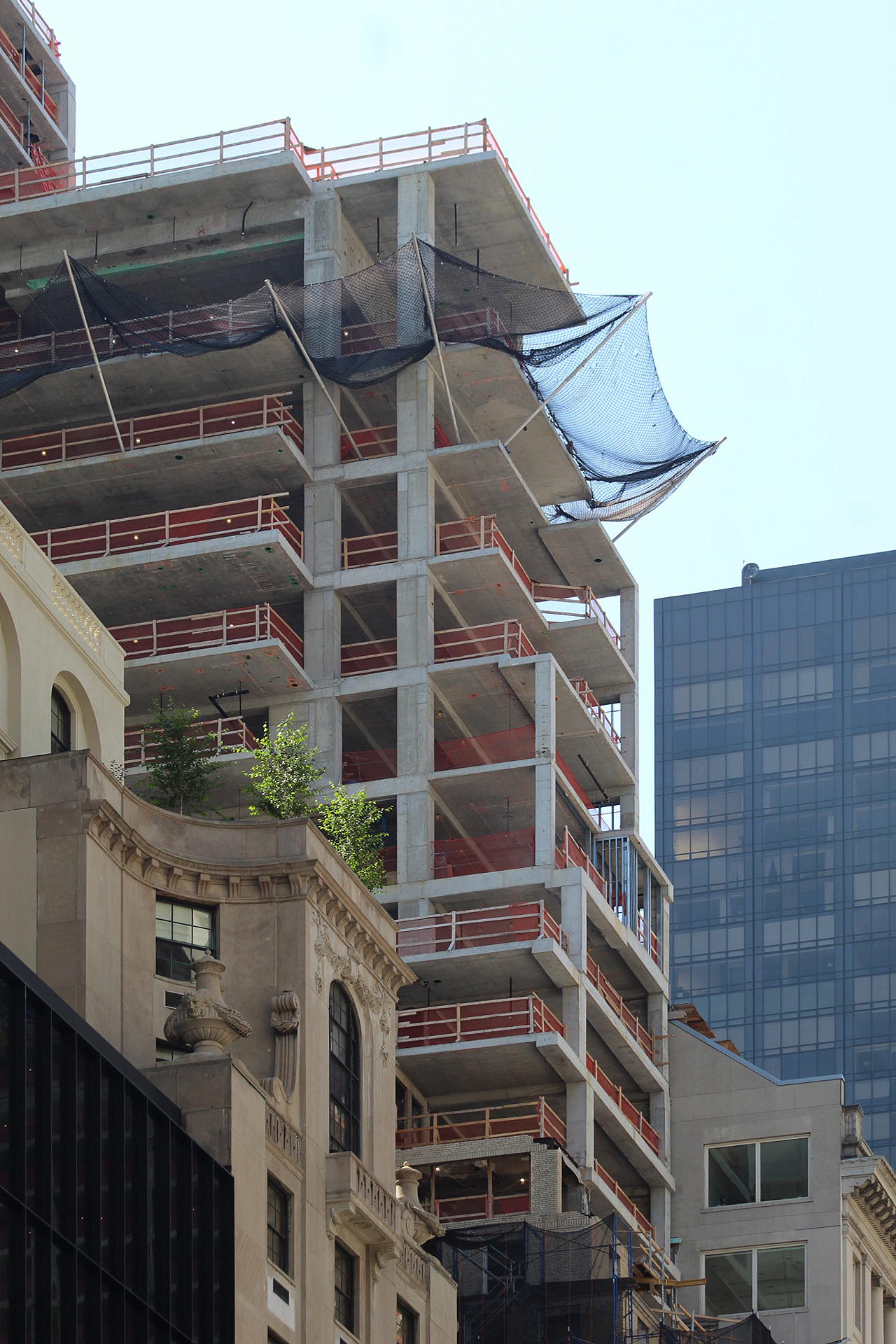
Since our last update in March, the reinforced concrete superstructure has reached the 350-foot pinnacle, marked by an American flag. Façade work on this portion has yet to begin.
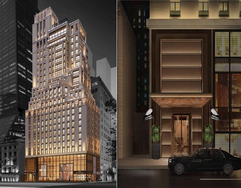
Most of the original building is still covered with black netting and scaffolding high above the retail façade. The new levels will feature a tight grid of windows illuminated with upward-pointing spotlights. Several setbacks are found across the meeting point of the old and new superstructures and on the upper floors, and the overall building will feature a cohesive design that gives the appearance of a singular structure constructed in the pre-war era of New York City. The highest portion of the construction is alongside the eastern half of the building and will likely house mechanical equipment within the extended rectangular volume. The main rendering also depicts glass railings and a set of black pergolas around the future rooftop pool.
Not much about the interiors or their appearance has been disclosed, though it has been reported that the top tier of the condominium portion will contain four duplexes. Units will begin on the sixth floor. The main entrance is going to be found along West 53rd Street next to the Coach flagship store, and the design scheme also includes a lounge on the 25th floor.
Below is a rendering of the pool area, seen on SHVO’s website.
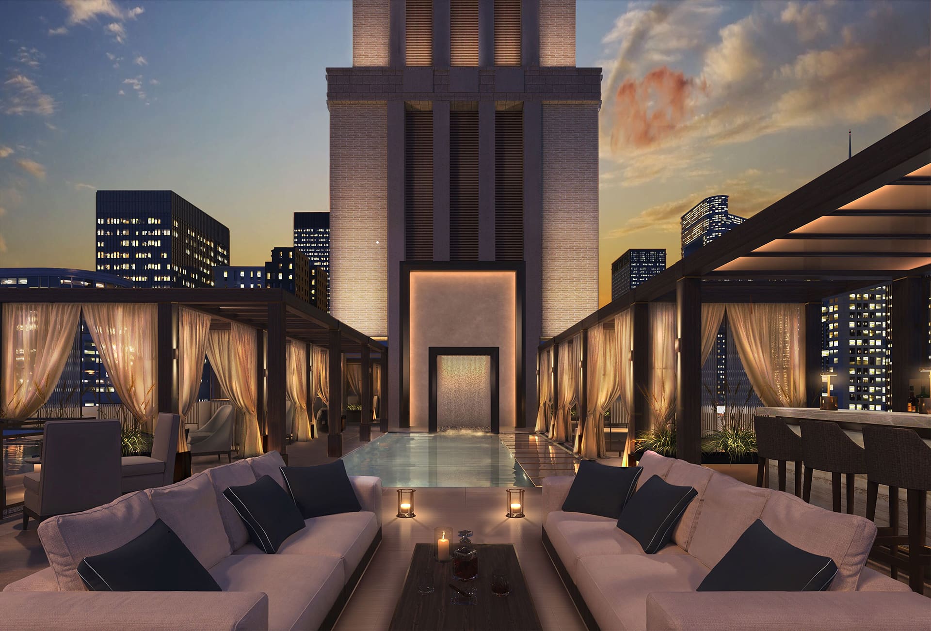
The outdoor lounge and pool area of 685 Fifth Avenue, designed by March & White. Rendering by March & White Design.
685 Fifth Avenue’s conversion and expansion should finish sometime next year, possibly within the first half of 2022.
Subscribe to YIMBY’s daily e-mail
Follow YIMBYgram for real-time photo updates
Like YIMBY on Facebook
Follow YIMBY’s Twitter for the latest in YIMBYnews






I stumbled upon the end of your report, on the way I see it. That’s how I have to comment, so take what I think; very beautiful lights: Thanks to Michael Young.
Looking good! Now for the most important part–the cladding.
PLEEESE ALWAYS INDICATE CROSS STREETS in your intro! Thank you.
oh me again…..google the address
The base still needs to be revised…..a “stone” building held up by a glass curtain wall makes no sense architecturally….and clearly there is an attention to the architecture in this design!
I agree. Seems to me they could devote an aesthetically appropriate number of vertical faux-pillars on the glass retail facade portion.
I agree. Those glass retail levels on masonry buildings always end up looking like cheap 1970s renovations.
Yes, a little masonry on the street level would have produced a more unified design.