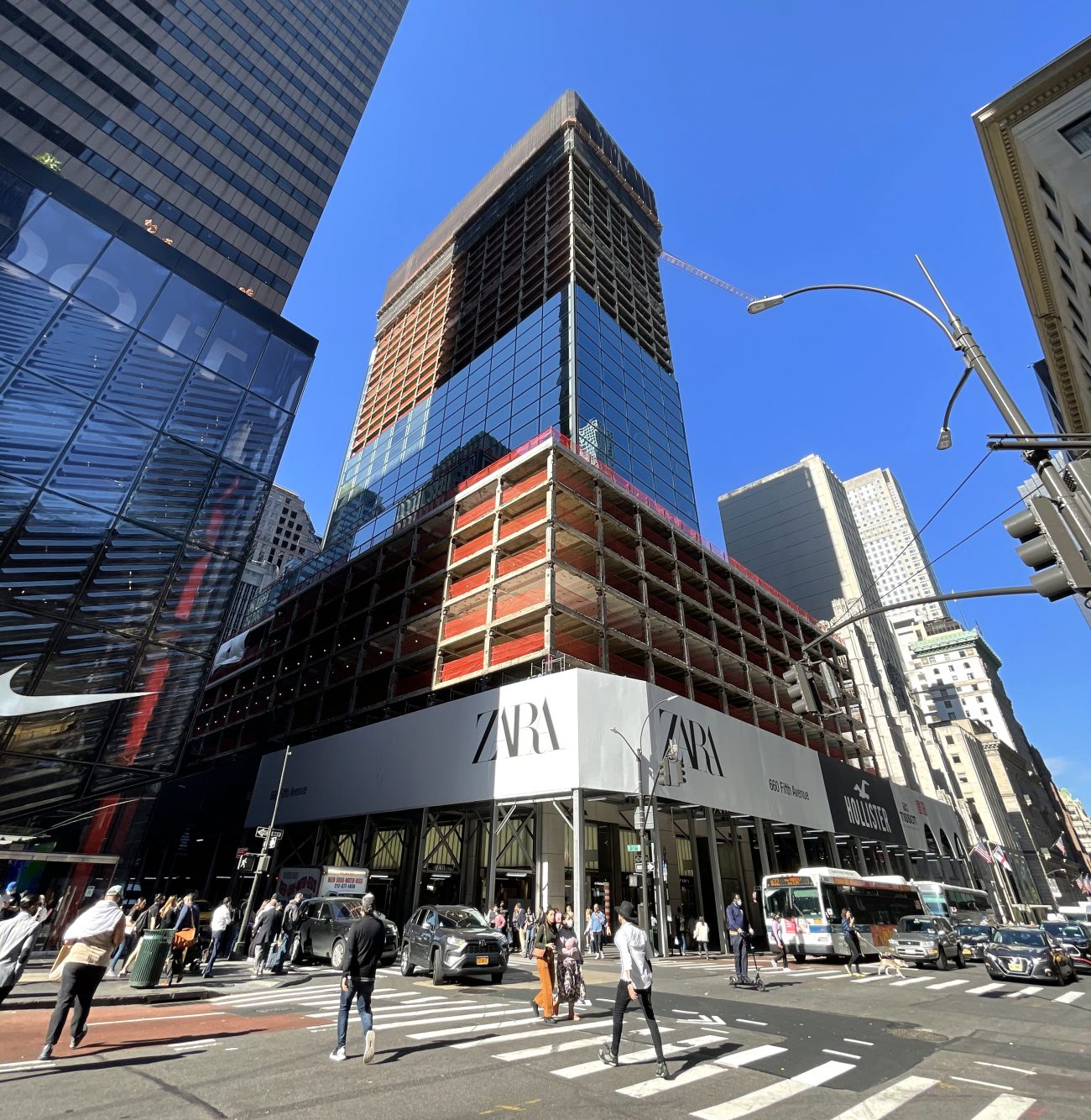
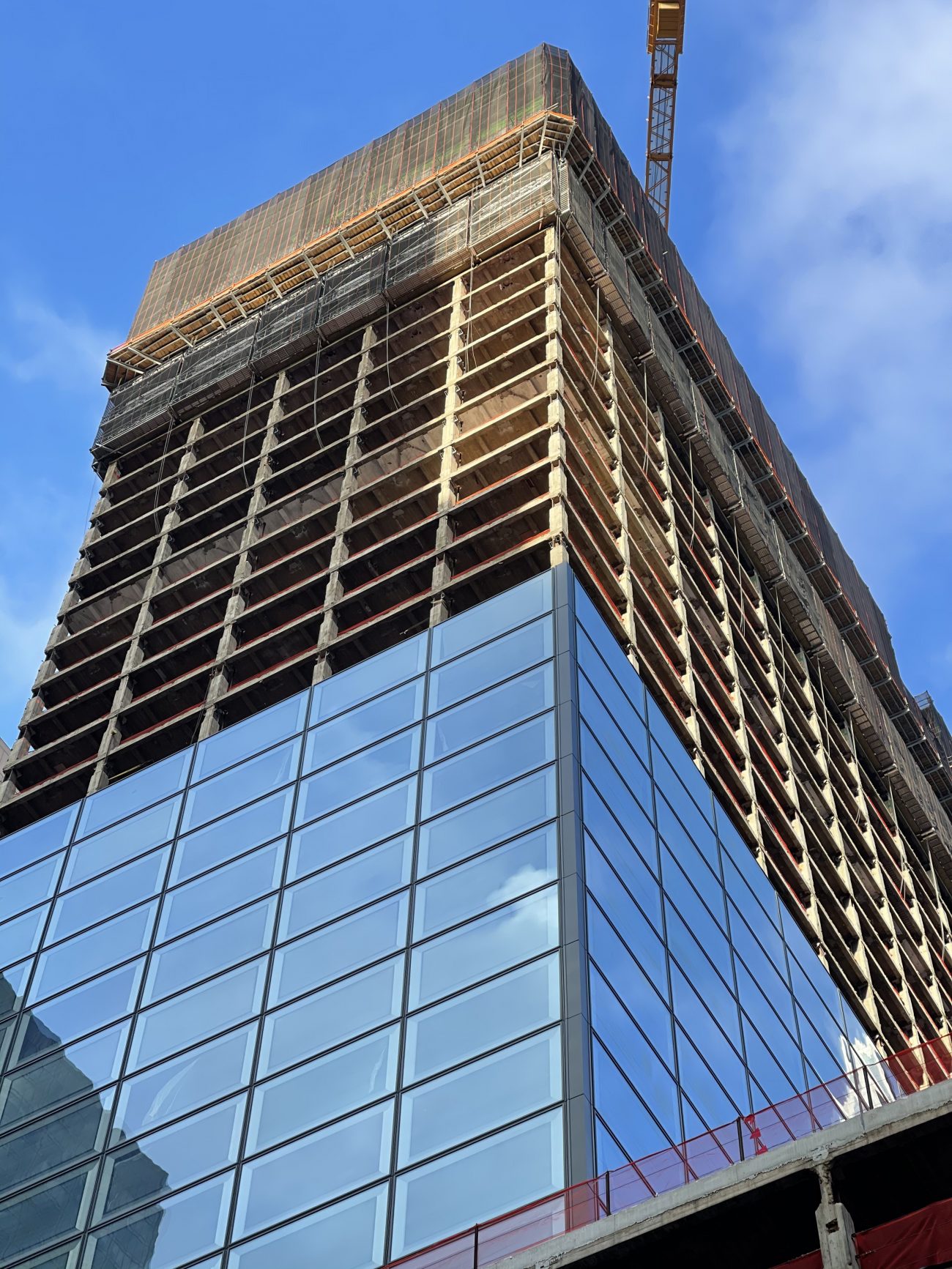
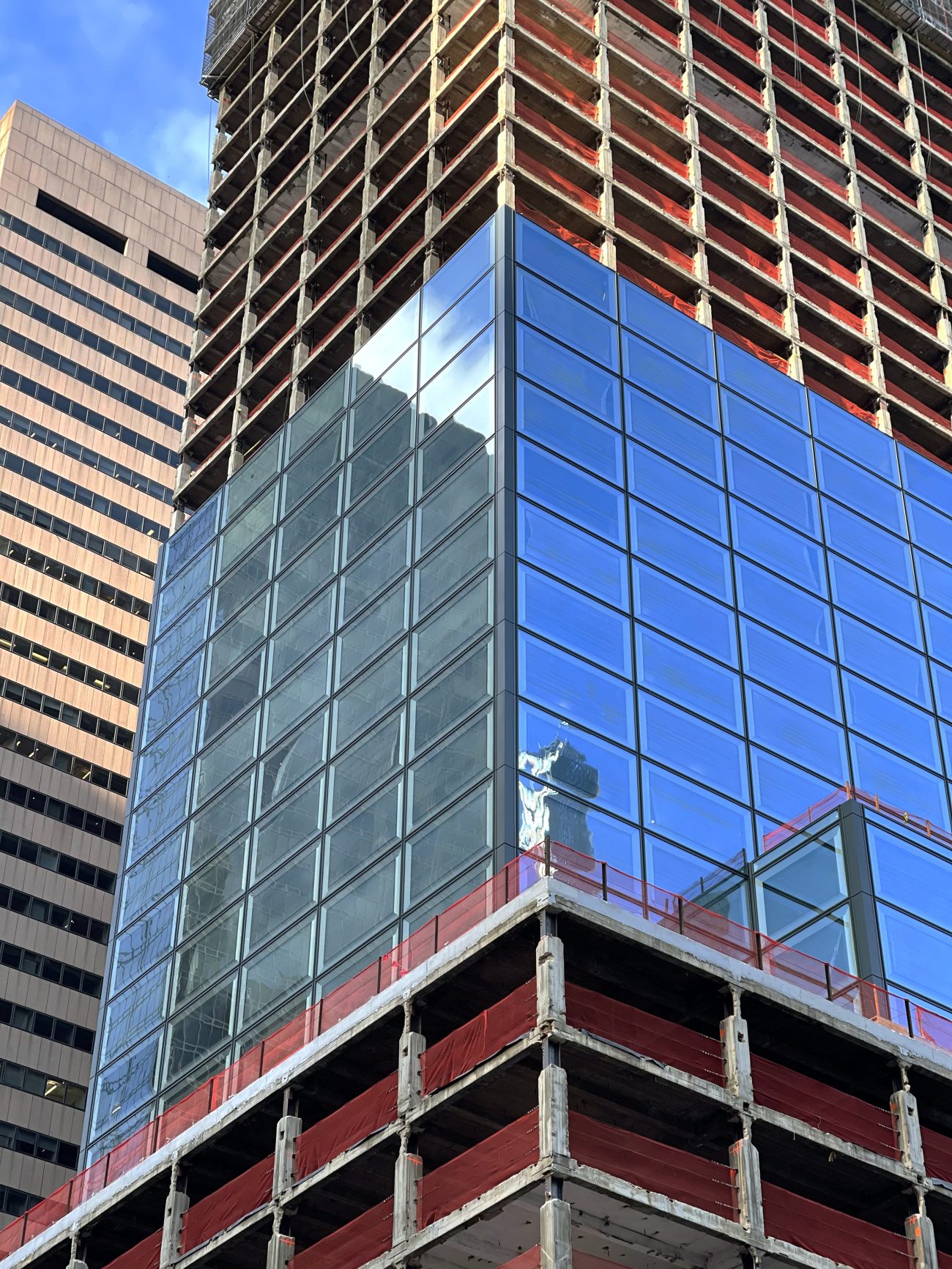
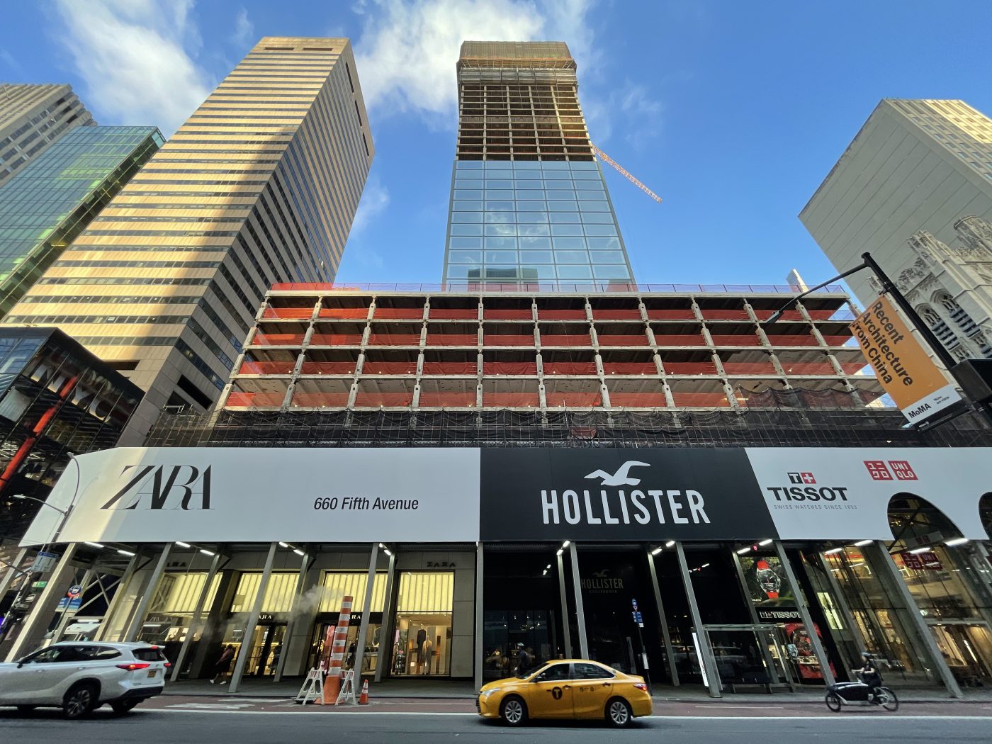
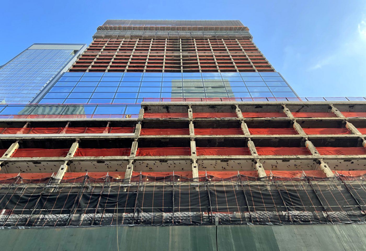
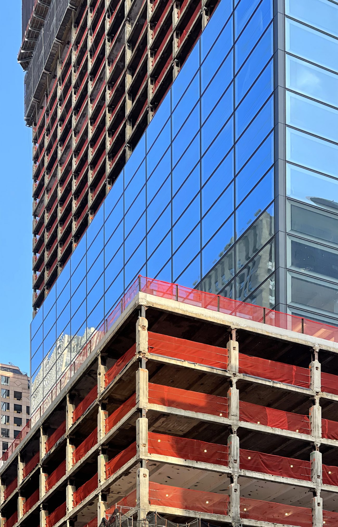
The new glass curtain wall continues to rise up the sides of 660 Fifth Avenue, a 39-story commercial building in Midtown, Manhattan. Designed by Kohn Pedersen Fox and developed by Brookfield Properties, the project involves interior renovations and the complete re-cladding of the 1957 office tower originally designed by Carson & Lundin. The 1.25 million-square-foot property is located along Fifth Avenue between West 52nd and 53rd Streets and was formerly addressed as 666 Fifth Avenue.
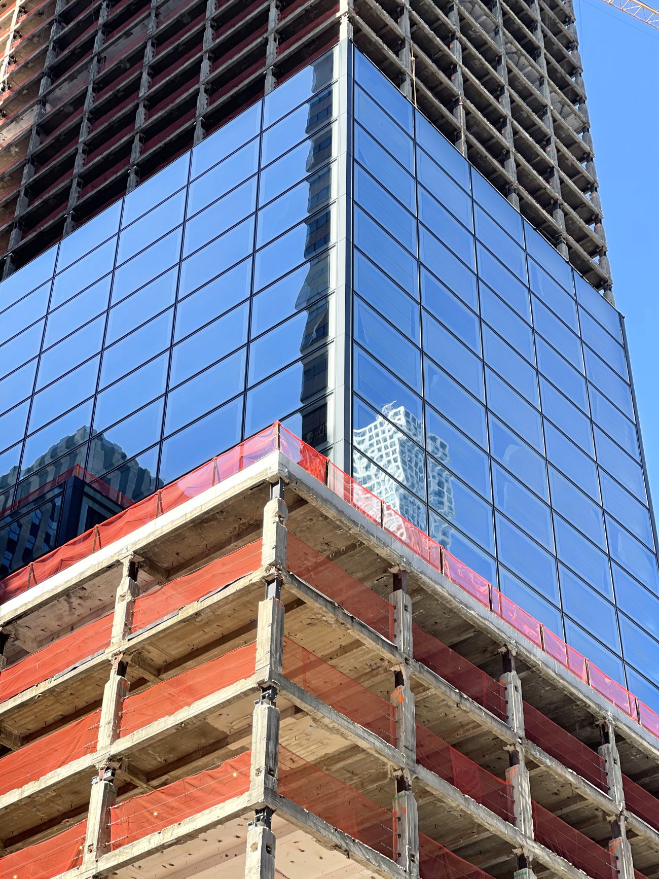
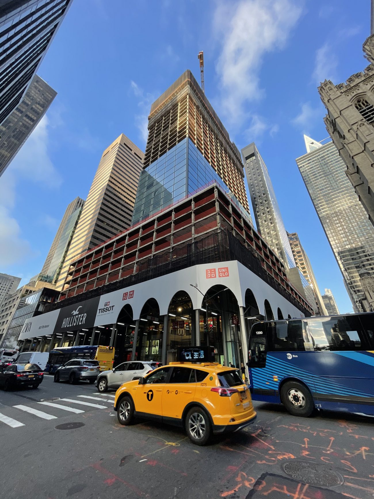
Since our last update in August, the new panels have risen steadily while the original metal façade has been almost entirely removed from the uppermost levels. Each new glass piece measures 11 feet tall and 19 feet wide, making them the biggest of their kind used on a redevelopment project in New York City, according to the developer. The overhaul will also introduce a new lobby, new elevators, and upgrades to the building’s infrastructure. Ground-floor retail occupants Zara, Hollister, Tissot, and Uniqlo have remained open as work continues above.
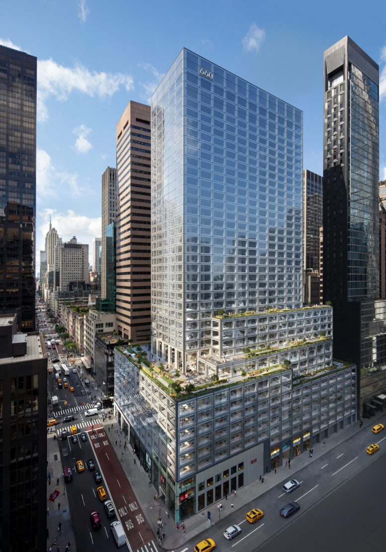
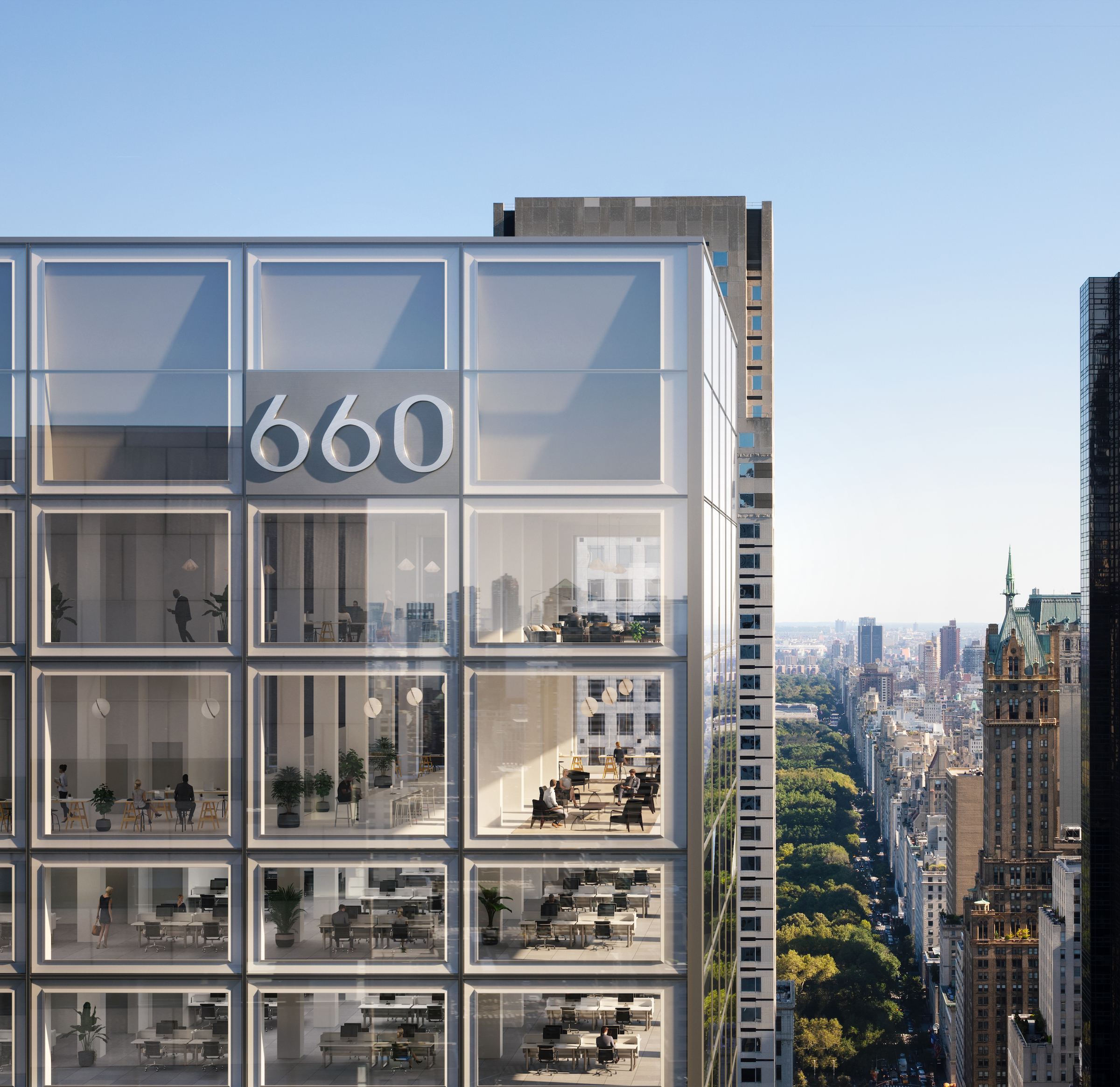
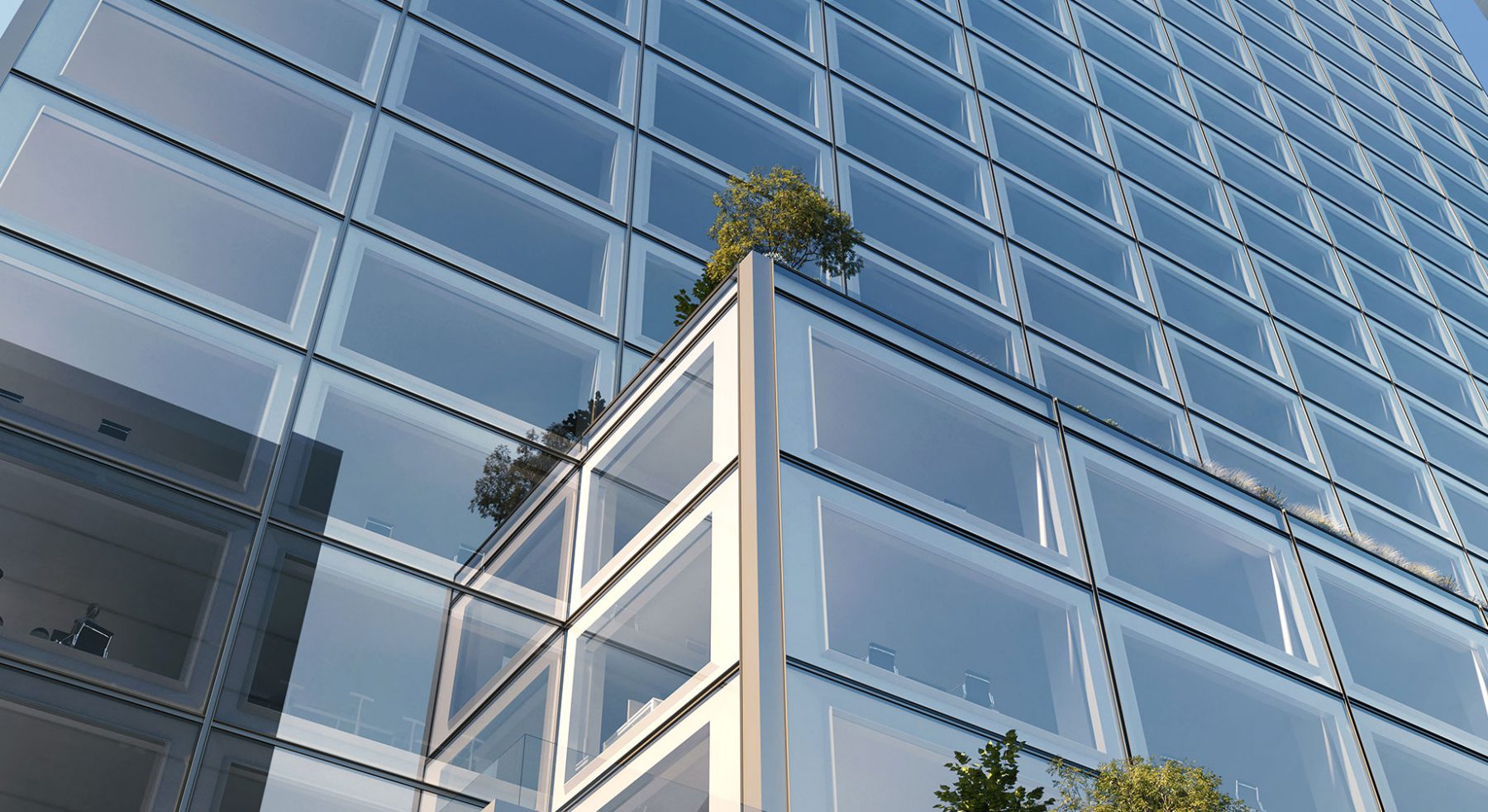
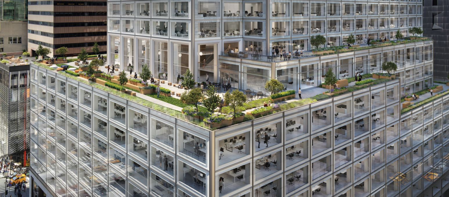
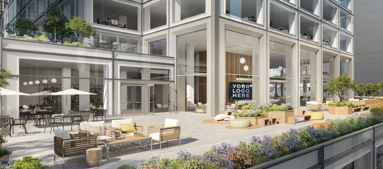
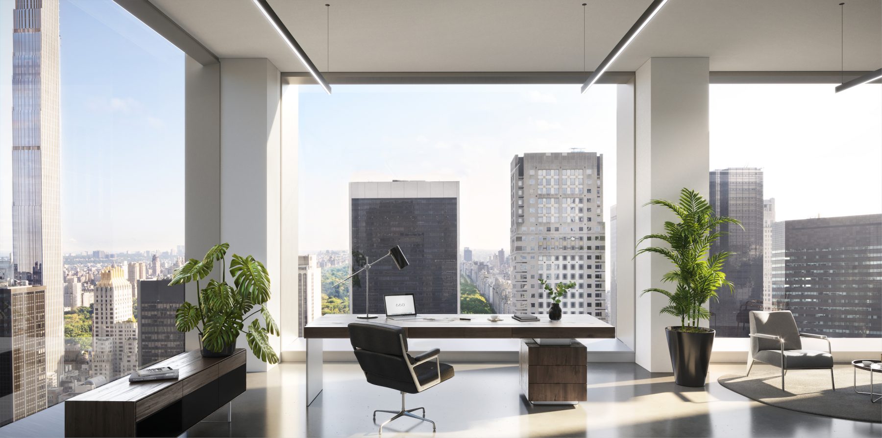
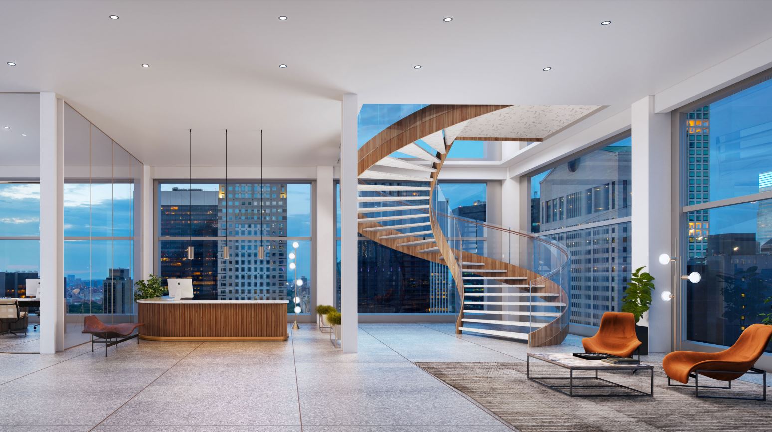
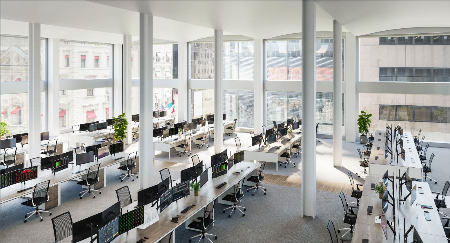
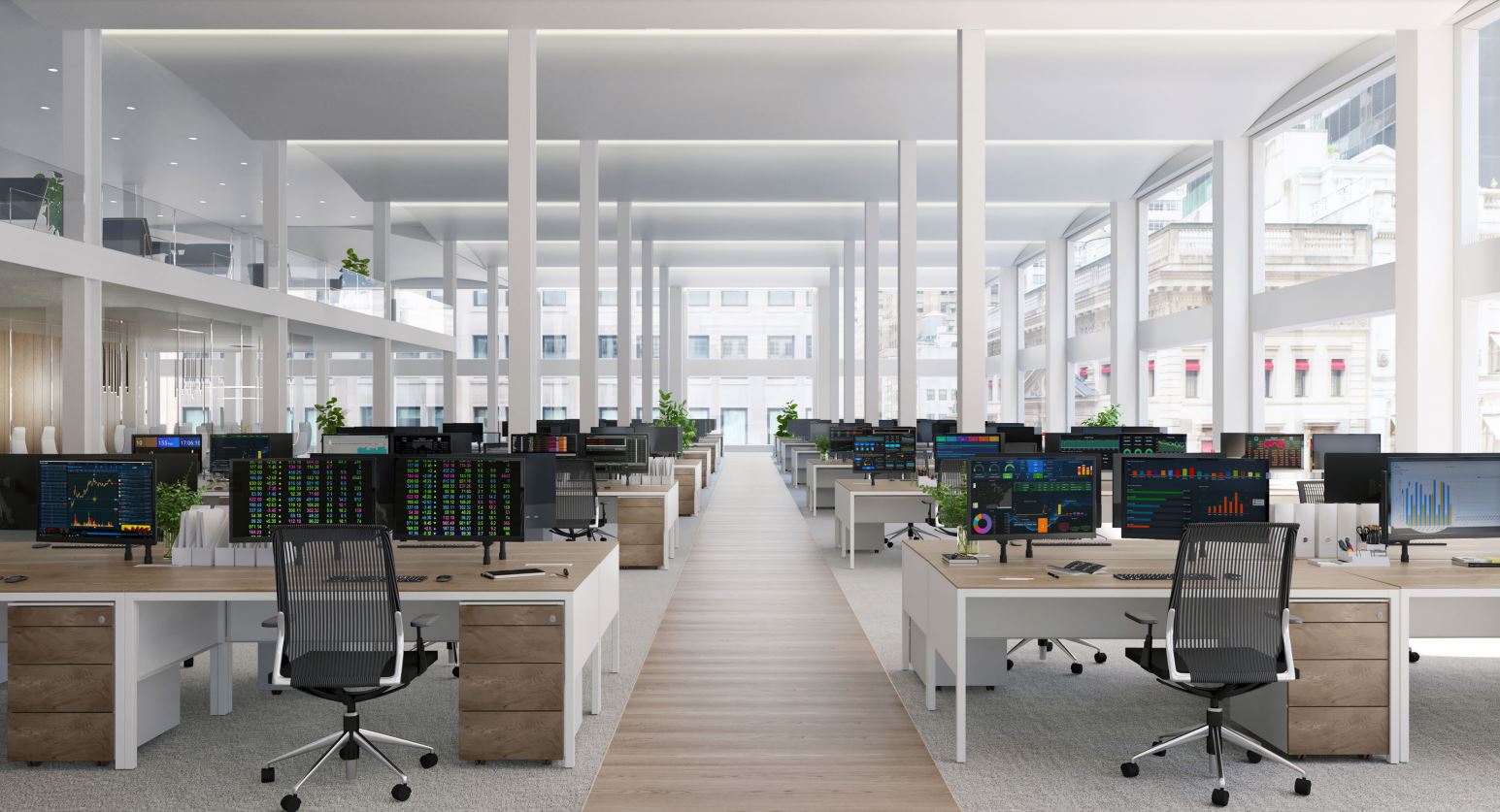
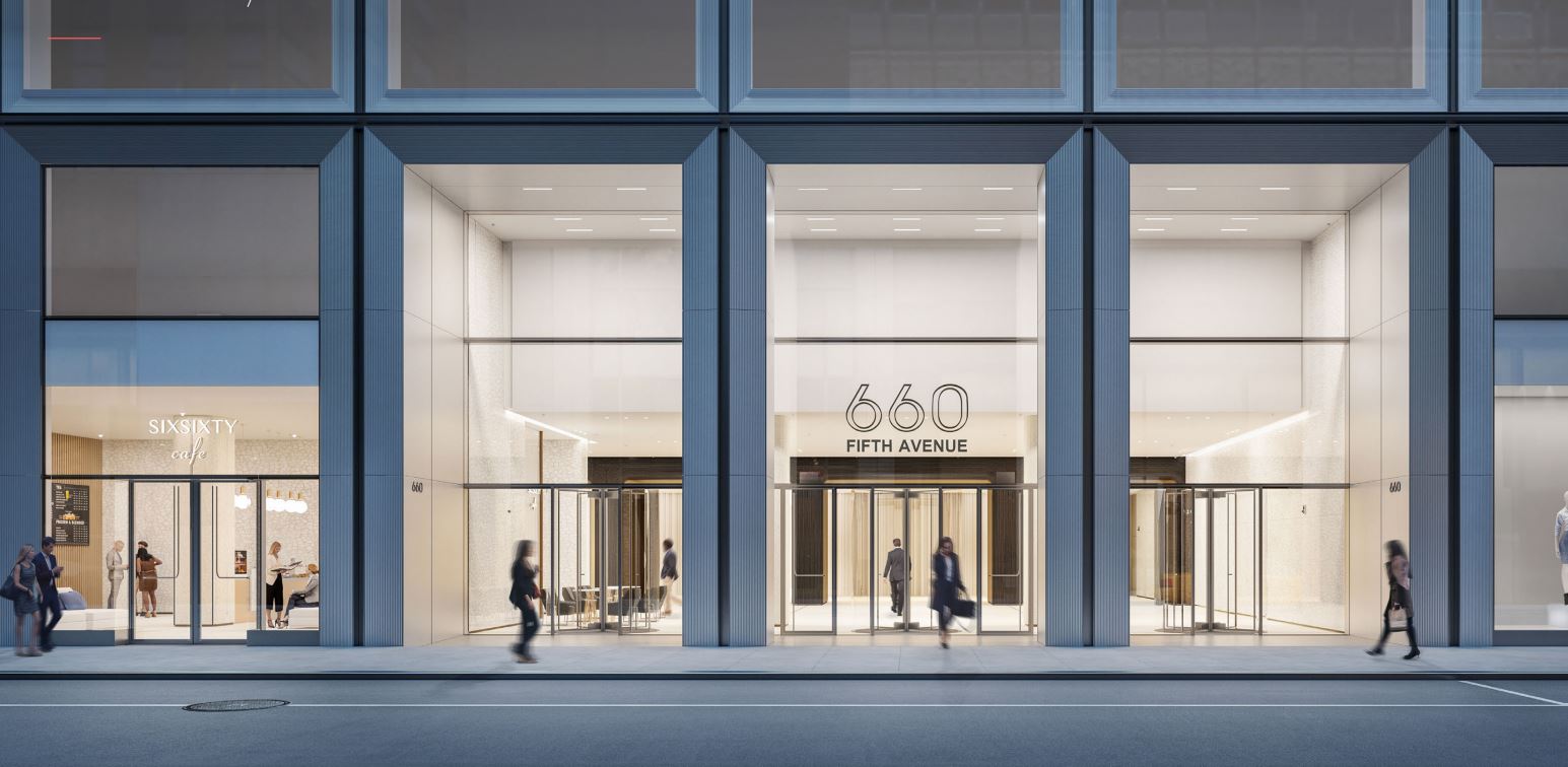
The 660 Fifth Avenue redevelopment is estimated to cost around $400 million. Floors four through nine in podium will span between 66,0000 and 70,000 rentable square feet per level, floors ten through 14 with around 40,000 rentable square feet per level, and floors 15 through 39 with around 25,000 rentable square feet per level. Office amenities include numerous landscaped outdoor terraces spread across four levels measuring 42,000 square feet, a boutique lobby space, on-site parking, and bicycle storage. There will be a separate lobby entrance along West 52nd Street for the main anchor tenant, which would also get two illuminated signs above their lobby and on the top of the building. Brookfield is also aiming for LEED Gold certification. Below are renderings of the terraces, office space, and the roof parapet.
Access to the 5th Avenue-53rd Street station, which is serviced by the E and M trains, lies directly below the site, while the B, D, and F trains can be found underneath Rockefeller Center to the south.
660 Fifth Avenue is scheduled to be completed sometime in 2022.
Subscribe to YIMBY’s daily e-mail
Follow YIMBYgram for real-time photo updates
Like YIMBY on Facebook
Follow YIMBY’s Twitter for the latest in YIMBYnews






This is good that noticing the building, that work in progress. The outdoor terraces are thing done to attract, with sincere renderings: Thanks to Michael Young.
What happened to the Noguchi lobby ceiling? The facade is a bit of an improvement, if somewhat uninspired, but it’s sad to lose works by the masters.
Those big open office spaces are just terrible, and unrealistic. The privileged still expect their private walled office at the window. How will they subdivide those 19 foot long windows into two offices?
I disagree. Many companies put their senior folks who still actually need offices in interior spaces. Studies have shown that placing people in open plans near natural light sources increases productivity and decreases personnel turnover.
Considering the breathtakingly large sheets of glass, the look – in photos at least – is perhaps a tad unexceptional. Nevertheless, the re-skin maintains an undeniably clean and handsome style, and I look forward to seeing it in person.
The large glass panes are beautiful and the light-filled high ceilinged spaces seem inviting. Somehow though the whole effect of the recladding is a bit bland. Apparently Brookfield gave Isamu Noguchi’s great lobby installation to the Noguchi Foundation in LIC. The latter supervised its removal and it’s now in their possession. That’s a relief…
I love the expansive new look. I think also about time the beast got tossed out of Manhattan. Too bad the money for the project was extorted from Qatar by the president’s son-in-law.
I have kids and they are mentally and physically disabled. We are all homeless. I’m also disabled. Everyone is disabled. I need application. Today is my real true honest 100% birthday. Its also my disabled kids birthday.
Honest to god 🙏
Thank you in advance.
Clean, crisp, elegant. And not one “glass box” slam (yet)!
Because it’s gorgeous.
Very nice.
Another building where the renderings show a nearly invisible transparent skin, but when built the reality of what a glass skin looks like takes hold. Can we stop making these dishonest renderings please?