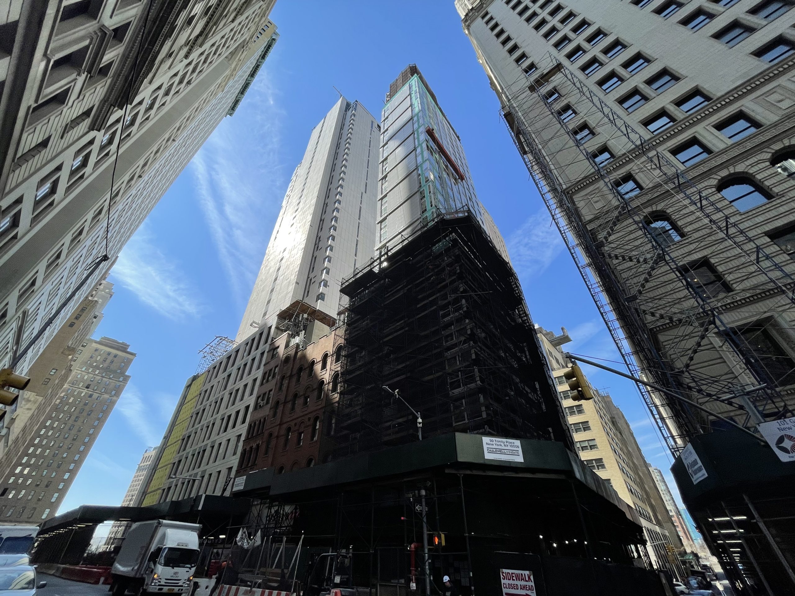
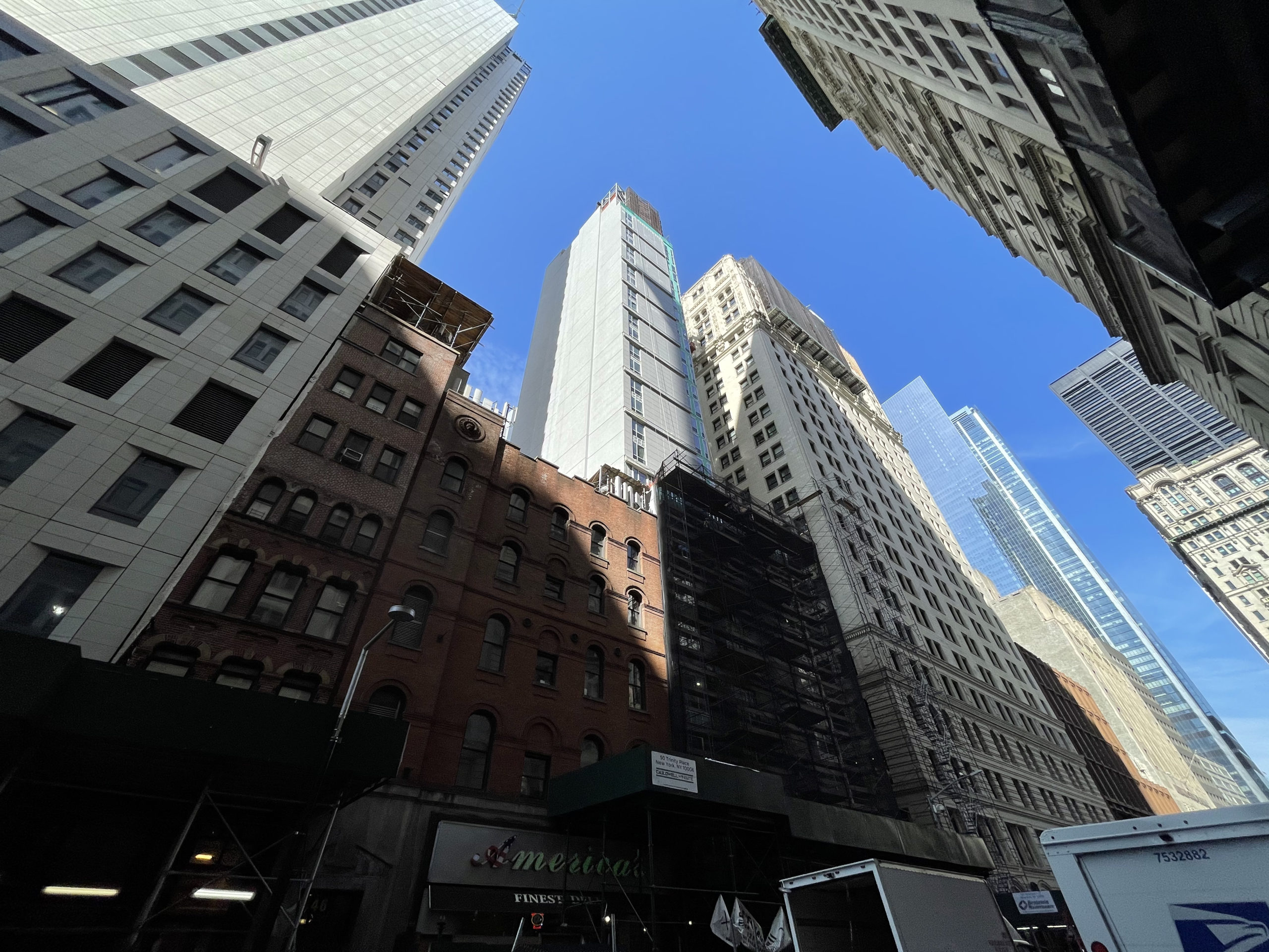
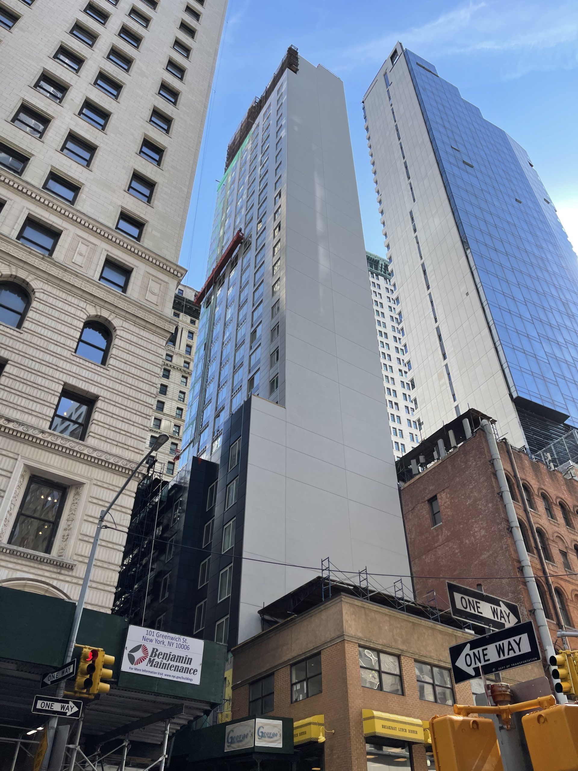
Exterior work continues to progress on 50 Trinity Place, a 28-story Aloft Hotel in the Financial District. Designed by Peter Poon Architects and developed by FIT Investment Corporation, which purchased the property for $15 million in 2012, the 77,310-square-foot reinforced concrete tower will yield 173 guest rooms. Cauldwell Wingate is serving as the general contractor for the project, which is located at the corner of Trinity Place and Rector Street, diagonally across from Trinity Church.
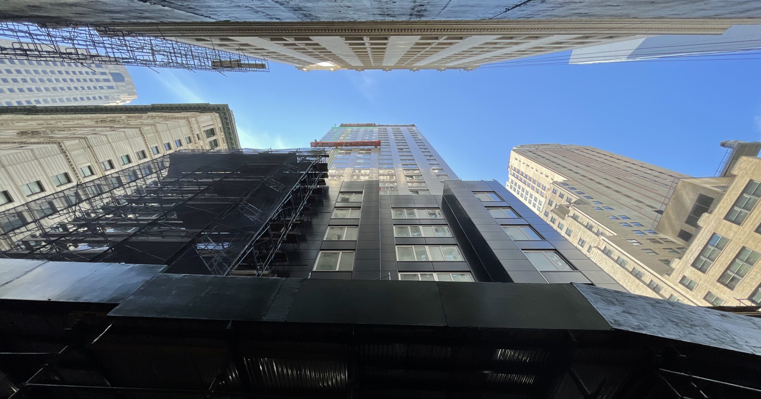
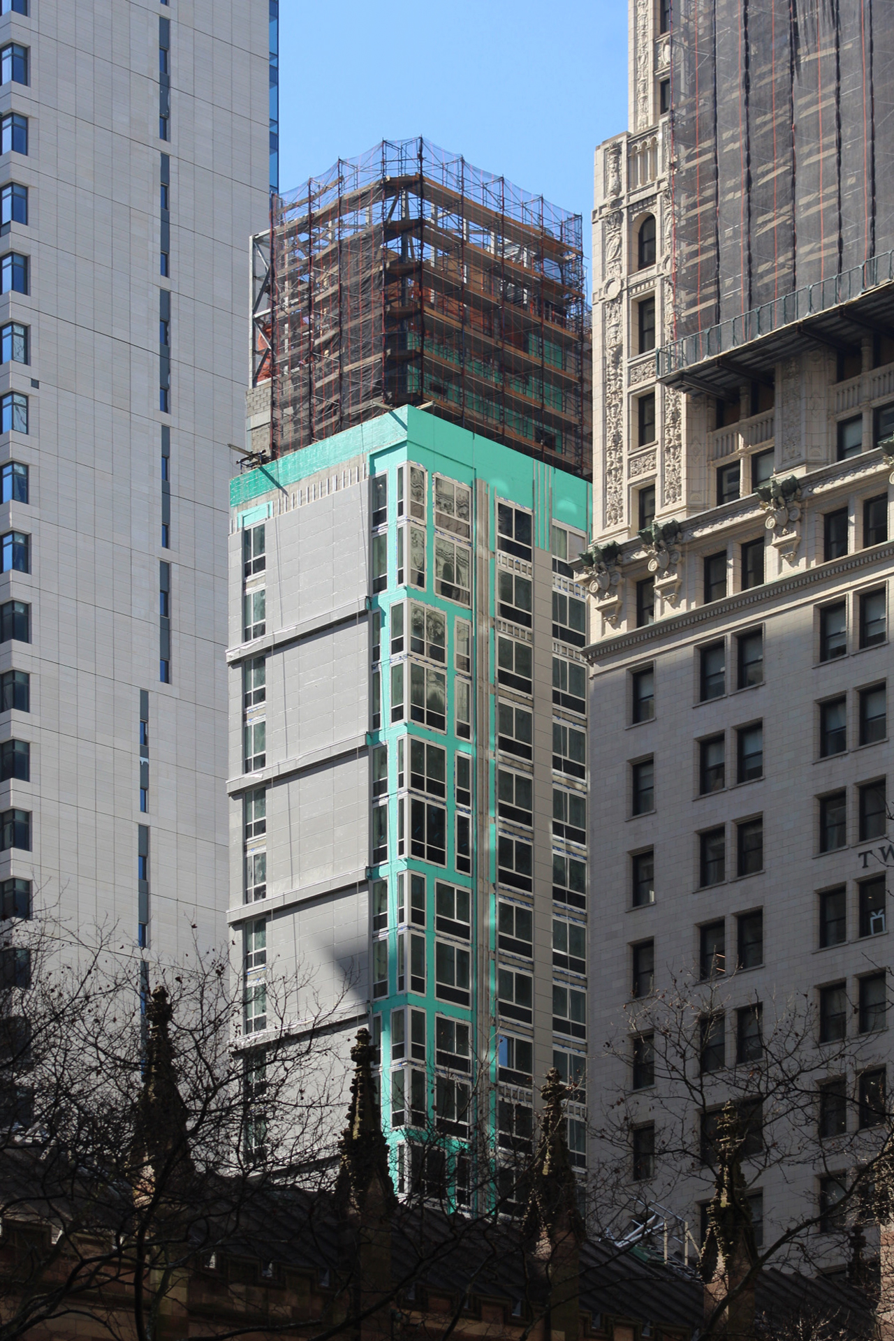
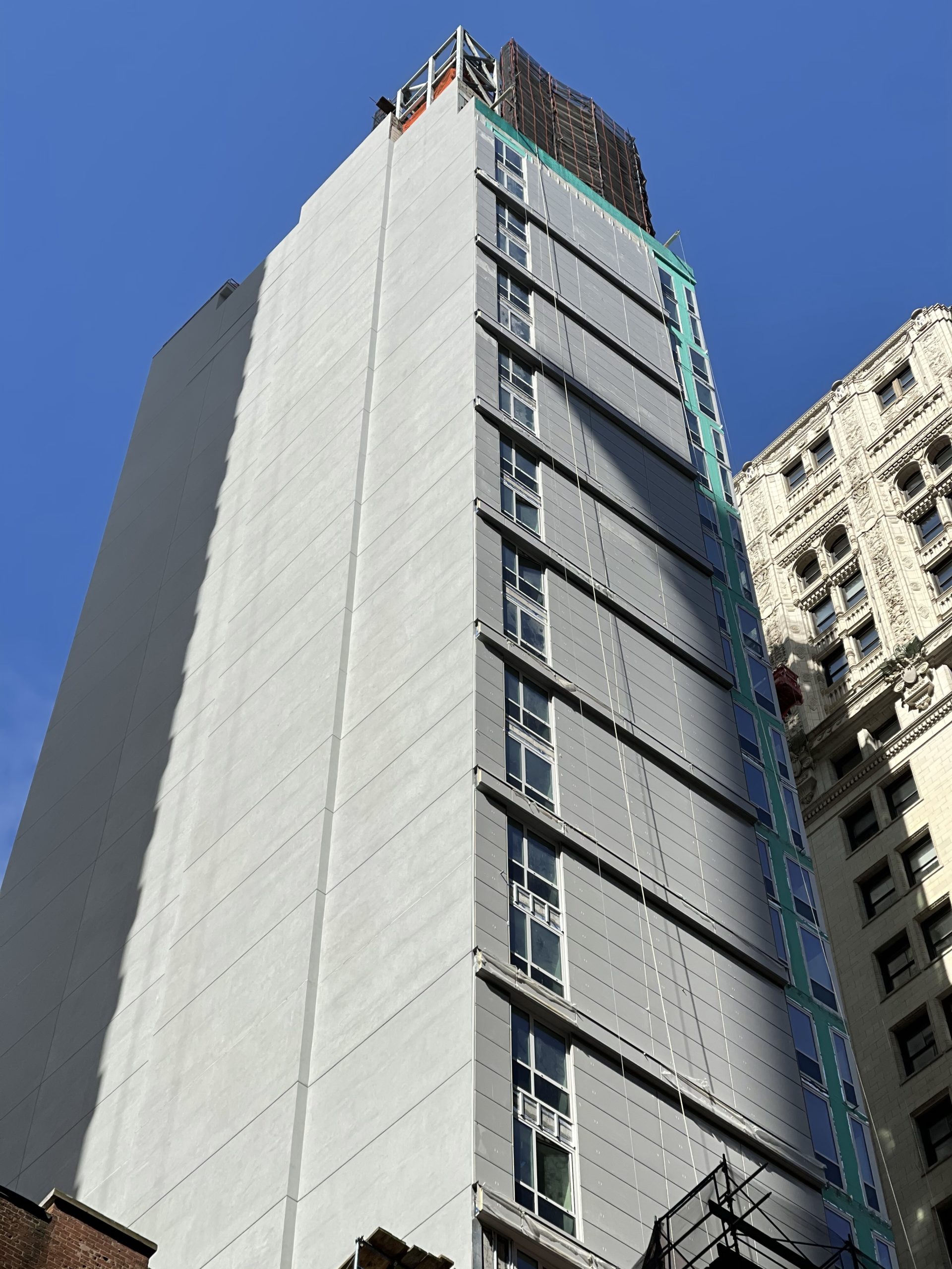
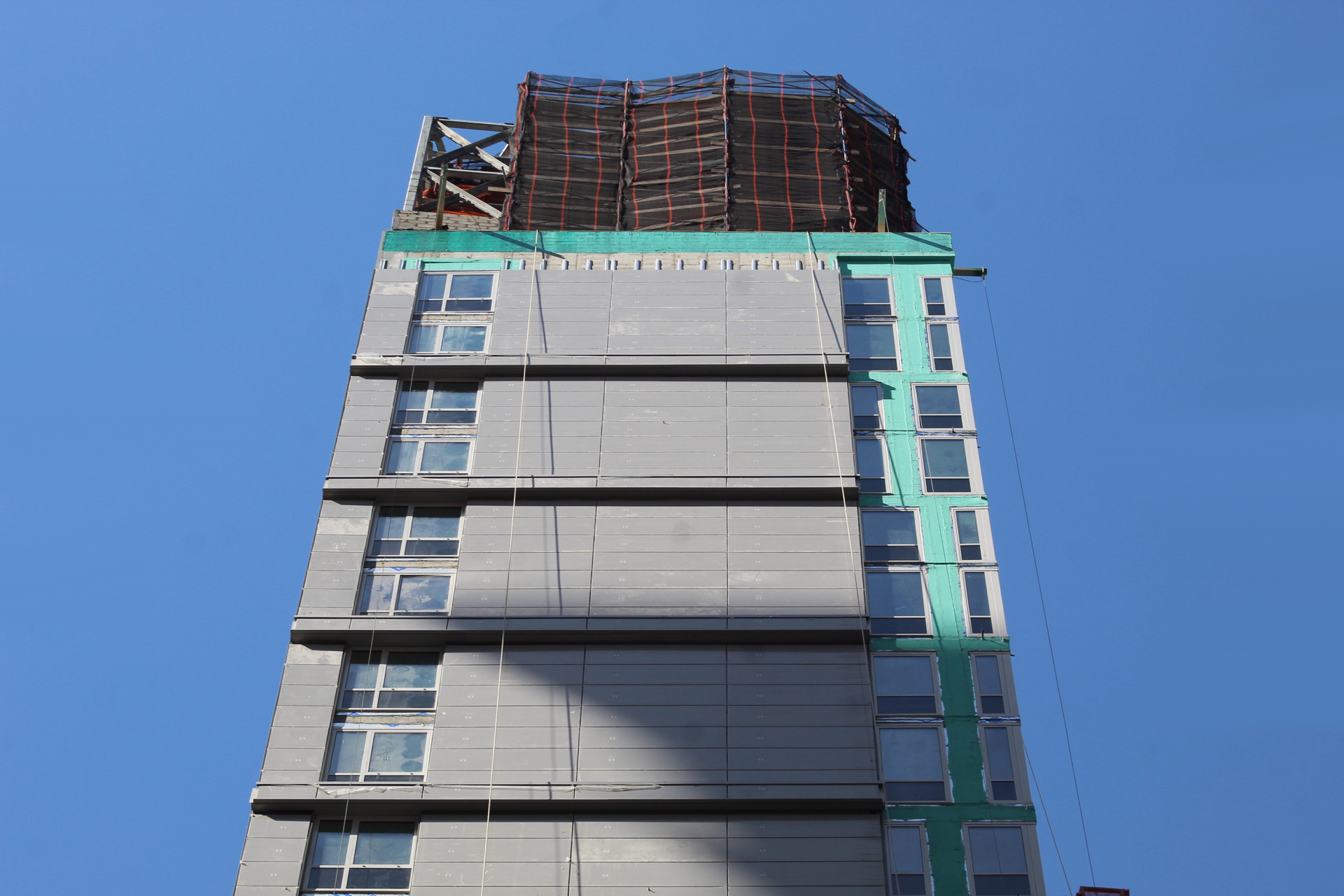
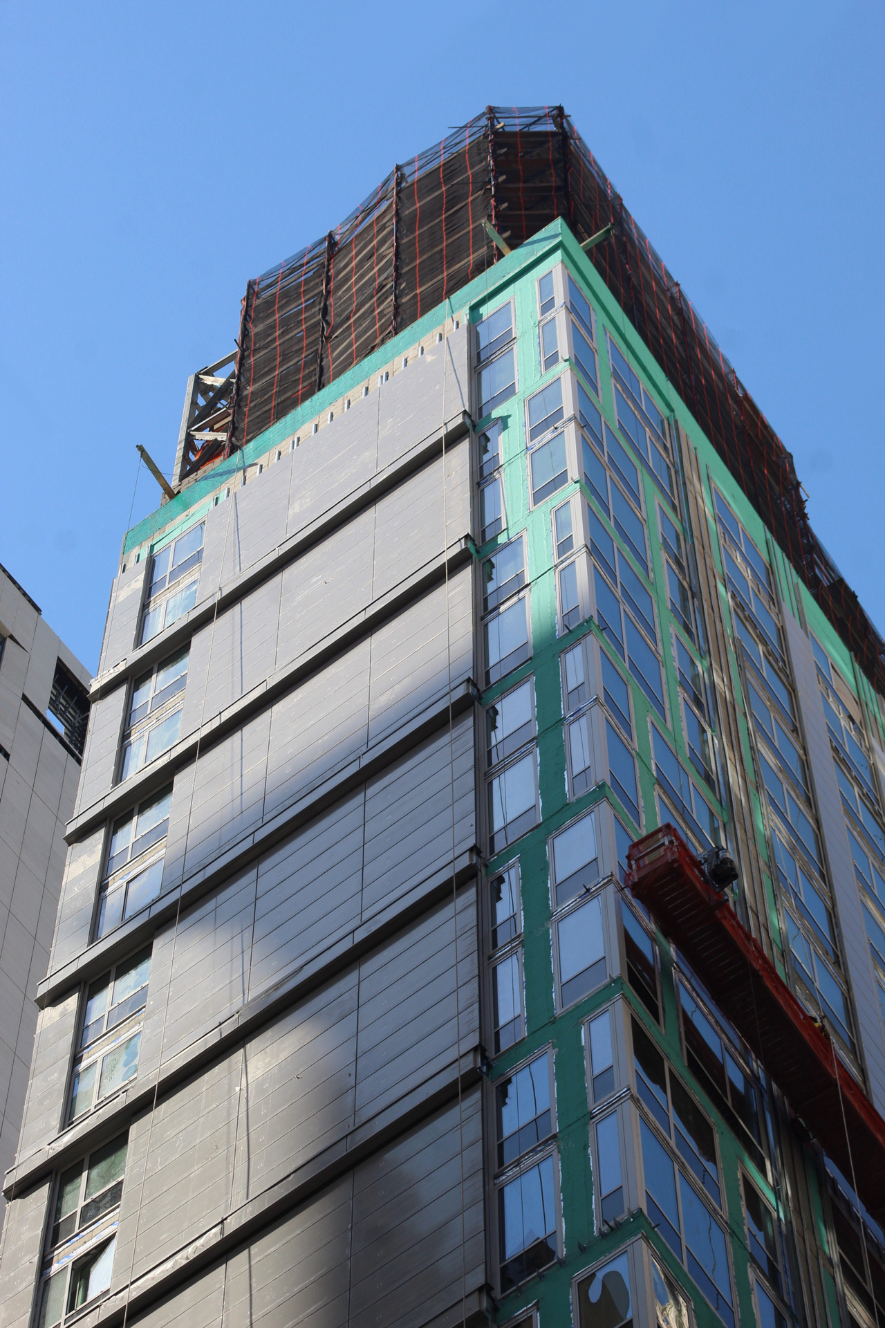
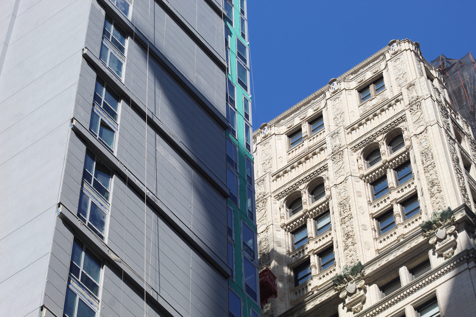
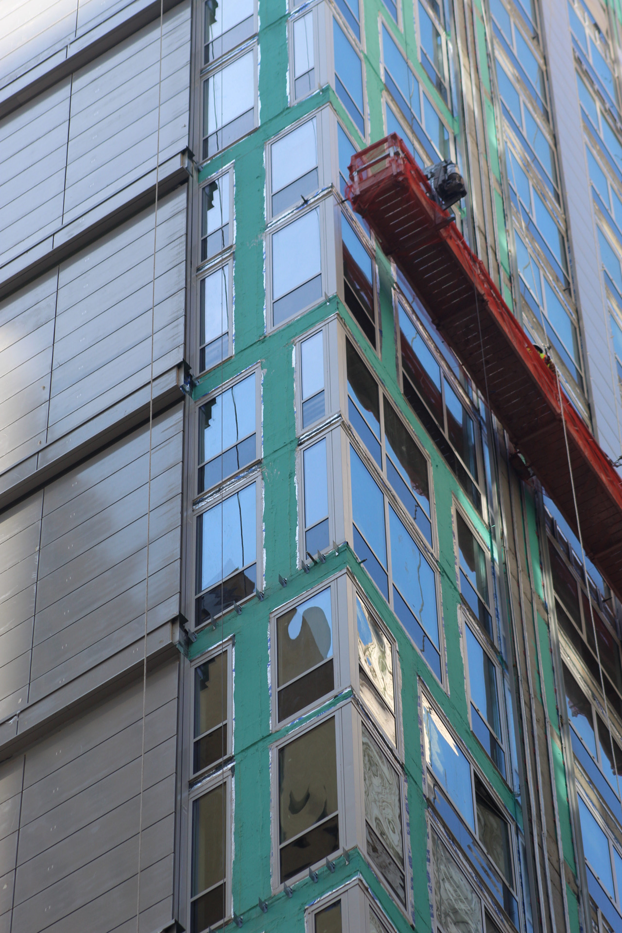
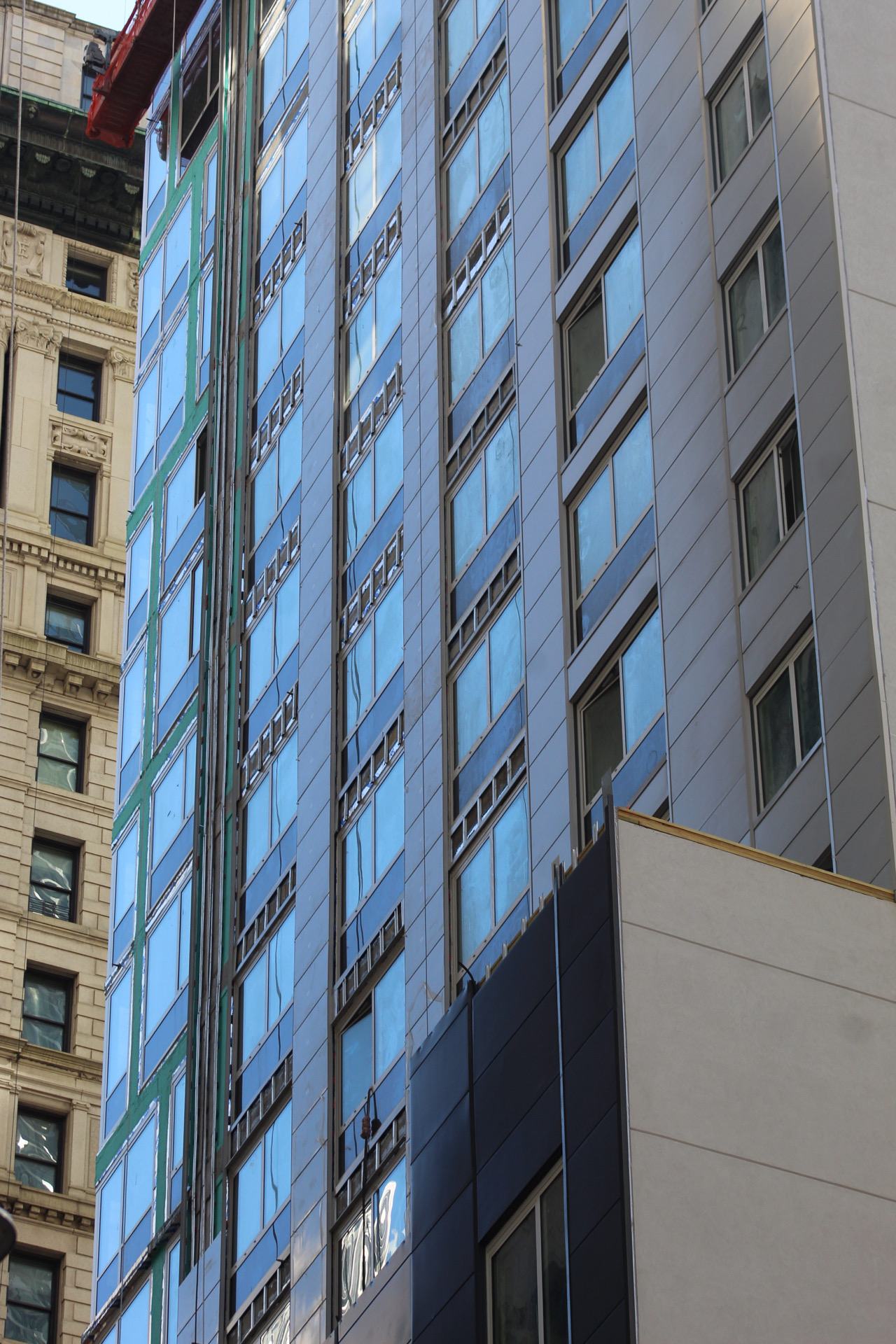
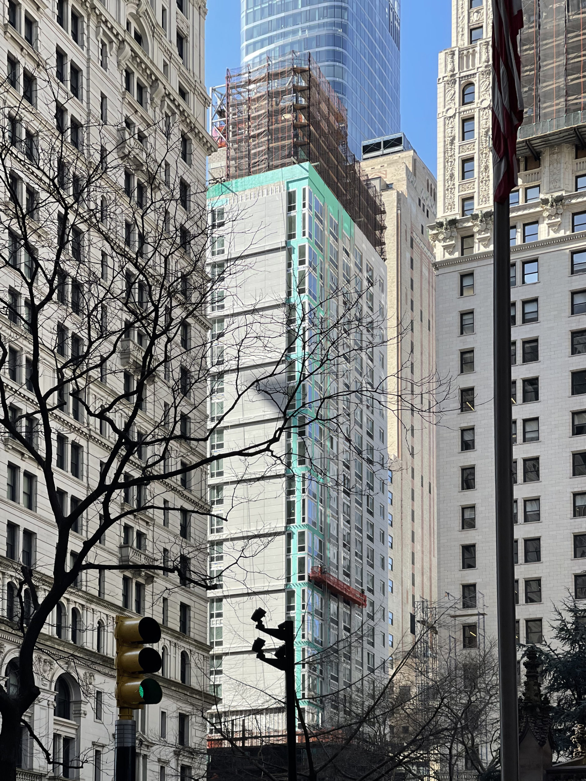
At the time of our last update in late November, window installation had recently concluded and preparations were ramping up for the remainder of the façade. Now, most of the upper levels have been clad in the final gray envelope, including the blank walls on the western and southern elevations. A dense network of scaffolding and construction netting has also been assembled around the podium levels of the superstructure.
There are some horizontal elements to the façade that break up the eastern profile. These will soon extend to the eastern corner and divide the building’s grid into two-story segments. The mechanical bulkhead on the top of the structure sits covered in black netting and scaffolding. We can see two wooden water towers already installed. Renderings show this upper portion of 50 Trinity Place clad with a rectangular metal screen.
The most distinctive feature of the design is the sweeping curved canopy that will cantilever over the ground floor and main corner entrance.
Overall, the color scheme contextually blends with the brick, terracotta, and stone-clad façades of the surrounding buildings, and only has a modest impact on the general cluster of towers next to it.
YIMBY last reported that 50 Trinity Place will likely be finished in the latter half of 2022.
Subscribe to YIMBY’s daily e-mail
Follow YIMBYgram for real-time photo updates
Like YIMBY on Facebook
Follow YIMBY’s Twitter for the latest in YIMBYnews






It does actually fit well with the surrounding buildings, but it’s still a very cheap filler.
Thomas, in so many of your comments like here, you have two completely opposing points of view.. it’s really quite crazy.
The contrast between the old and new is all you need to know about the decline of man.
We are DEVO! (I agree with you, but, yes, I fear a downward spiral….)
Meh once again.
Looks like another pile of Poon!


This city is trash and I’m a, native New Yorker born and raised here. The more I see these designs for buildings with the same Color schemes it further strengthens my thought that this place is losing its character ever more. I mean that’s what made new york unique diversity and not only in the people but the places, communities and neighborhoods… Colors, store front awnings, supermarkets, shoe repair places all the tings that made you feel alive… Now this city is just glass and mirrors or drab black store and restaurant fronts.. Good luck in the future here, I’m out…