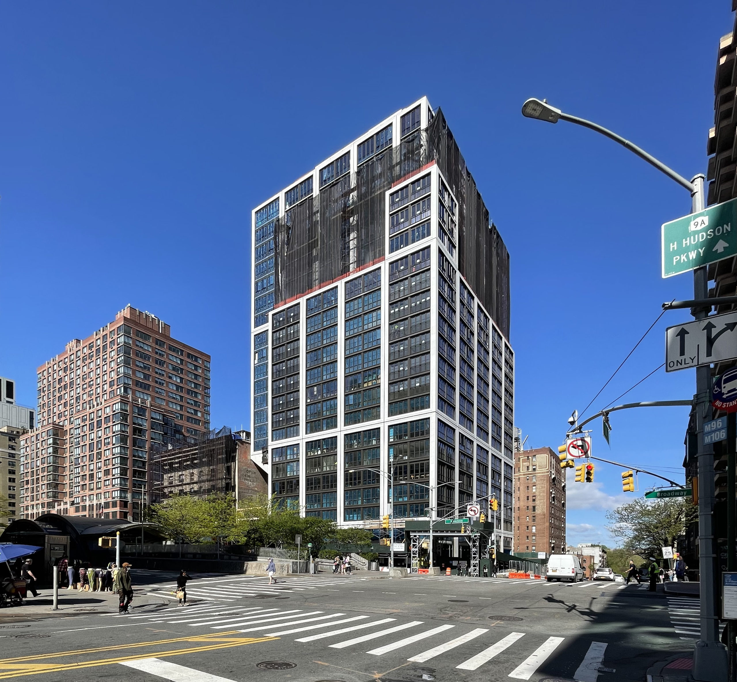
Façade work is continuing on 2551-2555 Broadway, a 22-story residential building on Manhattan’s Upper West Side. Designed by Thomas Juul-Hansen with Stephen B. Jacobs Group as the architect of record and developed by Paragon JV Properties III, the 276,578-square-foot structure will yield 130 units averaging 1,660 square feet each as well as 9,080 square feet of ground-floor retail space. Leeding Builders Group is the general contractor and RC Structures is the concrete contractor for the property, which is located at the corner of Broadway and West 96th Street.
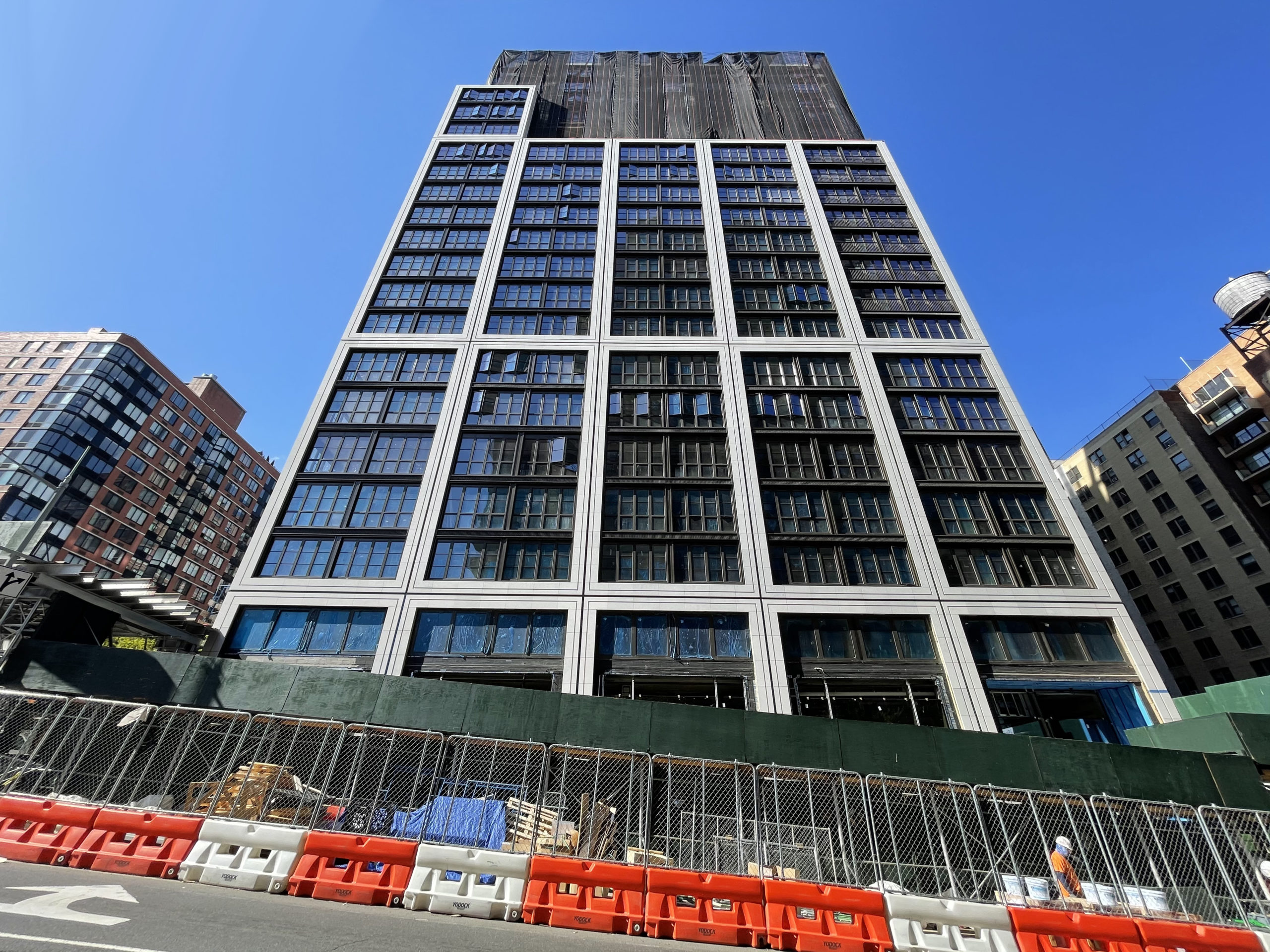
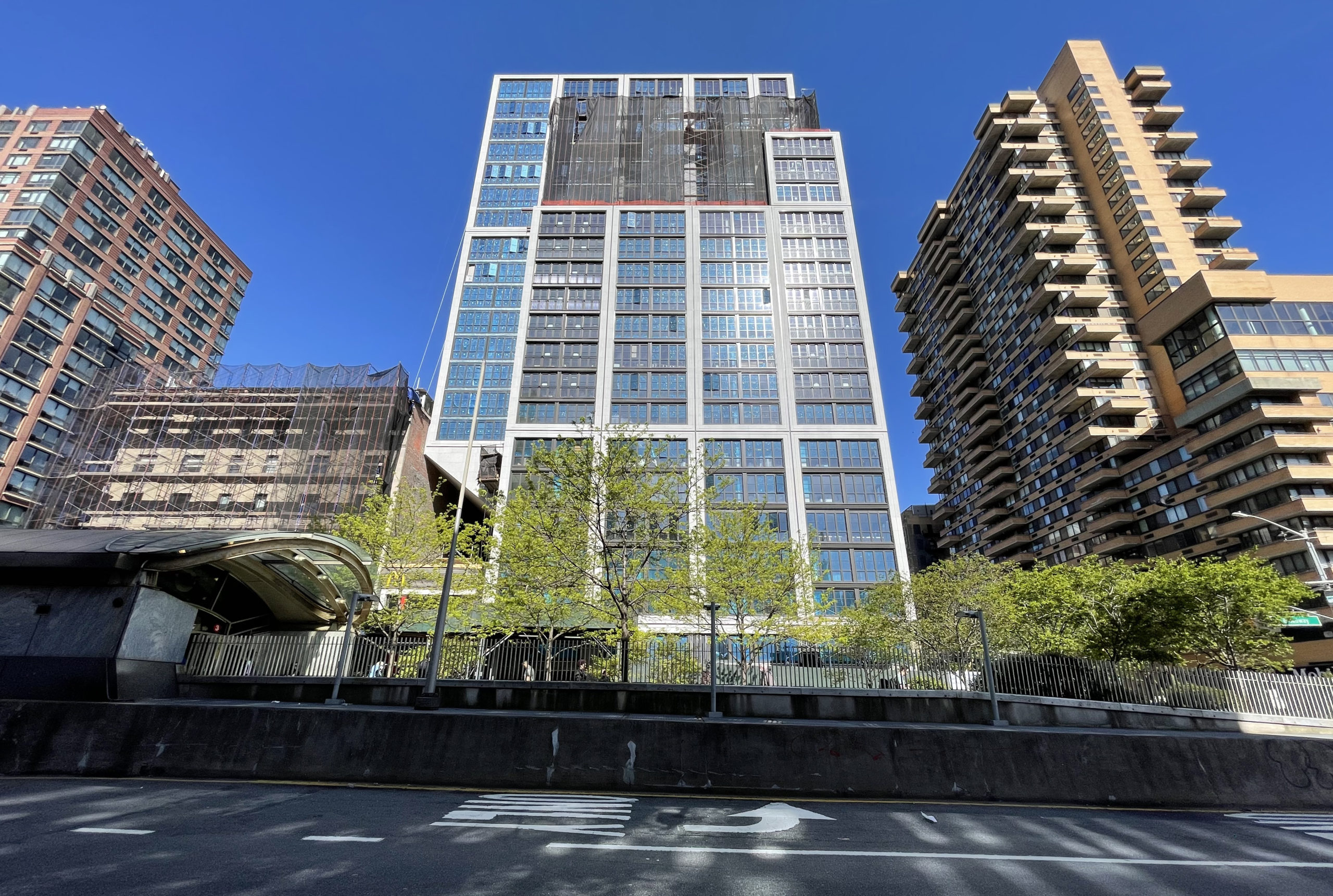
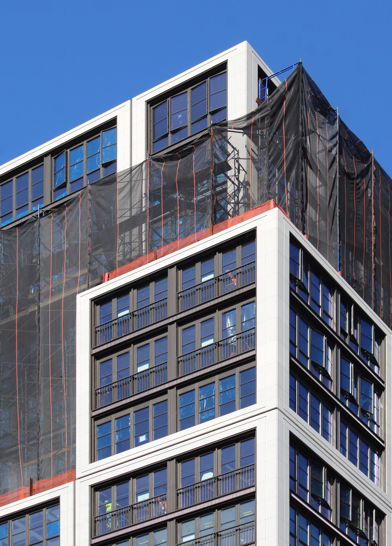
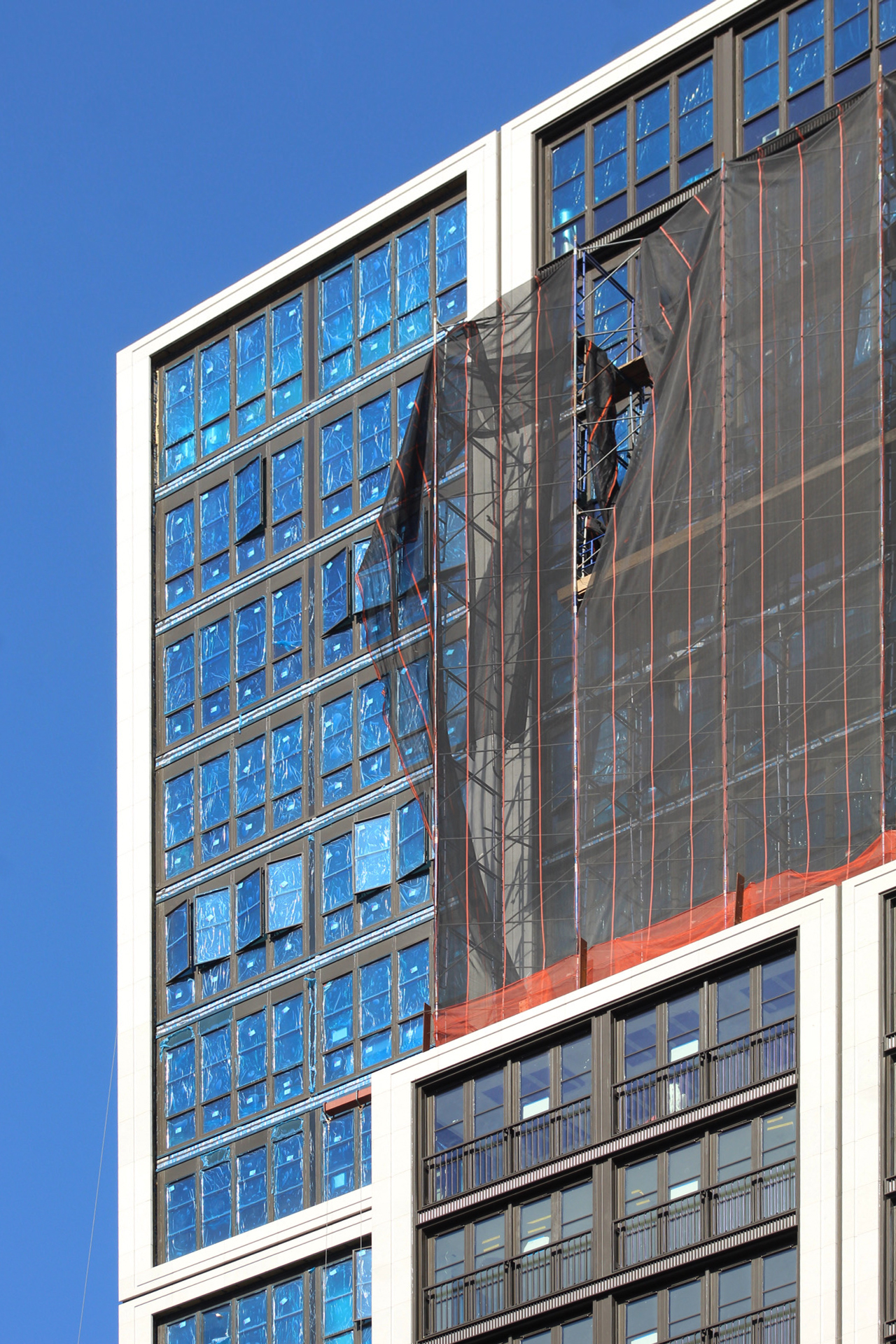
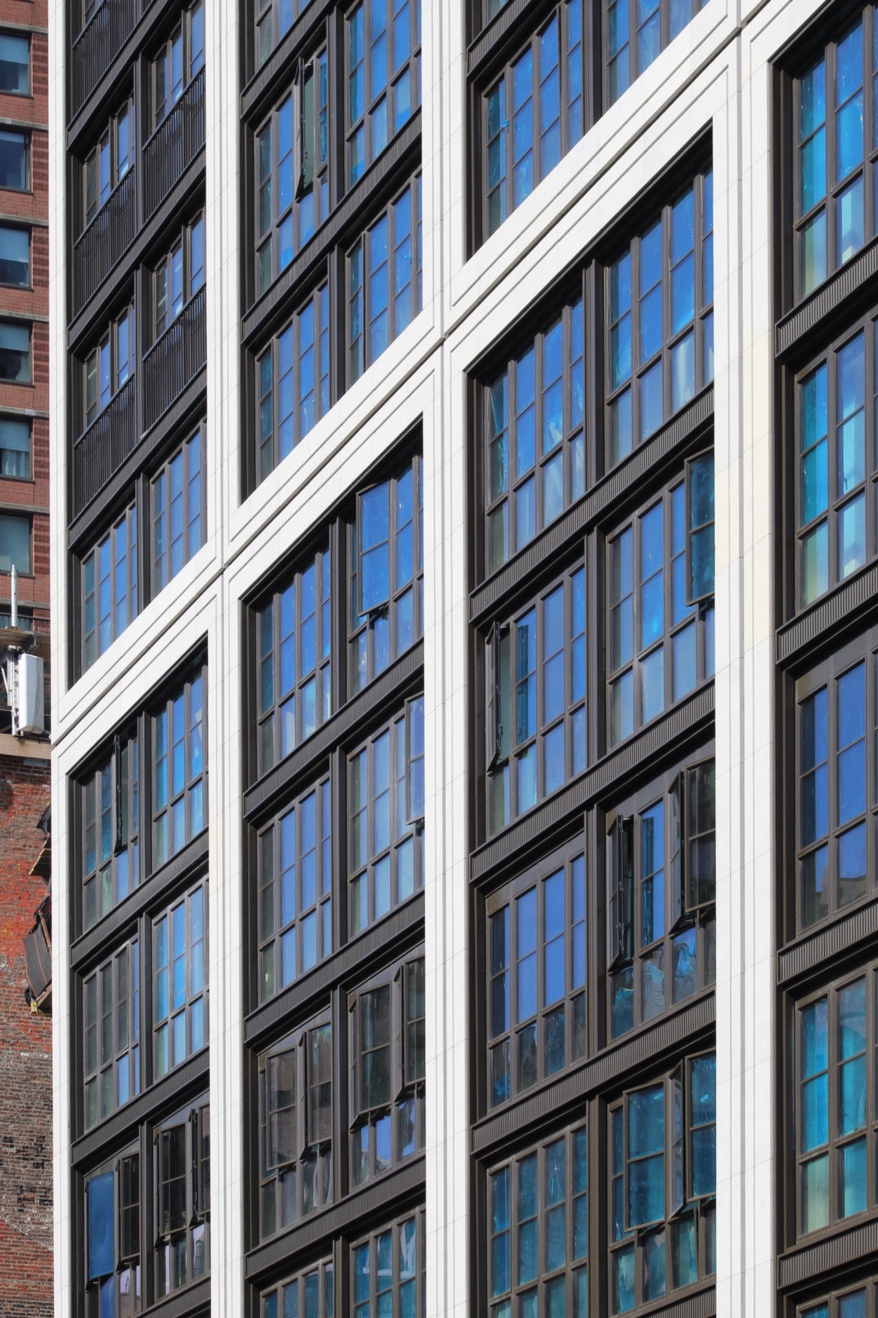
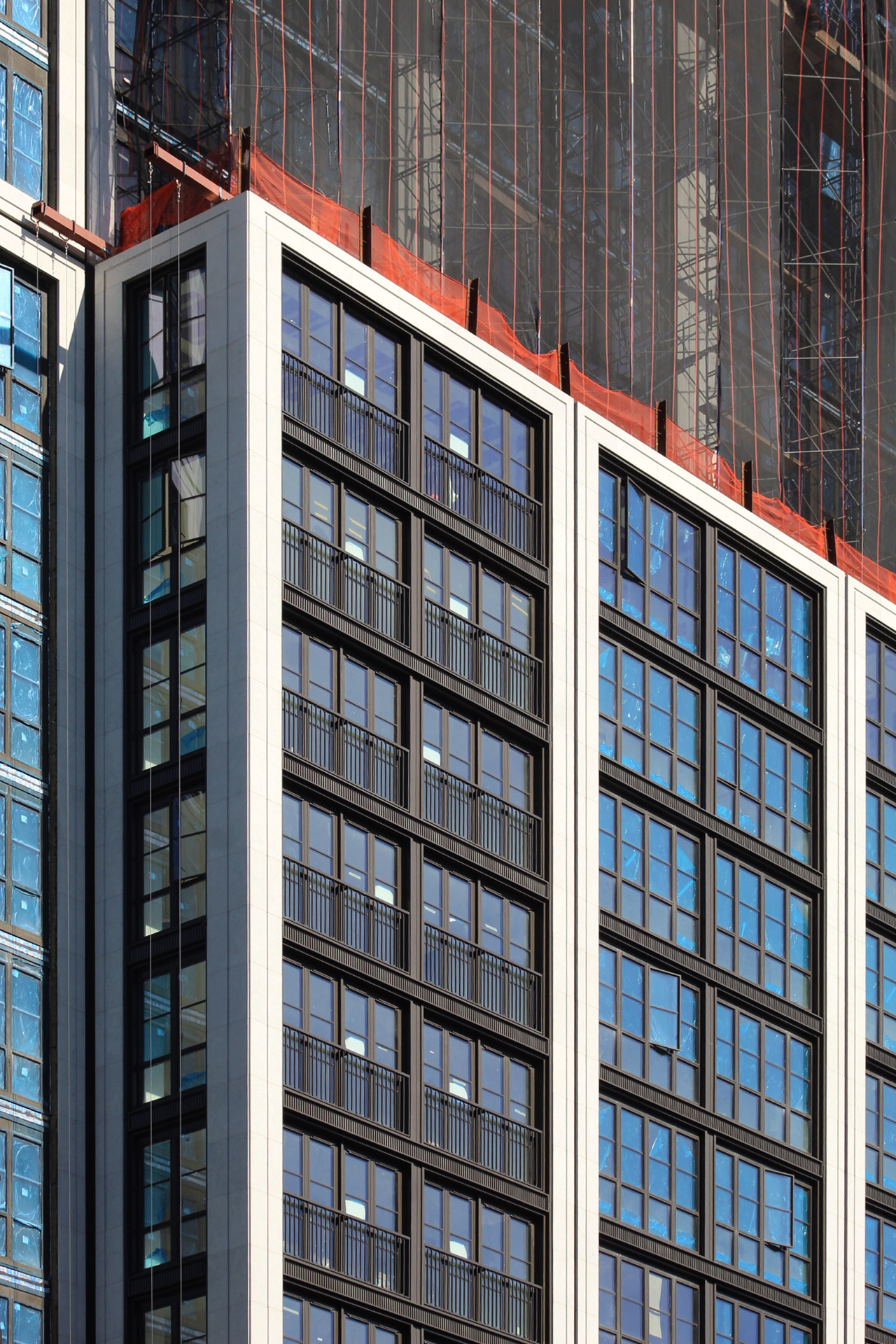
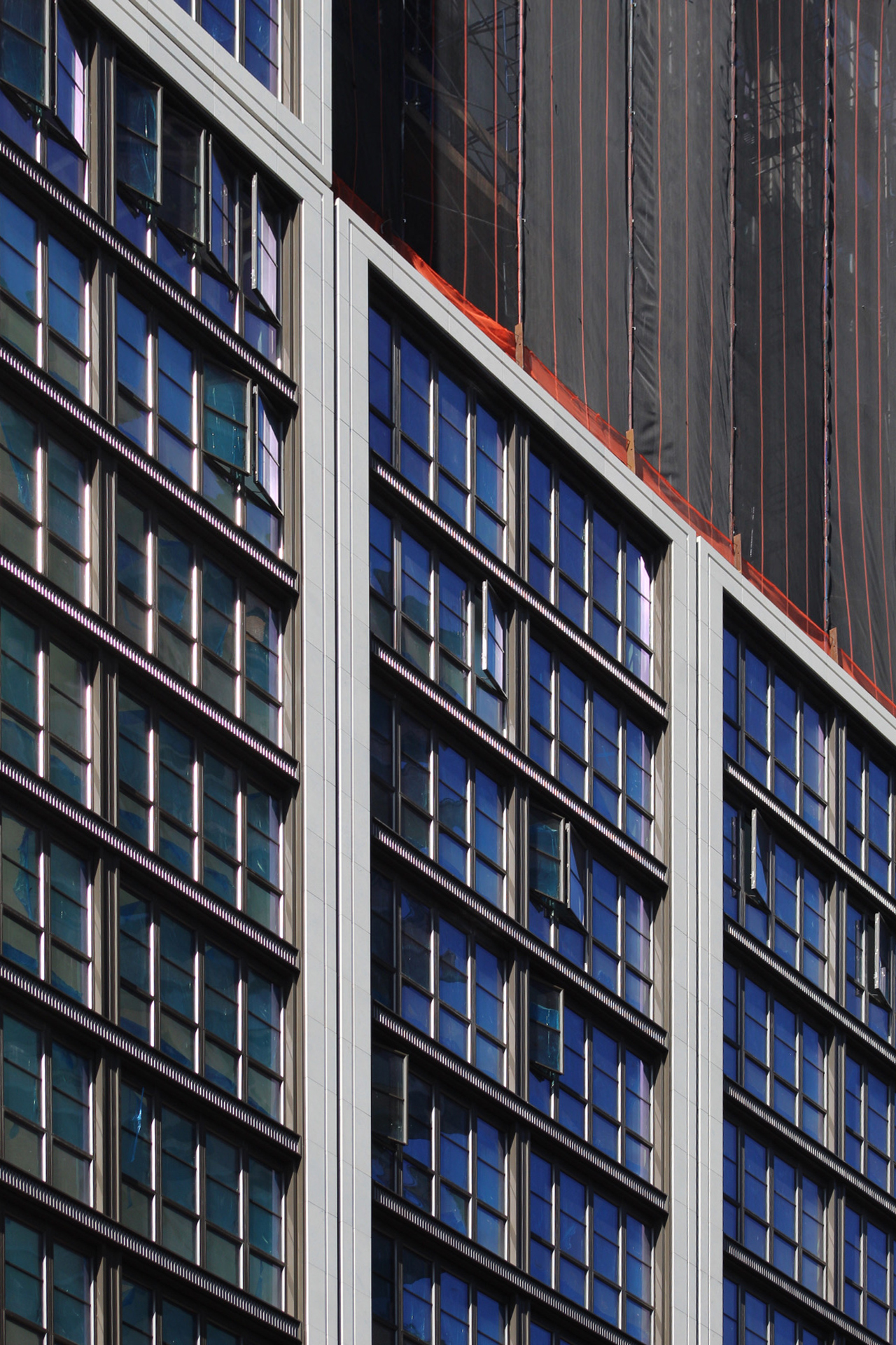
Since our last update in early January, more of the light-colored façade has been installed around the grid of industrial-style windows and portions of the scaffolding have been removed from the uppermost levels.
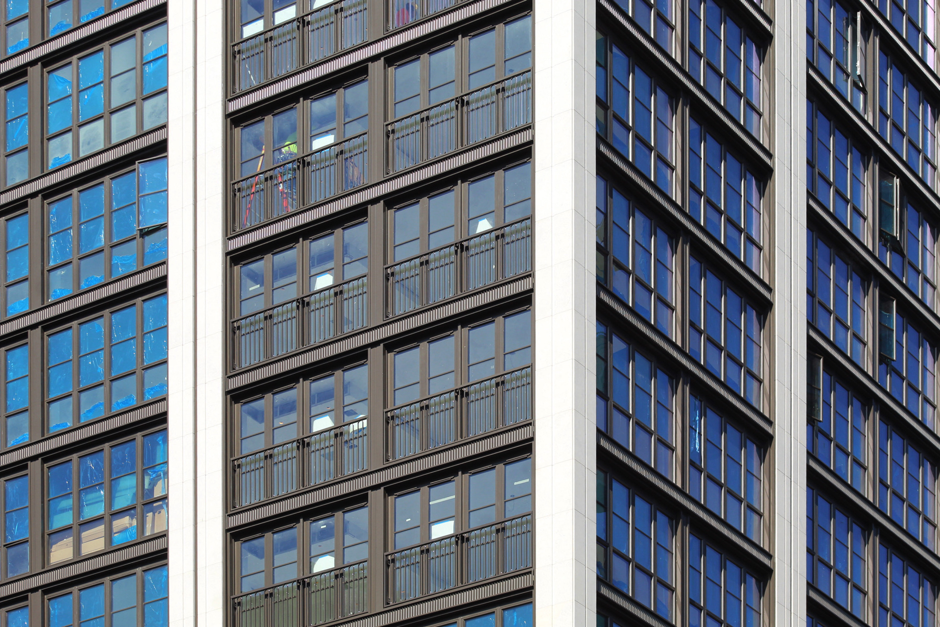
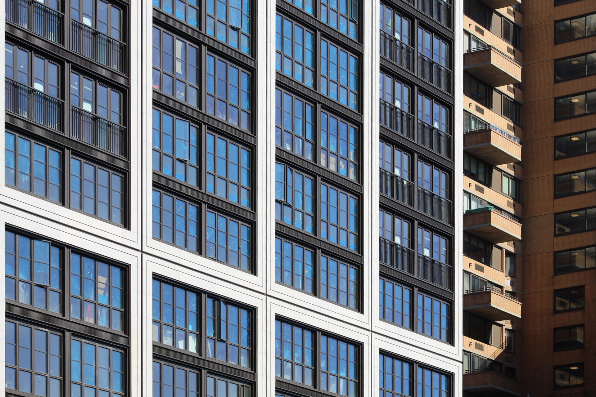
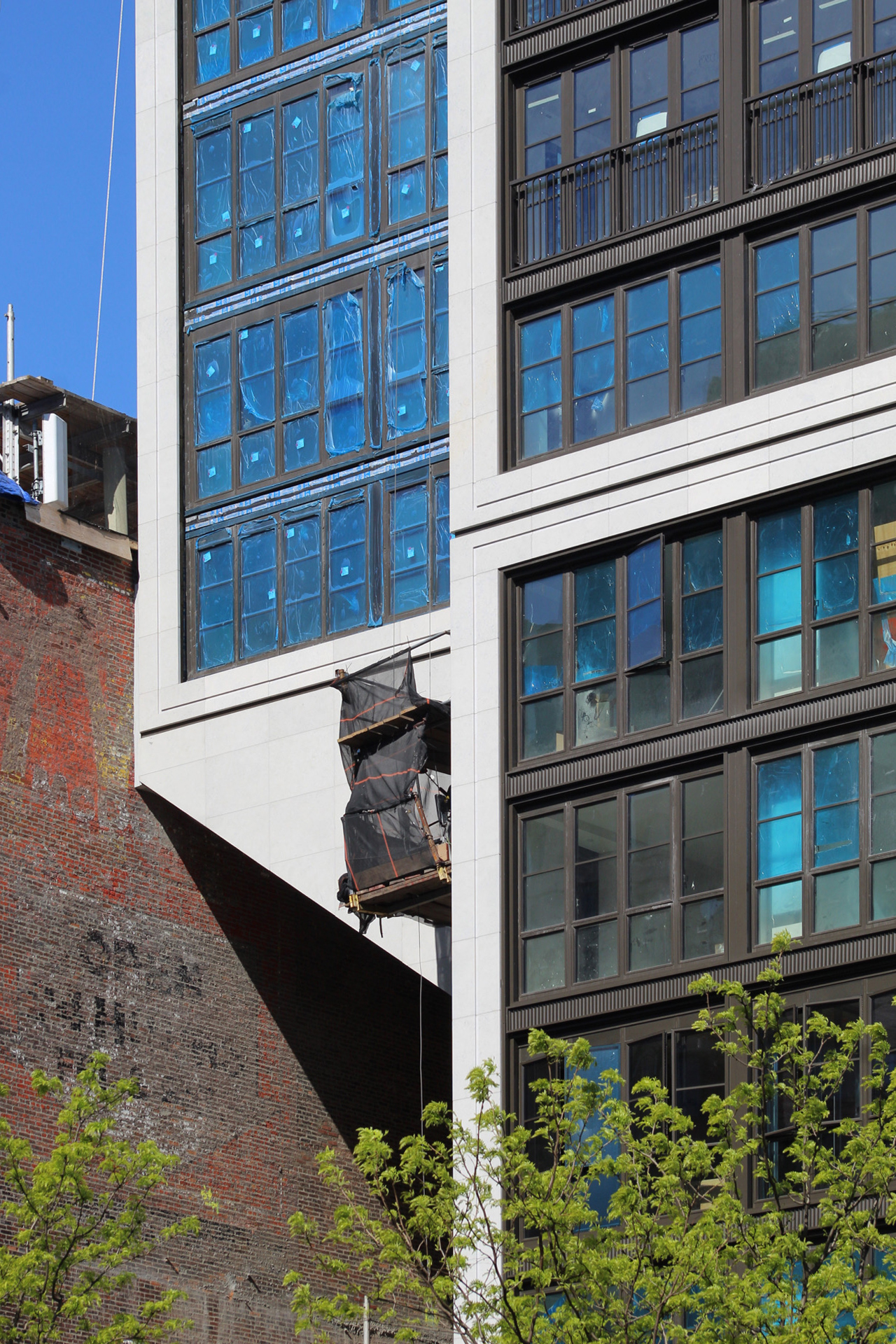
Close-up shots show decorative black metal railings in front of several floor-to-ceiling windows around the eastern corner. Some of the temporary protective blue film has been peeled off the glass panes and we can get a slight glimpse into some of the residential interiors, which are being busily furnished. The sidewalk scaffolding should likely be taken down closer to the end of the summer, revealing the residential entrance and ground-floor retail frontage.
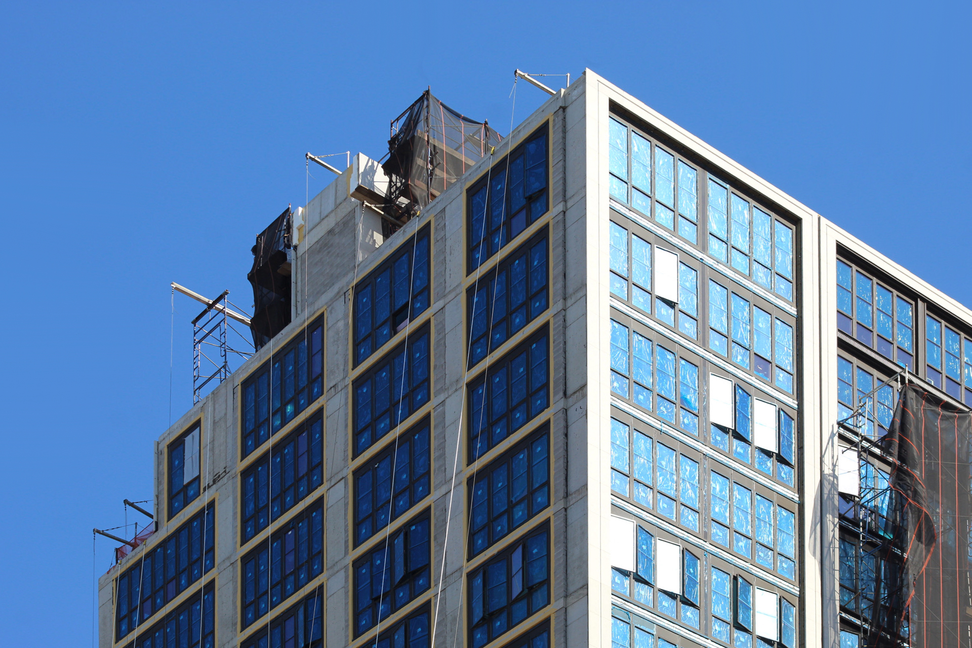
The two sets of climbing scaffolding rigs along the eastern and northern elevations are fully dismantled.
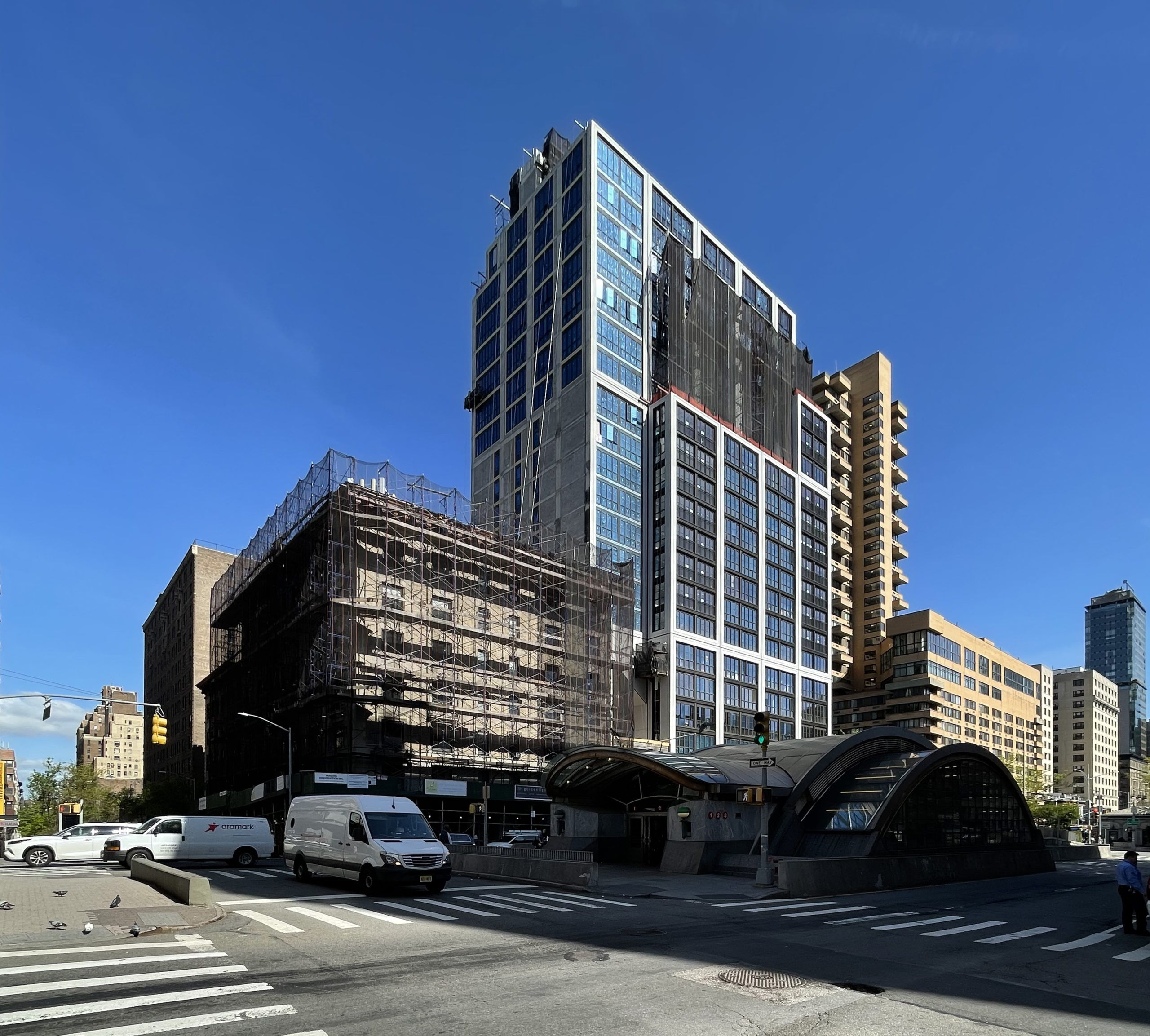
The southern wall of the edifice has some catching up to do in terms of its cladding, but otherwise has all of its windows in place.
The cantilever of the superstructure is now enclosed in a sloped outer skin and free of most of the temporary scaffolding.
YIMBY last reported that 2551-2555 Broadway will be finished this fall.
Subscribe to YIMBY’s daily e-mail
Follow YIMBYgram for real-time photo updates
Like YIMBY on Facebook
Follow YIMBY’s Twitter for the latest in YIMBYnews







Looks better close up than at a distance.
Beautiful windows come in crowds, with unbroken facade in great number of its shape. The building offers a wonderful panorama at corners, and revealed itself on upshot to working: Thanks to Michael Young.
“panorama at the corners”….you no make sense…the corner is blocked with a heavy vertical so there ain’t no panorama. Panorama: def: unbroken view.
The “eagle flys at midnight”, into the broken panoramic windows at the corners of life!
See, I have learned how to “David speak”!
The building is too much of a massive block for the location. The monotonous grid is relentless. The cantilever (the affliction of this crop of UWS buildings) is just stupid – leaving a pigeon / dirt alley over the McDonalds. A kinder, softer, more UWS building was
called for on this important corner, with some nod to the busy corner of W96 and Broadway.
It’s just a stubby version of TJH’s tower on Sutton Place, as if one style fits all.
C-
This building does look better up close than from a distance. However, even at a distance, the form and massing is in alignment with many of it’s neighbors. It’s certainly complementary in size and shape to buildings just a little further east on 96th. If this type of architectural approach to size and scale continues, this area could end up with a lot of complementary buildings but with a diversity of architectural styles. All-in-all, a pretty good addition for the neighborhood.
I want to like this, but it’s just not possible. J above, perfectly describes why.
thanks D. I wanted to like it….my office is across the street and I have endured it’s construction and, now, there is a more banal albeit “traditional” building going up to it’s east – mid-block on W 96. If it had some articulation, at the corner, or with set-backs…taller and less blocky it would have been better.
It’s a shame the little building on the left is now “trapped” forever in perpetuity, by the foreboding “cantilever”!
It would’ve been nice if it weren’t for the overwhelming nature of the design.
I also want to like this building but frankly, to me, it just doesn’t work. The choice of white concrete for the exposed structure is just way too heavy for a building of this scale. The nice windows just fade away. If they had used red brick where you now see white the building would soften and integrate much better into the neighborhood. And the juliet balconies seem forced and fake. The cantilever doesn’t bother me.
They’ve made such a mess of this neighborhood. I used to live at 92nd & Broadway in the early 20002. Almost all prewar brick and masonry construction at the time, and the new buildings never exceeded the heights of the prewar ones (~15 stories). Now, it’s a slapdash jumble of styles and nouveau riche confections. Glad I moved to a landmarked district in Brooklyn.