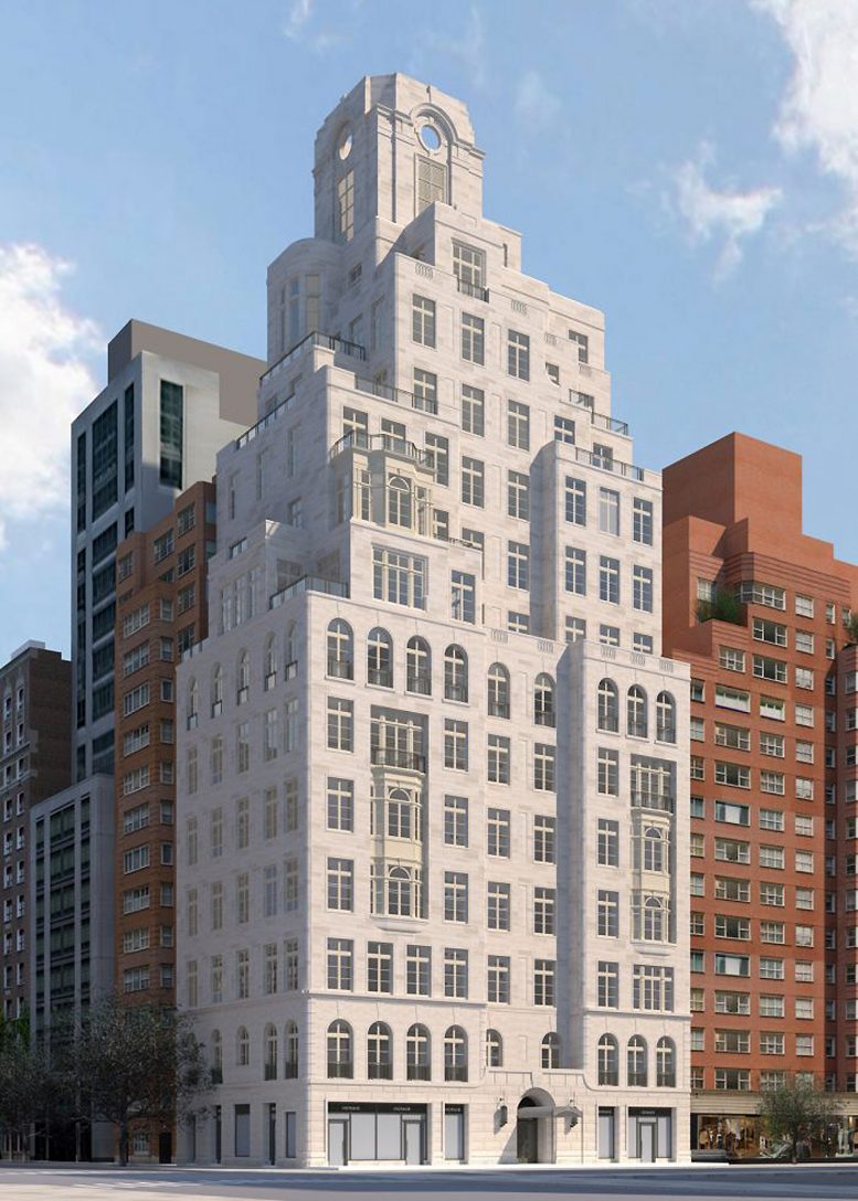
YIMBY captured the recent construction progress on The Bellemont, a topped-out 13-story residential building addressed as 1165 Madison Avenue on Manhattan’s Upper East Side. Designed by Robert A. M. Stern Architects with SLCE Architects as the architect of record and developed by Naftali Group, the ground-up 120-foot-tall reinforced concrete superstructure will yield a total of 67,680 square feet with 12 condominiums and 3,749 square feet of ground-floor retail space. Titanium Construction Services is the general contractor for the mixed-use residential project, which is located at the corner of Madison Avenue and East 86th Street. Compass Development Marketing Group is handling sales and marketing, and Achille Salvagni is the interior designer.
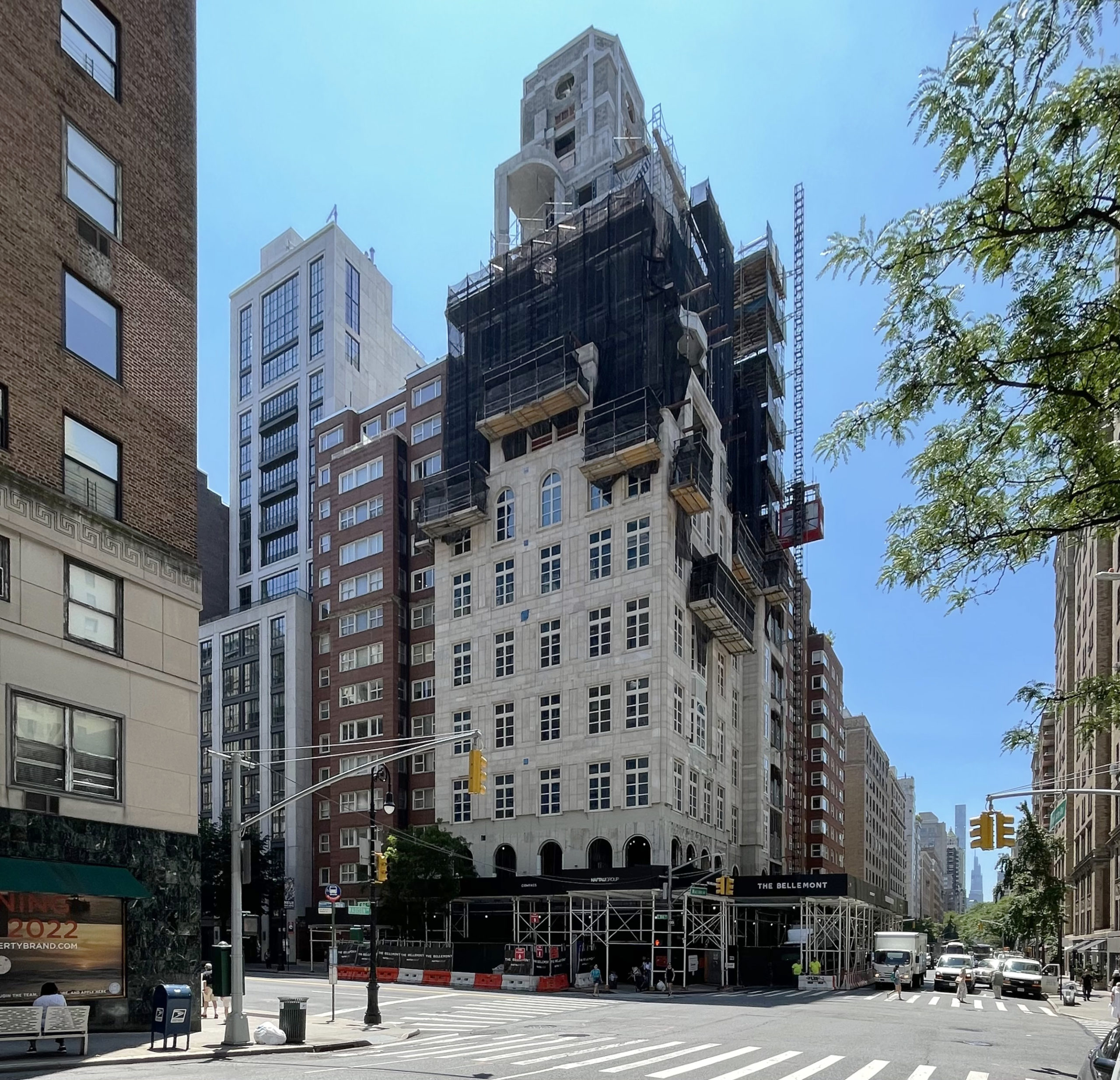
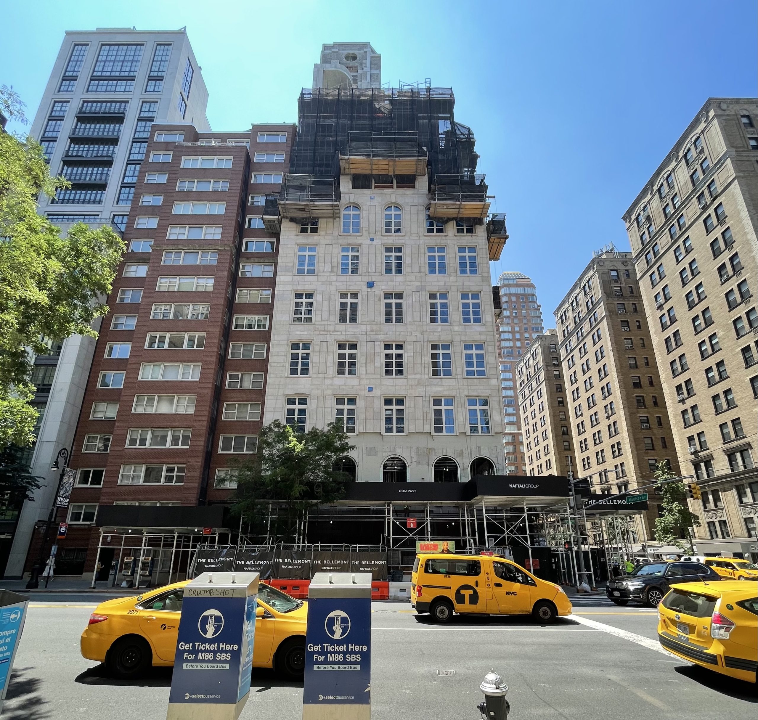
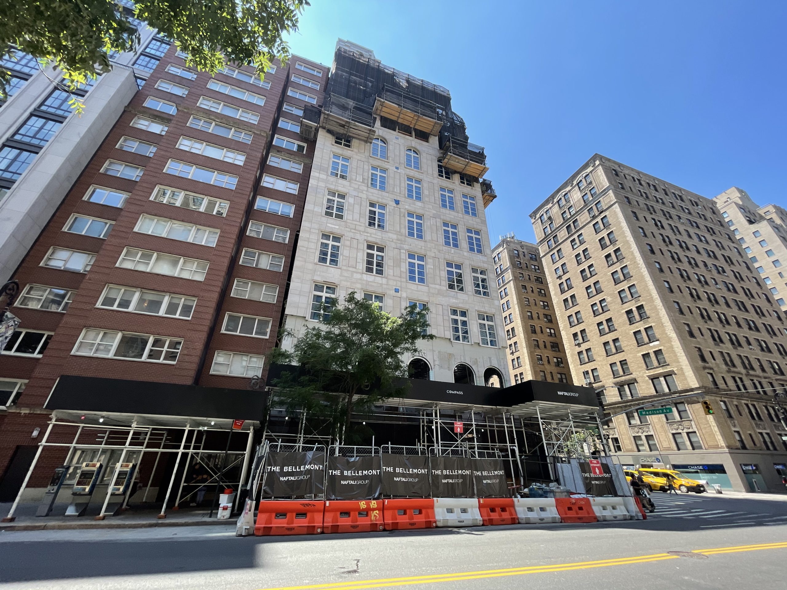
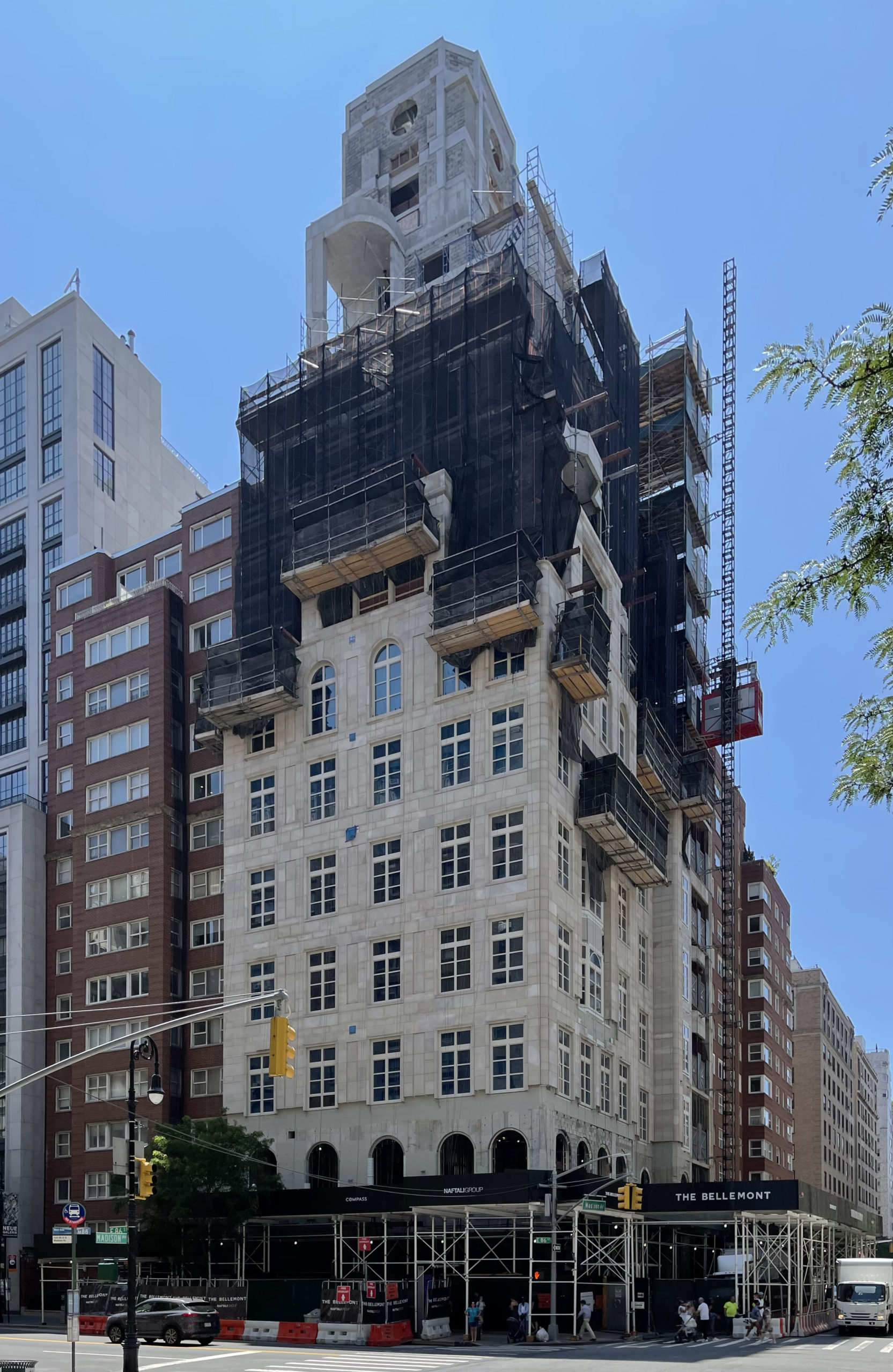
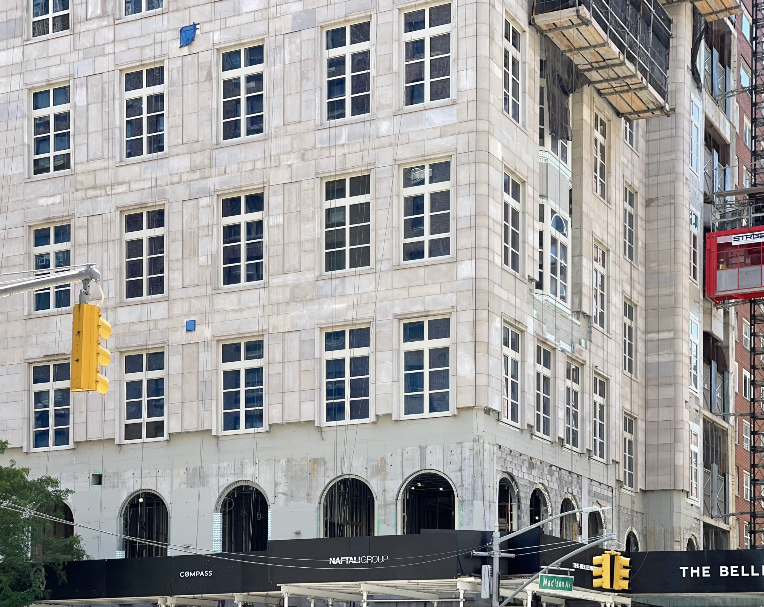
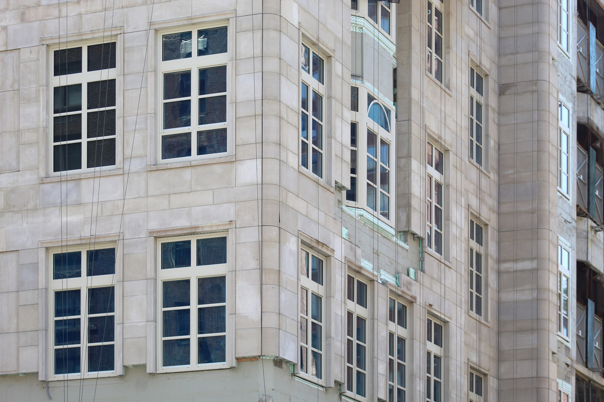
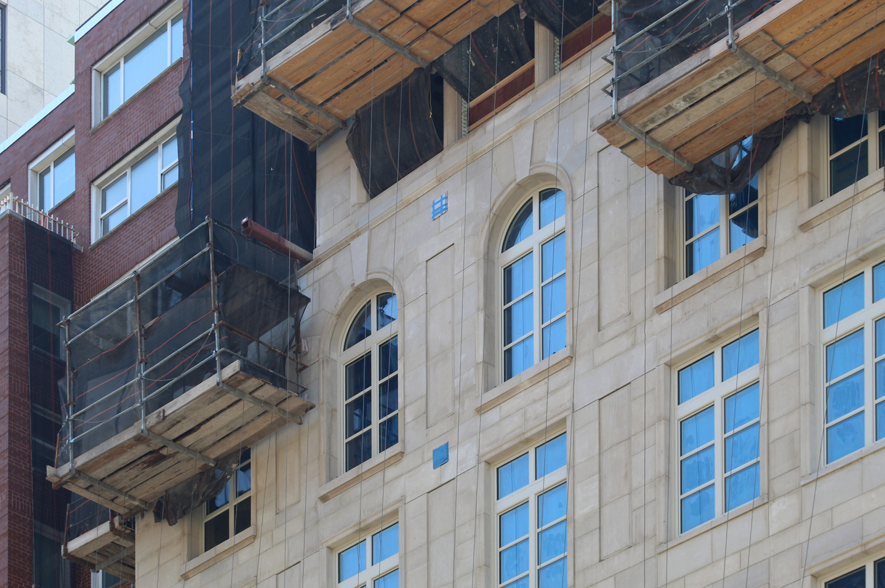
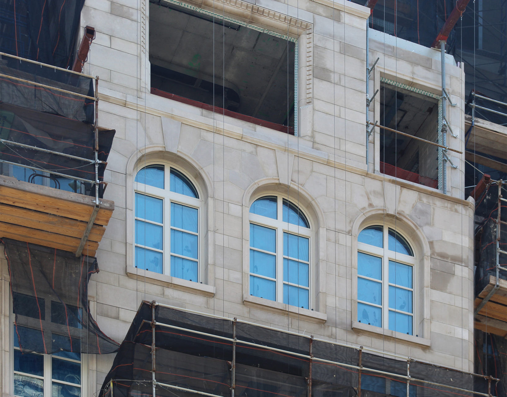
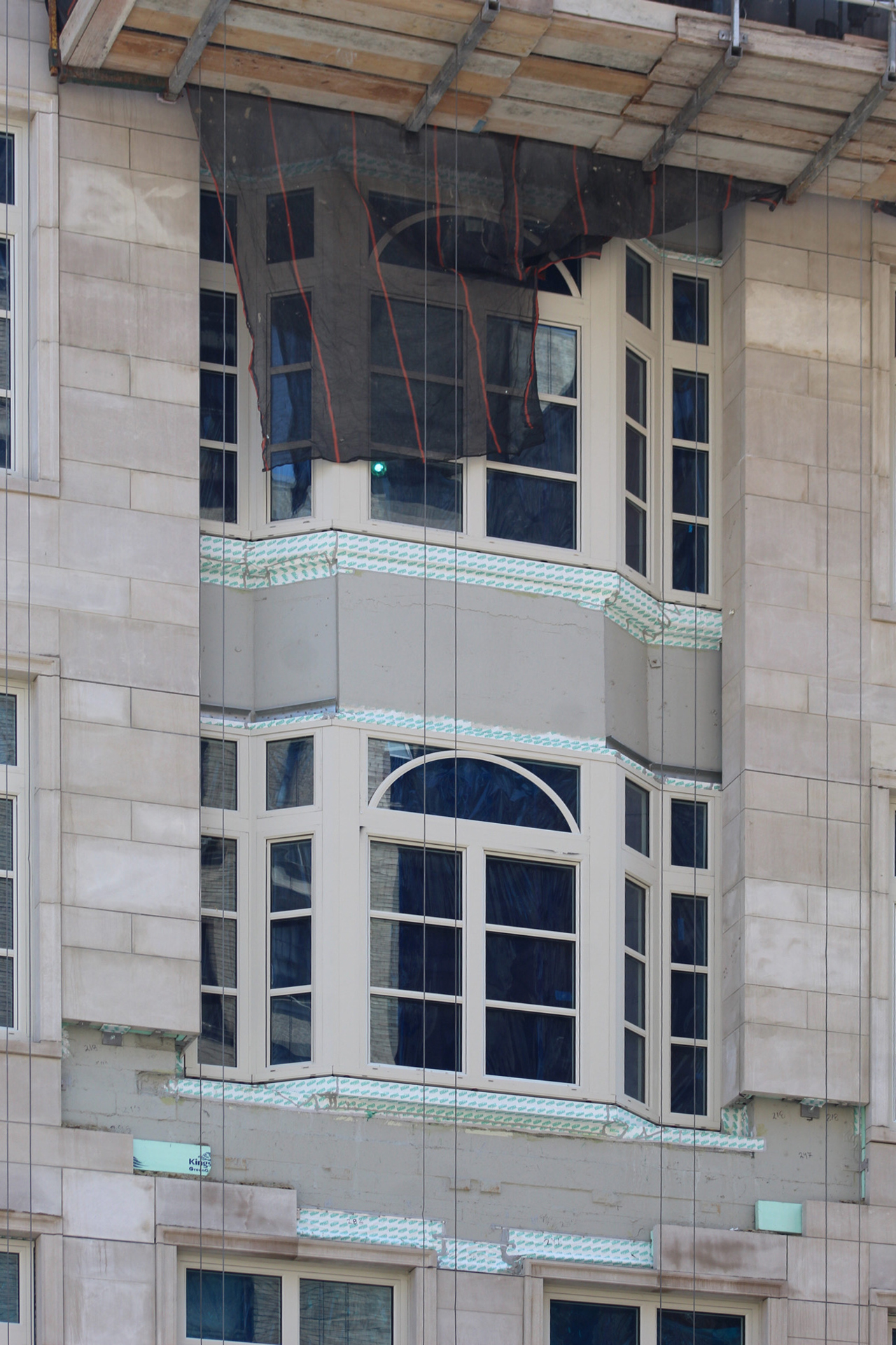
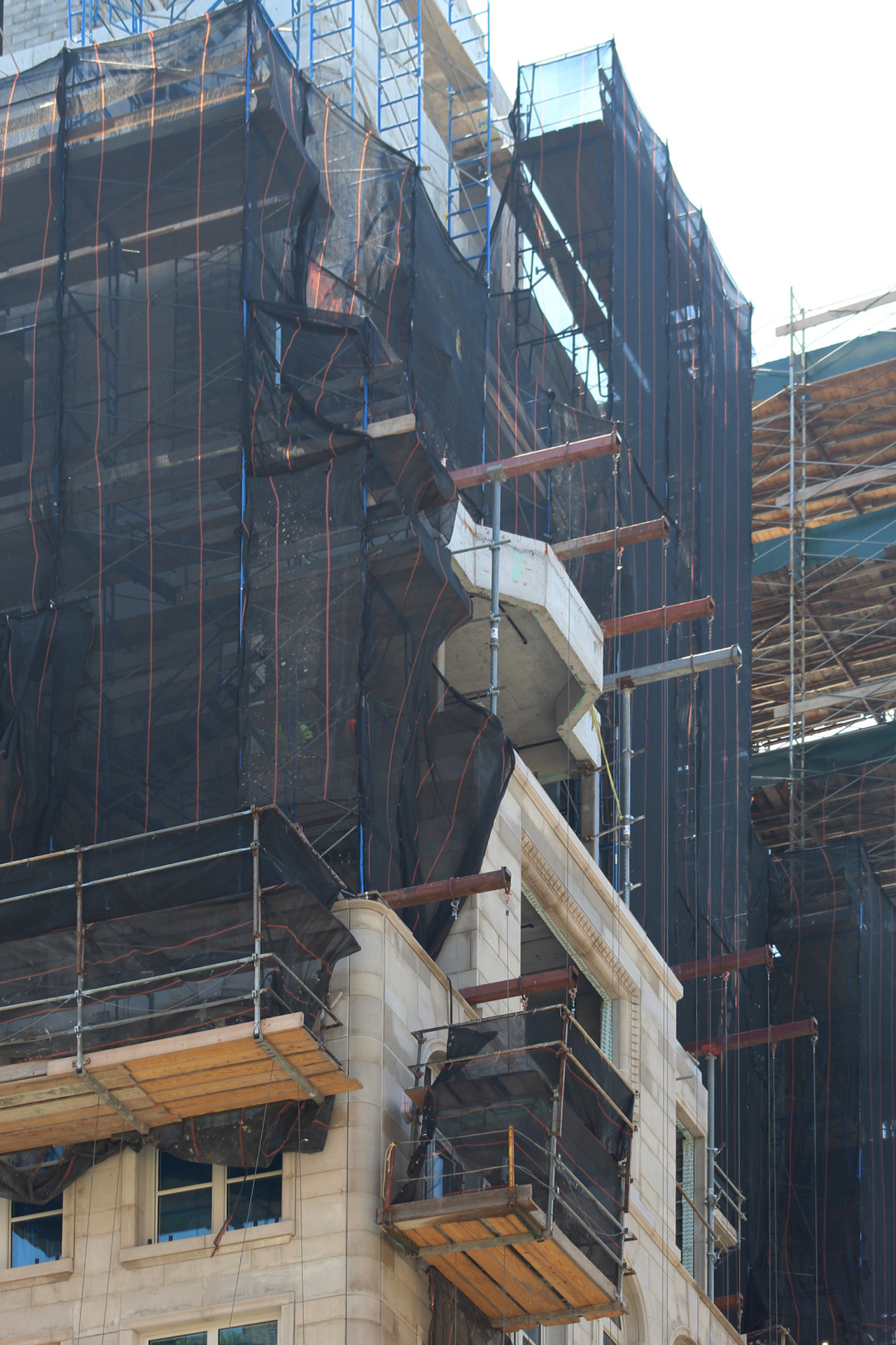
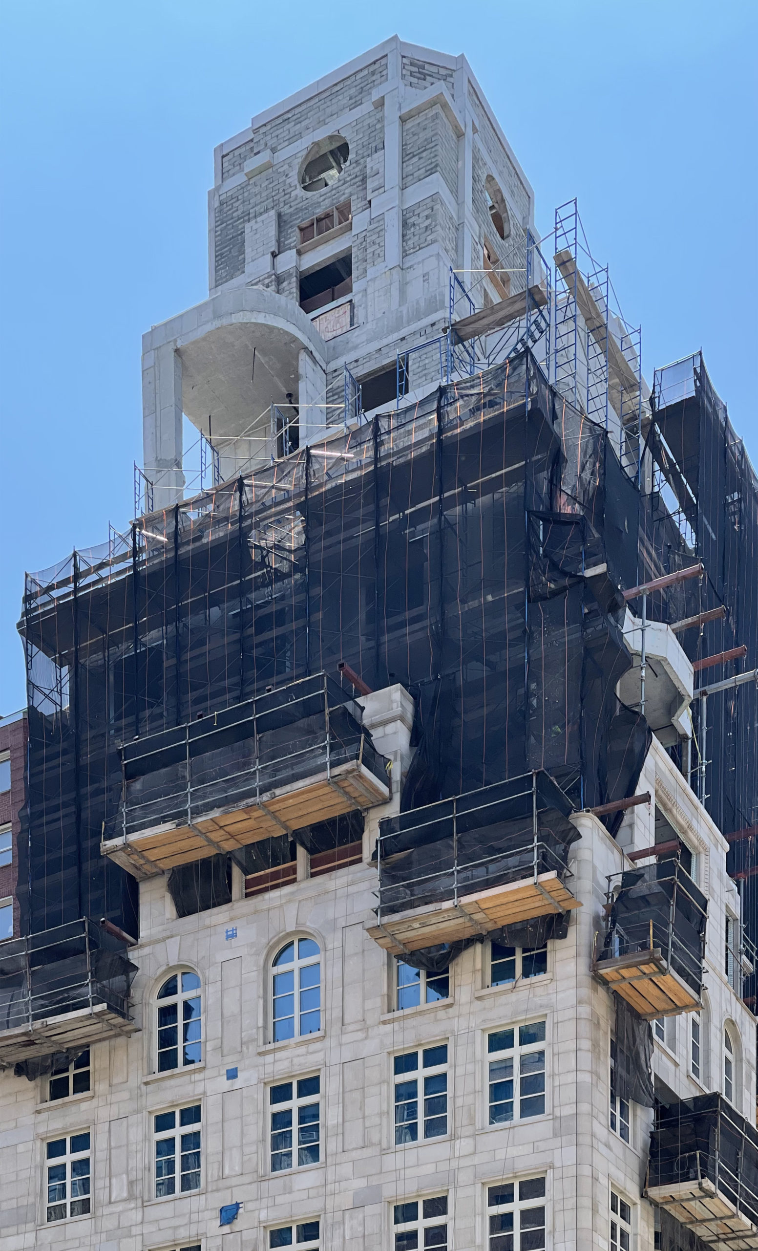
The light-colored limestone facade now covers a majority of The Bellemont, while black netting and metal scaffolding shroud most of the upper floors around the numerous setbacks that will eventually become home to private outdoor terraces for a select few residences.
At the top is the mechanical bulkhead with its perimeter walls filled in and three circular cutouts in the center of the northern, western, and eastern faces, along with chamfered corners, and a flat top. All of this will soon be covered in the same limestone surface and elegantly crown the entire structure. We should expect the top half of the building to be fully clad later this year.
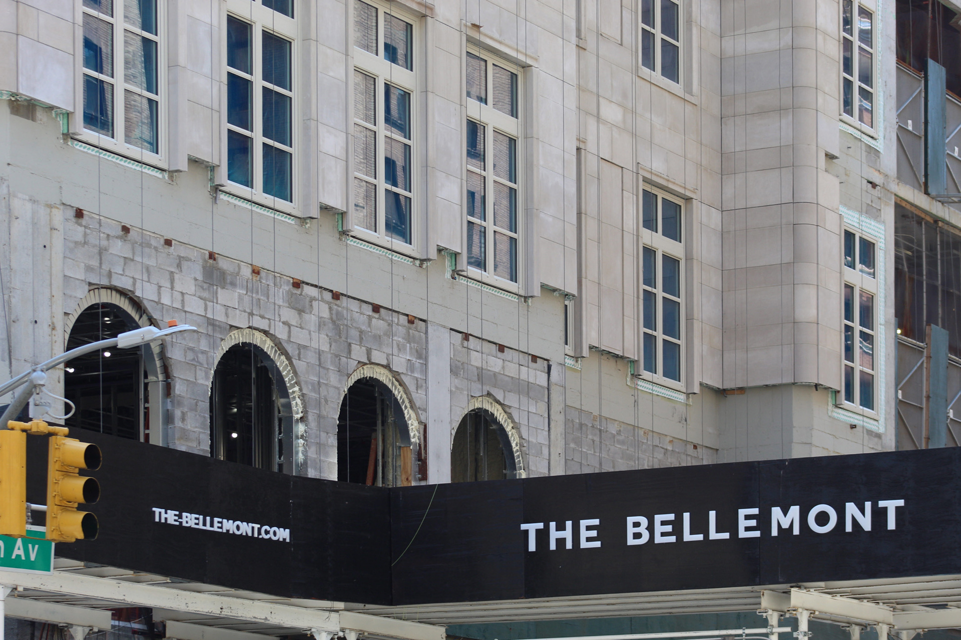
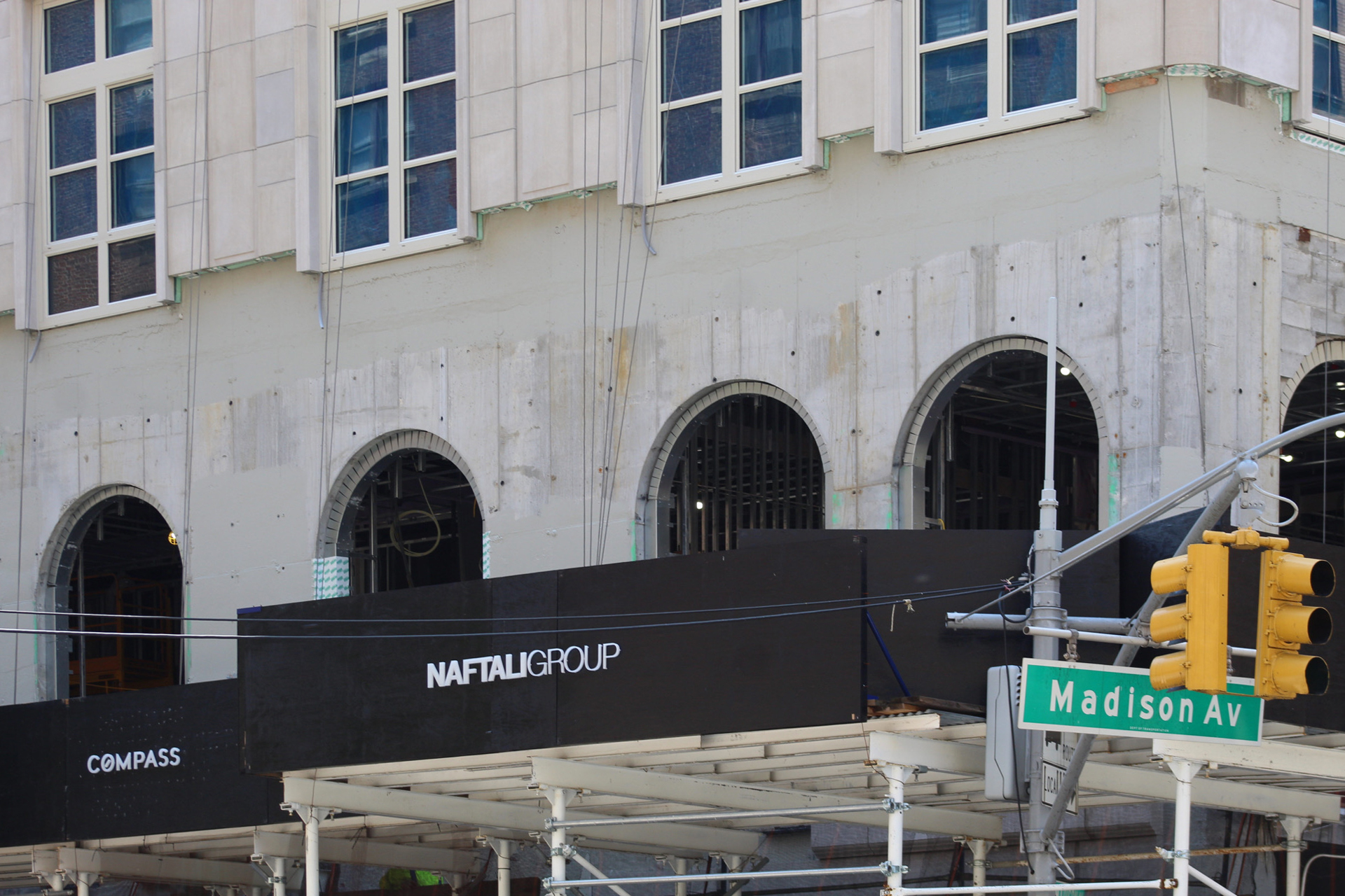
Meanwhile the ground floor remains tucked behind the sidewalk scaffolding, while the row of arched openings on the second level await their set of windows.
Future residential amenities at The Bellemont include a rooftop terrace that looks out toward Central Park, a state-of-the-art screening room, a regulation squad court, a children’s play room, and a holistic fitness space.
165 Madison Avenue is slated for completion next summer, as stated on the on-site construction board.
Subscribe to YIMBY’s daily e-mail
Follow YIMBYgram for real-time photo updates
Like YIMBY on Facebook
Follow YIMBY’s Twitter for the latest in YIMBYnews

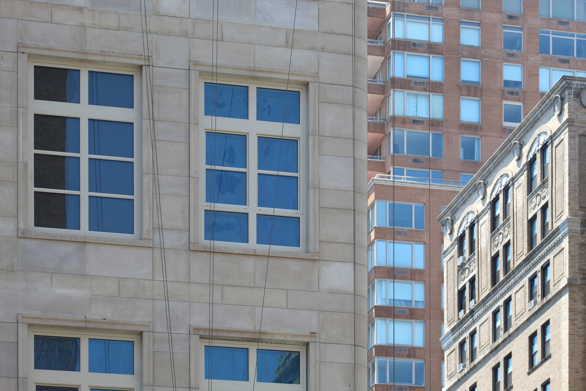



This building really stands out on the corner with the more brown and dull buildings next to it.
Brown = Boring ?
Three circular cutouts in the center of the northern, western, and eastern faces. With limestone surface on the entire structure, beautiful and elegant to arched openings: Thanks to Michael Young.
Bravo to the skill of the commitment to make a building that anchors an important corner of the UES with attention to detail and strength of materials. I think, the failure of this design over the recent RAMSA towers presented is the over-sized windows: reminiscent of the Gimbels reconstruction of the 1980’s down the street at Lexington and 86th – the windows there were over-sized and the building did and does look a little confused. Less mullions might in theory make for wider views but in this structure, they appear commercial and more like storefront.
Well, they won’t have to worry about vampires in this building—lots of those mullions look like crosses! Especially ninth pic with three arched windows. The rendering looks like a church headquarters!
He is designing 21st century buildings that cater to current buyers’ demand for tons of natural light. Unless you have a penthouse with skylights, oversized windows are the only practical way to cater to market demand. That in mind, this design is really good. Love the quality limestone they used. No skimping or value engineering here!
Windows are just fine.
So you’d prefer a 6-over-6 design or something like that? I kind of agree. I like the huge windows (reminds me of Park Ave or a Soho loft) but proper historical-looking window panes might look a little nicer… but the scale might throw it off.
I especially appreciate that RAMSA and other revivalists seem to favor limestone and grey brick for residential buildings and reserve red brick designs for light industrial projects. C’est génial.
RAMSA continues to amaze and inspire.
Stern continues to save NYC from banality
Brown = Boring ?
Already booked by sleazy Russians and coke dealers.
NOT our crowd, dears.
Only 12 units? This is so dumb, I hope they get luxury taxed to hell.
those tombstone shaped windows are a no-no for me. hate it.