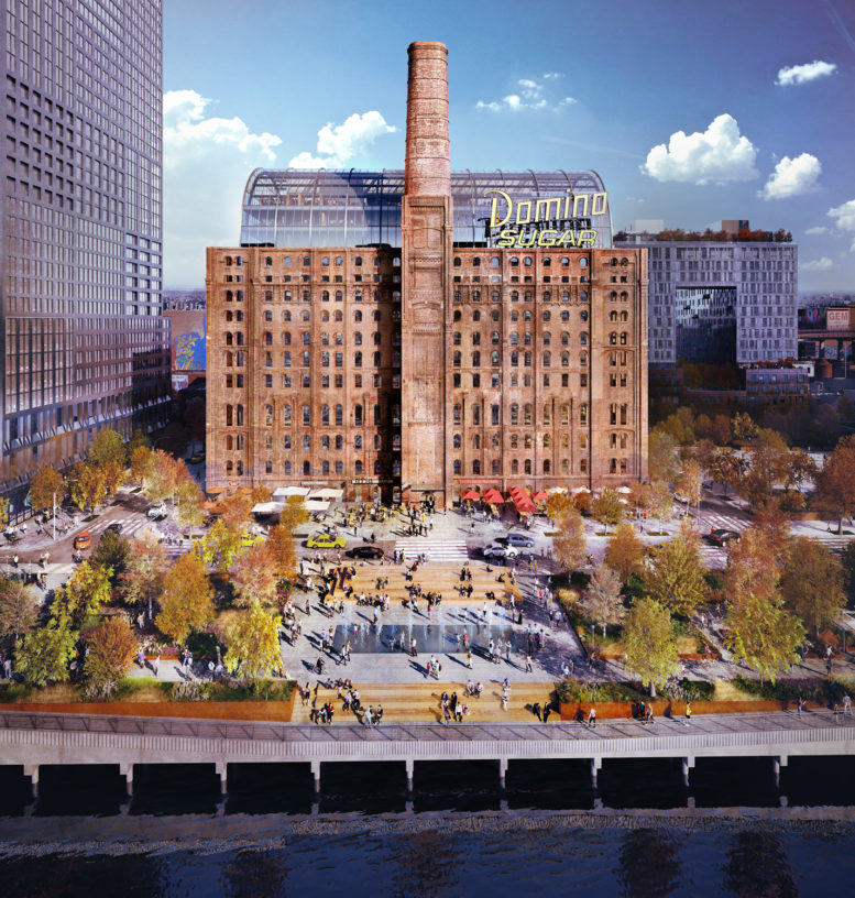
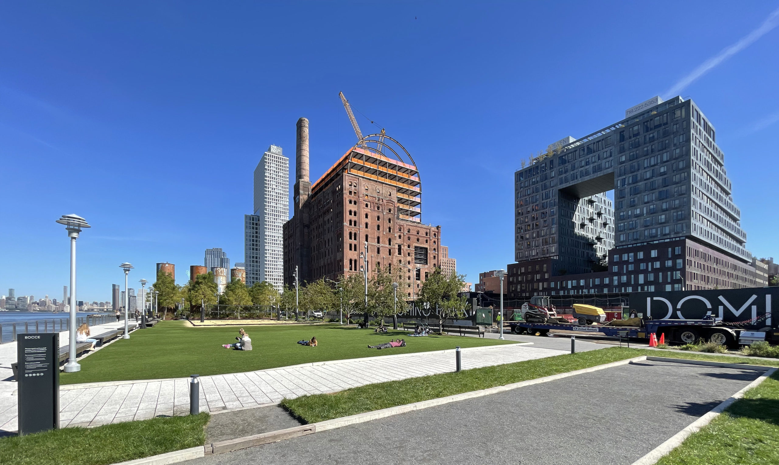
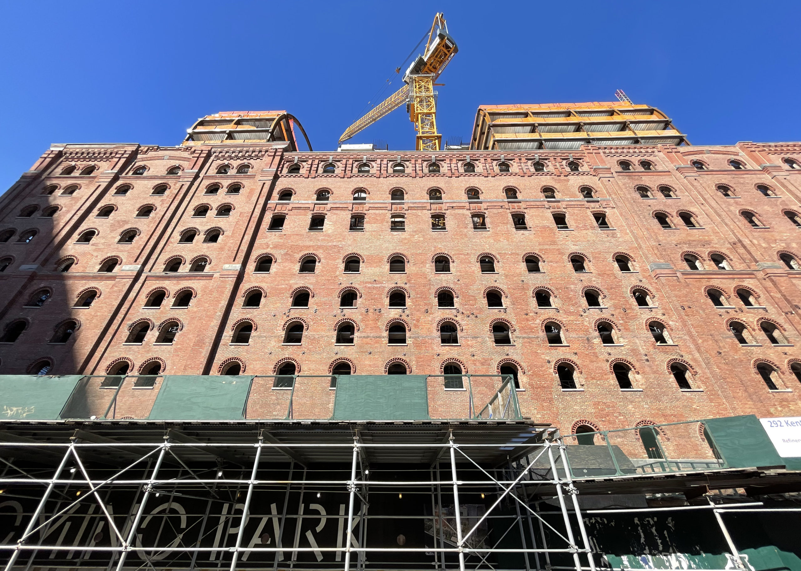
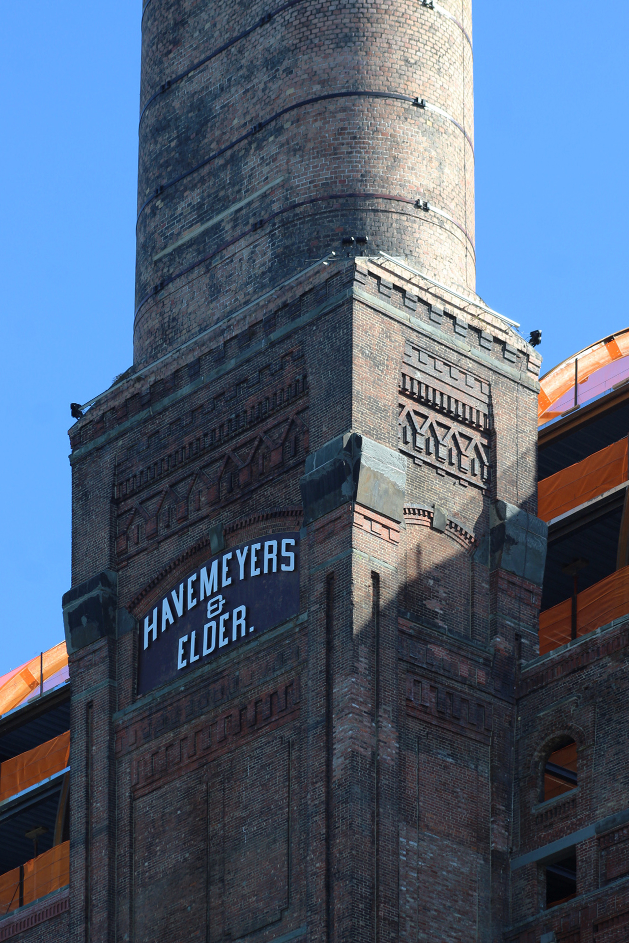
Construction has topped out on the barrel-vaulted extension for The Refinery, a commercial conversion and expansion of the 140-year-old Domino Sugar Refinery at 292 Kent Avenue in Williamsburg, Brooklyn. Designed by Practice for Architecture and Urbanism (PAU) and developed by Two Trees, the $250 million project involves the gut renovation of the former industrial facility and the construction of a 27,000-square-foot steel-framed, glass-clad addition that will bring the structure’s height to 235 feet. Dencityworks and Bonetti/Kozerski are the interior designers for the property, which represents the centerpiece of the Domino Sugar master plan by SHoP Architects and James Corner Field Operations along the East River waterfront to the west of Kent Avenue between South 2nd and South 3rd Streets.
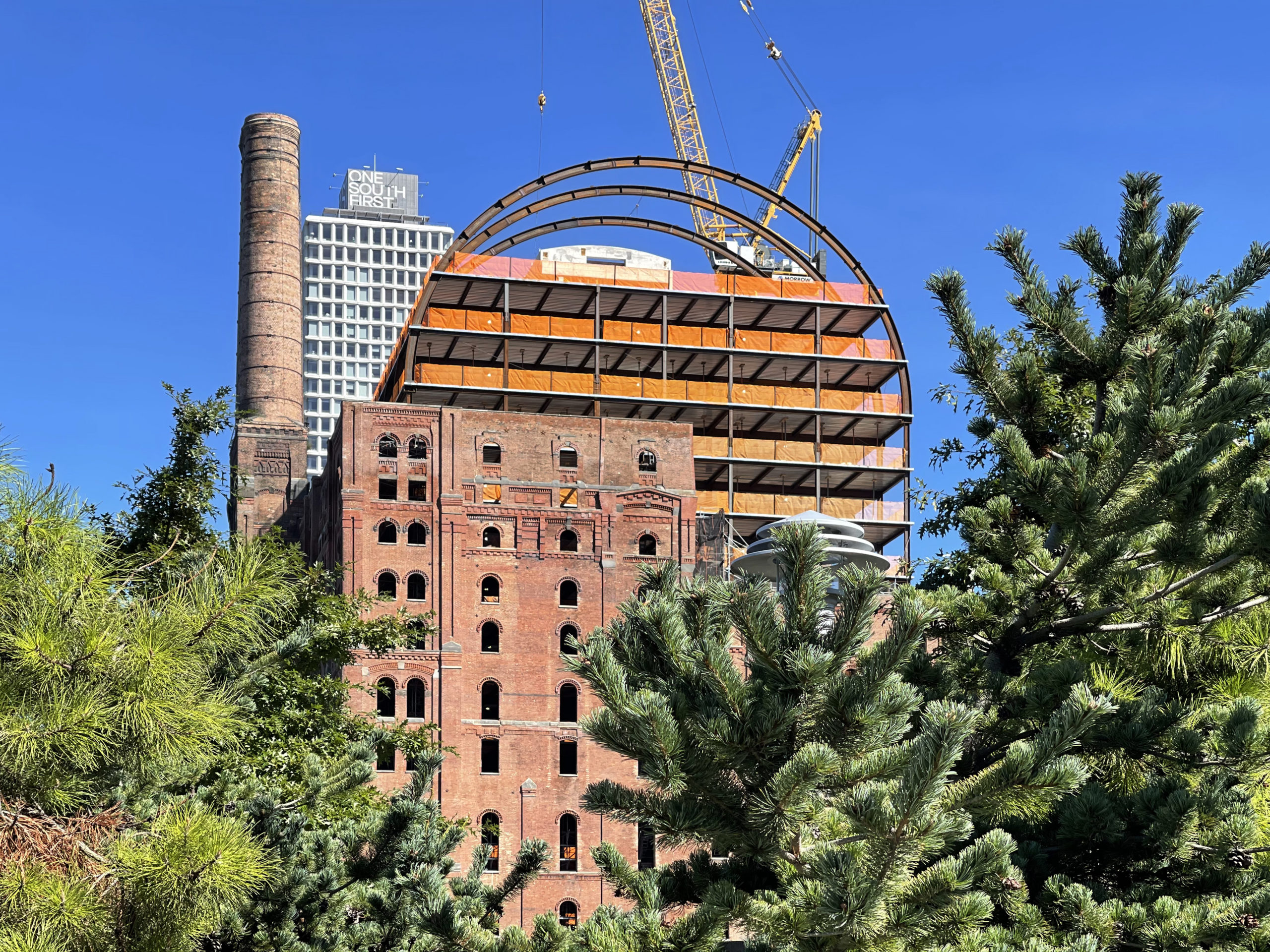
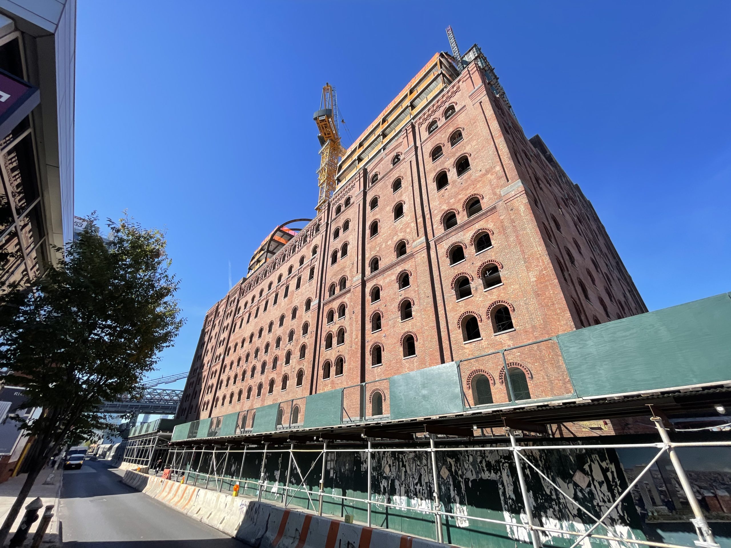
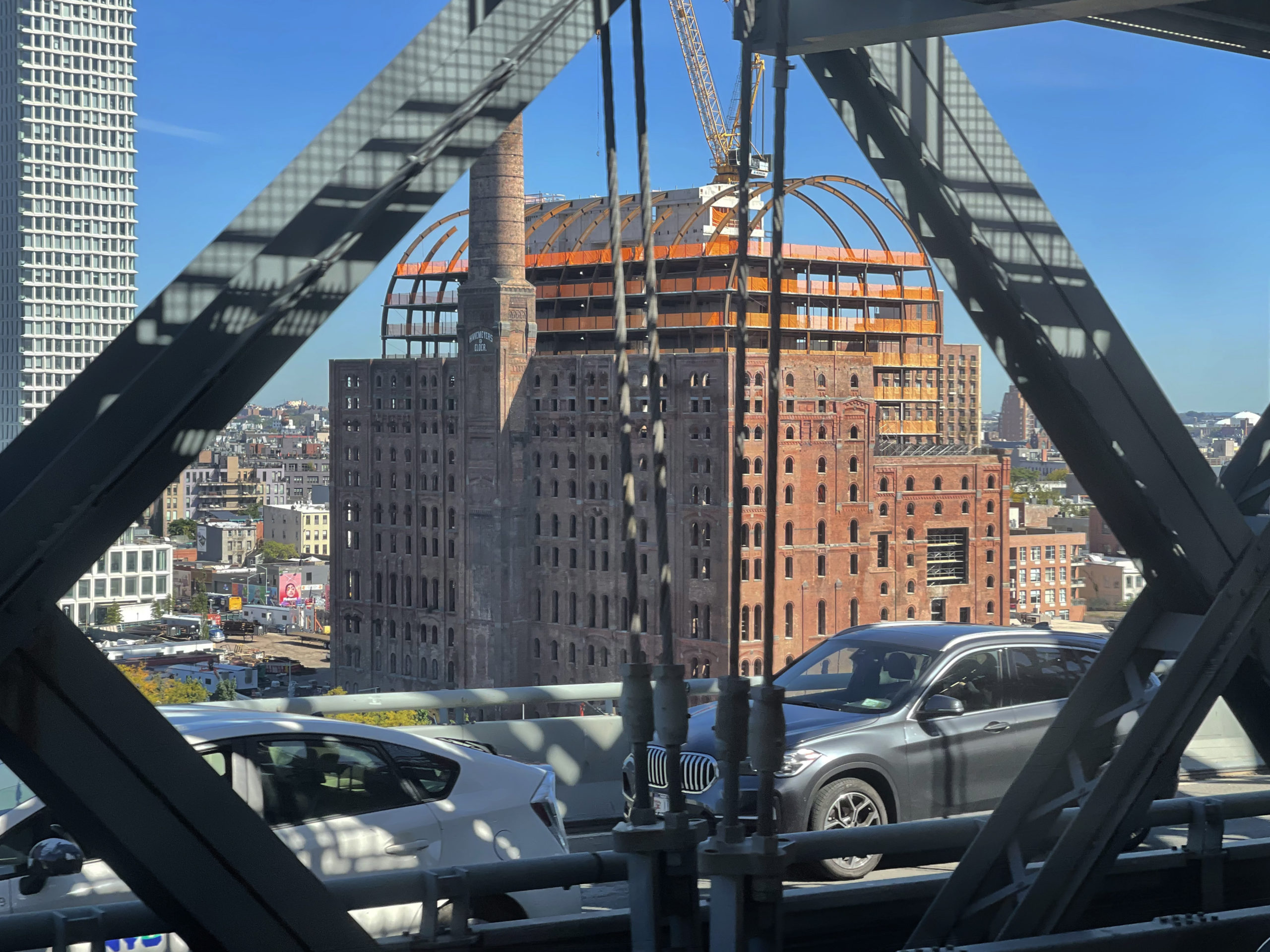
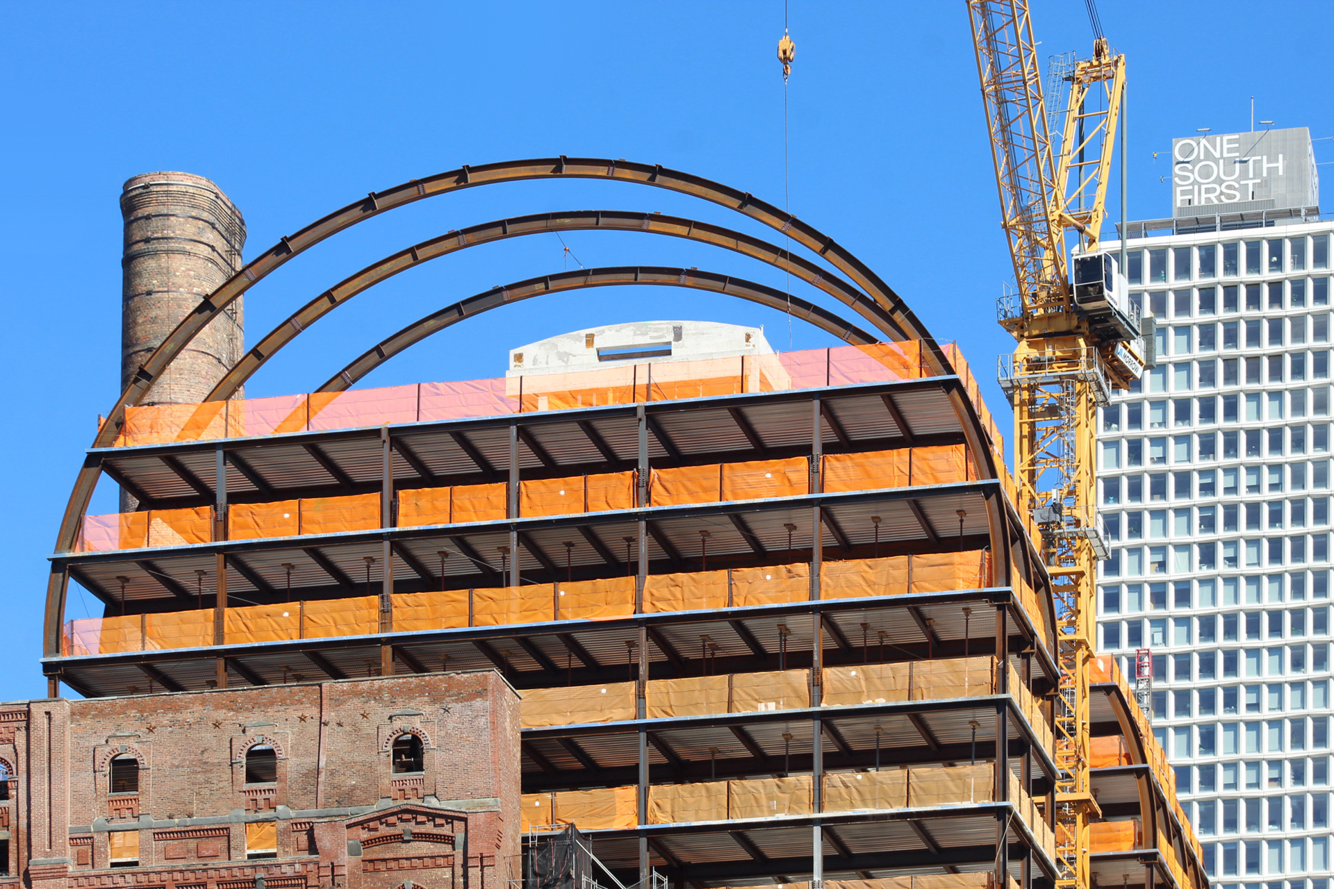
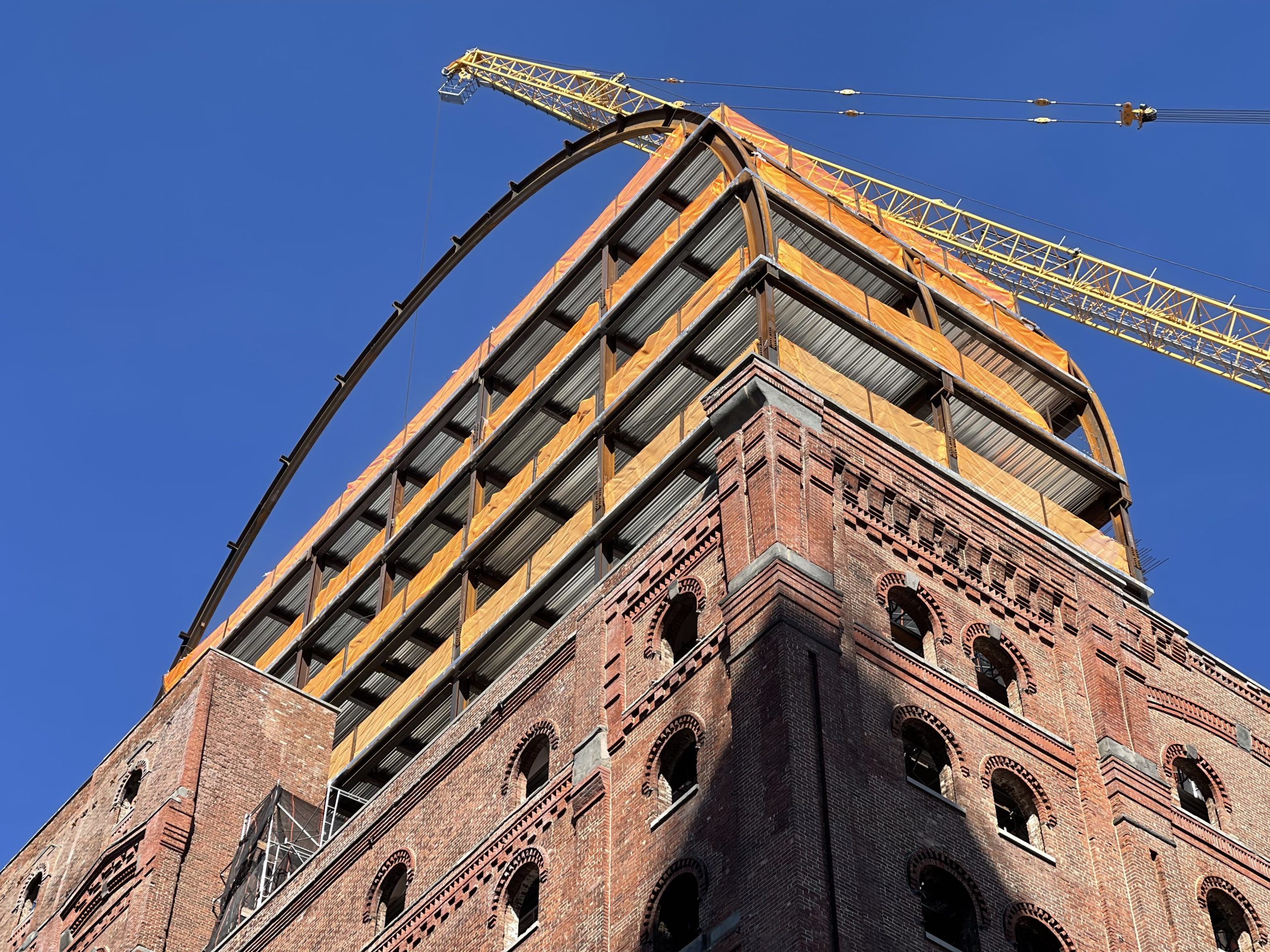
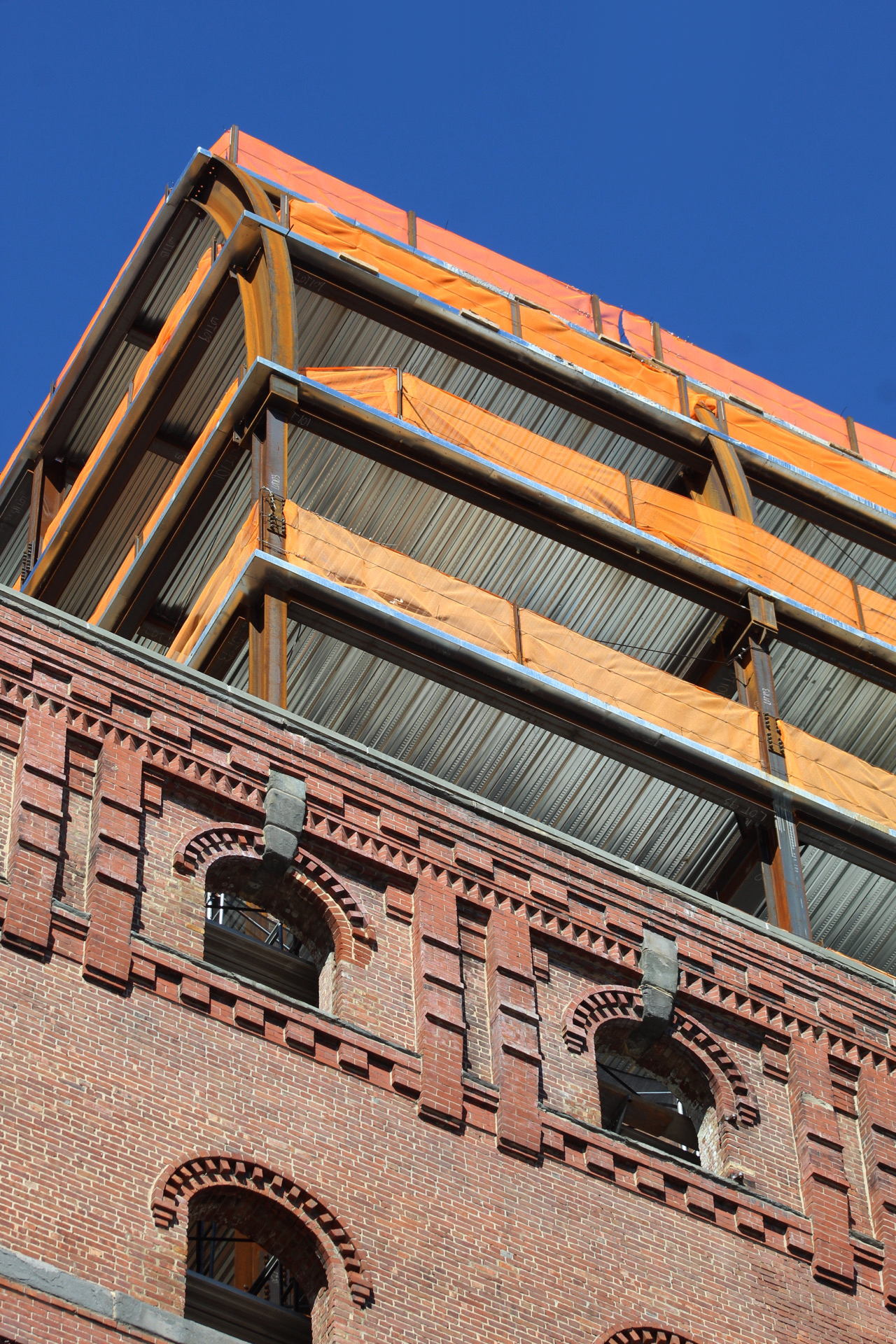
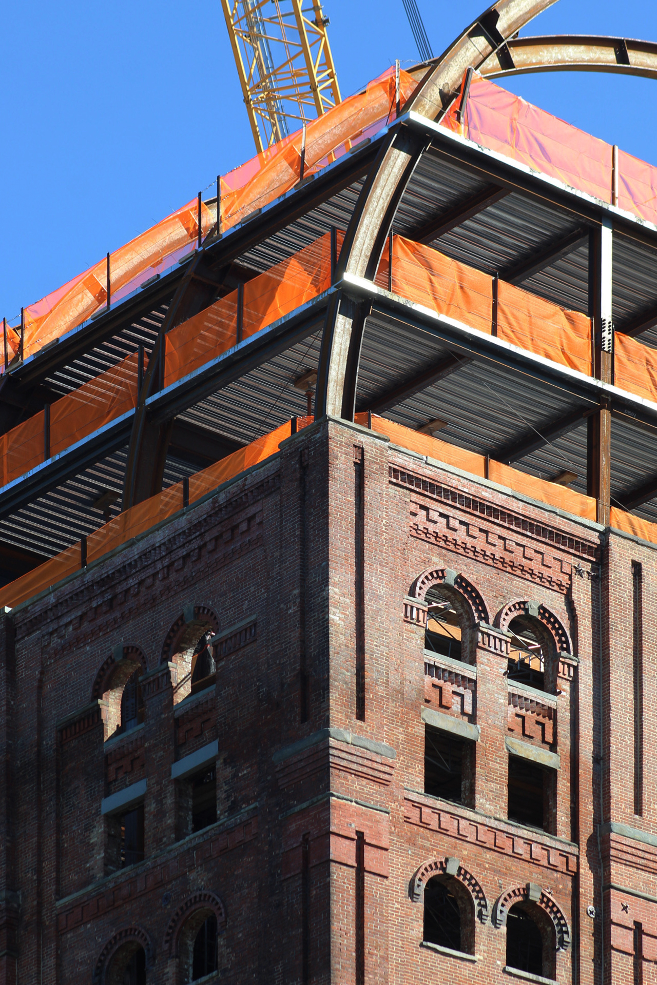
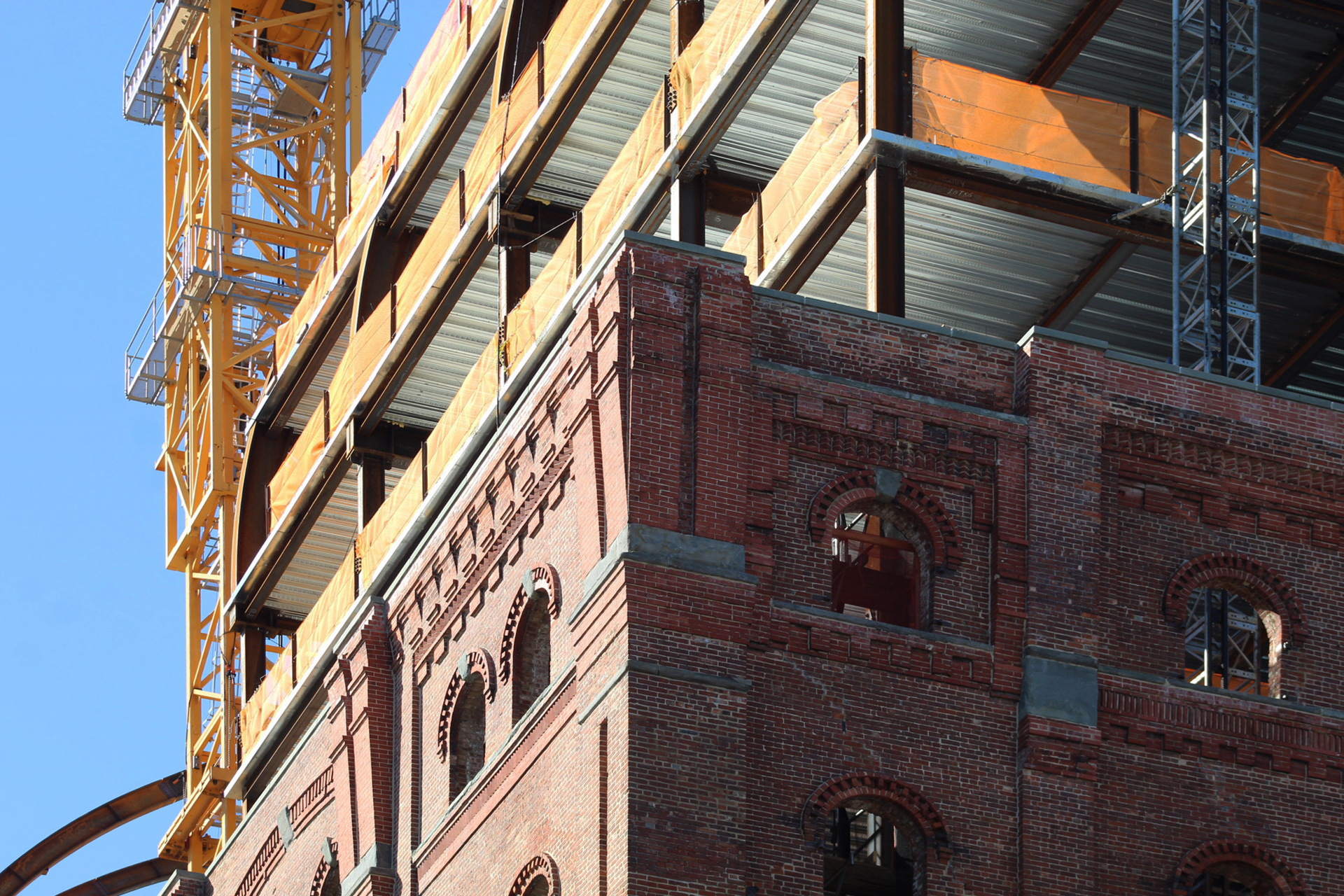
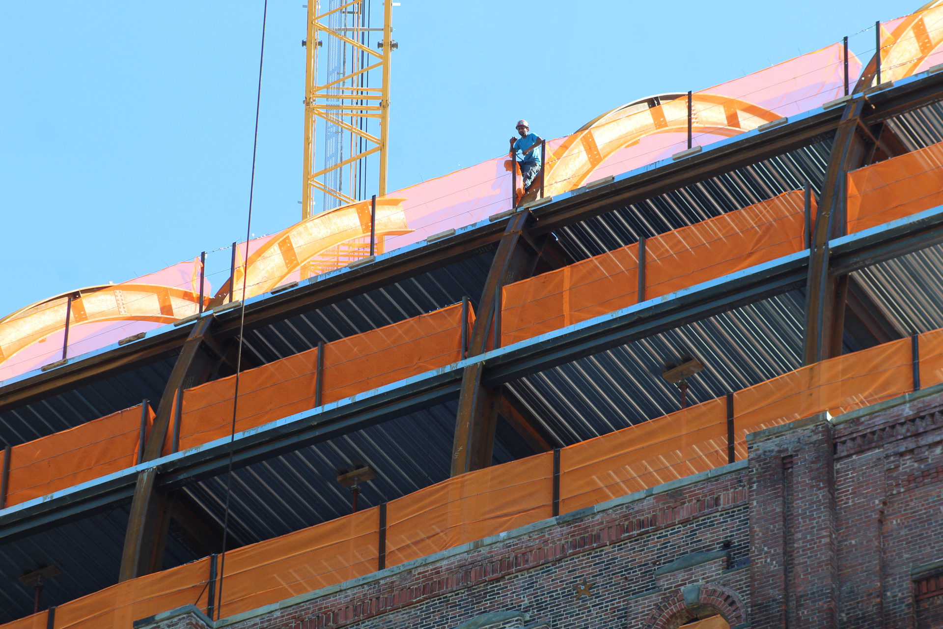
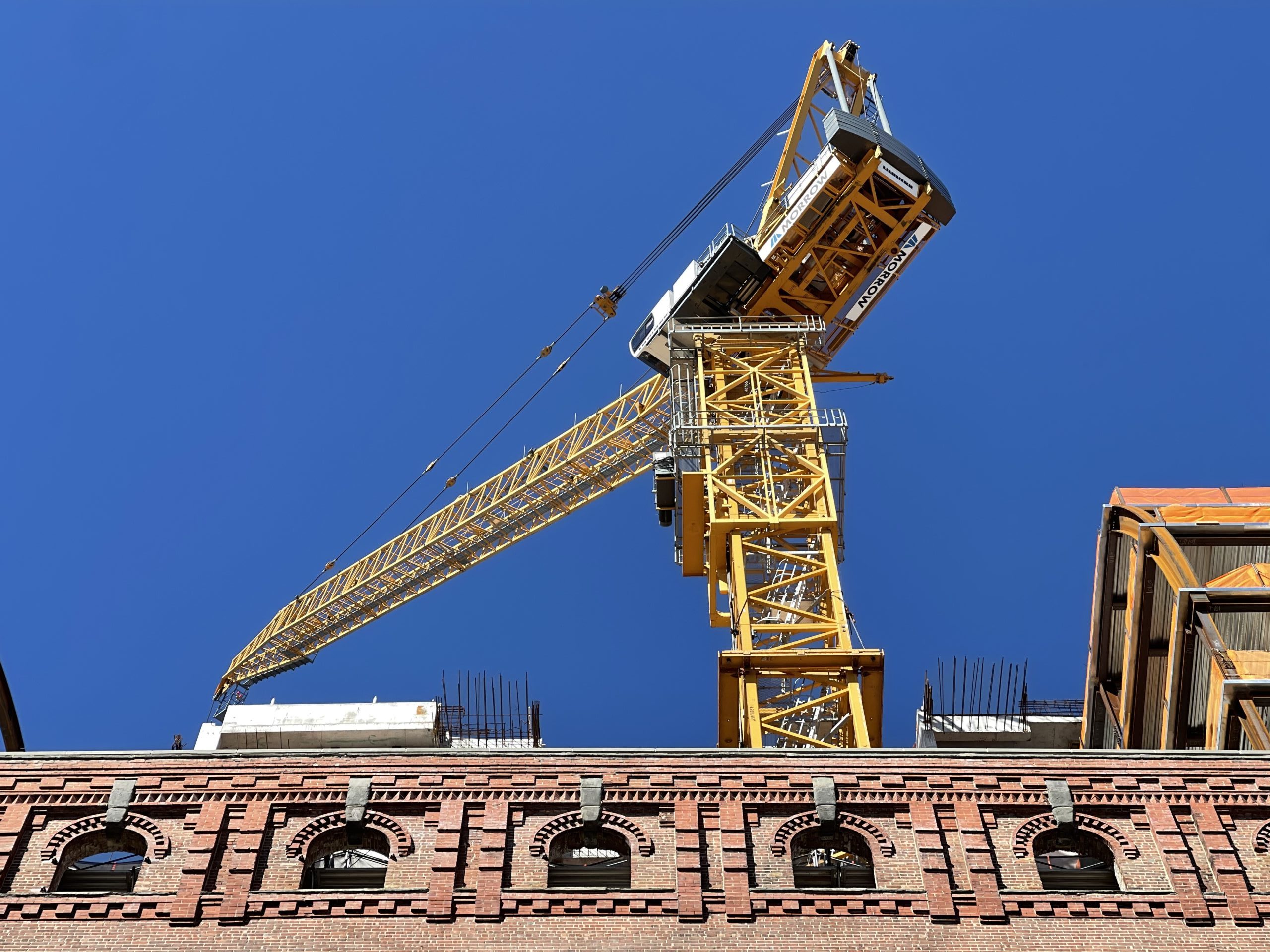
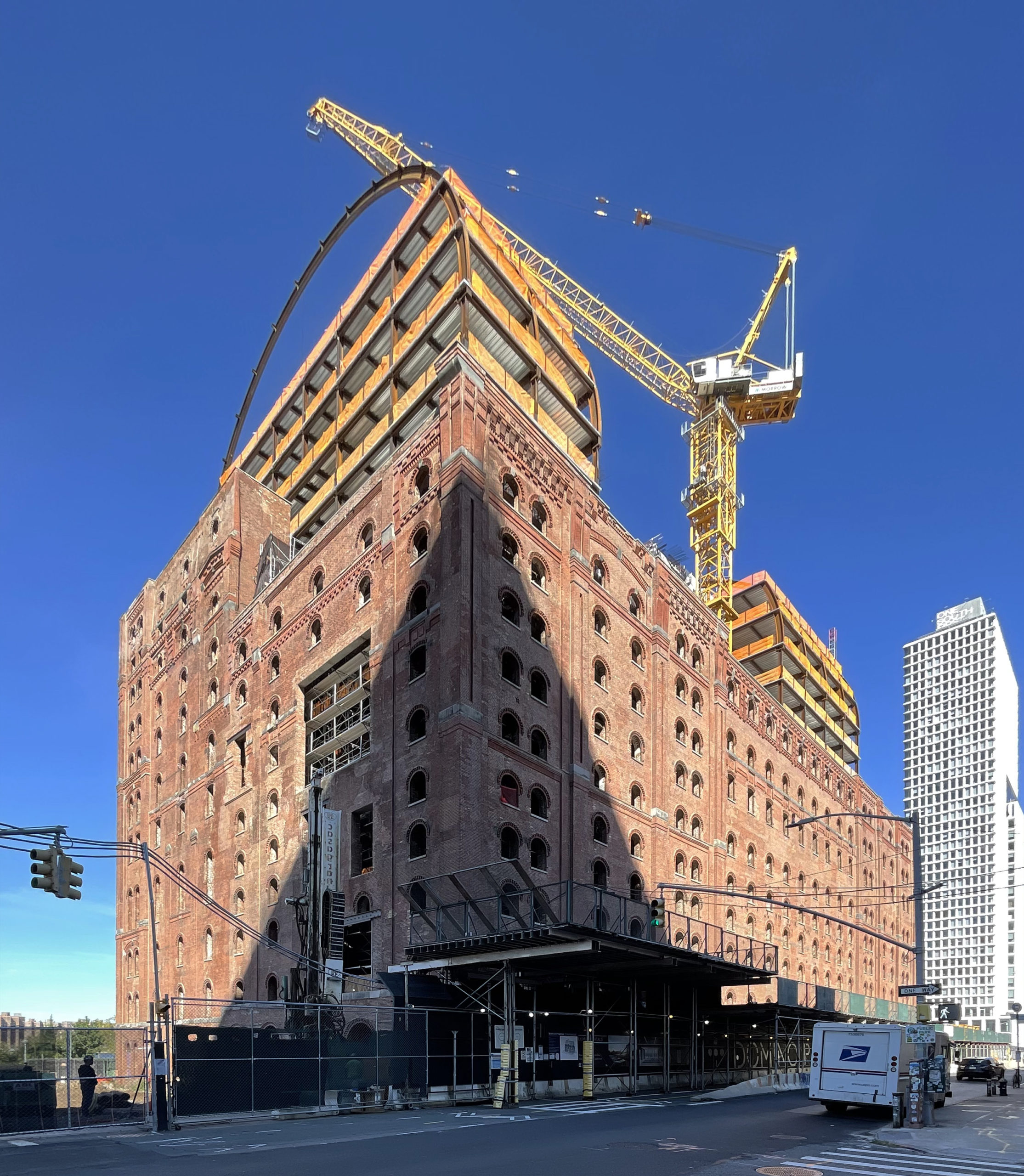
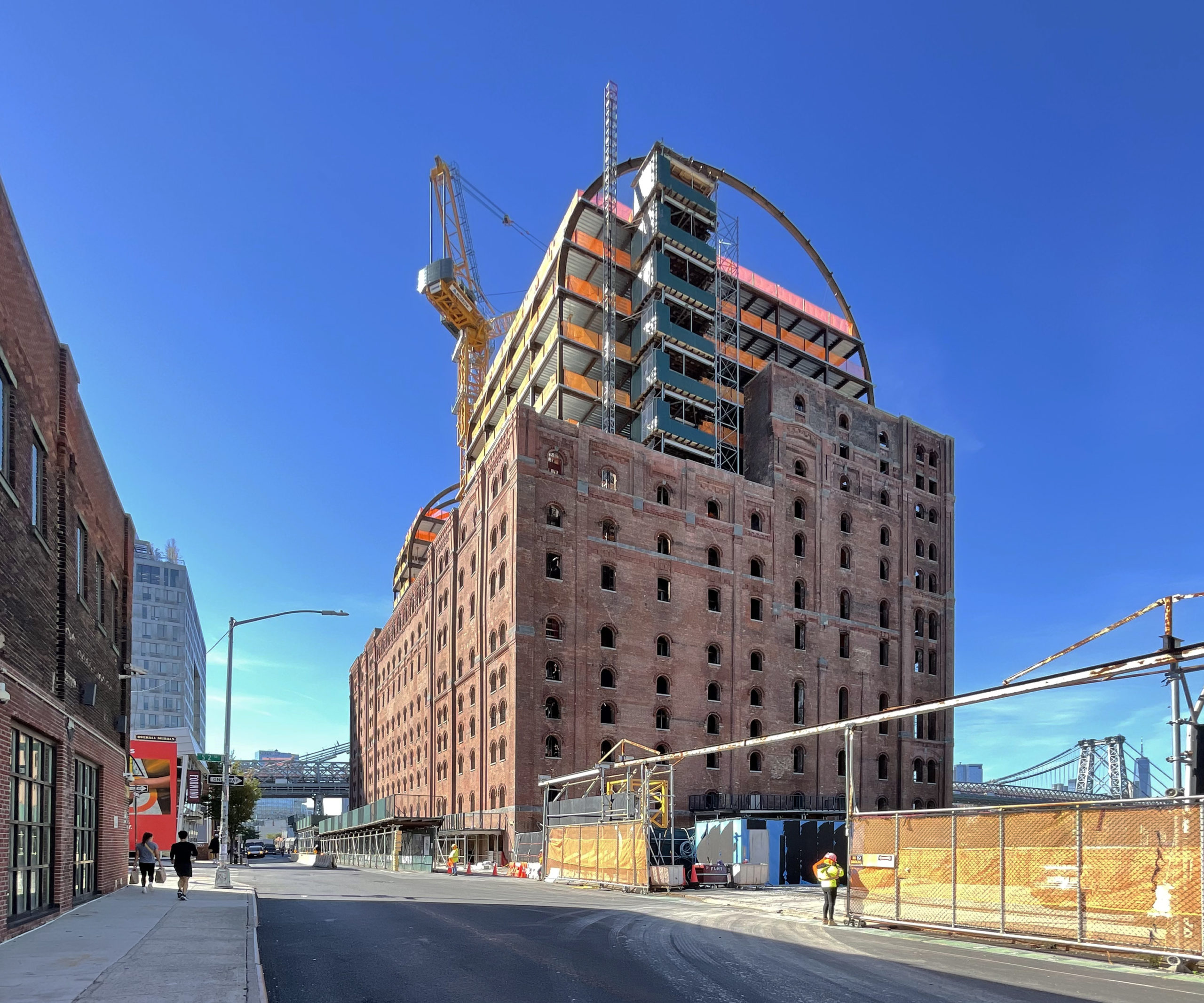
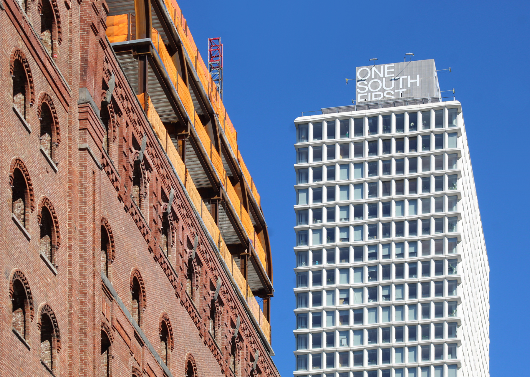
Work has progressed quickly on the addition since our last update in late August, when the steel-framed floors were just beginning to rise above the original parapet. Since then, construction concluded on the reinforced concrete core and most of the curved beams of the barrel vault have been put in place.
The temporary steel buttresses that formerly supported the brick walls on the northern, southern, and western elevations have been dismantled since our last visit. The construction elevator remains attached to the northern elevation.
A penthouse office space will occupy the top of the barrel vault and provide panoramic views of the Manhattan skyline.
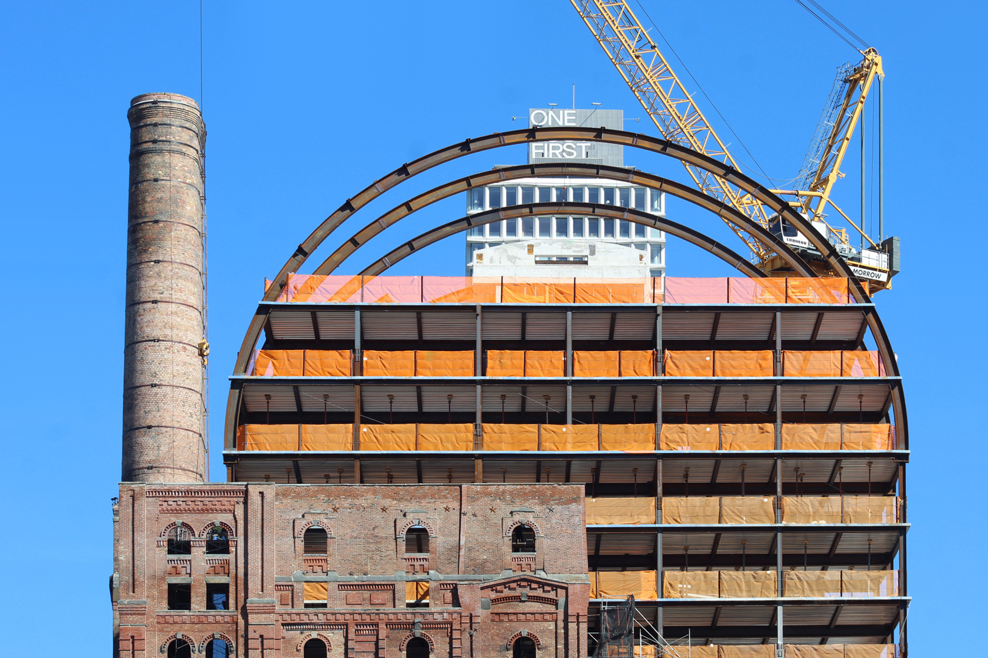
The following photo shows the structure’s proximity to One South First, COOKFOX‘s 45-story, 435-foot-tall residential tower that stands just to the north of the property within the Domino Park master plan. The complex will eventually be home to additional office space, market-rate and affordable housing, retail, and communal facilities.
292 Kent Avenue will feature 12 levels of office space, a 14th-floor event space with double-height ceilings, a catering kitchen, back-of-house areas, and ground-floor retail space.
The Refinery is estimated to be finished sometime next year.
Subscribe to YIMBY’s daily e-mail
Follow YIMBYgram for real-time photo updates
Like YIMBY on Facebook
Follow YIMBY’s Twitter for the latest in YIMBYnews


Looking good
So far, I think the addition compliments the refinery pretty well. I’m interested to see how it ultimately looks with the glass curtain wall, though.
I hope it does look as transparent as it does in the renderings and not reflective like those seen on those ugly residential glass boxes
The building has a lot of levels office space, and vaulted having many different with its floors below. The design was full of beautiful openings in a brick color, so it can be proved from photos to wrapped in a particular addition: Thanks to Michael Young.
“Market rate affordable housing” is a bit of an oxymoron
What part of “And” don’t you understand?
Not sure why the top is curved. Probably added a fortune to construction costs.
Because it looks extremely cool.
Would you rather it be a glass box that everyone here complains about everytime its done? No pleasing you.
So very glad this is finally happening. Reserving judgement about the very large curved addition until finished.
I’ll take it..Just make sure to put the “Domino Sugar” sign back !
LPC requirement so there’s no getting out of it. Not sure why they’d want to, the sign is iconic.
I think we might see it get installed sometime next year and can’t wait to see it!