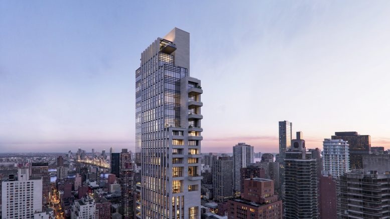
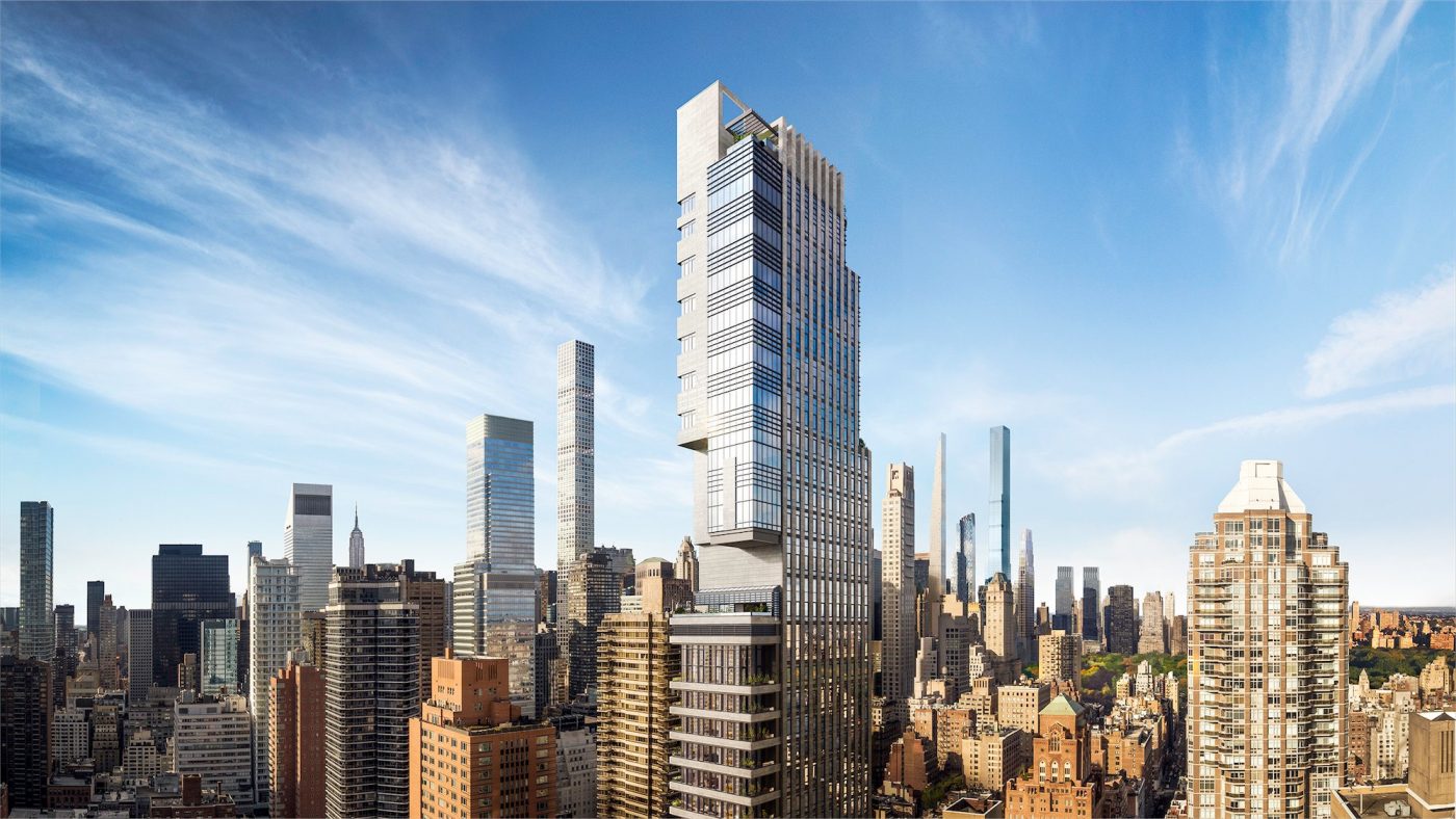
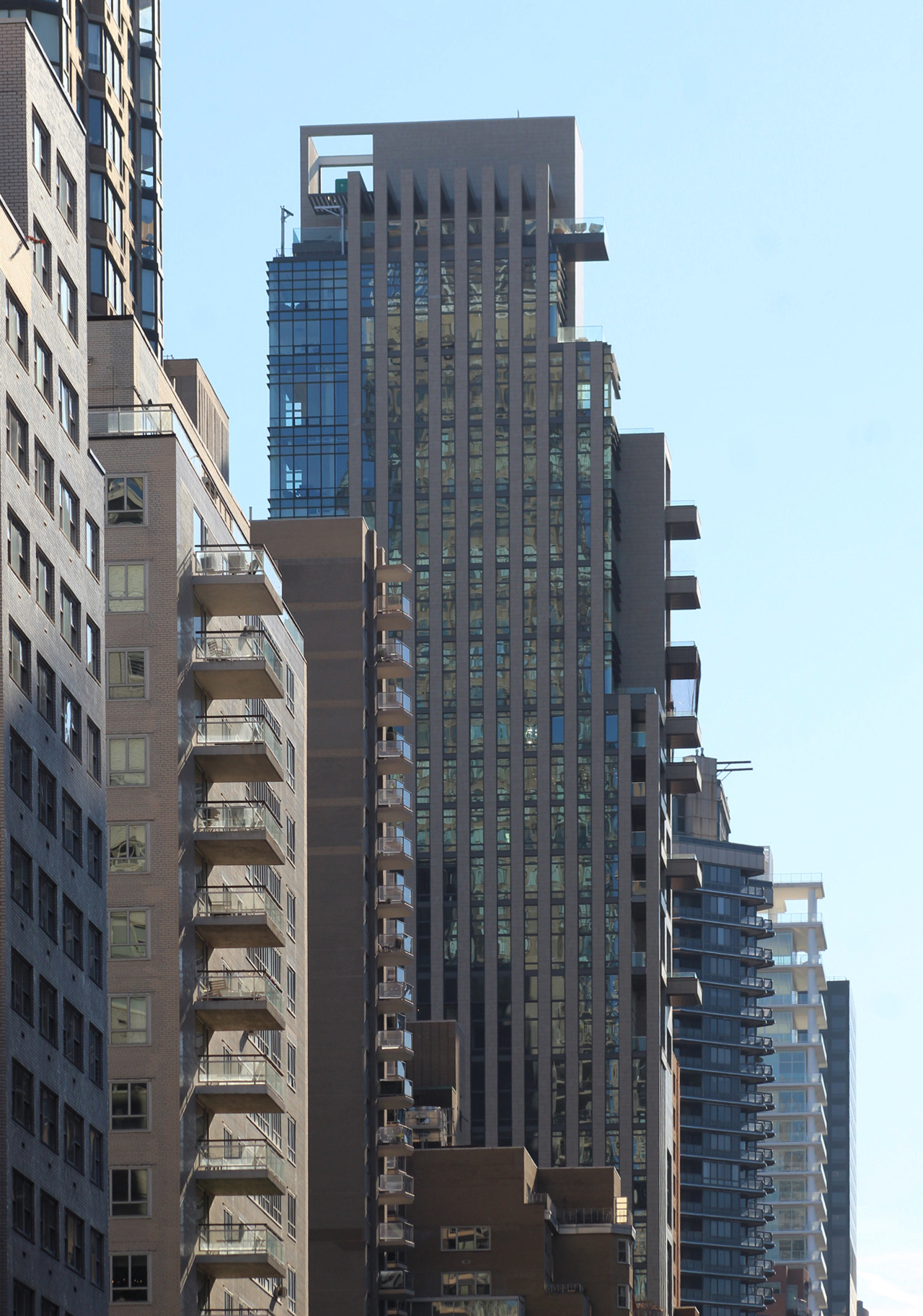
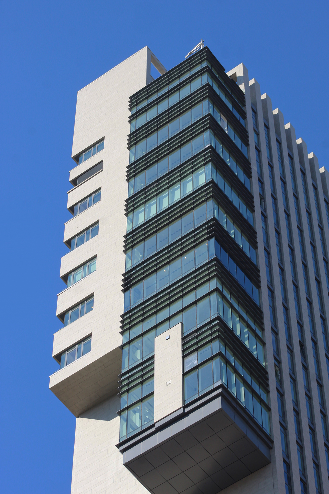
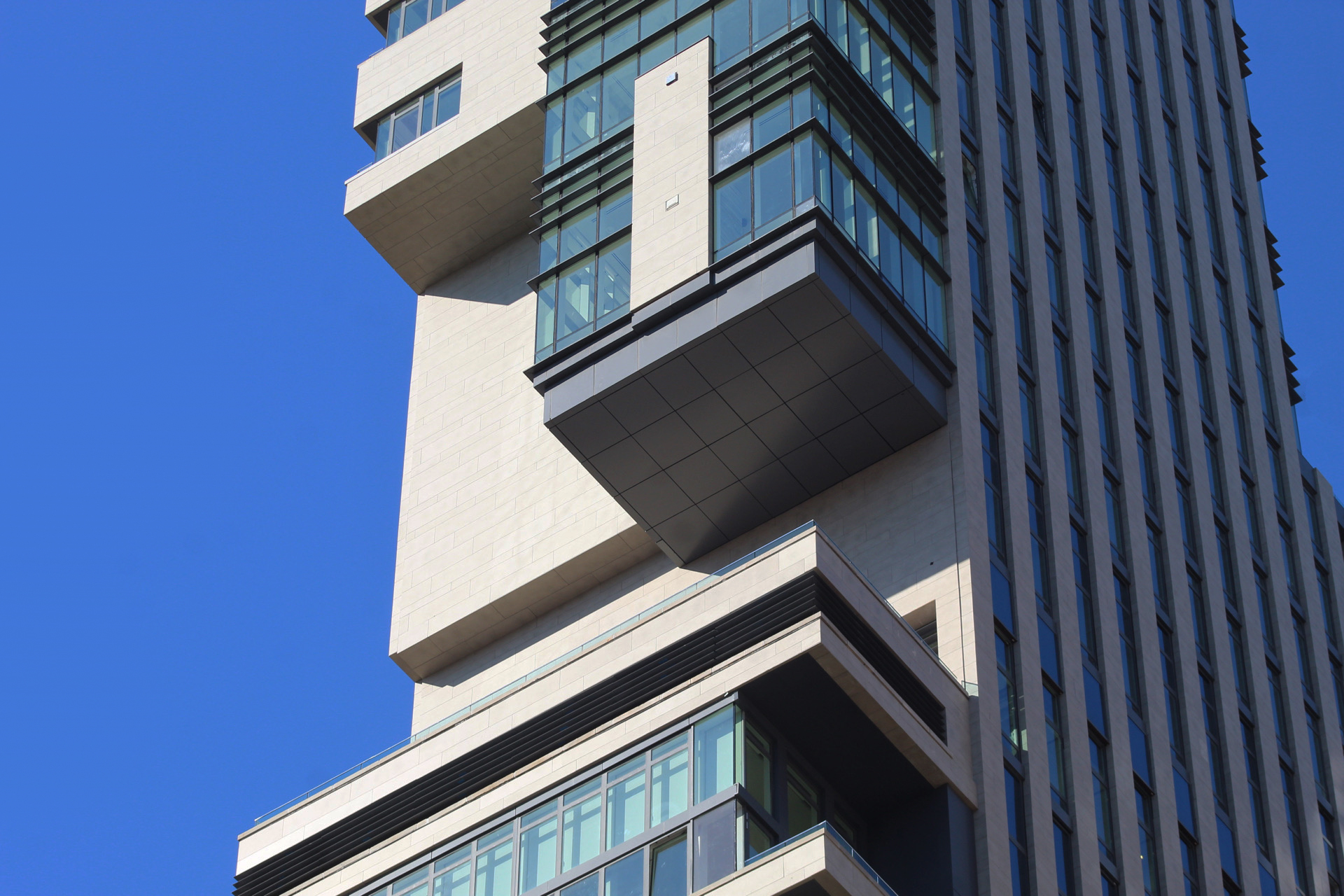
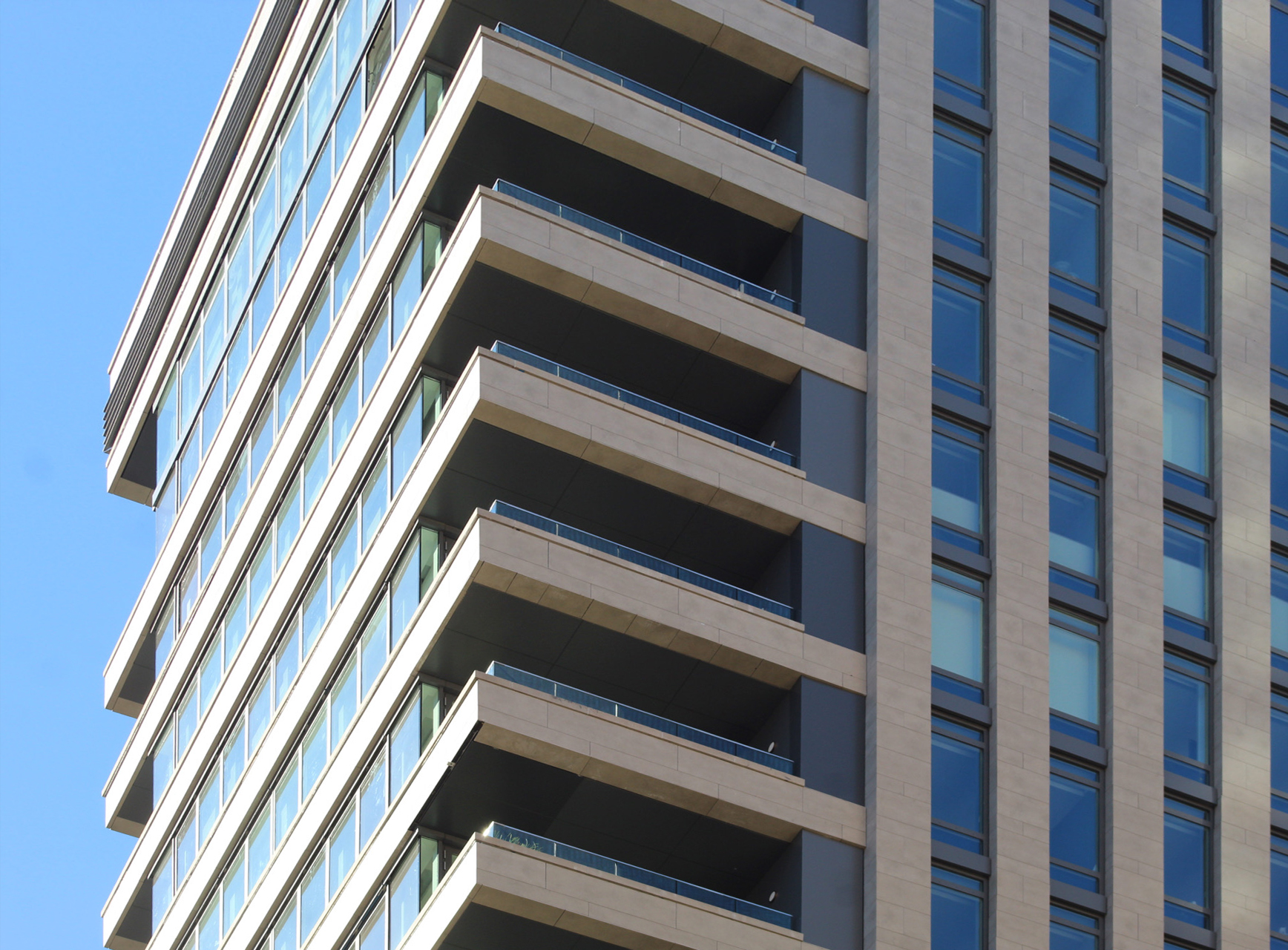
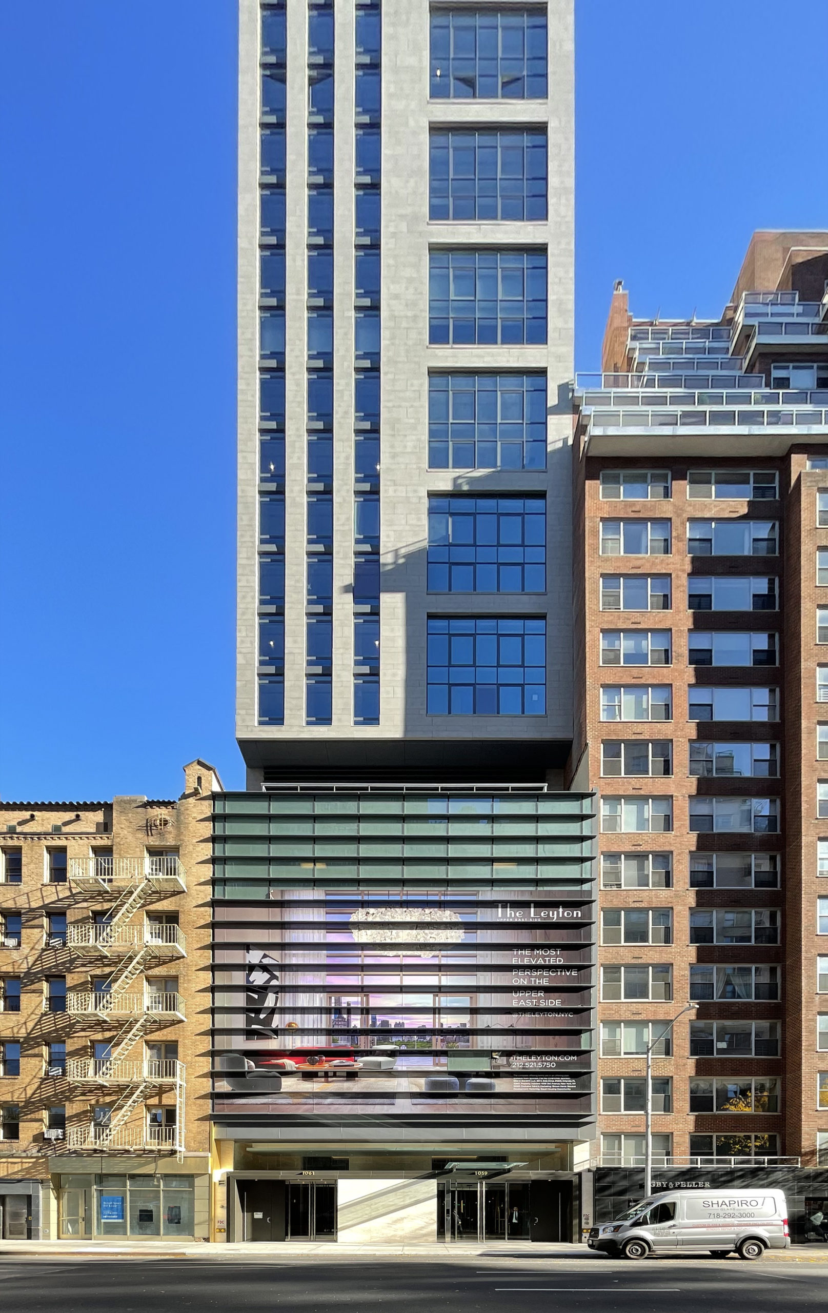
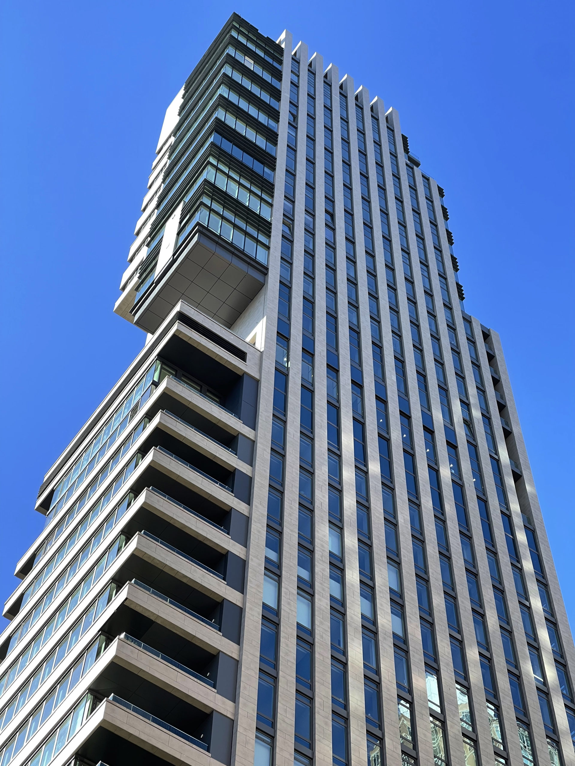
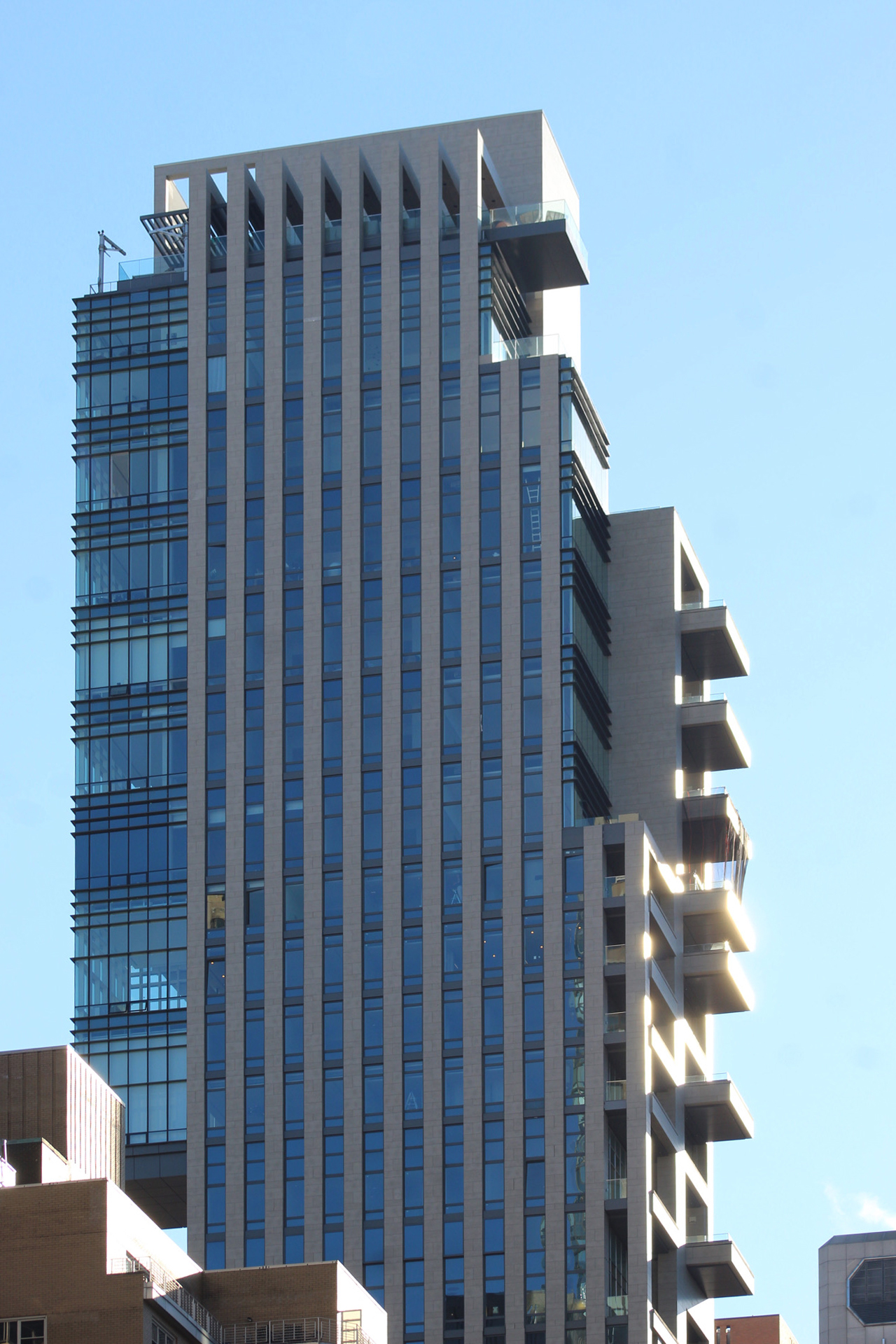
Construction is now complete on The Leyton, a 30-story residential tower at 1059 Third Avenue on Manhattan’s Upper East Side. Designed by Manuel Glas Architects and developed by Dart Interests and Real Estate Inverlad, the 481-foot-tall structure spans 127,000 square feet and will yield 38 condominium units with interior design by Frampton Co. and Champalimaud Design. The residential program includes ten full-floor homes and one duplex penthouse. Brown Harris Stevens Development Marketing is leading sales and marketing for the property, which is located by the intersection of Third Avenue and East 63rd Street.
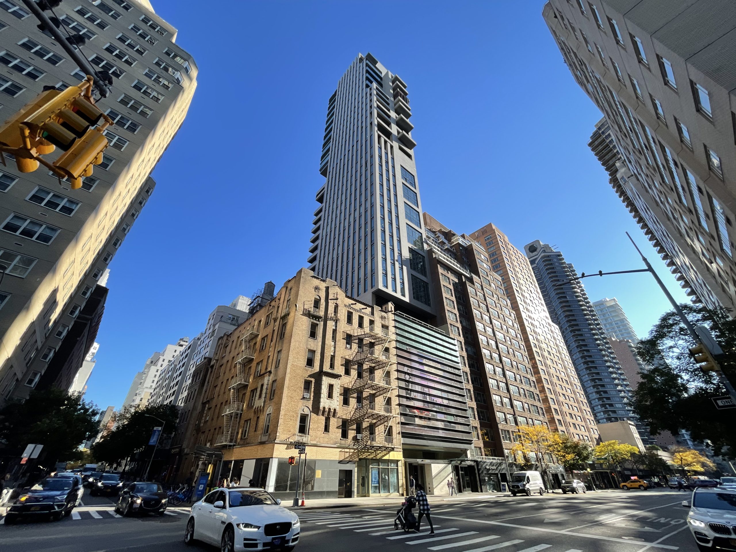
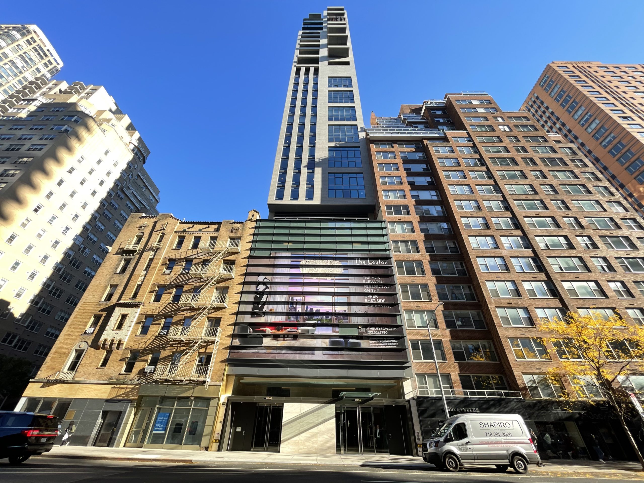
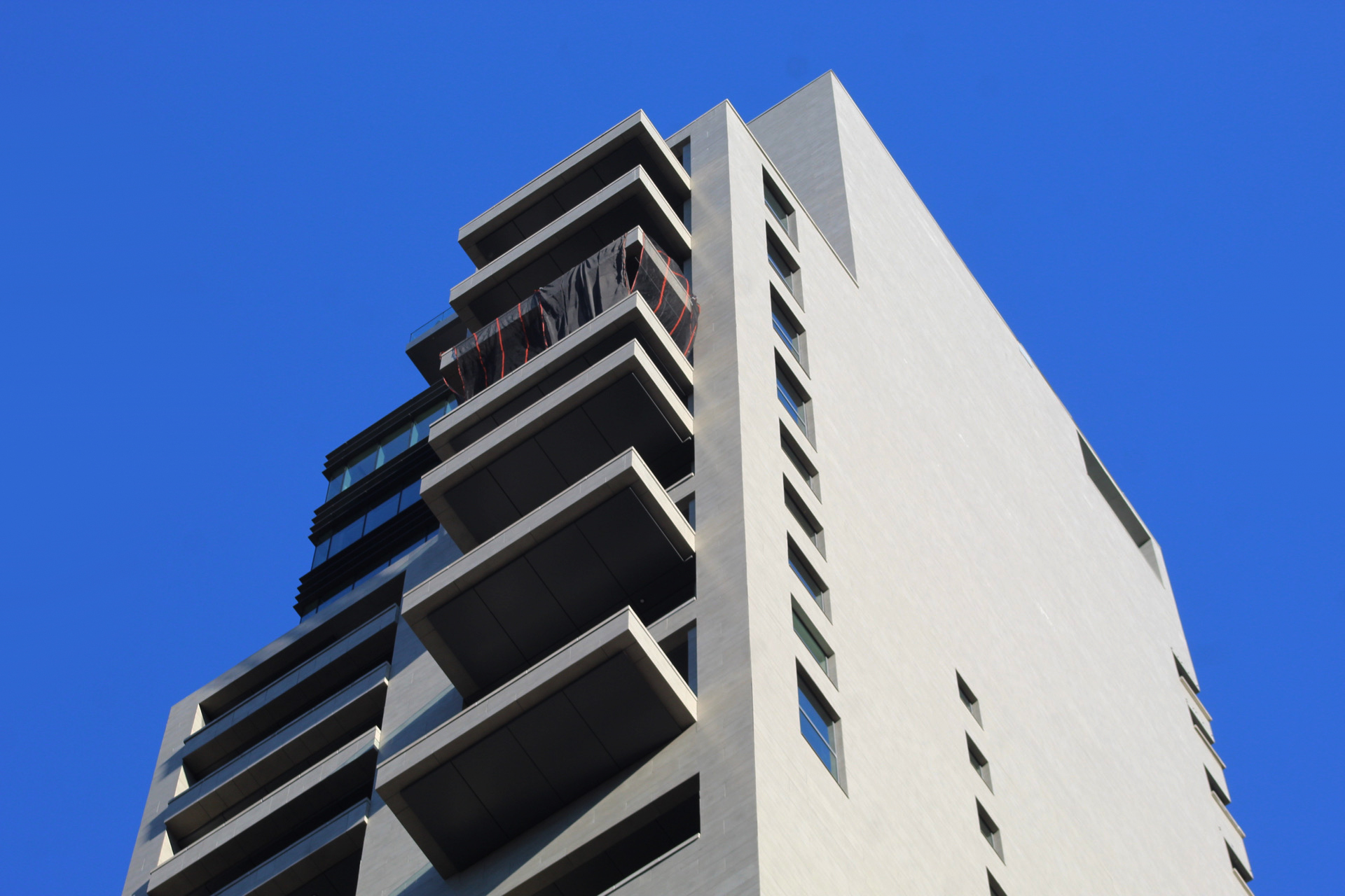
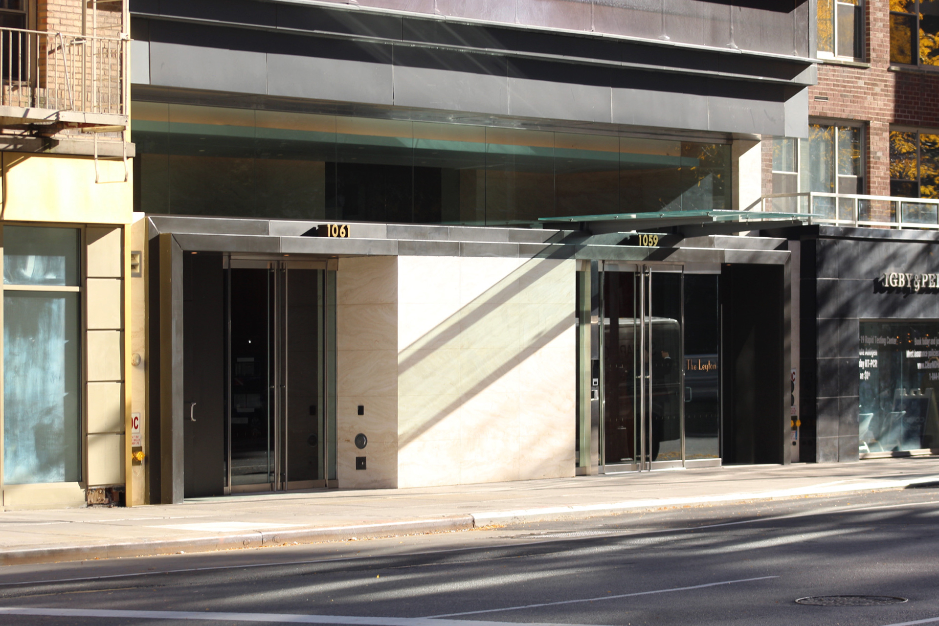
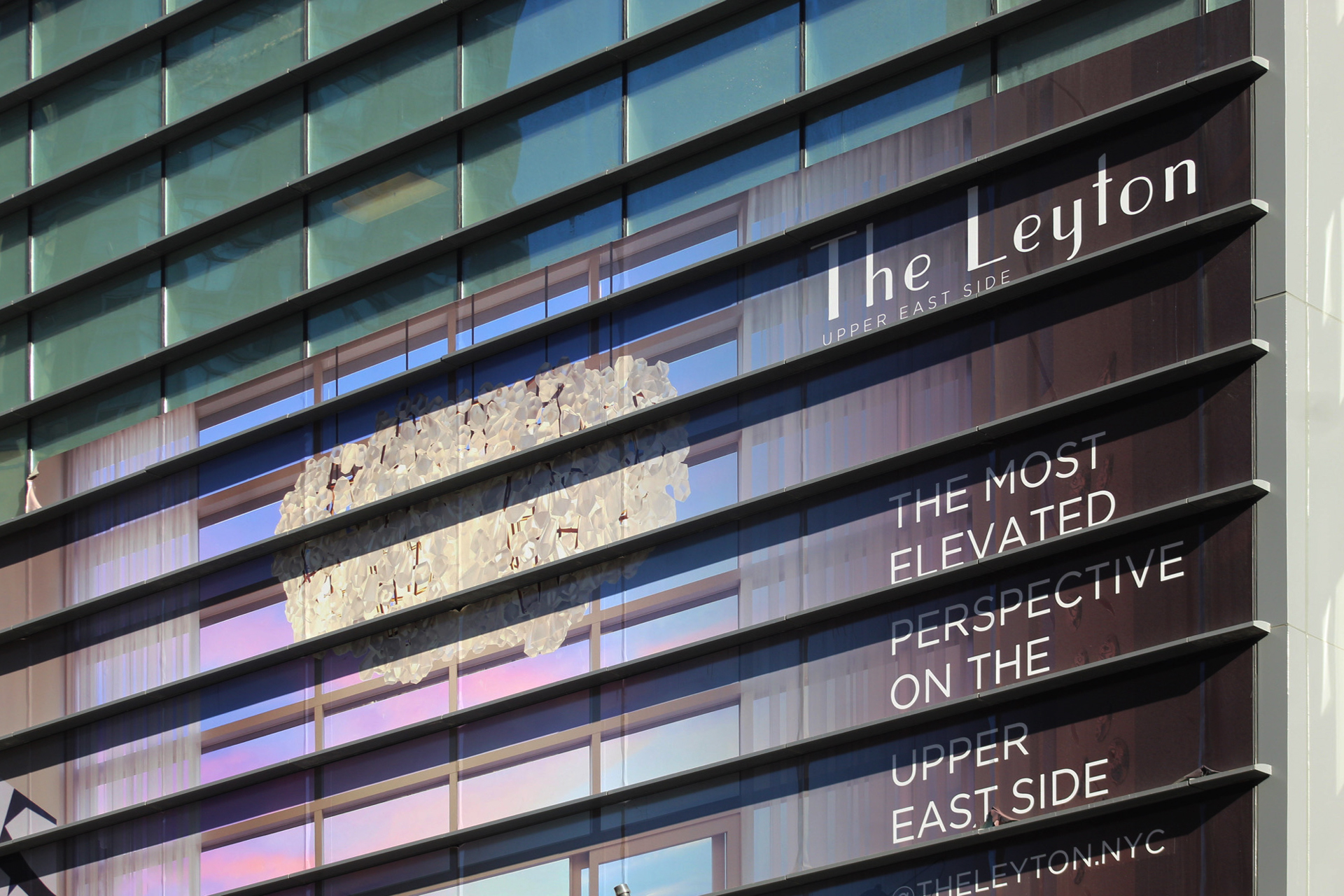
Since our last update in April, work has concluded on the ground floor and on the stacked balconies on the rear elevation. The sidewalk scaffolding has been removed, revealing the completed look of the frontage. The building features two separate entrances, with the residential doors marked with the address 1059. Above, the multi-story podium is wrapped with an advertisement for the penthouse unit.
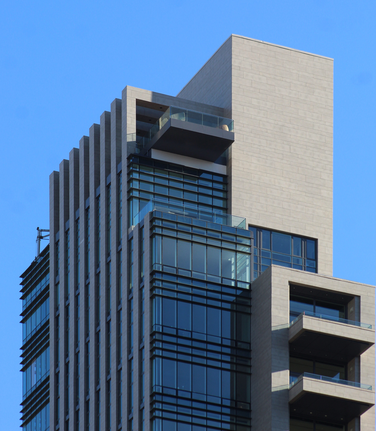
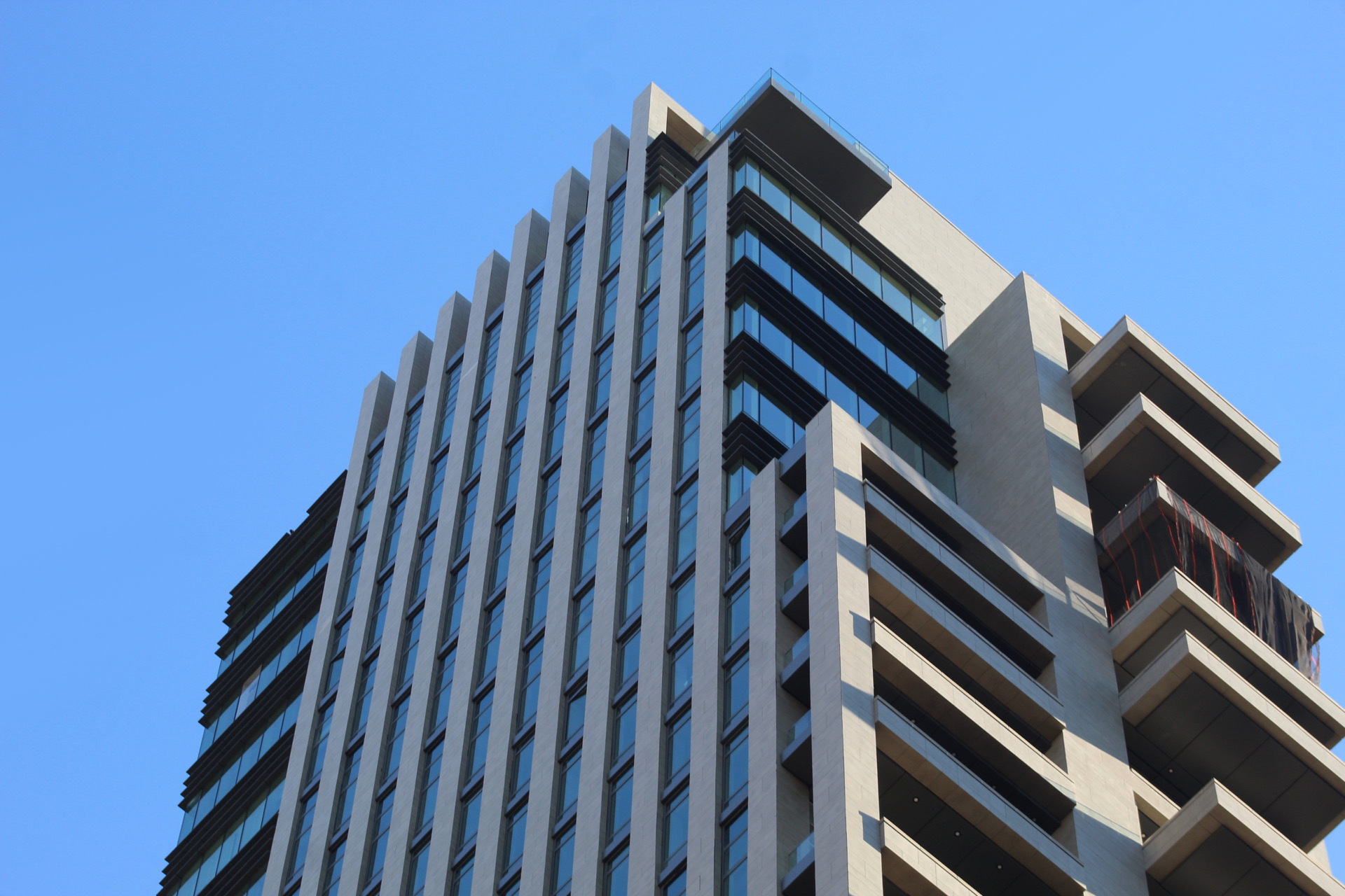
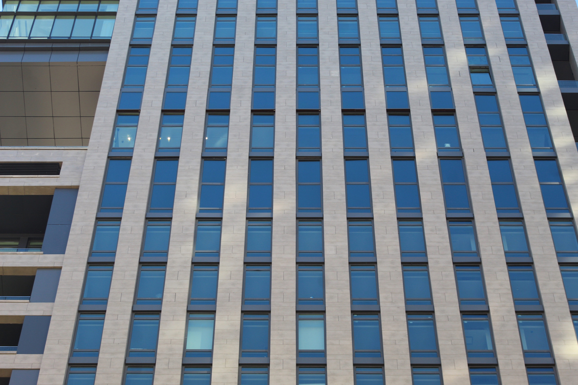
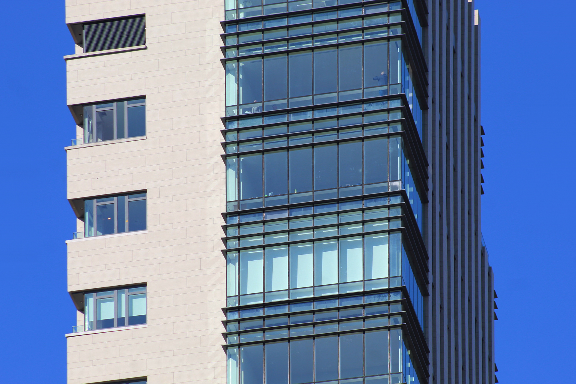
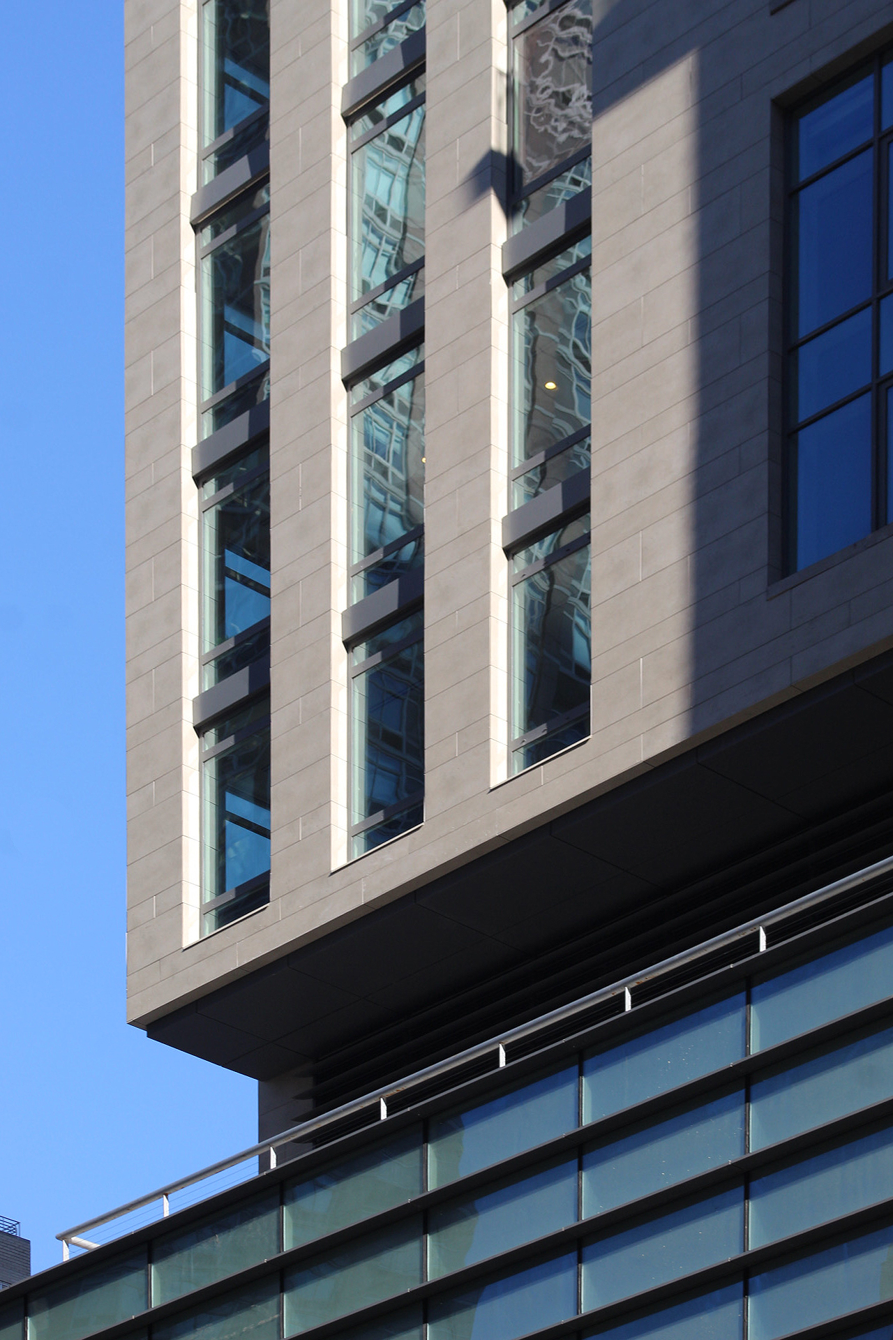
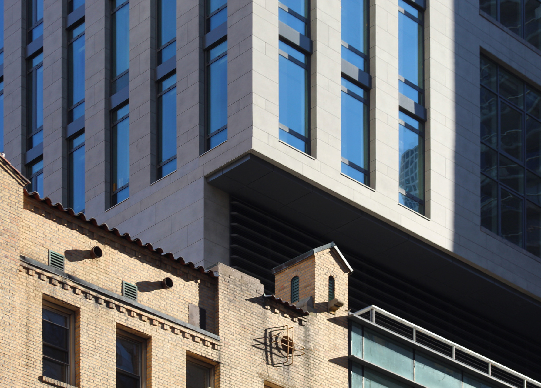
Below are additional photographs of the façade taken in the morning and afternoon lighting.
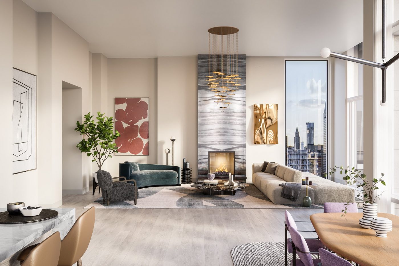
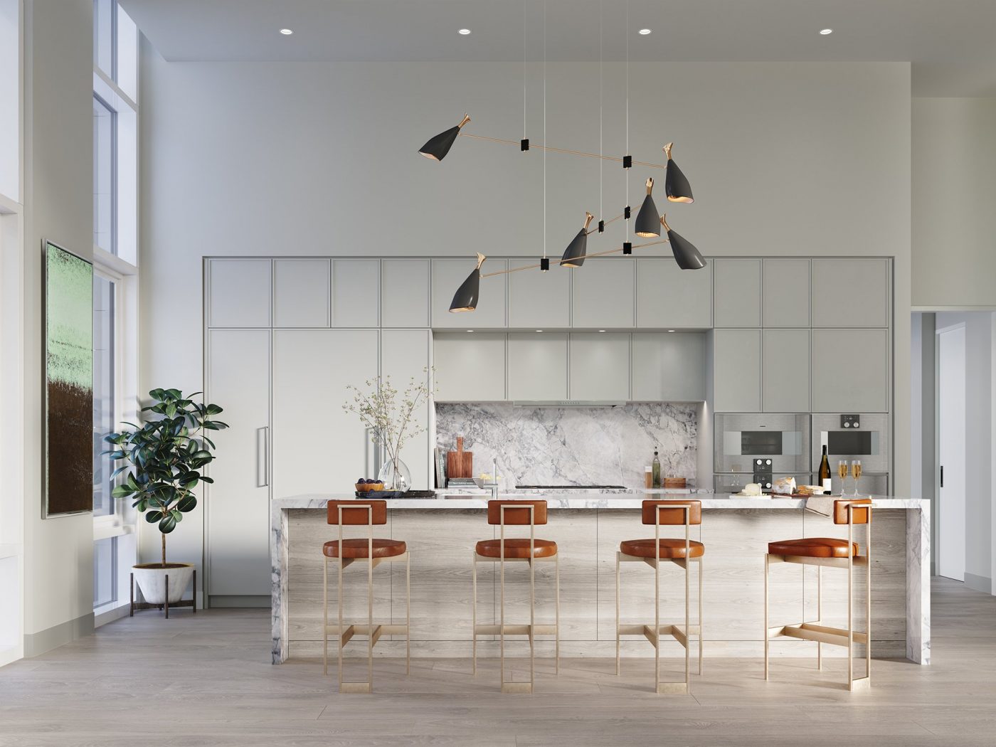
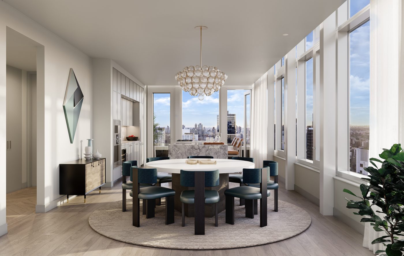
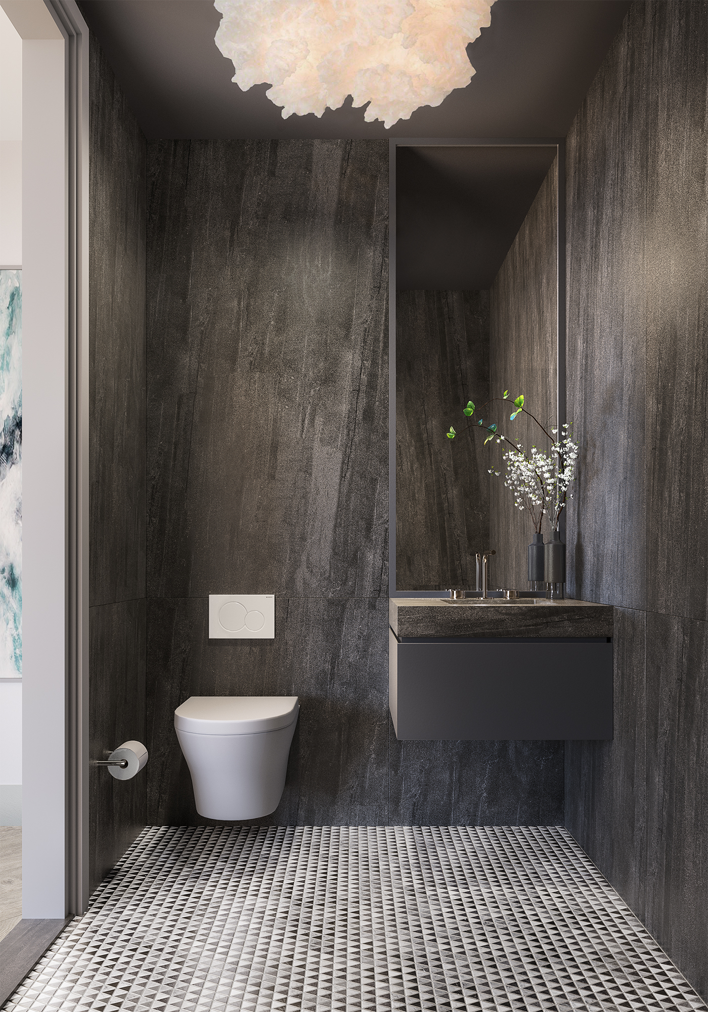
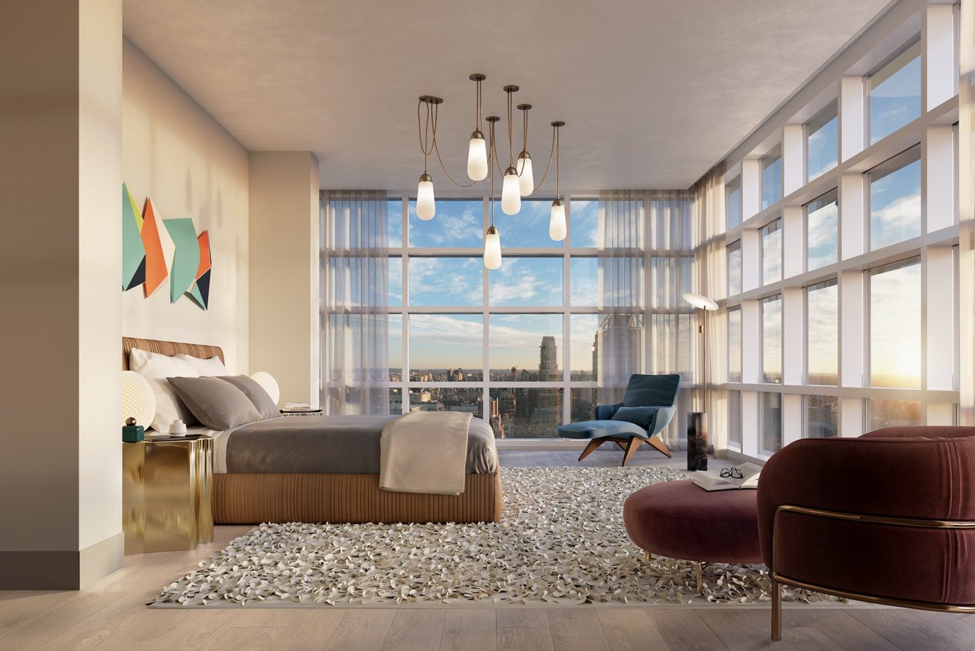
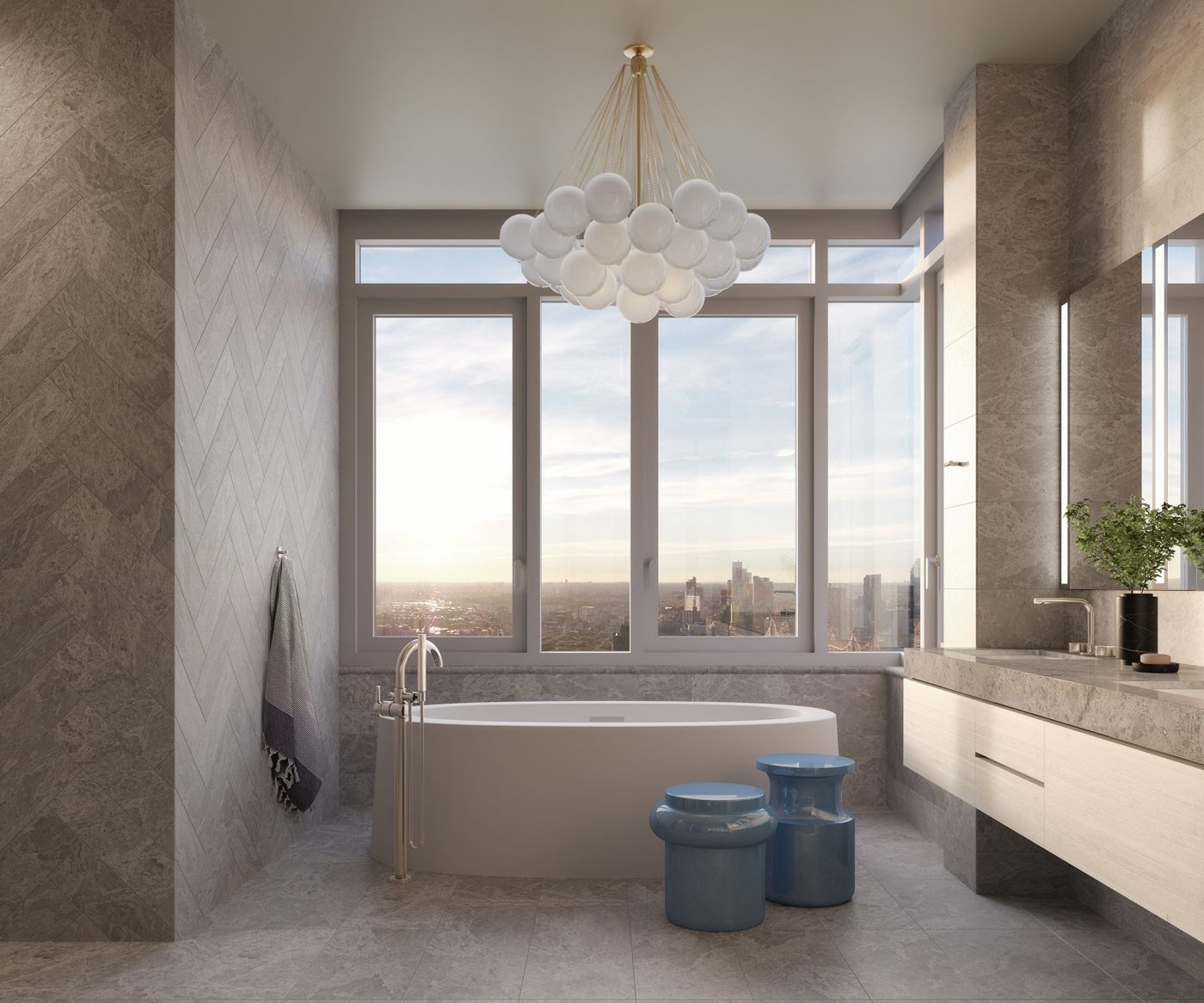
The condominium units are fitted out with hydronic radiant-heated floors, bespoke air systems, high ceilings, and open kitchen layouts with custom Poggenpohl cabinetry. Select units feature glass doors opening to private terraces. Primary bedrooms include walk-in wardrobes and en-suite primary bathrooms, and secondary baths come with a Belice Acero feature wall and Dover Caliza sand gray accent tiles.
Upper units will provide panoramic views of the Upper East Side, Central Park, the East River, and the Midtown skyline, as well as sunrise and sunset exposures.
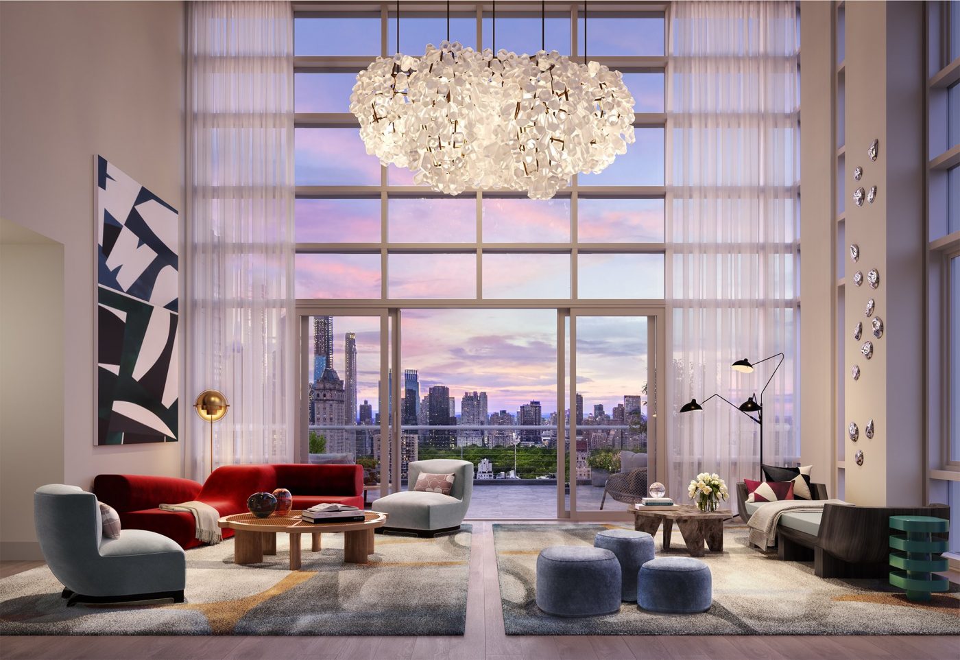
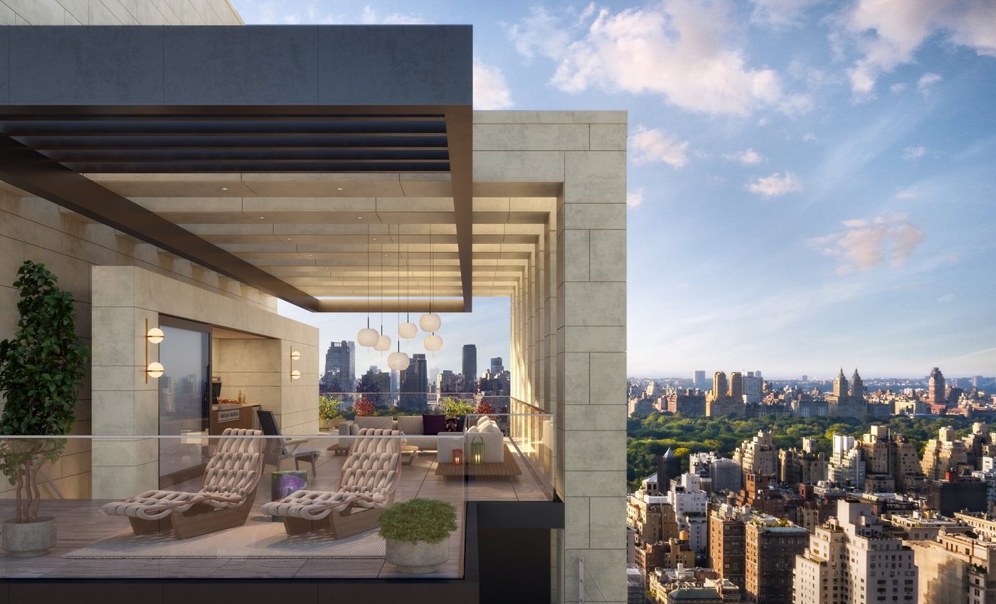
The most coveted home is the duplex penthouse at the Leyton’s pinnacle. This home features a double-height great room that opens to an outdoor terrace overlooking Central Park. There is also a private elevator providing access to a rooftop deck complete with an outdoor kitchen and even higher views of the city.
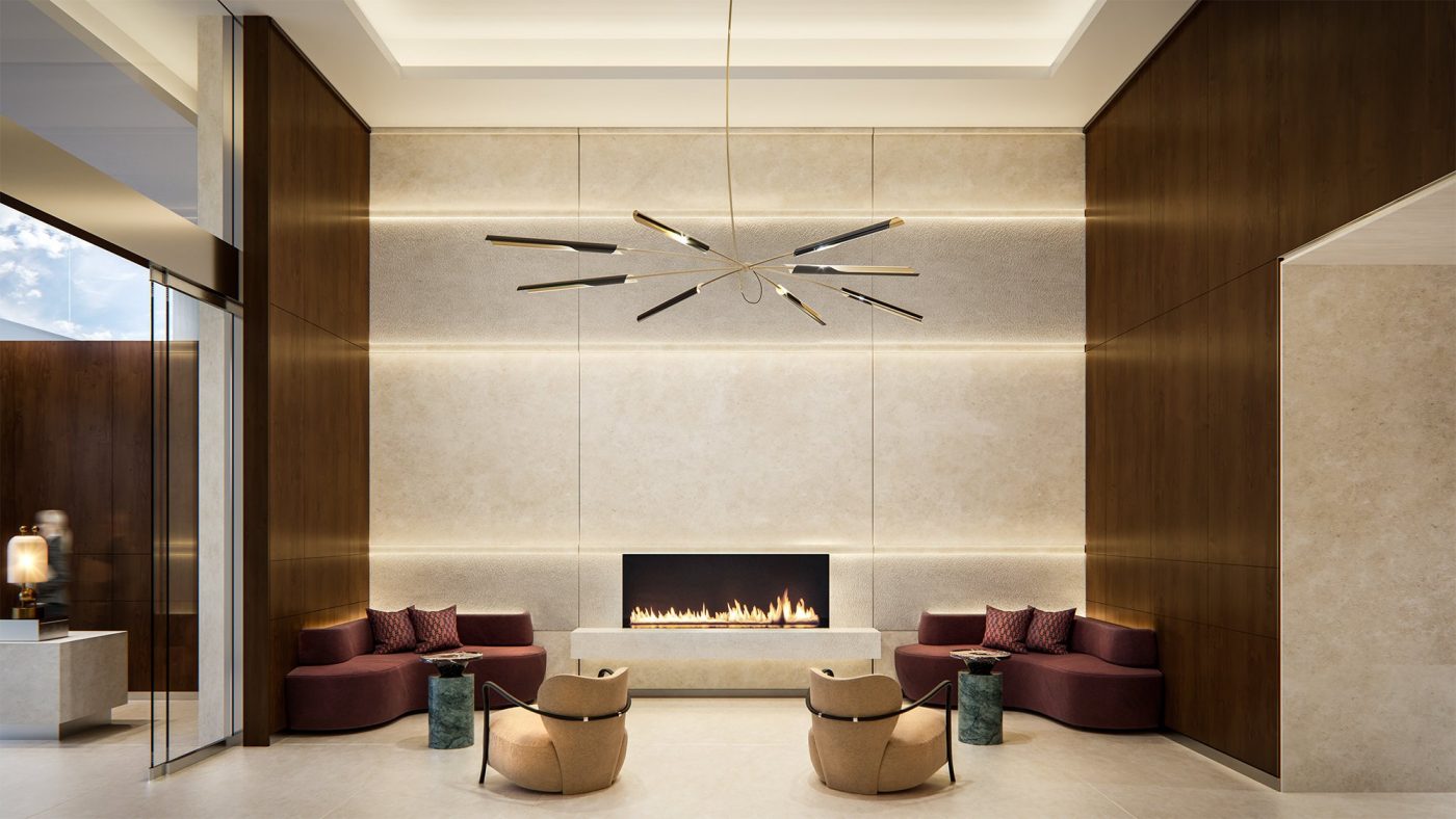
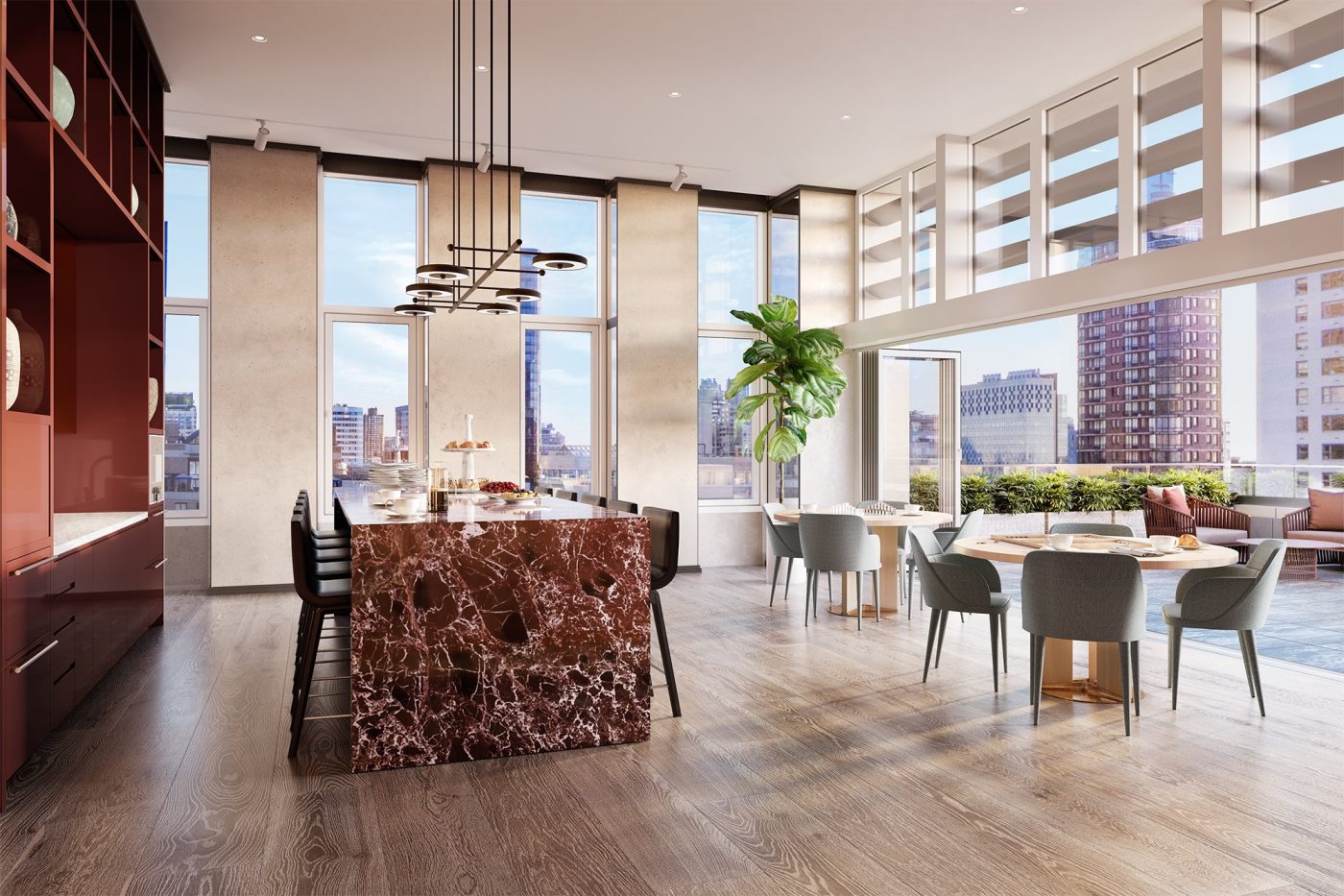
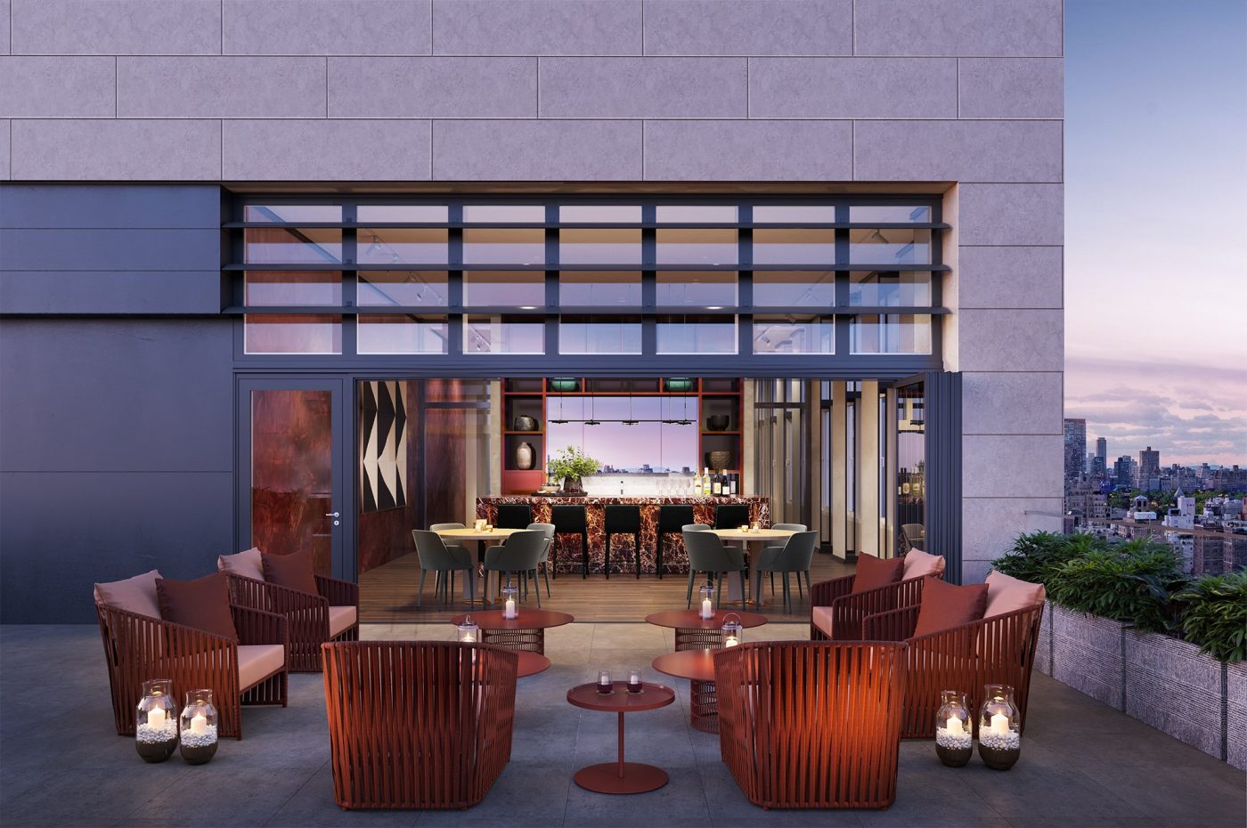
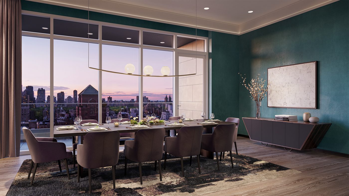
Residential amenities at the Leyton include the Brandy Room, an indoor-outdoor residential lounge on the 24th floor with a sun terrace on the eastern end of the floor plate, and a living room and dining room each with a separate terrace facing west; the Studio, a fitness center with an accompanying stretching room called the Retreat Room; the Paw Spa, a pet grooming and washing facility; a 24-hour attended lobby with a fireplace and service run by BHB Concierge; temperature-regulated, secured private storage; bicycle storage; and dedicated mail and package rooms.
Subscribe to YIMBY’s daily e-mail
Follow YIMBYgram for real-time photo updates
Like YIMBY on Facebook
Follow YIMBY’s Twitter for the latest in YIMBYnews







Looking near all new views on these designs, from where you show I could see beautiful day events by developer. The glistening had been named on my attracted to exterior with balconies, they made me feel powerful facade and lay several colors would surely be there need: Thanks to Michael Young.
Kind of looks like it’s having an identity crisis.
I couldn’t agree more.
Idk why but this is easily one of my favorite new high-rises. A classy design that is very NY in some way, i even like the super low-key entrance
Idk why but this is easily one of my favorite new high-rises. A classy design that is very NY in some way, i even like the super low-key entrance.
..building seems well executed and atypical. It’s curious when the floorplans are reviewed, so many of the bedrooms do not have wallspace/room space for a dresser? Millions of dollars and no place to put underwear and socks. I’m amused, or not?!
“It’s a little bit of this, and
a little bit of that”!
Looks like they used everything in the design? including the “kitchen sink”!


Somehow this works. I agree that it’s a bit of everything, but it all looks like it’s been thought out and well executed. And we all need to appluade that it’s not another glass tower. Great job!
In Damn Yankees Gwen Verdun sang “A little bit of dis-a and a little bit of dat-a with an emphasis on the Lat-a. Odd that seeing these photographs ran that melody though my mind.
I really want to like this, but there’s a lot going on. The ground floor entry is simply terrible. The projecting balconies on the upper floors ruin the look. The intent was good, but more design editing was sorely needed.
I am looking for a 2 bedroom apartment I have section 8 and my husband work
Please contact me at 347—873–1177
The word is ‘busy’—not offensively so, but a lot!