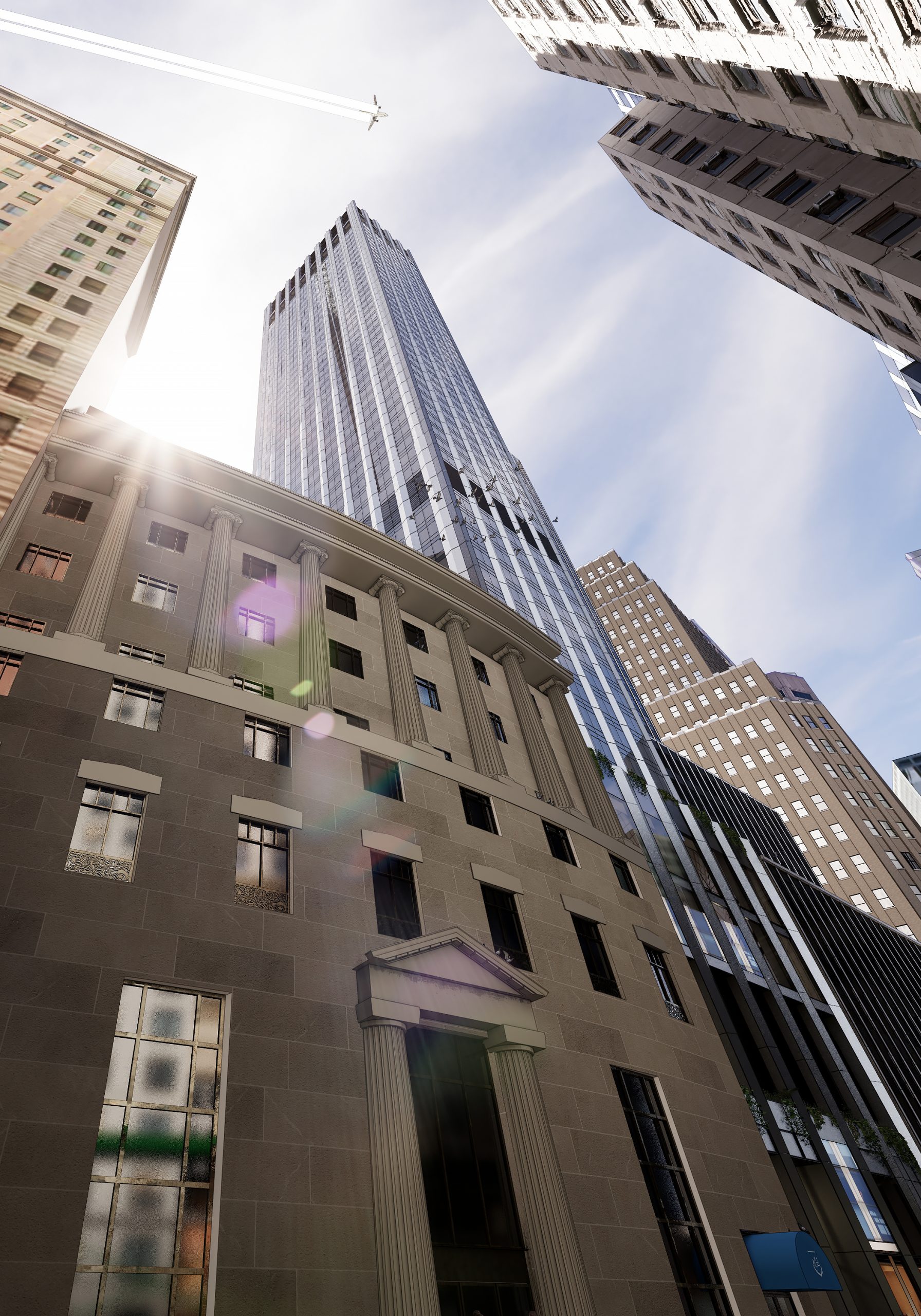
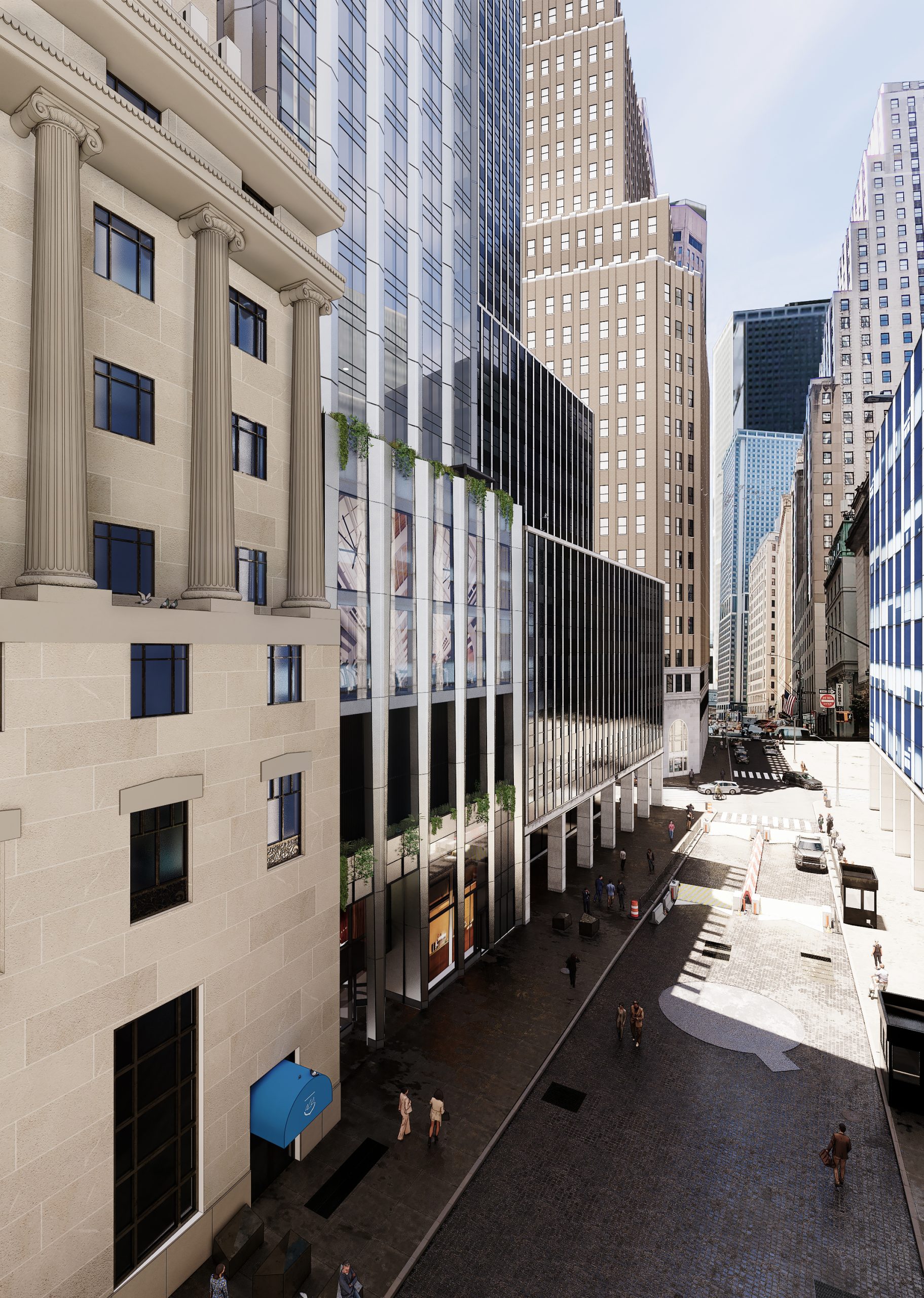
New renderings have been revealed for 45 Broad Street, a stalled residential skyscraper project in the Financial District. The images showcase a new 52-story design from Handel Architects that appears to be scaled down from the original 1,115-foot-tall supertall designed by CetraRuddy. Madison Equities and Gemdale Properties are the developers and Lendlease is the general contractor for the project, which will yield 302 units spread across 221,000 square feet. The property is located on a narrow interior lot between Exchange Place and Beaver Street.
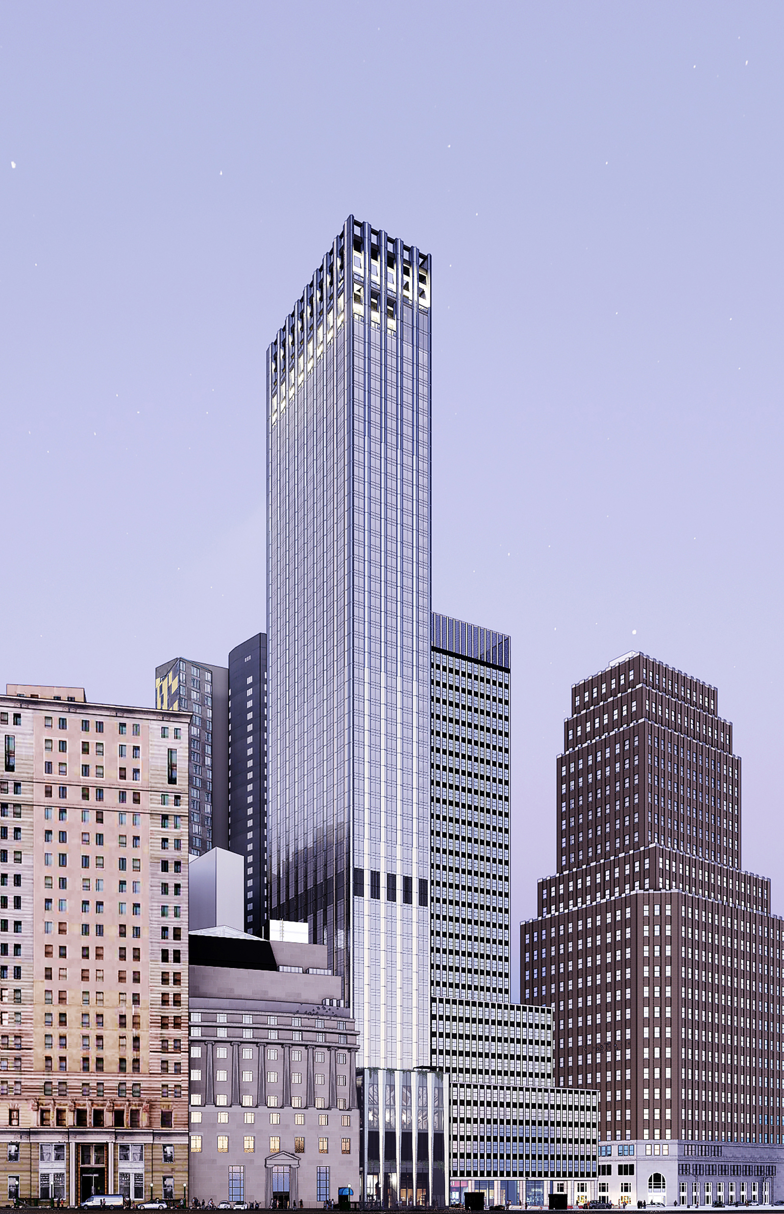
The renderings were first seen on Gemdale’s project website, showing multiple angles of the skyscraper. The façade is composed of floor-to-ceiling glass and light-colored paneling arranged in columns that run the full height of the tower, which rises from a five-story podium featuring what appears to be space for a ground-floor retail tenant. On the second floor is a pocketed loggia with overhanging shrubbery, followed by an outdoor terrace on top of the podium that nearly matches the height of 55 Broad Street’s first setback level immediately to the south. There also looks to be a higher terrace just below the perforated crown.
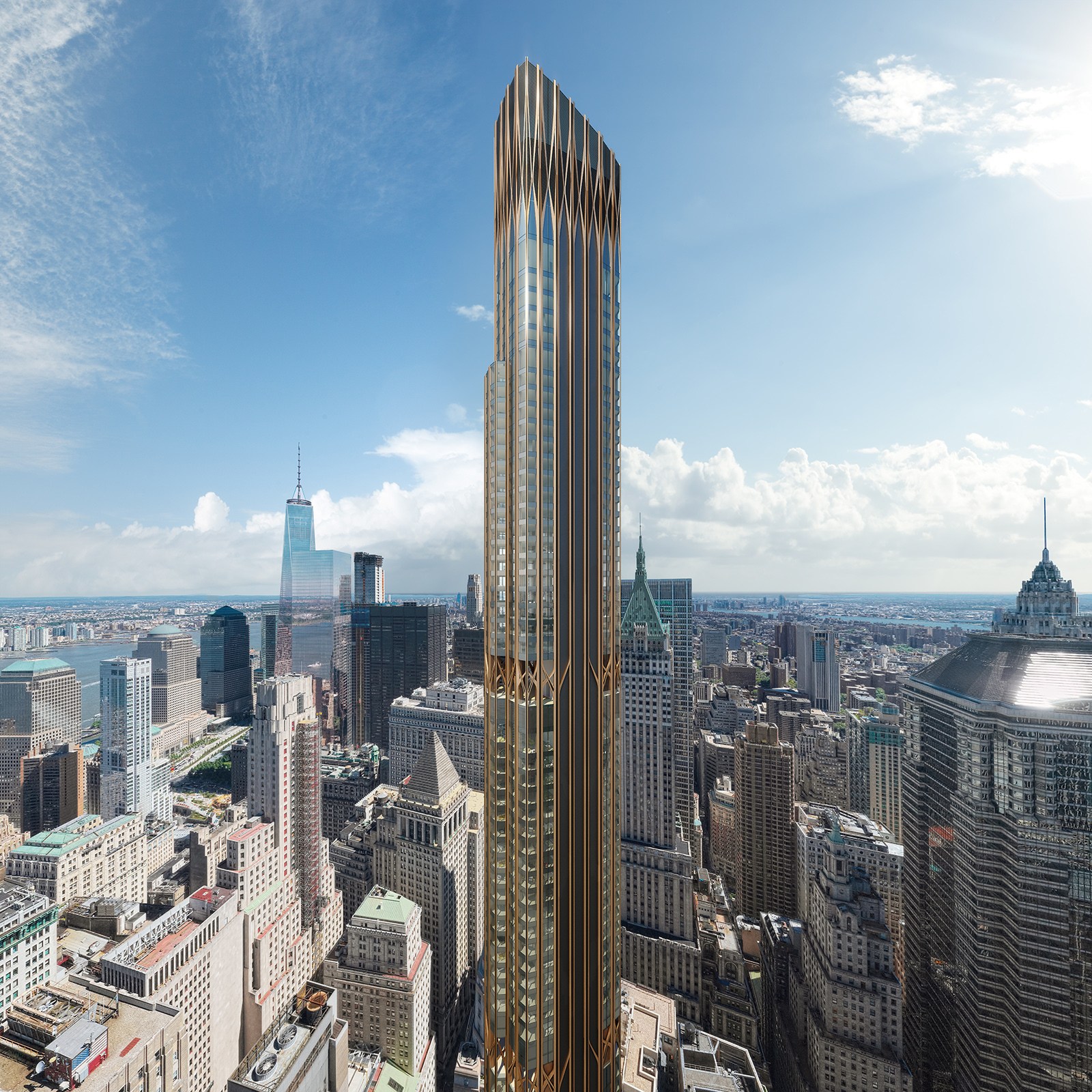
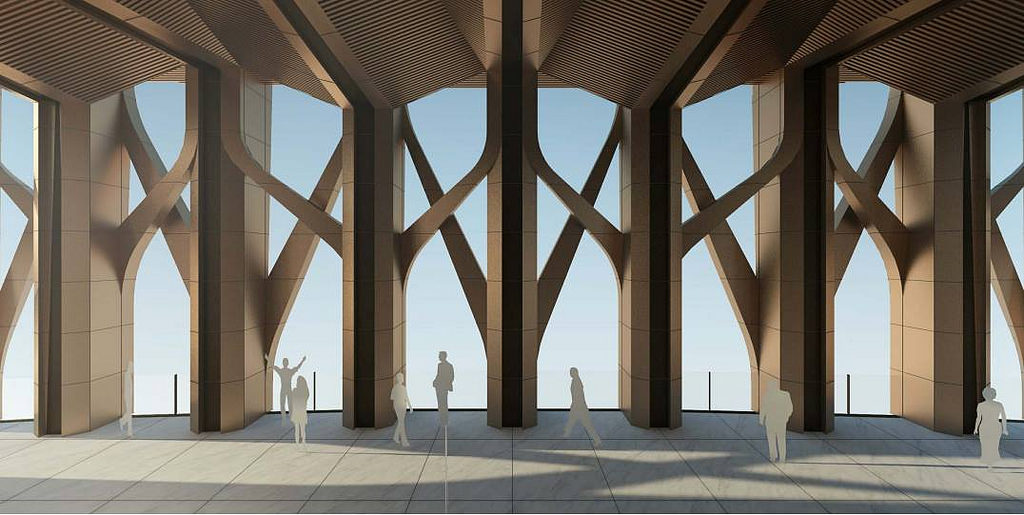
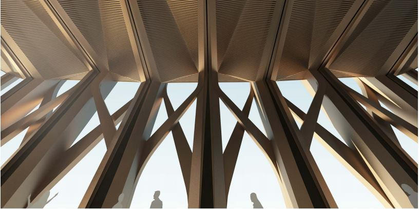
Below are renderings of the former iteration of 45 Broad Street, which had an Art Deco-inspired design implementing interweaving lines of bronze paneling over its glass façade and culminated in a sloped crown. This more slender design would have blended more naturally with some of the surrounding historic towers like 70 Pine Street, 40 Wall Street, 20 Exchange Place, and One Wall Street.
The overall redesign presents a much more toned down appearance with a wider northern and southern elevation and a façade hierarchy similar to that of Skidmore, Owings & Merrill‘s One Chase Manhattan Plaza just a short distance to the north. 45 Broad Street will more than likely not retain its supertall status, but will nonetheless help to contribute to the vertical density of the skyline.
No updated timeline for construction has been announced for 45 Broad Street.
Subscribe to YIMBY’s daily e-mail
Follow YIMBYgram for real-time photo updates
Like YIMBY on Facebook
Follow YIMBY’s Twitter for the latest in YIMBYnews







And the boner killer award goes to…
Bait & switch, online pic was a Playmate from LA, in person she was a 60yr old divorced cafeteria worker whom smokes two packs of reds a day.
I did really like the original design. It really embodied early 20th century Lower Manhattan, particularly in the Wall Street area. However, this new one kind of has a 60s vibe to it, which can also fit in nicely to the Lower Manhattan skyline. Still, I think I like the old design better. At least this project is resuming, though.
Agreed
If they could at least do a little more visual flare with the crown, then maybe it could be less ugly over the skyline
If I hadn’t seen the original renderings I’d love the new building. BUT comparing the two, the original is far superior in design. Sad it won’t be built.
The old design was like a Cadillac. The new design a Chevy. I guess that finacial issues forced this.
💯
Renderings of the former iteration of 45 Broad Street which had an Art Deco-inspired design, but redesign revealed should be created more than former renderings. For the reason on structure to its neighbors with facade is composed of floor-to-ceiling glass and light-colored paneling arranged in columns, run the full height of the tower is beautiful: Thanks to Michael Young.
Looks like there are some interesting elements, but overall this seems like a significant downgrade. I see the homage to 1CMP, but lower Manhattan really has enough glass boxes with emphasized columns.
The worst architectural downgrade I’ve ever seen in my life! CetraRuddy’s design looks more fitting and appropriate and should’ve been kept, not be demoted to looking like a value engineered hotel in Times Square.
Can we ever build great architecture in America anymore?! Everything has to be the cheapest blue box crap devs can muster. Sad, moving to Dubai or China
The lucky tenants will be those in the units on the right side of the tower. 🤗
Their living room windows will be right up against the office building windows next door…
that way they can watch office workers while having lunch!
🤓 🥪🧃
Reminds me of that medicine cabinet scene in The Money Pit.
What a sad downgrade. It went from very interesting to blah.
Beauty is only skin deep, but this one ugly to the frame.
most of this misses the points of architectural criticism that could be pointed at this proposal: ok, the faux gothic trusses that landed in mid-town already have been eradicated. This is more of a 60’s SOM approach. Accepting the curtain wall tower, and maybe it will be a really well detailed curtain wall; to the comment about apts opening to the office structure next door: the core is probably in the middle on the side where it touches the neighbor. The contextualist in me why the architects didn’t continue strong limestone base of the left side neighbor and created a pocket for the glass to come down creating an entry, having the tower appear it was floating about a medici palace – or a solid block, metaphor for the former banking institutions. Some gesture that shows that this building wasn’t designed for a site in Kansas City or Tulsa, or Chicago…..
Good points
I guess they decided to cheap it down
Wow. A huge downgrade in every dimension.
I’m happy there seems to be progress on this one, but I prefer the old design and height.
I guess it is like with hook up apps. The first picture is sexy, but then after they hook you, they share the way they really look. The first iteration would have been beautiful to look at – this one is, well . . . functional. Plain. Boring.
I think the latest version blends in nicely with the other buildings. Not every building design needs to make a statement.
And that’s the end of that
Very disappointing, but it will be good to finally put some life into a lot that has been empty since the school was demolished in the late 1990s.
It’s essentially One Chase Manhattan Plaza 2.0 but half the width and a more contemporary curtain wall. I wish Handel can at least go back to the drawing board and improve the crown of the skyscraper without something more appealing and striking
The original neo art deco design was a refreshing break from those monolithics rising all over Manhattan. Now it’s just another monolithic. What a shame.
Another ugly cheap blue box, just what we didn’t need. What morons actually pay millions to live in these souless cheap money pits?!