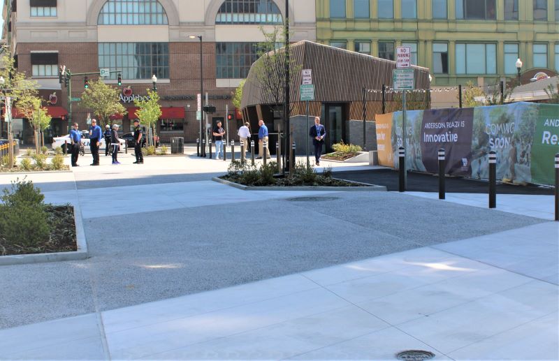
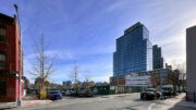
Wilder Balter, LMXD, and The City of New Rochelle have completed a $4 million revival of Anderson Plaza, an open-air space for pedestrians in downtown New Rochelle. Located along Anderson Street between North Avenue and LeCount Place, the plaza will support a diverse mix of seasonal programming, from farmers markets and pop-up events to festivals and live performances.
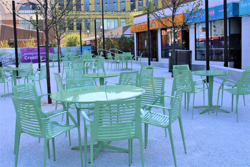
Retail spaces that flank the plaza will be complemented with improved walkability for pedestrians, ample public seating, and a warm weather water feature for children.
“Investing in our community by offering new and improved experiences for existing public spaces is an important part of New Rochelle’s evolution,” said city manager Kathleen Gill. “Anderson Plaza is a great example of how a community can reimagine an established neighborhood focal point and, in doing so, create more value for everyone living, working, or visiting downtown New Rochelle.”
Starr Whitehouse Landscape Architects and Planners served as design architect for the new plaza where construction broke ground in August 2022. On April 22, city officials hosted “Invest in our Planet,” New Rochelle’s first Earth Day celebration to celebrate completion of the new plaza. Festivities included a sustainable pop-up market with community gardens, green businesses, non-profits, local artists, and a petting zoo.
“New Rochelle continues to shine throughout New York as a leading case of what mindful civic expansion looks like outside of New York City, and it’s working, attracting an increased number of young professionals growing families each year,” said Adam Salgado, development commissioner for the City of New Rochelle. “The redevelopment of Anderson Plaza offers residents new and old a welcoming, engaging, and quality space for everyone.”
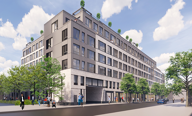
Previous phases of the Anderson Plaza revitalization include a renovated theater space at 595 Main Street, a community gallery at 393 Huguenot Street, and a seven-story rental building at 25 Maple Avenue designed by Beyer Blinder Belle.
Subscribe to YIMBY’s daily e-mail
Follow YIMBYgram for real-time photo updates
Like YIMBY on Facebook
Follow YIMBY’s Twitter for the latest in YIMBYnews


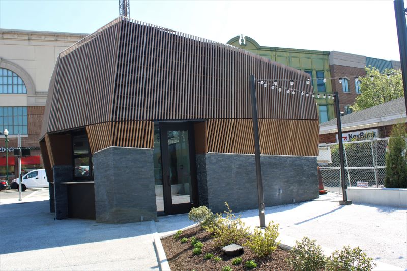



The kiosk looks straight out of the 60’s and 70’s. It’s ugly. Who approved it. It doesn’t fit in. Pathetic!!!