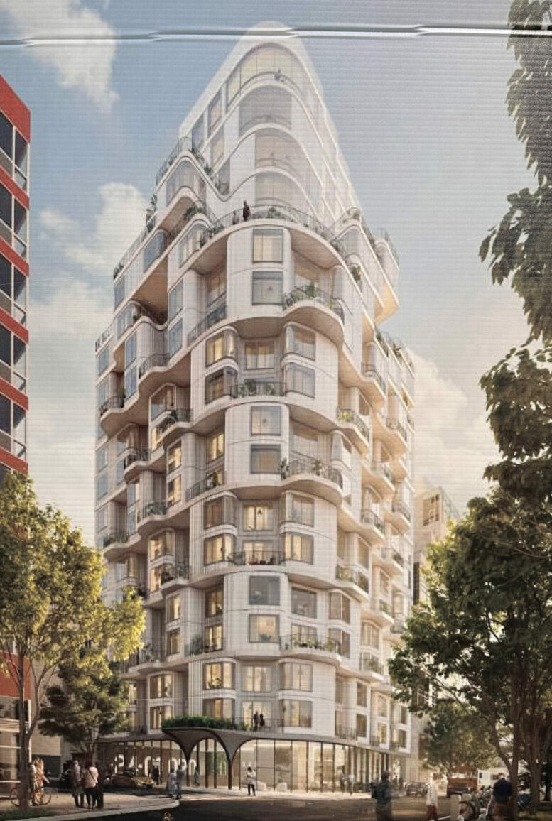
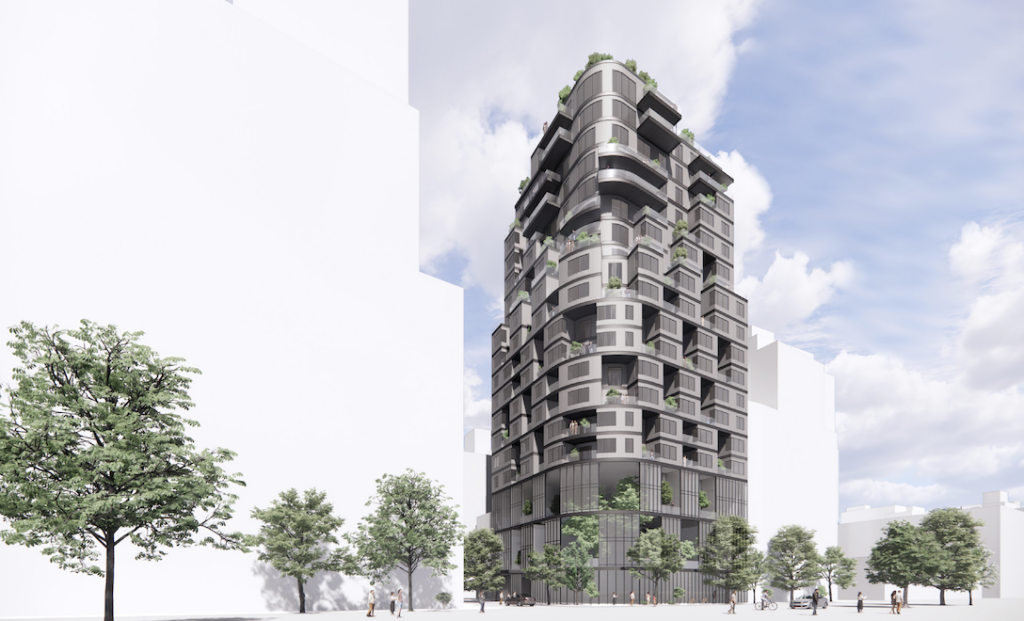
Naftali Credit Partners, a subsidiary of Naftali Group, has closed on an $18 million mezzanine loan for 24-01 Queens Plaza North, a new residential project in Long Island City, Queens. The loan is one of two recent mezzanine loans issued by Naftali Credit Partners, totaling $31.4 million combined, and was issued to the project’s developer, New Empire.
24-01 Queens Plaza North will yield 117 condominium units in studio to two-bedroom layouts, along with 1,828 square feet of commercial space. The development will offer a variety of amenities, including a penthouse resident lounge, communal outdoor spaces, a fitness center, and on-site parking. It was designed by ODA New York.
In addition to financing the mezzanine loan, Naftali Credit Partners structured the entire $72 million loan, syndicating the senior position to Axos Bank. This is the second successful collaboration between Naftali Credit Partners and New Empire, following their partnership on 208 Delancey in 2020.
“We’re thrilled to announce the successful closing of these two mezzanine loans, further solidifying our commitment to supporting promising real estate projects in New York City,” said Glenn Grimaldi, CEO of Naftali Credit Partners. “As we continue to foster partnerships with both new and repeat borrowers, we are very proud to contribute to the growth and development of noteworthy real estate projects in New York City.”
Subscribe to YIMBY’s daily e-mail
Follow YIMBYgram for real-time photo updates
Like YIMBY on Facebook
Follow YIMBY’s Twitter for the latest in YIMBYnews


Gorgeous! European-style apartments of elegance and distinction. Architecturally beautiful. LIC can do with some charm after all of the endless blue glass ugliness that has risen in the past decade, none of which is architecturally notable.
It is cool how much it looks like a modern interpretation of a Parisian apartment building.
How much was interest rate on loans? 19%
New Empire 24-01 Queens Plaza North is the chosen one, I’ve just seen a condominium in this style: Thanks.
Which rendering is of the more current design? The top is quite elegant, but the second one looks to be a worrying exercise in VE in which all of the finer qualities are stripped out.
The building is amazing. Why can’t they all have similar quality?
This is good. A bit of Paris, a bit of Barcelona, hugs the corner as if it’s in love with it.
Like Brad, my first thought was “value engineering “ when I saw the second rendering. But on closer look it has a lot of area on the lower section dedicated to green space, not the usual thing for a cheapening strategy. The main problem though is that the second one is really, really ugly. The first one has a resort city vibe that would give some pizzazz to the LIC streetscape. The second would just fit right into LIC and make very little impact.
Queens Plaza subway station has vanished.
The first rendering has the joy of Casa Mila, while the second has the grimness of Darth Vader.
The horror… the horror…