Among the numerous hulking eyesores in New York City, Two Penn Plaza manages to make a particularly negative impact, and its placement above Penn Station helps cement the latter’s status as an architectural failure. But now we have a first look at plans to transform the structure completely, created by Bjarke Ingels Group/BIG for developer Vornado.
The surrounding blocks are frequently subject to fantastical renderings. The Hotel Pennsylvania may eventually give way to a 1,200-foot office behemoth designed by Pelli Clarke Pelli. Madison Square Garden’s air rights have also been imagined in the vicinity. But the plans for Two Penn Plaza are grounded in a reality much closer to realization, as Vornado has publicly stated it is going to transform both One and Two Penn Plaza.
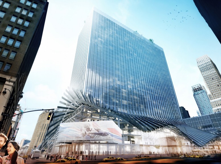
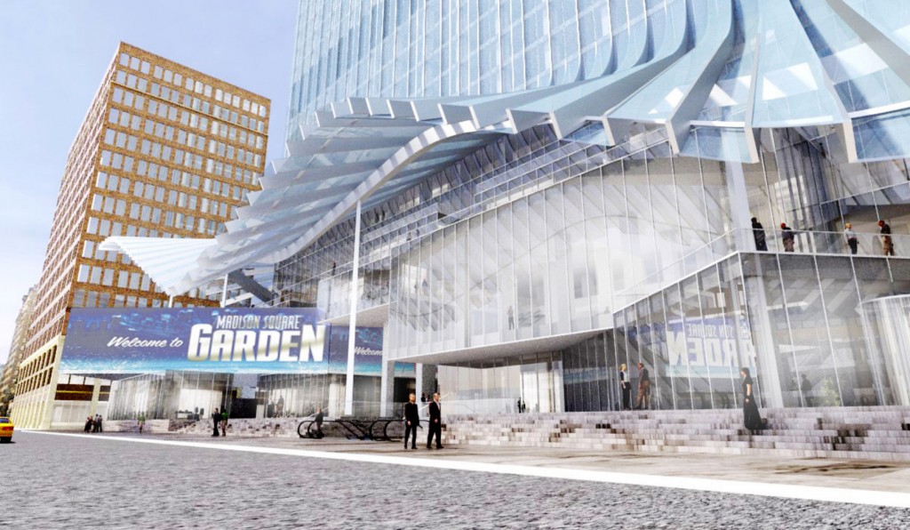
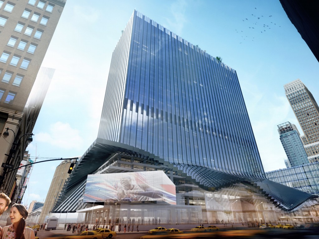
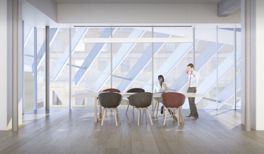
BIG’s design for Two Penn Plaza would replace its depressing exterior with an all-glass facade, and the firm crafted two different options for what the building’s new cladding could look like. The two programs are fairly similar, and while glass isn’t always the most exciting material, in this instance it represents a major upgrade.
The revamp’s biggest impact would be on the retail component of Two Penn Plaza. The lower levels of the building will likely have their floorplates reconfigured to maximize available space and visibility, but the more important impact to pedestrians will be the changes to the base of the tower itself. BIG’s plans would offer a major upgrade to the tower’s tenants and New Yorkers alike; instead of leaving glass flush with the original structure, it would extrude over Seventh Avenue, with undulating waves that would provide visual pizzazz while also helping to shield pedestrians from the elements.
Two Penn Plaza measures 1.6 million square feet, and while the overall square footage of the structure is likely to remain roughly the same, the reconfiguration of the retail floors should add some square footage, though no specifics are yet available. The revamp is part of a larger project to transform both One and Two Penn.
While reimagining Penn Station has been a hallmark of many political administrations, the scope of the project is exceedingly large, and local entities like the MTA specialize in incompetence, which means that the flashy renderings revealed by the Cuomo administration this past January are unlikely to translate into reality. Luckily, with Two Penn Plaza’s renovation being spearheaded by a private developer, the chances that complications will take a decade or two to resolve are significantly lessened.
Subscribe to the YIMBY newsletter for weekly updates on New York’s top projects
Subscribe to YIMBY’s daily e-mail
Follow YIMBYgram for real-time photo updates
Like YIMBY on Facebook
Follow YIMBY’s Twitter for the latest in YIMBYnews




BIG’s design is the best for the future art architectures, such as this building waving her skirt on the ground.
The obvious inspiration is Marilyn Monroe standing over the train grates.
Creative and practical. I love it!
futuristic looking hopefully it won’t disappoint
This design is ridiculous. Looking at BIG’s architecture somehow always reminds me of ‘The Emperor’s New Clothes’. Some of his buildings are utterly horrid and yet the media and public in general don’t dare say it because Bjarke the hot new name on the streets and in everyone’s mouth. What ever happened to elegant and beautiful architecture? It’s like the game today is the whackiest wins.
This is no where close to wacky. It’s a very gradual and graceful transition, evolution.
BS. I don’t buy this stuff anymore. Just likeTrump, it was fun watching it at the beginning but as time passes you realize we’re in a f’d up state of crisis. Do you really think we’ll look at this in 50 years and say ‘wow, what great architecture!’?. I reeeeeeeeeeeally doubt it.
For those of us commuters who are doomed to use Penn Station, anything other than what’s there now is an improvement. However, fancy buildings like this don’t address the squalid nature of Penn Station itself. I would rather see clean, safe restrooms and escalators that work and are going in the proper direction to and from the platforms for arriving and departing trains than award-winning architecture. Also, it’s in Vornado’s best interests to address the chronic crime and homelessness in the area.
Love watching Bjarke’s presentations for their building projects. But very few of his projects seem to come with a video. Would love to understand how they arrived at the concept. This looks great.
This is redic. It would be a nice enough building without the billowing dress at the bottom.
Another RIDICULOUS homage to BORING, BLAND, BANAL. Seriously sketch-up mediocrity, so ok, we get the” 7 Year Itch” reference out of which spurts yet another glass cereal box accounting sheet. And no sense that there should be HEIGHT for the commuter rats below….The emperor architect and lemming followers have NO clothes nor imagination…and New York is supposed to be the fulcrum of CREATIVITY and we get more of THIS nonsense????
While having the 7th Ave plaza under cover would be nice, one has to wonder how they plan to handle the rain? Continuous channels from the façade above, and cantilevered well out with no potential for a ground connection. A nice summer burst and you’re looking at a couple hundred waterfalls each pouring 3-10 gallons a minute. Good luck crossing the street, or getting out of a cab!
As to the “design”? Ennhhh. . . It’s still a box
“lipstick on a pig”.
Even with those changes, Two Penn Plaza still manages to make a particularly negative impact, and its placement above Penn Station is unchanged.
The tragedy of this plan is that a comprehensive vision for the entire area from 9th Avenue to 6th Avenue and from 34th Street to 31st Street has yet to be developed. The city should take the lead and put all the pieces together. Especially worrisome is the loss of public open space in this dense and crowded piece of Manhattan.
A larger view should include the use of streets (and surface light rail transit) and the connectivity of subsurface elements.
NYC, with its outstanding collection of designers, engineers and architects should be able to do much more with the Penn Station, Madison Square Garden and the 7th and 8th Avenue subway complexes plus the Herald Square complex.
Isn’t anyone in charge?
George Haikalis
Institute for Rational Urban Mobility
“lipstick on a pig”? That’s insulting to all the poor old pigs of this world. No, this is just a dressed up turd. Nothing to make commuting from the Hell hole known as “Penn Station” more bearable. This just makes more ground level retail and commercial space for the owners to rent out and takes away from the existing landscaped plaza. No matter how inferior it is, it’s still green space and it will be gone all to create a glorified covered mall. And yes, what about the torrents of rain washing off those peeled up ribbons of glass? Stepped boxes masquerading as a skyscraper and now this piece of garbage? What has happened to architecture?
Yeah, yeah, just wait until the great “bait and switch” er “value engineering” takes place and the final product is not much more than an updated version of the existing structure: a garden variety office building, with updated mechanicals and a “refresh” of the retail levels to contemporary standards, instead of anything closely resembling what’s being touted in the renderings, marketing materials and press releases!
lipstick on a pig.. that’s American.
The best renovation for Two Penn Plaza would be the wrecking ball.
Two Penn, MSG, and Penn Station are a disgrace to NYC. Utter crap, built like crap, designed like crap. This is the block in all of NYC that has to be razed, designed and rebuilt as a single project and the premier transit hub in America .
Unfortunately One Penn gets lumped in with this yet that is the building that could be updated and redressed.