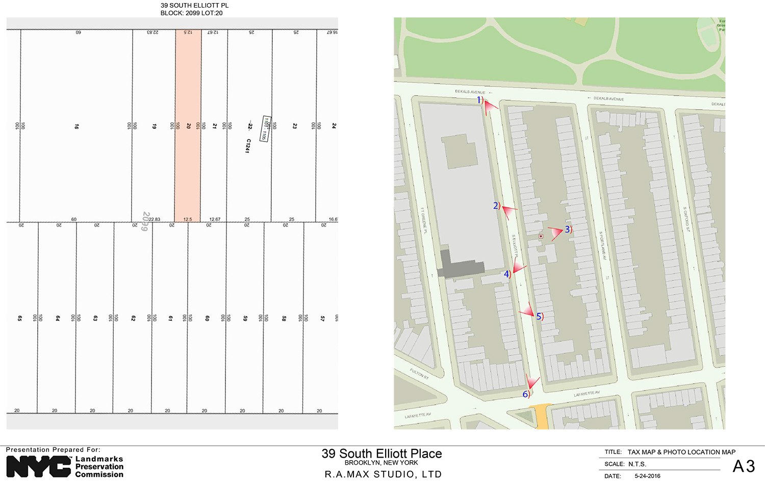
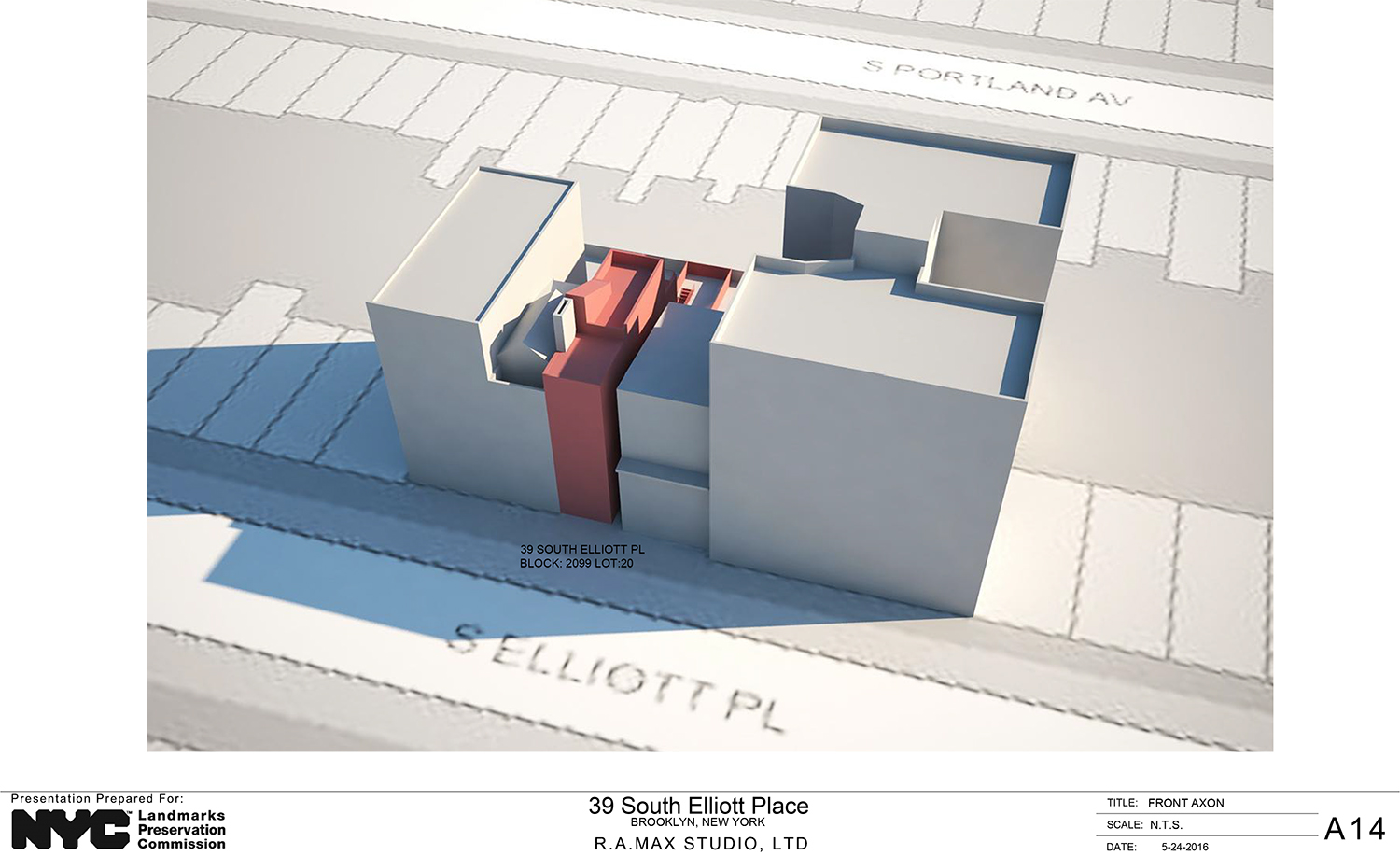
A proposal to construct a new two-unit residential building on a vacant Brooklyn lot hit a brick wall at the Landmarks Preservation Commission. On Tuesday, both the members of the commission and the public rejected the proposal for 39 South Elliott Place, located between DeKalb and Lafayette avenues in the Fort Greene Historic District.
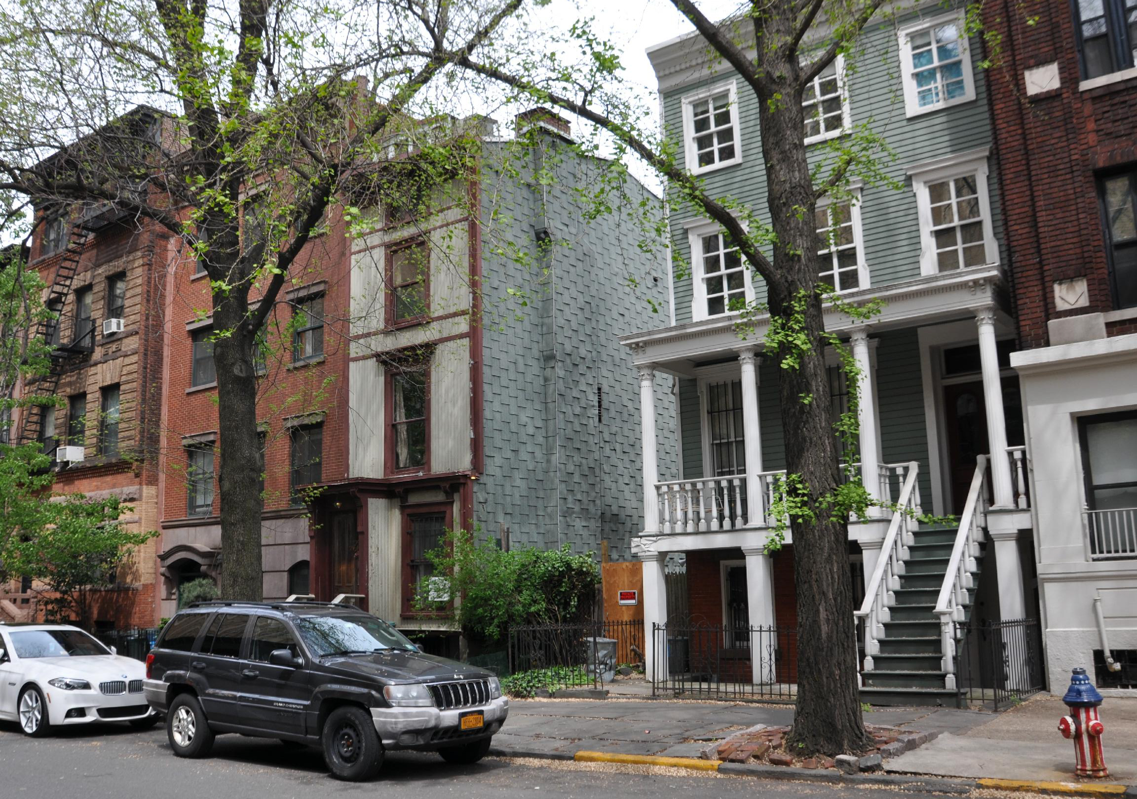
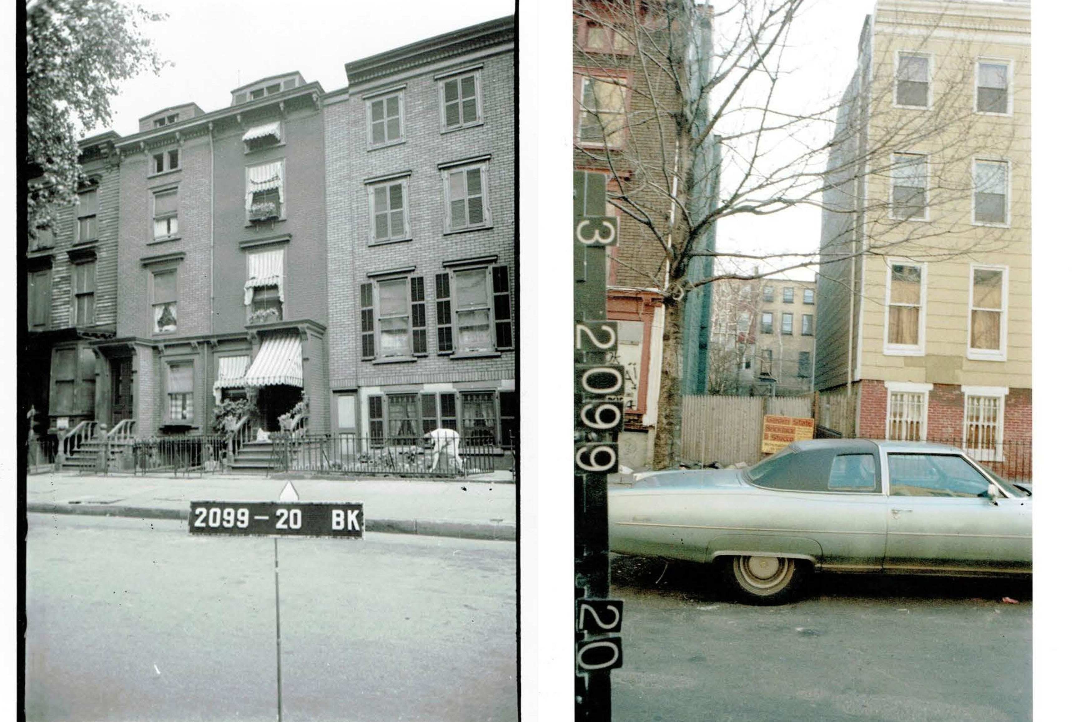
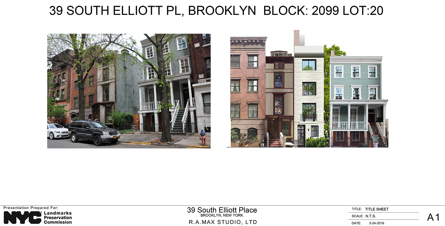
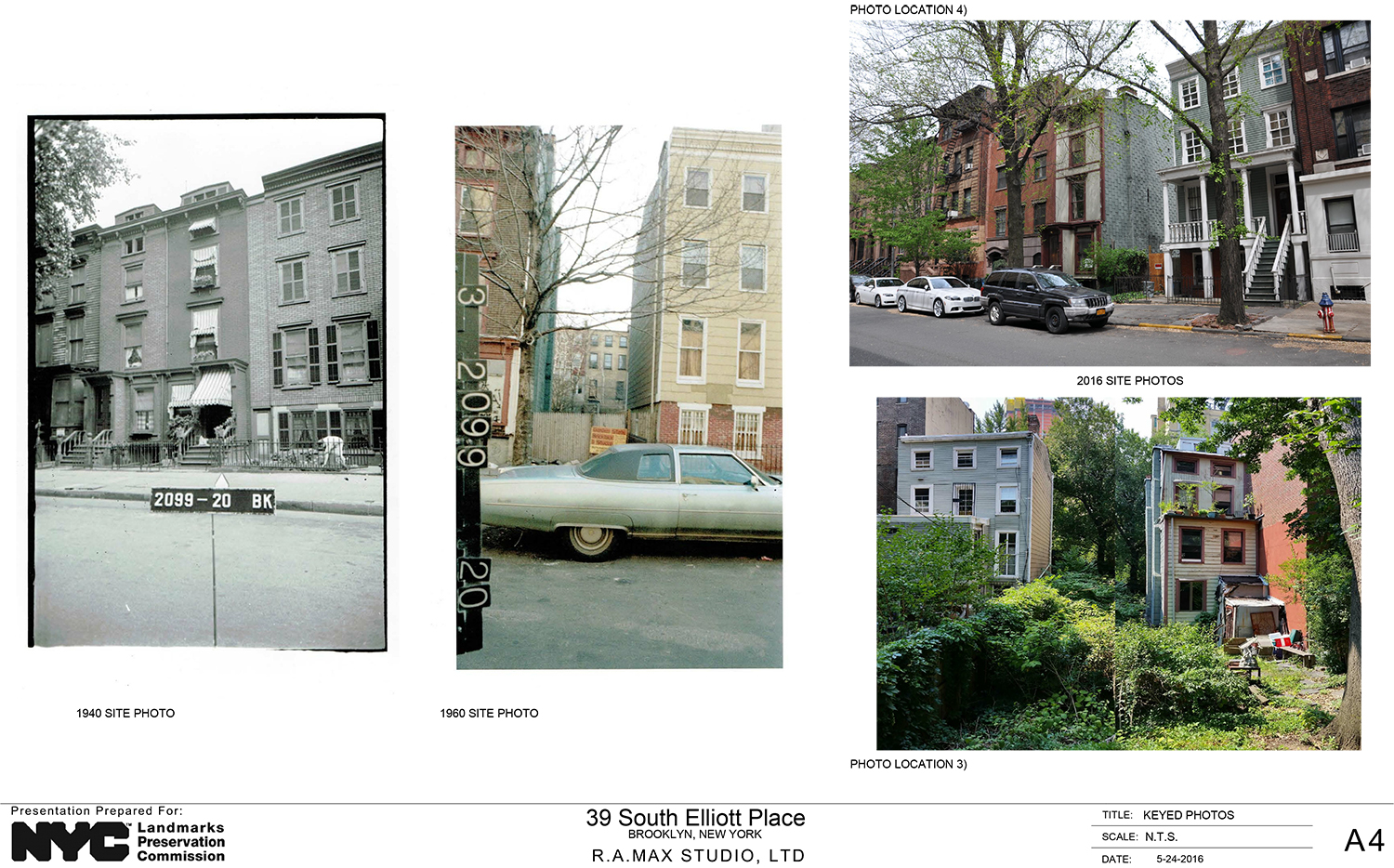
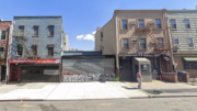
The site in question has been vacant for over half a century. It can be seen vacant in a 1960 photo. A 1940 photo shows a structure that is largely a twin of its neighbor at 37 South Elliott Place.
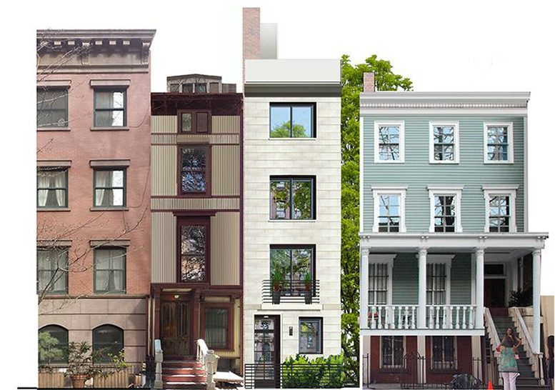
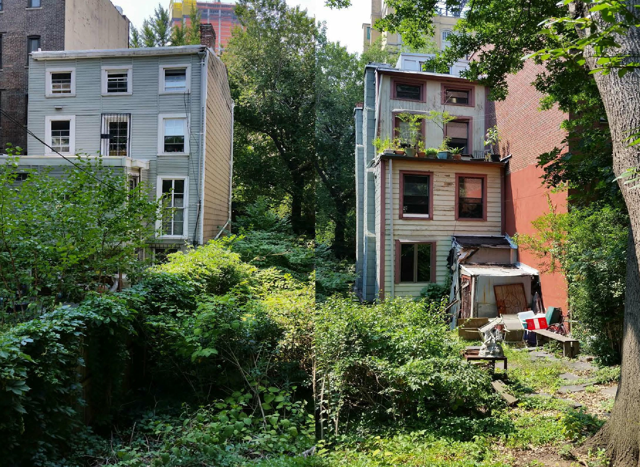
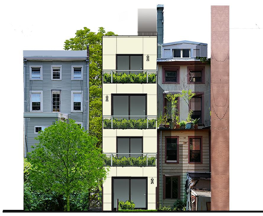
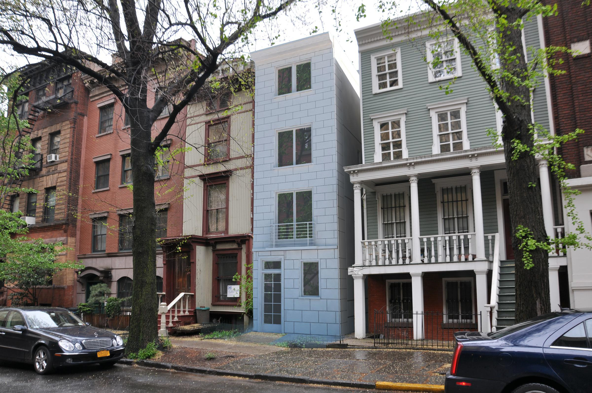
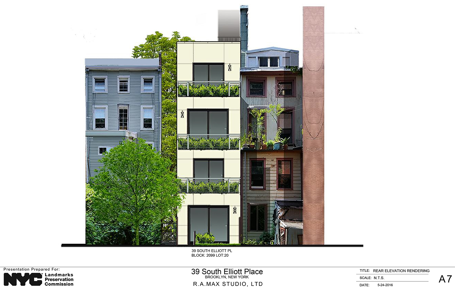
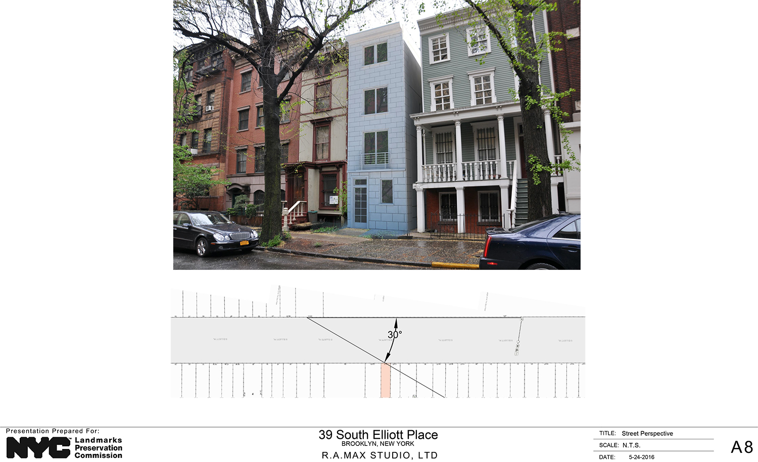
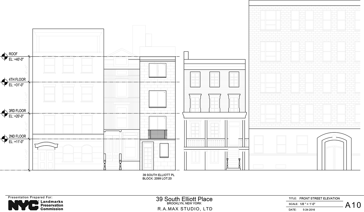
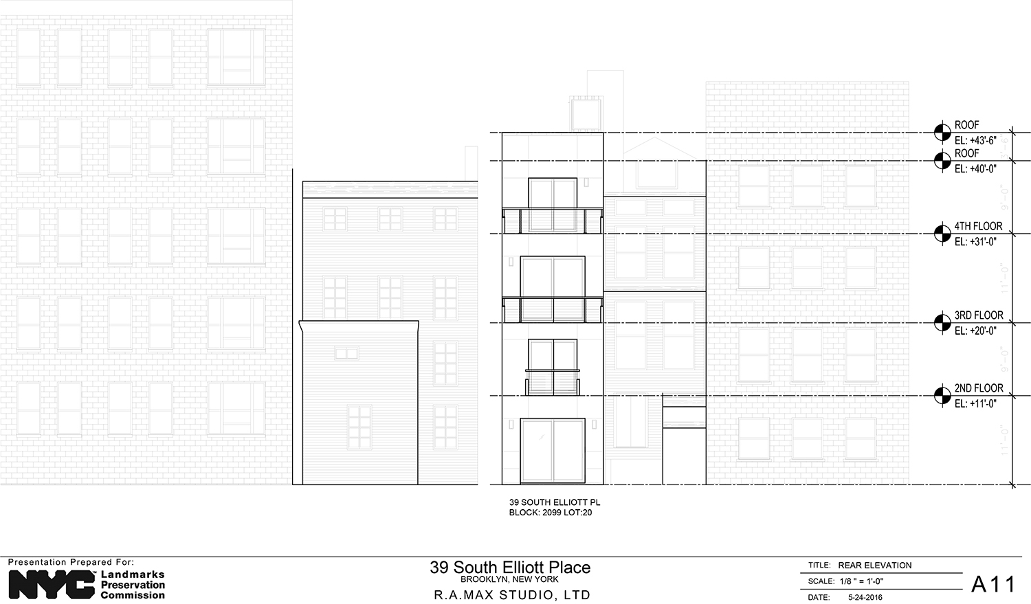
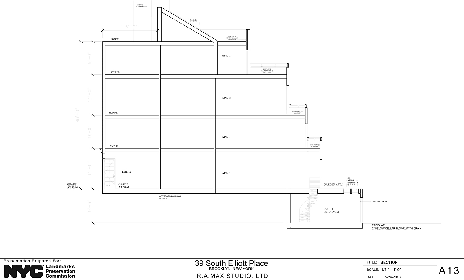
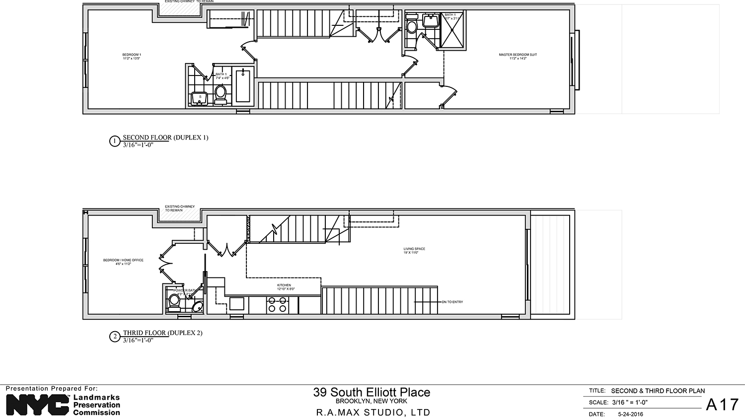
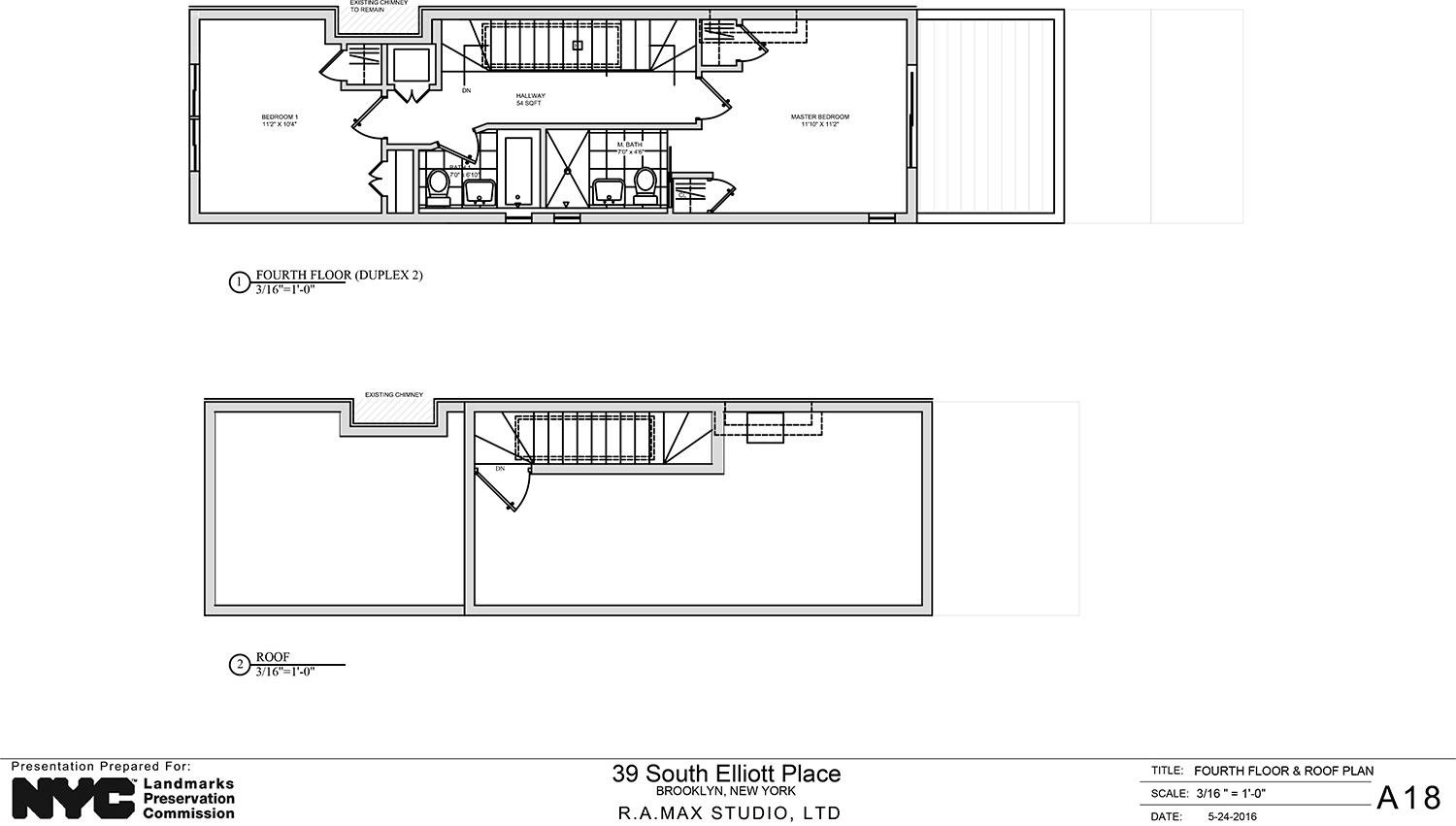
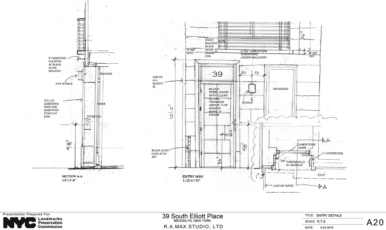
The proposal was designed and presented by Ana Eskreis of Manhattan-based R.A. Max Studio, LTD. It calls for four-story structure with a limestone front and stepped stucco rear. Plans indicate two duplex units inside. The lower unit would have two bedrooms and the upper unit could be configured for up to three bedrooms.
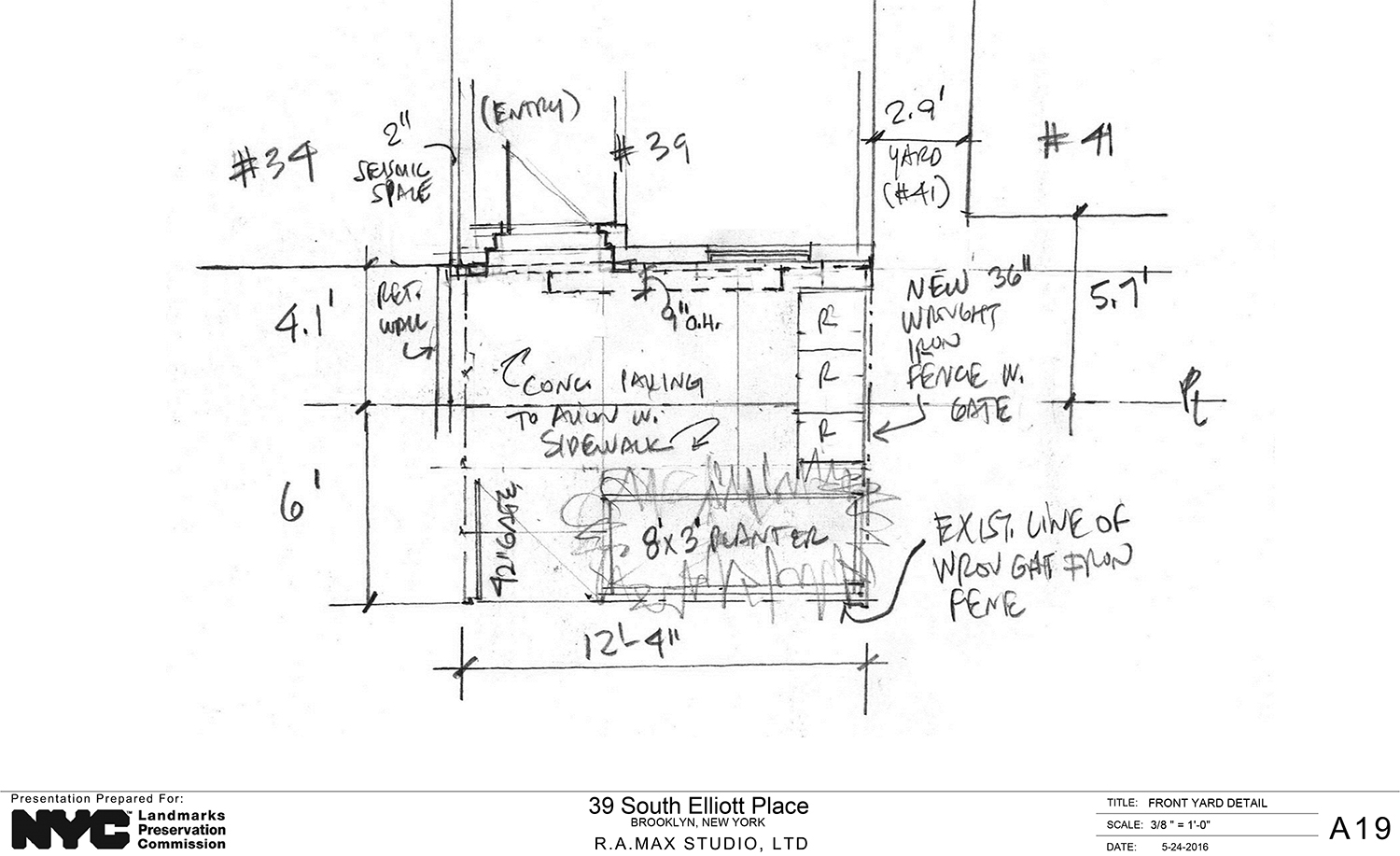
Eskreis called the stone a “versatile material” and touted the structure, with multiple layers of insulation, as being energy efficient. It would be two inches from no. 37 and the gap between it and no. 41 would be due to the that gap being on no. 41’s property, a piece of information revealed only because Commissioner Frederick Bland asked about it.
Commissioner Michael Devonshire questioned the use of Indiana limestone and said there might be issues with availability and sustainability. He suggested use of salvaged stone from New Jersey, or even sourcing stone from still-operating quarries in Massachusetts. That is if stone was to be used at all. He said limestone would be more appropriate for a municipal structure or a bank.
Devonshire criticized the design and presentation, saying its “lack of deal was a bit problematic.” He said he has recently been reviewing the design of a cell block at the Sing Sing prison in Ossining, and said this design was evocative of that.
Commissioner Bland said the design got off on “the wrong foot” and needs to be “rethought.” However, he said the proposal was the rear was relatively acceptable.
LPC Chair Meenakshi Srinivasan admitted that the narrow site is unusual and could lend itself to something different, but the proportions are off. She said it appeared to have been “designed inside out,” with the roof “completely unresolved.” She found the rear acceptable, but said the front needs “more study.”
Christabel Gough of the Society for the Architecture of the City said the proposal presents and “unusual design problem.” She pointed to 75 ½ Bedford Street in the West Village, where a much better design was conceived for a similarly narrow lot.
Ken Thomas, who lives at 37 South Elliott Place, spoke out against the design, noting, among other issues, the fact that the chimney arrangement isn’t even consistent across the various slides of the presentation. Vilna Staino also lives at no. 37 and spoke out against the proposal.
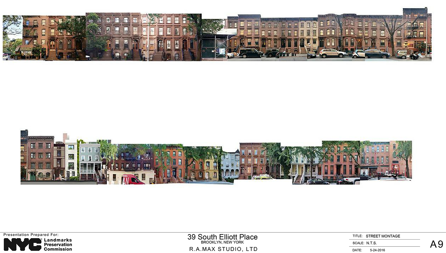
“HDC urges the Commission to demand a higher quality design for this site, this block and this district,” testified Barbara Zay of the Historic Districts Council. “The proposed house is very clumsy in its proportions, neither working from the dimensions of its former twin, number 37 South Elliott Place, nor ignoring those dimensions completely in favor of a contemporary approach. Even if the applicant wanted something contemporary, the design should at least reference the grid and height established by number 37, as the site’s relationship to that existing house is immediately discernible by virtue of their unique and shared narrow width. Ignoring that relationship would effectively create a permanent ‘elephant-in-the-room’ situation.”
“Regardless of how number 39 does not attempt to take cues from number 37, including its window placement and its stark and overpowering roofline, there are proportional issues even if it were a stand-alone house. Its lack of a stoop and door surround misses an opportunity to give the façade some depth, and makes the door appear proportionally tiny when compared with the façade’s very large windows. There are other awkward proportions on the front façade, as rendered, including the different widths between the windows on each floor and the fact that the front door and the window next to it on the ground level do not line up.”
“HDC also wishes to make a plea for better materiality, as there is no precedent for limestone facades on this block. Our committee also finds the stepping of the rear façade to be a form that is too fussy and not justified in this context. We ask that the overall design of the proposed house be rethought and dramatically refined, as is expected in our historic districts.”
In the end, the commissioners took no action, but suggested the applicant work hard with the LPC staff before coming back with a revised proposal.
View the full presentation slides here:
Subscribe to YIMBY’s daily e-mail
Follow YIMBYgram for real-time photo updates
Like YIMBY on Facebook
Follow YIMBY’s Twitter for the latest in YIMBYnews









The HDC states “the proposed house is very clumsy in its proportions”. Those words are too kind. Hideous and severely lacking in any architectural character is more appropriate.
ok, have the “architects” get a copy of “GET YOUR HOUSE RIGHT” and LOOK AROUND THE NEIGHBORHOOD at materials, style and character. Slabs of limestonish “subway” pattern with cyclops juliet balconies do not “contextual” make. Seriously the LPC should save us and all these “zombitects” a lot of time and money and INSIST that they build using CLASSICAL RULES (as in what any architect would have learned free WW11). It’s like a miniature mini mansion with no clue as to the classical proportions in all the surrounding buildings.
Past to present with an old or new, as principal by repairing to use.