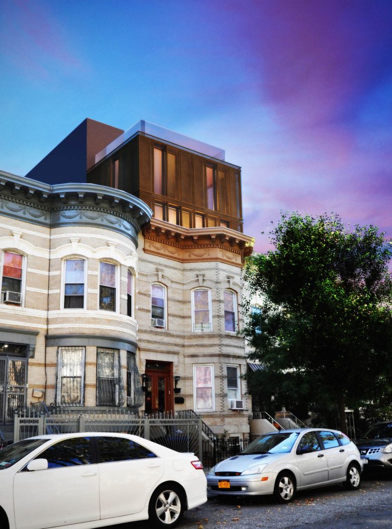
Many of Bushwick’s little townhouses have expansion potential, thanks to the neighborhood’s relatively generous zoning. One two-story brick rowhouse at 352 Weirfield Street is about to gain two more floors, and YIMBY has a rendering for the project.
The house’s pretty early 20th century facade and cornice will remain, but the owners plan to gut the interior and build a new steel frame inside. The new addition will be made out of a rust-colored metal, either corten, tinted steel, copper, or aluminum, according to architect Thomas Barry of OPerA Studio.
The expanded building will hold six rentals across 4,366 square feet of residential space, for an average, 727-square-foot unit. A duplex and a triplex will occupy portions of the top floors, and a glassed-in roof deck that’s half reserved for the triplex. The rest of the roof deck will be accessible to all the tenants.
The developer is Dorothea Donelan. Her LLC picked up the home between Wyckoff and Irving avenues for $995,000 last September. The Halsey Street stop on the L train is around the corner from there, and both the L and M trains stop at Myrtle-Wyckoff Avenues about six blocks away.
Subscribe to YIMBY’s daily e-mail
Follow YIMBYgram for real-time photo updates
Like YIMBY on Facebook
Follow YIMBY’s Twitter for the latest in YIMBYnews


A rendering looks like beautiful mansion in heaven, so build it closely an appearance as well.
That’s awful.
What a horror! This is why we need Landmarks.
I have never before been actually frightened by a building design. The modernist addition looks like a japanese techno monster devouring a Victorian mansion.
I have no problem with adding a floor or two to a brownstone, but that? It is horrendous. The architect should lose their license for even proposing something so offensive to the eye.
Agreed. This abomination is “FUGLY” and is a perfect example of why it’s absolutely necessary to create Landmark/Historic Districts. Not only should the architect lose their license, they should hang their head in shame for creating such a preposterous, out-of-context, “design”. Truly awful. [FWIW my background includes extensive undergraduate and graduate studies in Urban & Regional Planning]
David is just a troll. That addition is hideous and is not a welcome addition to this century old home.
Hard to believe someone actually thought this was a good idea. If the interior is to be gutted why even pretend to save the exterior. Demolish the well appointed and apparently well kept town house and replace it with an un attractive but not schizophrenic modern building.
If you want build a contemporary structure like this extension, go find a lot somewhere and have at it. But, if you want to ruin a row of beautiful houses, do this instead. Really awful. This, right here is why we need to expand Landmarks.
Is that the best they can do. My first resoonse was yuck!! Absolutely horrendous. So the owner doesn’t see how bad it looks. So sorry for the block, just ugly.
That is beyond horrible and should not be allowed.
What a beautiful design!
I think in so many ways this is art combining an eclectic design mixing the elements. Any artist can see this.
I get what many of you are saying but have an open mind.
I think it’s interesting and would love to see it when it’s done.
One more thing, I think all of you who have only commented negatively really need to relax, and I think your being a little harsh. You totally don’t like it that’s great but it’s really rude to go to the lengths and say Fire the Architect lol REALLY!!!