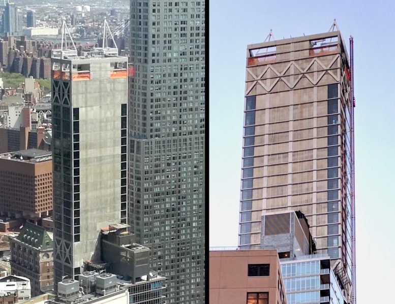
New York City’s development booms result in buildings of all shapes and types. And while each round of additions brings lots of positive changes to the city’s skyline, the city’s denizens must, unfortunately, accept the bad with the good. While new projects in surrounding blocks will eventually block much of the building from most perspectives, the misproportioned parapets of 5 Beekman are, in the intermediary, an affront to New Yorkers and the skyline.
The Financial District has a unique propensity for generating some of the worst architecture in the city. The previous development cycle, ending in 2008, gave rise to the William Beaver House at 36 Beaver Street, deep within the densest portion of the neighborhood. While that building’s envelope is plain enough, its brown and yellow-checkered facade is the visual equivalent of a 47-story, 528-foot-tall joke.
Sadly, 5 Beekman is substantially taller, clocking in at 687 feet, though its floor count remains the same at 47 floors. The tower rises out of the historic Temple Court Building, which has now been converted into a hotel with restaurant and retail space in its base. That portion of the project is certainly set to be a success, considering the structure had been sitting empty for decades.
Temple Court and 5 Beekman sit on one of Manhattan’s rare alleys. Theatre Alley had been one of the worst remaining examples of fetid New York City squalor in the entire borough, with Scouting NY’s trip to the area last decade revealing photos looking as if they were shot by Jacob Riis. The dank and claustrophobic alley, charming to some, is imminently transforming into a private-public cul-de-sac for high-end developments, complete with retail, as two towers on Park Row are about to rise on the side opposite 5 Beekman.

Theatre Alley in 2002, image from Scouting NY
Besides the beneficial streetscape improvements resulting from the refurbishment of the Temple Court, the new tower has a few additional positives. The sides with glass aren’t horrible. Its dimensions beneath the parapet are slimming and inoffensive. But the positives end there.
Adjacent to the southern side of the Beekman lies The Lara, which topped out just a few years ago at 29 floors. The question of why The Beekman has an approximately 250-foot-tall blank wall is then left to New Yorkers’ imaginations. Was it because the developers were lazy? Did they run out of glass? Though it is a lot line, the justification that would normally hold for such blatantly vulgar value-engineering does not hold, considering the site’s neighbor is already complete. Only yesterday, YIMBY revealed a building coming to the East Village standing a mere six floors that managed to tactfully integrate windows alongside its lot line.
Among the downtown skyline’s offensive blank walls, the Verizon Building and 33 Thomas Street hold special honors. But 5 Beekman seems to be the first residential building that really takes this aesthetic to heart, turning its back on viewpoints ranging from Ground Zero to Downtown Brooklyn.
As if the 250-odd-foot lack of effort weren’t bad enough, the building has painted-on concrete accents, as if they somehow make up for the gaping lack of thought expressed across the southern facade.
The effort does not improve with the rooftop ornamentation. Unlike the glorious copper-clad parapet of the monumental Woolworth Building, or the austere crown of the more modern but still historically-grounded 30 Park Place, 5 Beekman goes for a bizarre attempt at gracefulness that was evidently sacrificed to the bottom line. A sad coat of white paint covers steel girders that form two barely-there points on the skyline.
While new developments across Theatre Alley will obstruct the views for owners who’ve recently purchased in the building, they may actually leave the blank wall of 5 Beekman completely exposed. The recently revealed 1 Beekman will only stand 354 feet to its roof, but the new tower coming to 23 Park Row, designed by COOKFOX, is tentatively set to rise 691 feet and 54 floors, surpassing 5 Beekman.
23 Park Row may stand taller than 5 Beekman — and will block a majority of its views from the western side — but the tower will unfortunately leave 5 Beekman’s bare concrete Southern side completely exposed.
Additional developments along the waterfront may eventually obscure the building’s impact when viewed from Brooklyn, but in the meantime, a 250-foot-tall gesture in thoughtlessness will be plainly visible from at least two states. The project is being developed by GFI Capital and was designed by Gerner Kronick + Valcarcel Architects.
Subscribe to the YIMBY newsletter for weekly updates on New York’s top projects
Subscribe to YIMBY’s daily e-mail
Follow YIMBYgram for real-time photo updates
Like YIMBY on Facebook
Follow YIMBY’s Twitter for the latest in YIMBYnews


Your criticized is so hot (I like), I’m looking out to the tower and bear concrete should be decorated.
Had to put the elevators and egress stair somewhere!
To make matters worse there is the half-hearted, cynical attempt to “contextually relate” to the twin-peaked roofline of the truly splendid existing Victorian red-brick building adjacent (to which this number appears to be an “addition”) by the outre and totally lame ‘mimicking’ of the two ‘peaks’ below by a sad configuration in steel framing plunked perplexingly atop the roofline. Who designed this thing? A 12 year old boy? Somebody’s wife? This sort of amateurism and lack of competence in design is lamentable in a project that in the right hands could have achieved true landmark distinction.
This windowless South-facing facade is an eyesore for the neighborhood. But it also makes no sense for people living in the building, their other views will be partially obstructed by new building while the South one will not (smaller Lara building next to it) and South is always the best view for most buildings thanks to the sun exposure, yet no windows there!. What was the developer thinking? In the mean time I hope they find a way to turn this facade into something that is somewhat bearable to the eye: cover it with stone or even glass, anything would be better. And yes these parapet/steeples at the top are bizarre and just tacky, the pairing with the original building underneath does NOT work at all. At least William Beaver was coherent in its design….
The only thing that could, sort of redeem this building is if they painted one giant mural on the blank wall.
“the city’s denizens must, unfortunately, accept the good with the bad.” Presumably you meant to say, “…must, unfortunately, accept the bad with the good.”
That this 70-story Brutalist “parking garage” with its lame, skeletal ornamentation was ever conceived, approved, financed and built – amidst so many beautiful, historically significant, neighboring buildings, including City Hall – speaks volumes to the reality of money and cynicism over thoughtful, contextual design. While some buildings inspire and others impose, this homage to poured concrete never equivocates in its blunt nod to soulless Soviet-era design. What a wasted opportunity to add something positively inspiring to the City’s skyline.
The stairs and elevators are tucked up against that wall. With such a small foot print, where else would you put them?
I wont hold my breath waiting for an answer..
So what, all buildings have stairwells and elevators. This building is an blight on the skyline. It’s farcically ugly.
don’t sweat it….in 100 years we hope this one is demolished. Unfortunately nothing beautiful is respected and still demolished lets hope the developers 100 years from now have risen in aesthetic beauty and take this one down.
Agreed with Mr. Yimby here. While I fully support new, even tall, developments in the city’s historic core, developers have an inherent responsibility but not requirement, to create attractive looking structures. This one’s a joke.