Over a year ago, one of the world’s most distinctive supermarket locations closed. On Tuesday, a new vision for the space, a Michaels arts and crafts store, came one step closer to reality, as the Landmarks Preservation Commission held a public hearing.
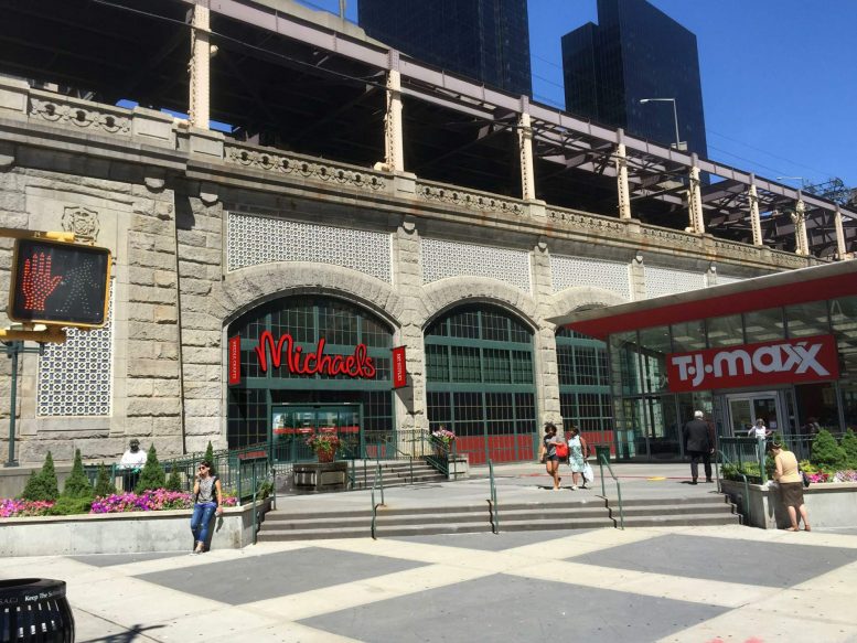
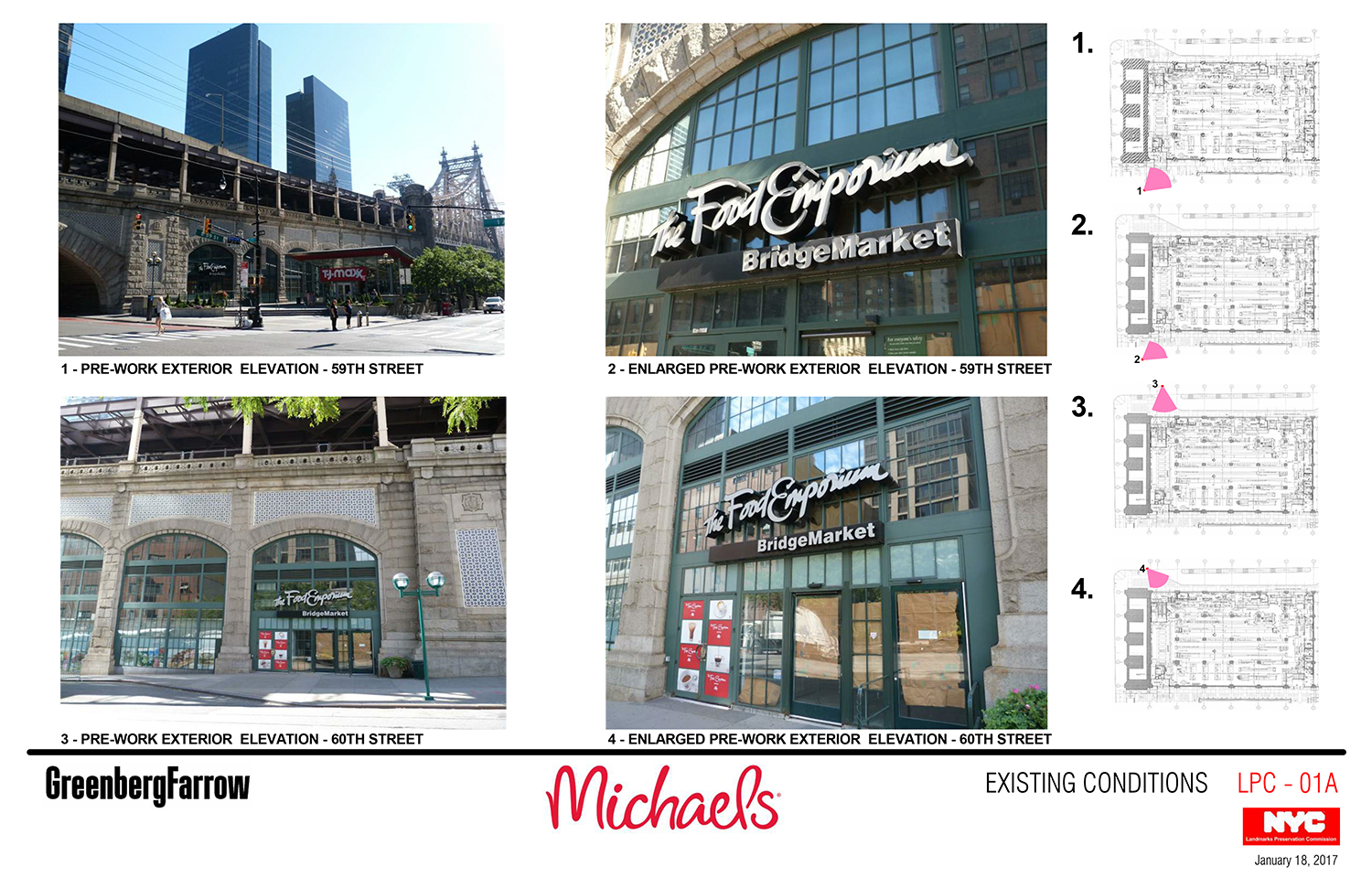
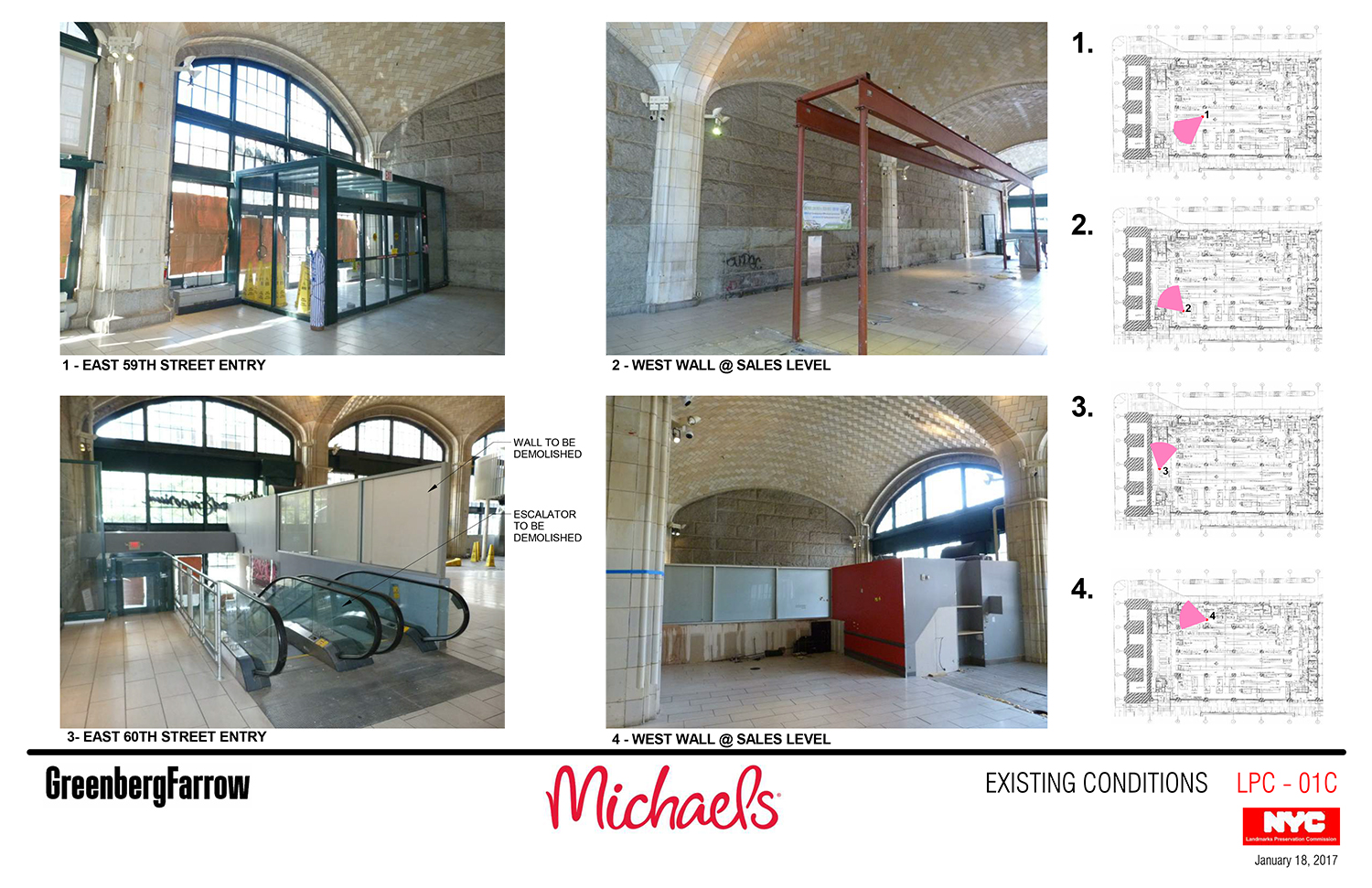
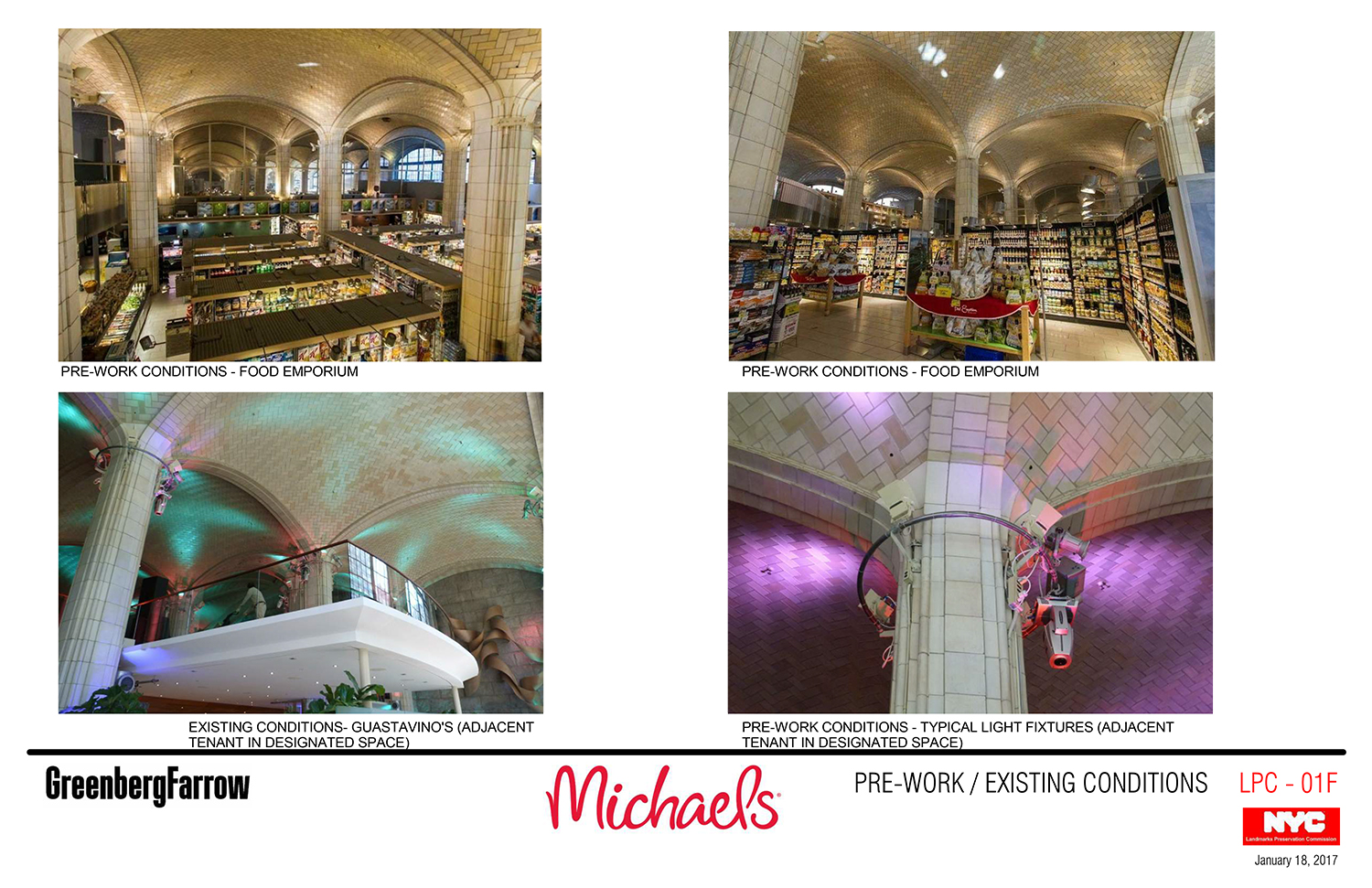
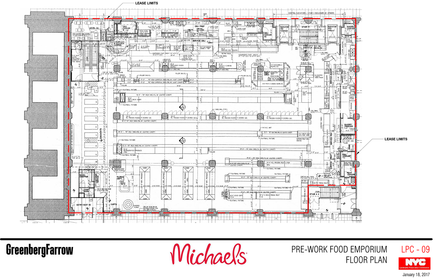
The market was the Food Emporium at BridgeMarket, an amazing space beneath the Ed Koch Queensboro Bridge with an official address of 405-415 East 59th Street.
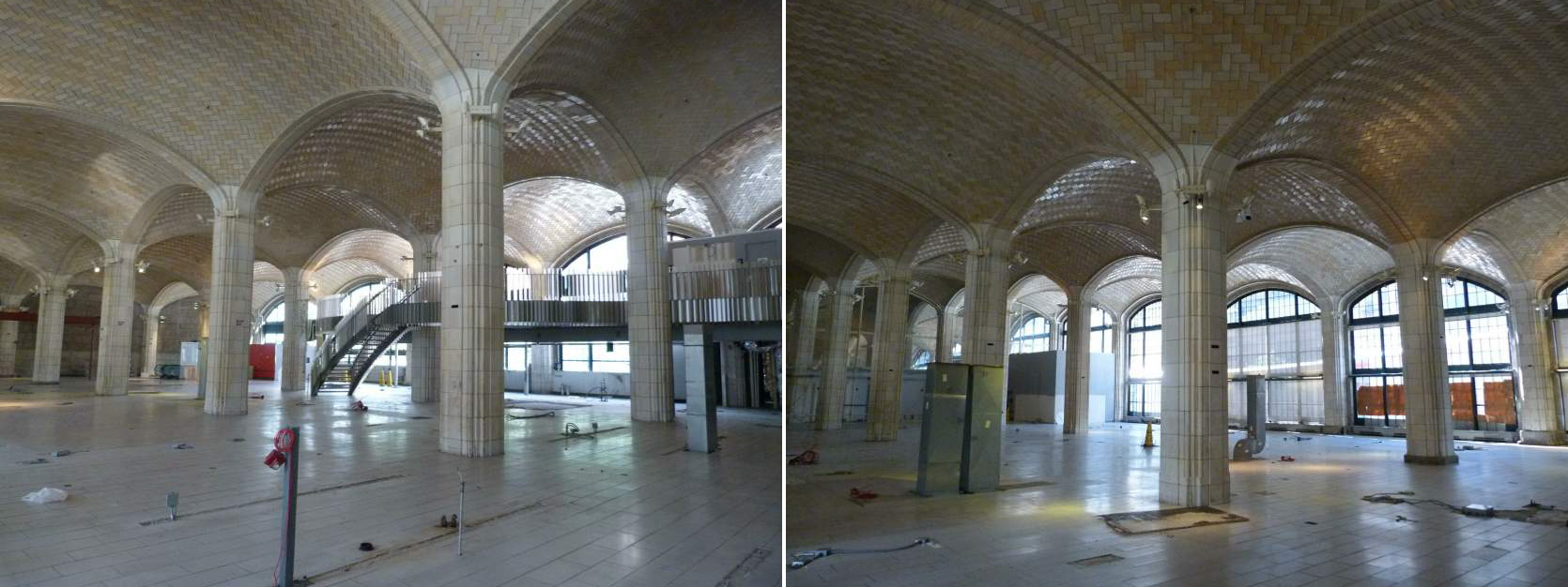
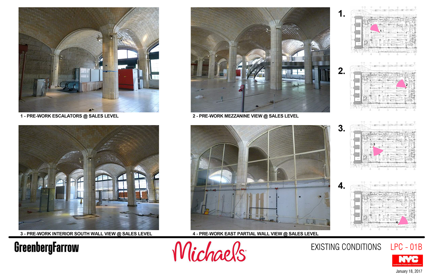
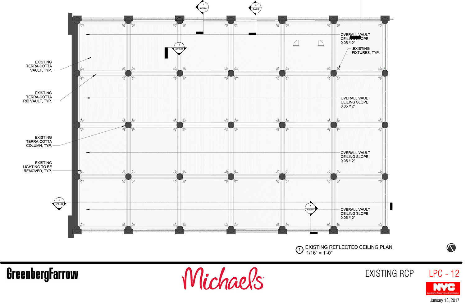
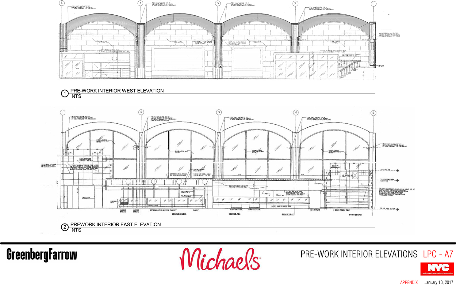
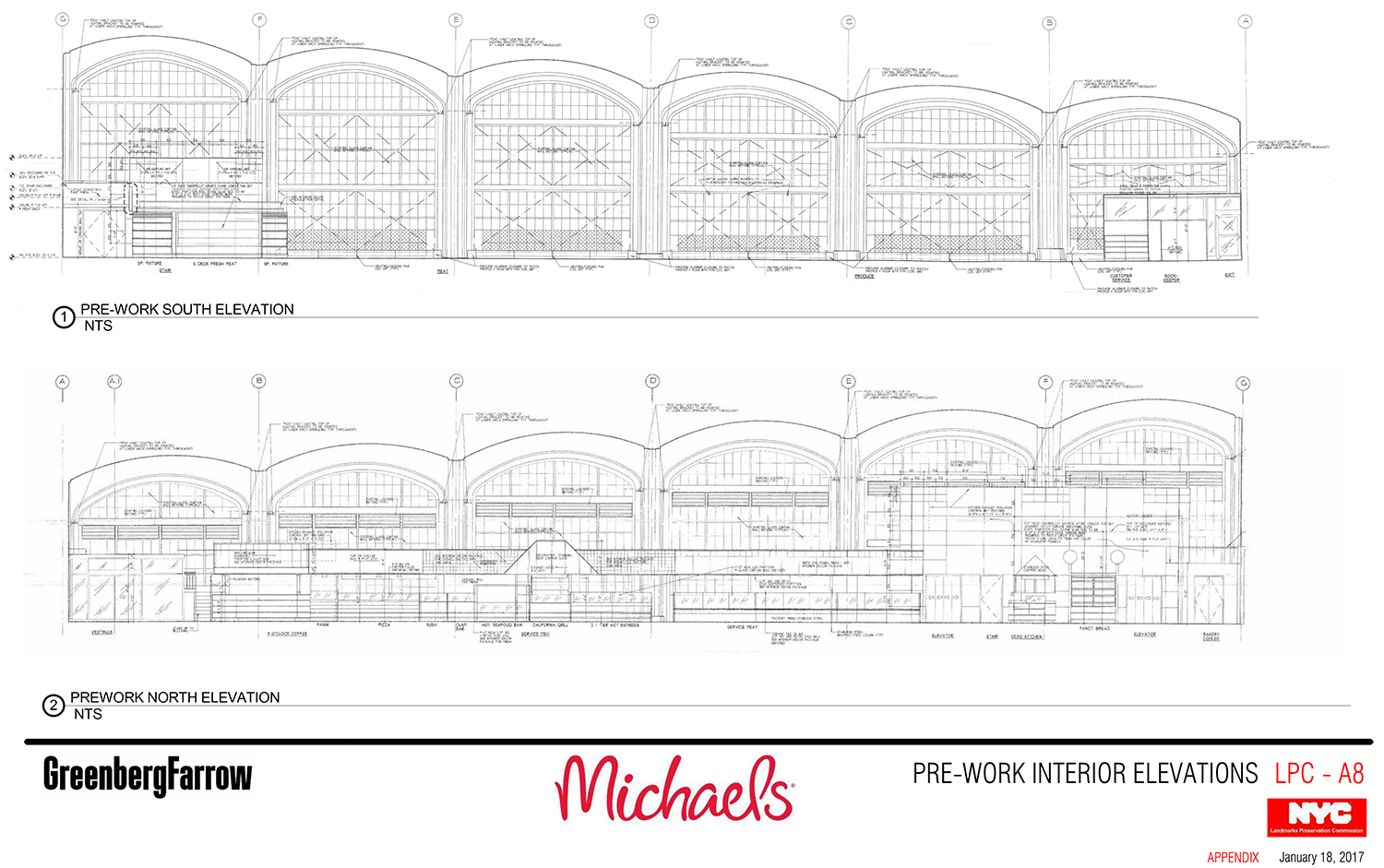
The space is so wonderful because it is topped by a Guastavino tile ceiling. Rafael Guastavino and his son, Rafael Jr., were the masters of the vaulted tile ceiling. Their work can be seen in the old City Hall subway station, the subway entrance plaza at the Manhattan Municipal Building, the elephant house at the Bronx Zoo, the registry room on Ellis Island, the Alexander Hamilton U.S. Custom House, and the Cathedral Church of St. John the Divine, among others. Portions of the old Penn Station also had a Guastavino tile ceiling.
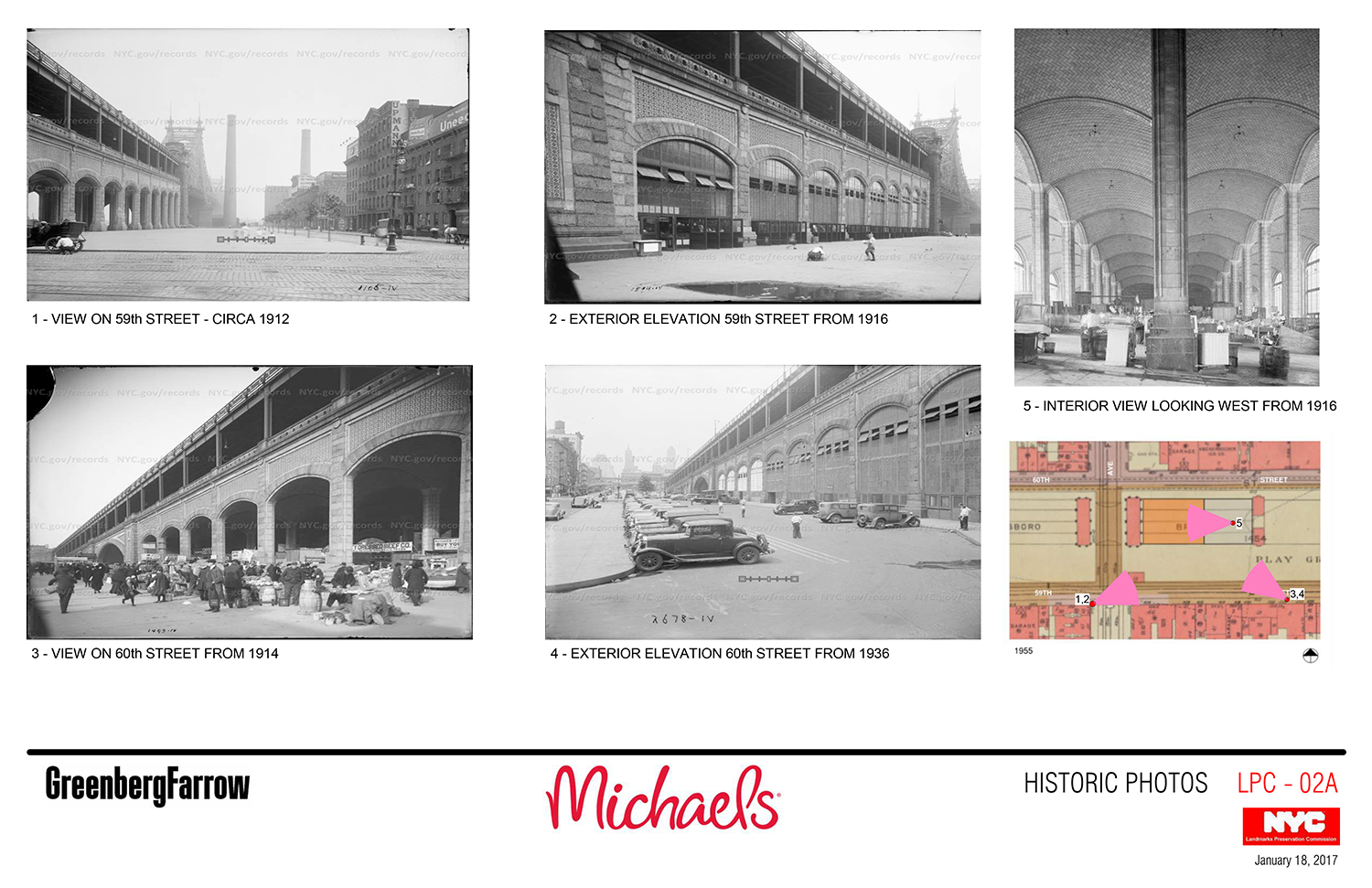
The underside of the bridge is divided in two. On the other side of a wall from the former Food Emporium is an event space called Guastavino’s. The bridge itself was designed by Henry Hornbostel and built between 1902 and 1908.
“The city seen from the Queensboro Bridge is always the city seen for the first time, in its first wild promise of all the mystery and the beauty in the world,” wrote F. Scott Fitzgerald in The Great Gatsby.
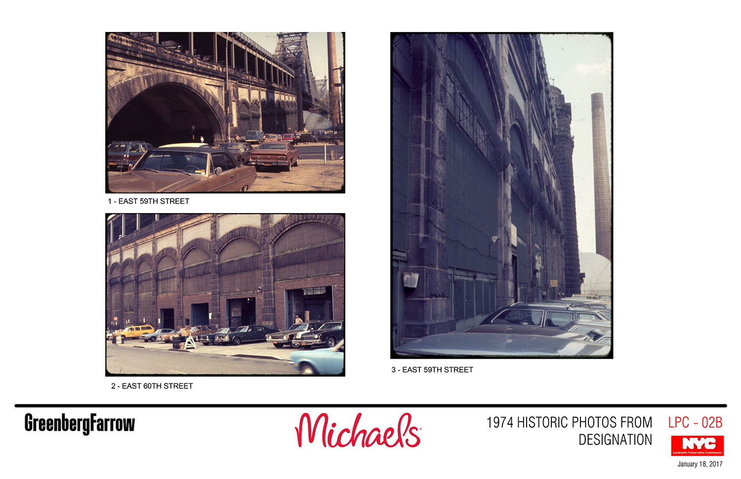
In 1974, the bridge was designated an individual landmark and has been regulated by Landmarks ever since.
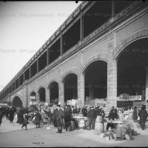
The space beneath was once an open-air market and is not an interior landmark. As a result, the way the commission regulates it is a little different from the way it deals with other interior spaces. LPC General Counsel Mark Silberman said Tuesday that the commission’s job is to maintain a sense of the “cathedral-like” feel of the place.
The proposal was presented by preservation consultant Cas Stachelberg of Higgins Quasebarth & Partners and Brian Dylan of the architecture firm GreenbergFarrow.
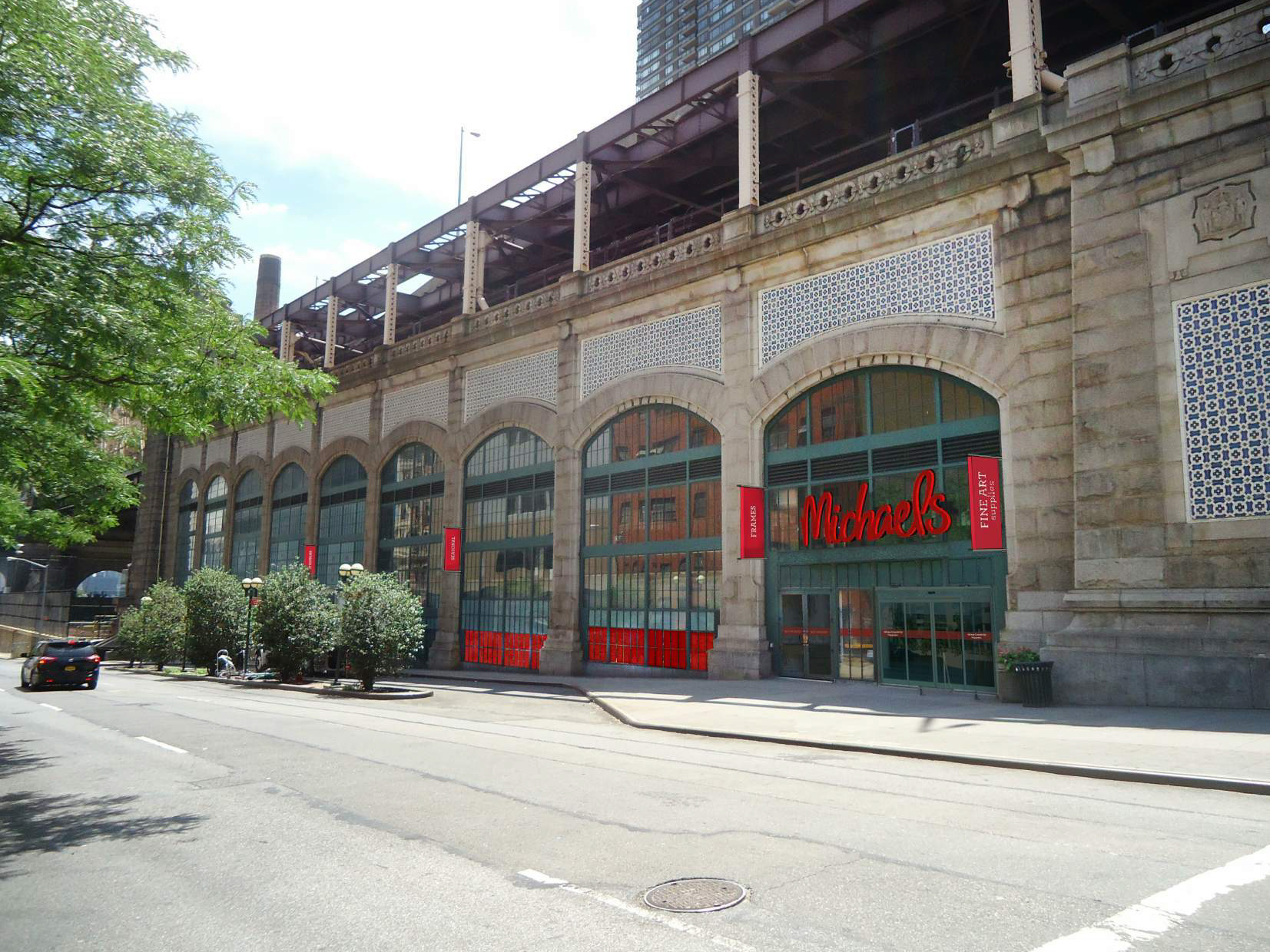
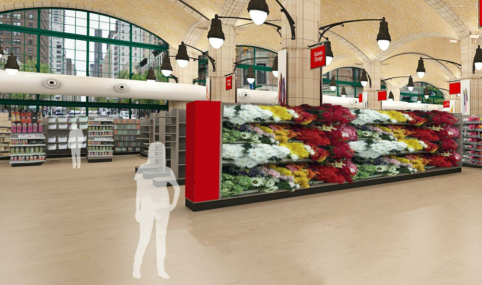
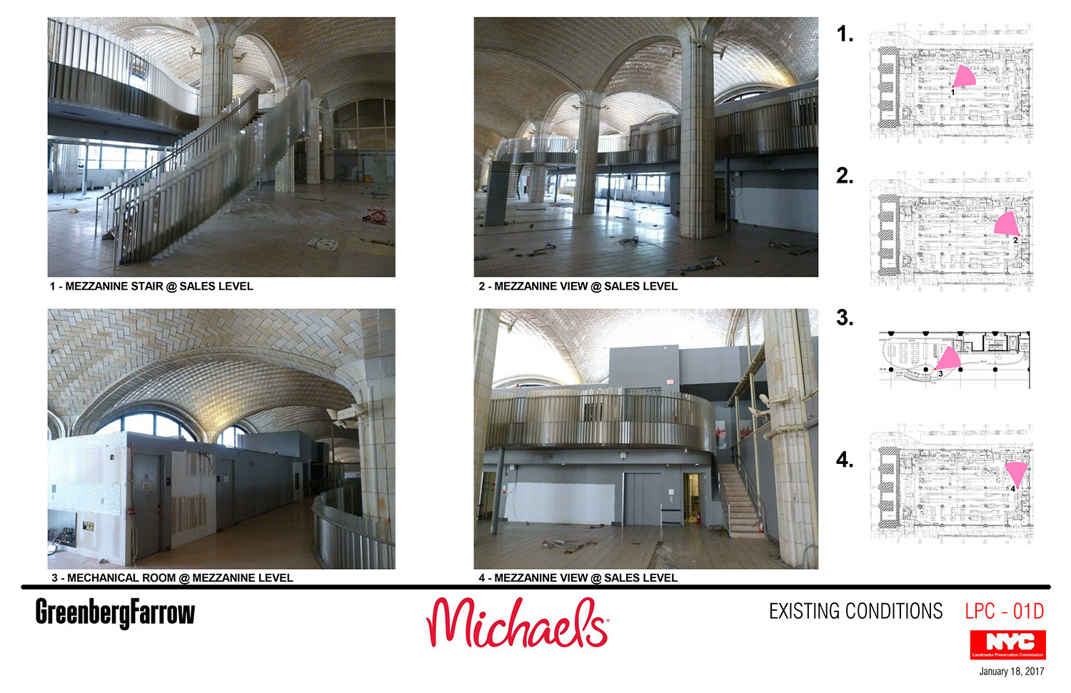
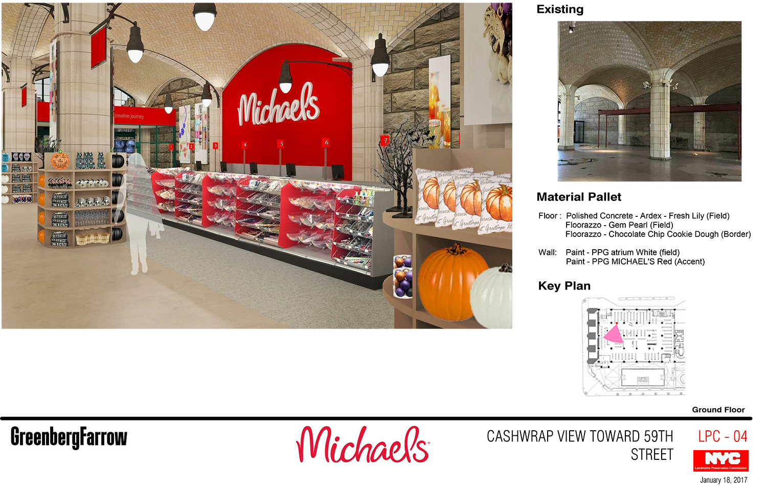
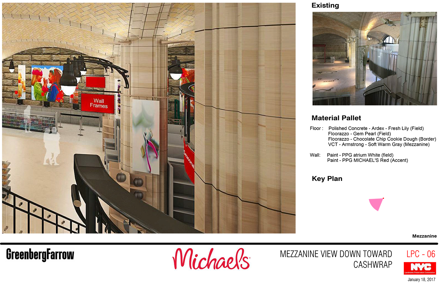
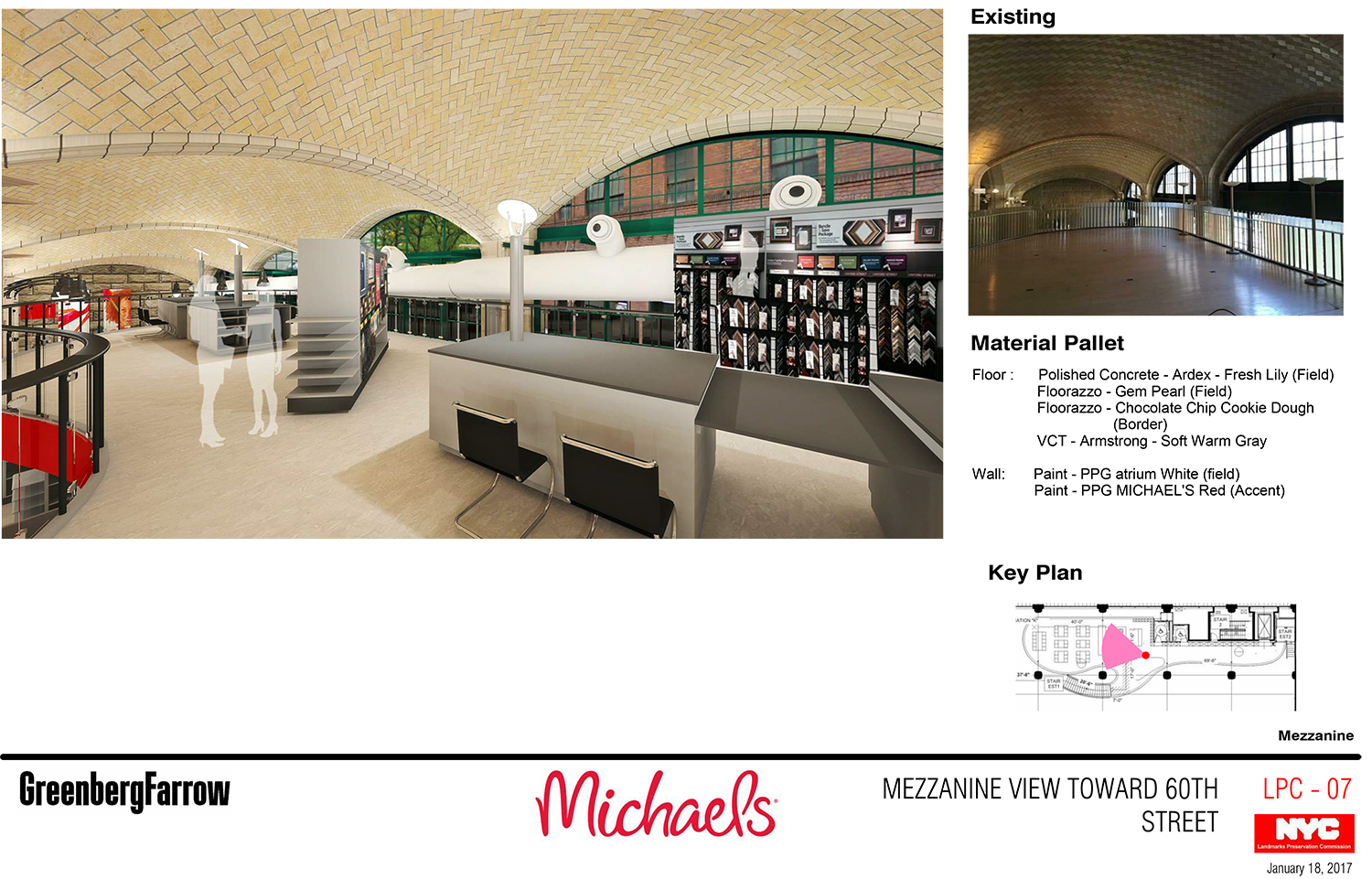
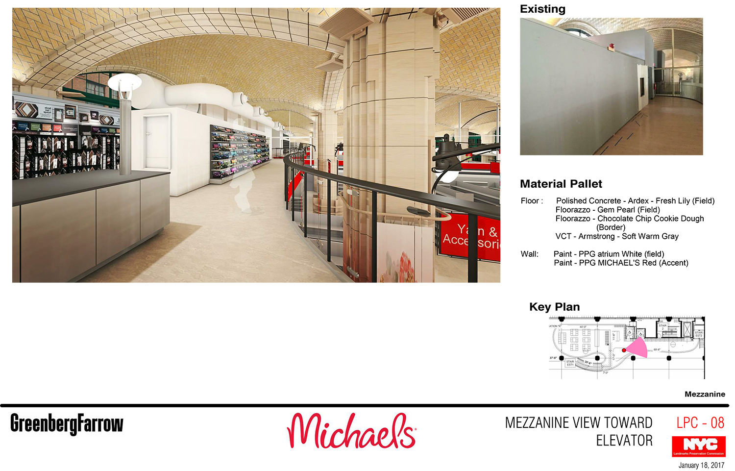
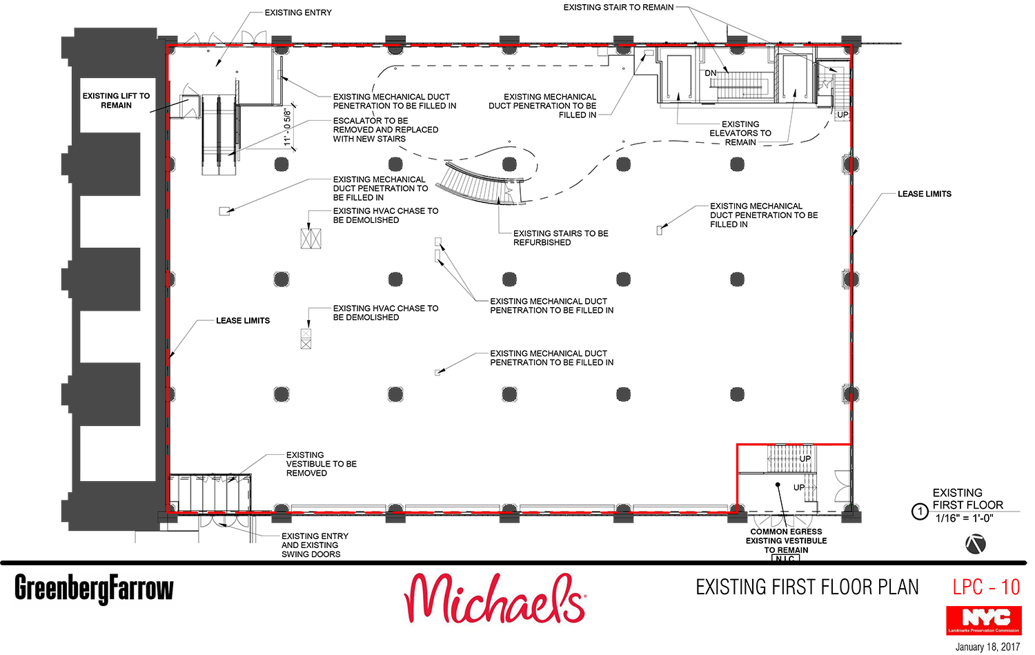
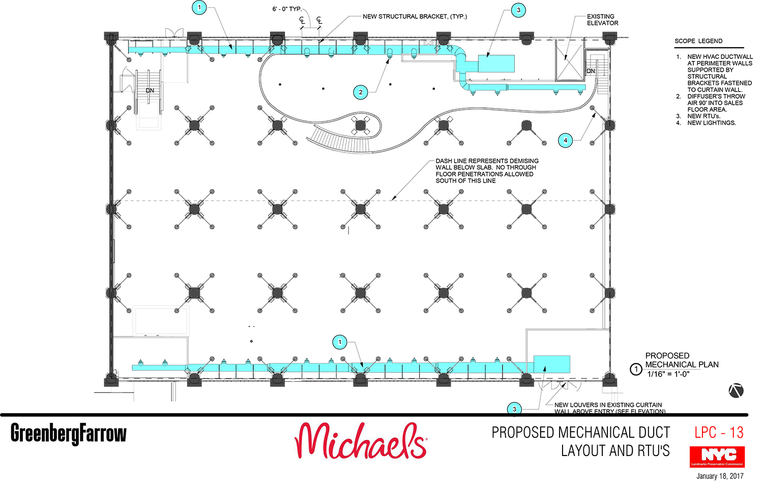
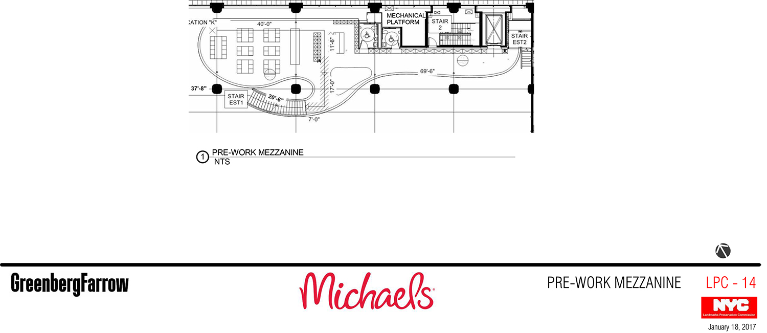
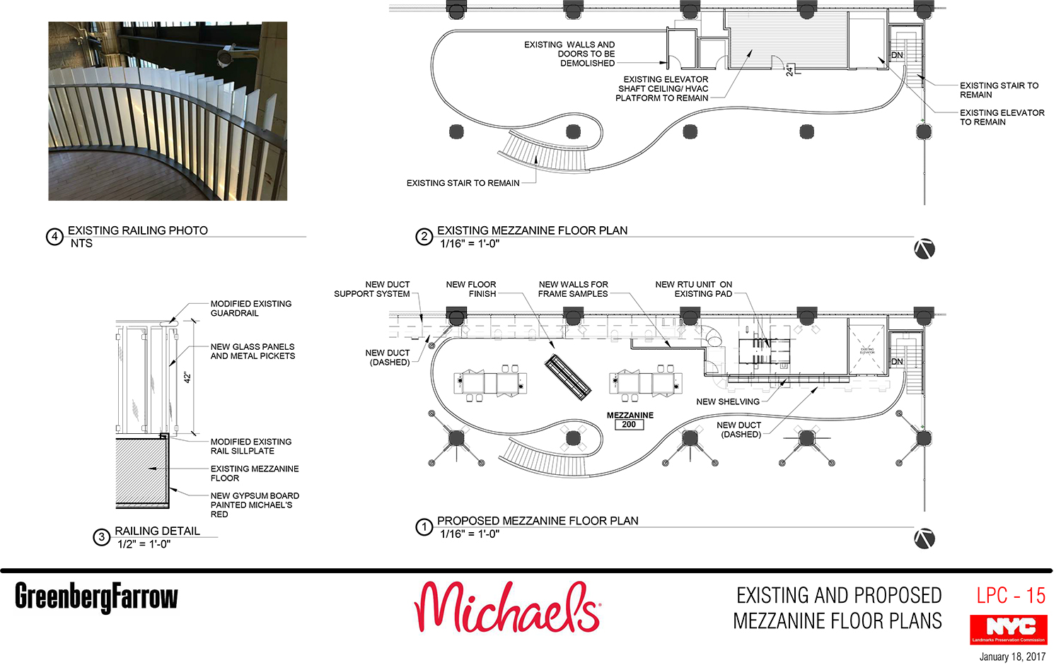
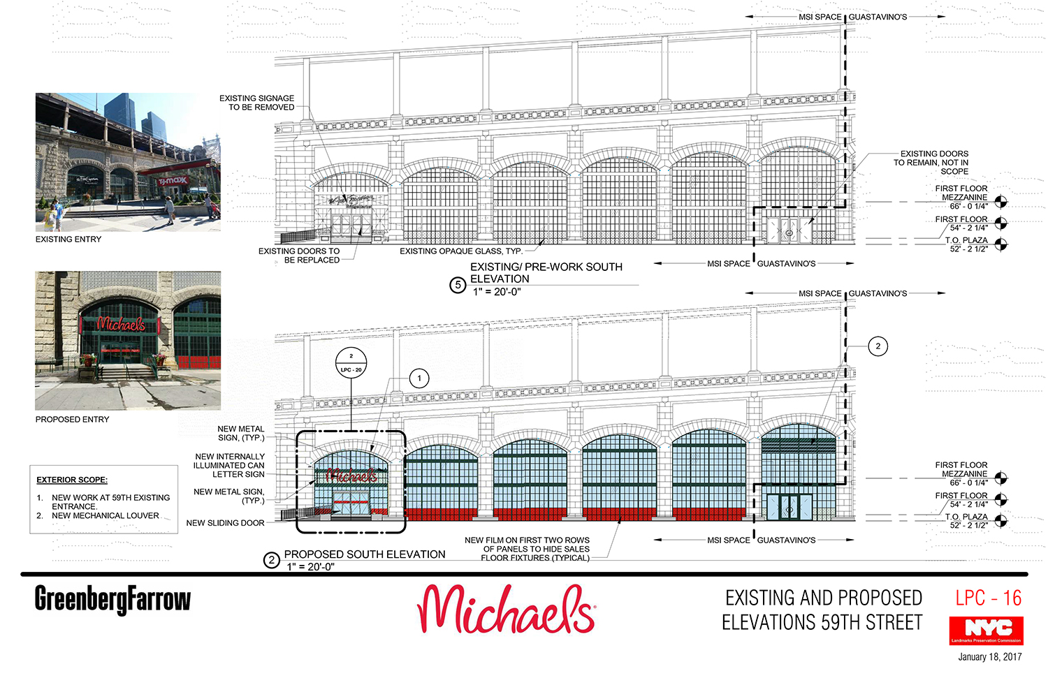
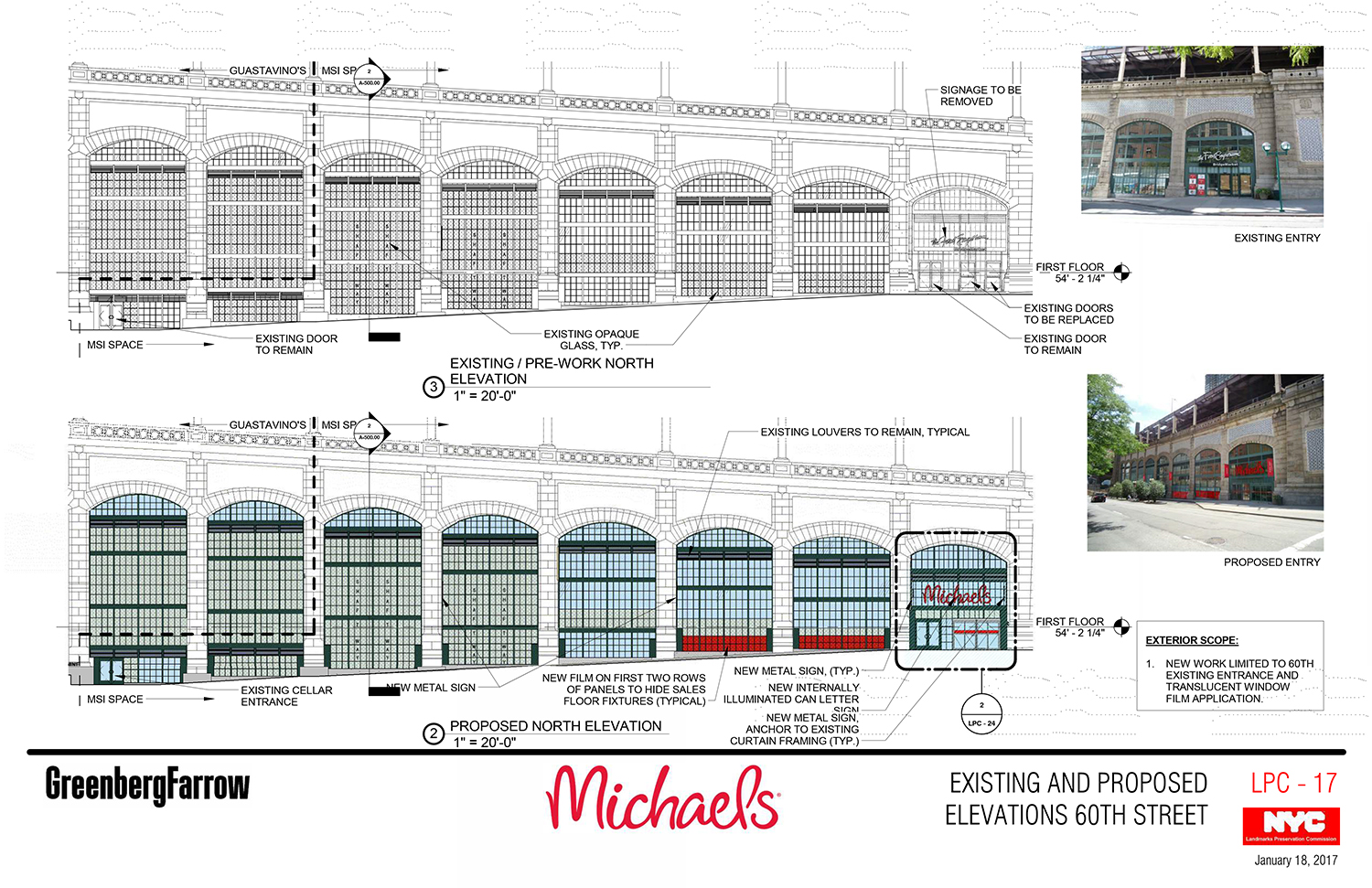
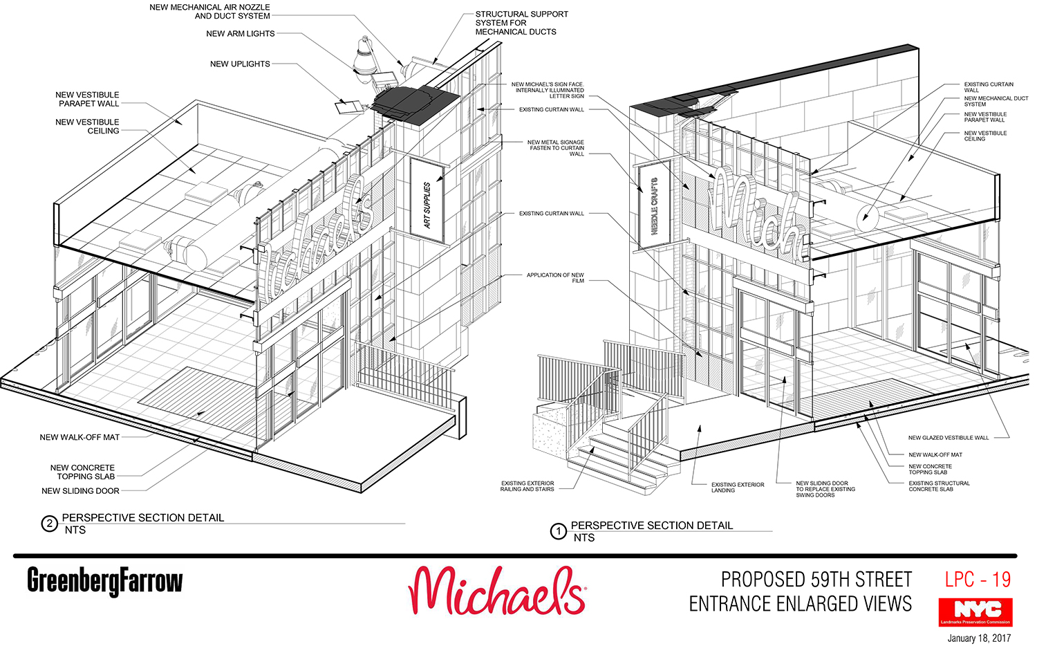
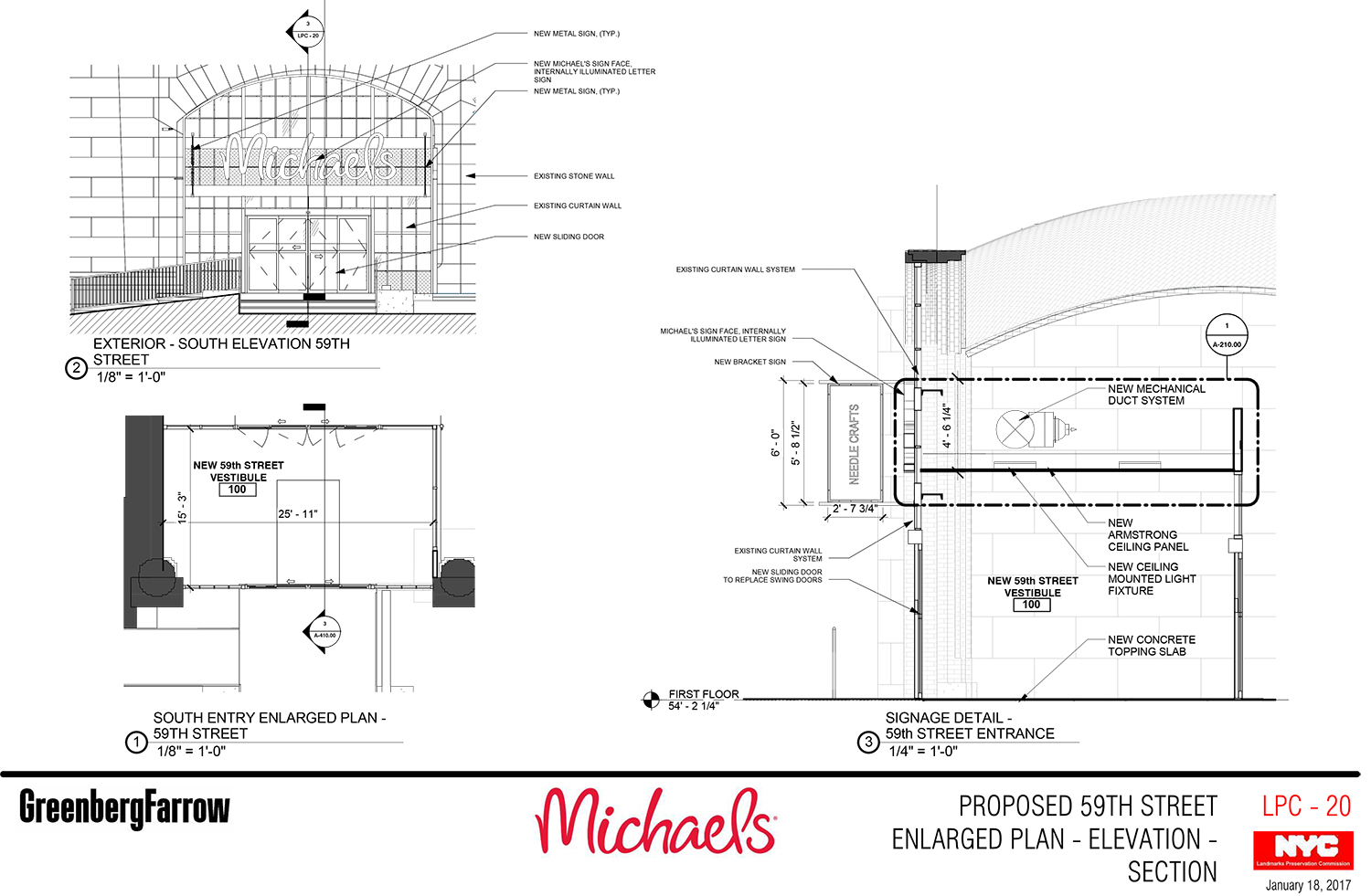
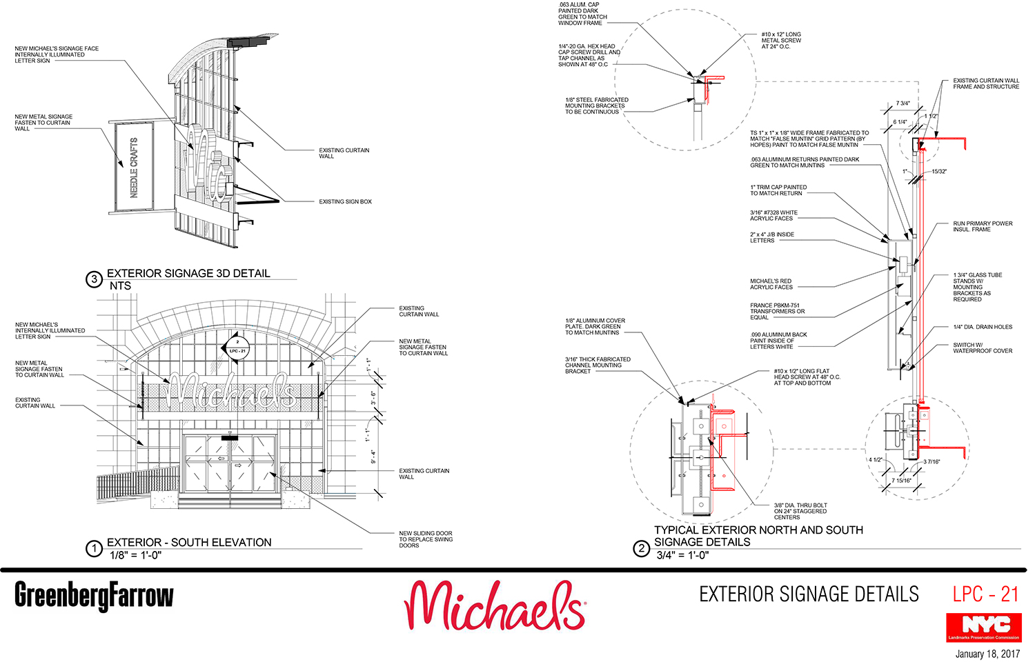
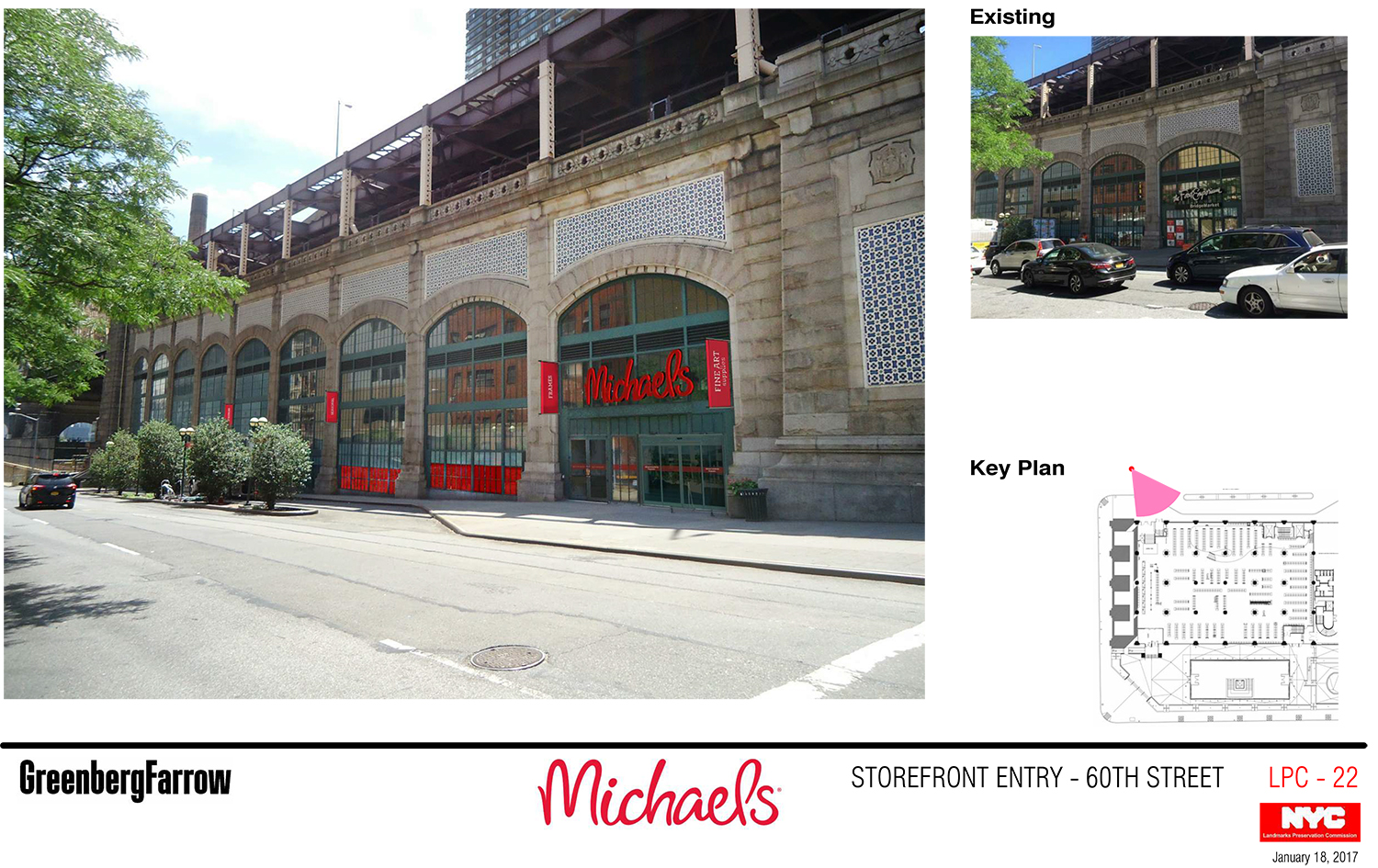
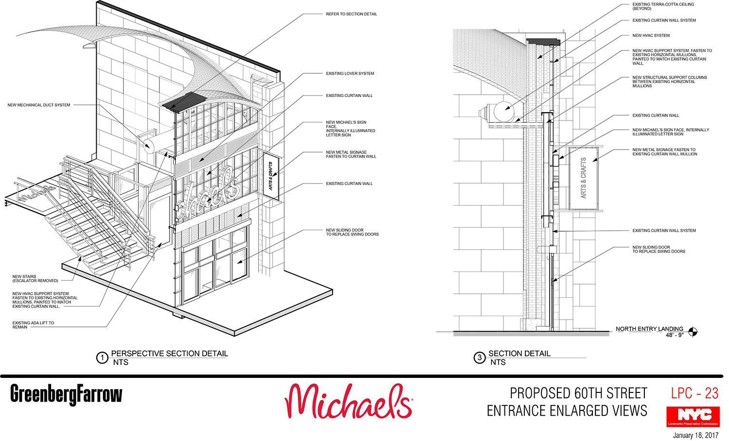
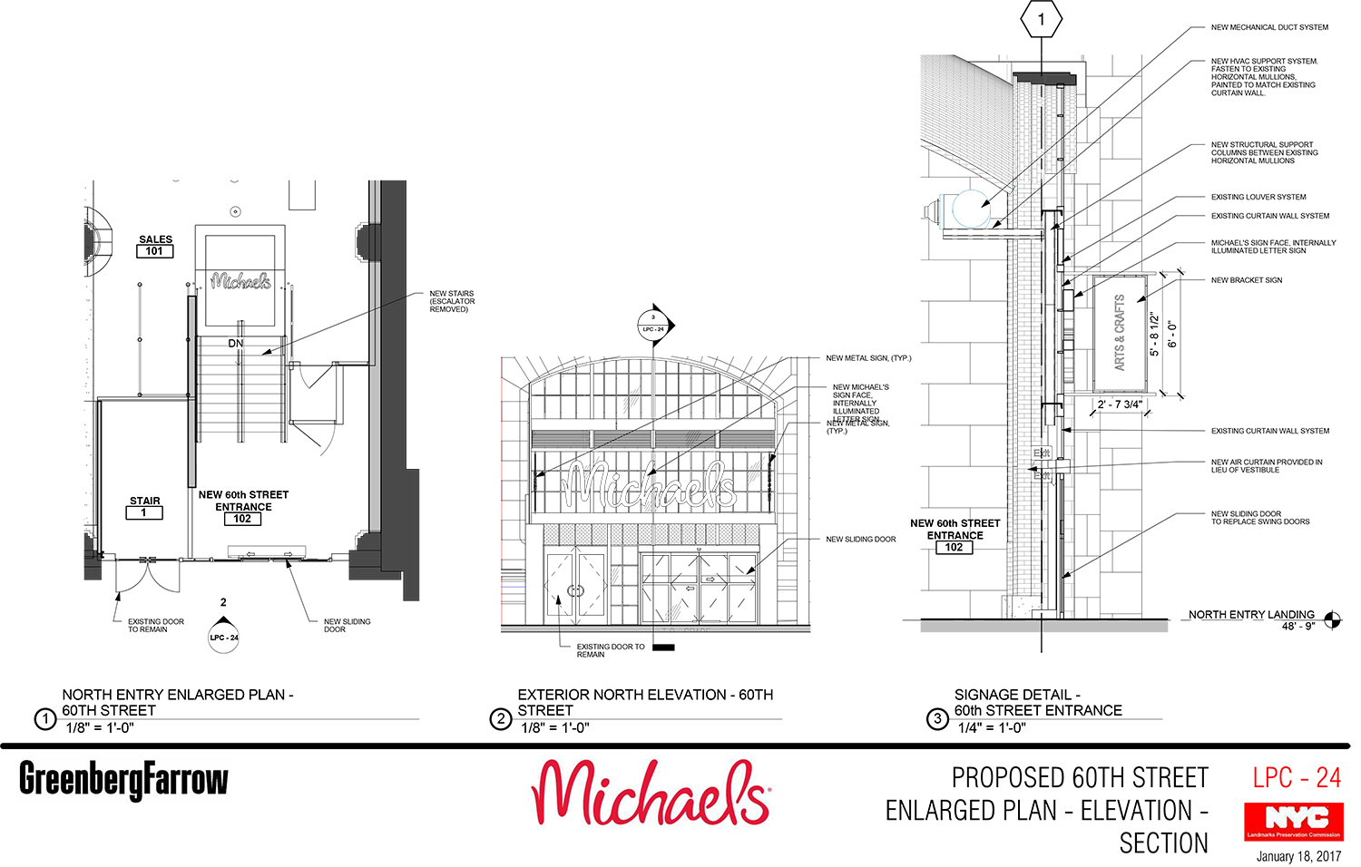
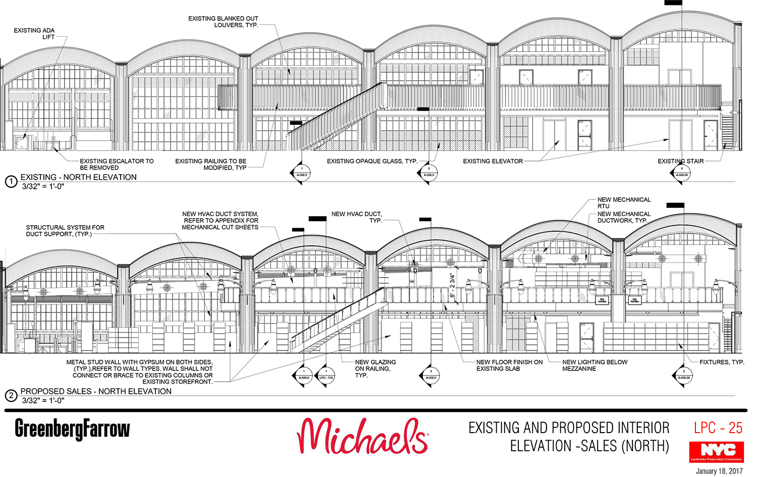
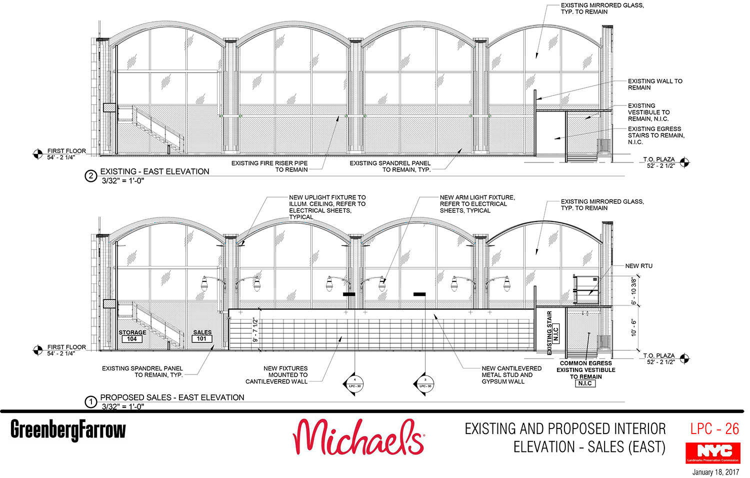
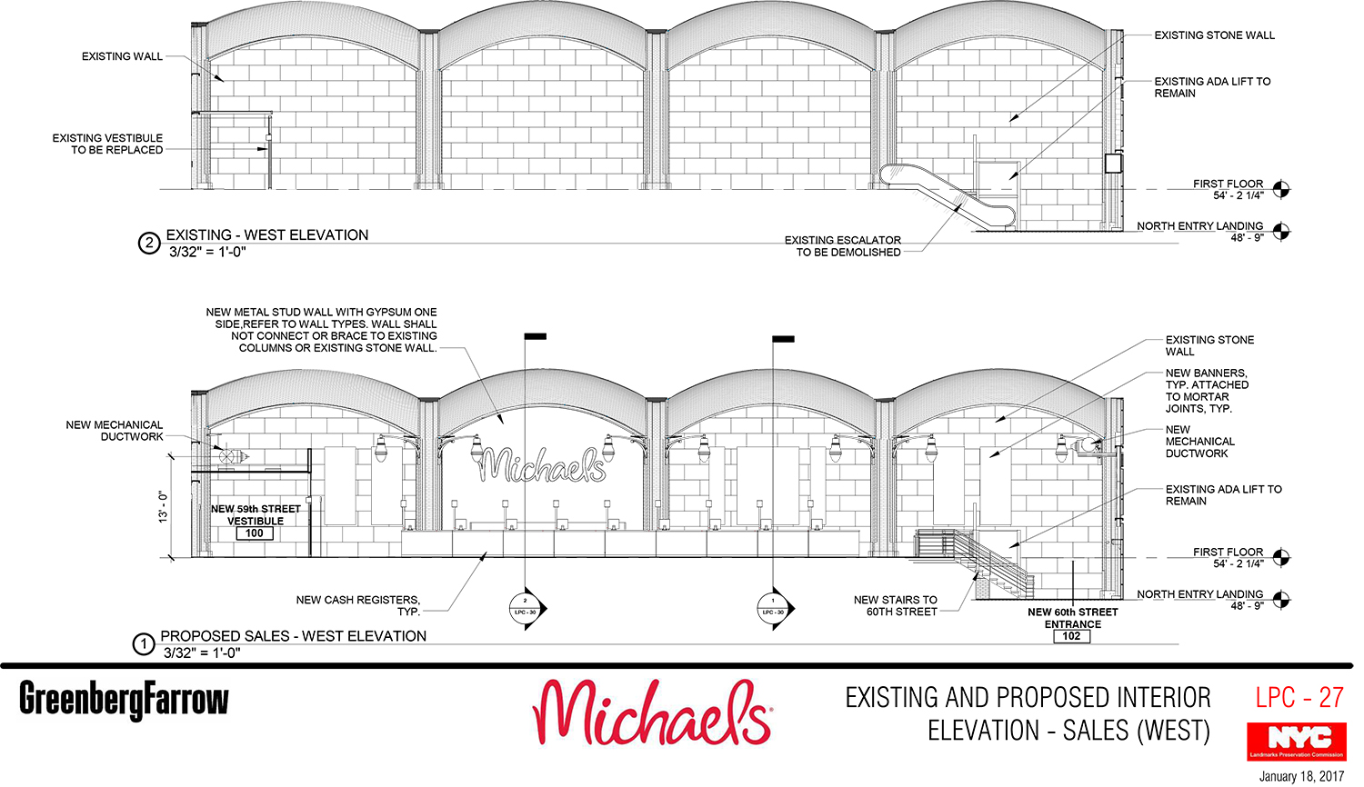
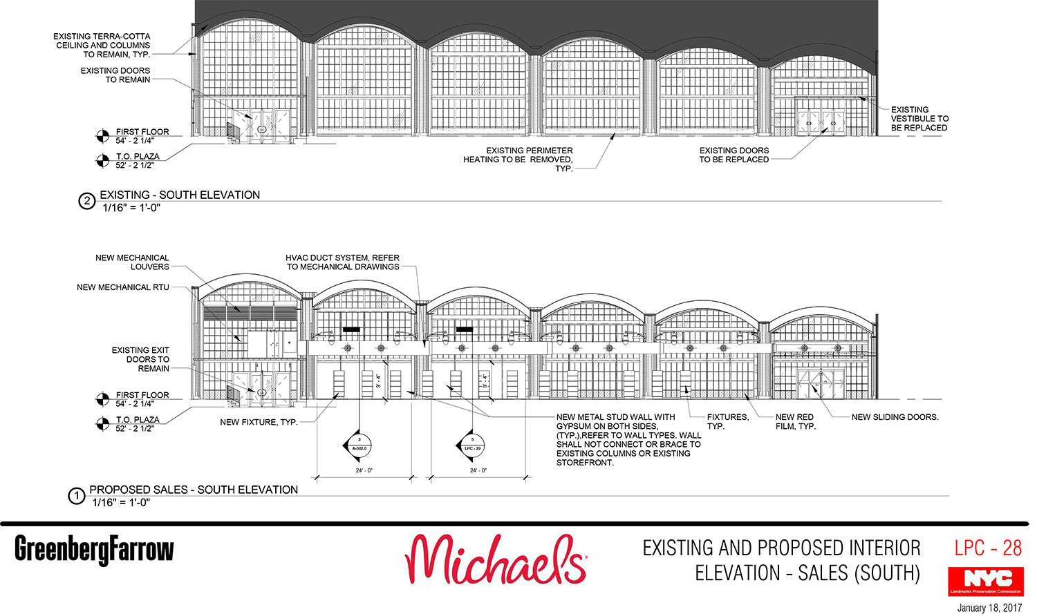
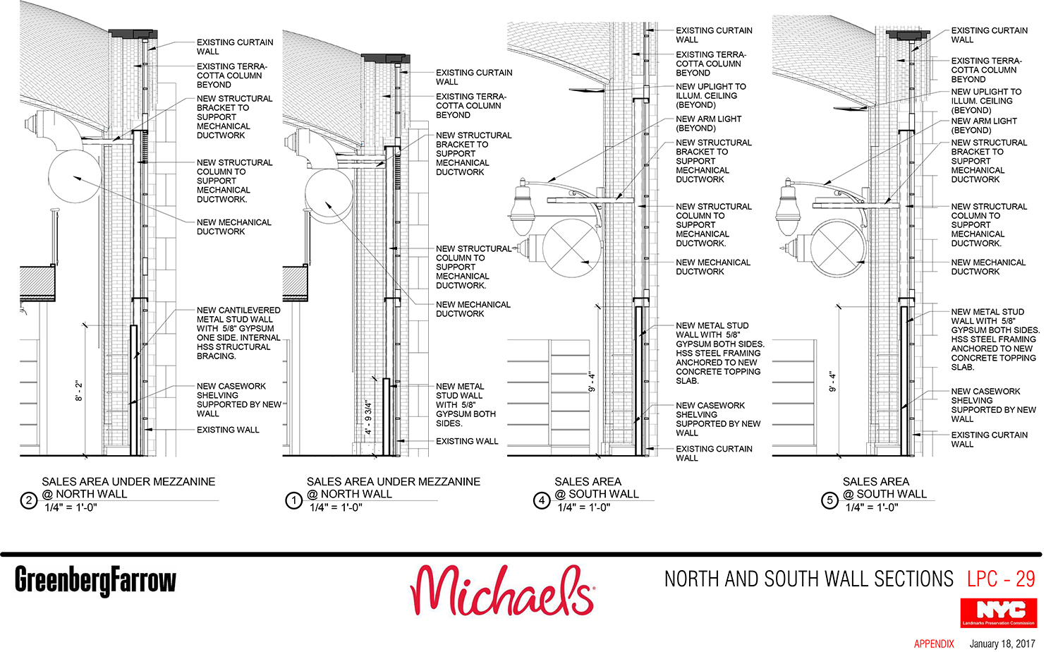
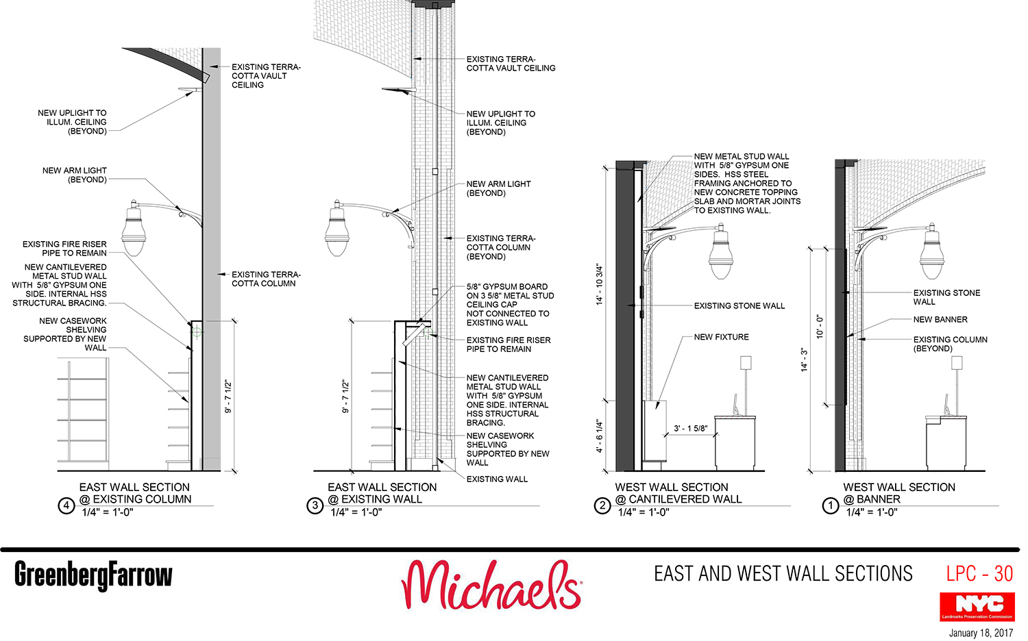
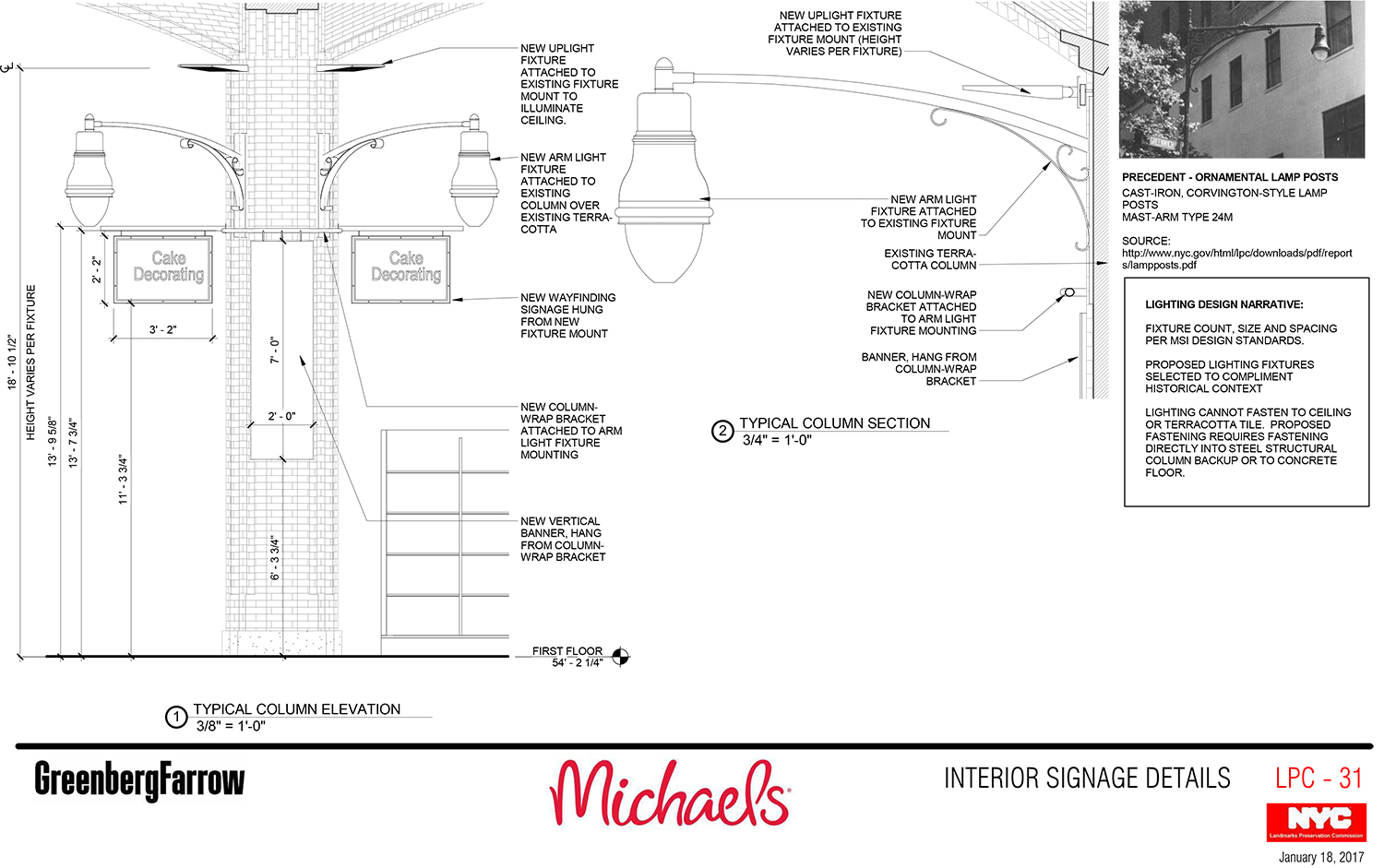
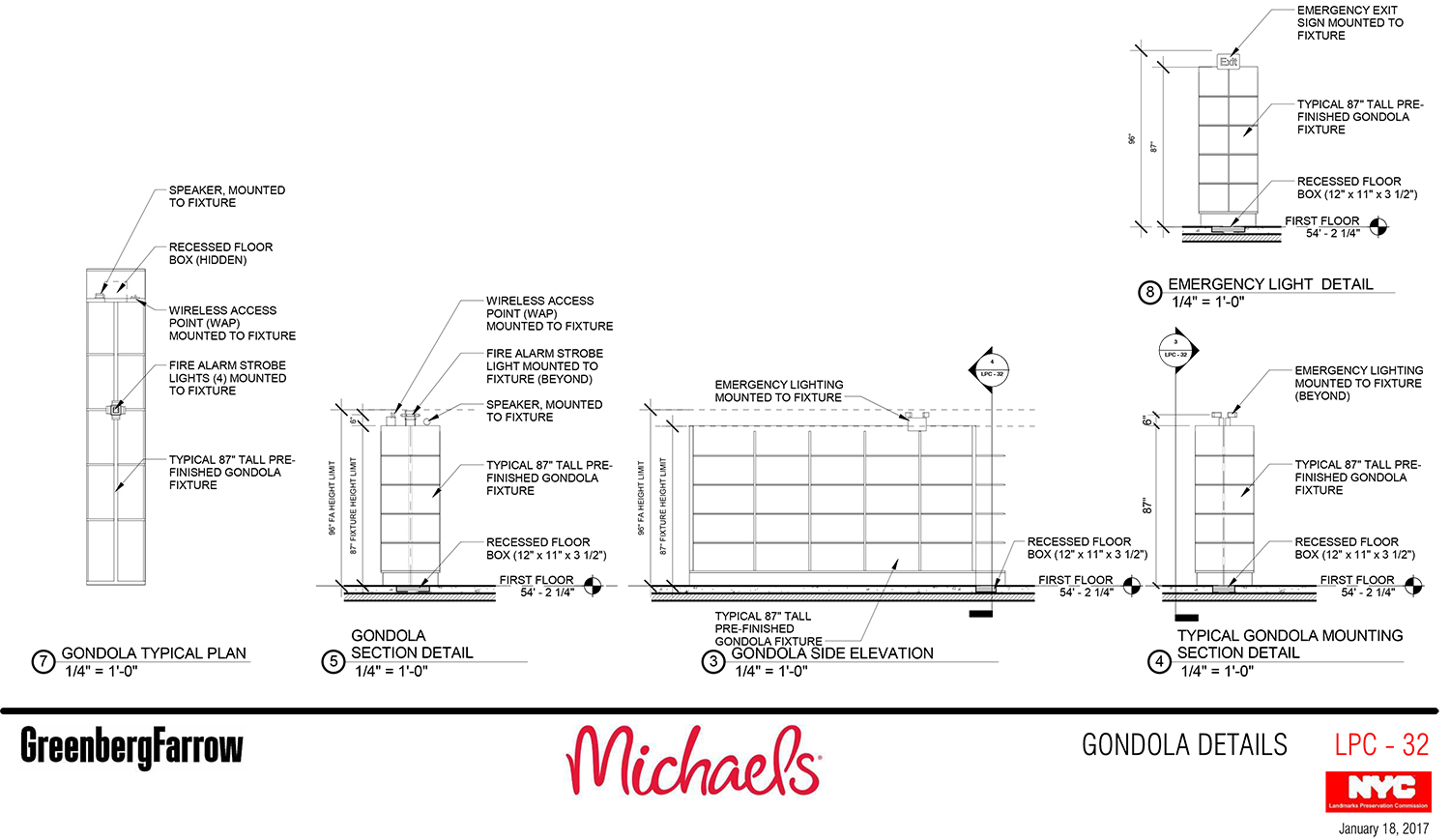
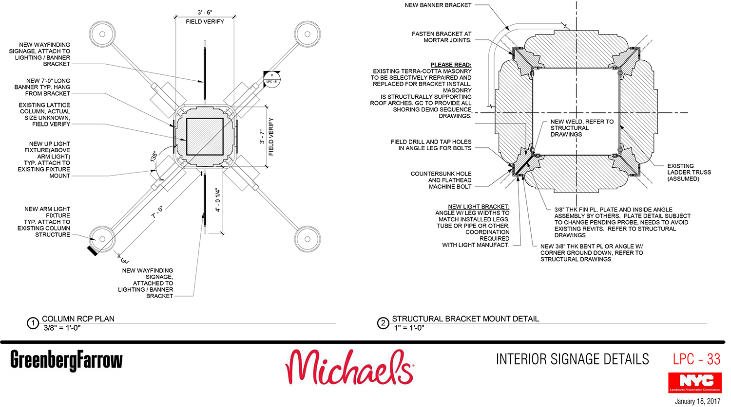
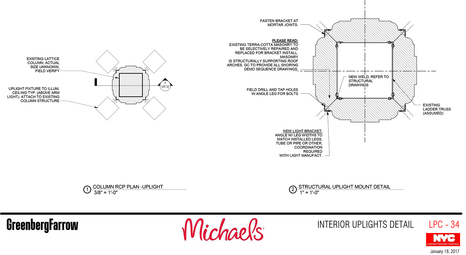
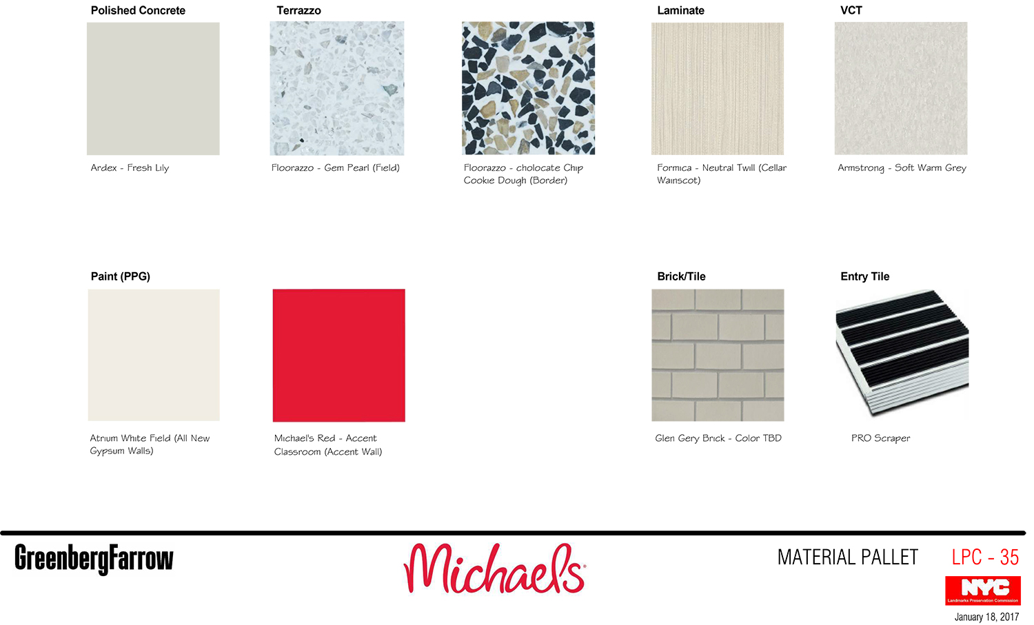
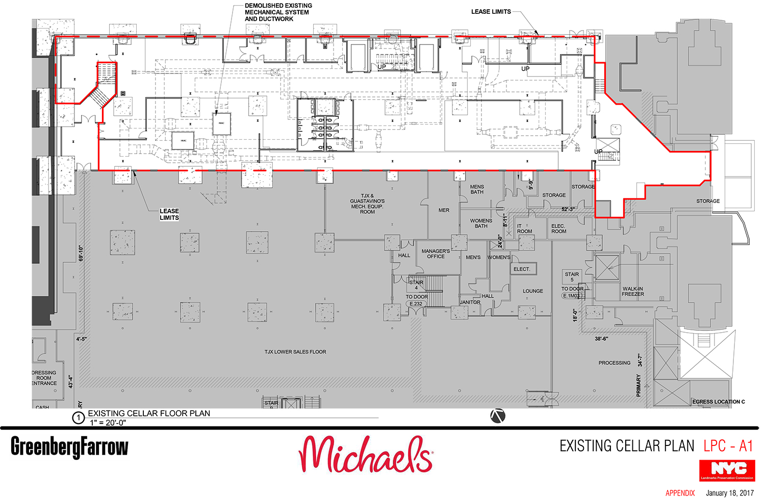
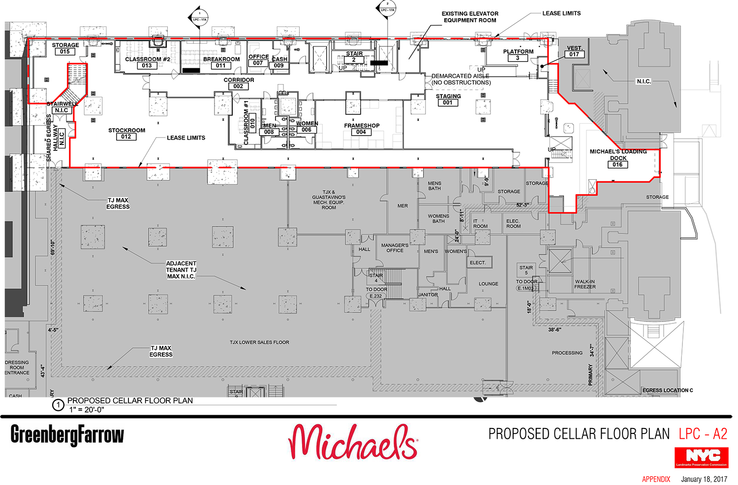
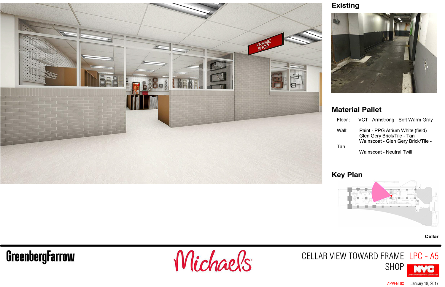
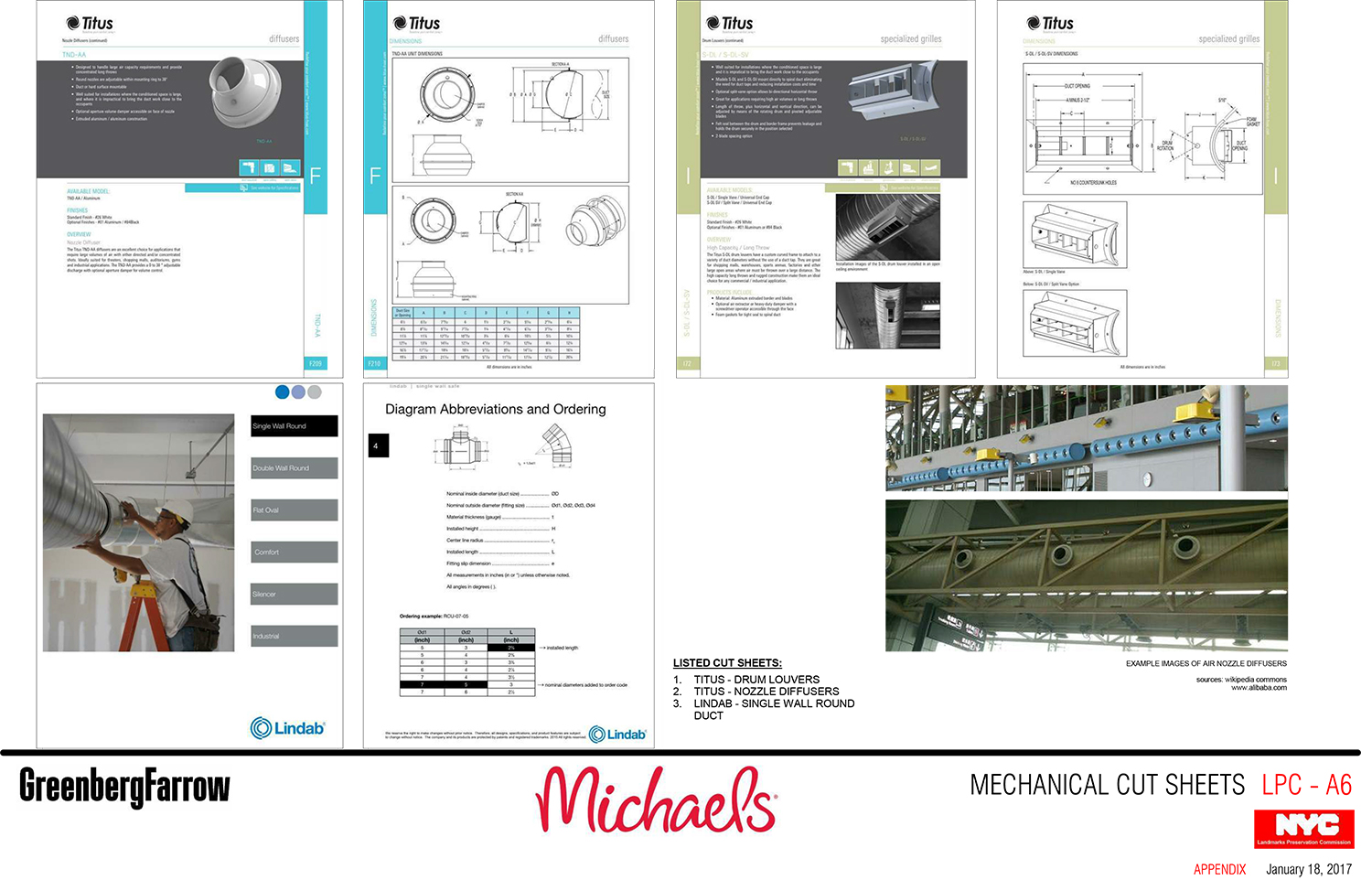
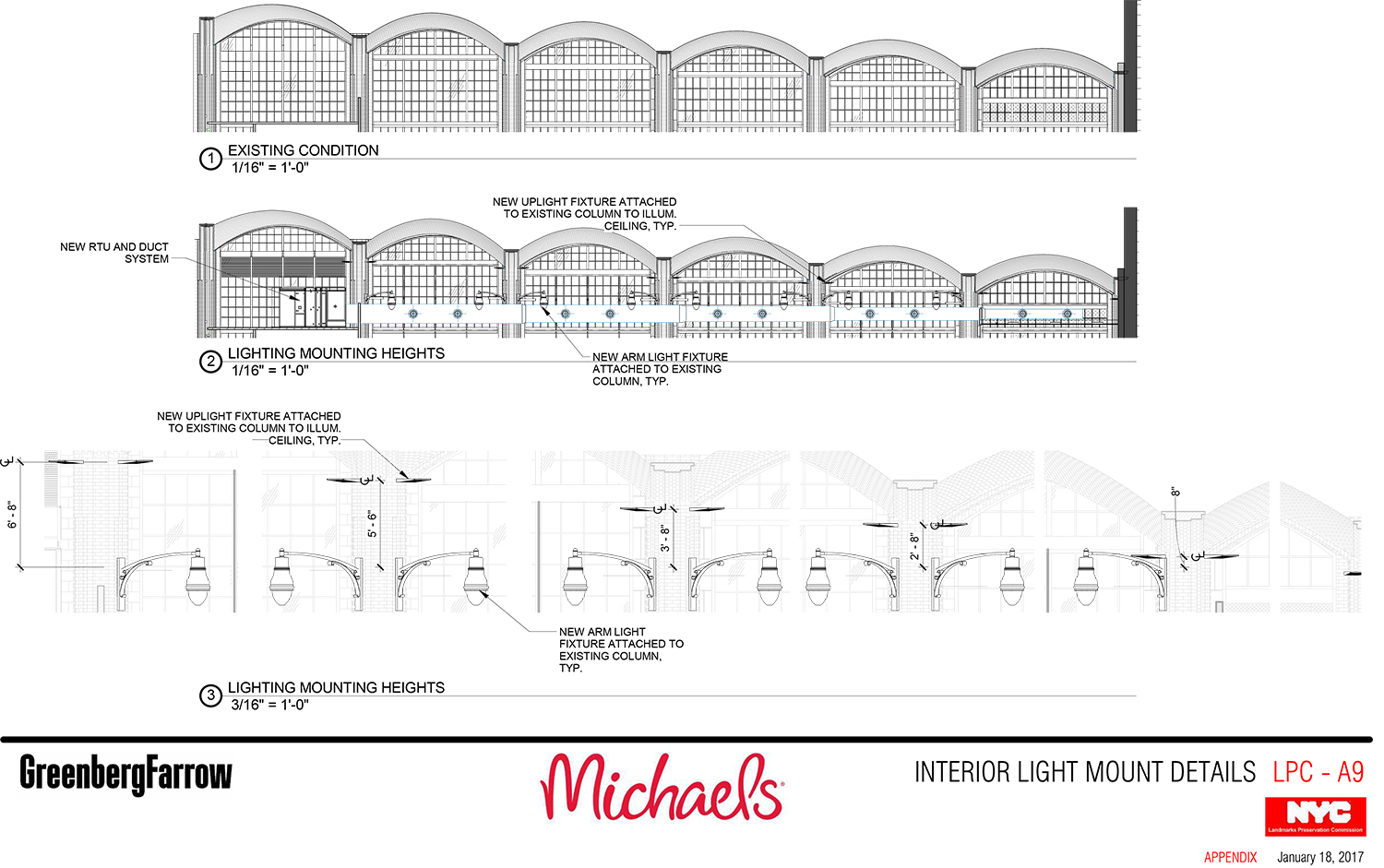
The proposal calls for new interior-lit outdoor signage, new uplighting and omnidirectional lighting mounted to the columns, a new ventilation system connected to the southeast section of the space by ductwork, and reversible red panels on existing opaque panels to the east of the main entrances. On the inside, a self-supporting sign would be behind the cash registers and a frame shop would occupy the mezzanine level.
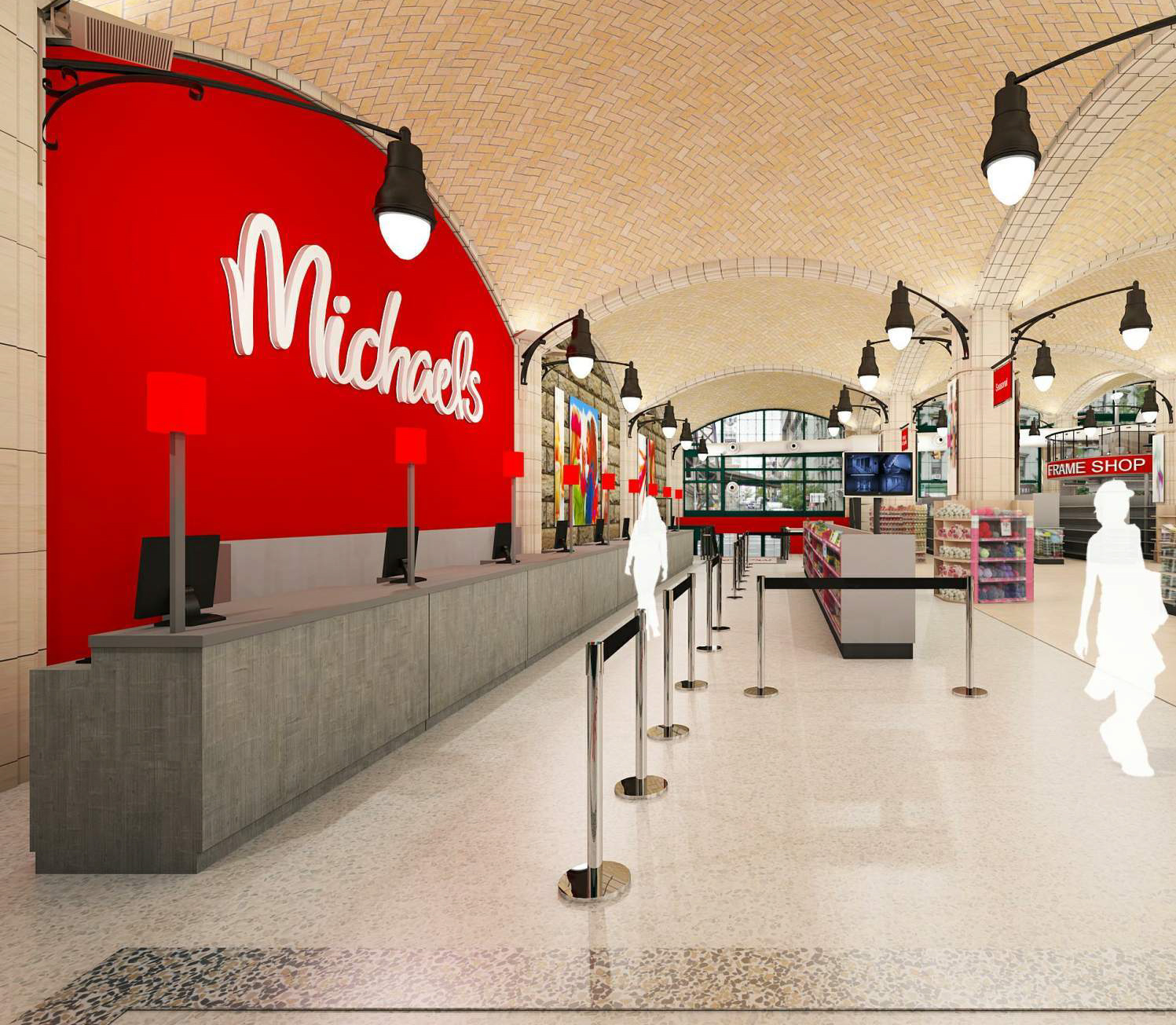
Rendering of the cash register area at the Michaels proposed for the space beneath the Queensboro Bridge.
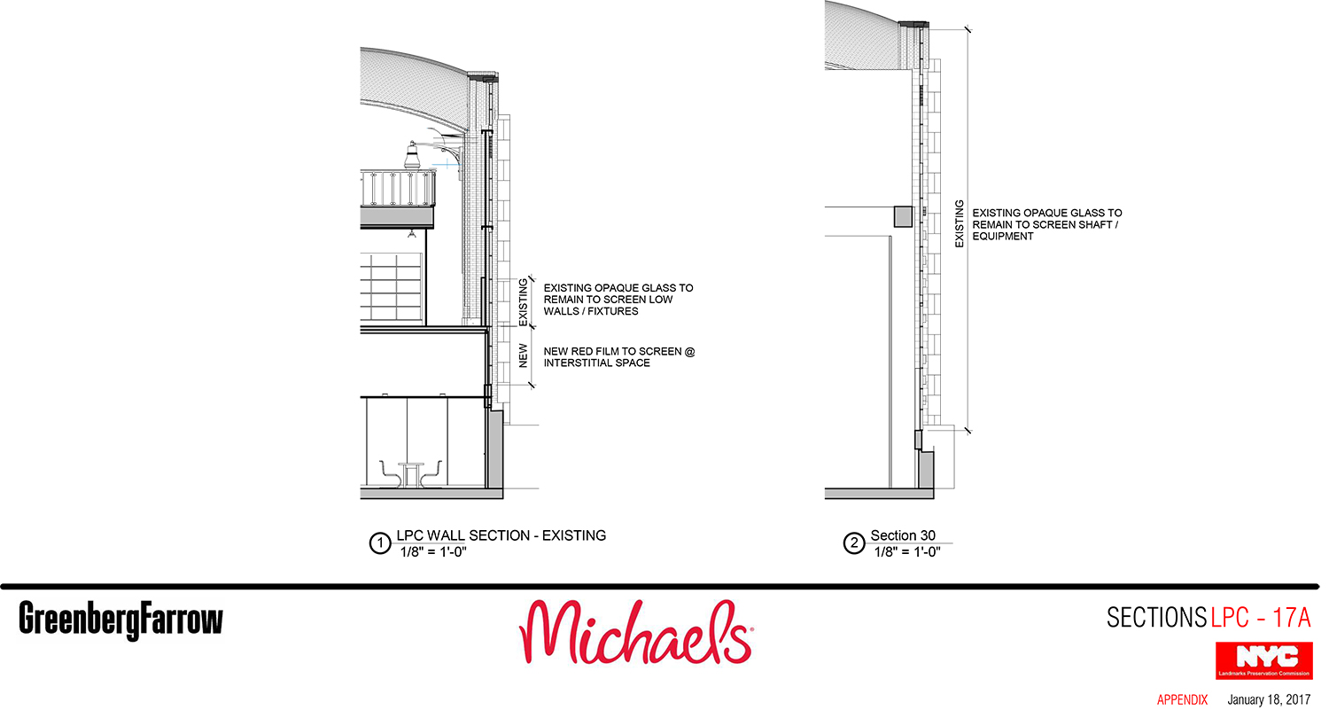
Commissioner Diana Chapin said the overall design was “working fairly well” and she was happy only one tenant is intended for the former supermarket space. However, she said she doesn’t like the red panels, which form a sort of strip on the exterior. Dylan made it clear that the amount of opaque space on the exterior wouldn’t actually change, but would just be reconfigured.

Rendering of the Michaels proposed for the space beneath the Queensboro Bridge. New lighting can clearly be seen here.
Commissioner Michael Goldblum was not a fan, agreeing with Commissioner Chapin’s negative view of the red panels. He also didn’t like the non-uniform height of the proposed lighting, saying it would detract from the experience of the space. He also had a problem with the ducts. Commissioner Michael Devonshire had “extreme misgivings” about the lighting. Commissioner Jeanne Lutfy agreed with all of her fellow commissioners’ negative assessments.
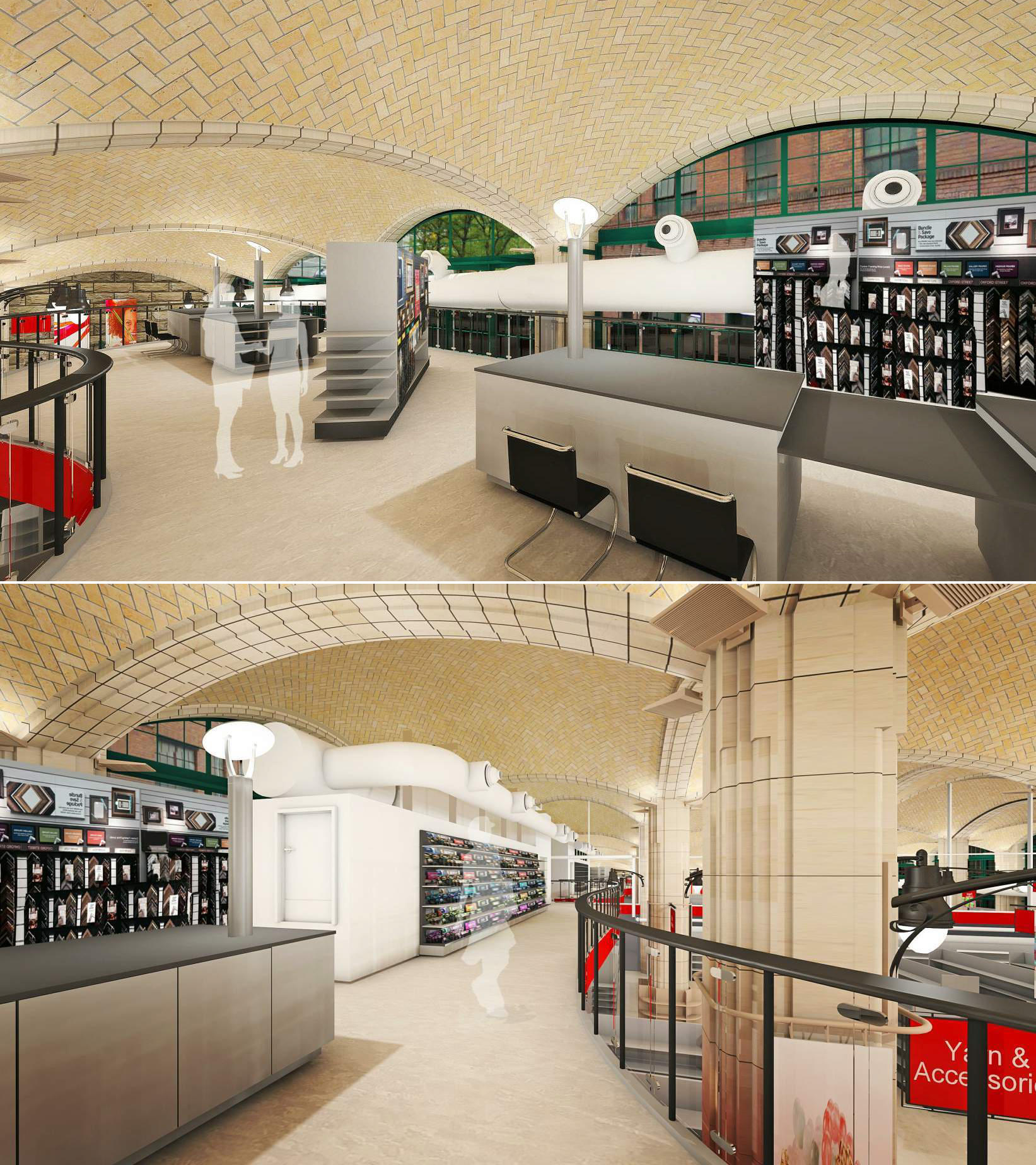
Renderings of the proposed Michaels frame shop at the mezzanine level of the space beneath the Queensboro Bridge.
LPC Chair Meenakshi Srinivasan said she thought the proposed signage worked well and believed there was precedent for the ductwork, but she wasn’t sold on the lighting scheme.
Manhattan Community Board 8 recommended approval of the project. Judy Schneider of the East Sixties Neighborhood Association testified in support of the project, as did her husband, Barry, who described the bridge as a “magnificent, muscular structure.”
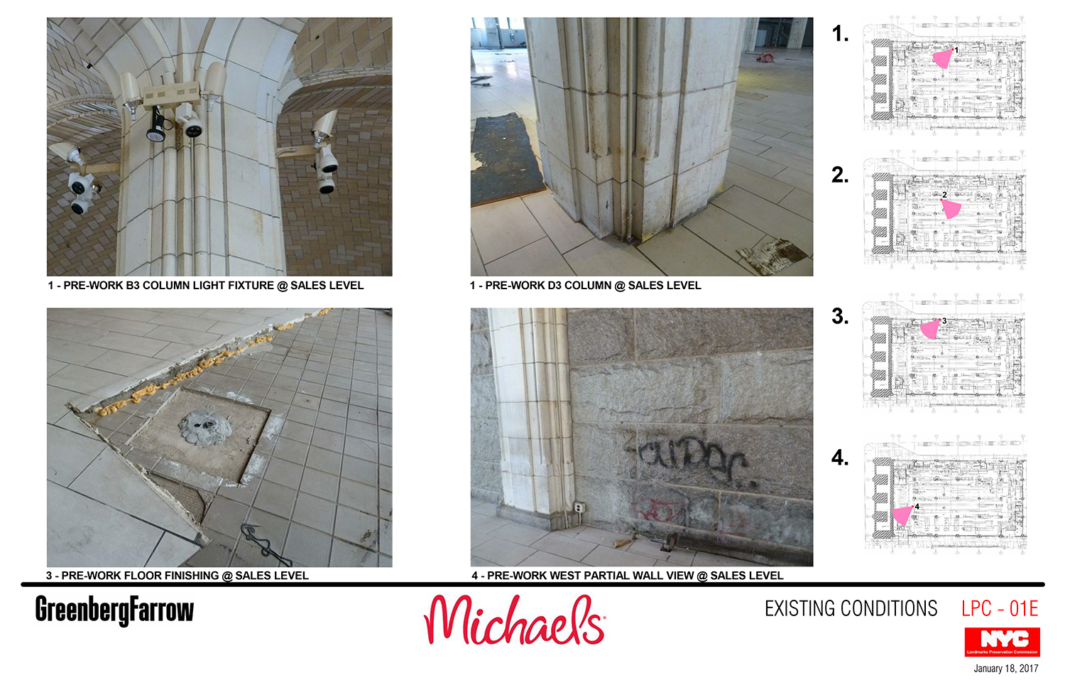
Rachel Levy, executive director of Friends of the Upper East Side Historic Districts, seemed closer to the feelings of the commissioners. She expressed concern about the removal and replacement of terra cotta and said the proposed HVAC system was “unsightly.”
In the end, the commission took no action, meaning the public must await tweaks to the proposal.
View the full presentation slides here:
Subscribe to YIMBY’s daily e-mail
Follow YIMBYgram for real-time photo updates
Like YIMBY on Facebook
Follow YIMBY’s Twitter for the latest in YIMBYnews












So many red-colors over everywhere more than necessary I directly criticized, smaller them to mix and match other materials.