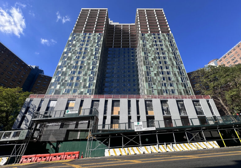
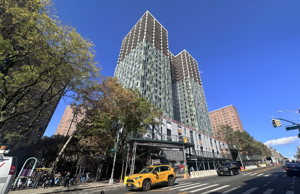
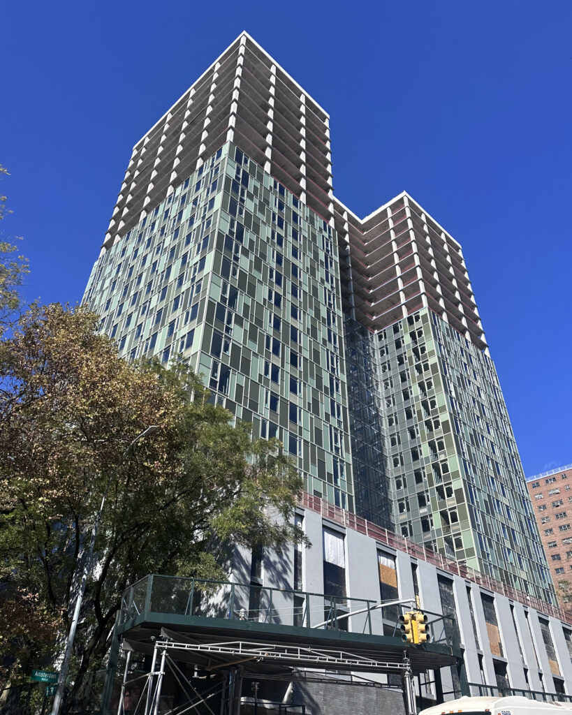
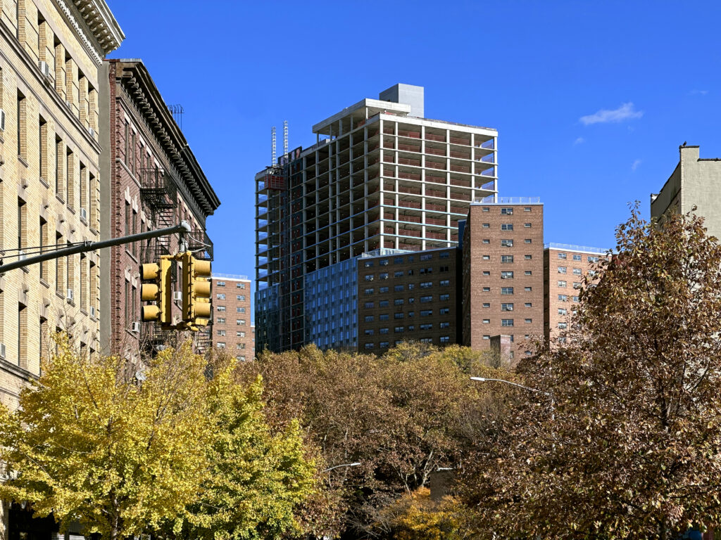
Façade installation is steadily progressing on 1440 Amsterdam Avenue, a 28-story residential building in West Harlem, Manhattan. Designed by Gluck+ and developed by Grid Group and Artimus, the 288-foot-tall structure will span 389,704 square feet and yield 490 rental units with an average scope of 753 square feet, as well as 10,998 square feet of commercial space, a 9,557-square-foot community facility, a cellar level, and 273 enclosed parking spaces. The property is located on an interior lot between West 129th Street and West 133rd Streets.
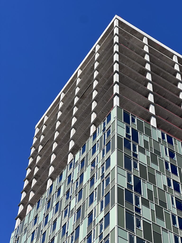
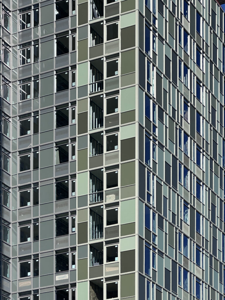
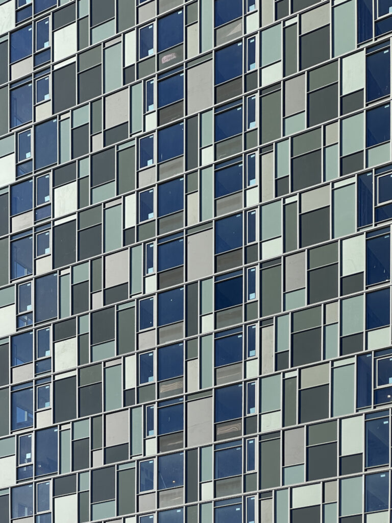
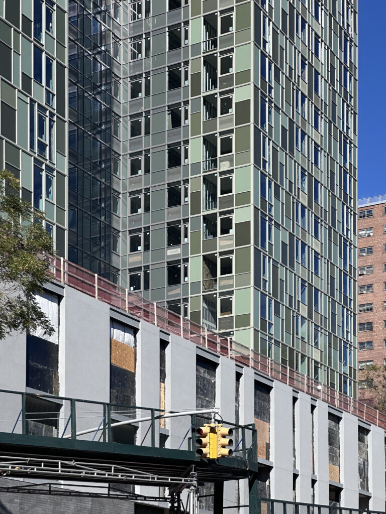
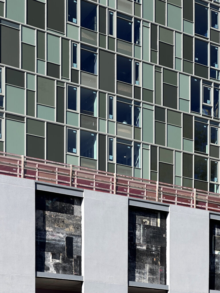
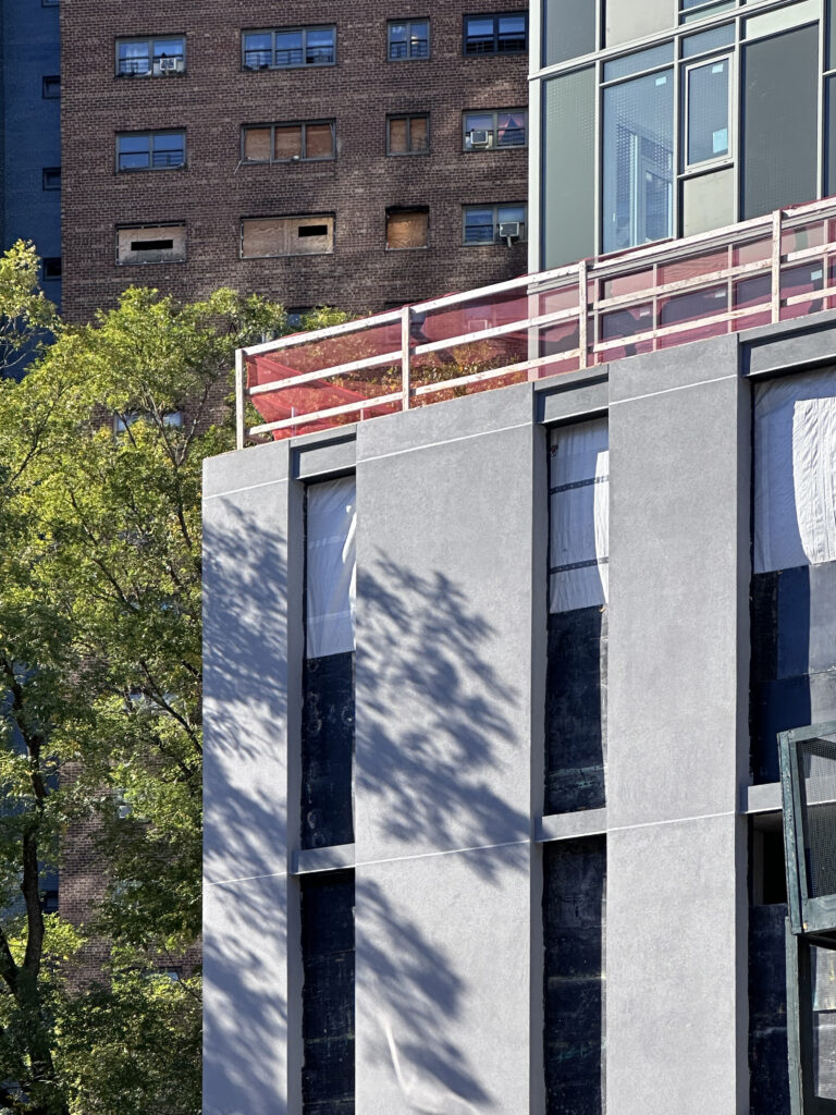
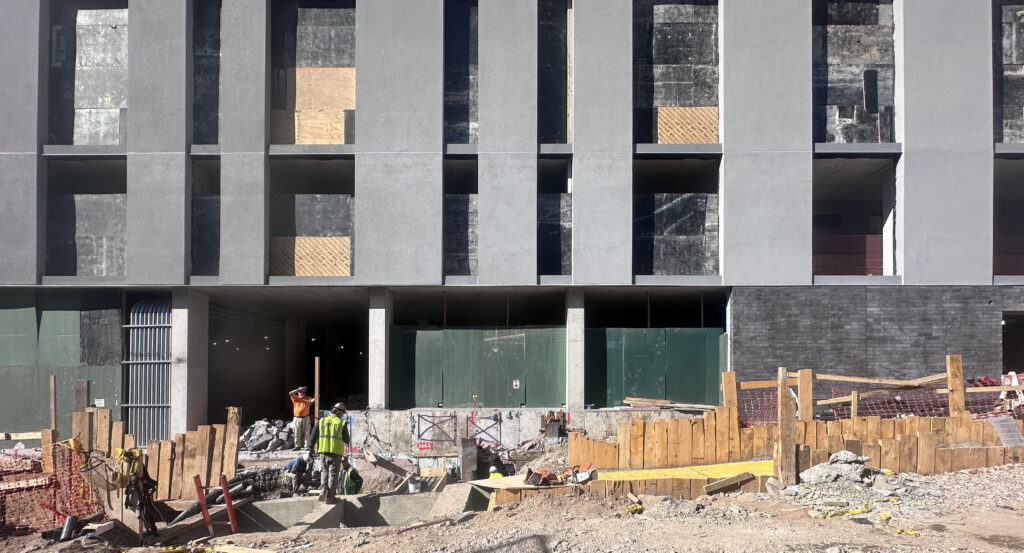
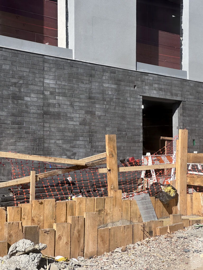
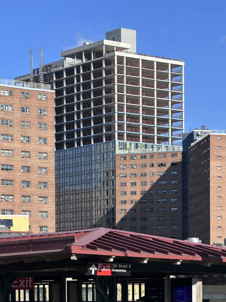
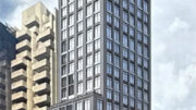
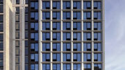
Recent photographs show the glass façade enclosing the topped-out reinforced concrete superstructure beyond the halfway mark. The podium features gray stone and brick surrounding tall windows, and the main tower’s exterior is composed of a Mondrianesque pattern of opaque green-hued glass and windows framed with metal mullions.
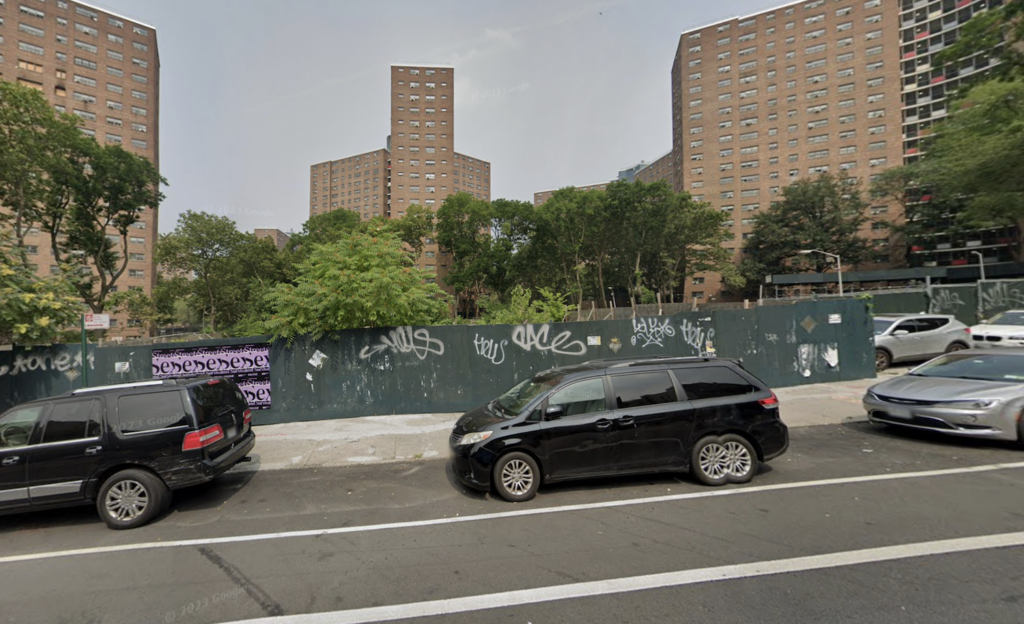
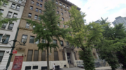
The plot was formerly vacant, as seen in the below Google Street View image.
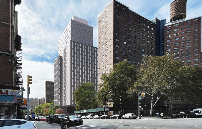
No updated renderings have been released for the project. The following image depicts the structure’s previous design, which featured a different fenestration, choice of materials, and building massing.
The development team is completing 1440 Amsterdam Avenue with $210 million in financing secured from Valley National Bank in June. The loan includes a $123 million senior note, a $55 million note, and a $32 million subordinate note. Artimus bought a 50 percent stake in the project for $17 million, and Grid Group purchased its stake from Lefkas Realty.
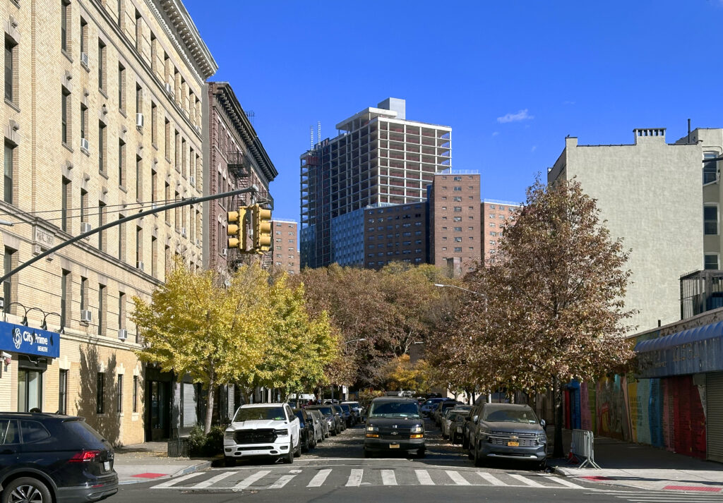
The nearest subway from the development is the 1 train at the elevated 125th Street station over Broadway to the southwest.
1440 Amsterdam Avenue’s anticipated completion date is slated for August 2025, as noted on site.
Subscribe to YIMBY’s daily e-mail
Follow YIMBYgram for real-time photo updates
Like YIMBY on Facebook
Follow YIMBY’s Twitter for the latest in YIMBYnews


Oh, no…
Unfortunate fugliness.
Why is this so hard? It would have looked better just making it look like a 60s NYCHA tower. Certainly wouldn’t stick out like an ugly sore thumb.
I personally strongly prefer this over 60s NYCHA buildings. Just pass by Chelsea or Fidi or East Village. They look very dismal
Yeah the Chelsea ones are extra ugly for some reason
The pattern of green opaque glass does not make the metal frame look dull, even though it’s a bit difficult to distinguish: Thanks to Michael Young.
Is this NYCHA housing or market rate?
Beautiful, love the curtain wall. Nice splash of modern in a sea of red brick sameness.
“Modern” as in 1958
So mid-century modern, love it!
The location is great. The site plan is great. The use is great. The density is great – totally appropriate to the neighborhood…………and the architecture is………..1972 Junior High school somewhere in Phoenix. As was said above….this shouldn’t be that hard.
I dont think it’s bad at all. Sure beats the sad sad NYCHA neighbors.
As this is on NYCHA land, what percentage is “affordable”. (subsidized rent)?
any market rate? that is what is needed – yes a lower monthly rent then others , but not subsidized by other taxpayers.
The next step is to demolish and replace the decaying NYCHA buildings – and YES jokesters, give the existing tenants NEW units in the new buildings – perhaps they can be for sale so folks have ownership stake in condos in their community.
At a very quick glance the façade is very reminiscent of Jean Nouvel’s 100 Eleventh Avenue tower in West Chelsea. Too bad that 1440 Amsterdam is sitting on top of such an ugly base.
exactly my thoughts – reminiscent of 100 11th Avenue in Chelsea, which is a luxury condo bldg.
This will bring 500 rental units to West Harlem/Manhattanville. Good news.
What is application process for Tryon North apartments?