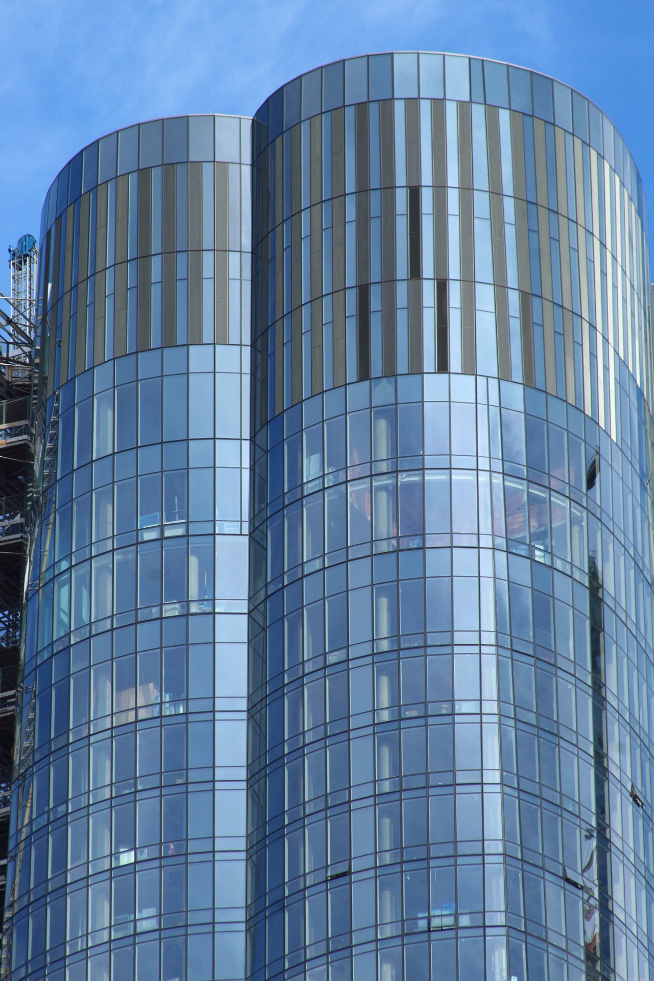
Rising on the southwestern corner of Phase I at Hudson Yards, 15 Hudson Yards is wrapping up its glass exterior work, while interiors are getting ready for opening day this coming spring. Designed by Diller Scofidio + Renfro, Rockwell Group, and Ismael Leyva Architects, the tower stands 88 floors, and ranks as the 15th-tallest skyscraper under construction in New York City. It is being developed by Related Companies and Oxford Properties Group.
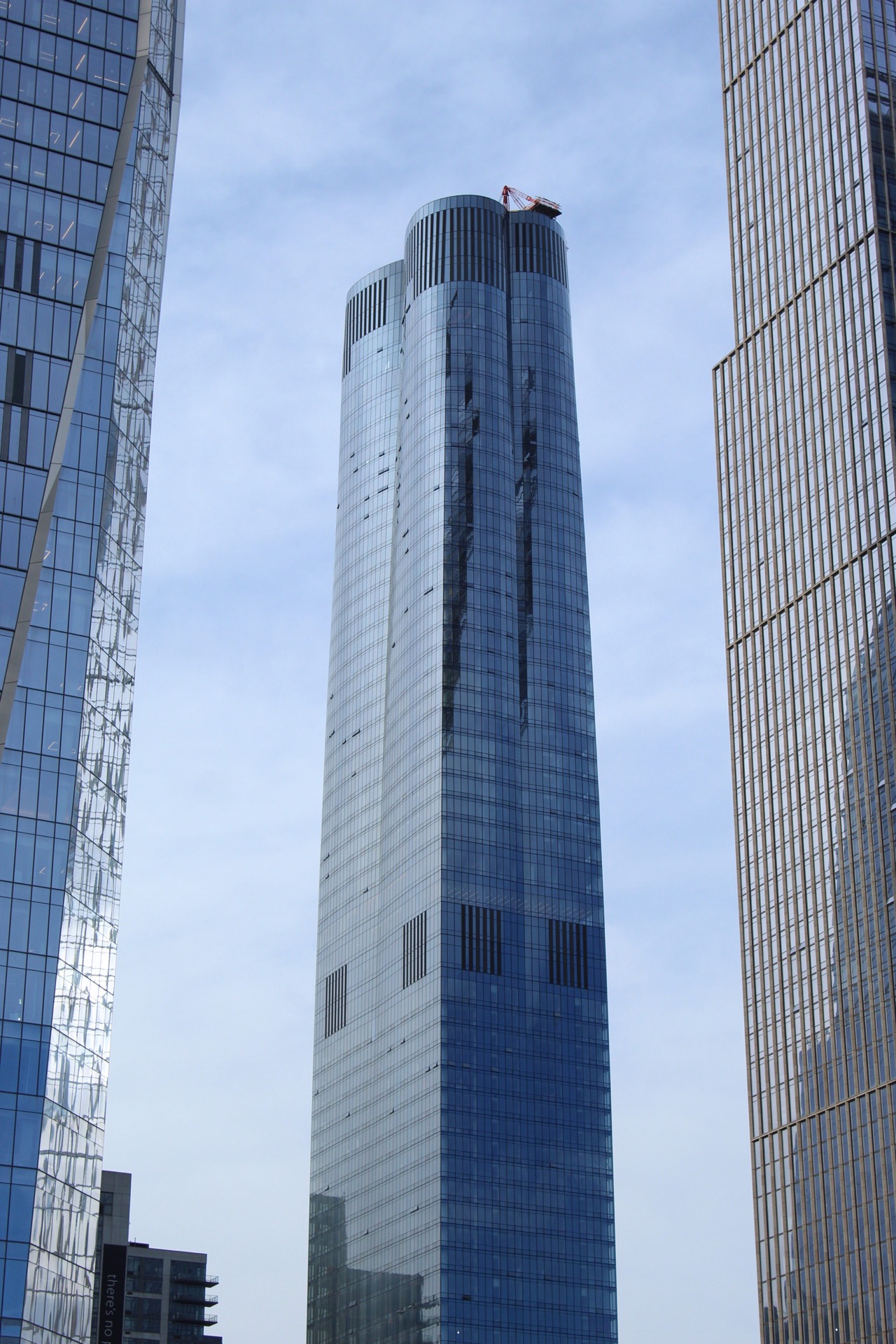
15 Hudson Yards from the 7 Train entrance,. Photo by Michael Young
Recent photos from the High Line and the surrounding area show the progress that has been made and how close this building is to being finished. The exterior elevator has not been disassembled yet, but will most likely be dismantled in early 2019.
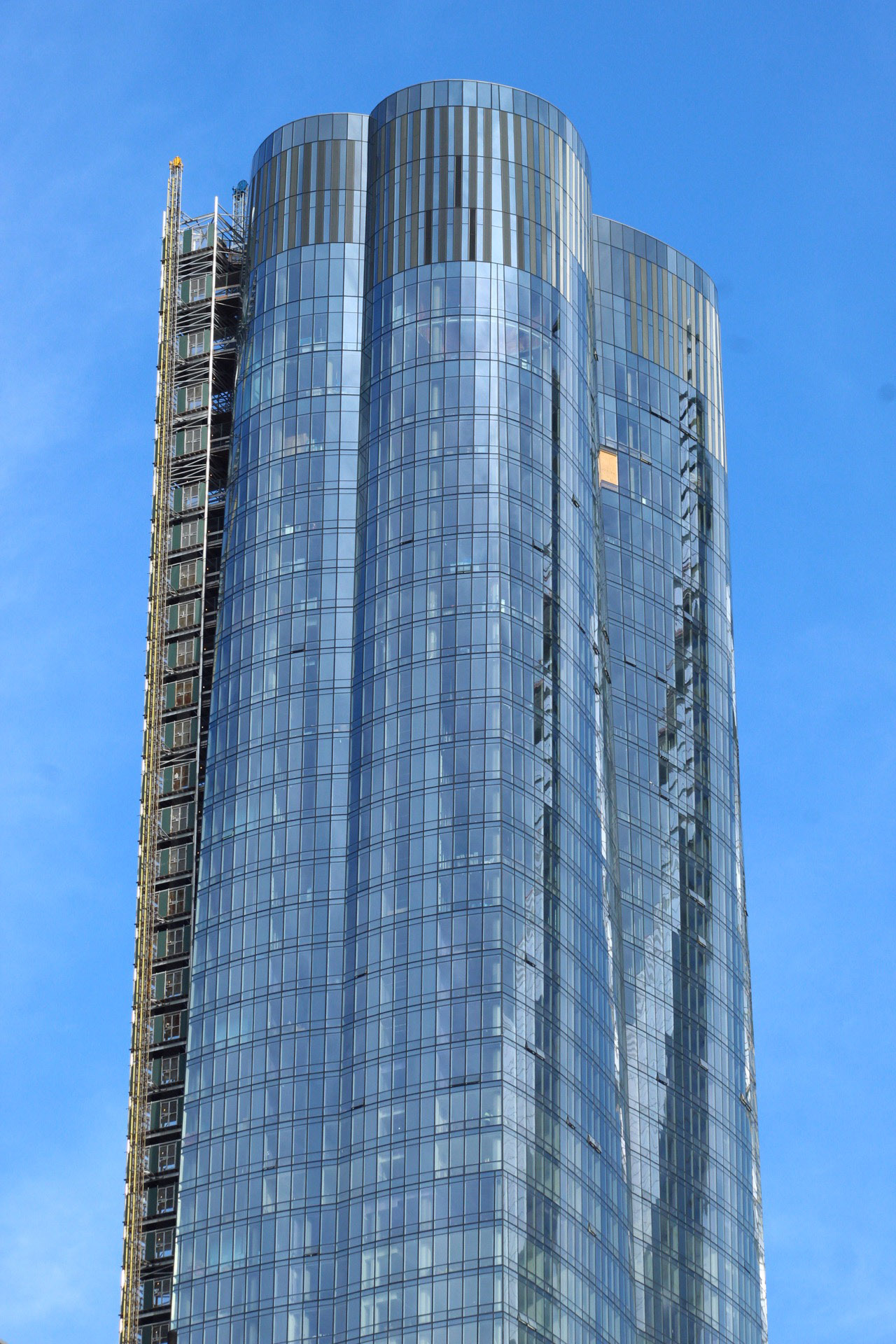
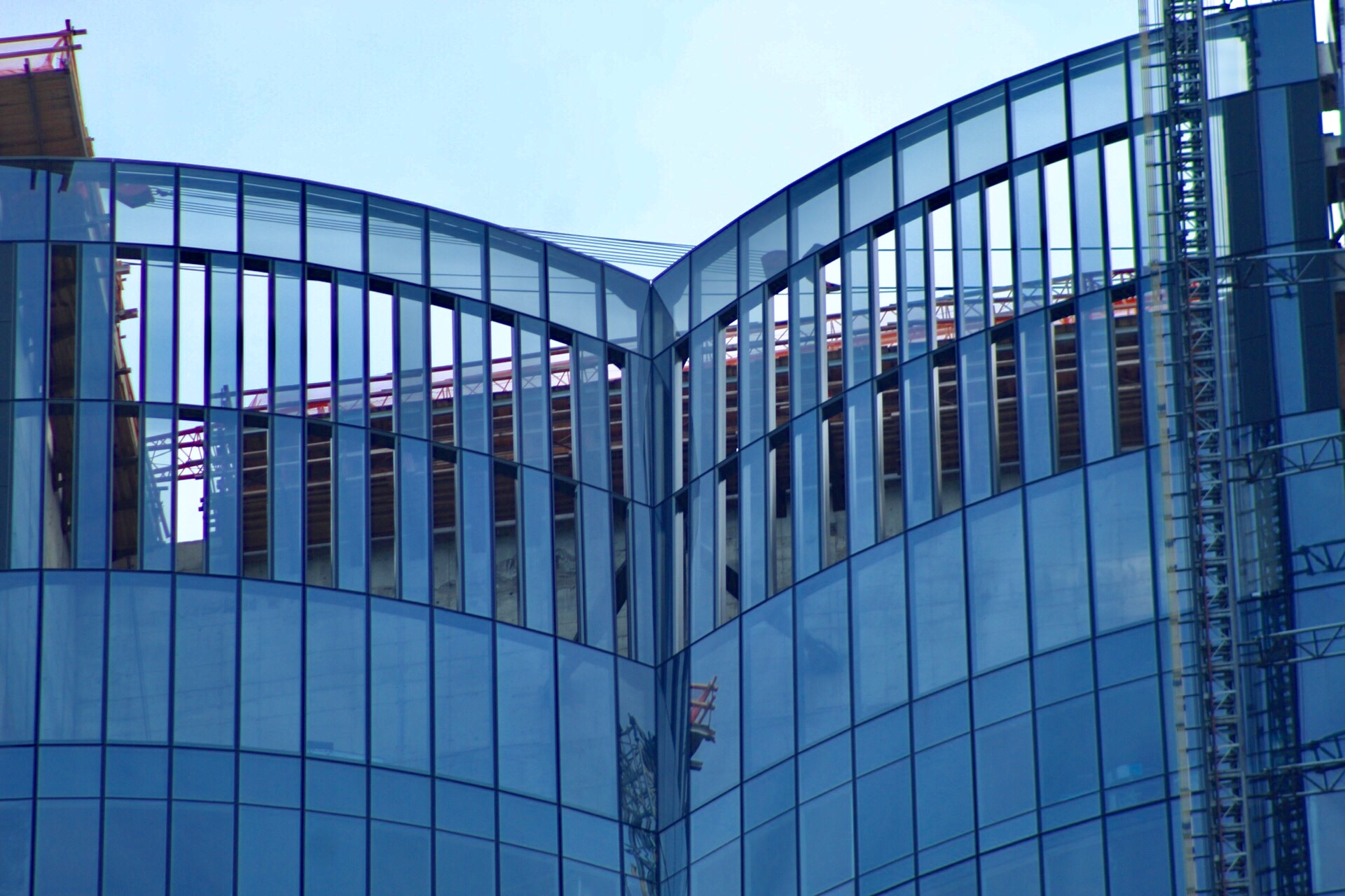
15 Hudson Yards looking north from the High Line. Photo by Michael Young
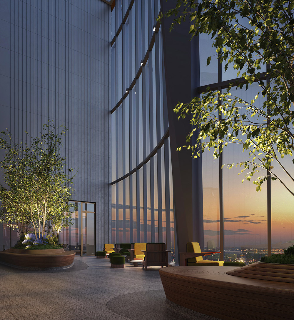
The residential units will range from $3.9 million for a two-bedroom spread up to $32 million for the duplex. 15 Hudson Yards will also boast the highest residential observation deck in New York City, called “Skytop.” This is located on the top of the western facade, and comes with a giant open-air space behind a 60-foot glass wall.
On the 50th and 51st floors, there are amenities that include a wellness center with a 75-foot-long swimming pool, a whirlpool and private spa, a beauty bar and a fitness center, a private screening room, a golf club and lounge, and a business center with two conference rooms and co-working areas. Together, the amenities take up about 40,000 square feet.
There will also be a lounge, and a private catering kitchen and dining room for residents, which will look over the Hudson River. This was the last upper portion of the curtain wall that was installed, because it required a special structural frame to hold the glass panels and adhere to the curved indent of the signature crown. Nonetheless, the Skytop space is blended and disguised behind the reflective glass facade.
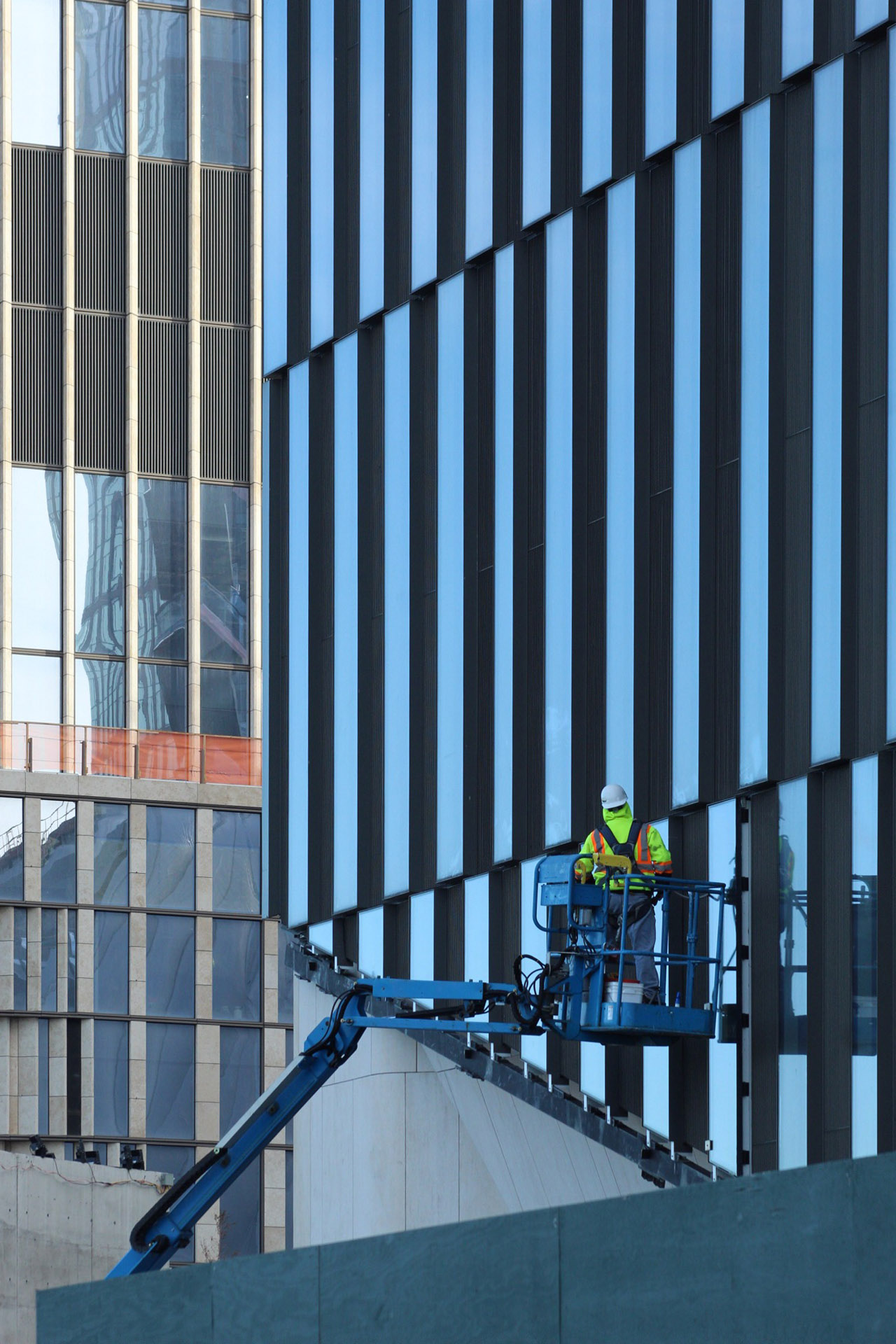
The panels on the lower floors are being inspected and finished while the exterior panels that align with The Shed are also nearly complete.
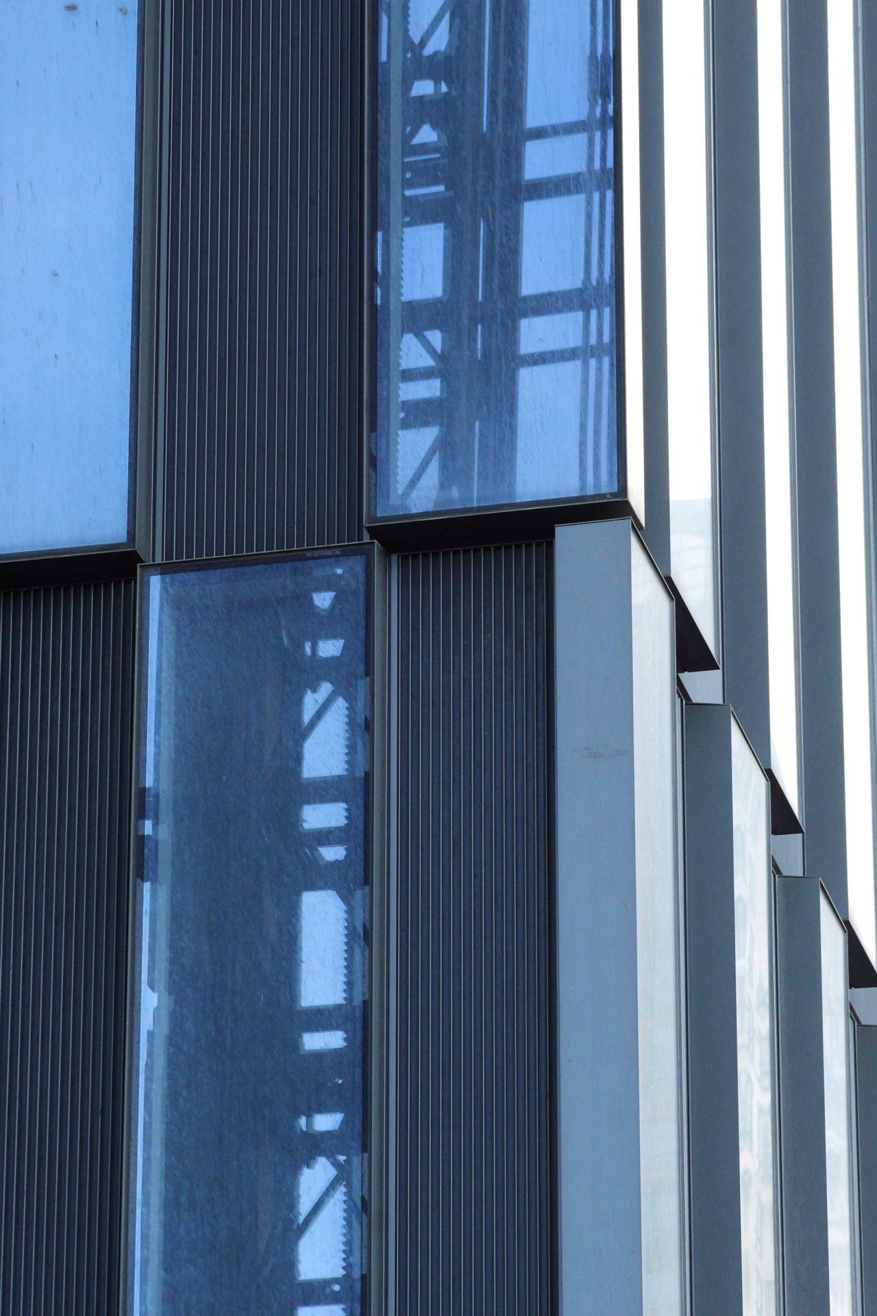
Close up of the western corner showing the staggered pattern of glass panels on the lower floors. Photo by Michael Young
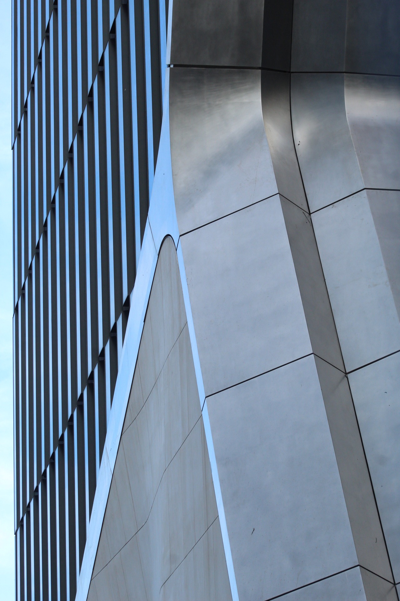
The exterior between 15 Hudson Yards and The Shed separated by a sleek metallic curved border. Photo by Michael Young
Subscribe to YIMBY’s daily e-mail
Follow YIMBYgram for real-time photo updates
Like YIMBY on Facebook
Follow YIMBY’s Twitter for the latest in YIMBYnews







Please pardon me for using your space: Design which I am prepared to see the body of the tower. Its crown very prominent and all parts of progress. Beautiful appearance is a real. (Thanks to Michael Young)
I find it amazing that there are enough people that can afford a $3.9MM+ condo…
According to the U.S. Metro Wealth Index (2012)there are some 727,100 millionaires in NYC.
It’s depressing to see the degree to which these architects betray what they originally promised the city, with this building and so many others. The clumsy alternating glass pattern on the top 6-8 floors is just horrifying. And it’s not even symmetrical all the way around? Nor does it remotely integrate with the glass pattern below or above it. It looks like they just ran out of money and grabbed whatever spare parts were lying around the construction site to just finish off the job then go hit the bar. Same with the ugly (air-conditioning?) vents halfway up that were also not part of the original rendering. There should literally be a class-action lawsuit by everyone within eyesight of this saying we’re owed compensation for the mental anguish, pain and suffering this visual atrocity is causing us. Could have been so much more graceful and elegant…
positively slick
Would like to know cc and taxes for one those $4M apt
Bleak…….and like a 60’s ‘avocado’-applianced kitchen: hopelessly dated. Additionally: such a concentration of glass curtain walls exposed to the western sun will make for a veritable solar furnace! Such wasted potential!
Still mad they rejected the old design. It was such a small detail, but it made the building so much better. Now, without it, it’s by far the worst building in the complex, and it looks terrible, from every angle.
Is the uppermost portion of this (yet another) Hudson Yards Fugly abomination (pick the best that matches from the below):
A.) An upside down clothespin?
B.) Peek-a-boo breast cleavage?
C.) Plumber’s crack?
D.) Alll of the above?