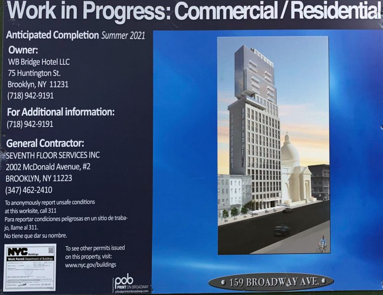
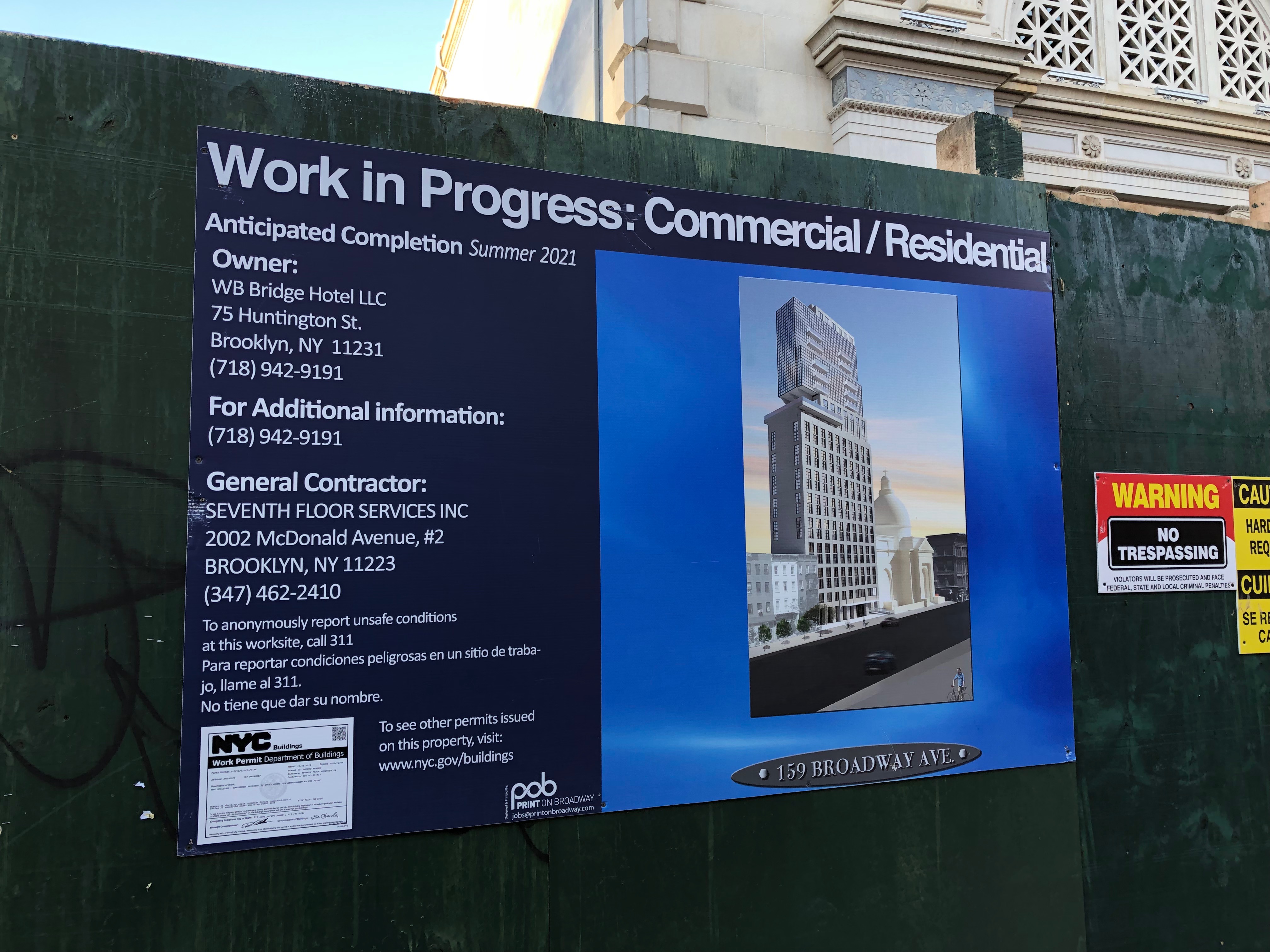
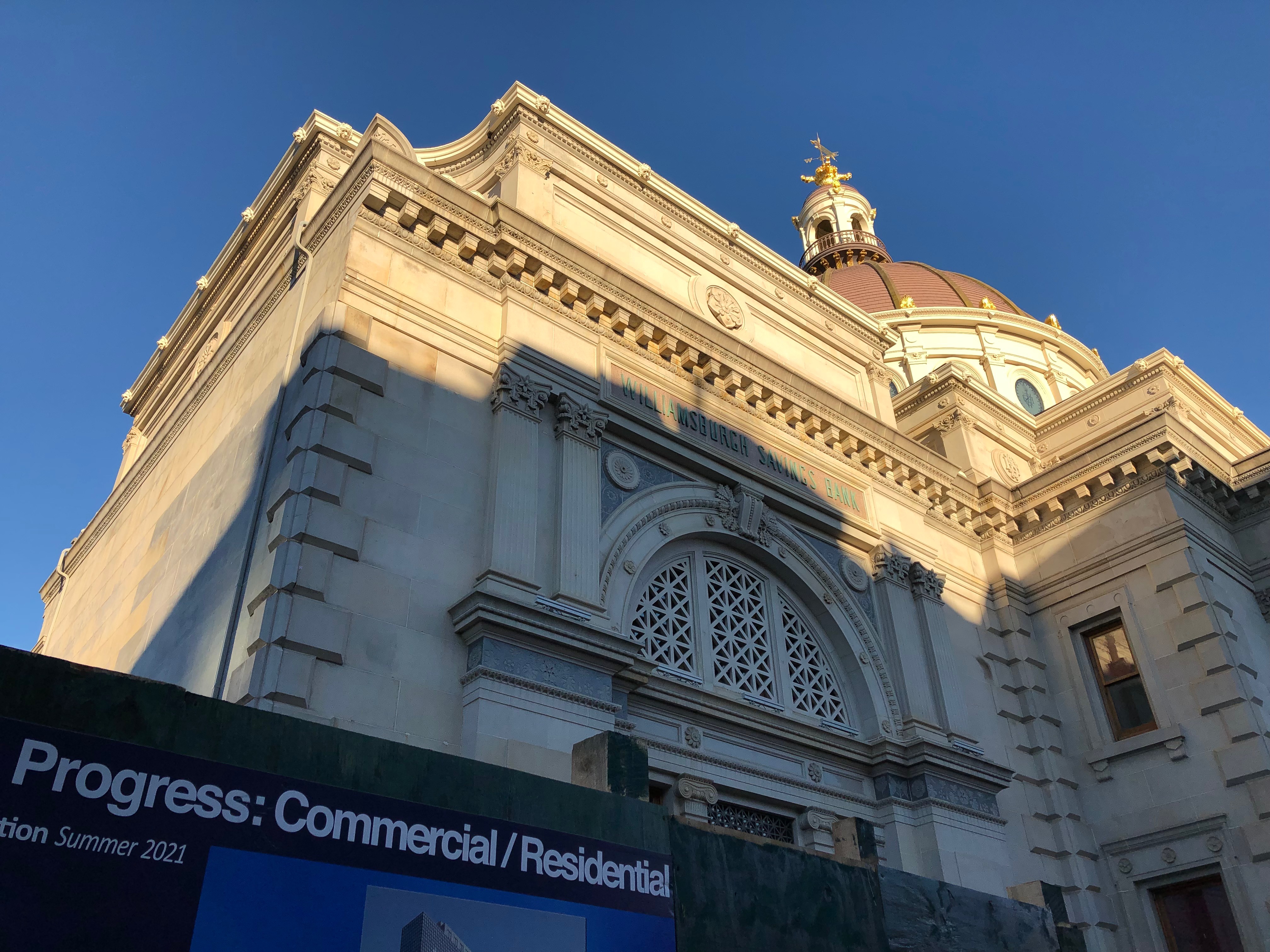
Flying under the radar for some time, excavation work on 159 Broadway is beginning to make some progress in Williamsburg. Today, YIMBY also has the first rendering for the impressively-scoped project, thanks to the construction fencing. Situated across from Peter Luger Steakhouse and immediately south of the Williamsburg Bridge, the site sits adjacent to the Williamsburgh Savings Bank. The 144-year old landmarked, domed structure will soon be surpassed by its future 133,340 square foot, 277-foot tall neighbor. This upcoming tower is set to become one of the tallest buildings in the neighborhood. It is being designed by Stonehill & Taylor Architects and is being developed by Cornell Realty Management LLC.
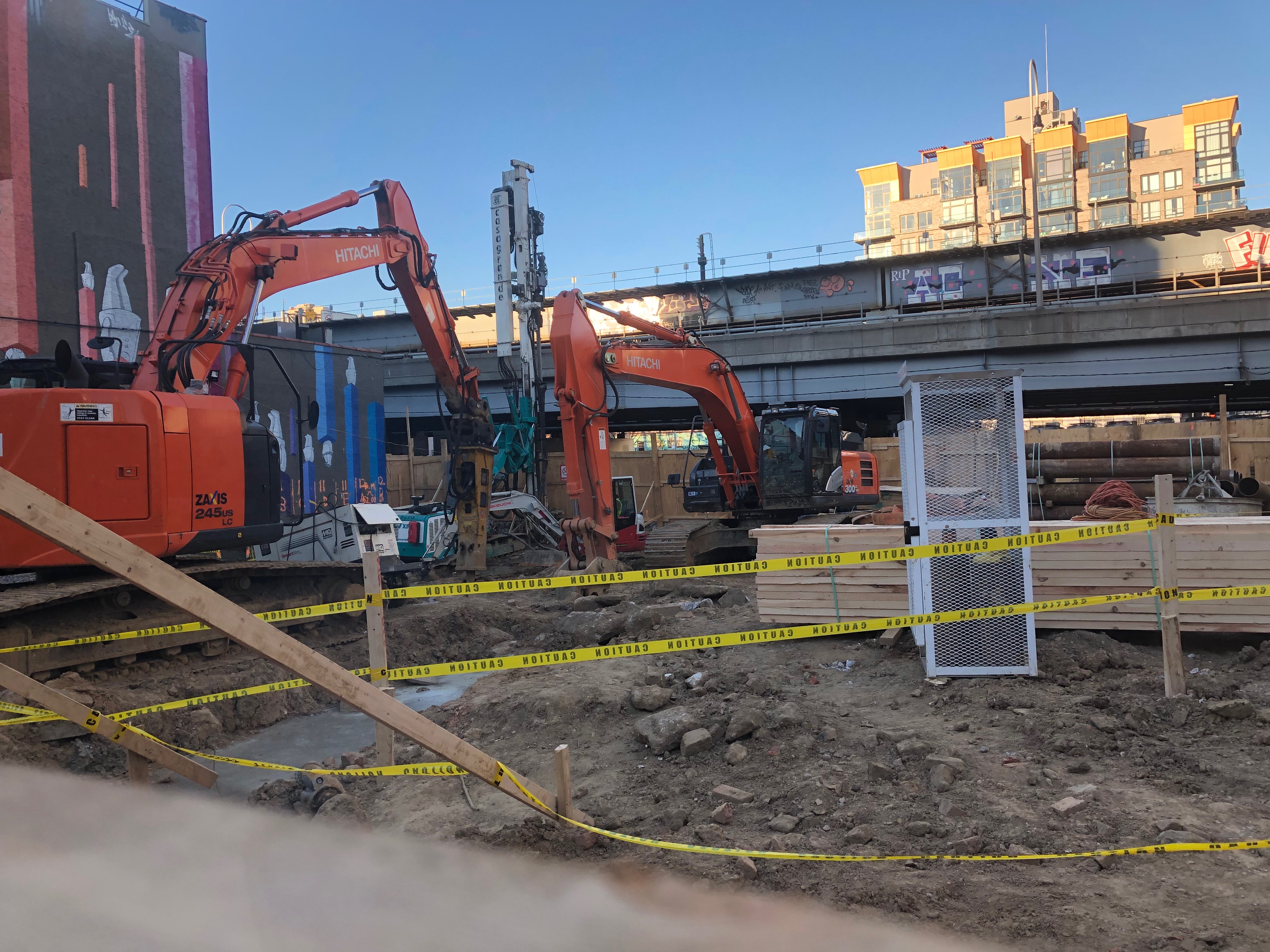
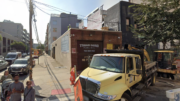
There are several machines currently working at the site, including two excavators. Foundations have yet to begin, but work should commence once excavation is complete. A colorful and abstract mural sits along the party wall of the adjacent building to the west of the site. Unfortunately, it will eventually be hidden once the tower starts to rise.
This will be a mixed-use tower, with a 251-key hotel and 21 condominiums up top. Rising 26 floors, the larger bottom half of the project appears to have a different exterior facade from the smaller upper half. The building begins with a grid of thin rectangular industrial-style windows in a uniform rectangular-shaped building mass. The upper half is enclosed with a tight mesh grid of windows on all sides, with several protruding balconies seen on the southern elevation.
Both sections of the high-rise are joined together by an open air terrace. This part of the building sits underneath a cantilevered section of the upper floors. on the western elevation, facing Manhattan and the Williamsburg Bridge.
When completed, 159 Broadway will surely make an impact on the skyline. Due to its inland location away from the waterfront, where most new buildings have recently been rising, the isolated placement will make it stand out even more.
A completion date for 159 Broadway Avenue has not been announced yet, but signage indicates a tentative delivery date of summer 2021.
Subscribe to YIMBY’s daily e-mail
Follow YIMBYgram for real-time photo updates
Like YIMBY on Facebook
Follow YIMBY’s Twitter for the latest in YIMBYnews

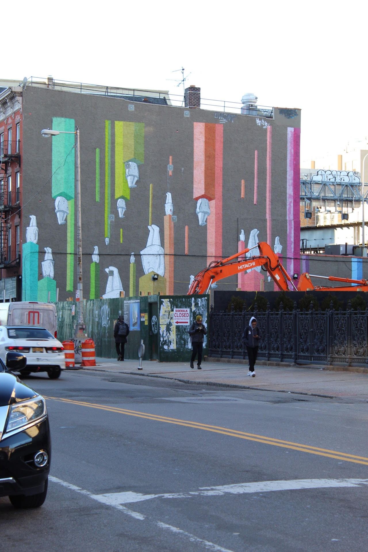
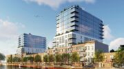
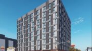
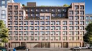
Top half of this building seems pretty disjointed and not aesthetically congruous with the rest of the building, especially the balconies on the upper section.
Please pardon me for using your space: Construction affirmed on your report and now Michael Young, I have to look positive with work in progress. Beautiful in advance. (Thanks to Michael Young)
Please pardon me for using your space
What an eyesore.
Can someone explain why NYC hasn’t developed better zoning laws for buildings this close to the river? Each new behemoth that they build then blocks the skyline/river views of everyone else behind them. If views typically mean higher rents/prices/real estate value, then each new (tall) building subsequently drives down that value for the buildings they’re obstructing. I don’t see how in the long-term that’s actually beneficial for the neighborhood. Alternatively, the closer you are to the river the lower your building should be.
This project is a few blocks in from the water and on a street that’s wide enough where the light to the street isn’t being blocked (yes there will be a shadow on the ramp to the Williamsburg Br.). In NYC there has bee a push for high-rise waterfront development since the mid 90’s starting on Center Blvd in LIC. The further you get from the water there is more of a push on contextual zoning (to make your development look similar to others in the area in size and appearance to preserve the character of the neighborhood). I’m surprised that this building was permitted to be built considering its size and how far from the waterfront it is. NYC Ferry service was started to handle the transportation needs for NYC’s growing waterfront communities. I’ve been to some of the rezoning meetings with community boards as a supporter of large scale development and these are some of the arguments for development. The airspace is plentiful, the lots were under used or abundant industrial sites (havens for criminal activity), it will create some affordable housing, it will revive the area with life and wealth, it gives people in Manhattan something to look at when they look to the east, it creates new views for thousands of people even though it will block them for a few. I just wish they were priced so that the average salaried worker can live in them, I’ll even take the second floor without a view.
Thank you, Rob! Some of the arguments for development seem straightforward/understandable despite my limited knowledge of new NYC construction regulations/reasoning. So the zoning laws actually work in the reverse (contextual zoning) from what I mentioned in my original comment? It would seem that way since we’re not seeing these highrises pop up 20 blocks further east. It’s a shame because we live in a new(ish) 12 story building (right near this one) and while the rooftop views are great, it seems rather inevitable that it won’t be the case for too much longer. Will be interesting to see if one day that’s factored into the rent – my guess no.
To the point about affordable housing, I don’t see how that could be the case unless they subsidize (80/20 kind of thing) some of the apartments? Then again, I think that’s a much larger argument and an easy rabbit hole to go down.
The top section looks like a last-minute add-on. Disjointed & yes ugly. Not sure how Stonehill got away with this FU to the neighborhood. A huge wasted opportunity ; all the more so next to the lovely WSB.
Speaking strictly visually here, the “shelf brackets” up top seem a little flimsy. I’m sure they will be engineered well enough to help carry the load of the upper volume, but something about it seems a bit incongruous.
Perhaps the architects of this building or other similar ones that have top sections that seemed to be designed by a different team – explain why this has become a style “thing” in new NY buildings. Agree with earlier comments – disjointed and a FU to real design rigour.
The reason the building is designed like this in the top section, is because there is a swimming pool on the left hand side,
I like the design in general,
Wasn’t there a much taller structure planned originally for this space?
It’s not the pool – it the change of articulation without reference up or down that it is the same building. Yes, it’s just a rendering, but it looks like a 2nd week presentation that would get blasted at a design critique. Buildings last a long time.
And yet another over priced project using unskilled labor to make even more profit and the fools rent it.
the last rendreing was much better.. this is just a regular shmegular eyeshore
I discovered the excavated land today and was disgusted. This fantastic view of the dome of the bank with the bridge in the background will be no more. This unneeded building will sit directly east of it making us just look at this horrible new building. A beautiful mural sits on the other side of the lot and will be completely covered up by the space. Where is the advocacy against the construction of this building?