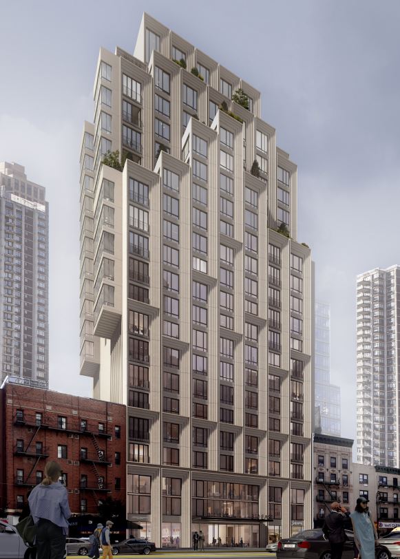
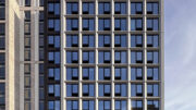
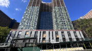
New York-based ODA Architecture has revealed another playfully designed residential building, at 310 East 86th Street on Manhattan’s Upper East Side. Reminiscent of the firm’s previous commissions, which are characterized by expressive cubic design language, this new development features a series of boxy setbacks and graceful cantilevers that incorporate private outdoor spaces on the upper levels.
As YIMBY previously reported in March, initial plans called for an 80,000-square-foot structure, but were dramatically increased to nearly 145,000 square feet. Comprised of five neighboring parcels, the development will top off at 21 stories and is expected to yield 68 units. Residential amenities include a music room, a laundry room, a children’s playroom, and a teen-oriented communal lounge.
The building also includes lower-level commercial space, but its specific use type has not been confirmed. It is also unclear when construction is expected to conclude.
Subscribe to YIMBY’s daily e-mail
Follow YIMBYgram for real-time photo updates
Like YIMBY on Facebook
Follow YIMBY’s Twitter for the latest in YIMBYnews


this is a part of the changing landscape og 86th St. I see canterlevering of floors has become a new thing .
Kill the decorative angled things all over — there’s enough going on on the building w the cantilevers, balconies and setbacks . Al that decorative fuss detracts from an otherwise acceptable background building.
Not bad, although l don’t know if I would call a 21 story building that seems surrounded by 5 story buildings, a ‘background building’
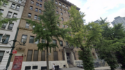
It stings that a few very nice brownstones, and two ground-floor restaurants, were demolished at this site.
thanks for ruining our neighborhood and turning 86th street into a dark wind tunnel – you should be in jail
(But the architecture of the new building seems pretty good, and its ground floor looks relatively open and welcoming.)
OMG, we need modest sized buildings designed by someone with TALENT — with detailing, complementing the space/block that exists. Not some wacho sophmoric out of place blob. We have lost the balance between old and new. THAT WAS the charm of NYC. These new “buildings” are most often eyesores, out of place, revolting. How to Kill the appeal of NYC!!! Greed, Greed, Greed and a total disinterest in becoming part of the existing architechtural space. AND the new is totally without quality, taste or beauty. UGH.
How did the space allowance increase so dramatically? When and by whom was this approved? More money passing hands? Board of Standards and Appeals, Dep’t. of Buildings, Courts? The result is absolutely horrendous, cold, sterile, oppressive, all wrong for Yorkville. An “architectural” ego-trip by “take the money and run” soulless developers. Yes indeed. Greed, greed, greed, at the expense of our lovely and fragile and fast being ruined neighborhood.
Awful. For people who enjoy living in office buildings.
It looks like it was designed by someone who as high. Or drunk. Or visually impaired.