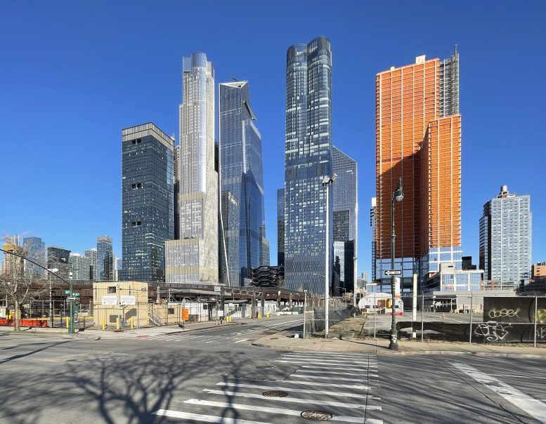
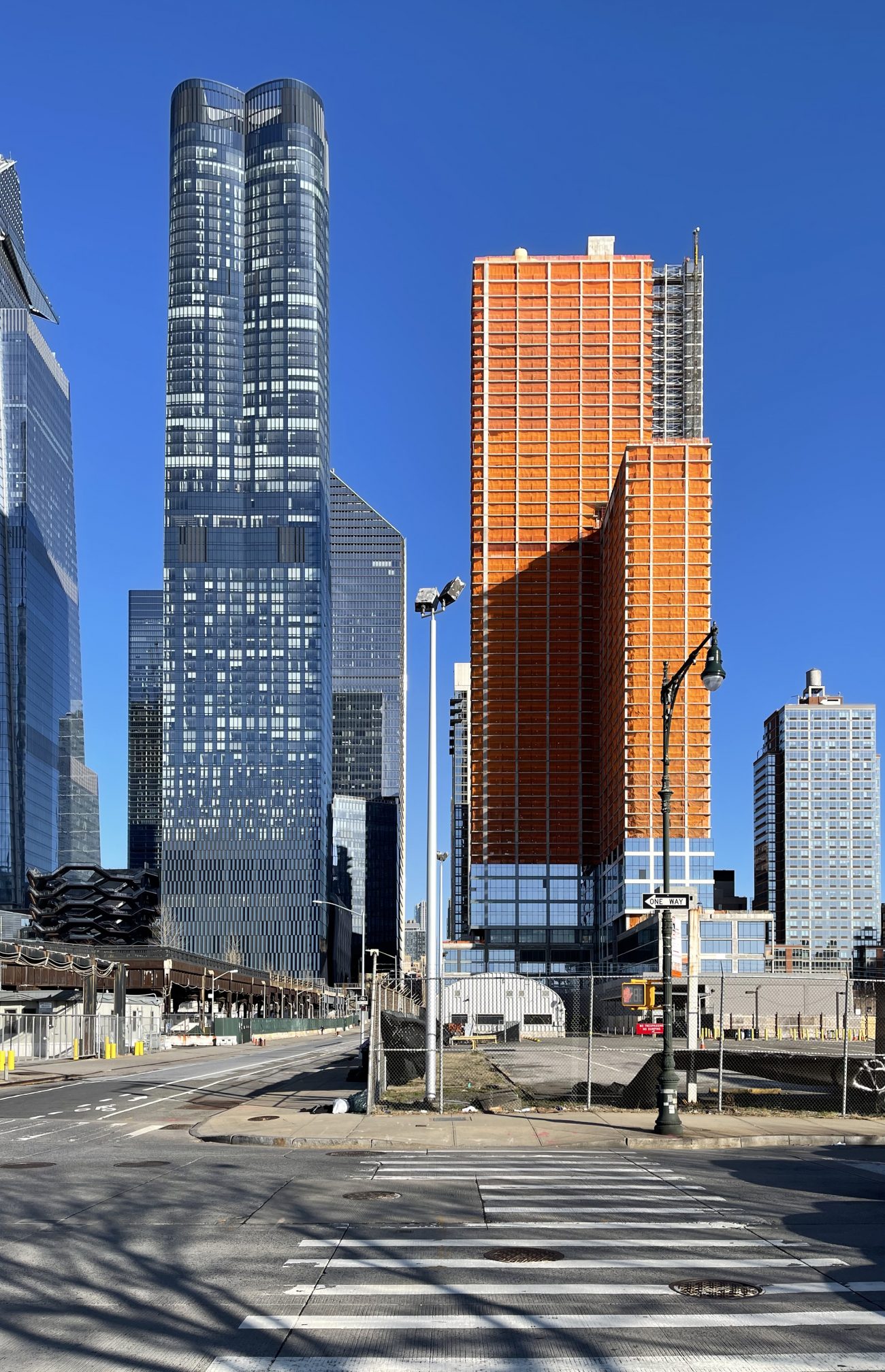
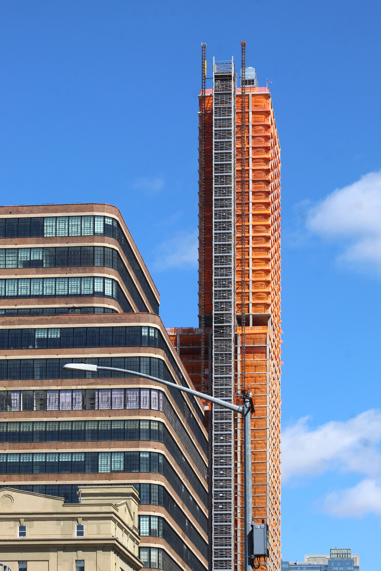
Curtain wall installation has begun on 601 West 29th Street, a 695-foot-tall residential skyscraper on the border of Hudson Yards and West Chelsea. Designed by FXCollaborative, developed by Douglaston Development, and constructed by Levine Builders, the 60-story structure is also known as “Tower A” in a two-building development along with the adjacent 606 West 30th Street, and will yield 703 market-rate and 235 affordable housing residences, 50,000 square feet of amenity space, and 15,000 square feet of retail space. The project site is bound by Eleventh Avenue to the east, West 29th Street to the south, and West 30th Street to the north.
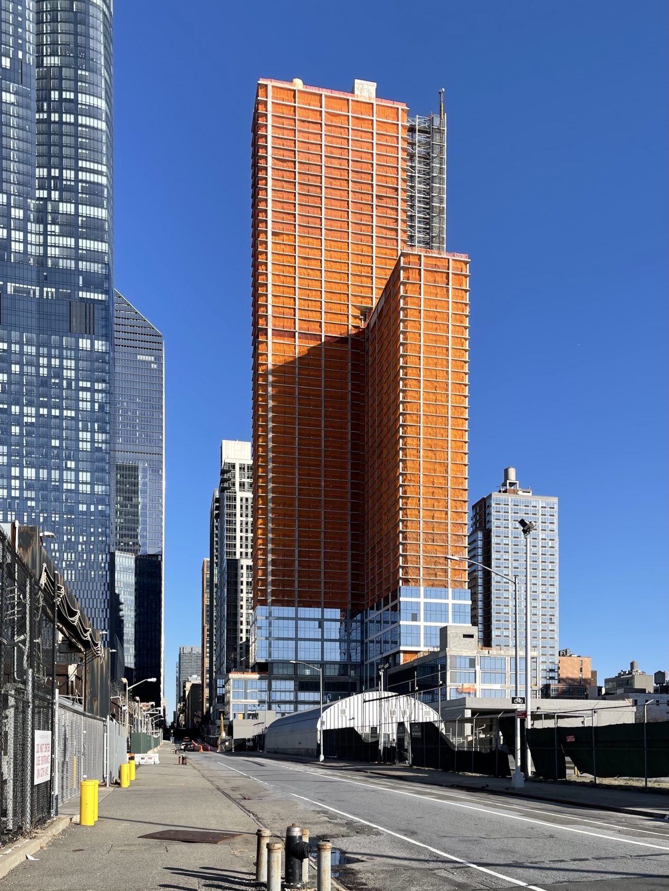
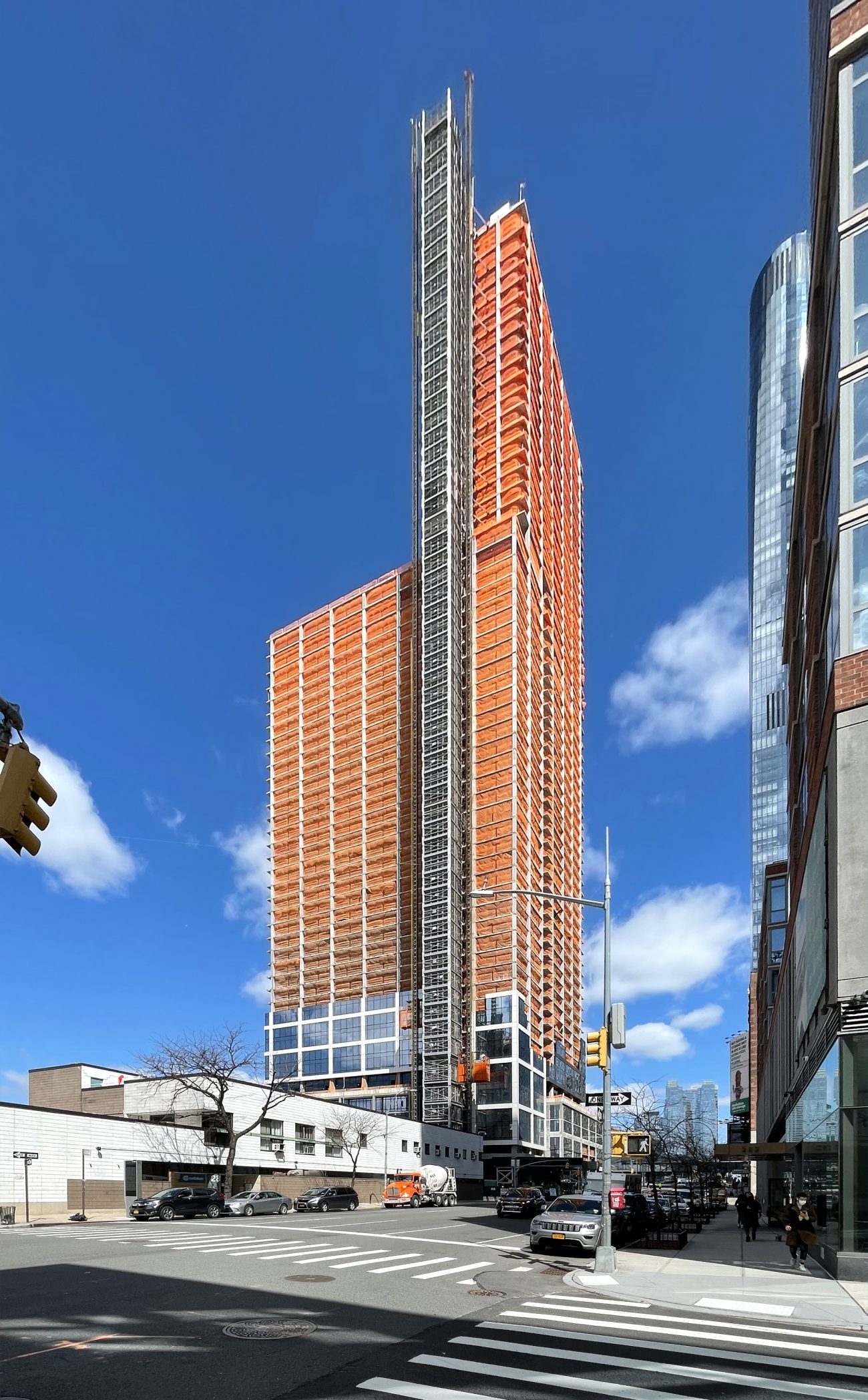
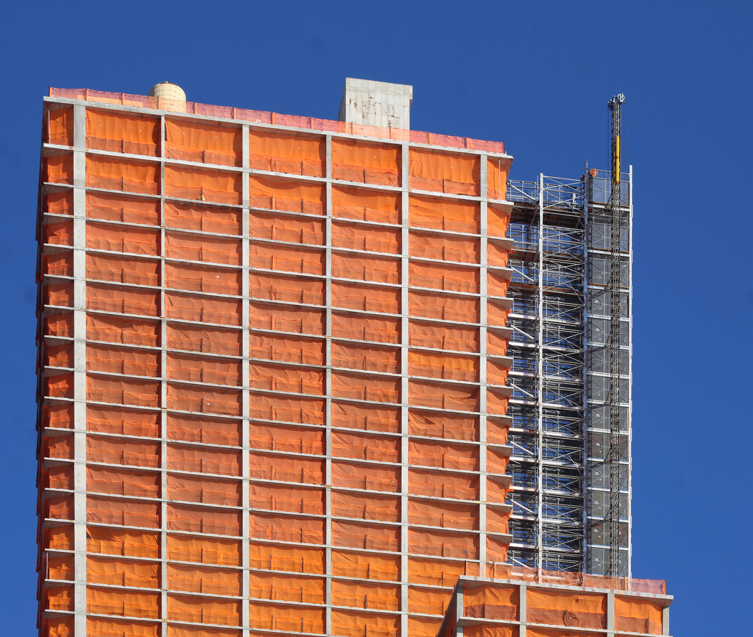
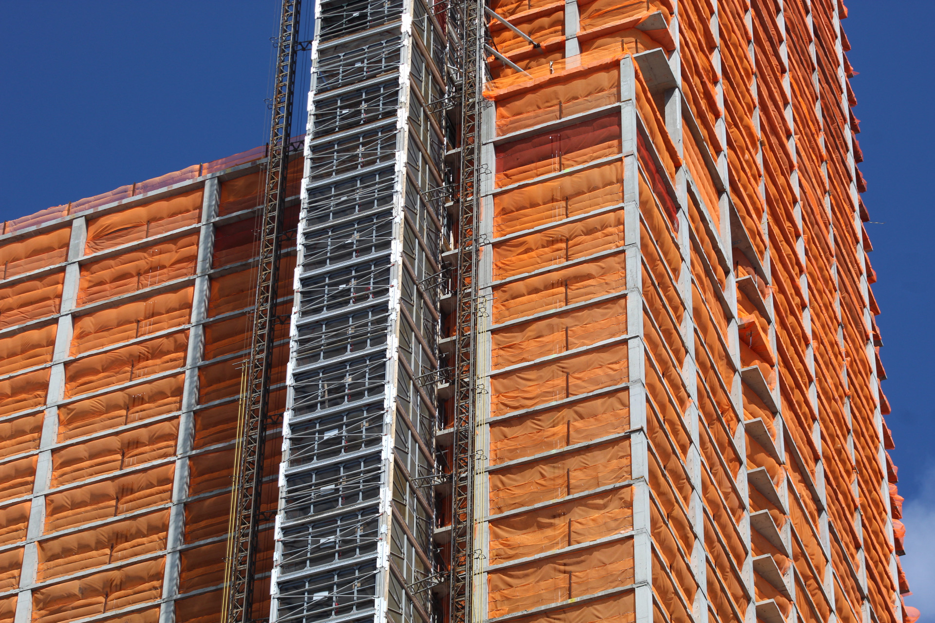
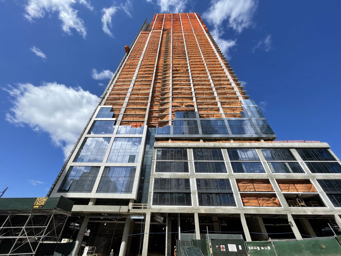
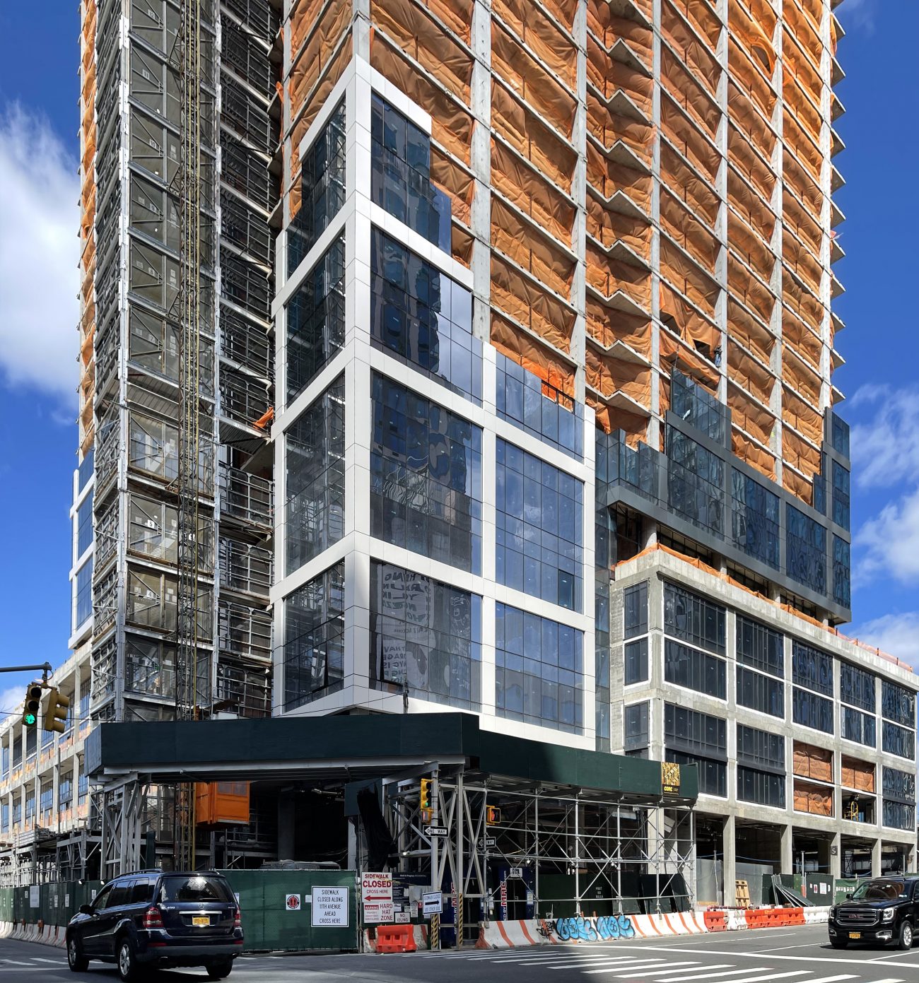
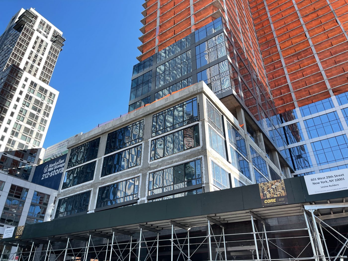
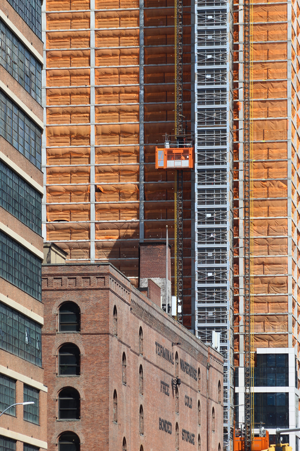
Recent photos show the tremendous progress on the skyscraper since our last update in December, when the reinforced concrete superstructure had just passed the halfway mark. Since topping out in late February, work has now shifted to the installation of the curtain wall, which has risen above the podium and is now making its way up the L-shaped massing.
The floor-to-ceiling glass panels are surrounded by a large-scale grid of light- and dark-gray paneling. The difference in gradient can be seen in the interlocking rectangular volumes that make up the massing of 601 West 29th Street.
Though far from the supertall status achieved by some of its soaring neighbors in Hudson Yards, the structure nevertheless adds significant vertical density to the far West Side of Manhattan, extending the skyline further south from the central core of the new neighborhood. From its isolated position, its bold grid pattern will help 601 West 29th Street stand out from and contrast with the more uniform glass-clad skyscrapers surrounding it.
Residential amenities include multiple tenant lounges, a gym with fitness studios, an outdoor swimming pool, multiple outdoor terraces, indoor and outdoor pet spaces, bike storage, and parking for 186 vehicles.
YIMBY last announced that 601 West 29th Street is expected to be ready for occupancy by next summer.
Subscribe to YIMBY’s daily e-mail
![]()
Follow YIMBYgram for real-time photo updates
Like YIMBY on Facebook
Follow YIMBY’s Twitter for the latest in YIMBYnews








As the number of buildings increases, Hudson Yards is finally turning into a remarkable development that rivals most other city’s downtowns. It’s impossible not to be impressed.
from the first photo, it is clearly not a collection of buildings that speak to each other – (Rockefeller Center): it’s a collection of weird shapes and sizes that does not make a memorable urban space; no hierarchy of design elements….no real learning from the grid or breaking it……impressive in size and expense – sad in its lack of there, there.
Hopefully the increase in housing we are finally seeing develop in the neighborhood will add a shot of vitality and character to an area currently dominated by tourists and office workers.
I’m pretty sure the next phase of Hudson Yards will bring a bit more residential.
Again, they don’t stop construction, under the sunlight and the sound of vehicles. I hope it will not bother the development: Thanks to Michael Young.
Looks like it will be a very good-looking tower. Hopefully it will bring some vitality to the area outside office hours.
Right around the corner from where I live! Built this tower remarkably swiftly.
SO excited to see this area get further developed. Terminal Warehouse is poised to be Chelsea Market 2.0 if foot traffic picks up. And hopefully Phase 2 of Hudson Yards + 3 Hudson Boulevard will finally go ahead to round out the lovely new west side.
Hopefully now they will clean up the neighborhood.
What is the name of the wonderful brick and glass mid-rise structure on the left of image 5? What a superb and rounded International Style building.
Joseph it’s the Starrett-Lehigh Building. I believe you are asking about. It’s in the 6th image.
Its design isn’t exactly remarkable, but it’s really not that bad either. I’m actually starting to really like it, especially with its unique L-shape. However, the glass looks a bit mediocre, I have to say. But overall, Tower A is actually becoming better than I first thought it would be. Nice!
Like this curtain wall