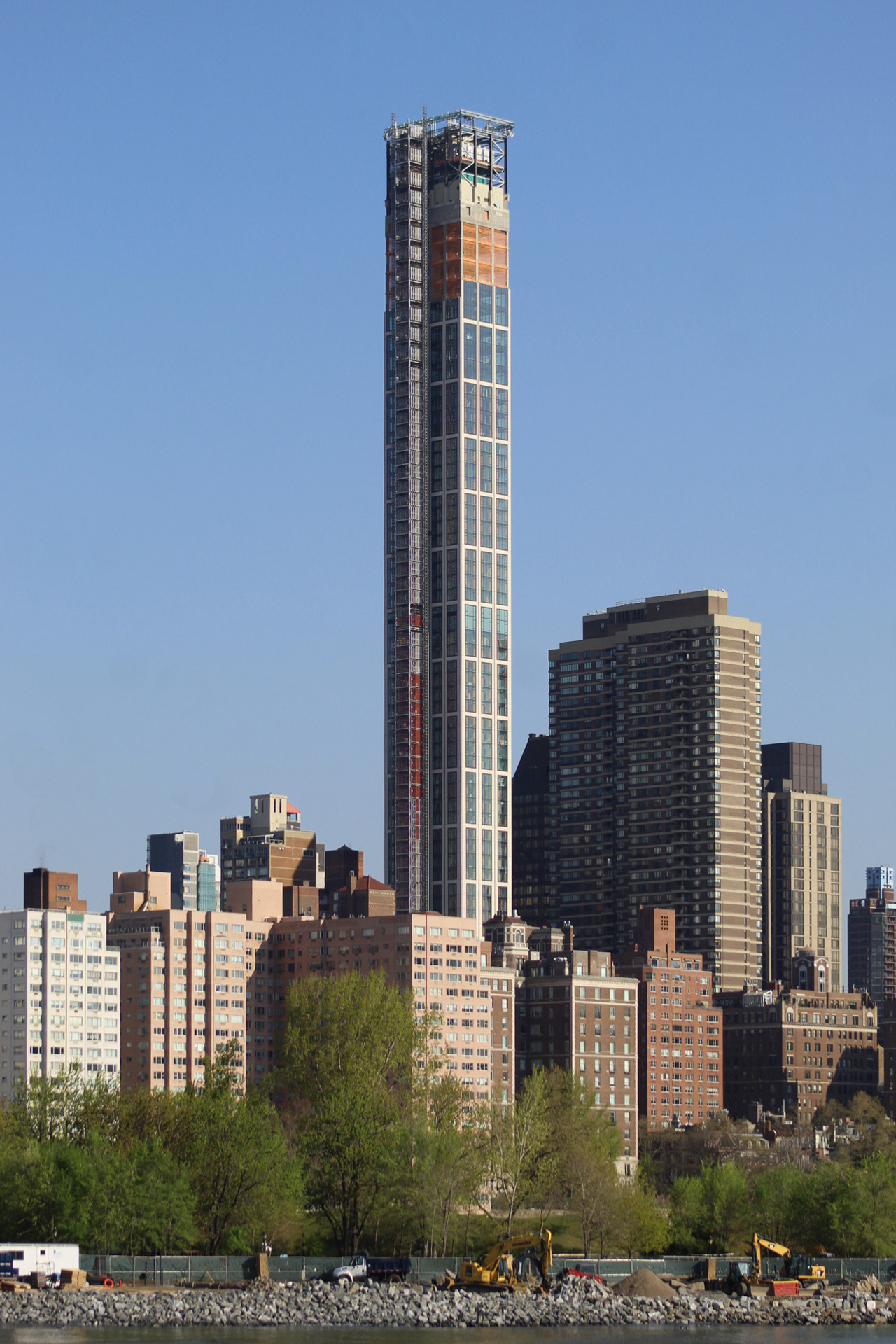
Façade installation is nearing the pinnacle of 3 Sutton Place, a 847-foot-tall residential skyscraper at 430 East 58th Street in Midtown East. Designed by Thomas Juul-Hansen and developed by Gamma Real Estate with Stephen B. Jacobs Group as the executive architect, the 62-story tower is located between Sutton Place South and First Avenue and will yield 121 residential units with sweeping views of the Manhattan skyline and the nearby East River. The site is a short walk from the waterfront and the Sutton Place Park North esplanade.
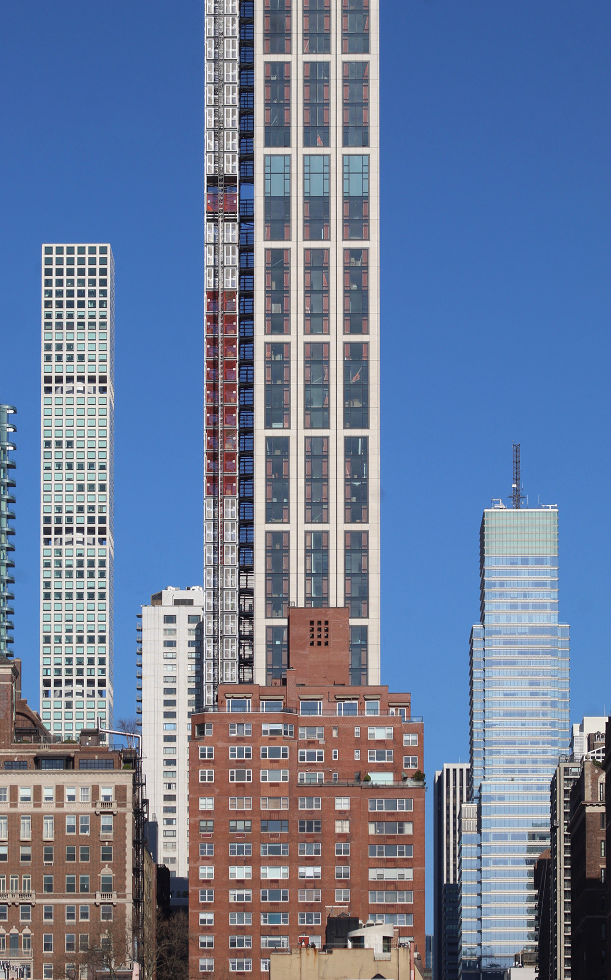
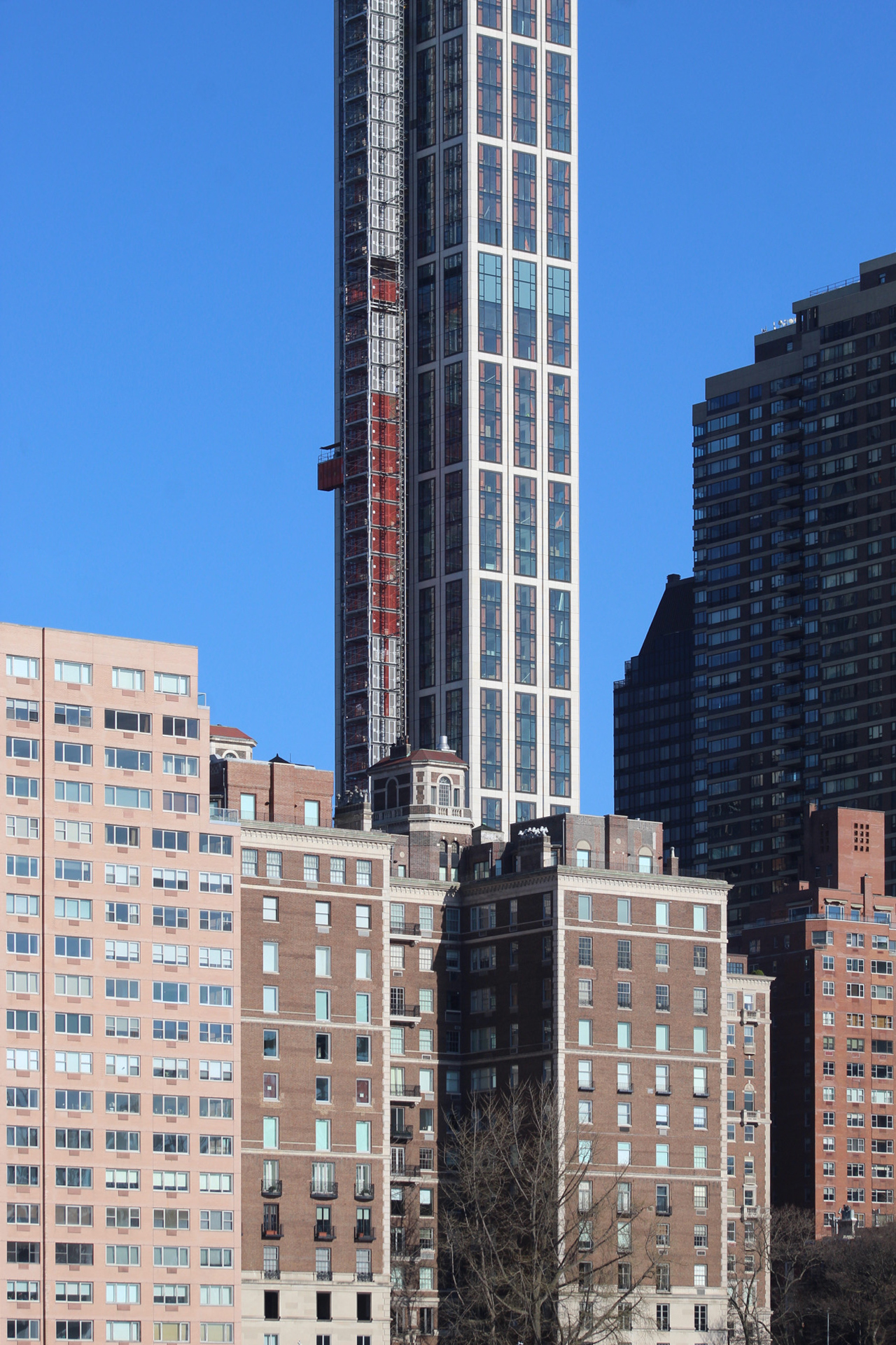
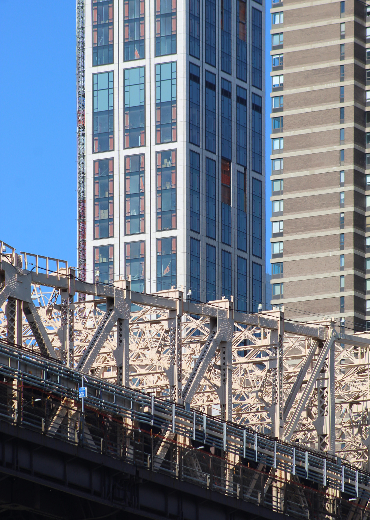
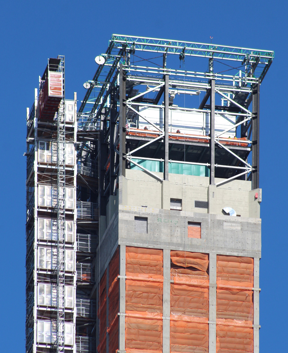
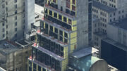
Photographs looking up and down the East River and from Roosevelt Island show the warm-colored stone and glass curtain wall approaching the crown. The crane and safety cocoon netting have both been disassembled since our last update during YIMBY’s annual construction countdown in December, while the elevator hoist is still attached to the southern elevation. The overall fenestration is composed of a vertically oriented window grid, with each section spanning four stories, and three units across on the narrower eastern and western sides and five units wide on the northern and southern walls.
3 Sutton Place makes a dramatic impact along the East River, especially when seen with the nearby surge of new residential construction across the river in Hunters Point South and Greenpoint.
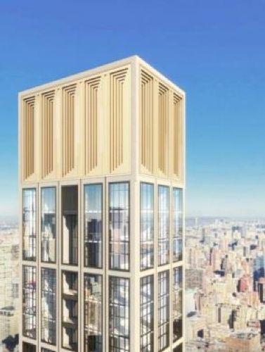
Previous renderings have depicted the mechanical levels hidden above the last inhabitable floor and comprised of the metal-framed structure that we see sitting assembled atop the slender edifice. The crown will come with a concentric pattern of indented rectangles that matches the tower’s window grid below.
A completion date for 3 Sutton Place remains unclear, but YIMBY predicts sometime toward the end of 2021 or early 2022 as a reasonable time frame.
Subscribe to YIMBY’s daily e-mail
Follow YIMBYgram for real-time photo updates
Like YIMBY on Facebook
Follow YIMBY’s Twitter for the latest in YIMBYnews




I believe it is 430 East 58th.
You have always been excited to see, progress that does not have to be seen inside: Thanks to Michael Young.
To much supply on the market . I predict auctions soon in the five boroughs. Start at 45% off market and let’s see what happens .
I doubt that.
i think 45% off is too conservative….maybe 65% off
I never realized how similar this was to 432 Park Ave… they’re almost twins.
Other than tall and sq in plan, has nothing to do with 432PA. Decoration, fenestration, facade treatment……that’s like saying a Mercedes and a Buick are alike. Yes they are!!???
Their ratios are similar. Other than that their facades have little in common.
I’ve enjoyed watching this tower rise from my Garden State view. Very handsome building that compliments its neighbor 432 Park Ave.
Look at me !
There’s nothing really wrong with the simplistic design, but it would have been nice if the windows weren’t entirely flush with the facade walls. A little texture would have helped.
there is really nothing nice about the detailing?…..nice if the windows weren’t flush…well, absolutely it would give some character to the materials if the windows were not flush, and the bands surround the windows between the stone veneer which looks like wallpaper had some reveals that could be read with shadow lines, and the top crown was something more than a lego construction….
It’s turned out very well and one assumes the mechanicals at roof level will be clad with the same stone (Indiana limestone?) as the remainder of the façade and will be a good deal crisper than shown in the rendering.
The ongoing purchase of air rights to facilitate the construction of very tall buildings in Manhattan in particular begs the question of whether available remaining rights could be fully depleted in the foreseeable future. After all, it’s a finite resource which isn’t being replenished except to a negligible degree.
Since when has the final product ever looked better than a photo-realitic rendering??? Since the advent of “accurate” renderings, they have only ever represented the dreams of the architect, before reality + technical issues + “value engineering” take their big bites out of it.
But in the end this building could never be better than the mediocrity that the renderings illustrate. It doesn’t surprise me regarding developers, as their agenda is solely financial. But given the chance to build big in what in someone’s mythology is the greatest city on earth, architects should be trying a lot harder. We’ve populated the skyline with an awful lot of meh.
Hear! Hear!
Spot on and said so well.
I really like this one. It’s certainly not a twin of 432PA but it makes for a very nice compliment when viewed west from east. As to facade texture, were it to be executed through window frame protrusions, accumulated dirt would soon begin to streak the facade. This is a gorgeous building especially when contrasted to its nearby semi-brutalist neighbor. And why the dust-up over its height?
It’s not bad, but I think it could’ve been better. At such a prominent height and location, I would’ve liked to see something more unique and imaginative than a setbackless, rectangular-shaped grid of windows.
Look Ma! No transparency!
Is this the one New Yorkers are calling the eye-sore? Or is it the other tall, skinny building? I wish we had beautiful architecture of long ago, but building like these are what’s being approved instead. Cheaper & boring looking.
No. You’re confusing it with 432 Park Avenue.
On a gut level I find something uniquely appealing about parts of the building design and the ways they work as a whole – in those parts. Specifically, I am referring to the proportions & groupings of the major facade divisions and their minor window groupings on the WIDER northern and southern facades (the sides with with five horizontal divisions). Those two facades/sides have a graceful proportionality. This, without making the building look either like a sky-stabbing needle or a tall yet squat set of dull pancakes. Instead the verticality of the building has a balanced & dignified stability that works as a whole, at least on those two sides. On the other hand , the eastern (river facing ) and western sides – with different proportions & divisions – are much more ordinary and relatively dull. It’s a shame that the space allotted to the building did not allow the architects to design all four sides to mirror the northern and western facades that they created. Still, half a tasty loaf is better than many of the failed cookie-cutter skyscrapers that have popped like ugly crabgrass on the lawn of our city in recent years.