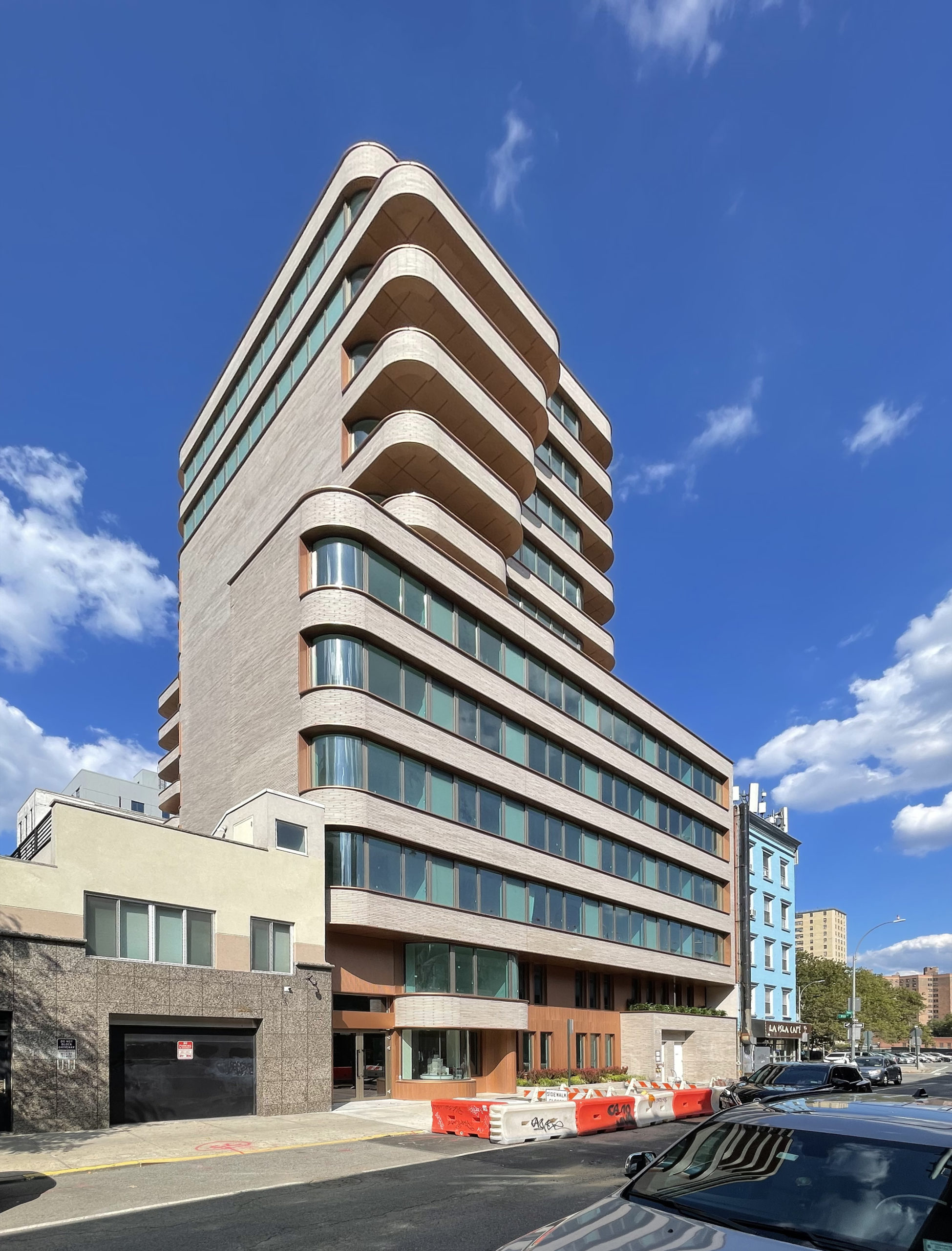
New Empire Corp. will soon welcome new residents to its latest condominium development at 208 Delancey Street on Manhattan’s Lower East Side. Designed by ODA Architecture, the 12-story building contains 85 units in studio to three-bedroom layouts.
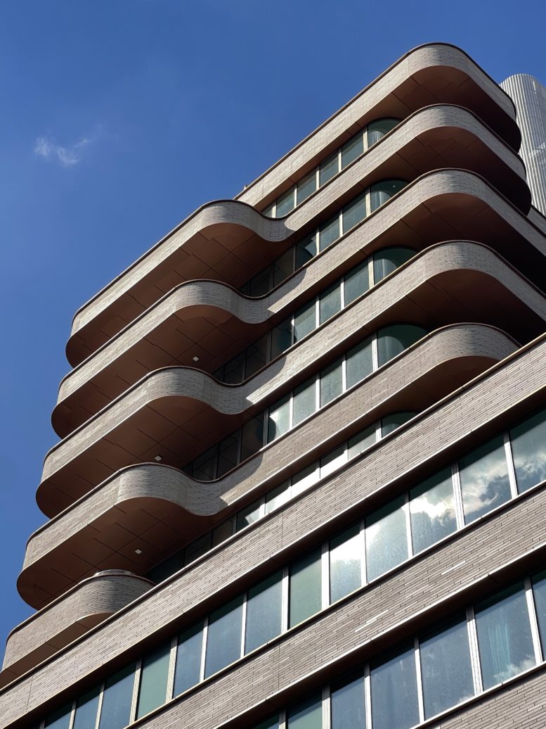
The building’s most premium residences feature expansive private terrace space atop the sixth-story setback.
Amenities include a communal landscaped courtyard and lounge area, an indoor lounge, a fitness center, bike storage, pet grooming stations, and a second communal outdoor space on the roof with barbecue grills, dining area, and a fireplace. Residents will also have access to dedicated parking and storage for an additional fee.
“This is an important construction milestone achievement as we look to wrap up development at 208 Delancey, and we are delighted to see this level of sales activity before the property’s grand opening,” said Bentley Zhao, New Empire Corp.’s chairman and chief executive officer. “When selecting the site and carefully crafting each design element, our team kept in mind the desires of prospective tenants including spacious open floor plans, and high-quality indoor-outdoor living spaces at an optimal price point.”
Compass has served as the building’s exclusive sales and marketing agent. As of today, their team has achieved a 90 percent sales milestone for 208 Delancey Street.
Subscribe to YIMBY’s daily e-mail
![]()
Follow YIMBYgram for real-time photo updates
Like YIMBY on Facebook
Follow YIMBY’s Twitter for the latest in YIMBYnews


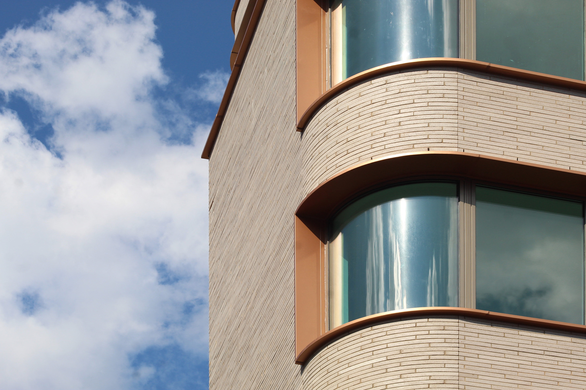
I love this building but it does look like to me they miscalculated the radii of those curved balcony cap pieces. The go from what looks like a larger overhang to barely anything on the curve. It’s noticeable and unlikely to be intentional – at least it’s hard to understand why anyone would do it like that.
Hopefully whatever eventually replaces that one-story neighbor with the garage door is complimentary.
Looks very 1960’s.
I see the ghost of Art Moderne here, but the upper floors seem to overwhelm the ground floor. Something bolder could have been used there.
Oh, I wanted to love this, but the second photo shows the upper balconies just overwhelm the design. Also, what’s with the balcony goofy panel seams?
The main idea was solid, the execution was the failure.
Brick expands and contracts. Without a joint, you can end up with stairstep cracks in the facade.