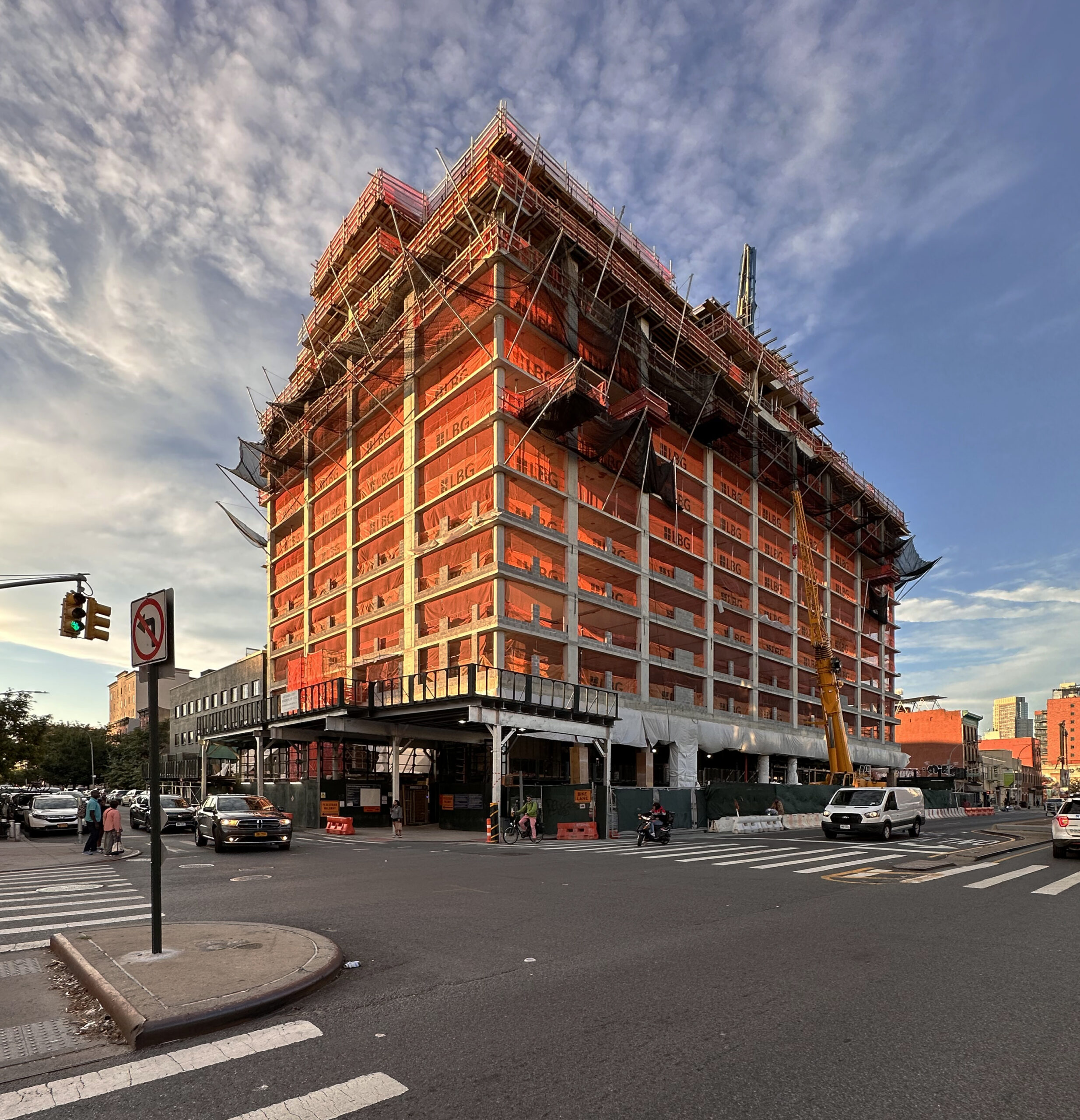
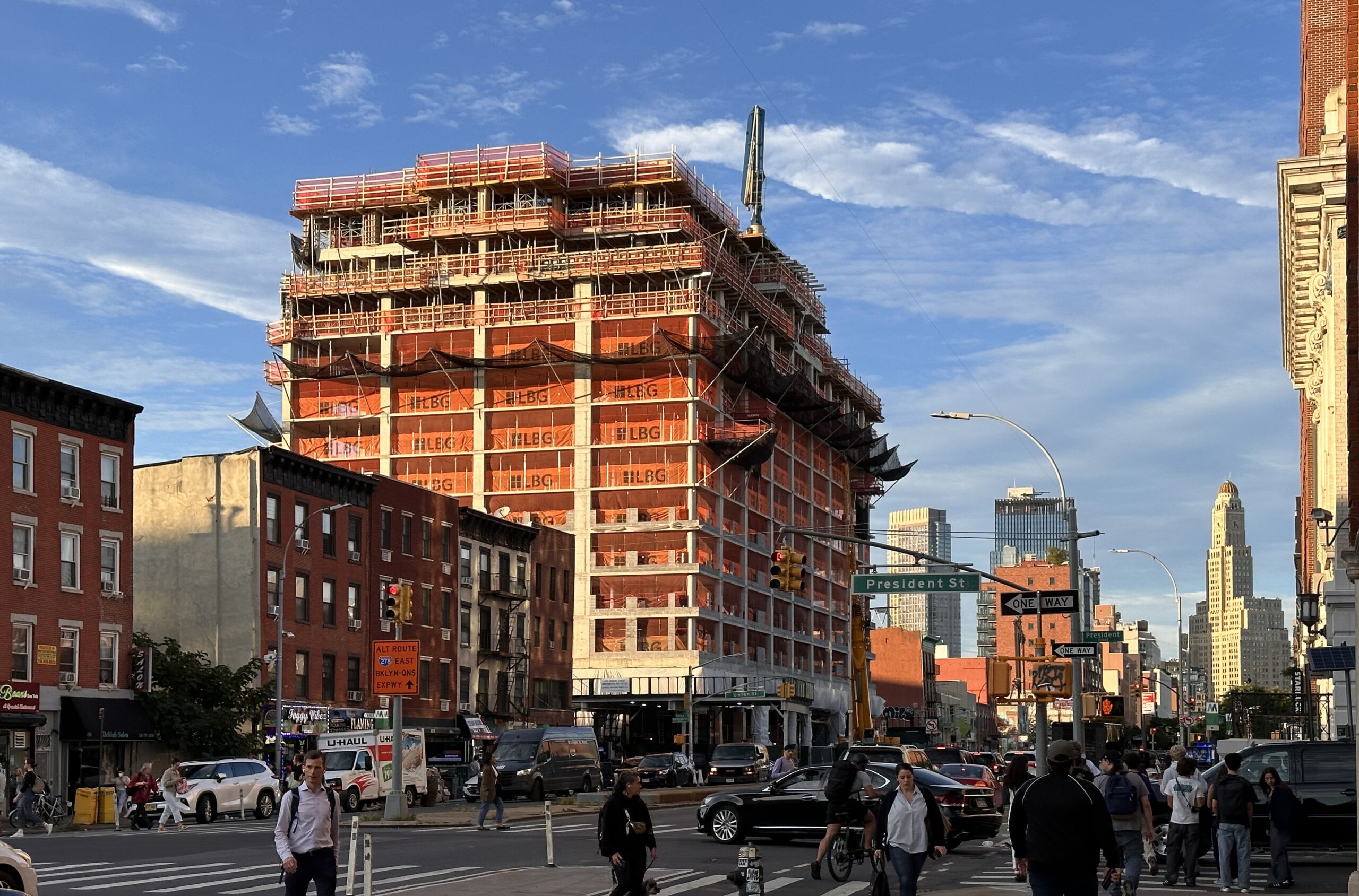
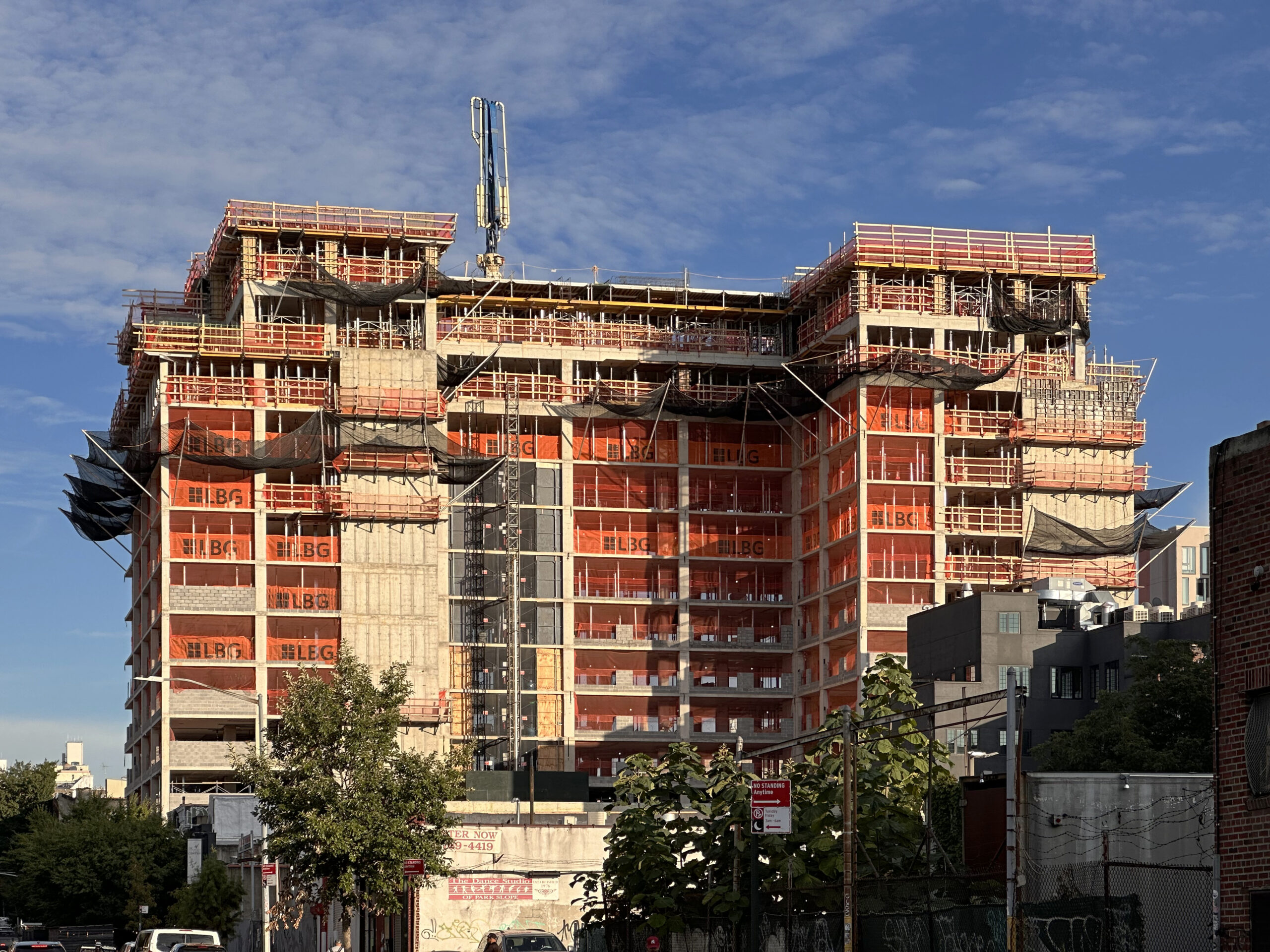
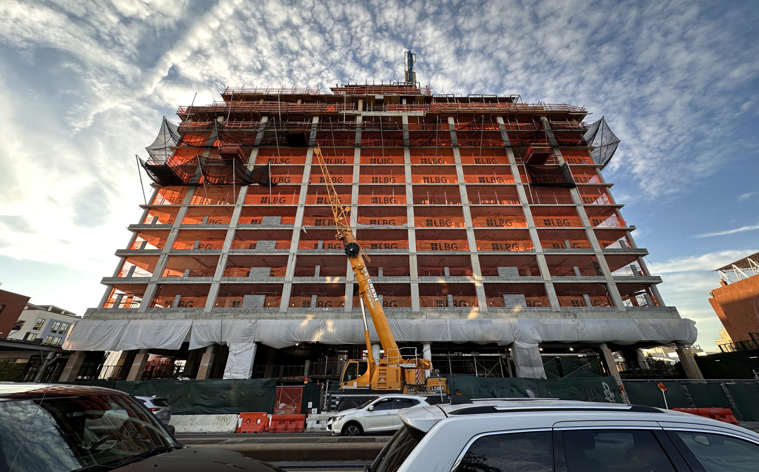
Construction is about to top out on 204 4th Avenue, a 13-story residential building in Gowanus, Brooklyn. Designed by L+Z Architecture and developed by Avery Hall and Gindi Capital, the 200,000-square-foot structure will yield 193 rental units and 14,000 square feet of ground-floor retail space. Leeding Builders Group is the general contractor for the half-acre rectangular property, which is alternately addressed as 655 Union Street and bound by Sackett Street to the north and Raul Vasquez Jr. Place to the south.
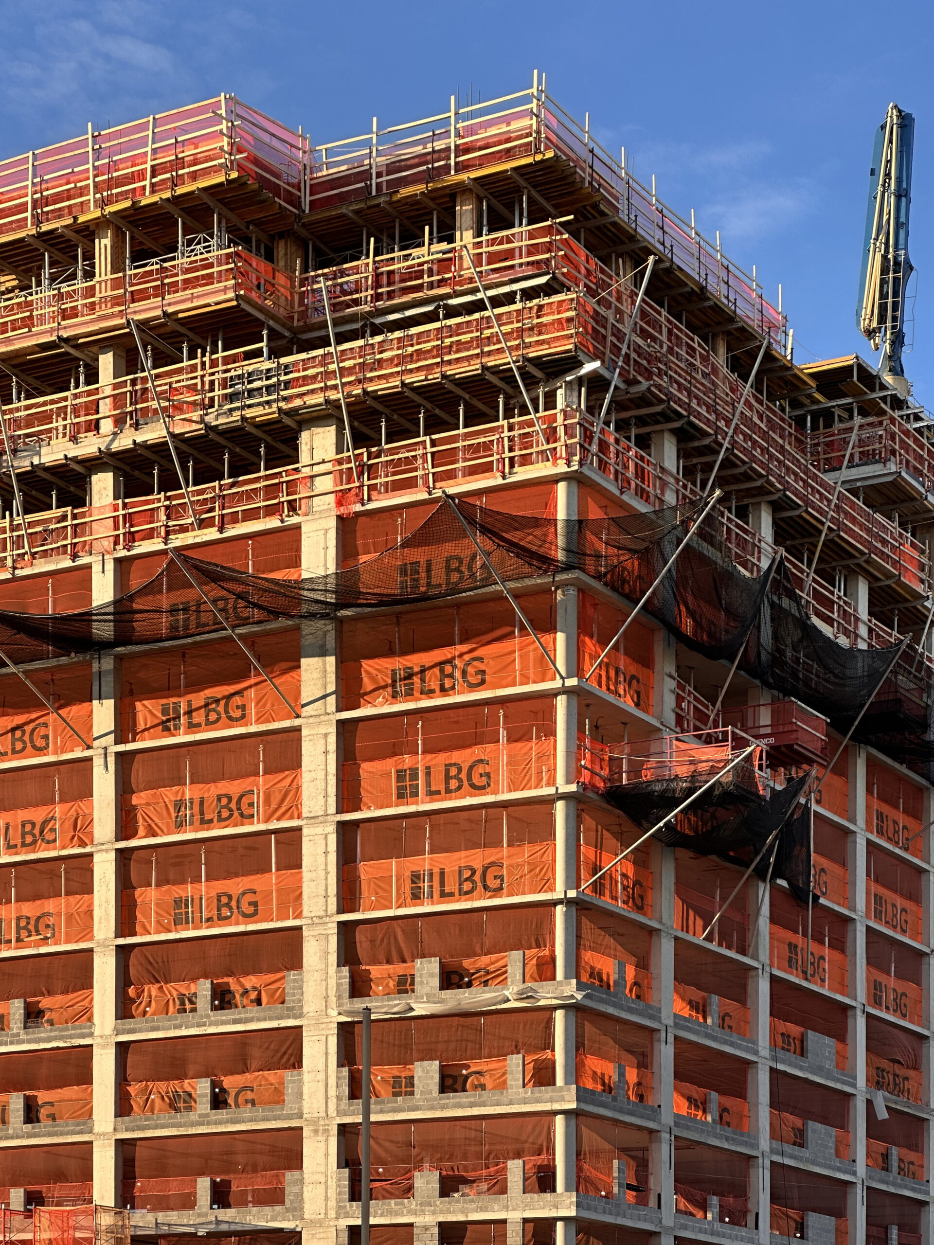
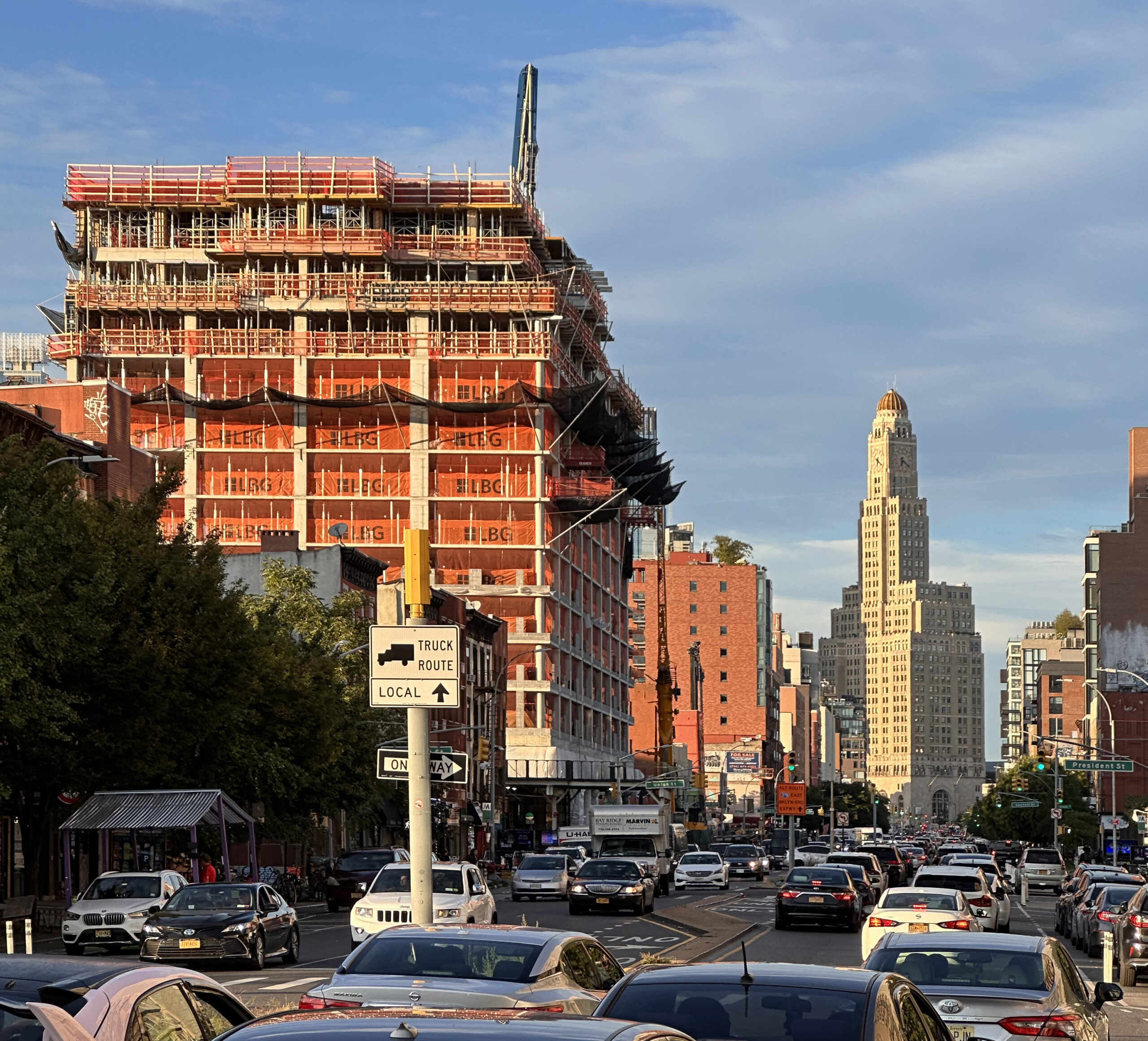
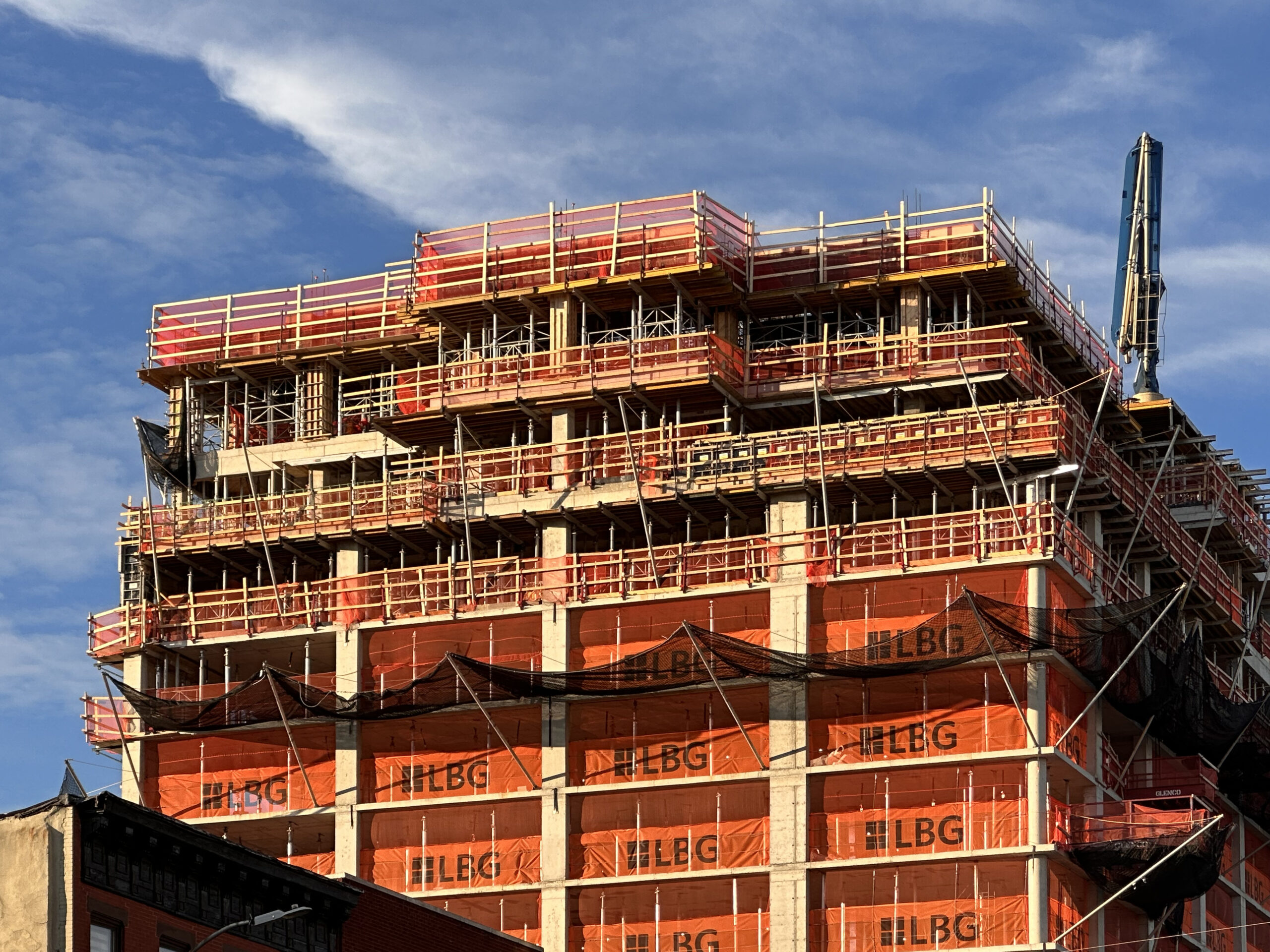
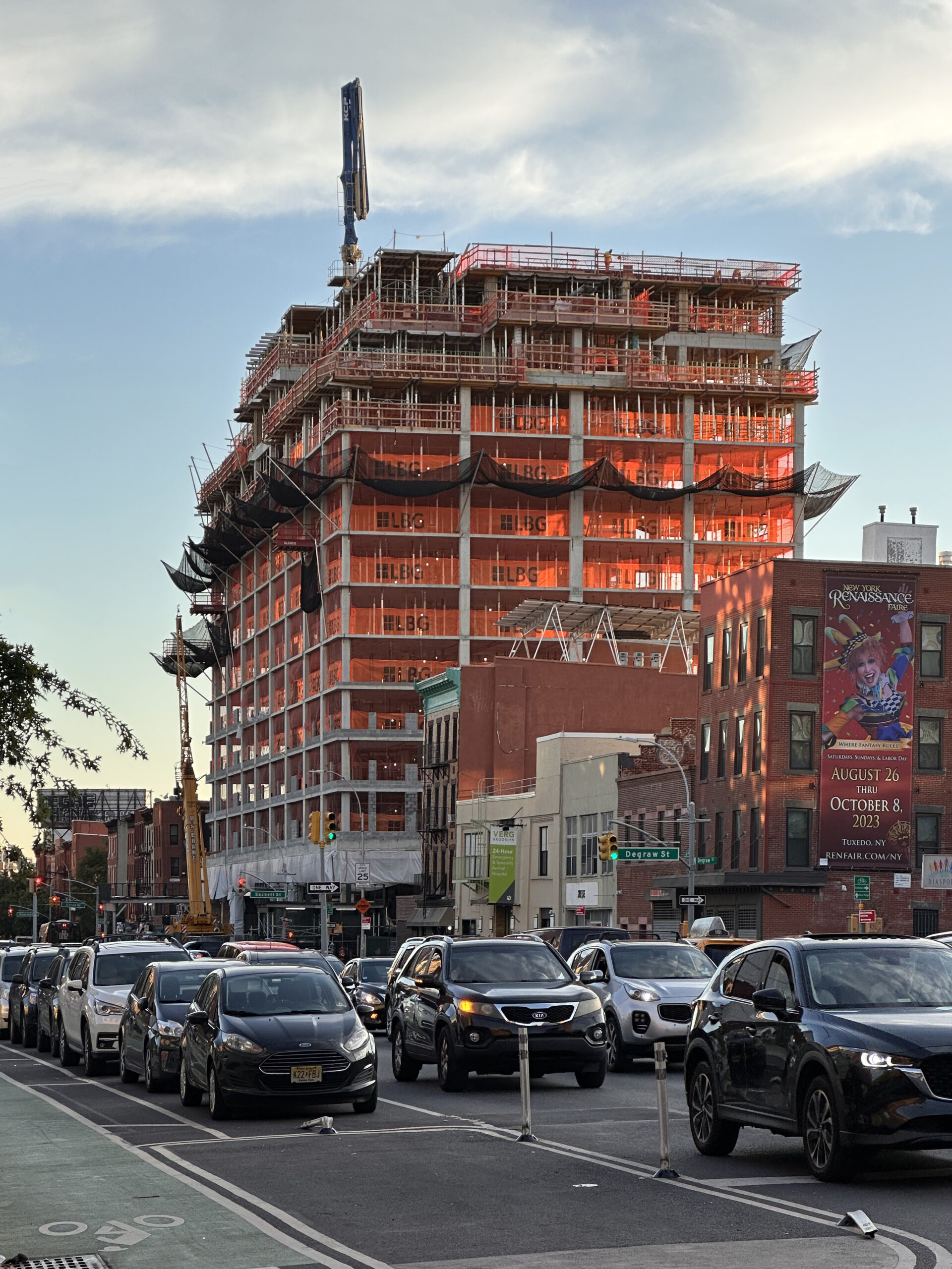
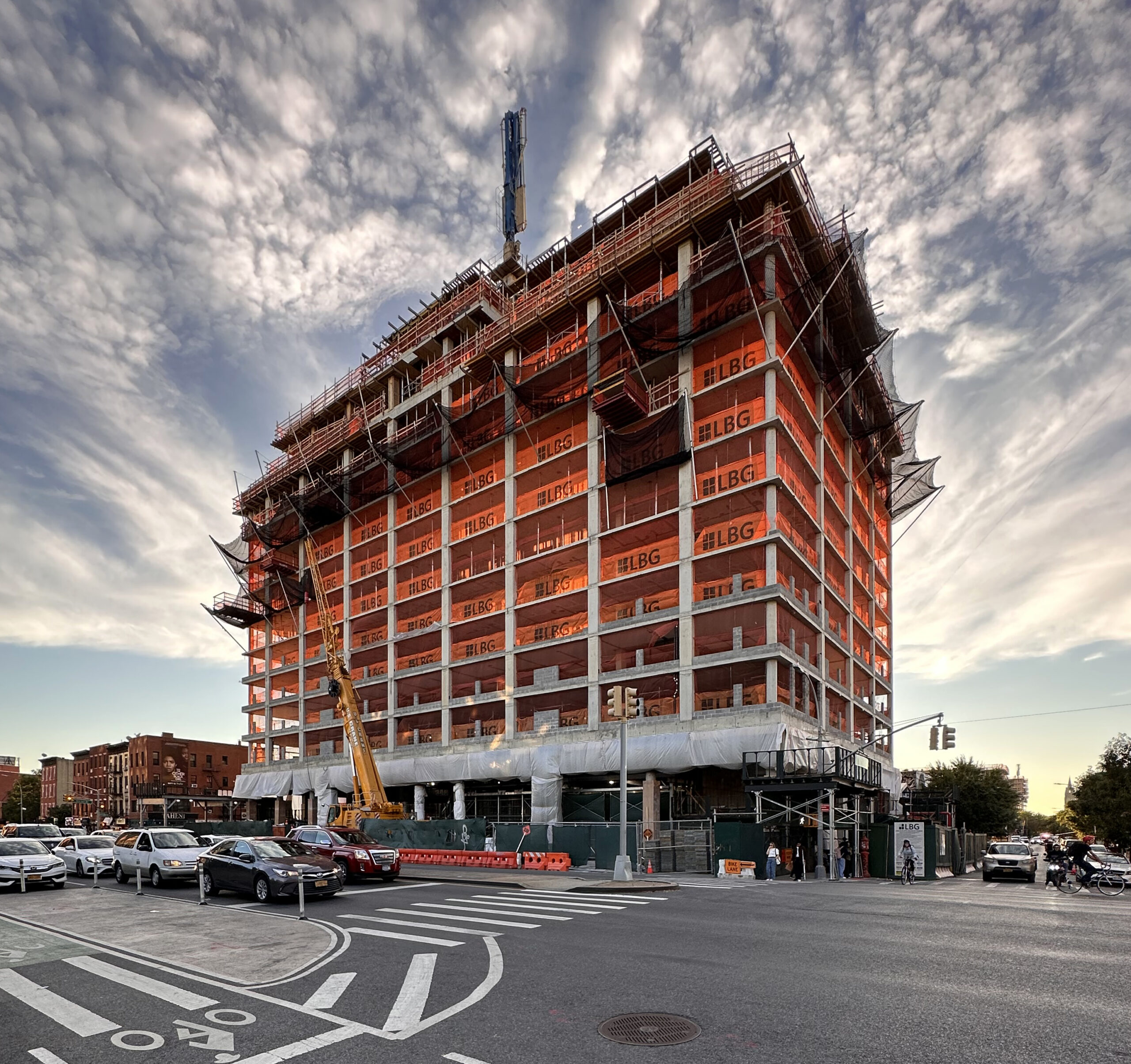
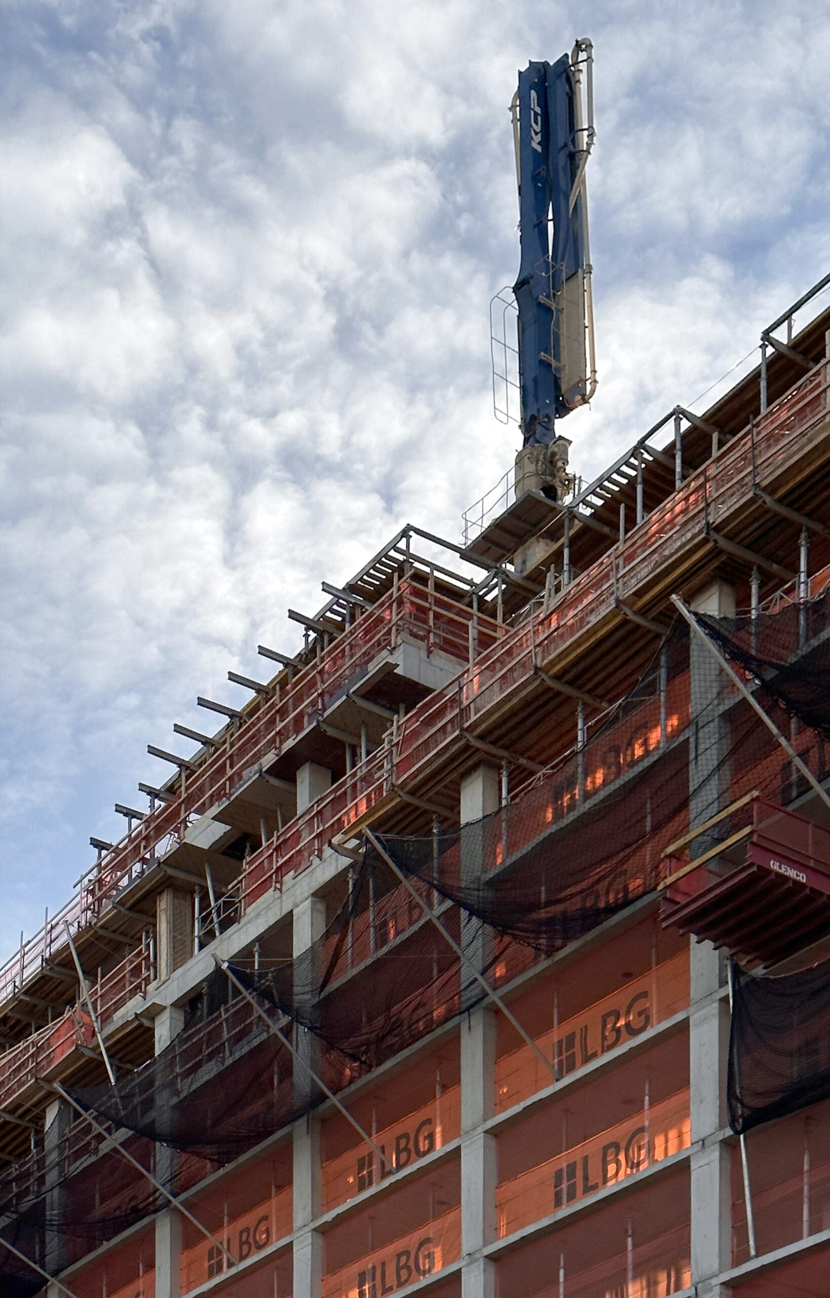
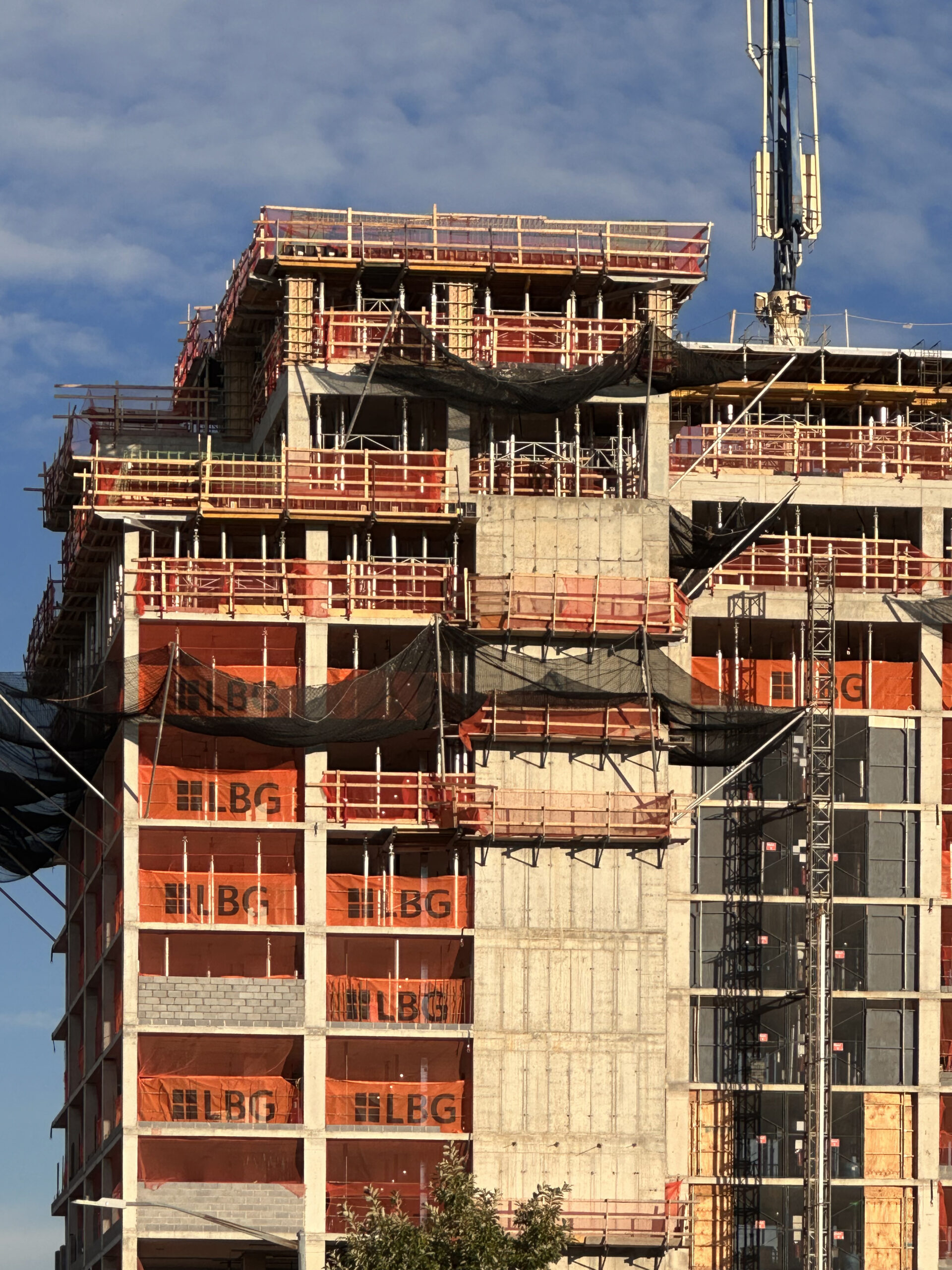
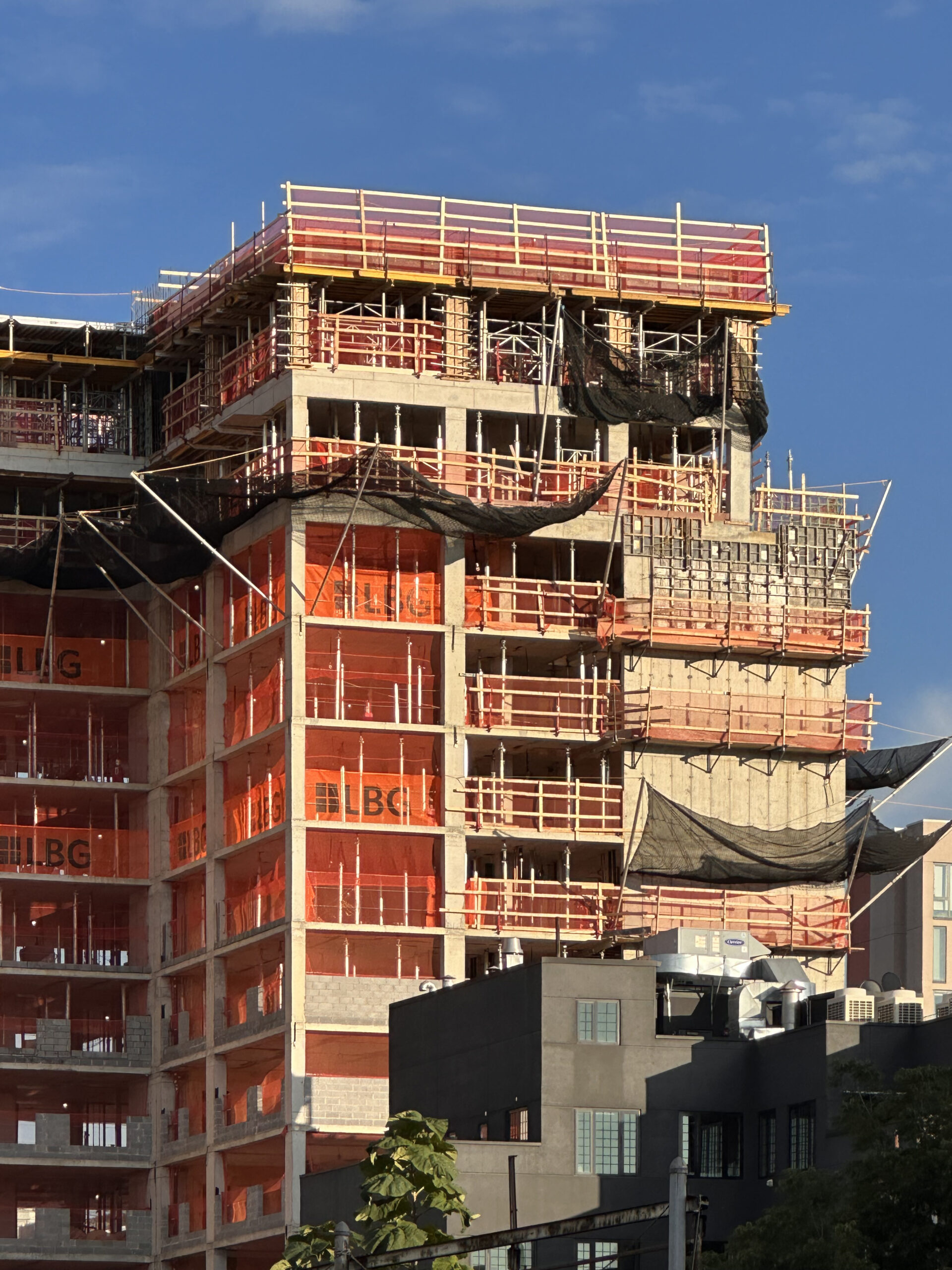
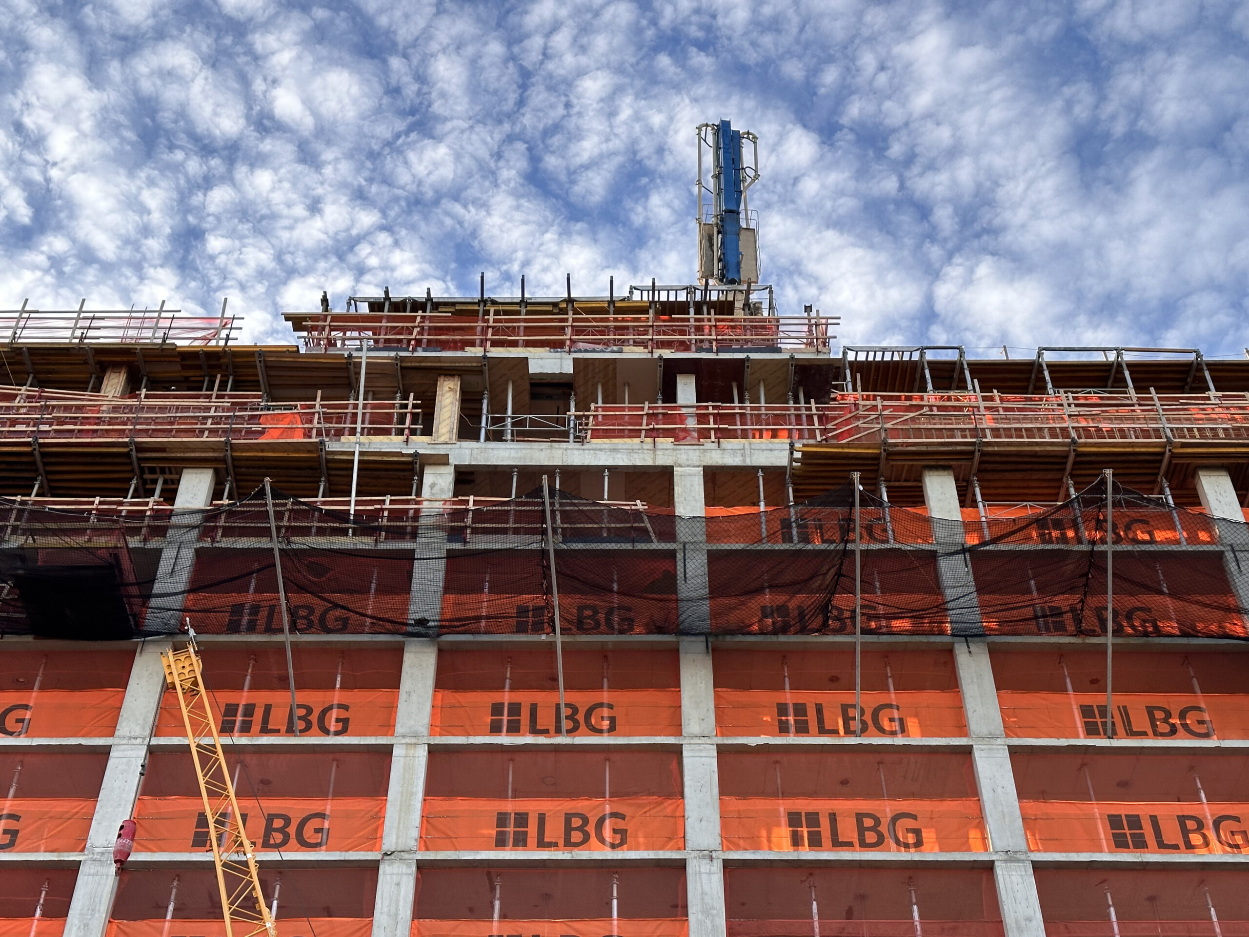
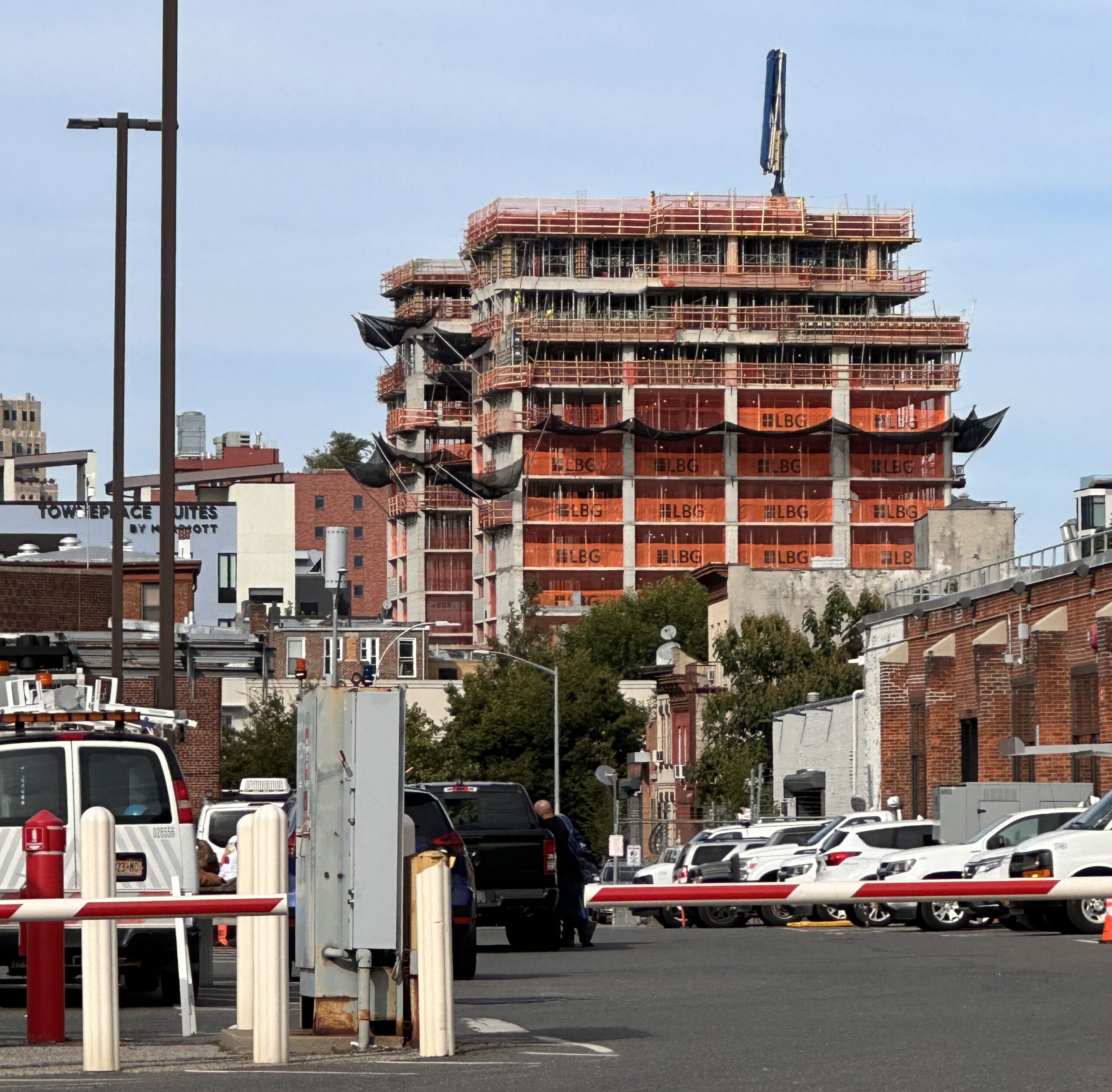
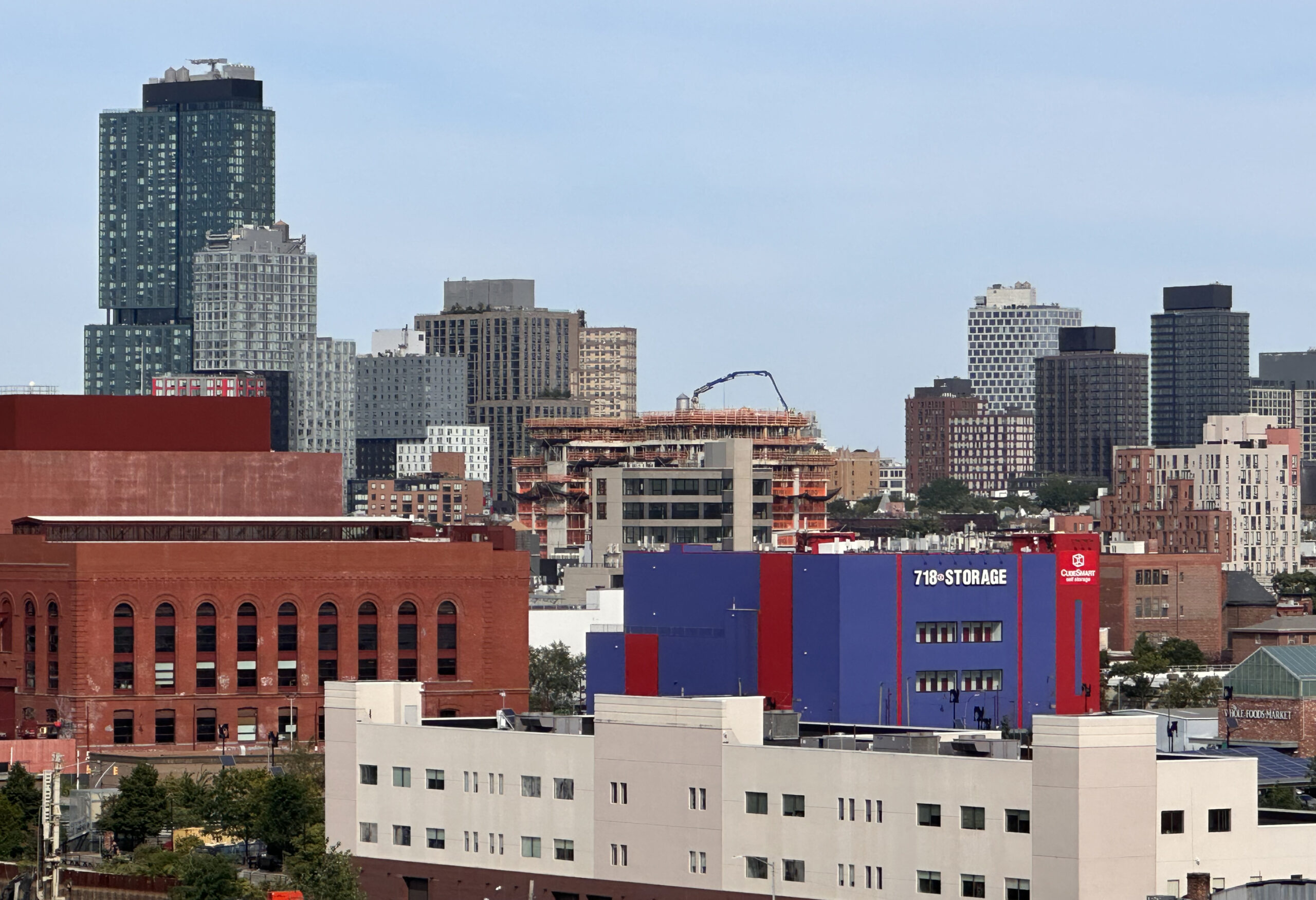
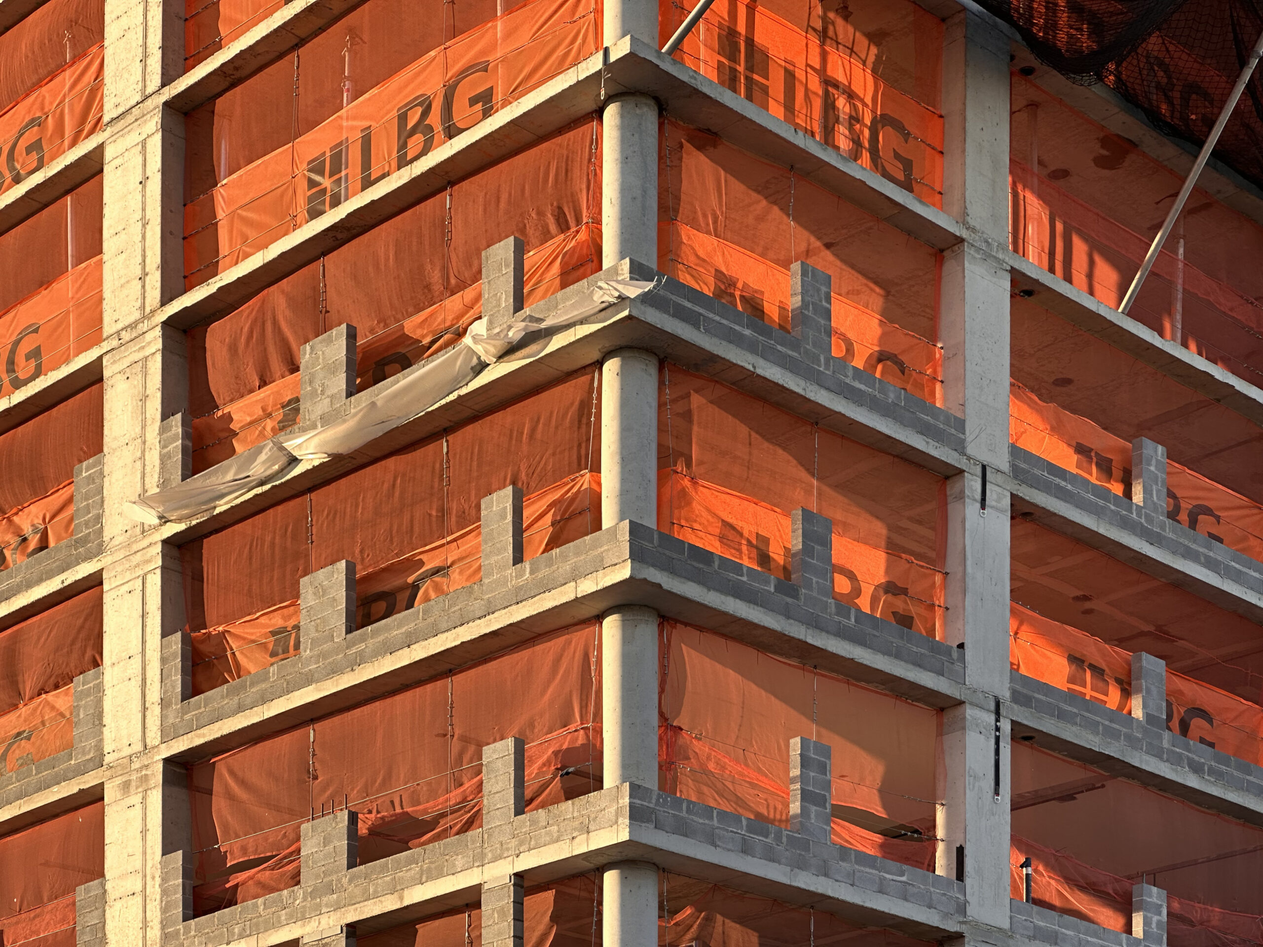
Almost the entire reinforced concrete superstructure has been formed since our last update in late May, when work had just begun to emerge above street level. Photographs taken over the weekend show workers reaching the 13th floor and about to pour the last set of columns, walls, and the ceiling for the roof parapet above. A concrete pump is placed atop the building, while the metal shoring and concrete formwork is visible on the upper levels of 204 4th Avenue. The multiple setbacks should be more distinguished when the temporary formwork and wooden railings are removed.
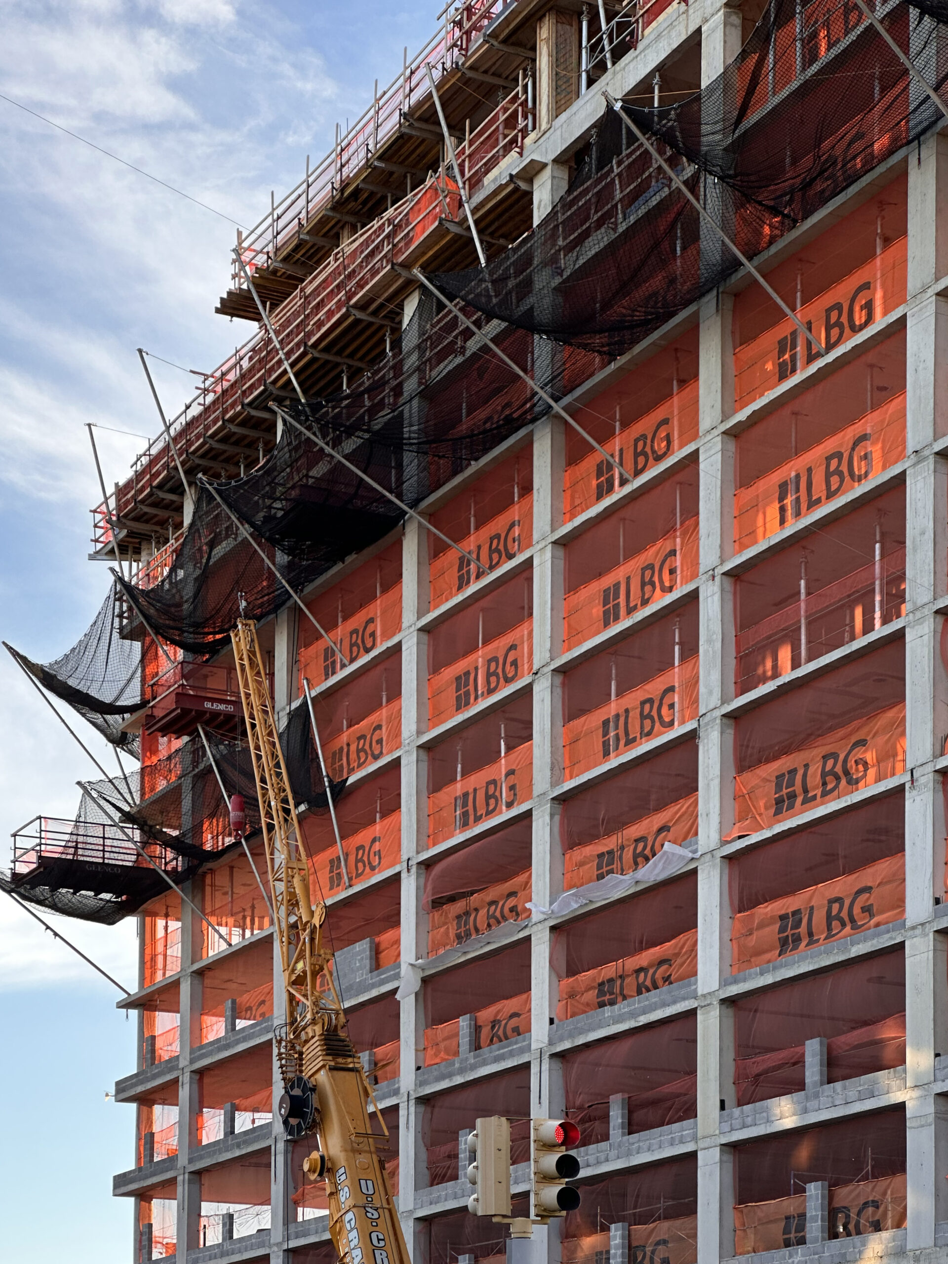
We can also see CMU blocks dividing the edges of the lower floors in preparation for the grid of floor-to-ceiling windows.
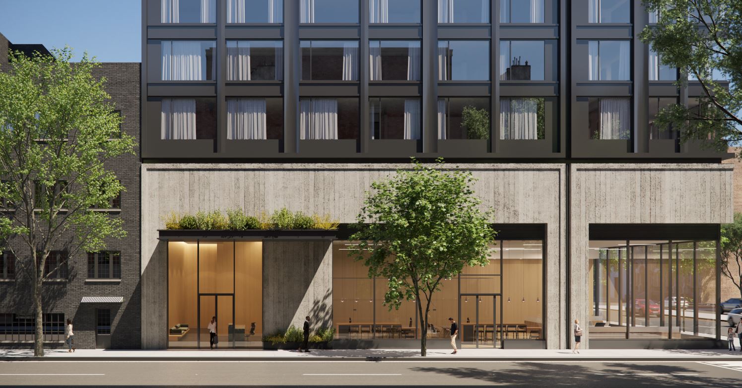
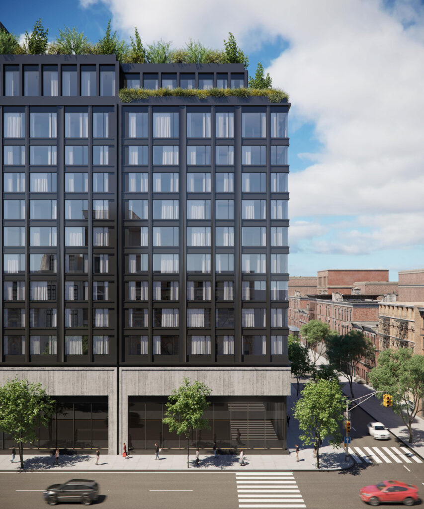
The below renderings from Avery Hall’s website depict a straightforward rectangular massing with the setbacks on the uppermost levels making way for a series of lush landscaped terraces. Dark gray paneling and a grid of floor-to-ceiling windows make up the exterior walls. The first story has a double-height ceiling span for the residential lobby and retail space, and the main entrance is situated on the southern elevation beneath a protruding sidewalk canopy.
Residential amenities will include an outdoor rooftop swimming pool, an indoor lounge, coworking space, a children’s playroom, a fitness center, a pet-washing station, tenant storage, and a bike storage room.
204 4th Avenue has an anticipated completion date of January 2025, as noted on site.
Subscribe to YIMBY’s daily e-mail
Follow YIMBYgram for real-time photo updates
Like YIMBY on Facebook
Follow YIMBY’s Twitter for the latest in YIMBYnews




A really decent design, especially considering this site was a huge gas station. It’s shockingly surprising there won’t be a 160 space parking garage. What went right?
I agree, this is a solid design and that facade looks promising! Also love the streetscape photos showing the building with the clock face
I’ve been excited about this project since It was announced. It got an MTA zoning bonus for including a new entrance to the R station.
Completely dull and sterile. But hey, plants on the roof!