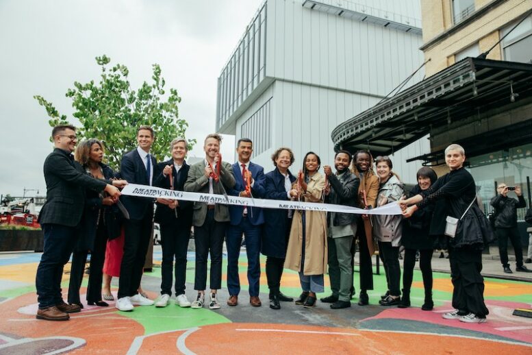
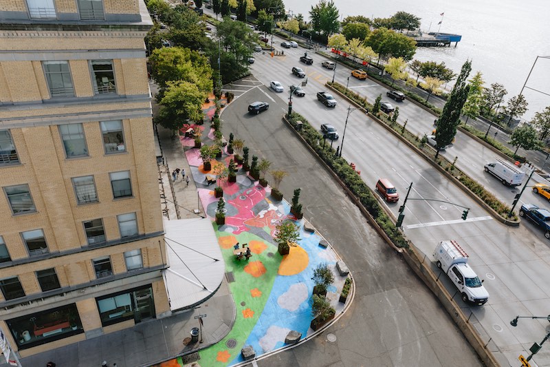
The Meatpacking District Management Association (BID) has revealed Gansevoort Landing, a new public plaza with expanded seating, artwork, and crosswalks in a busy section of Manhattan’s Meatpacking District. In addition to the BID, project partners include the New York City Department of Transportation, TF Cornerstone, and The Whitney Museum of Art.
The plaza spans a stretch of 10th Avenue between Gansevoort and Horatio Streets, and is described as the first implementation of the Western Gateway Area Needs Report and Public Realm Vision, a major victory as communities across the City reimagine streetscapes to create pedestrian-first public spaces.
As part of the opening, the Whitney Museum of American Art commissioned artist Alake Shilling to create a 120-foot vibrant mural on the plaza’s pavement. Entitled Buggy Bear Goes on a Cool Cruise, the mural depicts Buggy Bear, a playful character imagined by the artist, on a road filled with flowers.
“We’re thrilled to implement the first of many improvements outlined in the Western Gateway Vision Plan just one year after announcing the project, thanks in part to partners from the Department of Transportation, TF Cornerstone, and the Whitney, who were instrumental in bringing this to life,” said Jeffrey LeFrancois, executive director of the Meatpacking District Management Association (BID). “This is a triumph that demonstrates the positive impact that BIDs can have within their neighborhoods acting as the bridge between community members and local government.”
Later this fall, the Landing will be expanded to provide a new direct crossing between the Meatpacking District and Hudson River Park’s soon-to-open Gansevoort Peninsula.
Subscribe to YIMBY’s daily e-mail
![]()
Follow YIMBYgram for real-time photo updates
Like YIMBY on Facebook
Follow YIMBY’s Twitter for the latest in YIMBYnews

Why is this city incapable of producing actual pedestrian plazas? The constant use of granite blocks and concrete planters always took me as a temporary condition that will last until the autophiles can remove it and make it a car lane (or parking!) again.
Not impressed, looks like it was thrown together on a weekend!
That childish mural looks out of place, and only a matter of time before it gets tagged with graffiti!
As for those large rocks/boulders?!
🙄
I wonder what the inflated budget was for this attempt to provide a public plaza? 🤔
Kind of a desperate attempt to attract people to what is still a concrete plaza near a highway. I have watched as they have tried to attract businesses to this area. Sadly it is the plaza itself, exposed and noisy which defeats the purpose. Sound mitigation is essential if anything can ever truly happen here, as well as a way to modulate the harsh afternoon sun.
West “Street” is really an urban highway that needs at least one lane on each side removed. The removed lanes could become natural swales “ditches” that collect road runoff and reduce sewer overflow into the Hudson every time there is significant rain. This City really needs to start new thinking for this century, not maintaining the mistakes of the past.
The West Side Highway is the domain of speeders and source if severe pollution and noise. Any public plaza nearby must mitigate this hazard. Until these issues addressed decorating pavement will not do.
typo of not if
I’m glad there is at least one picture – the ribbon-cutting shot – taken as a pedestrian would see it, to supplement the aerial shot.
It is very disappointing in both views. I can only hope that it is a temporary place-holder until something better is designed and installed.
I wish these community boards and planners would realise that plazas don’t work everywhere. In the last ten years, there has been a notable trend of indiscriminately slapping down pedestrian plazas that are underused (if at all) in locations they are not conducive to. To me, it’s like an inverse of when the famous 1916 zoning law was amended in 1961 to permit buildings to rise sheer from their bases provided no more than 40% of the total lot was occupied by the building itself and the rest was given over to public plazas, except in the present day the plazas are not just a means for a building to climb higher while complying with zoning. The buildings in question made no bones about that- even today many plazas at the foot of buildings are deserted and fulfil no purpose other than the one described. In short, I think this “pop-up” plaza craze is just a creeping band aid way of making Manhattan’s streets more hostile to drivers without actually addressing traffic problems in more beneficial ways, such as more subway construction (too expensive and likely to provoke the NIMBY’s, so creating a redundant plaza is one means to at least look like the city is doing something).
The design of this is very tacky when it comes to the colors. It looks like they were trying to make a path when it comes to being near a busy street but I’m also thinking it looks like a weird bike path design. I’m trying not to get the two confused but overall It looks like they did a half job and I don’t like it.
Would Robert Moses approve?
Can we just normalize these things so we don’t need an effing press conference every time we remove a lane from a street and throw some paint on the ground?
Trust me keep doing it but enough with all the backslapping for doing your job.
It’s not East Harlem. It’s Central Harlem.
Just an occasion to show off the new white trainer shoes instead of formal wear to mark occasion – IF it was a real occasion.
Hi please send me info on your studio apartments Thank You