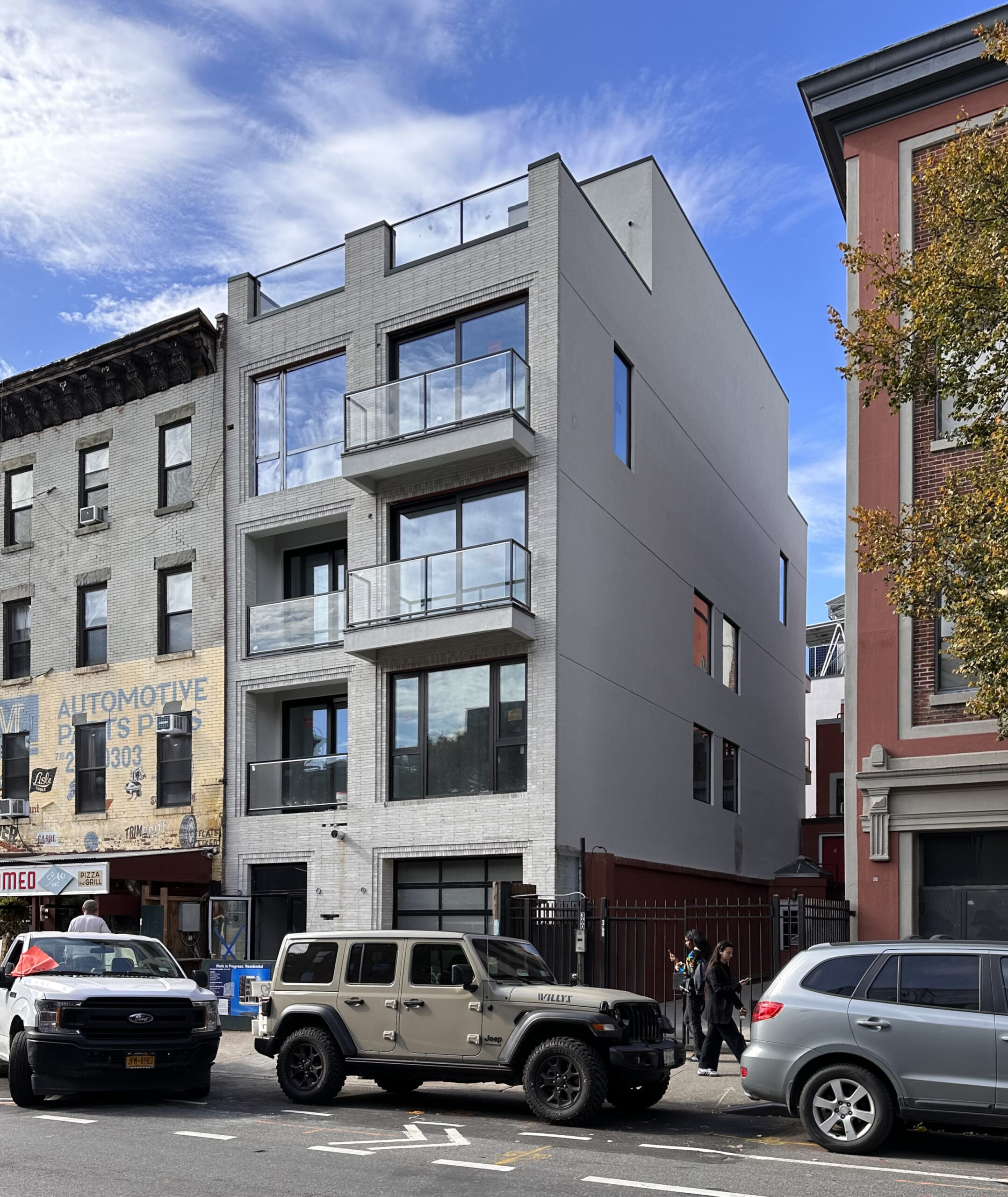
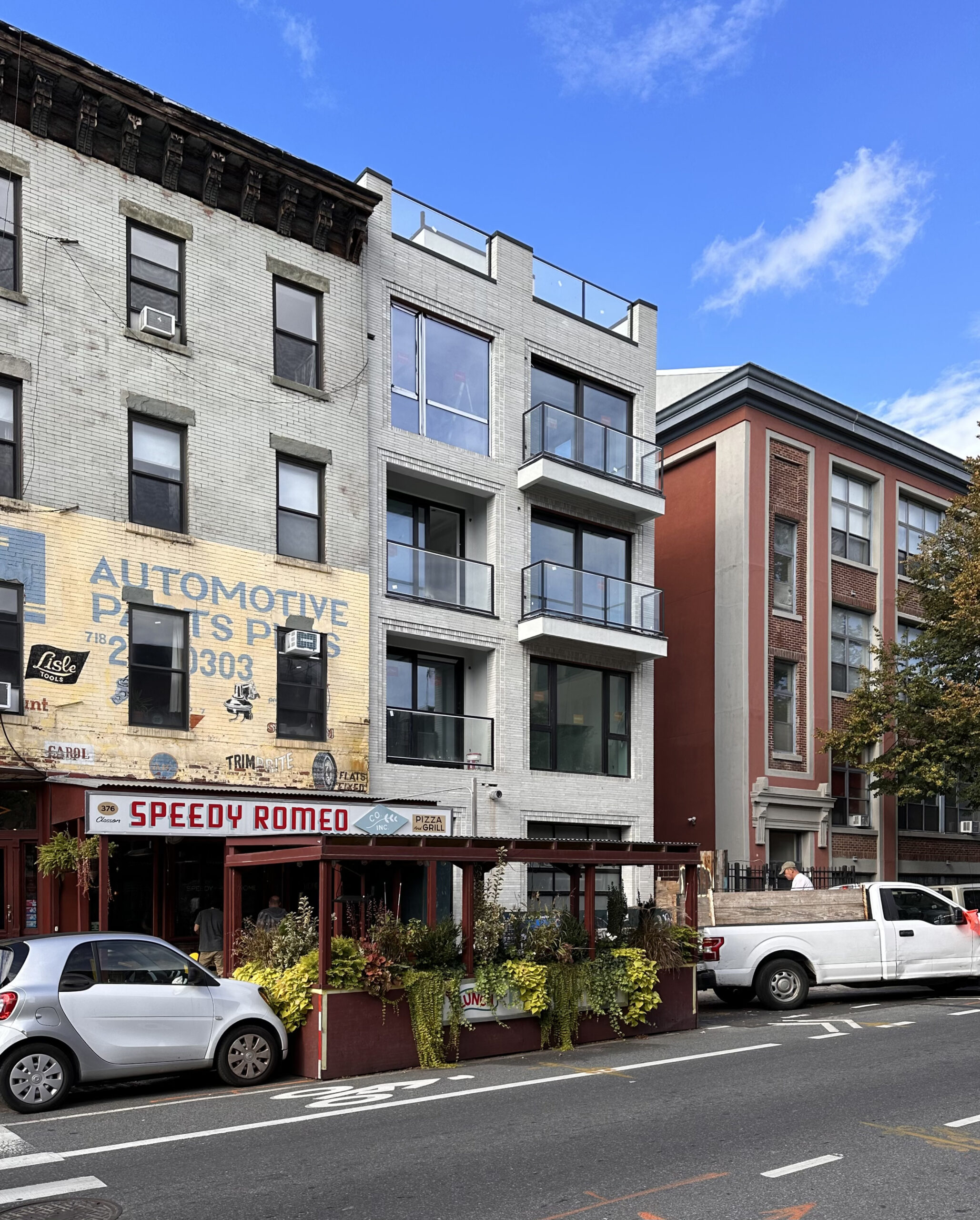
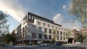
Exterior work is wrapping up on 374 Classon Avenue, a four-story residential building in Clinton Hill, Brooklyn. Designed by Saleh & Associates and developed by Arie Bar Chaim of Brooklyn AZ Inc., the 50-foot-tall structure spans 5,898 square feet and yields seven rental units with an average scope of 842 square feet, a 37-foot-long rear yard, and one enclosed parking space. Brooklyn AZ Inc. 289 also served as the general contractor for the property, which is located by the corner of Classon and Greene Avenues.
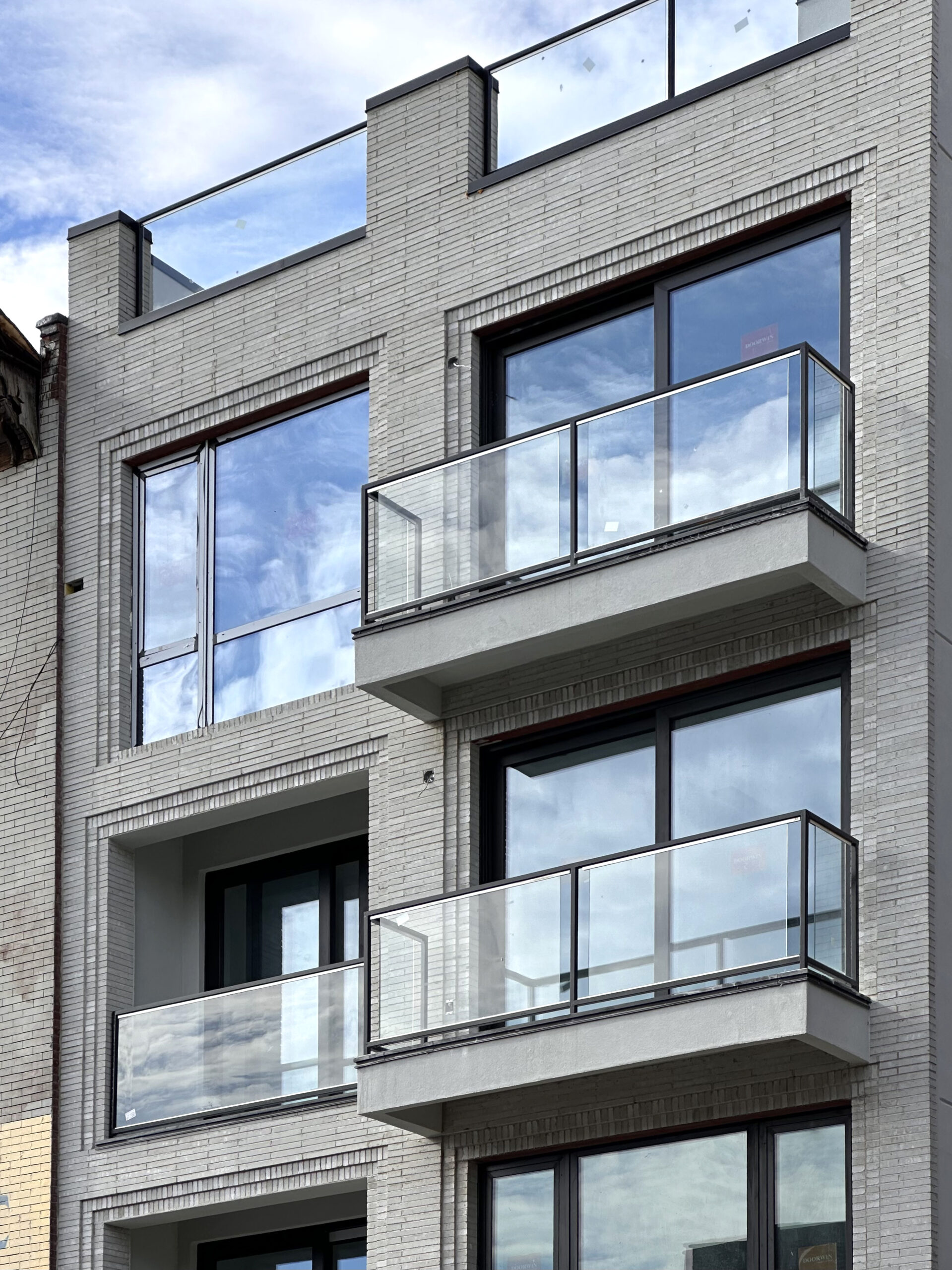
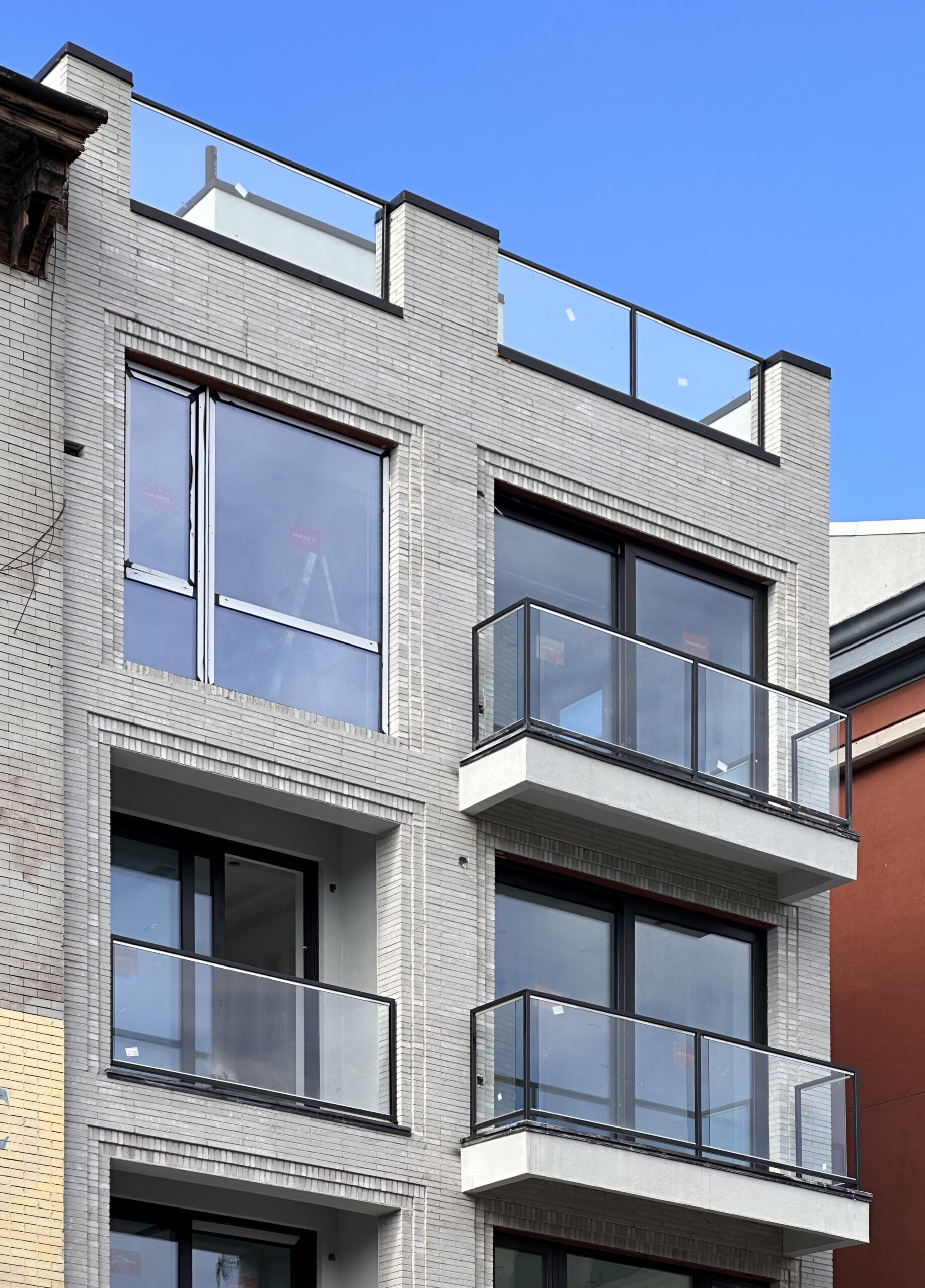
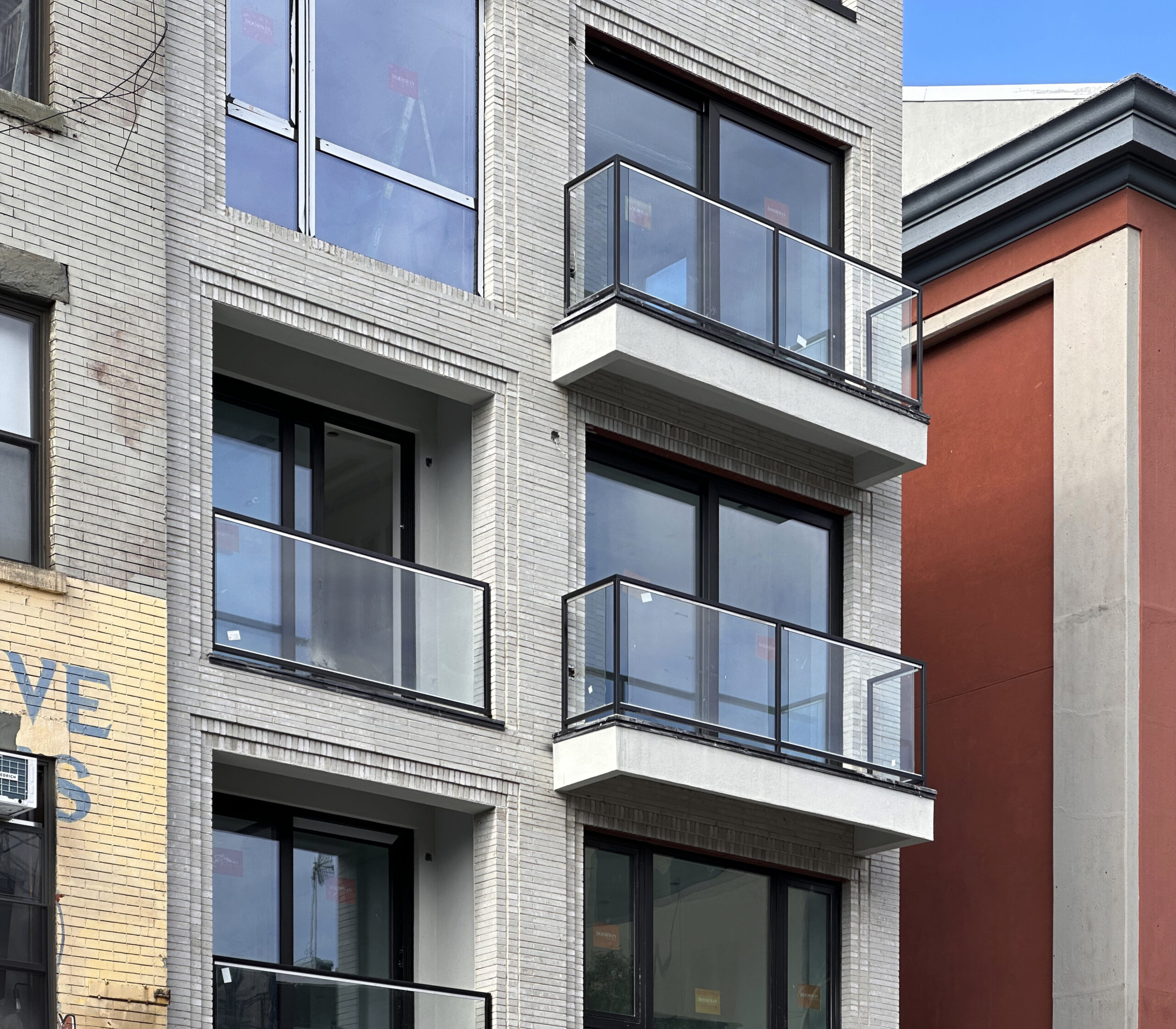
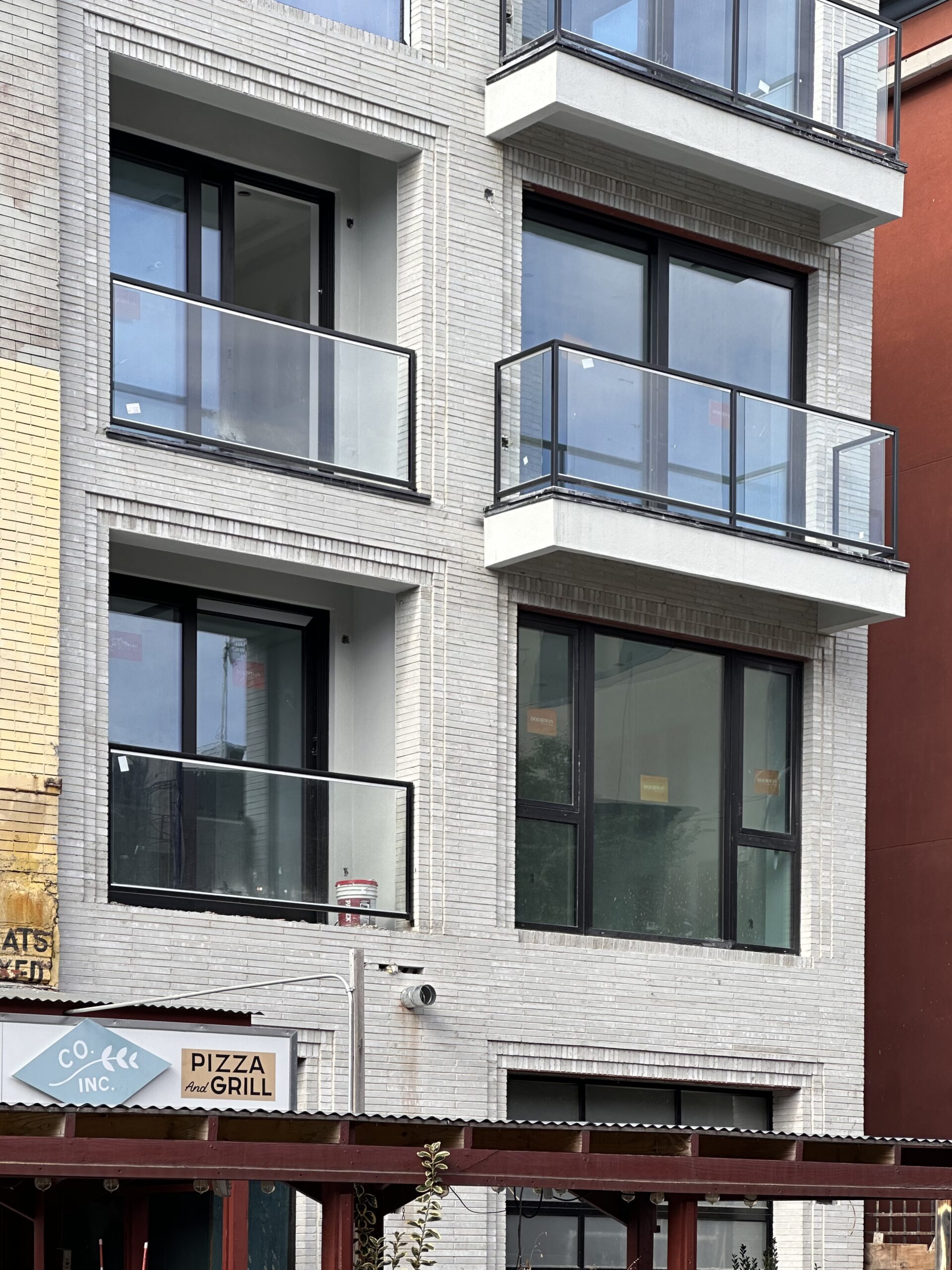
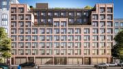
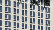
Recent photographs show the finished appearance of the white brick façade, floor-to-ceiling windows, and balconies and pocketed terraces lined with glass railings. The final product is a slight departure from the above rendering, which had arched openings framing the pocketed terraces and ground-floor entrance on the southern side of the main elevation. Nevertheless, 374 Classon Avenue blends well within the context of the neighborhood, both in terms of its height and its understated design.
Some finishing touches are in the process of wrapping up around the entrance, but should conclude in the coming weeks.
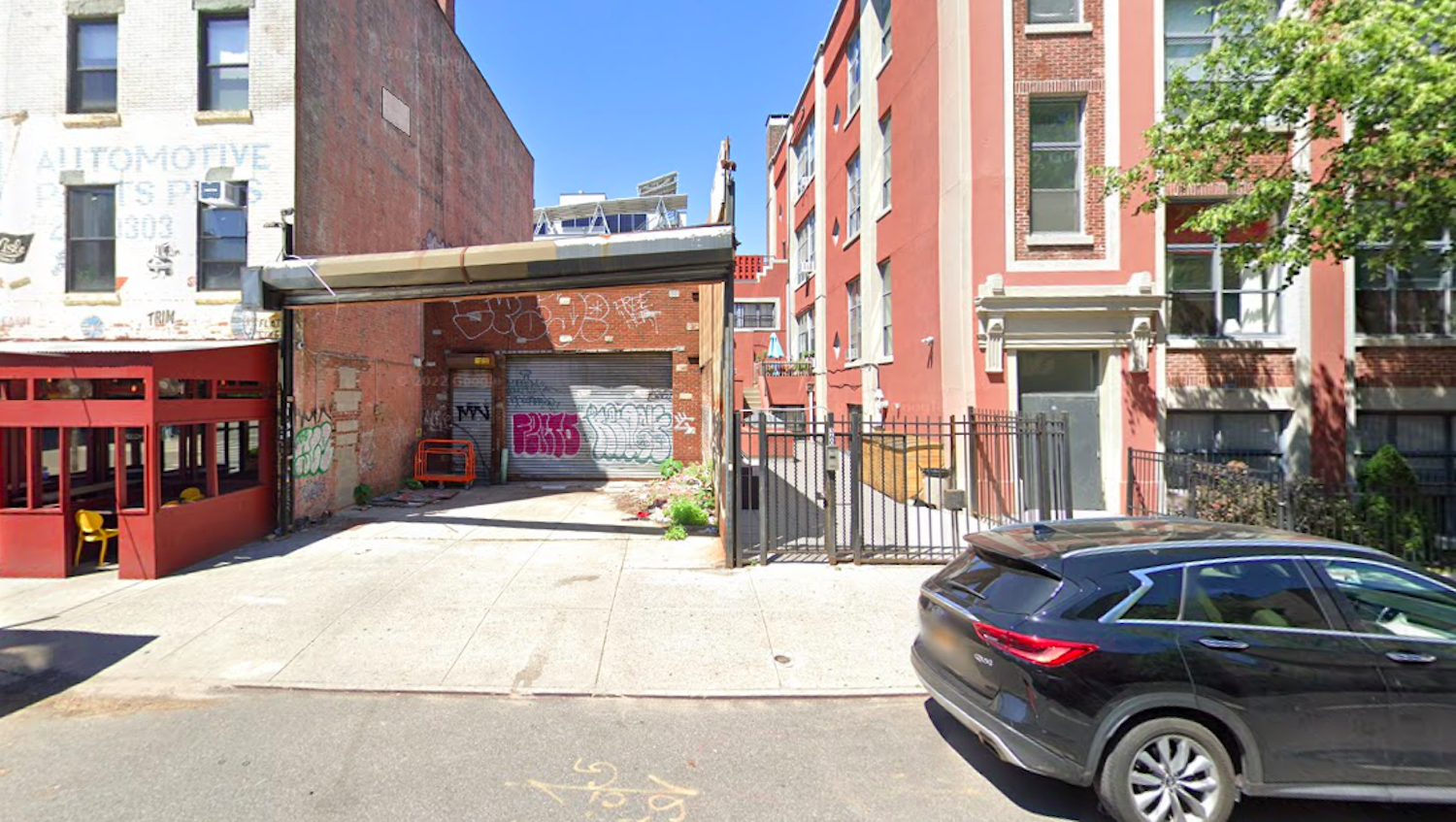
The below Google Street View image shows the dilapidated one-story structure that formerly occupied the property.
The nearest subway from the site is the G train at the Classon Avenue station to the north along Lafayette Avenue.
374 Classon Avenue is on pace to fully conclude construction by the end of the year.
Subscribe to YIMBY’s daily e-mail
Follow YIMBYgram for real-time photo updates
Like YIMBY on Facebook
Follow YIMBY’s Twitter for the latest in YIMBYnews


I think maintaining the angular design for all levels was a wise choice. Those arches are interesting, but might soon look dated. The light grey/white brick is refreshing; however, it is very high maintenance. Taipei is a city filled with white tile/brick buildings and while the city itself is amazing, those buildings quickly look drab. This building already has stains on the first floor facade.
Thank goodness for the redesign. It’s an absolute improvement.
The arches did not contribute very much and I took prefer the revised look.
Yes, I agree that those arches were a blur on the whole aesthetics. The arches made the exterior dark and unappealing. The clear glass balconies are gorgeous bringing so much light and clean beauty. However, the charm will be lost once the materials begin ageing due to that use of the substandard grayish exterior materials. Will probably require an upkeep of professional washing more regular than most. It’s amazing what is capable of fitting in what seemed like such a small area of a garage and now it holds seven apartments at about 800sqft each, which is a great and comfortable use of space. Including an actual backyard, wow!