Concurrent with the groundbreaking for the first Hudson Yards office tower (to be occupied by Coach), Related has updated the project’s website with some snazzy new renderings of the entire site. The North & South office towers look the same as in the most recent renderings, but the latest set of images show the Equinox Tower and the Diller Scofidio + Renfro residential building in much closer detail.
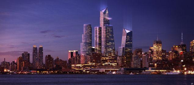 |
| The Hudson Yards Phase I: Image from Visualhouse via the NY Daily News |
The best part about the new renderings is definitely the Equinox Tower, which looks incredibly atypical for a building in New York City due to its oval base. As almost all buildings in New York conform to the city’s street grid, rectangular buildings have been the norm in Manhattan for over a century. The Equinox Tower rises like a wedding cake, with several setbacks as the tower progresses upwards–in this respect, the design actually harkens back to 1920s New York. The tower combines its unconventional shape with classical elements that have defined the New York skyline since the beginning of the twentieth century, and the result is a stunning modern masterpiece. Bravo, SOM and Adrian Smith!
Contrasting its neighbors, the Equinox Tower looks as if it would be much more at home in a city like Houston or Miami as the crown jewel of either skyline. Though it does not look typical for New York, that is certainly not a bad thing, and the tower will add variety to the future West Side skyline. In the below rendering, the Equinox Tower almost looks like the Trump Tower in Chicago–sans the spire, of course. It should come as no surprise that SOM designed the Trump Chicago, as well.
 |
| The Hudson Yards: Image from The Hudson Yards website |
Besides the Equinox Tower, the renderings also show the residential tower by Diller Scofidio + Renfro in great detail. Again, it’s a design that deviates from the norm, but in this instance it’s because the tower is extremely cutting-edge; the four tubes that rise out of the base almost seem to allude to the Marina City towers, again in Chicago. At 825 feet in height the tower would’ve been one of the tallest residential buildings in New York as recent as ten years ago. Though it doesn’t top the 1,000 foot mark, the DS&R tower is still massive. That it looks small next to its neighbors speaks to the scale of the entire Hudson Yards project, which is truly going to be enormous.
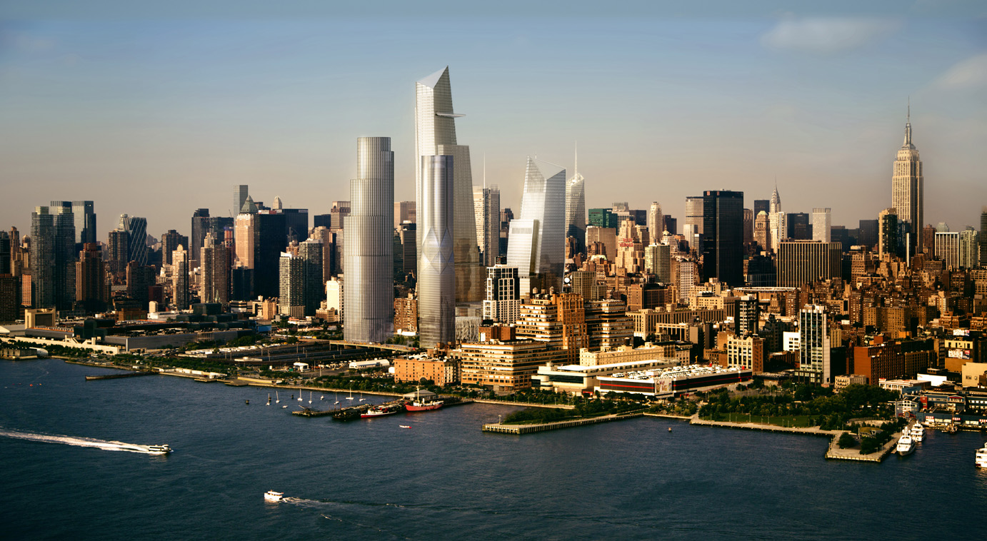 |
| The Hudson Yards: Image from The Hudson Yards website |
Subscribe to YIMBY’s daily e-mail
Follow YIMBYgram for real-time photo updates
Like YIMBY on Facebook
Follow YIMBY’s Twitter for the latest in YIMBYnews






Great comment! I actually meant to mention the Lipstick Building as it looks like a much taller and more layered version of that. But thanks for mentioning as the comparison is very apt, and the fact that the Lipstick Building is still so notable for its shape speaks volumes about how the grid has truly defined the NYC skyline (which overall is definitely a good thing).
I remember when it was built and the architects Burgee/Johnson were criticized in some circles because it did not conform to the “street wall”. I personally always loved it and it stands in marked contrast to the hideous US Post office next door. Granted such shapes are more appreciated when they are more stand alone and it does look a little “Dallas” but it does break up the canyon look that can be a little oppressive. BTW love your blog! I miss NY sooooo much and you help keep me in touch.
I agree, although that stretch of Midtown East will change dramatically once the rezoning kicks in–which is a good thing, as I find that part of town to be generally depressing. Thanks for the comments & for reading, as well!!
WOW, looks nice! Its way more better than the others buildings i have seen