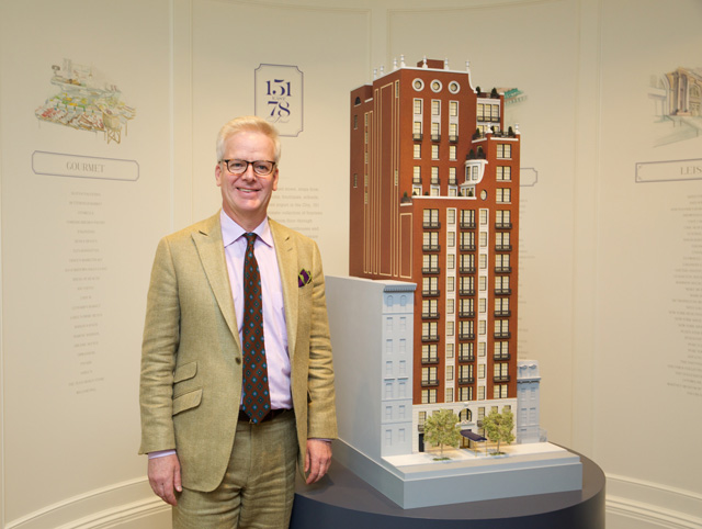
YIMBY sat down with architect Peter Pennoyer of the eponymous firm to discuss his latest project in New York City, at 151 East 78th Street. The building offers a classic take on new construction, with a commitment to authenticity that is difficult to achieve. Besides Pennoyer’s first major ground-up building in Manhattan, discourse touched on the architect’s inspirations, as well as his hopes for future skyscrapers in Manhattan.
YIMBY in bold.
You grew up in New York City, correct?
I grew up on 65th Street between Lexington and Third; I love that street because it had all the stores on Lexington, and it had some very grand houses; David Rockefeller’s house, by Delano, was just three houses away. But then it had a little house that was an art gallery, and the mother gave Italian lessons; I liked the blend of all of that happening on one block. And the corner house was unoccupied for 40 years — it was owned by a Mrs. Kean who lived in New Jersey. Where the Toll Brothers building is now — that was a house with a bronze collection. We had a store around the corner called Lucchesi which sold plaster casts of architectural fragments. So New York was cool. And then they built an ugly building at the corner of Third, called The Phoenix — which is concrete and brick, and really bad. So I wrote a story in my sixth grade school journal comparing The Phoenix to The Plaza Hotel, drawing a conclusion that one was not that nice, while the other was very admirable.
You specialize in classical design; what schools/styles do you come from, what do you try to emphasize in your designs?
My personal favorites are federal and regency architecture — so I like architecture that’s done with a very light hand. The details aren’t too rich or heavy. And I also like classicism that was done by people who didn’t have the materials, money, or cultural environment to do things in a full-blown way — so that’s why I love Monticello and Mount Vernon. They’re classical, but still a little bit crude and rudimentary. So simple classicism.
So your style is rooted in the timeframe following the Revolutionary War? And how does that translate into 151 East 78th Street?
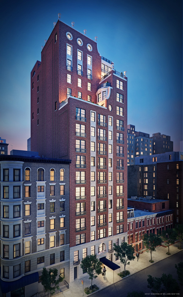
[151 East 78th Street] comes from a different direction. The first great American architects, all of whom studied in Paris, learned about total design — which means you’re learning about the plan, the elevation, the details, the artwork — the whole thing. And they were completely immersed in this method of French architecture. But then they came back to New York, and they suddenly had to design buildings that no-one had to do before — the high-rise apartment house simply didn’t exist at that point. So they had to come up with a new approach, and it was to take the building and to make the scale appropriate to the street. And we did that on one level by having a stone base with fairly delicate details — rustication, carved rackets on the door, and some metalwork to try and bring the building into a dialogue, and into context with the street. And on the other hand you have the skyline, and you can do more exuberant, fun, and sculptural gestures. The urns atop the project are there for the skyline; the street experience is very different. And I think all of that comes from studying classical architecture.
And the other thing about classical architecture is it teaches that you can add ornament or you can shift materials, so that the way the building appears — the proportions aren’t just about the specific plan. If a building has 150 windows on it, you don’t have to look at something that has 150 rectangles; you can join them together as we did, with stone spandrel panels and moldings; 151 East 78th has these nice, clean, brick-banded windows, and then you’ve got windows called out as individual elements on the facade. It’s all about manipulating the proportions of the building by shaping the massing and using ornament to organize an overall design.
It’s much more interesting — in my view — than just building a glass facade. And those buildings don’t age well; buildings that are made of stone, brick, and real materials look more beautiful with their patina and aging, and become part of the city. Glass buildings just die, and they need to be completely re-surfaced. If you’re a landmark, and you have some pockmarks, and you’re a stone building, Landmarks doesn’t even allow you to change the stones, because they’re the real thing. But Lever House — its glass curtain walls were literally sick. So they had to take the entire facade off. Same thing with the facade of the UN; it failed.
But it looks good now, don’t you think?
Yes, great — they did a great job. But is it worth $2 billion? I don’t think so.
On that note, do you think 151 East 78th looks further back than some of its neighbors on the Upper East Side?
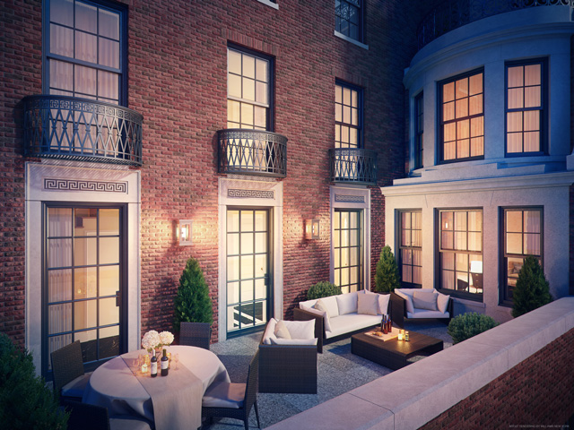
No, it looks back to the 1920’s — to Rosario Candela, Whitney Warren, and Mott Schmidt. It doesn’t look back beyond that, but it does look to what they were doing, and it has things that no-one has done in all these new buildings. This has real double-hung windows with mullions; that’s one of many differences.
What are some other differences between 151 East 78th Street and buildings from contemporary architects that draw from classic inspiration?
The difference is that the details are drawn by hand, by someone who is completely knowledgeable and fluent in that kind of architecture, instead of someone trying to imitate a past style. The partner in my office, who is not me, who drew that is a genius — he’s better at it than I am! It’s convincing and it’s not like you’re quoting a historical source and being ironic about it. It’s the real thing. It’s strange that there are so few architects alive who can draw these details correctly; but some of the few work here. Also, people either go for symmetry or asymmetry, and something that’s unusual is that 151 East 78th Street has symmetry up to the first major terrace, and then the massing above becomes asymmetrical; that hasn’t been done much, except for 15 Central Park West which also takes liberties with the window grids like 740 Park Avenue does. The scale of the panes of glass — there’s no other building that I know of, other than Roman & Williams’ Viceroy, where they actually do mullions instead of big sheets of glass.
The Viceroy? Roman & Williams shares your knack for authenticity rather than replication. Maybe you should work together?
We were going to work together. We even had a conversation. But the client had a budget for talent.
One day. Hopefully soon.
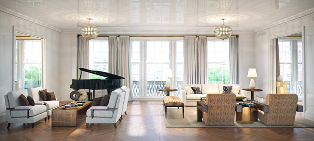
Yes. I admire Stephen. I saw his drawings years ago on a jury — he deserves a prize for those incredible drawings. But yes, it’s thinking about the view from the inside out. Most people think, ‘well why would you put in mullions?’ but it’s about the scale. It makes the room seem thirty percent bigger if you’re not looking out from a sheet of glass.
So you think you would be more satisfied with the evolving skyline if more buildings looked to the past?
Yes. And I think stone is a better material for New York — stone works better because it ages more beautifully, and it reflects light more beautifully. It connects buildings with other buildings. Glass seems brittle and unfriendly; I also think stone looks much better at night, and to look up at a stone building and see its lights on the city skyline has always appealed to me. Especially in art, as New York has been the model for many great artists, including Martin Lewis. When I look at glass buildings at night, I don’t see anything about the architecture, so much as I see a beehive of human habitation — of flickering TV screens. I find too much glass a bit depressing.
So you find the evolution of 57th Street to be a bad thing?
I take it on a building by building case. The new one by Bob Stern — at 220 Central Park South — that will be good.
Do you have any other ground-up projects on the horizon in the city?
We’re in discussions with someone who has a great site.
Do you have any interest in doing something on a larger scale?
Yes. I think I would feel strange about doing something really really tall, and I’ve been involved with groups that have tried to stop people from doing that.
Unfortunately. But that’s ok…
Like the Municipal Arts Society. But I am also pro-growth. I’m just worried that if we do too many glass buildings, we’ll lose the character New York has; traveling in Asia some of those cities are character-deficient.
But what if you can build these new buildings in historic-minded styles?
I would love to do that. And I’d be leaving some trace of history.
For any questions, comments, or feedback, email [email protected]
Subscribe to YIMBY’s daily e-mail
Follow YIMBYgram for real-time photo updates
Like YIMBY on Facebook
Follow YIMBY’s Twitter for the latest in YIMBYnews


