News broke this week that billionaire Ron Perelman committed $75 million to financing the World Trade Center’s Performing Arts Center, which will provide the complex with a much-needed cultural amenity. But with 175 Greenwich, a.k.a. 3 World Trade Center, nearly complete and the remaining puzzle pieces now falling into place, it is YIMBY’s opinion that it is also time to reconsider the design changes proposed for 2 World Trade Center. With Fox failing to commit to BIG’s proposal for the site, it makes much more sense to return to Norman Foster’s far more attractive design for the tower, which was shelved last year.
The crux of the argument comes down to the intention of the site’s master plan, when the architects of the four main towers worked together to come up with a cohesive vision that would both respect the site’s history while also restoring the Lower Manhattan skyline to its former glory. Each of the buildings was designed to complement the others, and while minor parts have been value-engineered, the vast majority of the plan has been built as originally envisioned.
When it comes to 2 World Trade Center, things get more complicated (and evidently, the tower did not meet its originally-anticipated 2011 completion date). But that doesn’t mean Foster’s design is unfeasible. In fact, the base of that design has already been built to street-level — which would have to be completely redone if BIG’s tower ends up rising.
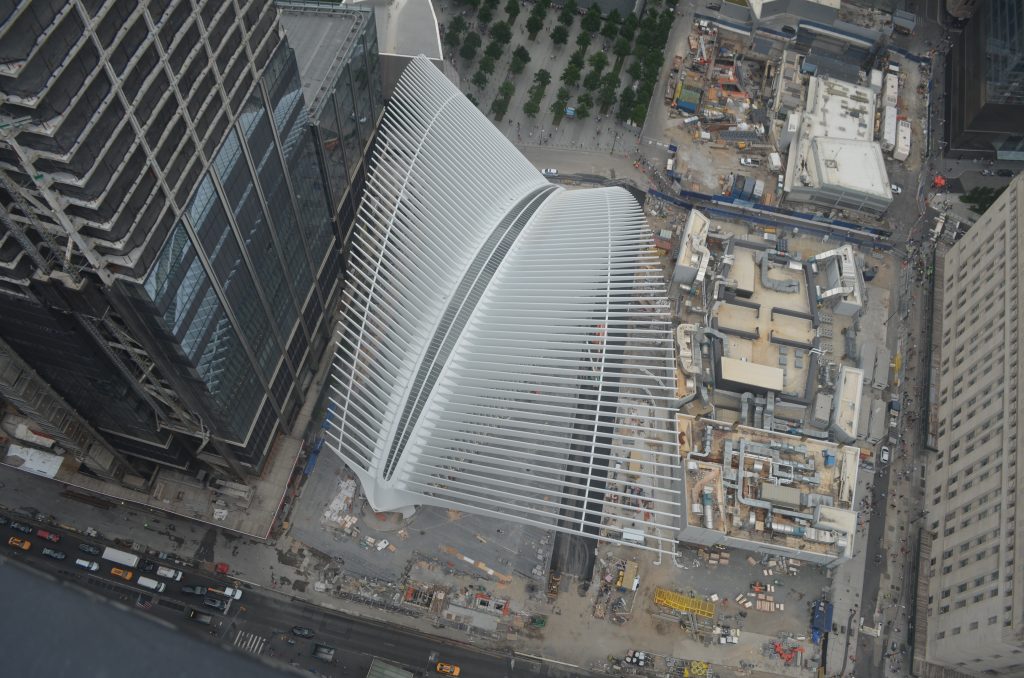
Transit Hub at center and Two WTC’s foundation at right, from Earthcam via the YIMBY forums
The reason for the change in architects was Fox’s tentative commitment to the site, which has since fallen through. They wanted layouts that Foster’s version could not provide, and so BIG created a design that stacked boxes of various sizes on top of one another, allowing more flexibility, and catering specifically to media companies.
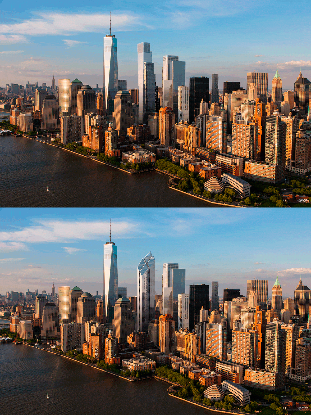
Unfortunately, that design fails to relate to any of its neighbors in any meaningful way. Besides the numerous cantilevers — which are controversial enough on an individual basis — the bottom of each box would feature a moving ticker tape, casting stock symbols and whatever news Fox saw fit over the site of the most devastating attack in the country’s history.
Nothing is explicitly wrong with BIG’s design, which is certainly innovative. But it would be much more at home in Times Square or Hudson Yards, instead of the most hallowed ground in New York City.
Foster’s vision was the complete opposite of BIG’s. Instead of rising as a glorified staircase, the tower would first ascend from a prominent base featuring trading floors. The mid-levels, though uniform, match the other towers in the complex, which also feature relative monotony for the bulk of their programs. But the big difference, and what’s truly beautiful about Foster’s design, is the crown.
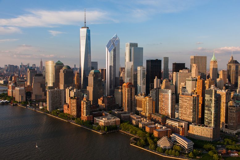
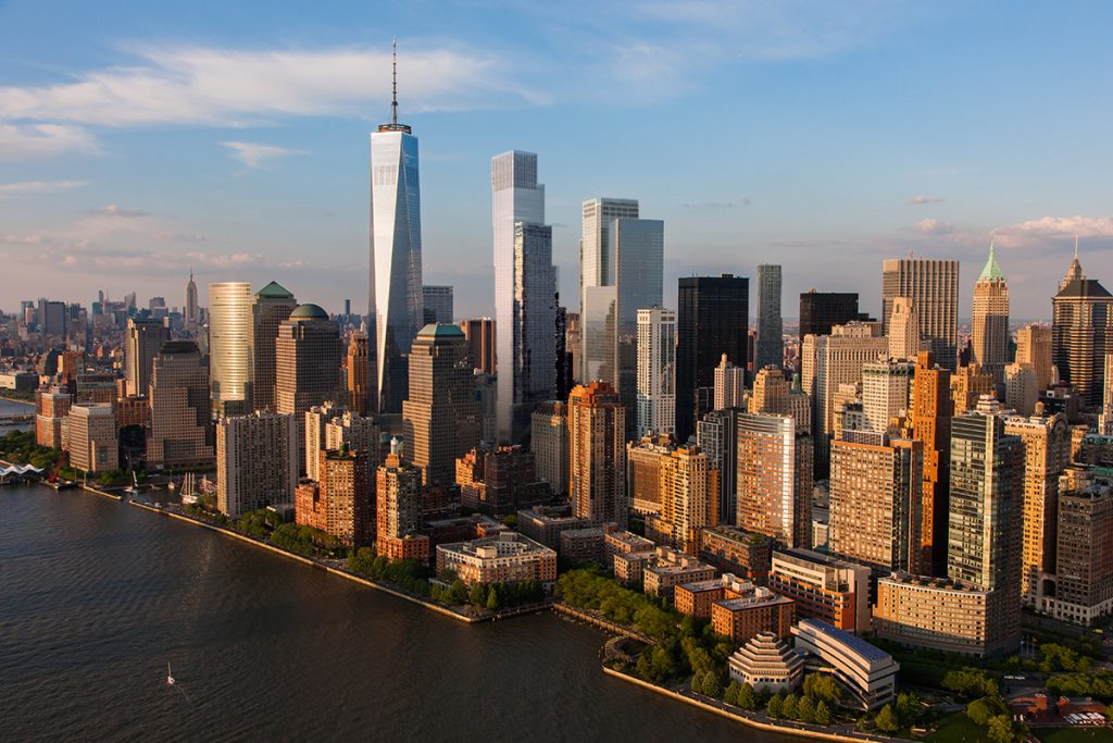
Under Foster’s scheme, 2 World Trade Center’s mass would’ve been capped by four separate pinnacles, each topped by its own diamond, rewarding the Lower Manhattan skyline with a true crown jewel. 200 Greenwich, the site’s address, would bridge the divide between its flat-roofed neighbors at 175 and 150 Greenwich and the soaring spire atop One World Trade Center, while attaining prominence in its own right, both out of sheer height and unparalleled uniqueness.
Despite the lack of anchor financial tenants in the current market, the Foster design had the same square footage as BIG’s, and the interior space would realistically be just as good as whatever the alternative would have. More importantly, it would have been truly unique and original to New York City; a series of cantilevers is certainly creative, but it is no more inventive than 625 West 57th Street (VIA 57 WEST) is compared to Mercedes House just a few blocks to the south.
When it comes to a site that is so important to New York City’s future, something as respectful as it is iconic is key. And after a year of reflection, it seems obvious that BIG’s tower is not the kind of building that would befit the new World Trade Center. Without the tenant it was specifically designed for, why should it rise anyway?
With the Performing Arts Center set to rise in the near future, and the Greek Orthodox Church also coming along, the gaping wound in Lower Manhattan’s cityscape is finally almost done healing. But with the fifteen-year anniversary of September 11th on the near horizon, it is important to remember both the significance of the site as a whole, as well as the intention of the original masterplan. For those reasons, it is important that the final stitch in mending the area’s urban fabric stay true to the superior building that was originally envisioned.
At the end of the day, Foster’s design was custom-tailored to the memorial, the surrounding neighborhood, and the New York City skyline; BIG’s was created specifically for a corporation.
Subscribe to the YIMBY newsletter for weekly uxpdates on New York’s top projects
Subscribe to YIMBY’s daily e-mail
Follow YIMBYgram for real-time photo updates
Like YIMBY on Facebook
Follow YIMBY’s Twitter for the latest in YIMBYnews






Yes, I totally agree with your assessment as to the Norman Foster tower design that ought to rise at 2WTC! Let’s remember too that the “diamonds” atop the tower were designed strategically to point downward towards the 9/11 memorial to give it a point of reference. The tower also relates more to the other three as the Lebeskind master plan intended. I agree that the tower is unique in it’s design and respectful to the site. The BIG tower looks to me like another bland corporate tower befitting Hudson Yards or the canyon of towers along Sixth Ave near Rockefeller Center.
Yes!!! A thousand times yes!
The BIG design looks like a pile of children’s you blocks. The Foster design was the nicest of all the buildings proposed.
FINA-A-FUCKING-LY! Thank you thank you thank you. It is by far BIG’s biggest failure and lack of attention and imagination. He clearly let this project slide though. I like most of his work but this just seems like it was another big (no pun) project to seal his name into starchitect status and never really examined the impact that this project really holds. The video he did to describe the project made my jaw drop in a bad way and I could easily mistake it as a joke if I didn’t know he was serious.
That’s a very good text about this matter between distinct designs for Tower 2 of the World Trade Center.
I’m okay with the BIG’s design if it’s chosen to be really really built, but I still prefer Lord Foster’s.
It was made specifically for the WTC site. It’s unique four diamonds top is beautiful, symbolic and, as Lord Forster himself said in this video below, “from anywhere in the city from afar, you see that angle and you will know it’s a reminder of what that site is and where it’s pointing”.
https://www.youtube.com/watch?v=UMcV8S9Ic7g
Here’s how I see it. I like both designs. With BIG’s design, I was unsure at first but when I looked at inside renderings, I thought it was pretty cool. I’m fine with either design. Also, I believe the base of BIG’s design was made to fit the one already made. Anyways, that’s just my opinion.
Funny thing is, I’m 13, going on 14. Been into the WTC since I was 10 and a half. I think the WTC is amazing.
I’m willing to vote for new and old design, whatever on 2WTC is right on a piece of suitable.
Completely wrong. It is the BIG design which is respectful and references the sites history. Its “staircase” as referred to here speaks directly to the climb of the rescue workers, 9/11. That’s exactly what it looks like rising into the sky, toward 1 WTC. Build it and the skyline would forever commemorate the heroism and sacrifice of 9/11. As it should.
Michael Burke, what apologist nonsense. Where on earth did that analysis of yours originate? It is an incredible stretch of the imagination to associate this bland, artless design with the climb of the 9/11 rescue workers and to forever commemorate the heroism and sacrifice of 9/11???? It sounds more like you’ve carefully digested whatever pablum Big came up with to justify their unimaginative, soulless design and dispatched you to defend it. Your comment is truly laughable. Sir Norman Foster’s design is exceptional in its proportions and its height. it is also elegant, purposeful and cognizant of its surrounding architecture and landsvape. And it aesthetically pleasing to the eye compared to Big’s box upon box upon box solution those annoying cantilevers.
What relationship *does* Foster’s design have with the rest of the WTC site? This post argues that Foster’s design somehow both “respects” and “relates” to its neighbors, yet also features “unparalleled uniqueness”. I fail to see how the four-diamond crown respects or relates to its neighbors—indeed, I see a building that pays no respects from its neighbors, a building that lamely attempts to steal attention away from One World Trade, itself a rather lackluster tower.
BIG’s proposal was well-considered from a number of perspectives, literally and figuratively. The cantilevered, or stepped, approach reinterprets the classic New York setback in a fresh and respectful way, blending the rectilinear forms of the other Trade Center towers with the angularity of One World Trade.
If, as you argue, “respect” and “relationships” are key for 2WTC’s design, then BIG’s proposal is the superior proposal.
Thank you Karl,
at last someone notes the obvious.
GREAT ARTICLE YIMBY and YES lets bring back Foster. What’s unique about Lower Manhattan is that as it narrows the moisture in the air from the two rivers responds differently to light which is why Tower 7 and Tower 1 have this luminous, transparent effect and one that Foster’s structure will capture so beautifully as well.
The BIG building is an interesting design, but suffers greatly in comparison to the Foster design.
Love the Foster building, but “truly unique and original to New York”? To me it presents like a beautifully updated descendant of Epstein’s 1983 Smurfit-Stone building in Chicago.
It’s sickening to see (presumed) New Yorkers trip over themselves defending whichever of the two designs they believe to be more ‘respectful’ to 9/11. The World Trade Center is not defined by 9/11; 9/11 is a tragedy that happened to it. The World Trade Center is defined by Minoru Yamasaki and Austin Tobin’s original vision for a center of world commerce. To allow the terrorists to take that dignity and vision away from them, and from New Yorkers, is the true sign of disrespect. The World Trade Center is, and always has been, a place of pride and strength, not of deference and melancholy, and that was the intention of its original creators, whose vision we ought to respect. Wallow in solemn reverence all you want, but I refuse to allow terrorists to ruin Lower Manhattan’s spirit and drive any more than they already have.
In the long run what will really matter to the public is the visual effect as well as the uniqueness of the infamous location. all financial considerations will be worked out over time, but I feel the majestic beauty of original 4 diamond design will add to the ultimate prestige of the site thereby increasing the value. the newer design appears bulky and out place and takes away from the prominence of the site. You know the old say if it aint broke don’t fix it.
I agree 100% with this article’s idea of returning to the Norman Foster design for Tower 2. I have always thought that his design was the most beautiful of all the building designs that were chosen. When the BIG design was announced, I accepted it for the practical reasons that were given, but I didn’t like it. Seeing the picture of the BIG design from the Hudson River shows how much it looks like Tower 3. The Foster design is much more attractive and uniquely identifies Tower 2.
I want this site healed and to be beautiful. My wife died on the 97th floor of Tower 1, and the site’s healing goes hand-in-hand with my own. The aesthetics of Norman Foster’s design are gorgeous. Let the site be gorgeous, Larry Silverstein.
I do not agree with most of you
BIG’s design is more innovative and complementary to OWTC, though Foster’s design respectfully interact with the below square.
Since I preferred a new and modernized version of the old complex, Ingel’s design creates something much closer to this rather than the one with the Foster’s design in it.
But S.P. could have built Foster’s skyscraper in place of the now under costruction tower 3 and BIG’s building as nr 2 or viceversa
‘Four Diamond’ design is a five star production!!
I agree with you on the Foster design. Everyone who disagrees is an idiot, especially the people who want to be respectful to the original crappy World Trade Center, which was one of the ugliest and least worthwhile projects ever foisted on lower Manhattan. It had no connection with the streetscape whatsoever, and that forlorn, windswept “plaza” was a place New Yorkers avoided like the plague.
You’re attitude about the subjects makes your opinion worthless. ” anyone who disagrees with me is an idiot”. Seriously, go learn how to not be immature.
If you ask me, I’d much rather have a powerful-looking, postmodern skyscraper that actually fits with all the other ones than something that looks like a pile of Legos a 7-year-old made. These towers aren’t just for the companies that use them, they’re supposed to represent the humble comeback we made from something we lost 15 years ago. They’re supposed to show this country’s ability to rebuild from such a tragic event, and I think Foster’s design looks staggering and mighty, something that stands out and really catches your eye. And I don’t think BIG’s design looks like a “vertical village” as he claims it to be, because it’s covered in glass anyway, so it would seem really awkward or out of place on the Tribeca side as well. Why try to make it look like all the other regular buildings in the city when this is supposed to be the grand finale of our amazing comeback? I don’t think saying how it “divides it into sections” covers it either, I think that just makes it look like everybody has OCD or something. The whole thing looks like something I would build in frigging Minecraft. It would be a joke to make it one of the most important towers in our country.
It looks good… if it’s on its own, in a different city. But when you put it next to the other WTC towers, I’m sorry, but it just looks downright awful. There’s no way you’re going to look at it and think first thing off the top of your head, “Oh yeah, that’s supposed to represent how they climbed to the top during the struggle of 9/11” HELL NO you’re gonna look at that and think “That looks like a pile of Legos.” To Mr. Ingels, I say, go build it somewhere else. Norman Foster’s design, on the other hand… now I can see THAT becoming a true symbol of the greatest city on the planet.
But can the old design meet the boom of TAMI tenants? Or are there enough financial and law firms to fill the space?
Foster design wins, hands down. Three out of three here. Tenants will change over the decades, the shell is what will remain. I usually love BIG designs, but this one was meh from the start. The idea of interior/exterior is great, but the structure should wow from the outside also.
This is my favorite YIMBY article by far.
I think that the decision between Foster’s and BIG’s design for this very important site should be made based upon two broad topics: aesthetics and feasibility.
In the former category, Foster’s design takes the cake, no doubt. Not only has it been the longtime favorite in the complex of many skyscraper lovers, Silverstein himself has mentioned that it is his favorite design of the four towers. Its four diamonds, which if built would be the epitome of New York’s skyscrapers and maybe even of modern architecture, face down to the memorial, serving as a perpetual tribute to the victims of 9/11. And while the main body of the building may be monotonous, you could say the same thing about many famous buildings such as the Empire State Building, Chrysler Building, and even the other towers of the World Trade Center. It doesn’t need to provide eye candy all the way throughout; it just needs to look iconic in some way, and I’m sure New Yorkers will instantly love the design. If it gets built.
Meanwhile, BIG’s design is a different story. It may be unique in its own right, but if built would be a rather controversial tower. First, it cantilevers over many times, almost lending itself to look like it is falling over, something that is definitely inappropriate for this site. Secondly, there are ticker tapes on the underside of this building, something more suited to Times Square and not for the most hallowed site in America. Critics and locals alike will surely not approve of these aspects. One advantage BIG’s tower does have is that it looks like it is leaning towards 1 WTC and therefore it “twins” with the other tower, but then again, this is a massive trade off because any leaning tower at the WTC site would not be welcomed. That isn’t to say that BIG’s tower is not beautiful or innovative; it is, but it would be better suited to another site (as YIMBY mentioned, the Hudson Yards or a Times Square.) Overall, whether the two designs are shown to architects or average New Yorkers, Foster’s design is almost objectively better.
The feasibility of building one of these towers makes this matter more complicated, as no anchor tenant has shown up to Foster’s design. The reason that BIG’s tower looks so appealing to Silverstein is because it was tailored to the needs of a corporation and therefore is more viable to build. However, the one corporation so dedicated to building BIG’s design has since left the table, and as of now no other corporation has shown a preference for BIG’s tower, so why should it be built? Does the addition of a sky lobby in the Foster Tower make the tower unmarketable? One World Trade Center has a sky lobby and people don’t seem to be complaining. Both towers would have fine interior spaces, and the fact that no anchor tenant has stepped up for either design shows that just because one interior is “better” or “‘more suitable” or “innovative” than the other does not guarantee a sell. And Foster’s design would be much cheaper to build, due to its simple design and the fact that its foundations are in place. Destroying the current foundations to build another tower is expensive, not to mention blatantly unnecessary. The failure of either design to attract a tenant is not due to one design having inferior spaces, but rather due to the fact that erecting a tall tower is expensive and time consuming. Changing the design won’t help, especially when going with the current design could save a lot of time and money.
I am not an expert on economics, nor am I an architect, but the fact that BIG’s tower might get built shows how the interests of a corporation can triumph over beauty and our desire to restore the World Trade Center to its natural glory. If the Foster design gets built, it will surely be an instant classic, as it was designed ten years ago and still has captured the hearts of many. BIG’s tower is certainly more “innovative” (mostly because it was designed more recently, tailored to the wishes of NewsCorp) but it follows many of the trends in modern architecture (cantilevers, endless green space, looking purposely “different”) and pays less attention to being timelessly iconic. I know Silverstein is under pressure to get something built on the 2 WTC site, but he has only one shot at this, so he might as well do it right instead of rushing it. Personally, the day of the Foster tower’s completion (assuming it gets completed) will be the day that architectural beauty trumps corporate interests and the day that the wound of 9/11 has truly healed. Seeing the BIG tower get built would mean that the wound has healed, but with a scar, and a missed opportunity.
Fantastic analysis. Agreed on all points and hope the final product is indeed Foster’s masterpiece. Not holding my breath though…
Can not agree more with your great response. Tower falling towards 1 WTC – completely inappropriate at this site and it’s really going to be a depressing scar.
I wonder what’s gonna happen with Five World Trade Center.
Not sure, but I say if BIG’s 2 WTC gets built, then construct Lord Foster’s design as 5 WTC, or at least something similar, as if it were built at 2 WTC’s height, it would disrupt the flow of the other building’s rooftops in order due to its placement. It would certainly come after 2 WTC, so if it ends up seeing the light of day, it has a chance to be the true grand finale we need to top off the new complex. However, seeing as people are starting to (thankfully) gear more towards Foster’s design for 2 WTC, we don’t really know much about how number 5 is going to go.
Norman Foster’s design looks like a “car salesman of the year” award. It’s cheesy, tacky and tasteless. Maybe BIG’s design is not perfect, but if you look beneath the facad, it’s a far more contemporary plan fitting for today’s workplace needs then Foster’s design from 10+ years ago. The 1970’s style downtown floor plate Foster prefers certainly satiates stuffy old corporations like AT&T but it is not ideal for the kind of startup business that will keep NYC vibrant and competitive. I very much doubt that he would create the same design again if he had the chance to do it over. Too much has changed in this world, design evolves, needs change. Not to mention that it looks like 4 Diamond award for excellence in optometry.
Agree.
I was one of the many who wished for a rebuilding of the towers. As an FU to the deviants who destroyed them – and as a symbol of how in the practical sense little was accomplished by their acts except the murder of the innocent (without great expectation of regret from them – but more for us – to continue to stand strong in our desire not to let anyone else define who we are.
Having said all that – you could probably guess that I would prefer two identical towers built. Since World Trade One is complete – World Trade Two would have to match it’s design. I’m not delusional though – this is my very own expressed pipe dream. However barring this I think it would be nice to go real BIG. (Not the design – but as in HUGE).
Same here bro, same here.
replace *accept with *except above – this typo is unacceptable.
frankly, the façade, footprint, and slowly escalating heights are the only unifying elements of the design. They are 4 towers by 4 architects from 4 countries. The foster design is great, the BIG design is great. Continuity wise, the three established towers are more proportionally in keeping with BIG’s design by manner of the long continuous single glass wall, fosters is more dynamic and less parsed down than the other towers or the BIG design which places it a hair out of continuity. Additionally, the gentle lean towards tower one and manner in which the angles match to tower one make BIG’s a hair more in continuity. Don’t get me wrong, Foster did magnificent work, but his tower is also more the “star” of the show where the BIG design allows tower 1 to be the centerpiece. I go BIG.
We already have tower 1, you admit the Foster design is superior, it’s a star, then why build another mediocre stack of cubes inaccurately thrown on top of each other. WTC 3 and 4 are already so boring that having another set of boxes makes the whole WTC complex unbearable. The only hope was that Foster design would make it interesting.
Just add a second freedom tower or rebuild the twin towers. No one wanted these designs are in the first place.
I’m with you.
So, I am not the only one who wanted to see a twin to the OWTC.
By the way as said by Andrew Park, here above “…The World Trade Center is not defined by 9/11; 9/11 is a tragedy that happened to it. The World Trade Center is defined by Minoru Yamasaki and Austin Tobin’s original vision for a center of world commerce…”
The twin towers were the first thing where my mind flew to whenever I used to hear the word “New York”.
Personally, I’d much prefer to have a replica of One World Trade Center built next door as 2 World Trade Center to restore a semblance of the “Twin Towers” to the World Trade Center site, but that seems unlikely. If the developer is going to stick to the Master Plan created after the attack, he really needs to return to the Foster architectural plan! It’s beautiful, iconic design compliments both the redevelopment at the site and especially the memorial, unlike the hideous BIG design, which has no place at the WTC. The four diamond shaped tops to the Foster design for 2 WTC were also meant to shine sunlight onto the twin reflecting pools every September 11, which the BIG design would not do. Plus, the foundation for the Foster design is already completed and would have to be ripped out and rebuilt, which is a total waste of money. New Yorkers and the world deserve the most unique, respectful and lovely building as 2 World Trade Center, and this is Larry Silverstein’s chance to make a permanent mark on the site that everyone will remember. Only the Foster design does this. Please, Larry Silverstein, go back to the original design for 2 World Trade Center. You owe it to the world!
YES PLEASE KEEP FOSTERS DESIGN. So so so much more sharp then the ugly cube design from BIG. The Freedom Tower is very sharp looking so as should be the building next to it. Fosters compliments the sharpness of 1 wtc while looking modern and just as awesome in its own way where as BIG’s design is such a loaf next to the incredible freedom tower and is merely stacked blocks. If you want that design go play with legos rather ruin an amazing shot at an incredible, memorable Fosters World Trade Center 2.
Congratulations!
Back when this BIG project appeared I was one of the first to give my opinion (here at YIMBY) in favor of Lord Norman Forster’s project.
I hope it will be the one finally constructed.
Thank you.
Luiz Fernando
Brazil
Please return the Foster design. As a person who walks by the site every day I could not believe that the only beautiful, elegant building planned for the WTC site, could have been suddenly replaced with clumsy stack of boxes that look like they are ready to fall on your head. It’s so depressing to look at. The whole downtown Manhattan skyline would be altered for the worst. I would even agree to pay my own money to see the Foster design build.
Please, just pull all these new f*****g ugly buildings, except OWTC, and put up two new twin towers
YES, the Foster design is better all around. Relates better to original intent too. Fox should have a ticker display further away, it’s too crass for that site.
Why would you build another outmoded office tower when 1 WTC is still 2/3 vacant, 4 years after completion ? It’s construction lights gleaming through the night are a pathetic testament to what happens when you let politicians, real estate moguls and other non-professionals make hugely consequential urban planning decisions. To this,I will also include that bombastic waterfall monument to al-qeada’s greatest moment and the truly absurd PATH station. Unfortunately, I feel the tragedy of this site will now be foisted on future generations of New Yorkers by these ill conceived constructions.
I think this is a complete overreaction. I can understand a frustration with the practicality of the design of 1WTC or the PATH station if they do not achieve the possible utility. But to say the incredible and grand monument TO THE VICTIMS OF THE 9/11 ATTACKS and the trauma this nation experienced are “bombastic” and a “monument to Al-Qaeda’s greatest moment” are plainly disgusting.
I, for one, agree with others on here that the choice to not reconstruct the power that was the Twin Towers is a poor effort to re-establish the beauty that were the original 2 World Trade buildings. If feasible and pragmatic, I think a match of 1WTC would be the best aesthetic design possible. If that can be achieved along with any internal enhancements needed to support business needs, than I believe it to be the most attractive path.
Agree 100% that the original Foster design for 2WTC is the best.
The author is so correct about this. Foster’s design is magnificent, I hope NYC gets the proper choice.
I really hope they make aother Freedom Tower,to make it the twin Freedom Towers,please make New York city back the way it was.