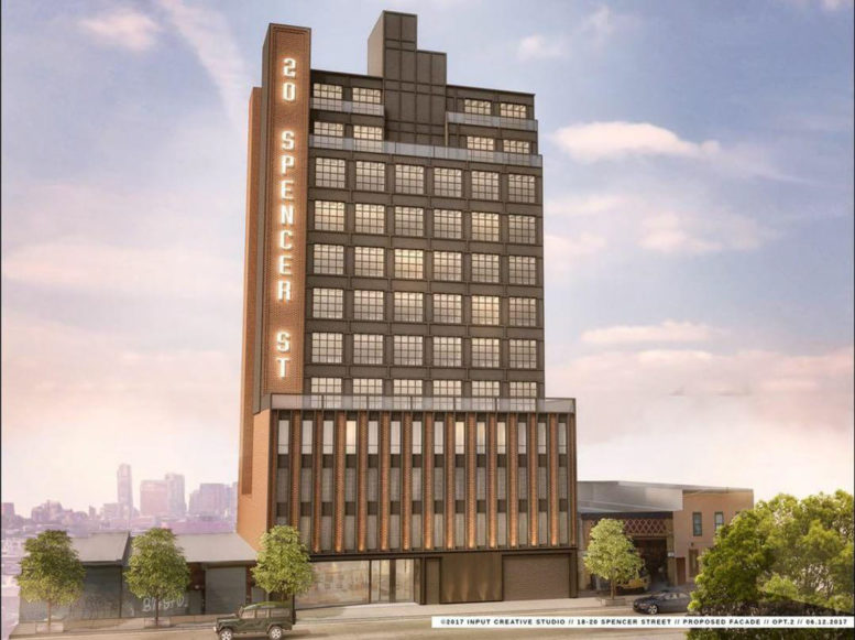
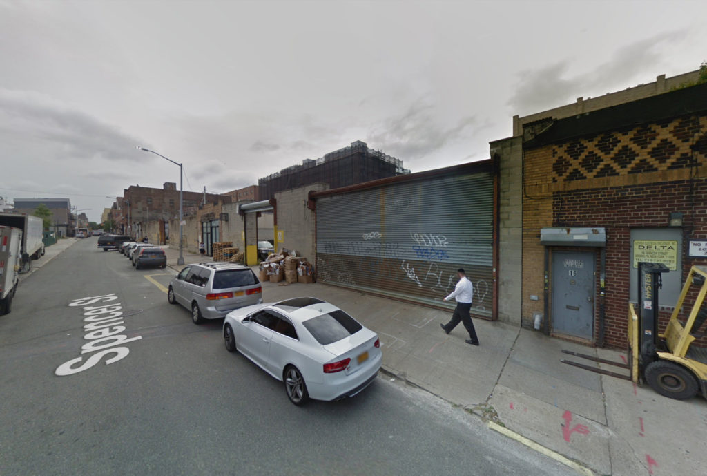
Today YIMBY has the reveal for the 12-story mixed-use building coming to 20 Spencer Street, formerly known as 18 Spencer Street, in Bedford-Stuyvesant, Brooklyn, right on the border with Williamsburg. The site is six blocks away from the Flushing Avenue subway station, serviced by the G trains. The Loketch Group is responsible for the development.
The 136-foot tall structure will yield 59,500 square feet, with 12,460 square feet dedicated to commercial use, and 20,550 square feet for community facility use. Four floors, from the second floor extending as far as two floors below ground, will be dedicated to a parking garage with capacity for 81 vehicles. Offices will occupy floors four through six. The remaining floors will be dedicated to a medical ambulatory diagnostic facility. The lobby will be positioned in the basement.
Queens-based NY Building Associates is the architect of record. The rendering reveals a minimalist design, incorporating brick with exposed steel girders. Terraces will be created on the two top floors, as well as on the setback space on the fifth floor.
Demolition permits have not been filed. Considering the limited extant development on site, they may not be necessary. The estimated completion date has not been announced.
Subscribe to YIMBY’s daily e-mail
Follow YIMBYgram for real-time photo updates
Like YIMBY on Facebook
Follow YIMBY’s Twitter for the latest in YIMBYnews



Commercial space in this building will sit vacant for a long time. Why was it even included?
Please pardon me for using your space: The 12-story mixed-use building get involved to Bedford-Stuyvesant.
Love the design – finally not another glass box. Hate the huge lighted sign.