For a third time, DXA Studio approached the Landmark Preservation Commission with a proposed design for 827-831 Broadway, a landmarked building in the Union Square area. The latest design is a large departure from the faceted glass of previous proposals. Several major alterations have occurred to drastically change the entire project to appease the LPC, ultimately leading to approval this past Tuesday.
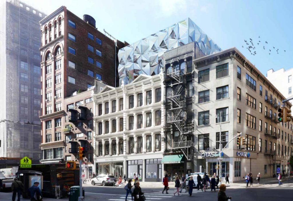
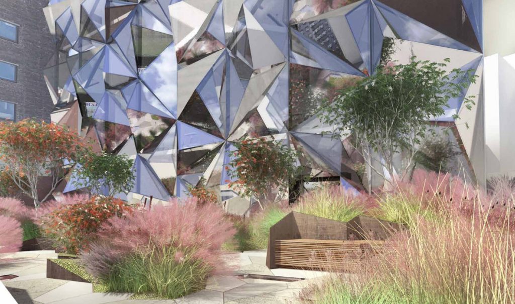
Quality Capital and Caerus Group are responsible for the development, after purchasing the buildings in 2015 for $60 million. They initially filed permits for a 300-foot tall commercial tower, but that was disapproved after the LPC granted the existing buildings landmark status due to their connection with famed artists Elaine de Kooning and Willem de Kooning. The original design paid direct homage to the style of Willem de Kooning’s painting Excavation.
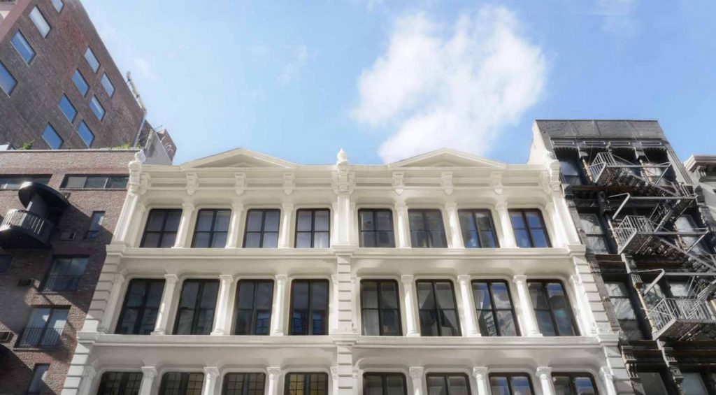
Preservation of the original structure remains identical, removing paint to expose the original limestone façade. If the stone is not presentable, it will be painted over again with an identical hue. The ground floor will provide space for retail use, a community facility will operate out of the second and third floors, and offices will occupy floors two through eight.
The approved design is a more broad homage to de Koonig’s style.
Architect and Founding Partner of DXA Studio, Jordan Rogove, spoke with YIMBY about the recent redesign.
Of the project’s original appearance, “Half the commissioners understood it and were excited. The other half felt that it wasn’t appropriate on the grounds of not having a strong enough relationship to the building below.” It was the idea of strengthening the relationship that spurred DXA Studio to revisit an older design they had previously considered.
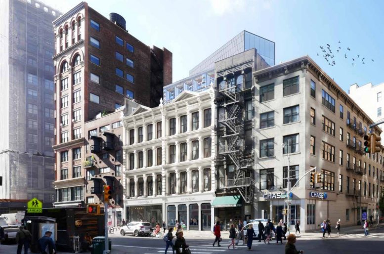
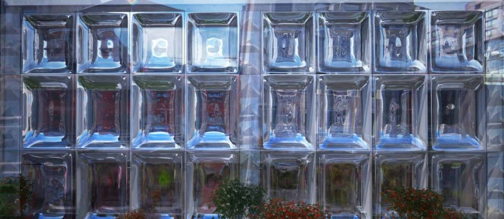
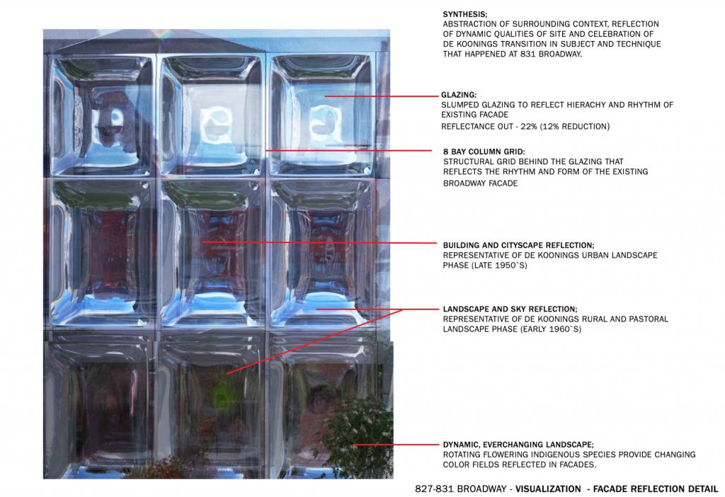
The latest proposal addresses the issue of relation by using slumped glass in rows of eight to visually line up with the original façade. Rogove said “The slumped glass naturally fit with the existing building, with the three-point arches and round columns.”
To address further issues raised by the LPC, they removed a floor from the building, which renders the glass nearly invisible from street view. To avoid loss of floor space, they increased the height of an addition on East 12th Street, which will peak at 11 stories.
Rogove spoke further about the divisive arguments driven by the initial proposal, telling YIMBY, “The people who got the old design, absolutely loved it, Finding inspiration in their work and expressing that through the architectural lens. People who didn’t like it thought it wasn’t like De Kooning at all.”
It’s a disappointment to hear that a bold design would be rejected for being too audacious. That said, the architect was encouraged by how the heated discussion between commissioners was substantive and provocative.
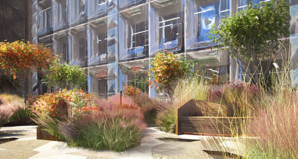
The slumped exterior will still bring a reflective quality that distorts surroundings. The glass will reflect the landscaped terrace area and surrounding buildings, and slingshot the colors toward the streets. One quality that is definitely no longer present is controlled chaos. The slumped glass is arranged in cadence and hierarchy alongside the base building.
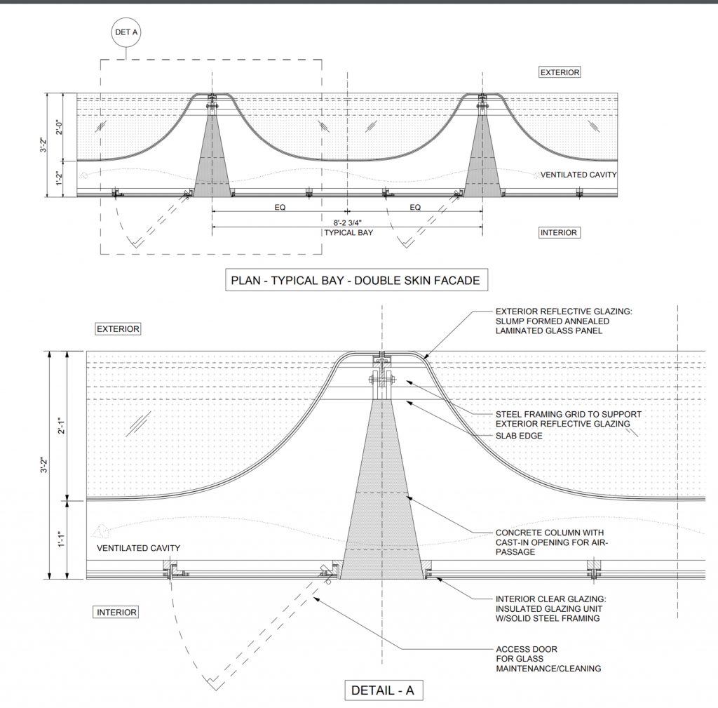
What DXA hope to achieve with the design is pushing the limits for slumped glass, with few people in the world able to do what hopes to be done. The glass will be pushed 24 inches away from the frame, significantly deeper than has ever been attempted before. It will include a double-skin system for improved energy efficiency.
If you find yourself upset about the loss of the first proposal and also planning to visit the Venice Biennale, do not fret. DXA Studio plans to showcase a three-meter installation of the faceted façade with projected light interactions. For the last words, Rogove stated, “The new design isn’t as avant-garde, but it will still make for a great building. It will be more timeless.”
Subscribe to YIMBY’s daily e-mail
Follow YIMBYgram for real-time photo updates
Like YIMBY on Facebook
Follow YIMBY’s Twitter for the latest in YIMBYnews





Please pardon me for using your space: From my innermost thought, I don’t have anything to hate.
The de Kooning would have loved the original design for its audaciousness. Another loss for the city.