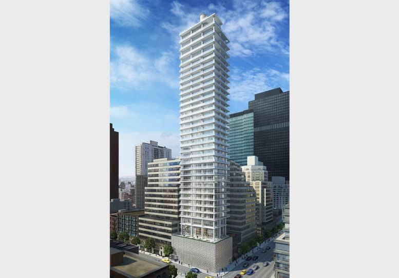
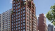
Macklowe Properties‘ newest residential tower at 200 East 59th Street stands 35 stories above Midtown East. Its entirety is now nearing completion as work begins to wrap on the lower floors. While advertising may promise elephants, giraffes, and other live animals for prospective residents of the 67 condominiums, reality provides a bold white facade and neatly stacked, and slightly protruding wraparound balconies. The building was designed by CetraRuddy Architecture and rises to a total height of 490 feet from the retail base.
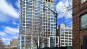
Current photos show the facade of the retail base going into place. The metal weave basket that is designed to cover the podium is likely to follow once the entirety of the base is enclosed with the hidden layer of glass, not visible from the sidewalk.
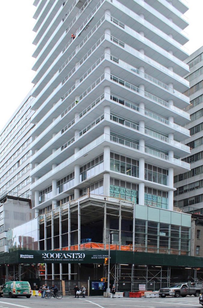
The retail base of 200 East 59th Street nearly enclosed before the basket weave metal facade goes up in front of the glass panels. Photo by Michael Young
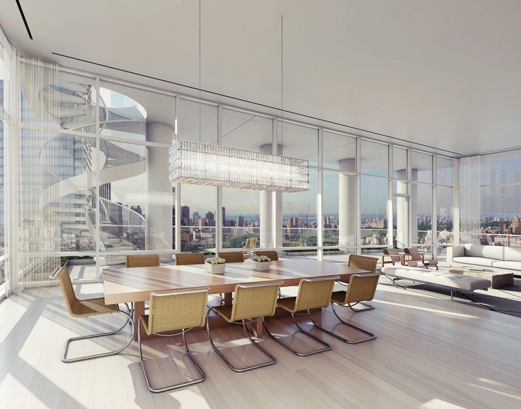
Above the double-height marble clad main lobby and retail base is the amenity section, which sits between the podium and the residential units up top. Featuring a landscaped terrace, a white exterior metal spiral staircase connects the floors and the tall ceiling heights.
Behind the glass curtain wall and large white columns, there is a lounge with a full-height marble fireplace, a private dining room, a catering kitchen, and a fitness center overlooking the outdoor terrace. All these spaces are double-height. There is also bicycle storage and an additional laundry room for residents on top of having a washer and dryer in every unit.
Other amenity services include 24/7 white-glove concierge service, valet car service and parking, dog walking, floral arrangements, housekeeping, personal training and coaching, passport assistance, fine art installation, move-in planning and storage assistance.
Condominiums will feature corner views of Central Park to the west, the Citigroup Center and Macklowe’s famous 432 Park Avenue to the south, and nearly head-on views of the Queensboro Bridge and the East River to the east. Each vista can be enjoyed either from the comfort of being indoors behind the floor-to-ceiling 10-foot windows, or standing outside on the terraces that measure between 144 to 574 square feet apiece. The penthouses have terraces spanning from 1,186 to 3,471 square feet each.
The building focuses on an expansive use of glass, allowing abundant sunlight to illuminate the white oak flooring and column-free interiors with 10-foot ceiling heights. The penthouse exclusively has 14-foot ceilings.
Kitchens have open floor plan layouts with Meile Brilliant White glass appliances, Italian white glass and aluminum cabinetry, white oak wood islands, and Calacatta marble slab countertops and backsplashes. Some units feature wine coolers as well. Master bathrooms have radiant heated floors, freestanding soaking tubs, Tot wall-mounted toilets, rain showers, thermostatic shower controls, and Siberian white marble on the floors, shower walls, water closets, and countertops
Prices start at $2 million for one-bedrooms, and range up to $15.75 million for the three-bedroom penthouse.
Subscribe to YIMBY’s daily e-mail
Follow YIMBYgram for real-time photo updates
Like YIMBY on Facebook
Follow YIMBY’s Twitter for the latest in YIMBYnews


Miami Beach on East River. Nice building on Third Ave btw. Good design, balconies a plus plus for overall view. Height is pretty moderate but just 2 feet below that builfing fall to became a true Skyscraper, 490 vs 492 feet or 150 meters. A little white elegant or giraffe, but again nice addition for that neighborhood, and not any new building we built in Mamhattan should be skyscrapers, and this building still in category of one of tallest structure in this neighborhood, even with his moderate height. Apartments on top floors will provide outstanding views. Welcome.
Please pardon me for using your space: First of all: Thanks to Michael Young: I saw design settle down so stunning.
Hideoous
Hideous. This website will never criticize any building design.
That is not true, and your comment was approved, so go ahead and criticize as you see fit
OK, here it goes. That podium is appalling. This base is rude to the street and its pedestrians. It is a deadening hulk, an oafish component to what may have been an aesthetically-passable high-rise. How, how could this have remained after an initial design review, and subsequent think sessions? Geez folks, can an urban corner condition get any worse?
Echo Mr.Korom’s observations. The tower is LeC’s ‘Maison Domino’ extruded upward, an aesthetically provocative move. The ‘base’ is ridiculous, no obscene beyond all measure. The so-called ‘basket weave’ shrouding of what would otherwise have been a positive transparent volume will render a vital urban corner visually dead. If this were the adolescent 1950’s one might forgive such willfull self-centered urbanistic destructiveness, but come on with all the history and lessons of hindsight now behind us who proposes such a move? Please come to your senses — not to mention save some serious money!!!!!–and delete the ill-conceived basket weave shroud (a disappointment only to flying animals and stray plastic bags that would lose a lodging place). Think ‘Urbanism’ and not hackneyed and outré decorative effects.
Amenities leave much to be desired. Everything cramed into one floor
Main Bathroom exquisite other bathroom cheap
Bedroom nice