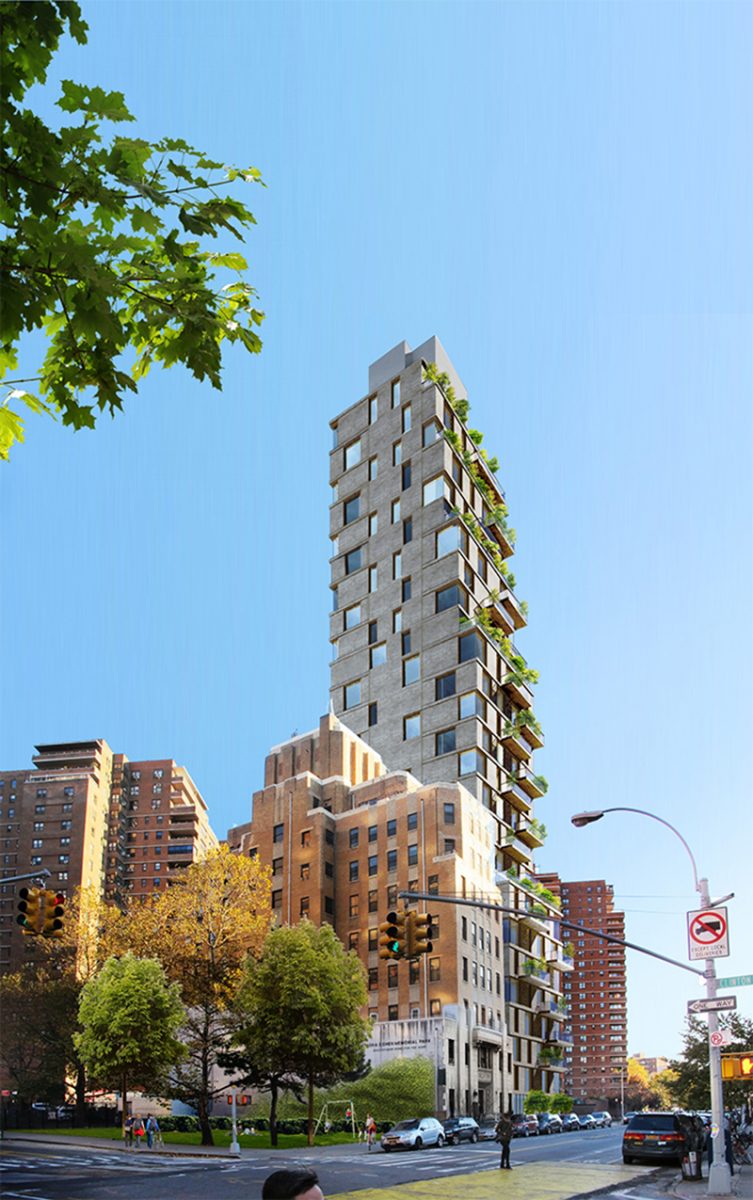
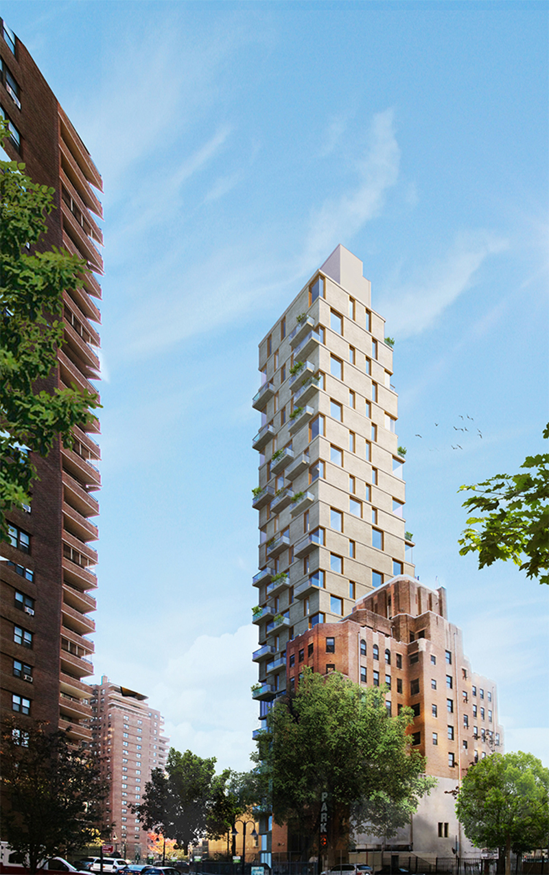
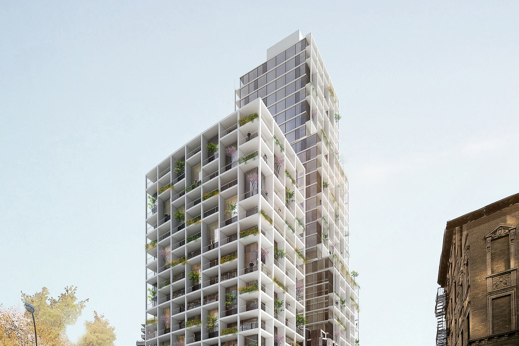
Space 4 Architecture, aka S4Architecture, has released renderings showing a new design for 226-232 East Broadway on the Lower East Side. The original plans called for two residential towers that would rise with identical architectural languages and surround a landmarked pre-war structure at 228 East Broadway. Now the project shows only one modestly tall building rising to the east of the former nursing home. The Ascend Group is the developer of the site.
The new design has a completely different curtain wall and building mass than the previous iteration. The featured rendering and the photo above show a building that would easily stand out among its neighboring structures. The exterior appears to have a mix of square- and rectangular-shaped floor-to-ceiling glass panels set between architecturally finished concrete walls. Etched lines on the eastern and western elevations would indicate the location of the floor slabs and also visually add a layer of texture and details to these walls.
The main southern elevation features a number of landscaped balconies that define the profile and aesthetics of the tower. It also is the only side of the structure that has multiple setbacks. The northern elevation that faces Midtown is completely flat, but would utilize the same design approach as the front of 226-232 East Broadway. The roof parapet looks to contain mechanical units hidden within an extension on the building’s flat rooftop. Residents on the upper levels will have views of the Financial District to the south and Midtown to the north, along with clear vistas of the Brooklyn, Manhattan, and Williamsburg Bridges.
The site of 226-232 East Broadway is located on the northeastern corner of East Broadway and Clinton Street. The original low-rise structure that once sat on the rectangular plot of land has been demolished. The closest subway is the F train at East Broadway, at the corner of East Broadway and Rutgers Street.
A completion date for 226-232 East Broadway has not been announced yet.
Subscribe to YIMBY’s daily e-mail
Follow YIMBYgram for real-time photo updates
Like YIMBY on Facebook
Follow YIMBY’s Twitter for the latest in YIMBYnews




Come to the point, and point out!
Please pardon me for using your space: Thanks to Michael Young.
Please pardon me for stinking up the place: The point is to point out. ( You’re welcome New York).
Damn what a disappointment. The old design was far superior.
it was but let’s be honet that was never going to get built, they were going to VE the crap out of it. But it was pretty cool.
The new one isn’t that bad, remember it could always be far worse. Plus I’m really digging this neo-brutalist aesthetic.
I AGREE
Very nice!!!
looks mighty ugly to me. Does not match the neighborhood at all.
Interesting. Not just another glass box. And the Mayor is on to those environmental atrocities. That silver exterior wallpaper will need to be replaced.
The old design fit in much better with the surrounding buildings and neighborhood and I wouldn’t miind seeing it. This tower however is absolutely ugly, sticks out and offers no continuity of design. I am glad my apt doesn’t face it but it makes me depressed just having to see it everyday. In contrast, the new building where Trader Joe’s in Essex Crossings on Grand St works well with it’s surroundings.
It’s not only ugly it doesn’t fit with the surrounding area that keeps the neighborhood on East Broadway
Unique
Wow! Really ugly they couldn’t do better ?
There are many new buildings that fit the neighborhood.
This was just doesn’t.