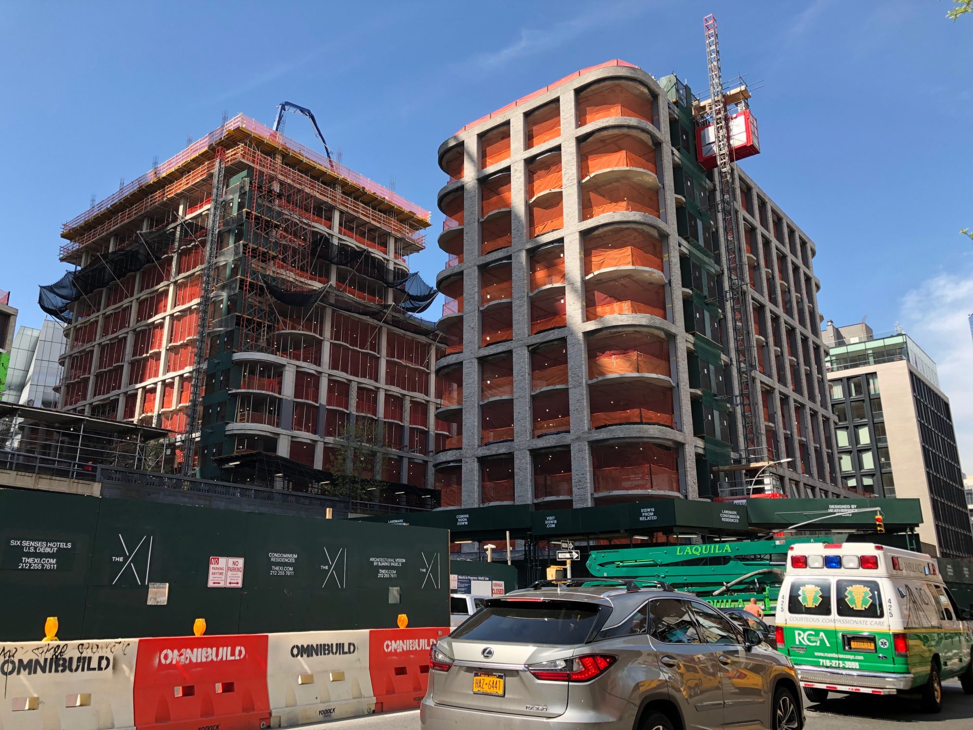
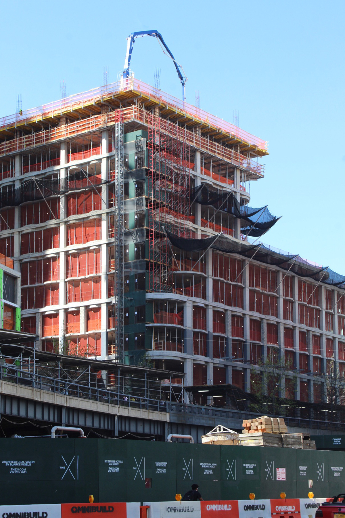
The first sculptural glass panels on Thomas Heatherwick’s premiere residential project at 515 West 18th Street are starting to be installed. The glass and metal frames are rising on the western elevation of the shorter ten-story building, which has topped out along Tenth Avenue. Heatherwick’s pair of architecturally matching structures straddle the High Line and will be an interesting addition to the Chelsea neighborhood. The taller half of the complex is rising on the western edge of the elevated park and will soon stand 22 stories high. The site is being developed by Related Companies.
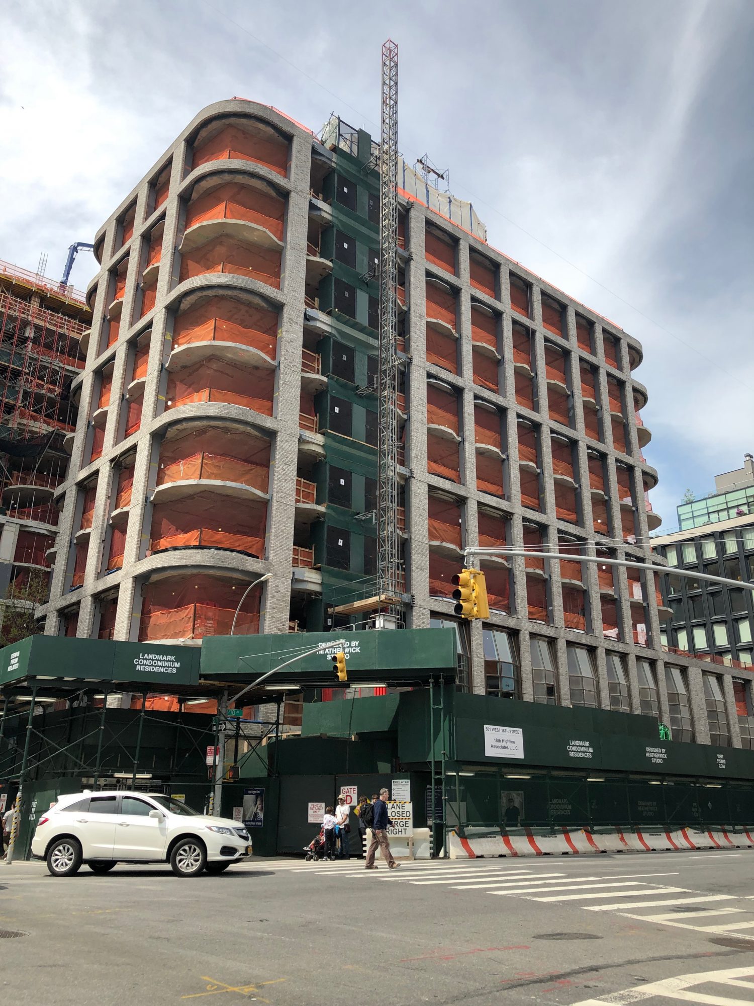
The 10-story building at the complex is topped out and has the first set of windows on the second story along Tenth Avenue. Photo by Michael Young
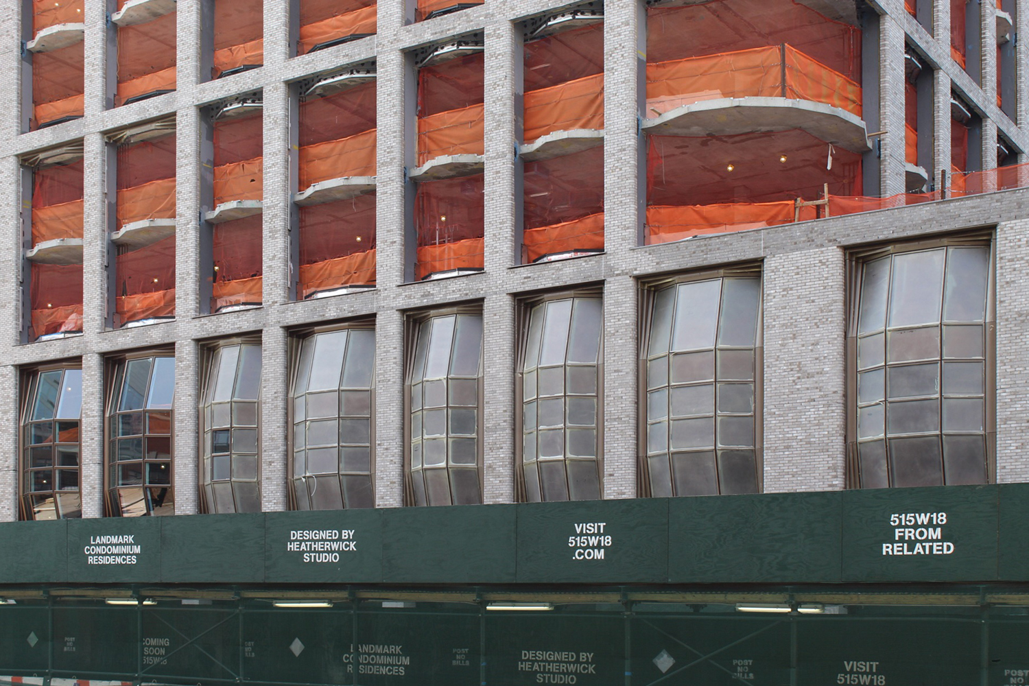
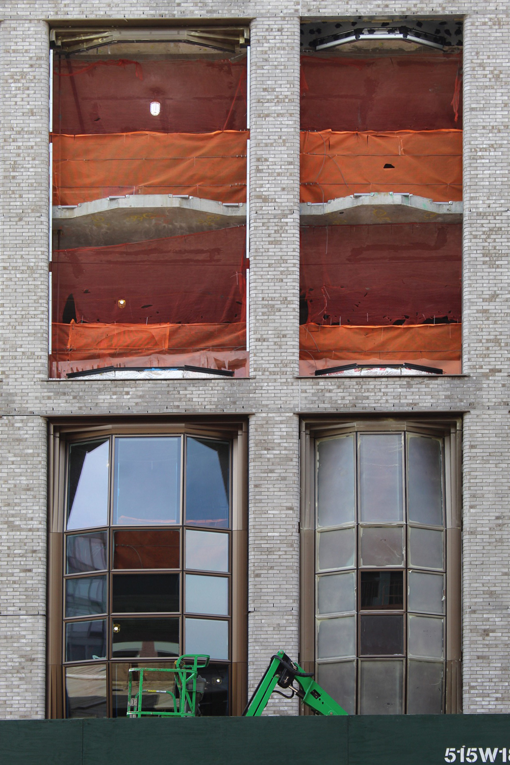
Photos alongside Tenth Avenue show the second floor beginning to give a glimpse at the size and scale of each convex, floor-to-ceiling panels.
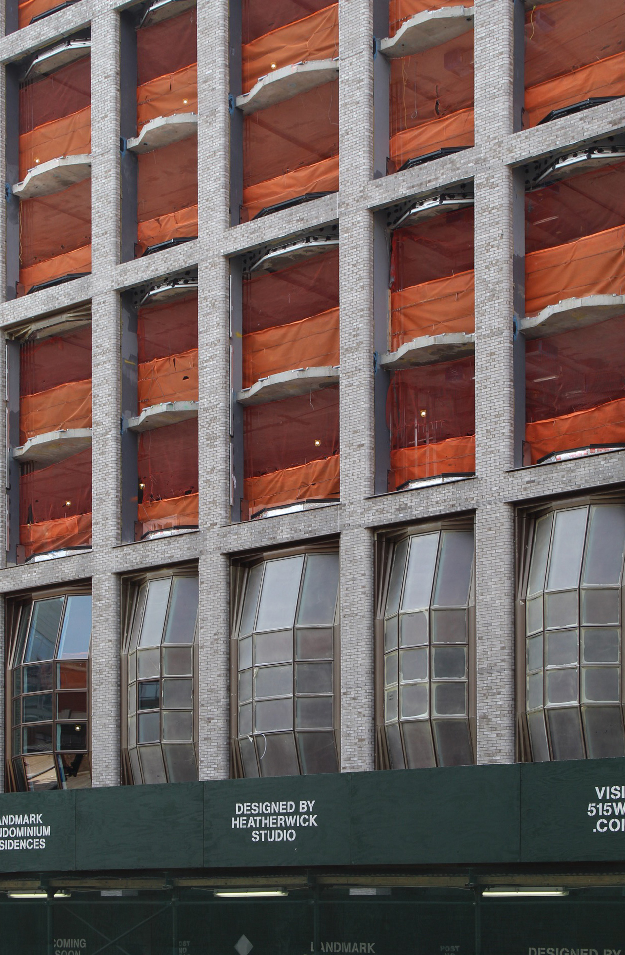
The second story with the first batch of panels installed and sheathed with temporary protective film. Photo by Michael Young
The best angle to see the bubbling grid of windows is from the corners, where the degree to which they protrude from the gray-colored brick façade is more apparent. This design will also make the building appear much bolder and more voluminous in terms of its aesthetics and proportions with the structural columns and floor slabs.
The 22-story counterpart should top off sometime by the end of spring or early summer. Construction only began to rise above street level back in early December and quickly shot up in four months. There will be a total of 181 units at 515 West 18th Street, with amenities including a fitness center and spa, an entertainment room, residential lounges, and parking for 175 vehicles. There will also be landscaped outdoor rooftop terraces on both towers that overlook Chelsea, the Hudson River, and the second phase of the High Line.
Completion of 515 West 18th Street should happen sometime next year.
Subscribe to YIMBY’s daily e-mail
![]()
Follow YIMBYgram for real-time photo updates
Like YIMBY on Facebook
Follow YIMBY’s Twitter for the latest in YIMBYnews





Tell: I have mole under my nose on left, both were inaugurated as new design that I never seen it before. Boss! (Thanks to Michael Young)
Please pardon me for using your space: David, please pardon yourself before using the space!
AGREED!
Pardon me for stinking up the place: David have you been drinking from those rum barrel windows? (You’re welcome New York).
Please pardon less for using space,
thereby using less space.
Well, the brick “walls” don’t look as light as the rendering and the mullions definitely aren’t as light. What’s going on?
Those one-trick bubble windows get really tired after the first 100 or so.
The “bubbling grid of windows” look like hand grenades.
Pardon me for using all your space.
This looks gimmicky and pretty lame, like an architect that ran out of fresh ideas.
I’m gonna go ahead and use some of this space here too
While there’s a ton of lousy architecture going up these days I have to say that the High Line corridor is a nice exception. It’s become a showcase of interesting ideas that fit the scale and location beautifully. This is a reminder that relatively low-rise properties can and should aim higher. We need more corridors like this, far more than we need endless whining about subsidized housing.
Agree!!
And just how many of these units are set aside & provided for low-income or affordable-rent tenants! And many of them will be welcomed in the spa?
none, hopefully.
The building is a condominium, not a rental.
Why repeat Zeitz MOCAA?
The wonderful thing about Heatherwick has always been his brilliant originality. Is he doing a Gehry or Libeskind seen-one-seen-them-all now?
Ctrl-Z this!
BUILD THE WALL
I guess foreign architects aren’t aware that sloping glass or metal walls in NYC are a design 101 no no. The cleaning maintenance costs for this building are going to be horrific. Water carried dirt stains after 2 months. Take a look at KPF’s monstrosity, Baruch College in Kipps Bay.