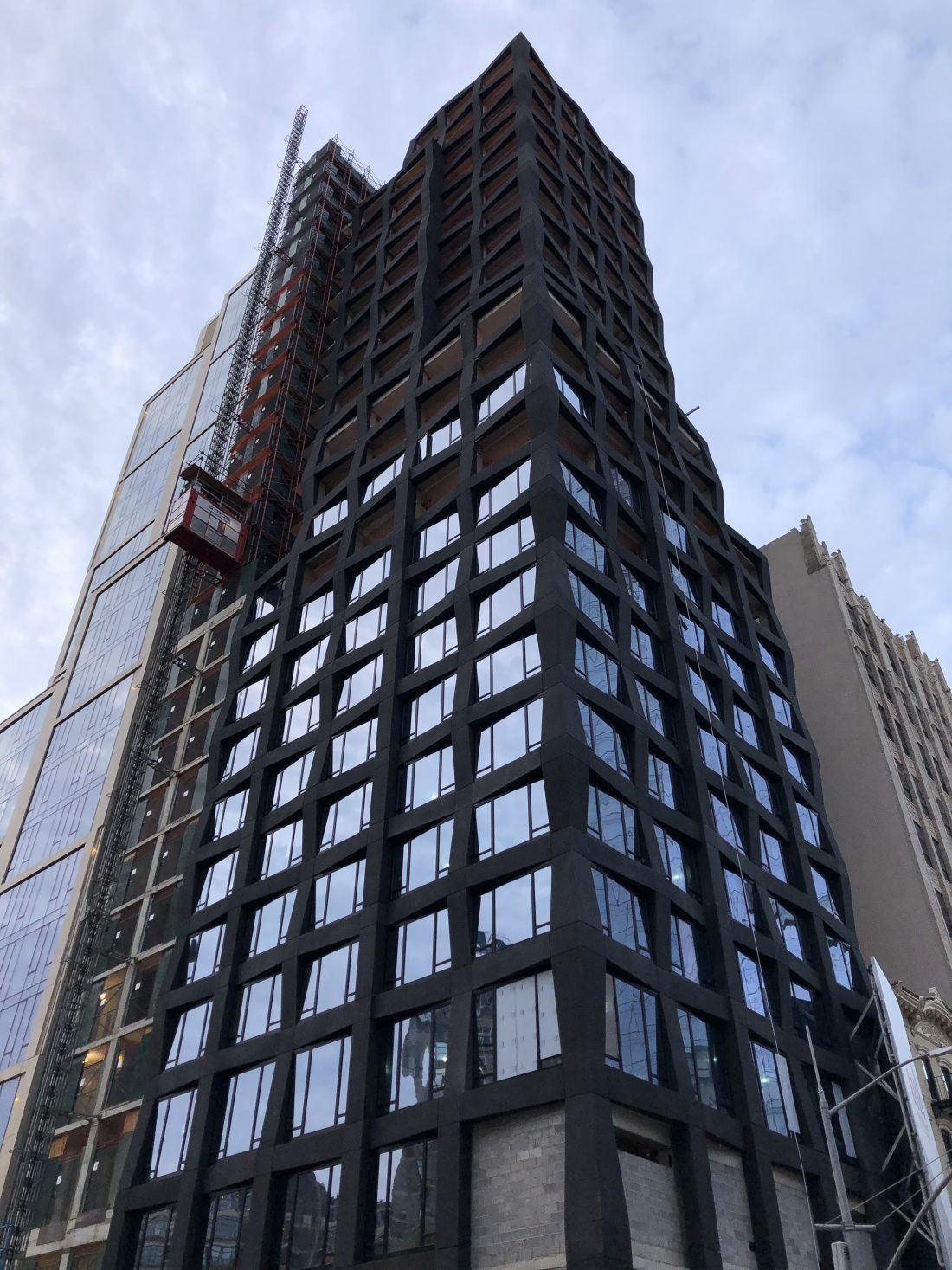
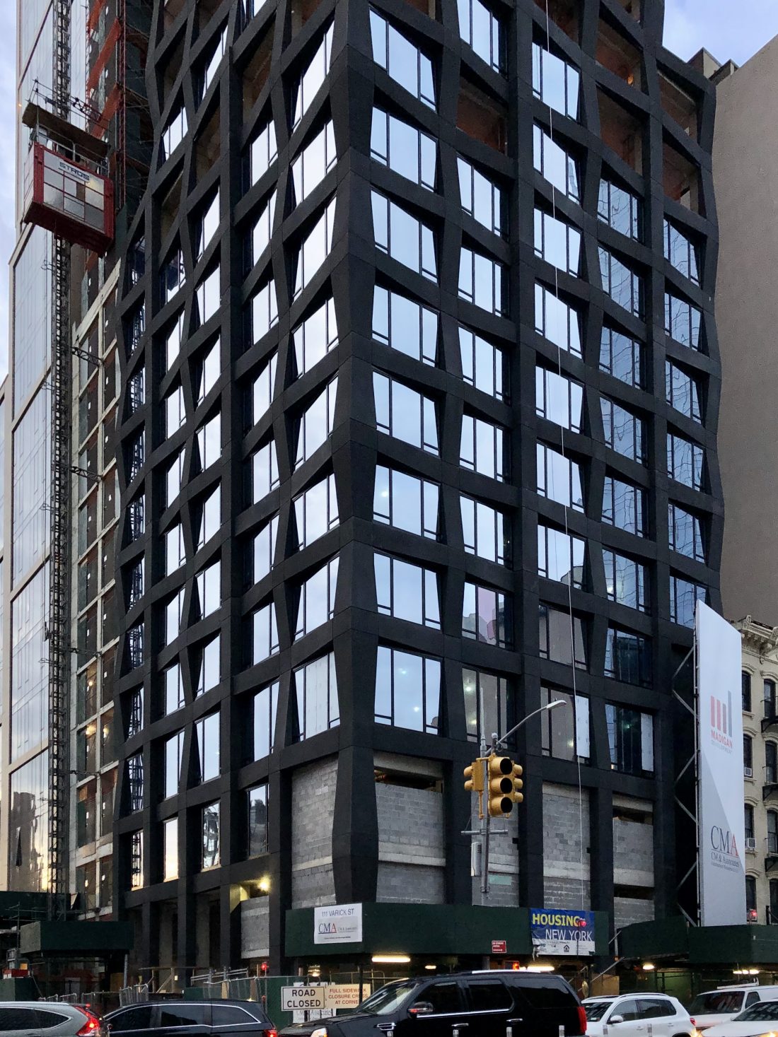
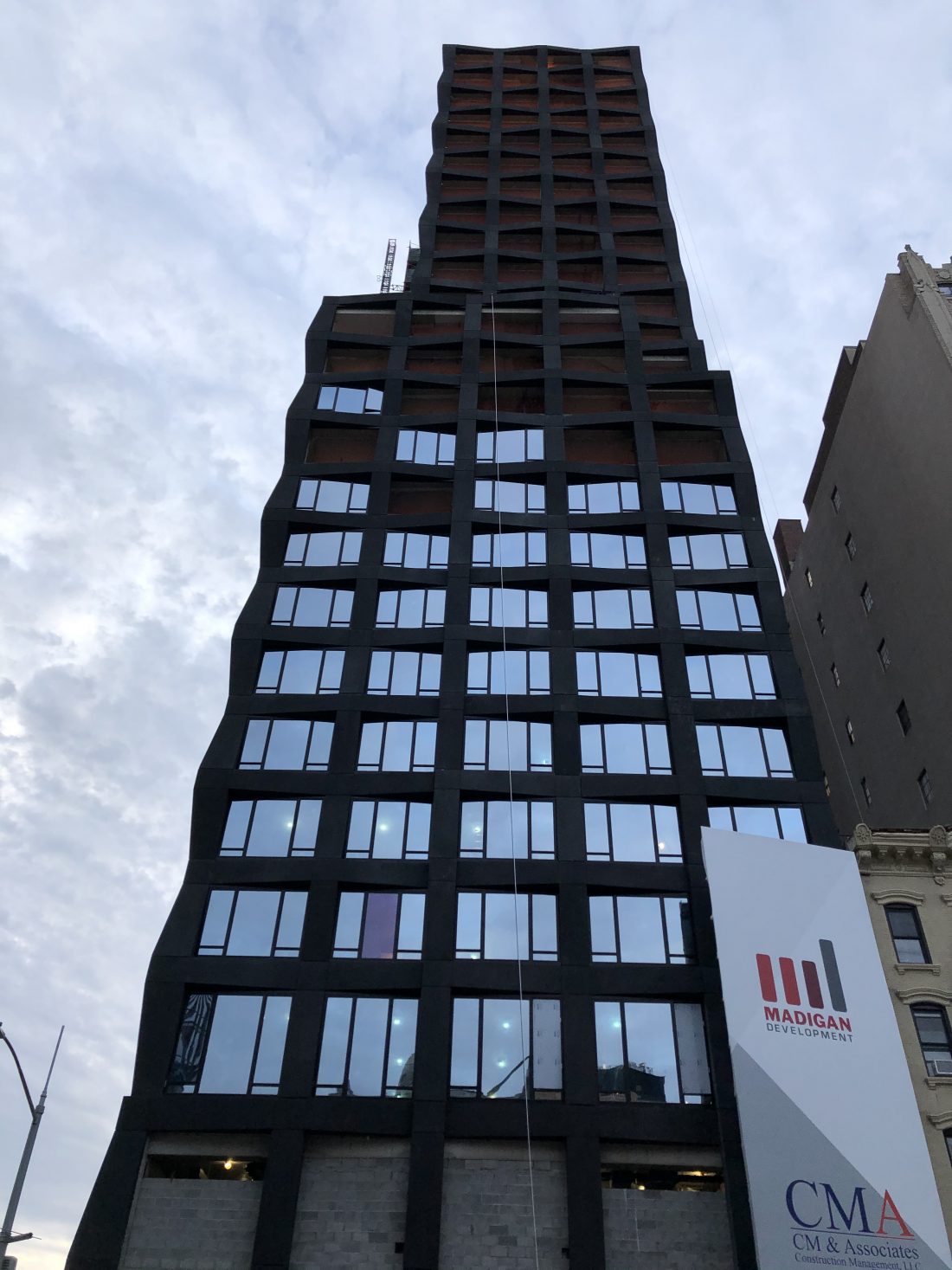
The unique dark-colored curtain wall of 111 Varick Street has reached the roof parapet of the topped-out 27-story Hudson Square building. Designed by S9 Architecture and developed by Madigan Development, the ground-up residential project is located at the northern corner of Varick Street and Broome Street. CM & Associates is in charge of the construction process.
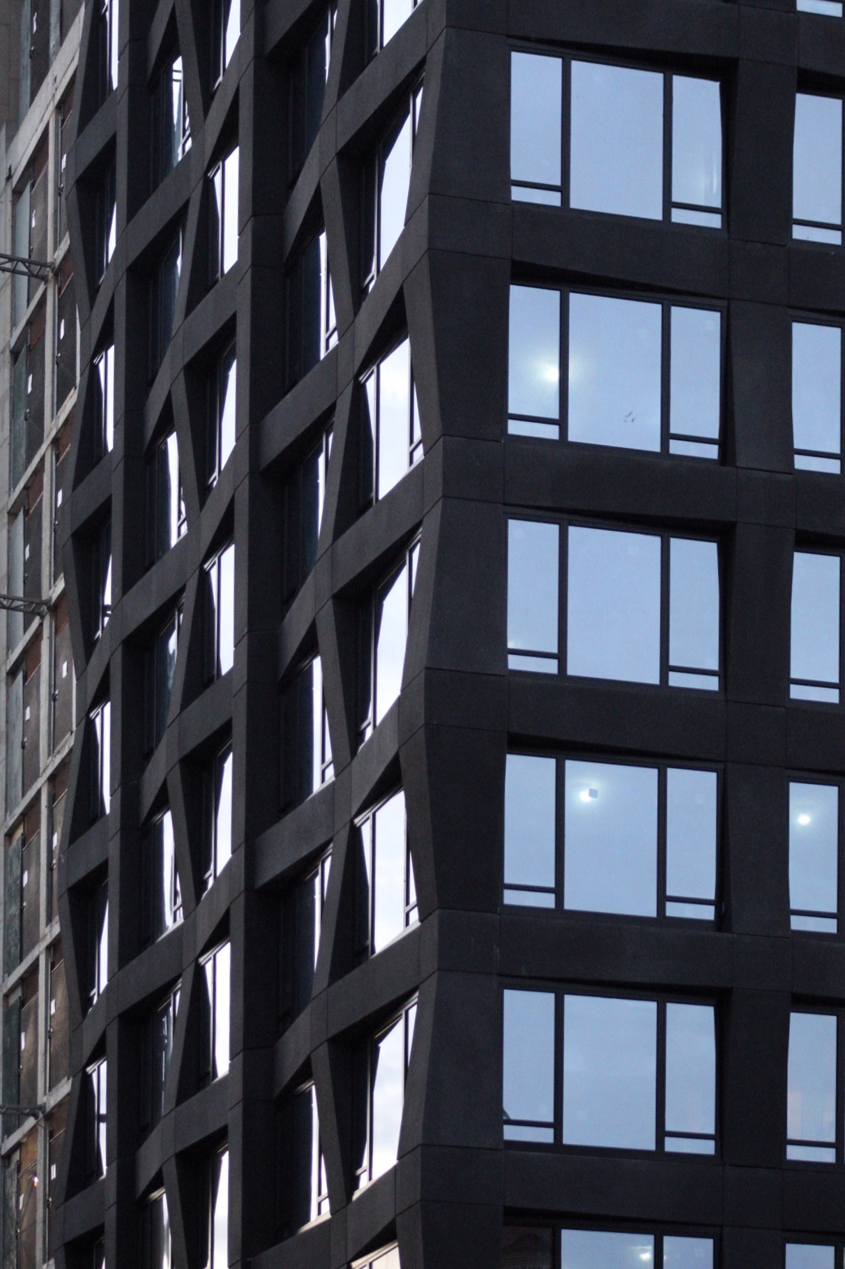
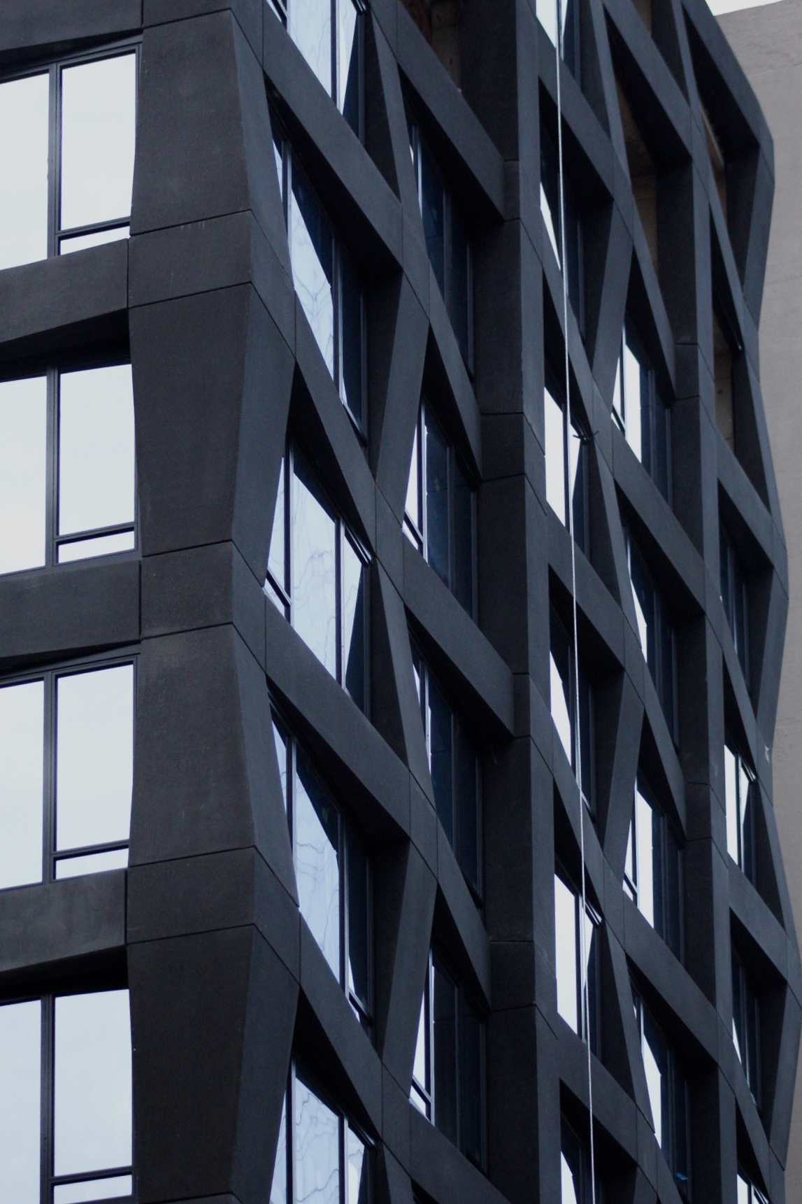
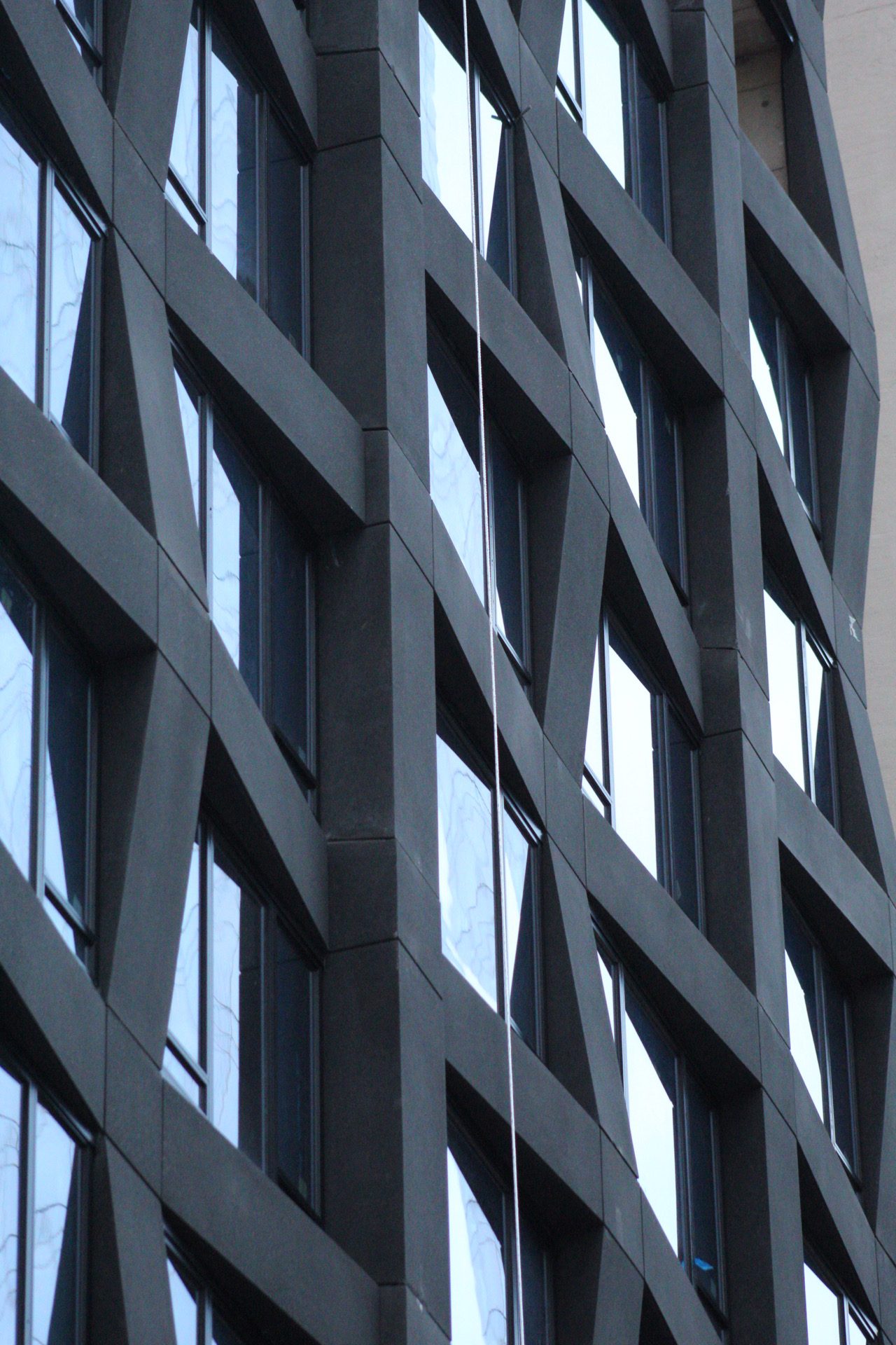
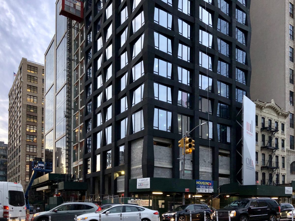
Photos from across the street show the charcoal-colored geometric paneling fully covering the edifice. The envelope’s shifting and sloping exterior surface gives the structure a lively appearance that contrasts with the more orderly nature of the adjacent structure. Meanwhile, installation of the glass panels is underway, with the majority of the floor-to-ceiling windows already in place below the first few setbacks.
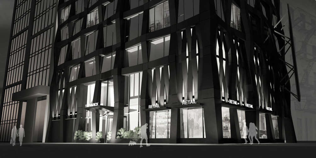
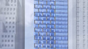
Large bay openings above the ground-floor retail frontage have been walled up with cinderblocks. These will form the backside to decorative panelings that match the style and color of the dark outer walls, and will feature miniature canopies and spotlights that project up on the structure, creating a play of light and shadow. The photograph and rendering below compare the current state to the completed look.
Madigan Development and CM & Associates have displayed their names on a tall white advertisement banner on the western elevation of 111 Varick Street that is clearly visible to traffic heading into the Holland Tunnel.
111 Varick Street will contain a total of 100 affordable and market-rate units, as well as ground-floor retail space. Amenities for residents include a 15-car parking garage, a roof terrace for all residents, bicycle storage, a lounge, and a laundry room. The closest subway is the Spring Street station, serviced by the C and E trains. Trader Joe’s is the nearest large supermarket and is found at 233 Spring Street.
111 Varick Street is expected to be completed in the fall of 2020.
Subscribe to YIMBY’s daily e-mail
Follow YIMBYgram for real-time photo updates
Like YIMBY on Facebook
Follow YIMBY’s Twitter for the latest in YIMBYnews





Pops, without completely screaming at you.
Very nice, clean look.
Unfortunate both towers have the same height. It would have been better to see a more diverse streetscape