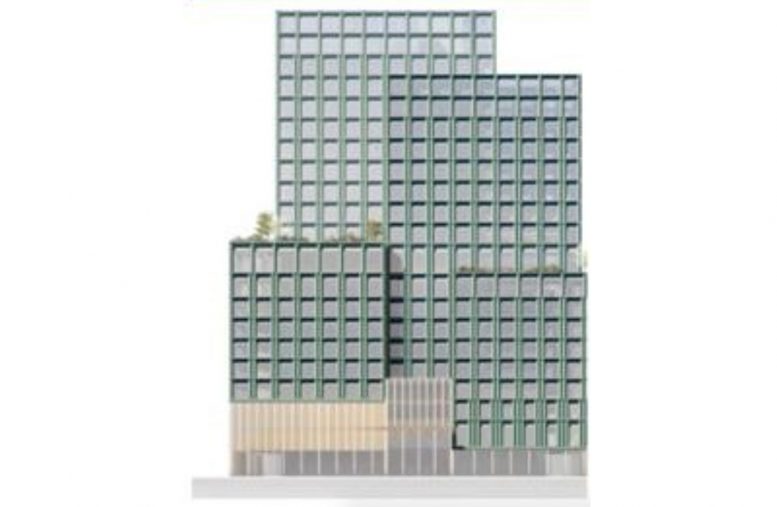
Today, YIMBY has the first look at The Walt Disney Company’s future headquarters in Hudson Square. The development will be located at 137 Varick Street and will consist of a pair of 19-story buildings. Demolition is currently underway at the site, and several more structures will also need to be cleared to make way for the mass media company. YIMBY last reported on the property back in late September, noting the project will be formally addressed as Four Hudson Square. Skidmore Owings & Merrill is the designer of the project and Skanska is in charge of the on-site demolition activity.
The elevation in the rendering above shows one of the two edifices, with the profile indicating modest height. The façade is composed of a grid of floor-to-ceiling windows, and varying setbacks that make way for landscaped outdoor terraces and culminate in a flat roof parapet. It remains to be seen whether this will be the final iteration or if the design will change before construction begins, although the image comes from construction sources working on the project.
Disney purchased the site from Trinity Church Real Estate for $650 million and can construct a potential 1.2 million square feet of newly built space under a 99-year agreement. Retail space is set to sit on the first floor, with offices beginning on the third floor. ABC and WABC News, production space, and television studios for The View and Live With Kelly and Ryan are also set to be housed inside the property. Disney and ABC are currently located on the Upper West Side along West 66th Street between Central Park West and Columbus Avenue.
Start and completion dates to the new headquarters have not been announced yet.
Subscribe to YIMBY’s daily e-mail
Follow YIMBYgram for real-time photo updates
Like YIMBY on Facebook
Follow YIMBY’s Twitter for the latest in YIMBYnews


A very SOM facade grid, altered at mid-height.
Not skyscrapers, modesty and discretion on the part of Disney and/or SOM ?
So these will top out somewhere between 350 and 400 feet. Is that in line with the height limits in the Hudson Square neighborhood? It’s unfortunate, that neighborhood could easily support buildings in the 600-800 foot range.
I fell asleep halfway through scrolling. I was hoping for at least one Aladdin dong turret.
I was looking forward to a Disney Supertall.
Nice. This plus the new Google and Yext headquarters (all beautiful buildings) will make NYC the new Silicon Valley of the East!
NY has been the Silicon Valley of the east for two decades. Ever heard the term “Silicon Alley” which was coined in the 90s? It used to refer to the area around the Flatiron where tech companies used to be clustered. But of course it is true that, as a sector, tech is now much bigger in NY’s economy.
“Disney purchased the site from Trinity Church Real Estate for $650 million”
This is insane. The priorities of the greedy ruling class are completely out of touch with the 99% who’s drudgery helped put them there.
The ruling class in this case being the greedy church and god knows what they are doing with the billions their real estate holdings have flooded into their coffers. It’s the middle ages all over again.
*whose
Unfortunately, the neighborhood NIMBYs put height limits on the neighborhood when it was rezoned a few years ago. So there will be no supertall towers in Hudson Square. There are a couple of sites where tall buildings can still go, but this isn’t one of them.
So amazingly boring…..from Disney…..and its world of fantasy! Just the opposite of what I expected.
The name of this building should be “Missed Opportunity”. My god, how dull can one get with a design such as this? And why so stubby?
Sadly, with rare exception, NYC is quickly becoming home to some of most spectacularly insipid and banal architecture possible.
And that’s when it’s just boring and uninspiring – and NOT full-on terrible such as 30 Hudson Yards, and most of the Supertalls polluting NYC’s soon to be if the crap seen being built of late continues unabated formerly envy of the world skyline.
Yep, and this (proposed, maybe it’ll get better?) snore fest by Disney is but another example of the milquetoast, throwaway buildings popping up like unwanted weeds that seems to be all the rage these days.
Where’s the wow? Apart from a precious, and too few examples, such as American Copper, former Domino Sugar factory in Williamsburg, The Via or Bjarke Ingles’s twister rising near Chelsea Piers along the West Side Highway (or whatever of the many names it goes by within a mile or so), there’s NOT much “WOW!” seen being built in the (self-proclaimed) “Capital of the World” anymore ?
Here’s hoping the bland, depressing, dreck of the current era is just a (soon to end) passing fad. [fingers crossed, fingers crossed]
Oops! Forgot to also note Zaha Hadid’s gorgeous stunner in Chelsea adjacent to the Highline Park.
Such a shame that’s a low/mid-rise building whose brilliance is largely obscured by a city where many underwhelming high rises makes this gem barely noticeable. ?
And speaking of atrocious “architecture” let’s not forget that gleaming new “prison-like” appearing building unveiled last week at the eastern edge of the new, glorified bus terminal being built at LaGuardia Airport! ??
Yeah, yeah, ANYTHING is better than the current dilapidated dump that is LaGuardia Airport.
And yes, at least Delta’s very prison-y looking exterior for its 1st phase of its “vision” for “New LaGuardia Airport” hides an interior that’s a big improvement over the dismal interior seen thus far in the updated version of the Port Authority Bus Terminal (anyone else notice the similar depressing brown color palette used at Terminal B that resembles that of the PABT in Manhattan?), but nobody will mistake the dismal architecture seen thus far for “New LGA” for the type of “World Class Gateway” promised in the fairy tale renderings they still distribute to the media to use in place of the crapshow actually rising along the Grand Central Parkway and Flushing Bay.
Wow – if this insipid architecture was the best they could come up with last century, we’d probably never have the iconic masterpieces like Chrysler Building, Empire State, Rockefeller Center, Lever House, Seagram’s Building or the Guggenheim Museum (just to name a few standouts from a bygone era…).
Congrats, they couldn’t possibly design an uglier building than this. Well done!
Z-z-z-z-z
Boring. I’d much rather have City Winery back there!