New York City’s Landmarks Preservation Commission (LPC) will decide the fate of a new nine-story hotel to be constructed within the historic Margaret Louisa Home in Union Square, Manhattan. The existing six-story structure at 16 East 16th Street was completed in 1891 and included 78 bedrooms, parlor and reception rooms, private dining areas, a public restaurant, and laundry facilities for over 100 women who lived in the building.
Prepared in part by BKSK Architects for Gramercy Park House LLC, proposals reveal that the structure in its reimagined form would comprise 82,761 gross square feet and expand to nine stories above ground. 63,802 square feet is proposed for hotel use and would be divided into 88 guestrooms. Considering these measurements, each room would each span approximately 725 square feet.
The proposed expansion would also fill much of the underutilized area on the grounds of the property to generate additional area for the hotel.
According to a report published by the LPC in 1989, the building’s original architect R.H. Robertson envisioned the building with a complete seventh story under a peaked roof. This design detail, however, was prohibited under regulations governing lodging houses at the time.
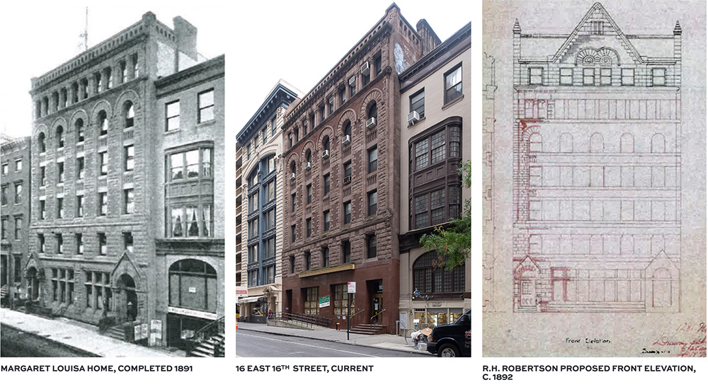
The originally complete Margaret Louisa Home (left), the existing structure at 16 East 16th Street (center), proposed front elevations drafted in 1892 (right)
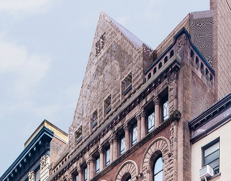
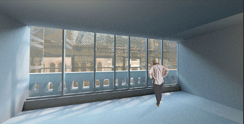
It is the conjecture of the project team that the reimagined designs, which also include the addition of a large gable at the roof of the structure, favor and reestablish building elevations in line with Schuyler’s original intent. The interpretation is abstract at best and includes a façade comprised of perforated metal that takes on the appearance of a woven pattern. Behind this exterior are large floor-to-ceiling windows offering a unique viewing experience from within the building.
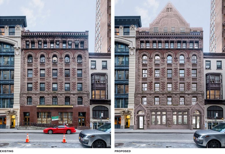
At the 16th street elevation, the building’s historic masonry façade would be repaired, where possible, or replaced. This includes the installation of new windows, granite elements at the base of the building, and a sandstone portal entrance, all designed to match historic conditions.

Existing conditions at 16 East 16th Street (top) and proposed facade alterations (bottom) – BKSK Architects
Inside the building’s ground level, floor plans reveal a restaurant, a large skylight lounge, and lobby areas. Two cellar levels beneath would contain a wine cellar, a spa with multiple treatment rooms, a sauna, and a steam room, as well as a fitness center, staff lockers, and building mechanicals. The second level will support unspecified amenity areas in addition to a large outdoor terrace.
Guestrooms are located on the third through eighth floors. Additional amenity areas are positioned on the ninth floor, which also includes terrace areas facing both 15th and 16th streets.
Considering a potentially long approval process by the LPC, the project team has not yet revealed a construction schedule for the new hotel.
Subscribe to YIMBY’s daily e-mail
![]()
Follow YIMBYgram for real-time photo updates
Like YIMBY on Facebook
Follow YIMBY’s Twitter for the latest in YIMBYnews




If the base of this wonderful slice of NY history can be rebuilt to look original, so can the expanded gable roofline at the top. This doesn’t need to be somebody’s original art experiment, but should reflect the historical nature that the Commission is supposed to be advocating.
Agree.
The original roofline you speak of is reflected in the current state of the building. Base is original and roof is a modern interpretation of something that was proposed in 1892. This is a excellent nod to what could have been.
David hits the nail on the head with that comment. The first thing I said to myself was why do something half assed like this. If they are looking for LPC approval why waste time , just do it right in masonry as originally envisioned and get the LPC on your side. It’s obvious to anyone but the lazy that this proposal should be rejected unless they come back and do it right.
I really like this. Let the experiment happen!
Compare the photos of the original building and the current one where steps lead to the two entrances, albeit with the current left entrance providing handicap access. The project will be worth it, alone, to eliminate the steps to the right entrance and the handicap ramp to the left, as shown in the graphic of the proposal.
Gable is pretty radical..I approve.
Super amount of effort by architect to do something new and different rather than what would be obvious…ie just extend as originally intended. The new and different just seems tired and pointless.
What a little gem of a building. The abstract roof proposal is a bit disconcerting at first but it would fit pretty well. They’d have to lower the ground floor to sidewalk level to eliminate the steps and ramp. That sounds like a lot of work and makes the building more vulnerable to the next Sandy. Good to see a proper wine cellar planned for the restaurant too, although it’ll have to be located well away from the steam rooms & sauna.