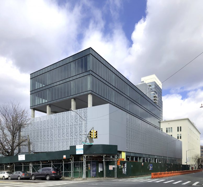
Exterior work is nearing completion at 200 Kent Avenue, a six-story mixed-use building in Williamsburg, Brooklyn. The 83-foot-tall, 125,000-square-foot development is designed by ME Architect P.C. and developed by Cornell Realty Management, which purchased the rectangular full-block parcel for $33 million by two anonymous entities in the summer of 2016.
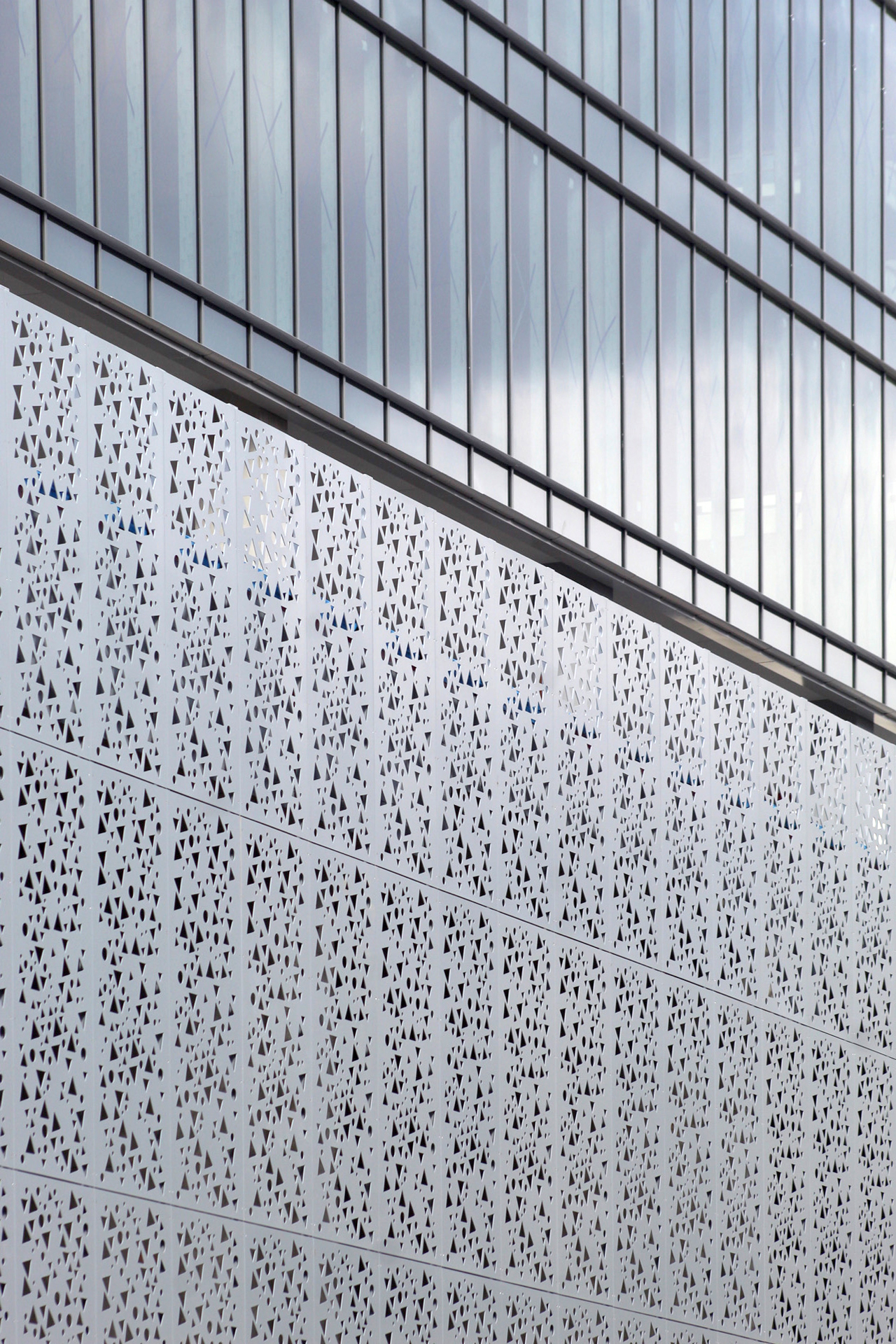
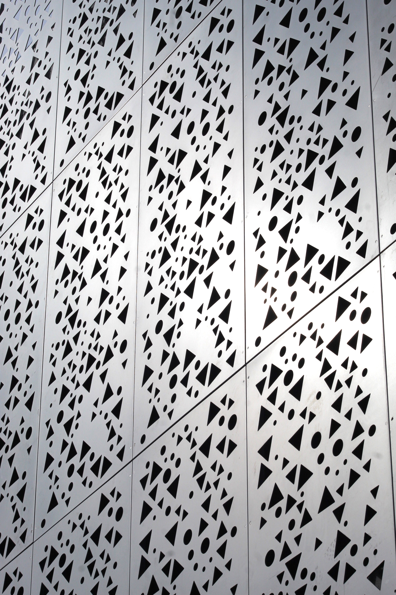
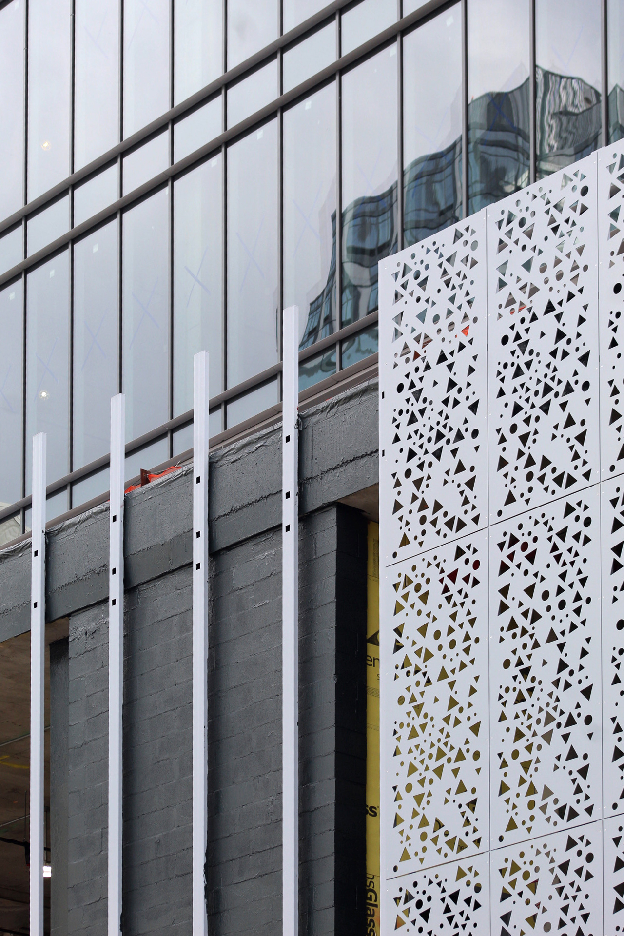
200 Kent Avenue is bounded by Kent Avenue, River Street, Metropolitan Avenue, and North Third Street. Photos show the different sides of the podium that are completely enclosed and parts that are underway, revealing the layers of installation in front of the perimeter walls of painted cinder block. Each gray metal panel features a repeating pattern of triangular and circular voids.
YIMBY last reported that a Trader Joe’s will take up 18,000 square feet of ground-floor retail space, though no official announcement has been made yet. The second level will house a parking garage behind the porous façade assembly. Meanwhile 22,640 square feet of office space is expected to occupy the third through sixth floors, where the glass curtain wall is visible. The third story comes with an open-air terrace that faces the East River. The cellar level will have an additional 44 parking spots.
200 Kent Avenue is likely to be finished sometime within this year. An official completion date has not been announced.
Subscribe to YIMBY’s daily e-mail
Follow YIMBYgram for real-time photo updates
Like YIMBY on Facebook
Follow YIMBY’s Twitter for the latest in YIMBYnews




Very different from the original design, but better. It’s an updated retro 60s design that is a rather nice change.
Too bad the Trader Joe’s is so far from the train station, but that might keep it from being mobbed all the time.
Why aren’t you against Trader Joe’s? They are a big corporate company and the profits are making someone rich, which you complain about all the time.