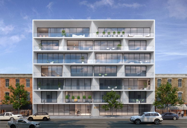
With $4.4 million in construction financing successfully closed, Threefold Development has released the first renderings of a seven-story residential building in Flatbush, Brooklyn. When complete, the development will span approximately 45,000 gross square feet.
Located at 1458-1466 Flatbush Avenue in the southwestern section of the neighborhood, the property is near some of the borough’s most prominent landmarks including Kings Theatre and Prospect Park, in addition to a busy thoroughfare of restaurants, cafes, and independent retailers.
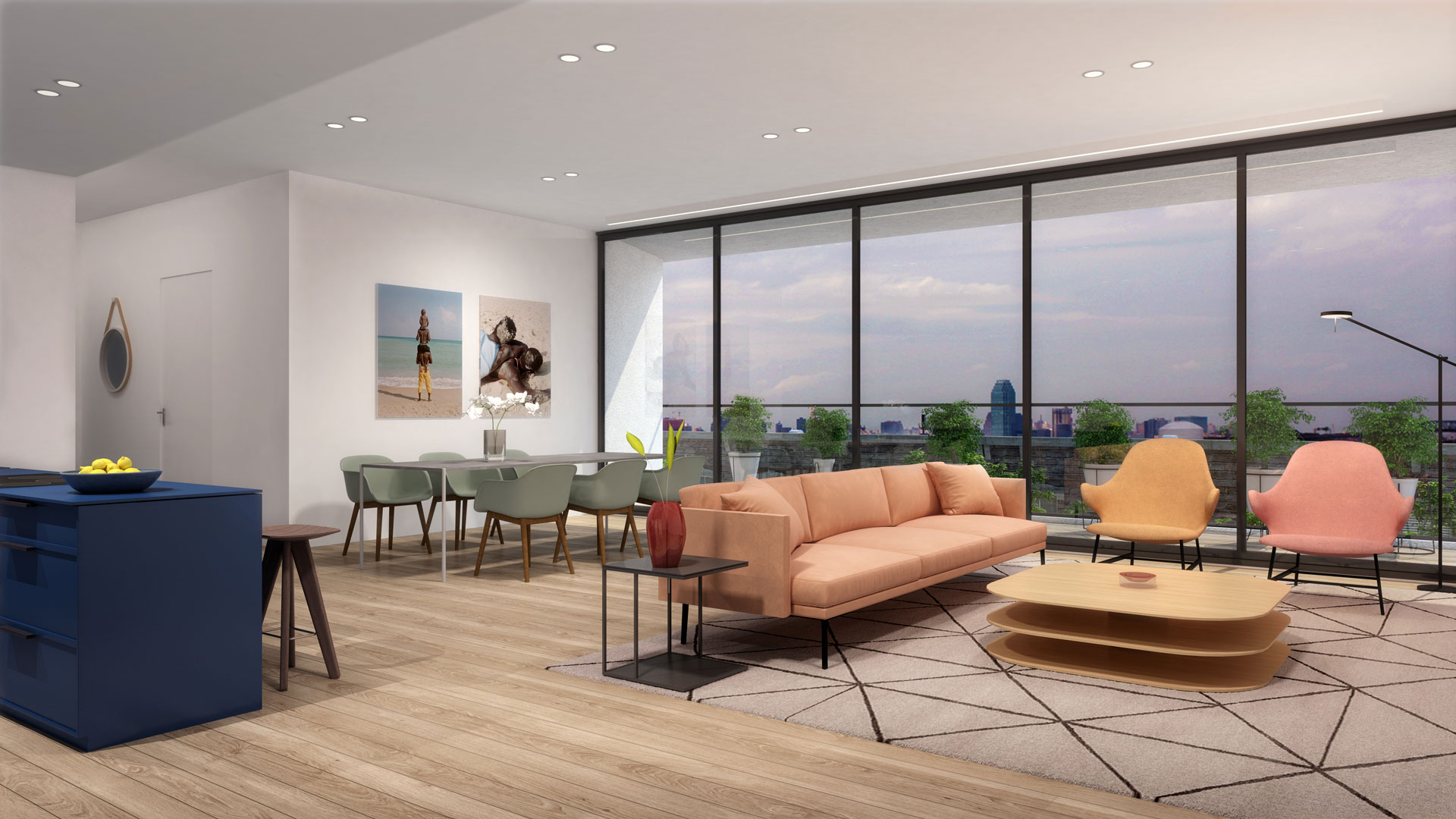
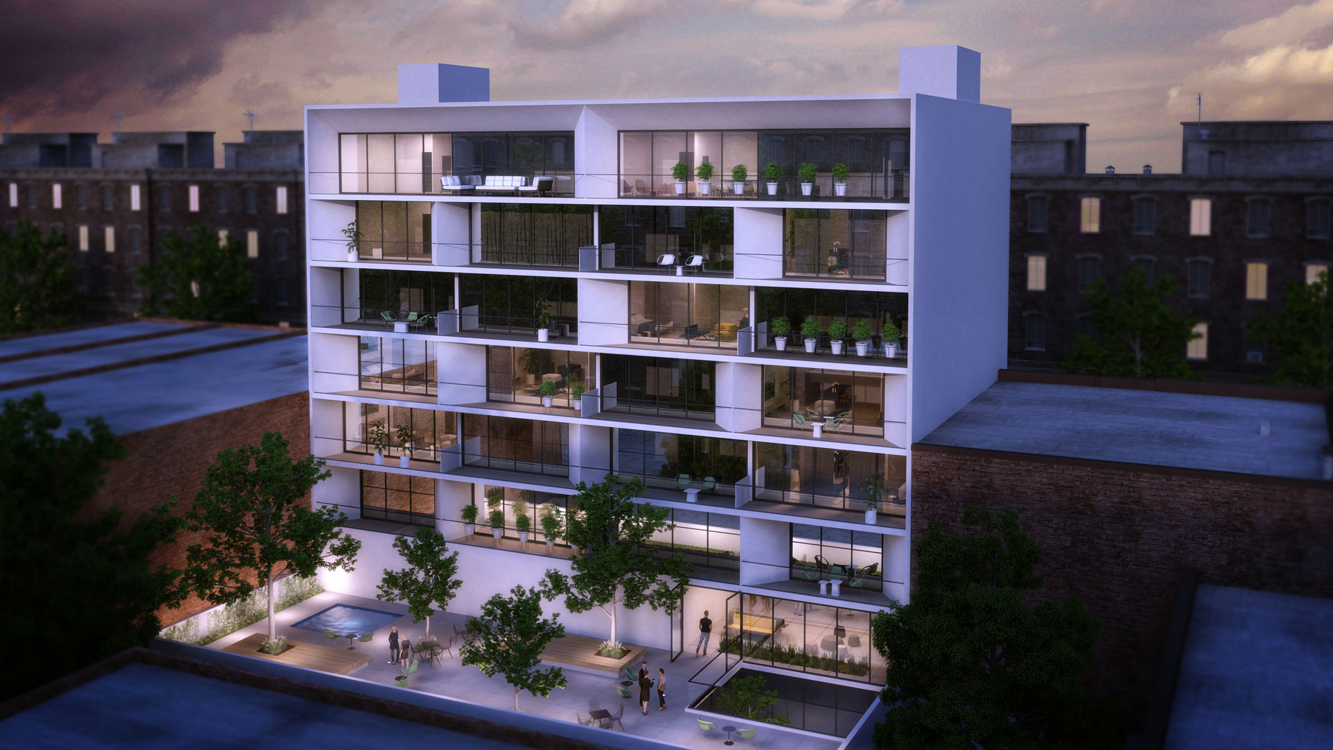
Designed by architect Bar Orian, the façade is reminiscent of the contemporary waterfront structures popping up around parts of southern Florida and the Caribbean. The structure’s pale concrete curtain walls and columns slant inward to support large private terraces and floor-to-ceiling windows in excess of ten feet heights. Future occupants will have access to a private fitness and yoga studio, storage areas for both personal items and bicycles, on-site laundry facilities, and a lightly landscaped rear yard.
The residential component includes 43 units in a mix of 38 single-bedroom and five two-bedroom apartments. The ground floor of the building will also support two small commercial spaces.
The project team has not yet revealed an anticipated date of completion.
Subscribe to YIMBY’s daily e-mail
Follow YIMBYgram for real-time photo updates
Like YIMBY on Facebook
Follow YIMBY’s Twitter for the latest in YIMBYnews


Anybody else rather see a 3 story base and the rest stepped back from the street in this area of Flatbush to maintain cohesion with the rest of this lowrise commercial area. Seems like it could have been much more sensitive.
“could have been much more sensitive” is the understatement of the year. This is an elephant trying to dance Swan Lake.
Flatbush Ave is four lanes wide at this location, and the lot sits right at a y-shaped intersection so there’s even more street space directly in front of the building. It’s also a few blocks from the big intersection with Nostrand Avenue. Seven stories seems reasonable for this spot. What’s odd about the area in general is that Flatbush is one of the busier streets but it’s lined with low rise buildings, whereas the narrower streets to east and west have a number of 6- and 7-story apartment buildings.
It doeesn’t make sense to me that you’re saying zoning law should promote more residential building, and higher population density on “busier” streets. One of the important purposes of zoning law is to prevent “excessive concentrations” of density so you’d want to site new density away from “busy” areas. This is also common sense. On a busy commercial thoroughfare where delivery trucks, public buses, and cars will be numerous, and there are already many pedestrians shopping, walking towards subway stations, or waiting for buses, adding people will only increase congestion. People complain about this all the time, mostly drivers, but now that social distancing is required, a lot more people are noticing how crowded the sidewalks are. That is probably why historically, buildings were relatively low rise on many commercial avenues throughout the outer boroughs. The intended purpose was an active commercial strip with some residential for the store owners/employees above. That’s not to say we should knock down houses on the “side streets” to put up six story buildings. Some of that already happened so there’s a good level of urban density already, but many of these buildings, when built, “counted on” being next to low rise houses to provide some of their light and air. You can see that from the number of apartment buildings with lot line or near lot line windows. Another important principle of zoning is to ensure that buildings have a “reasonable relationship” to one another in terms of size and setbacks. This building is at least twice as large as the rest of the three story buildings on that block. Apart from being visually intrusive, because all the buildings are attached, knocking down the existing three story building and putting up a much larger one could threaten the foundations of surrounding buildings. In this context “seven stories” is just an arbitrary number, and not a reasonable one.
Now what I would prefer to see is not a change in the height/bulk, but instead the inclusion of street-level retail in this commercial strip. Adding residential buildings with no store frontage is not good for keeping a lively strip like this in business.
Even if the width of Flatbush Ave is such that it is appropriate to construct a building several times taller than what was there before, the new structure doesn’t have to look so alien relative to its surroundings. This is not city building. It’s not even hubris, vanity, or architectural ego-puffery. It’s really just contemporary schlock architecture. I suppose one shouldn’t expect better considering the project is just about maximizing profit for the real estate developer…. But still.
And of course Yimby being Yimby seems to wanly suggest that this is good and appropriate design for this spot by describing it as “reminiscent of contemporary waterfront structures popping up in Florida and the Caribbean.” Is that a subtle attempt to say this project is somehow in keeping with the neighborhood’s large West Indian population who will no doubt not be able to afford to live in this new building? Or is that a feeble effort to suggest that architecture appropriate in subtropical Miami is thus appropriate in Brooklyn? That would likely give Yimby too much credit. In fact, Yimby probably just regurgitates the real estate developer’s PowerPoint presentation with no critical assessment.
I think you woke up on the wrong side of the bed today, perhaps you should change up your morning routine.
Spot on assessment. This is just lazy design. Completely ignoring the community and the surrounding aesthetics.
This is a beautiful, broad-shouldered, comfortable dwelling in which to live and work. The 19th century stuff surrounding it is commodity architecture and the best that antique technology could produce. It’s neat that it’s still standing, but I prefer moving forward. I’ve never understood the knee-jerk impulse to castigate buildings for not fitting the surrounding architecture that saw its day depart a century ago. What is this fetish for uniformity with a world that no longer exists about. Do the people who support that go about in spats and stovepipe hats?
False choice. Im not against the broad stroke modern styling of the building, I’m startled by the complete lack of organic interaction with the one immediate built environment as if it was imagined existing in a complete vacuum. That’s not good design in the bigger sense of the term, it’s just flash that in the end may very well detract.
I appreciate your reply, but I still don’t understand why a newly designed and erected structure should make any kind of concession to what is around it, when what surrounds it performs insufficiently. Because it would “look” better in some sense? When the Dutch put multi-story structures made of bricks on the island of Manhattan, would they have been appealing to some higher sensibility if they’d built the city of willow bark and branches, as their predecessors had? (I’m aware that the Dutch conducted themselves monstrously in just about every way in their “new world”. Obv. not my point.)
Hope I can get in it would be nice to have a two bedroom apartment in that area for a two bedroom