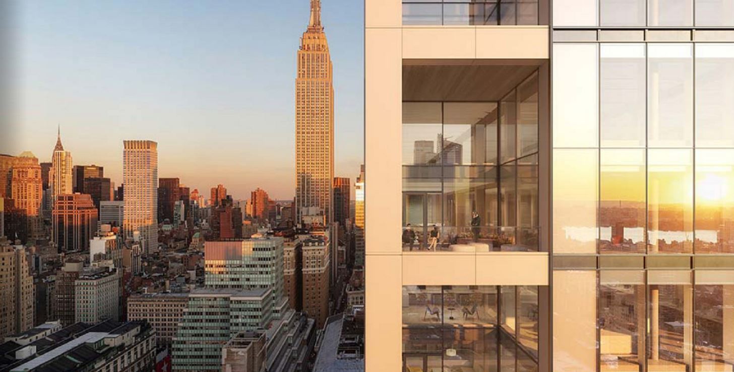
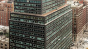
More renderings have been revealed for PENN 2, Vornado Realty Trust‘s recently commenced renovation of Two Penn Plaza, a 412-foot-tall commercial office building in Midtown. Originally designed by Charles Luckman Associates, the 31-story structure currently yields 1.61 million square feet and stands immediately to the east of Madison Square Garden along Seventh Avenue between West 31st and 33rd Streets. The project, designed by MdeAS Architects, will fully revamp the 53-year-old building’s interiors and replace its dark mid-century modern façade with a lighter, more transparent glass envelope designed by MdeAS Architects. The endeavor is among a flurry of efforts to modernize the area surrounding Penn Station, which include the proposed construction of a nearly 1,200-foot-tall, 2.7-million-square-foot office supertall designed by Foster + Partners that would rise directly across the street on the site of the Hotel Pennsylvania.
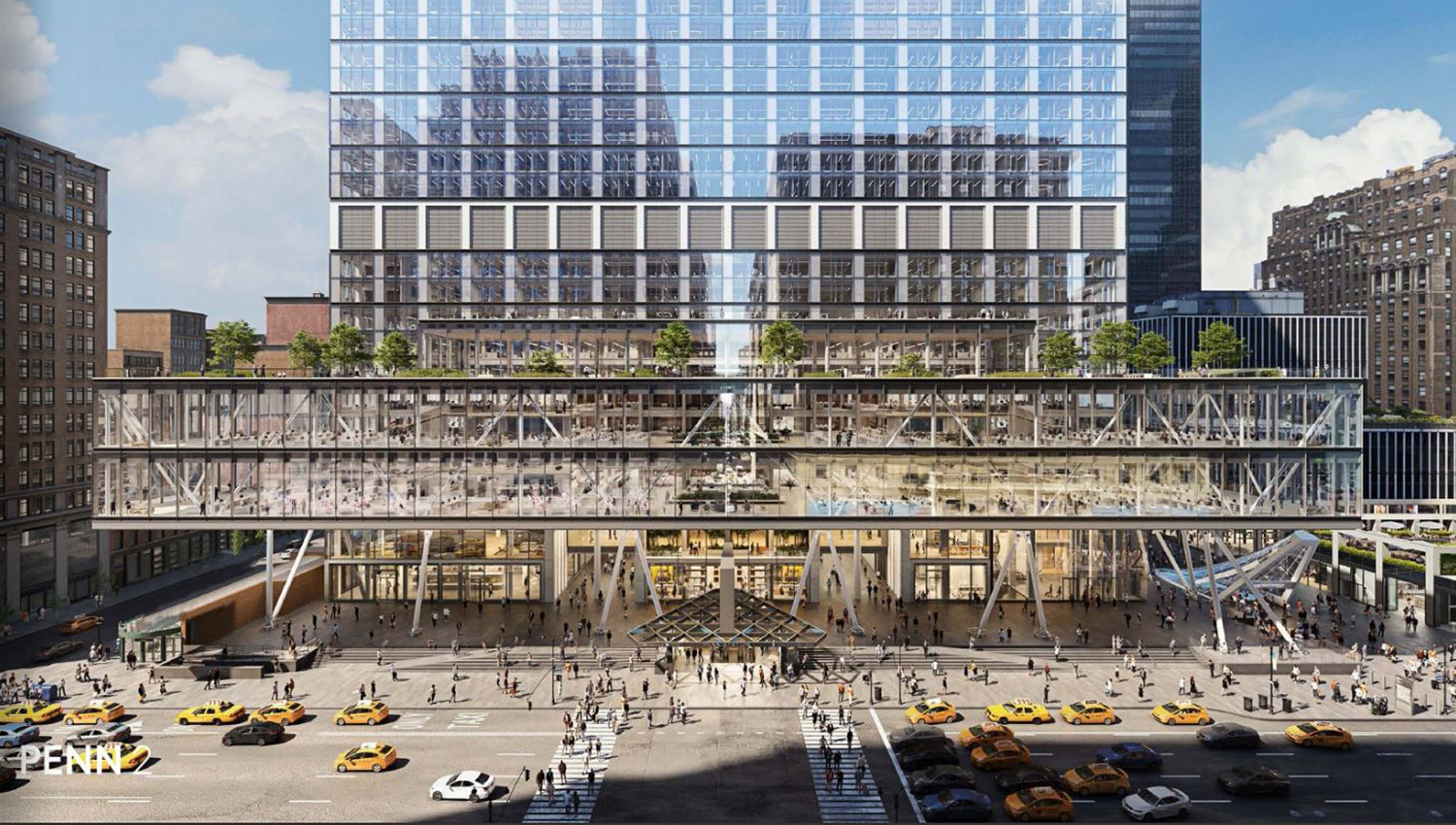
PENN 2 revamped design by MdeAS Architects. Rendering by DBOX for Vornado Realty Trust.
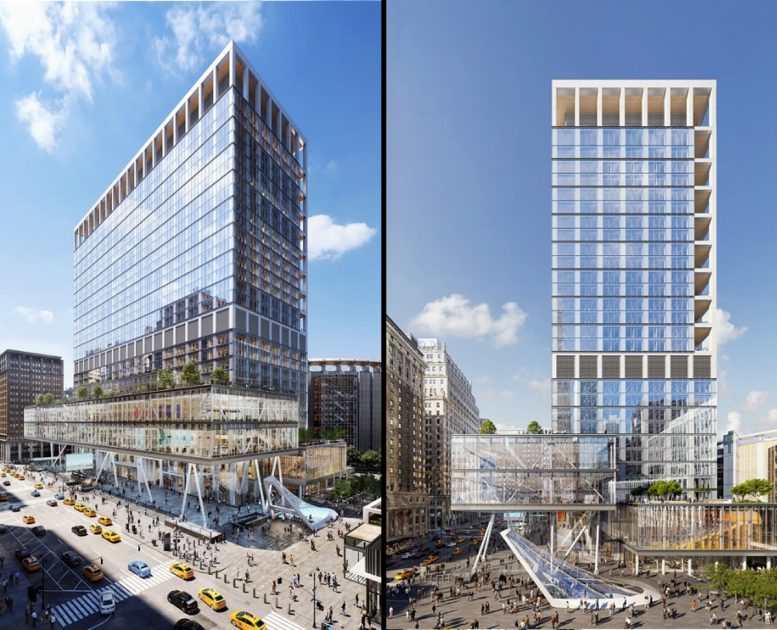
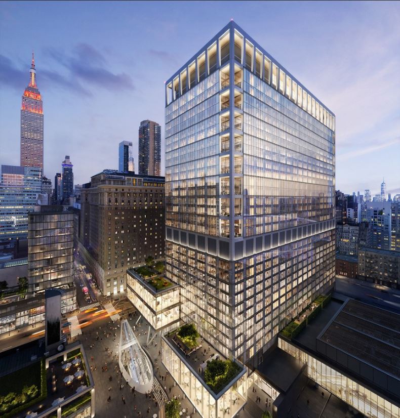
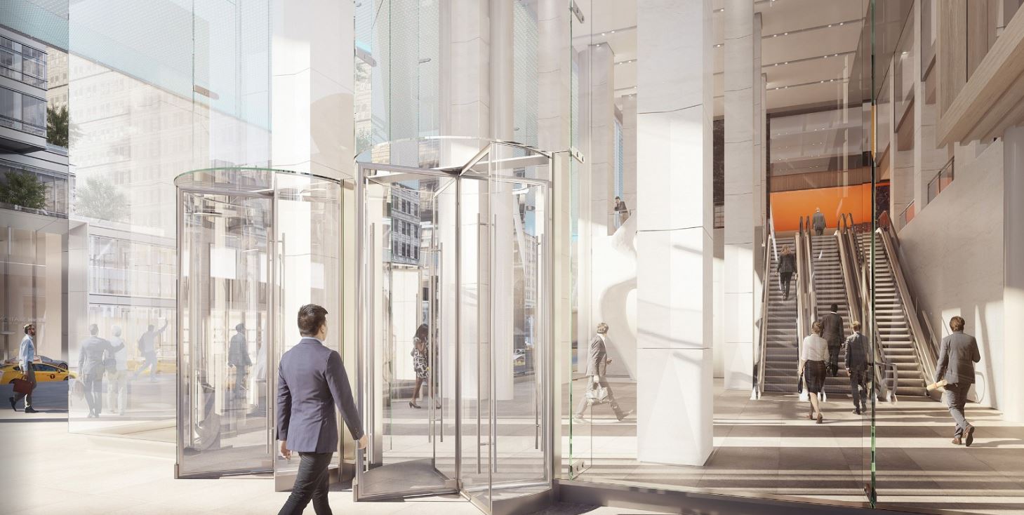
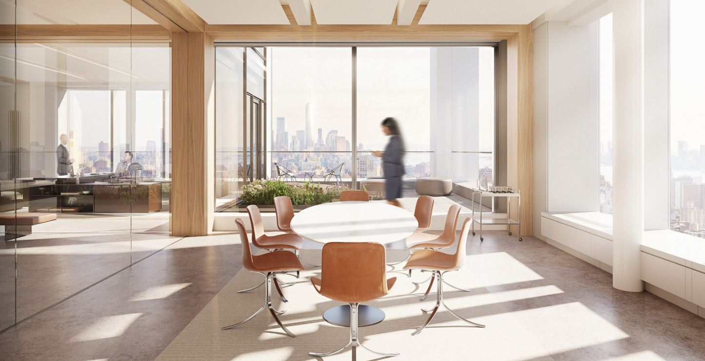
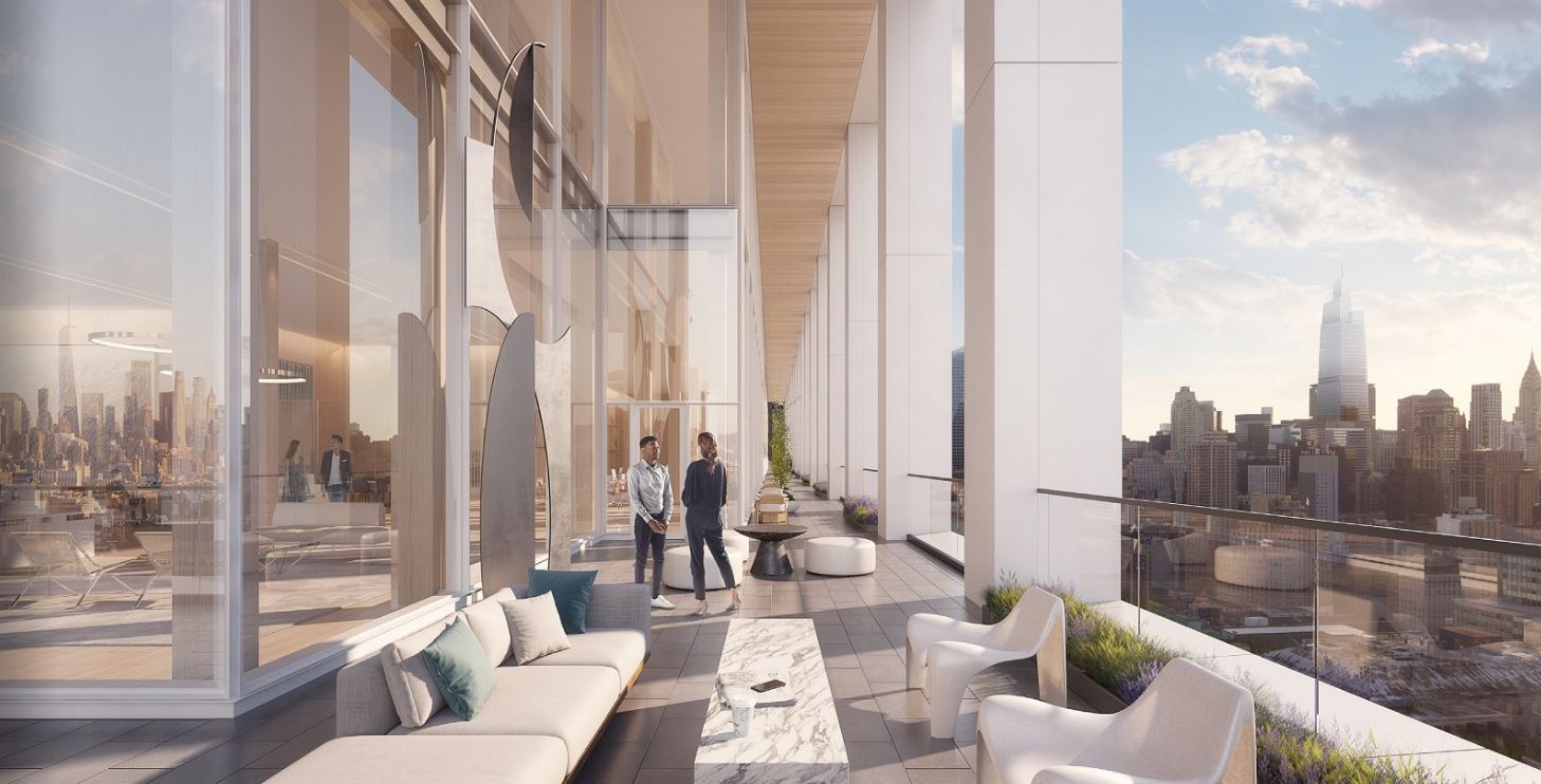
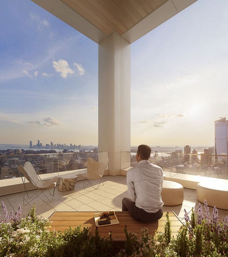
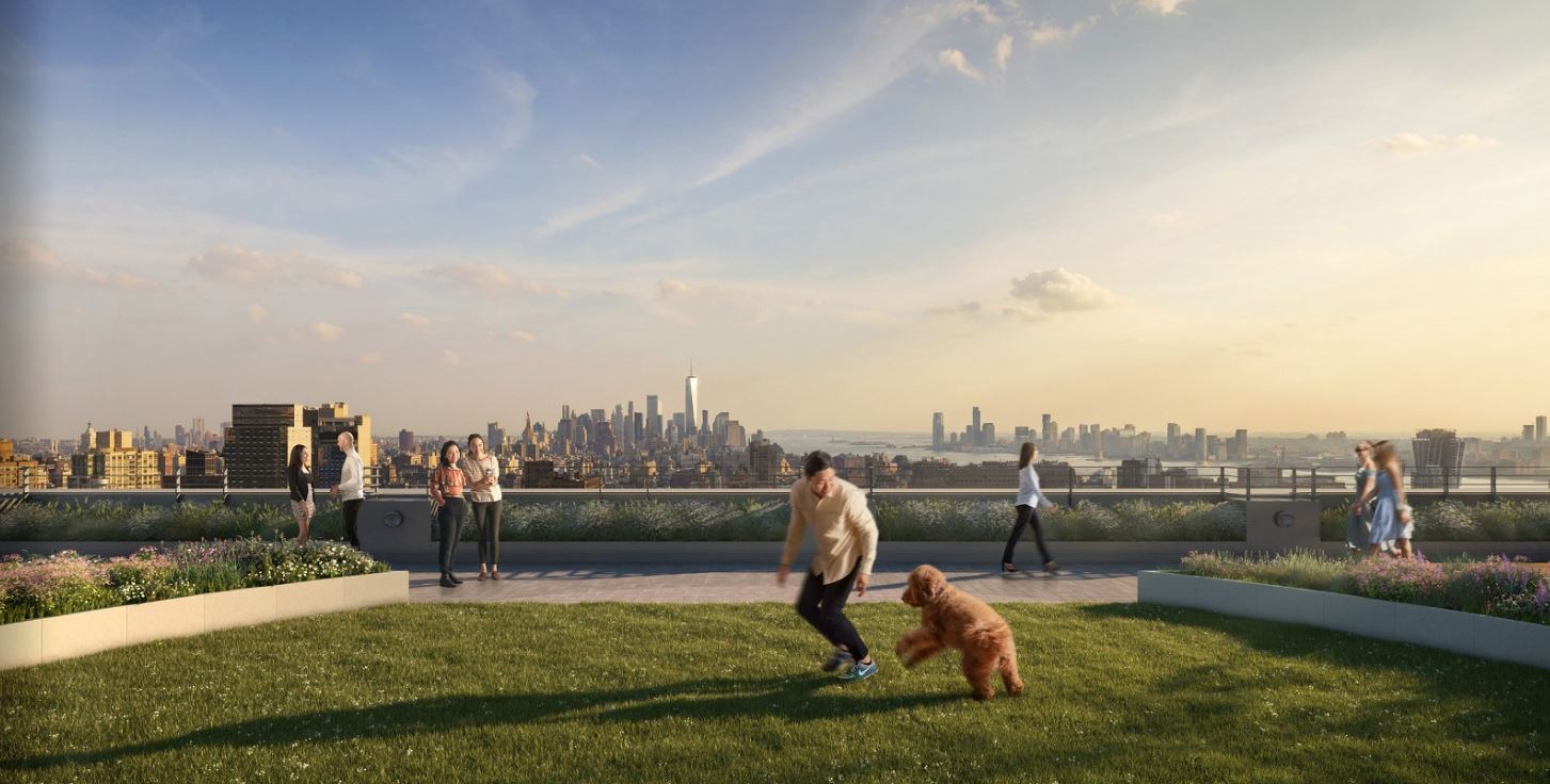
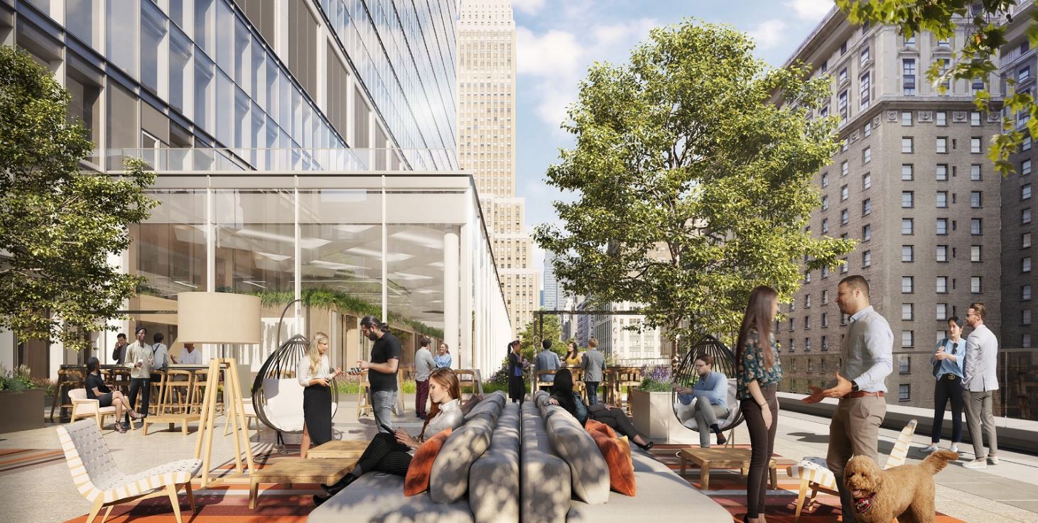
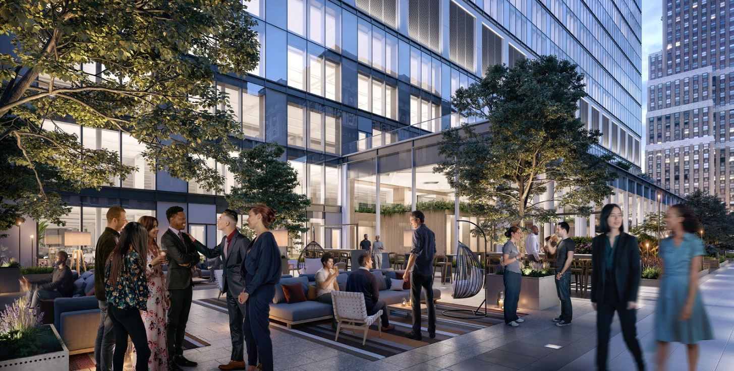
The 430-foot-long frontage of the building, which spans 88,000 square feet, will be renovated with double-height, column-free space. The renderings also show a modern update to the entrances to the subterranean levels of the complex on the western side of the parcel, linking to the subways and Penn Station. In addition, a two-story cantilevering section of newly built office floors is shown to extend over the Seventh Avenue sidewalks, supported by numerous underlying diagonal beams. Corner loggias will be added to every floor, as well as flexible tenant spaces for public or private events, a 275-person town hall, casual lounges, a rooftop pavilion, outdoor green space, and over an acre of outdoor terraces. A triple-height office entrance will be relocated against a new tree-lined plaza along West 33rd Street.
MdeAS Architects expects PENN 2’s overhaul to be completed in 2022, as indicated on its website.
Subscribe to YIMBY’s daily e-mail
Follow YIMBYgram for real-time photo updates
Like YIMBY on Facebook
Follow YIMBY’s Twitter for the latest in YIMBYnews



It looks comfortable and easy to admire the beauty, of the buildings in the city: Thank you.
Best revamp would be to tear this and MSG down..start from scratch.
To an extent, yes.
Sorry, but that is not happening.
No, it probably isn’t happening, but Monath is right. RAZE IT!
Probably true. But this renovation is a big improvement. If the Garden is relocated, the passageways leading to it through this building could become a grander entrance to Penn.
Unlike the rest of the slight mediocrity of this project (at least for me), I actually kind of like this new “PENN 2.” It looks very fresh and sleek. It seems like a very nice work environment.
However, I do question the little artistic feature on the corner that I believe is the subway enterence. It looks…interesting.
Also, this project as a whole is very risky, as it is a giant office project. But, this’ll certainly be completed by the time that office will be wanted once more. We can’t be working from home forever! Yep, here comes the controversy. ?
Well, the 2 Penn Plaza renovation looks to become a nice sub-project, as I suppose it is.
While much of the Penn 2 rendering is admirable, the diminutive paper straw-like support beams at the ground level are ridiculous.
The entrance at the corner that you mention is a separate project and has already been built. It opened about a month ago.
The renderings make great use of The Hotel Pennsylvania’s scale and decorative masonry, to bring light to this site, and provide a foil to the brittle facade; re-draw this project with Foster’s project across the street, and the result is dramatically different.
Good point
This is of course an improvement, but I really think the all-glass era needs to come to an end.
Pretty good! Transforms one of my least favorite buildings in Manhattan into something genuinely appealing. Usually, these updates convert 60s or 70s or 80s mediocrity into the current equivalent. This is a rare exception.
MdeAS has a winner here! The new Seventh Ave pavilion that extends to the sidewalk provides shelter to pedestrians, while the supporting buttresses underneath and inside give rhythm to the whole extension. A nice civic gesture. Maybe this bodes well for creating a new westside entrance to Penn Station where the Hulu Theater is now…
I can’t wait for Bring Your Dog To Work Day!
I like this design. Open and airy. And I hope they move MSG to across the street from Macy’s. It think there’s a plan to re-skin MSG with glass and make that the new entrance to Penn Station.