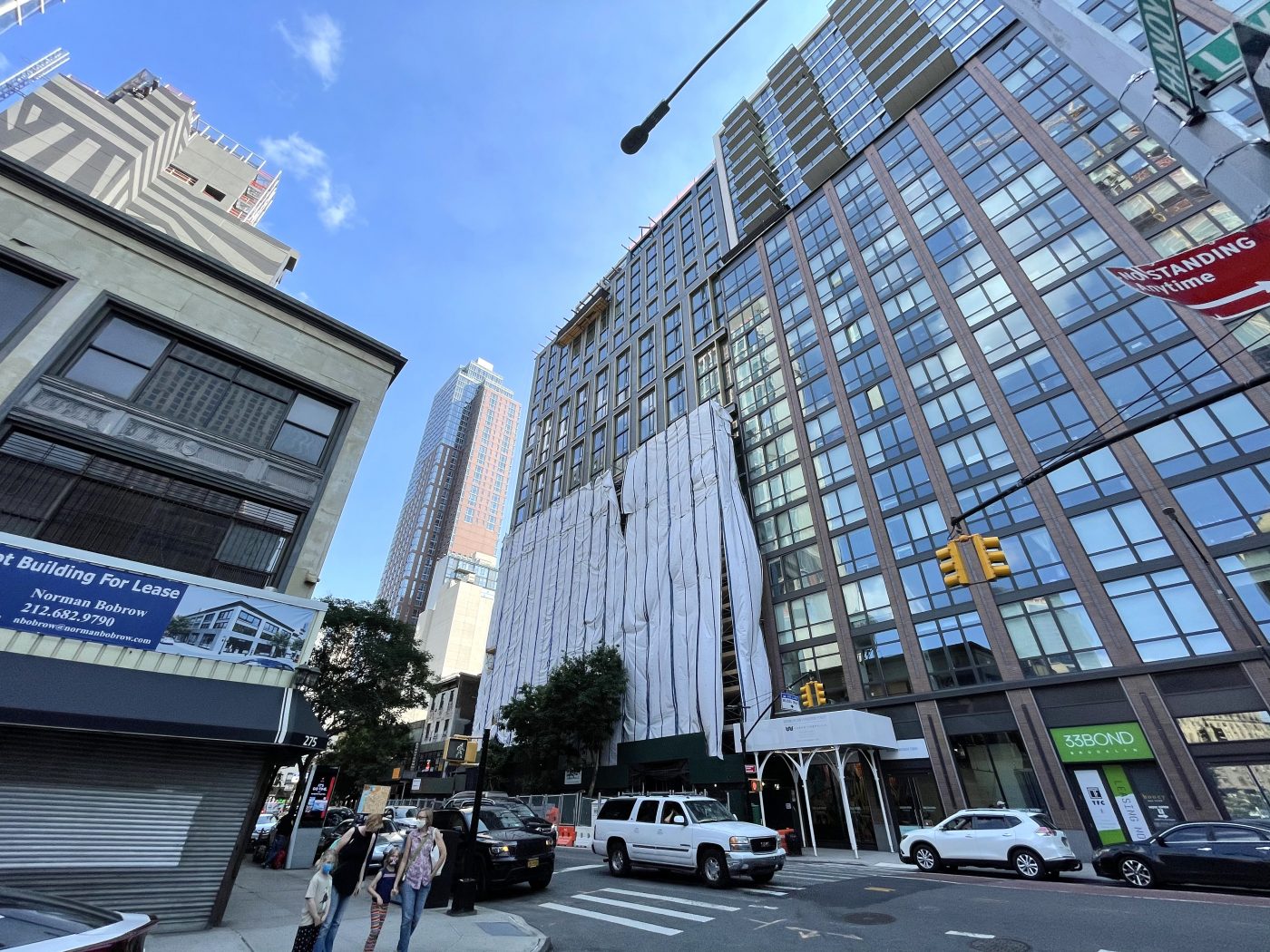
Scaffolding continues to be disassembled from 308 Livingston Street, a 23-story residential building in Downtown Brooklyn. Designed by Fogarty Finger Architecture and developed by Lonicera Partners, which purchased the property in May 2019 for $11 million, the structure will yield 160 units in one- and two-bedroom layouts and ground-floor retail space facing Livingston Street. Noble Construction Group, LLC is the general contractor and King Contracting Group is putting together the signature brick masonry walls. The site is located between Nevins and Bond Streets.
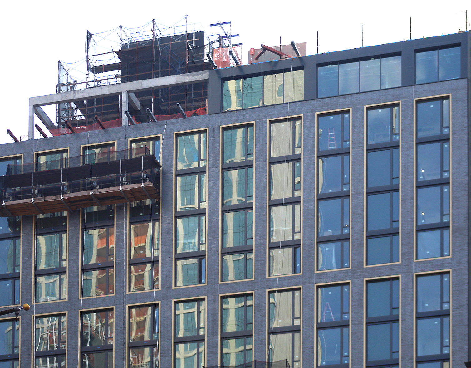
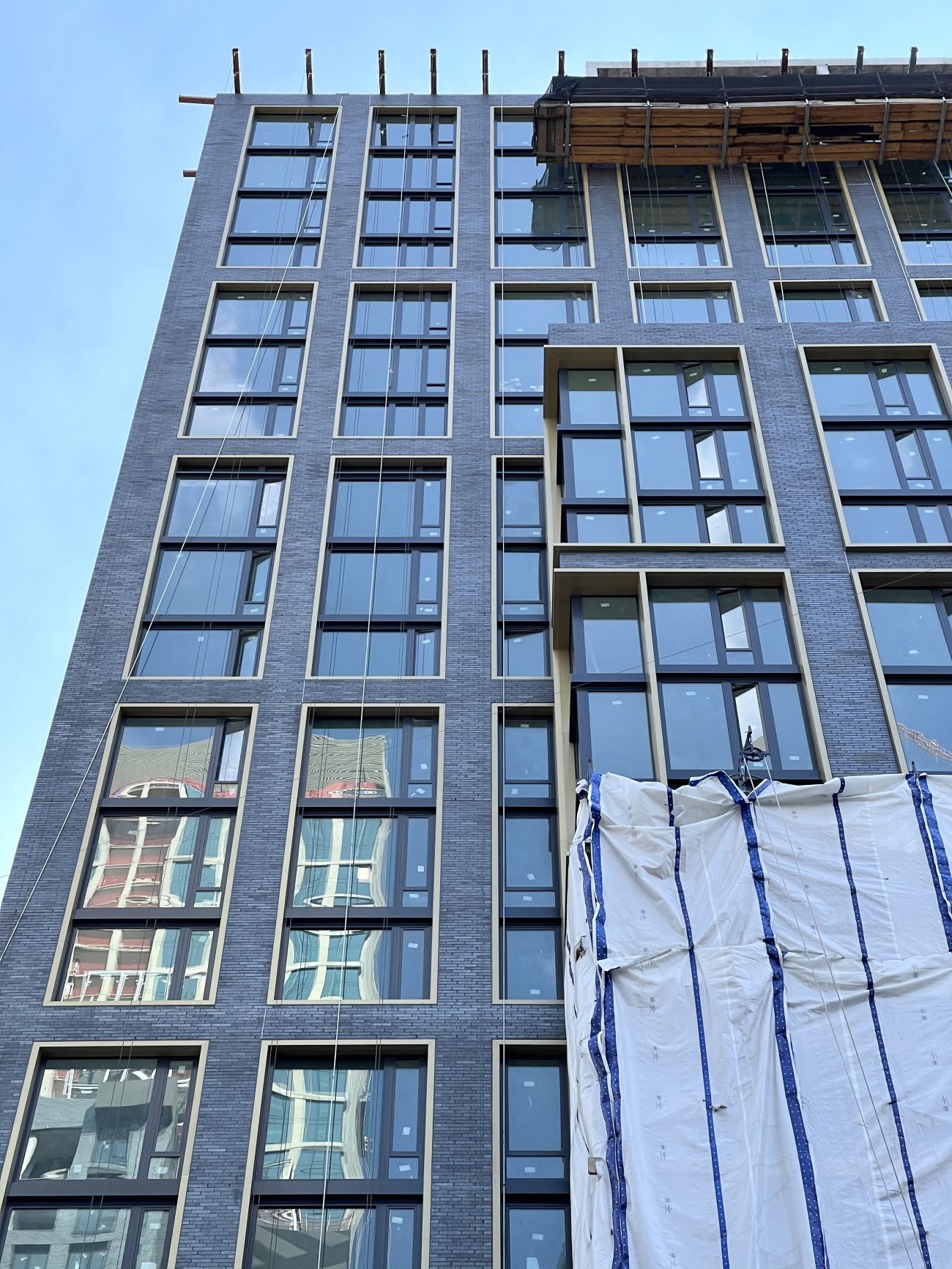
Since our last update in late June, more of the scaffolding and white plastic sheets have been disassembled, revealing the finished façade. Only the bottom third of the structure remains obscured. We should expect the rest to be dismantled by the end of the year. The bricks were done by Brett Steinberg, former principal of RSC Group, now King Contracting Group. Meanwhile, the details in the gold-colored rectangular grid across the main northern elevation can be clearly seen even in the shadows when looking across Livingston Street and from afar on Flatbush Avenue Extension.
308 Livingston Street’s exterior renderings depict the signature dark charcoal-colored brick walls and the uniform series of rectangular outlines framing three- to four-story stacks of floor-to-ceiling windows. At the pinnacle is a flat roof parapet and an open-air void of perimeter columns and beams that line what looks like an outdoor rooftop terrace. Also on the roof is a minor mechanical extension set back from the edge around the center of the building. Few details about the residential interiors are known, other than YIMBY reporting that each home will feature floor-to-ceiling windows, large kitchens with stainless steel appliances, and stone-clad bathrooms.
It’s estimated that 308 Livingston Street should be completed in early 2022.
Subscribe to YIMBY’s daily e-mail
Follow YIMBYgram for real-time photo updates
Like YIMBY on Facebook
Follow YIMBY’s Twitter for the latest in YIMBYnews


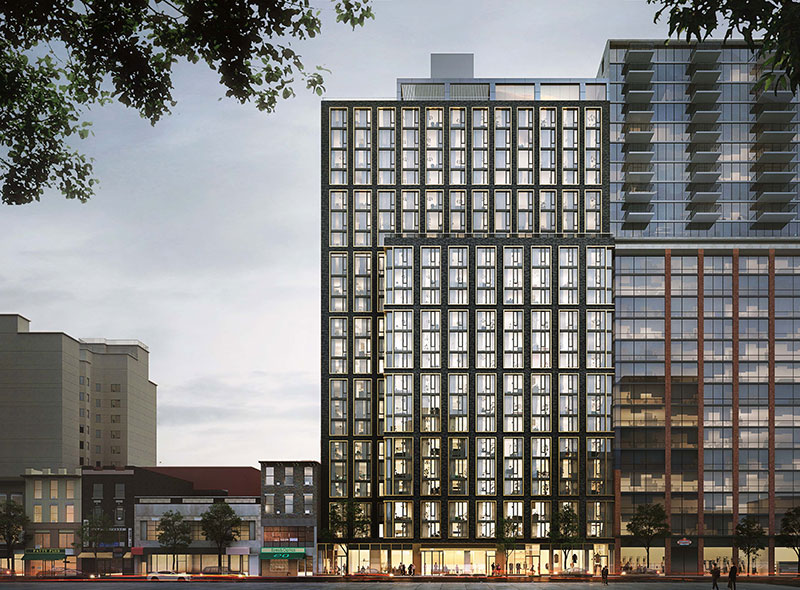


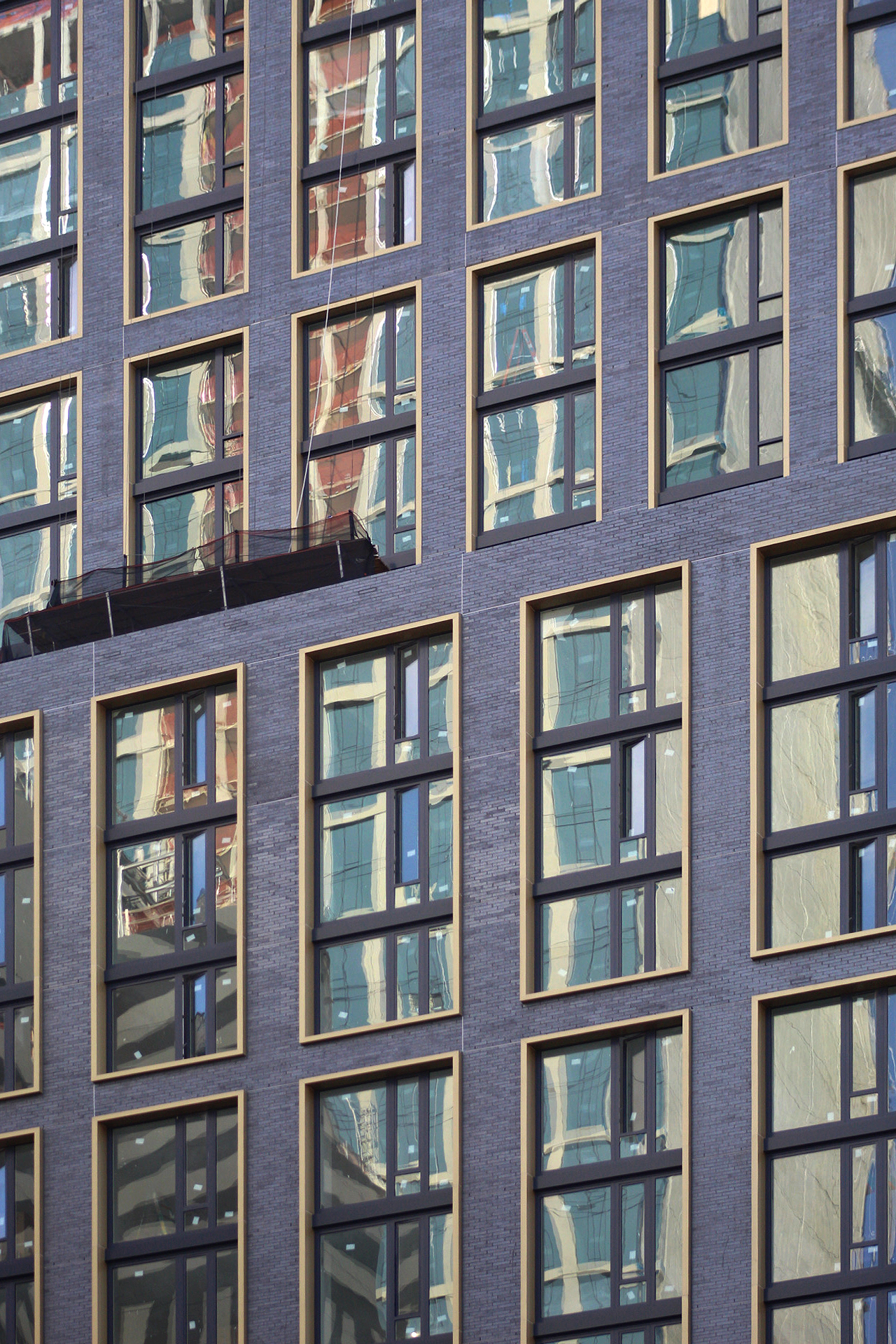
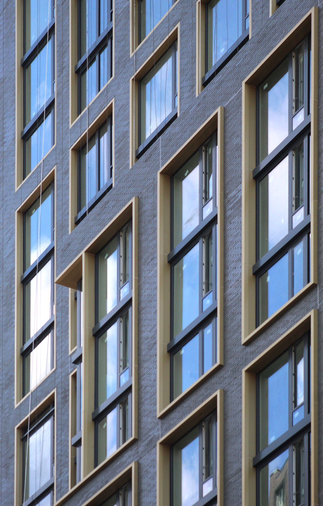
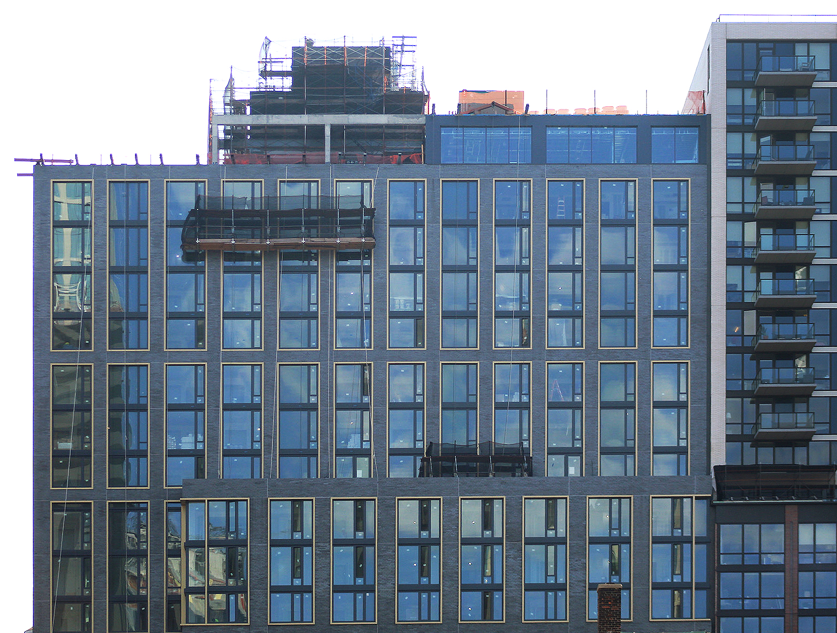
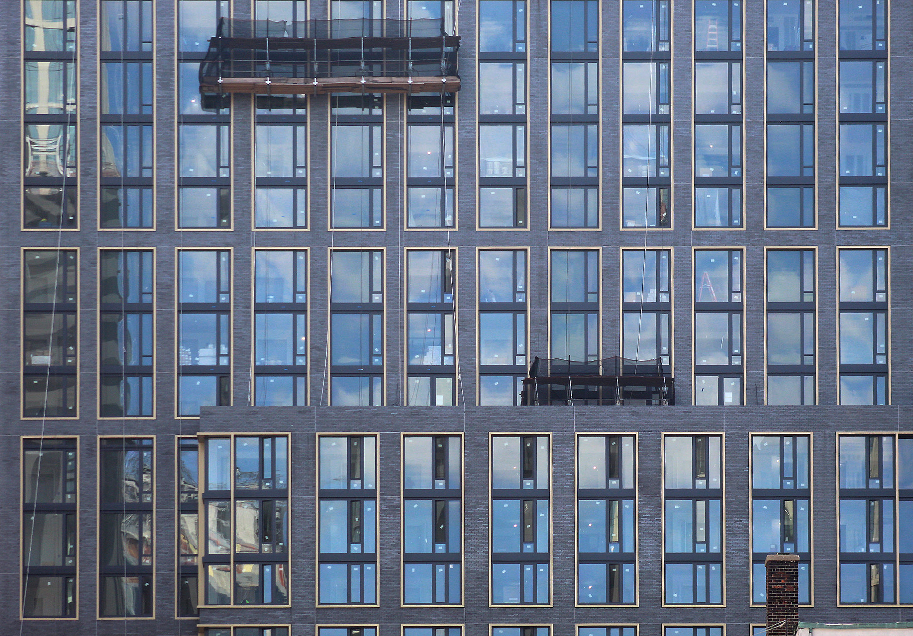
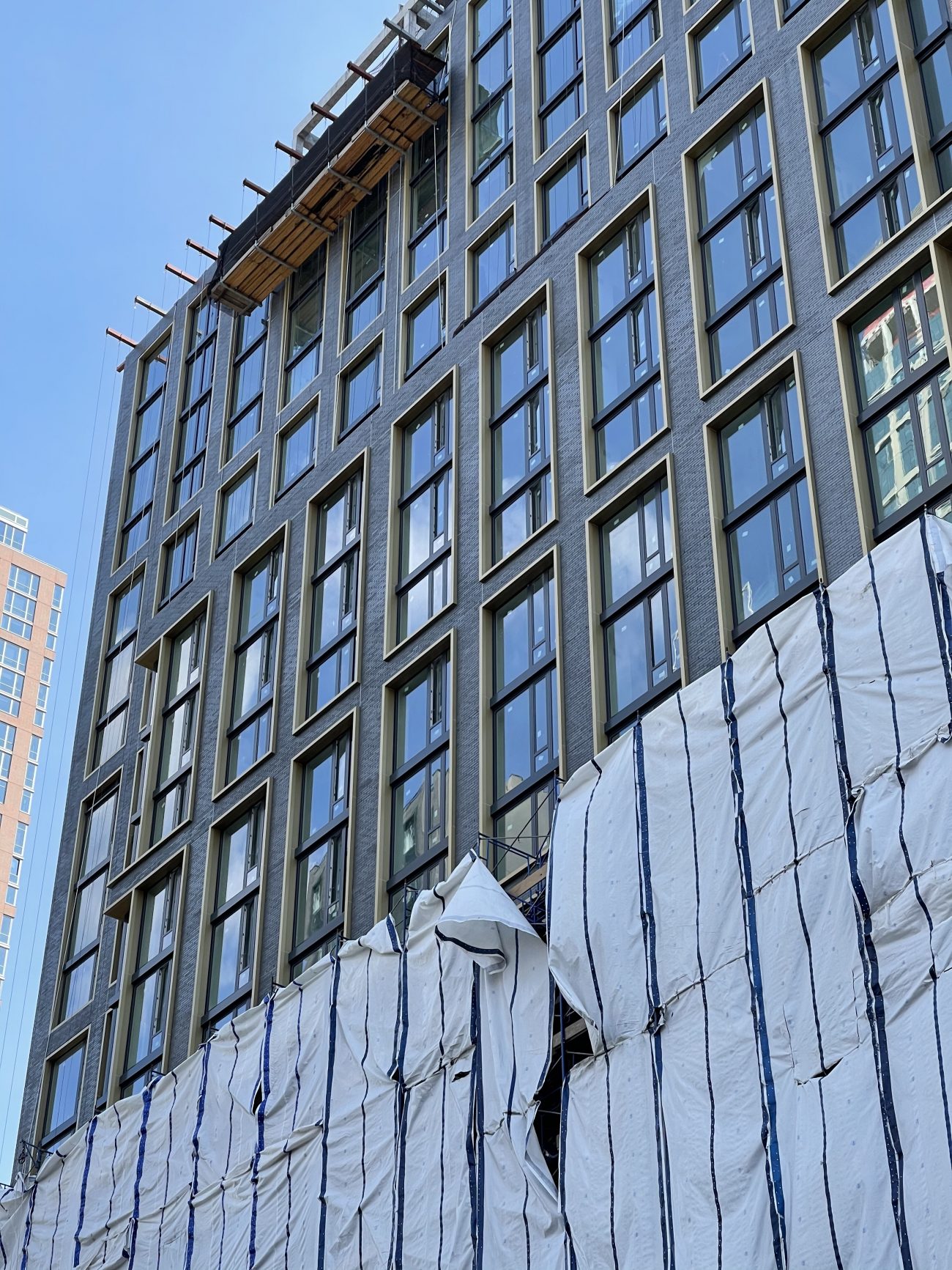


The brick is a lot lighter than what was depicted in the renderings, though I don’t think it’s so bad. I like the industrial-contemporary feel to it.
Renderings are always going to be moodier. I do think this looks great though.
Right.
I would seriously appreciate Mr. Thomas (see above) refrain from making any more stupid and or inappropriate comments regard this or any other Yimby project. Enough is enough!
Stunning and the colors will compliment 9 DeKalb quite well. Side note, what’s up with the negative comments towards others the past few days? Is this now NY NIMBY?