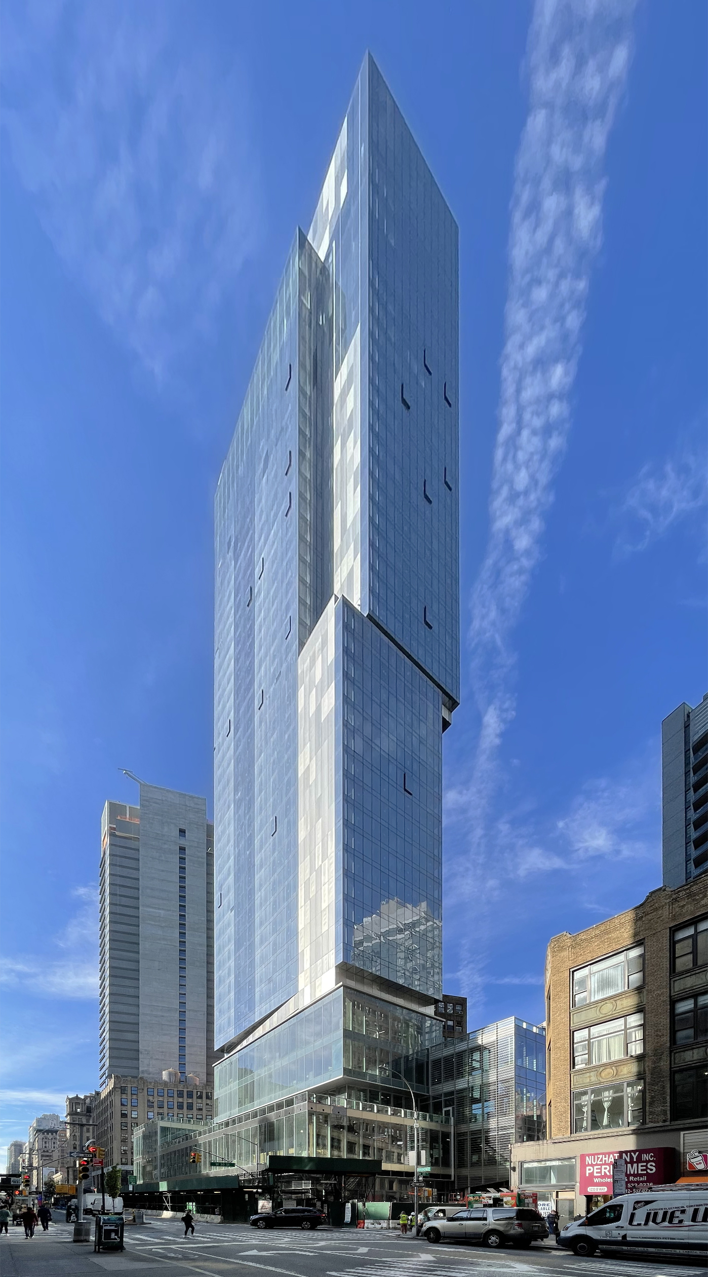
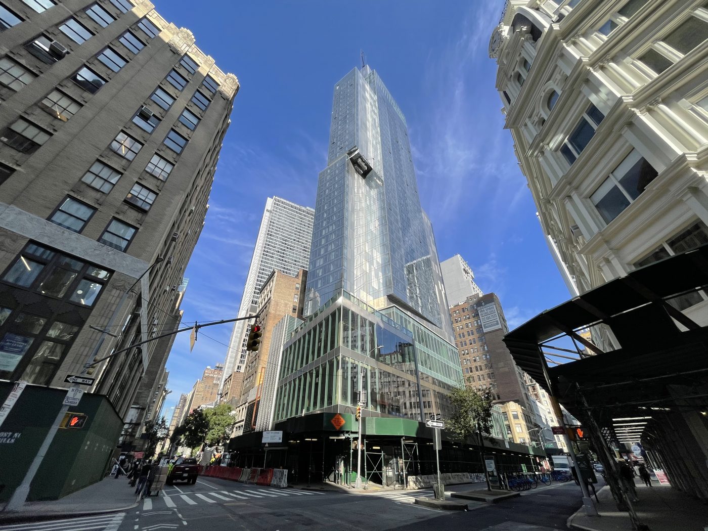
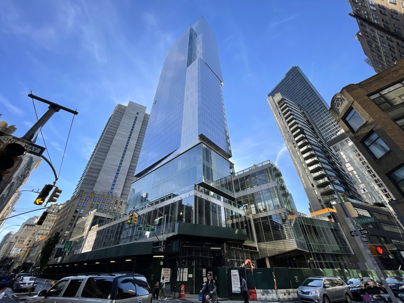
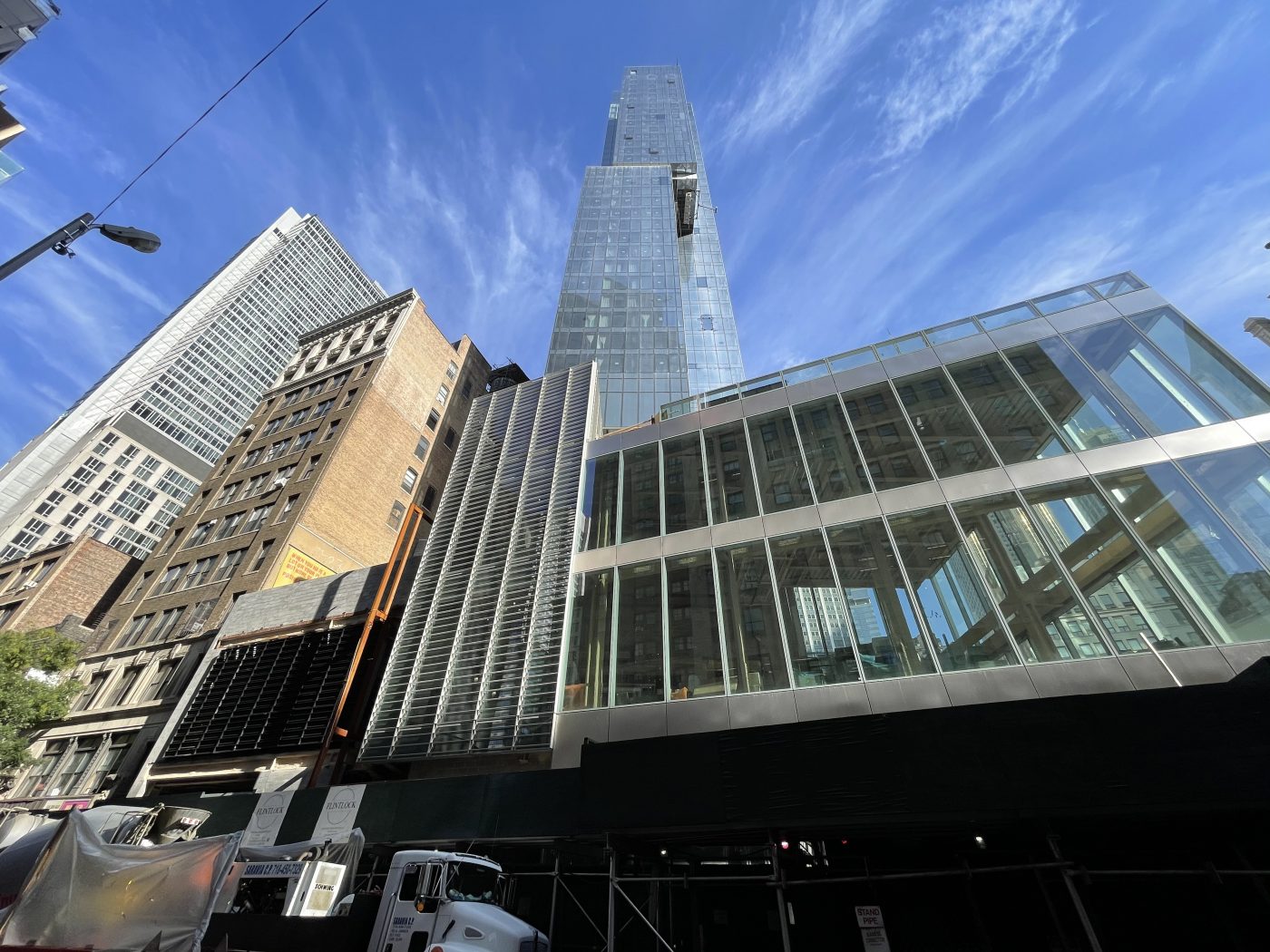
Construction is wrapping up on the Virgin Hotel, a 38-story tower at 1225 Broadway in NoMad. Designed by Stantec and developed by Lam Group, the 476-foot-tall, 300,000-square-foot structure will yield 460 hotel rooms managed by Sir Richard Branson of Virgin Group. Flintlock Construction Systems, LLC is the general contractor for the building, which is bound by Broadway, West 29th Street, and West 30th Street.
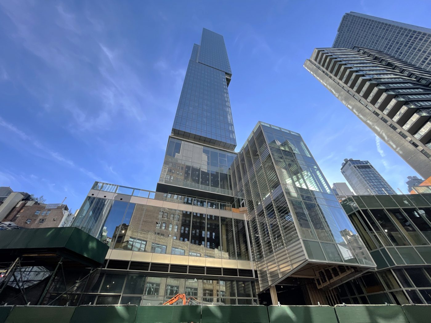
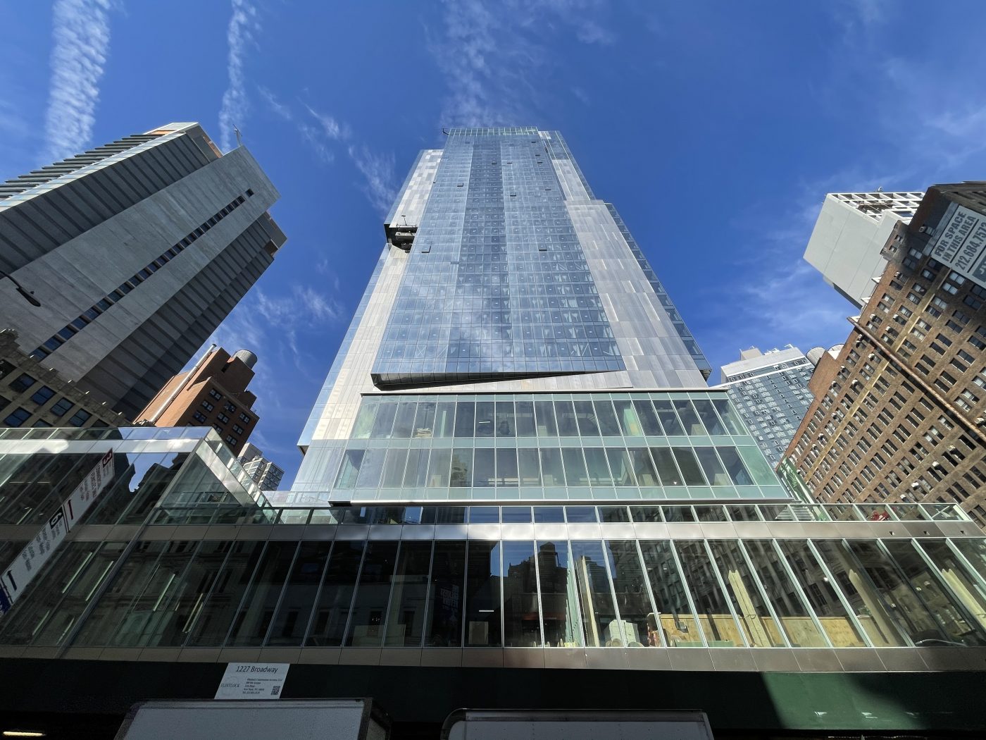
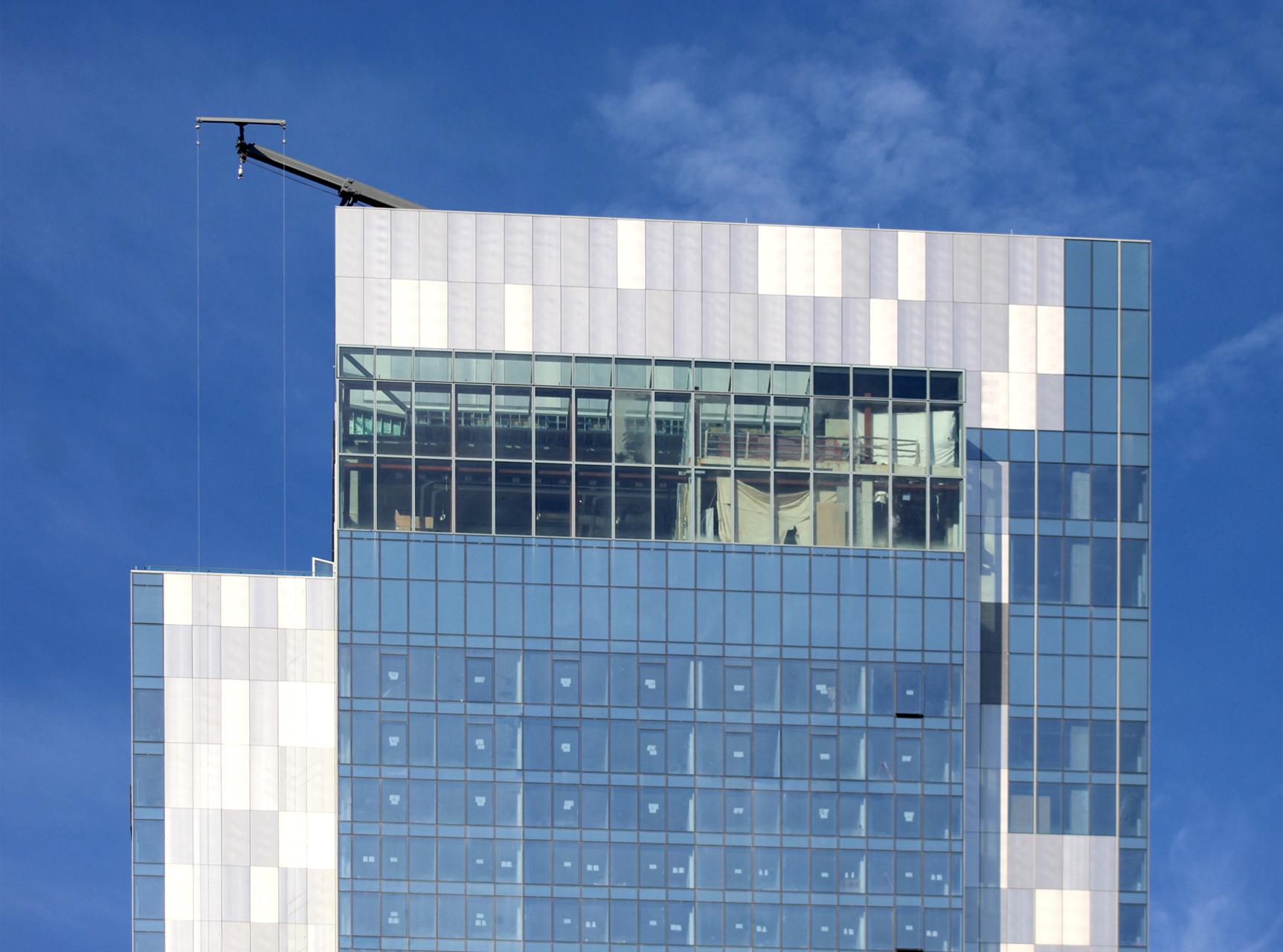
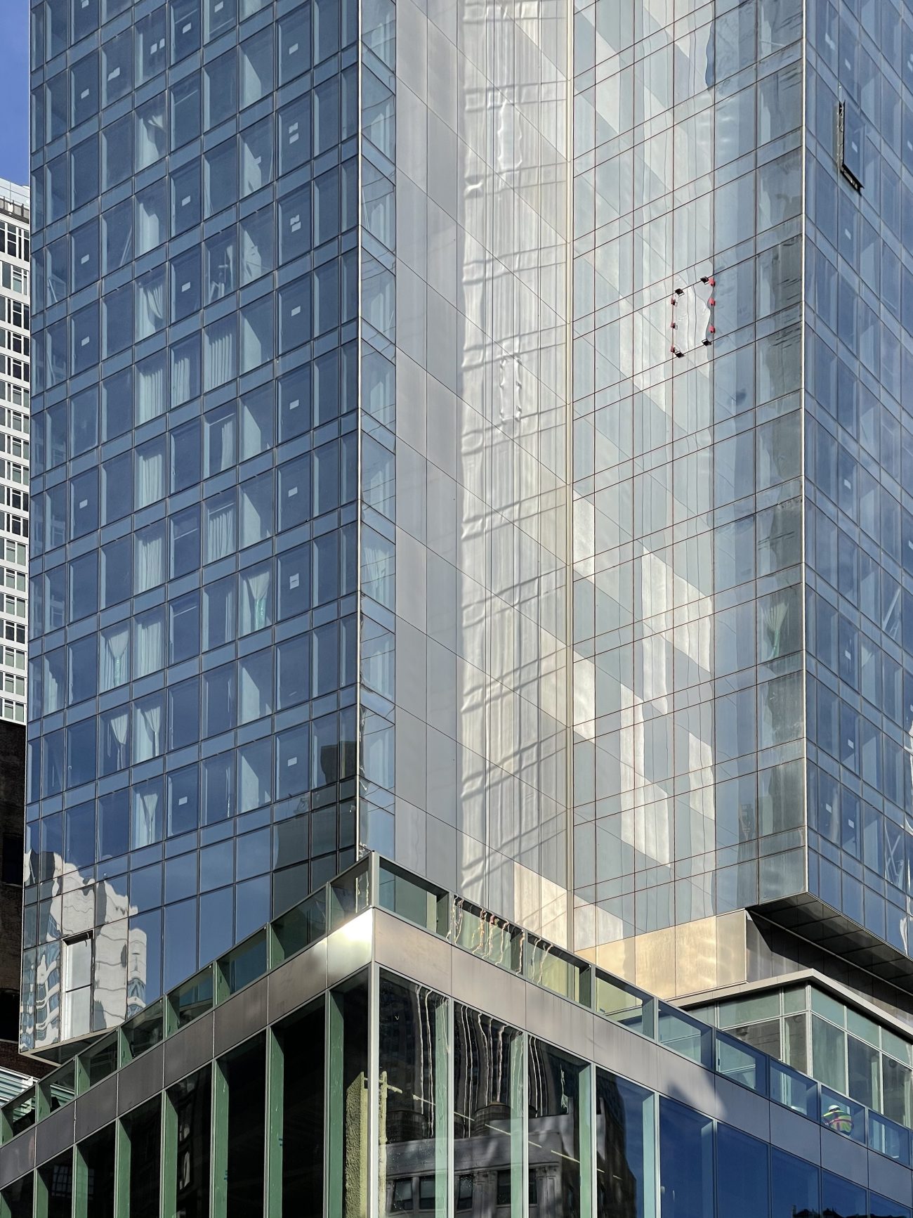
Since our last update in June, almost all of the remaining gaps in the glass curtain wall have been filled in and podium work is drawing to a close.
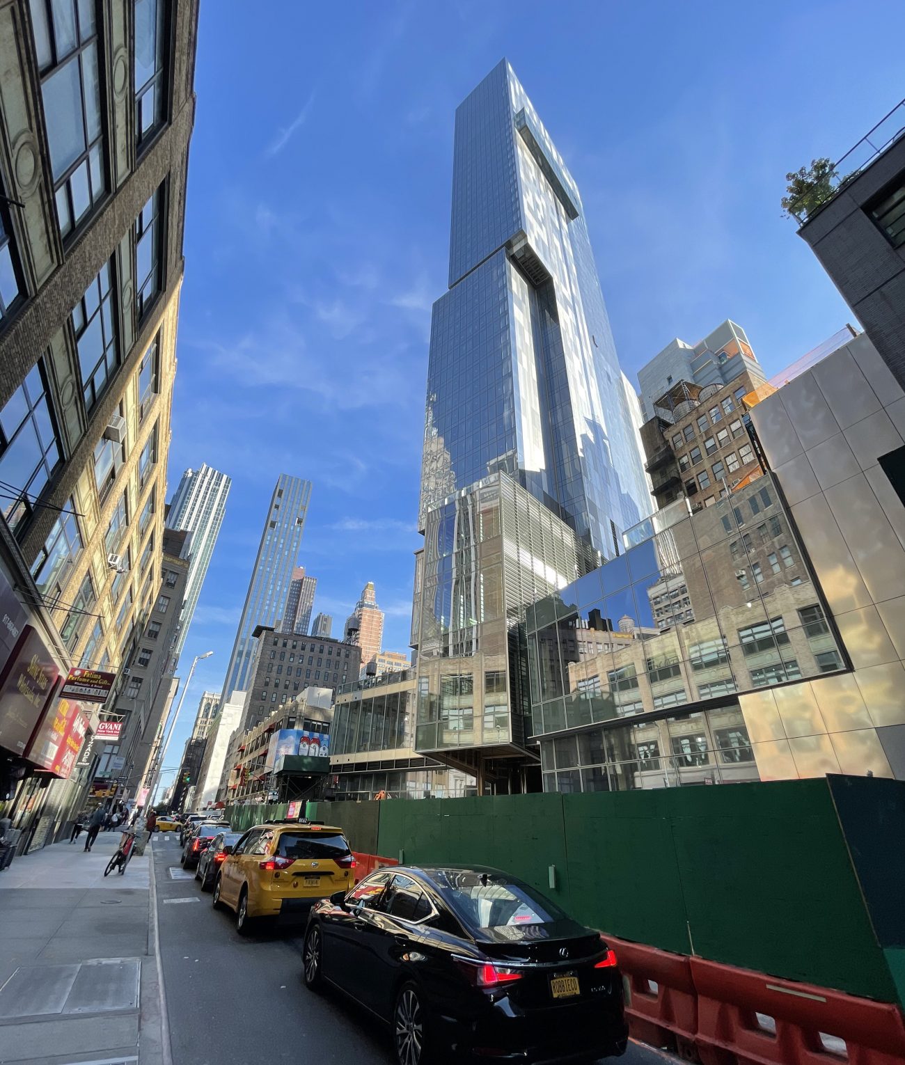
We can now see glass railings and practically all the floor-to-ceiling glass units installed on the podium section. The wraparound sidewalk scaffolding and construction fencing and barriers should finally be removed before the end of the year. as well as seeing the iconic red logo placed somewhere close to street level.
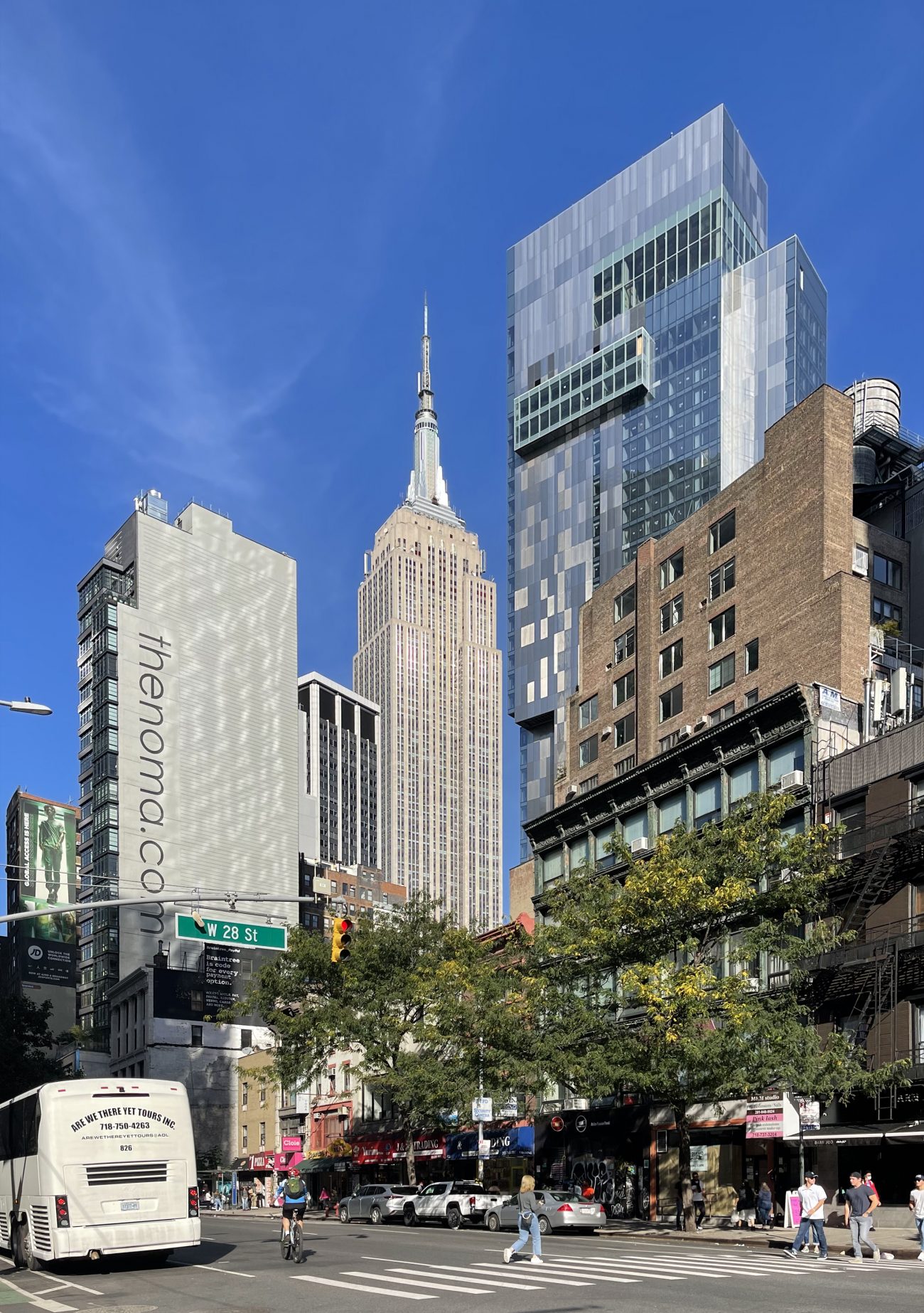
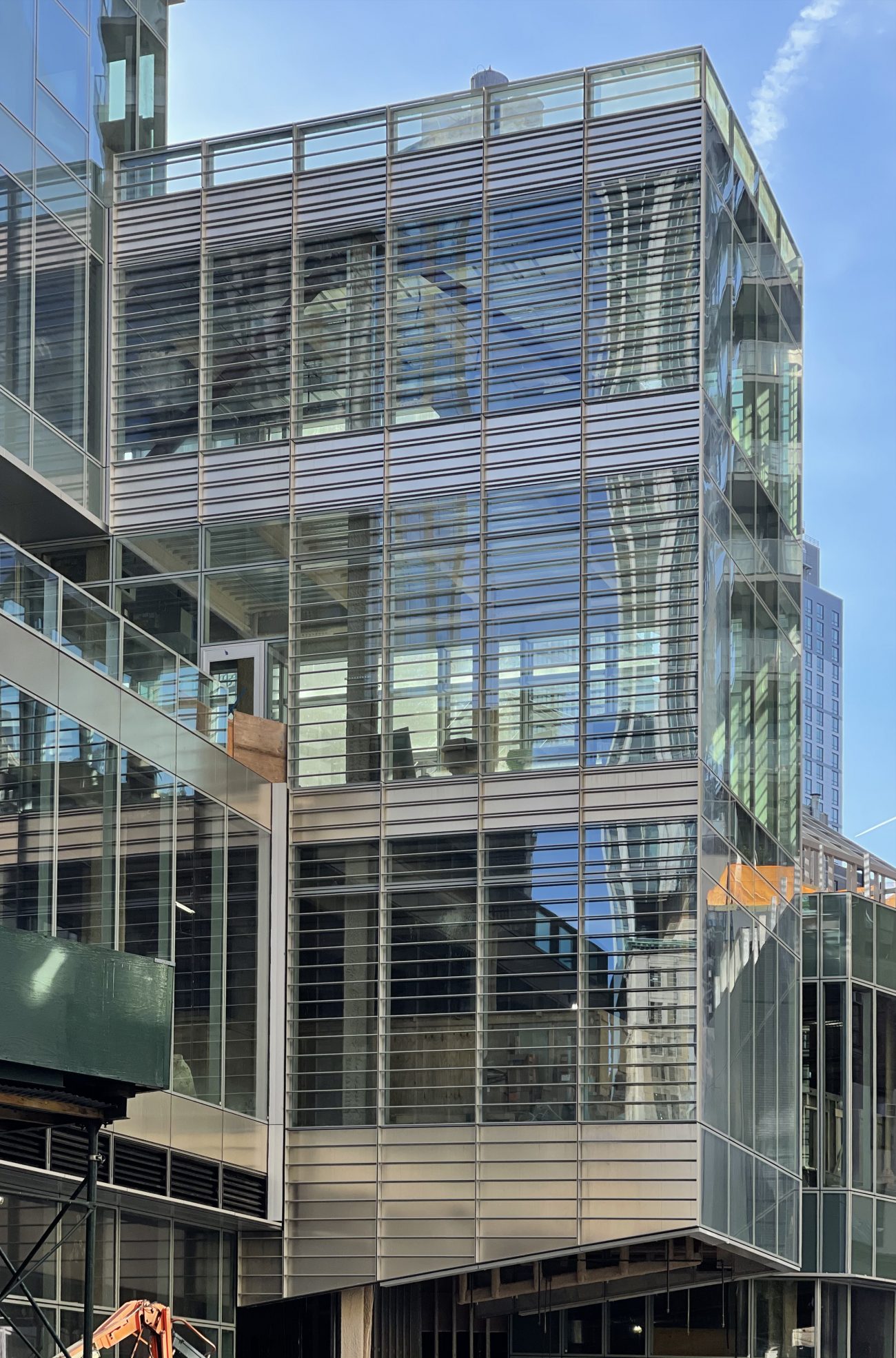
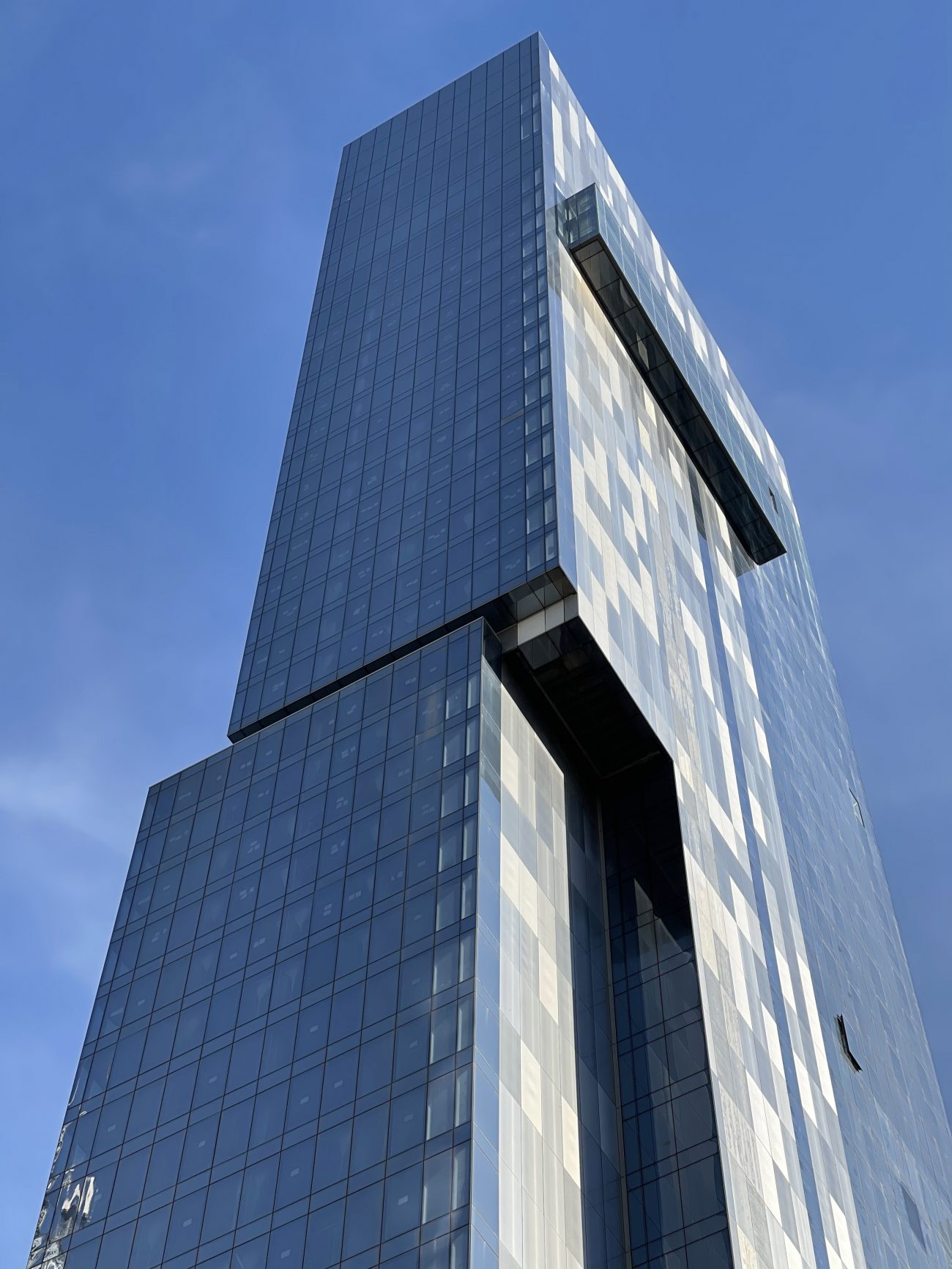
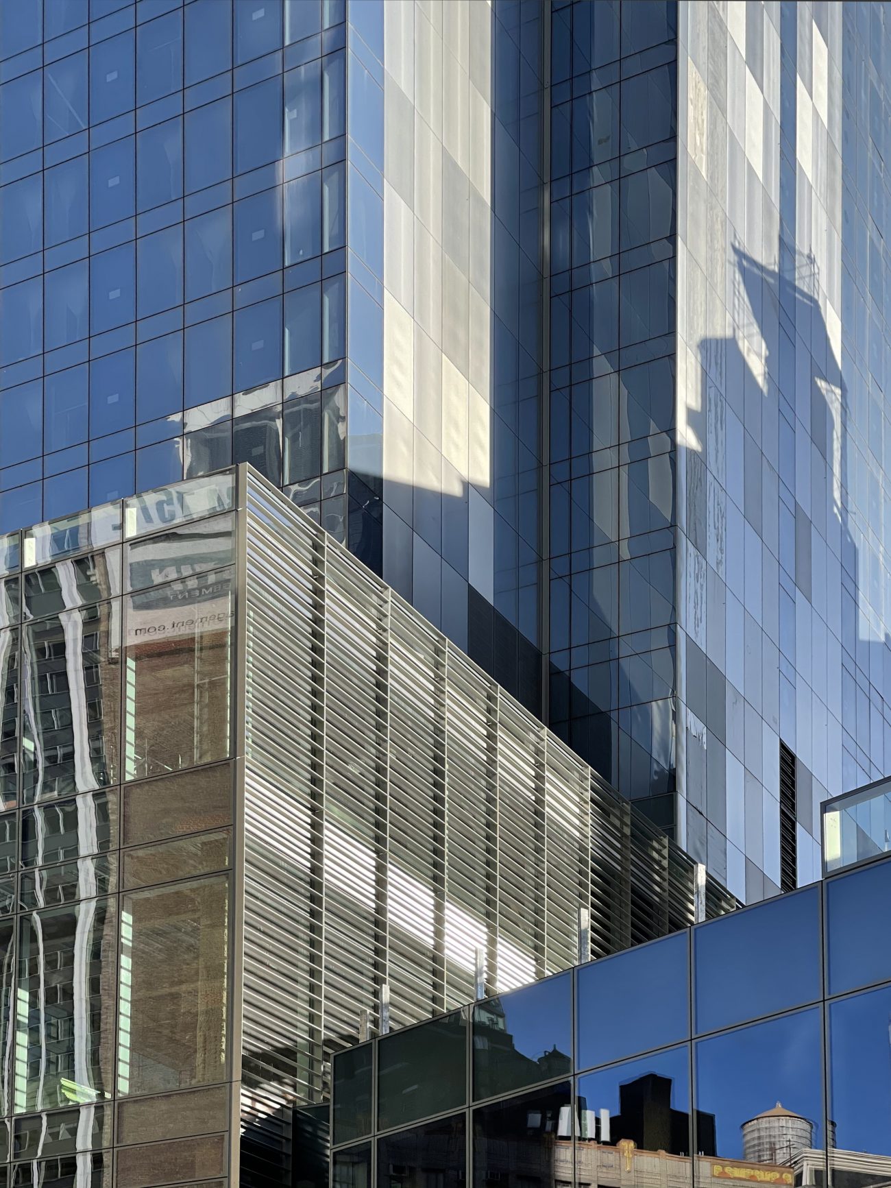
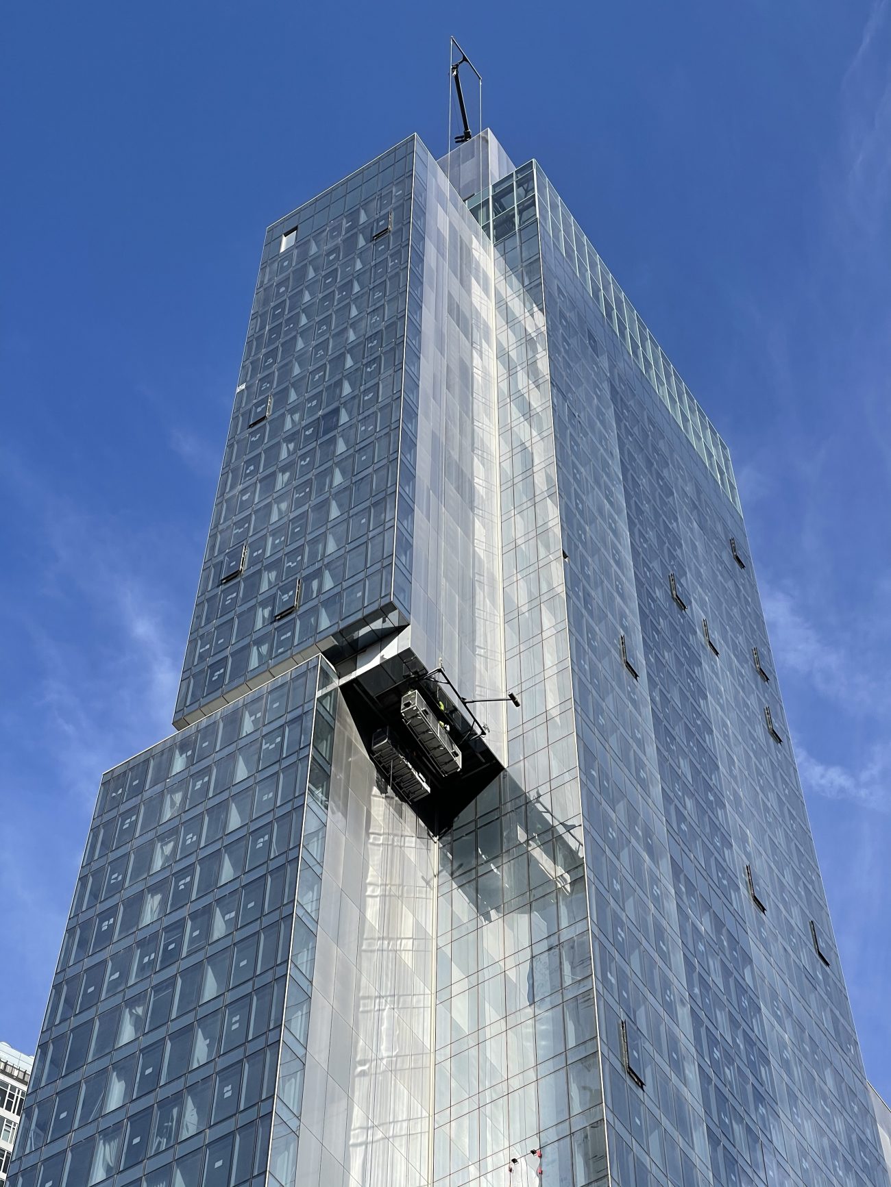
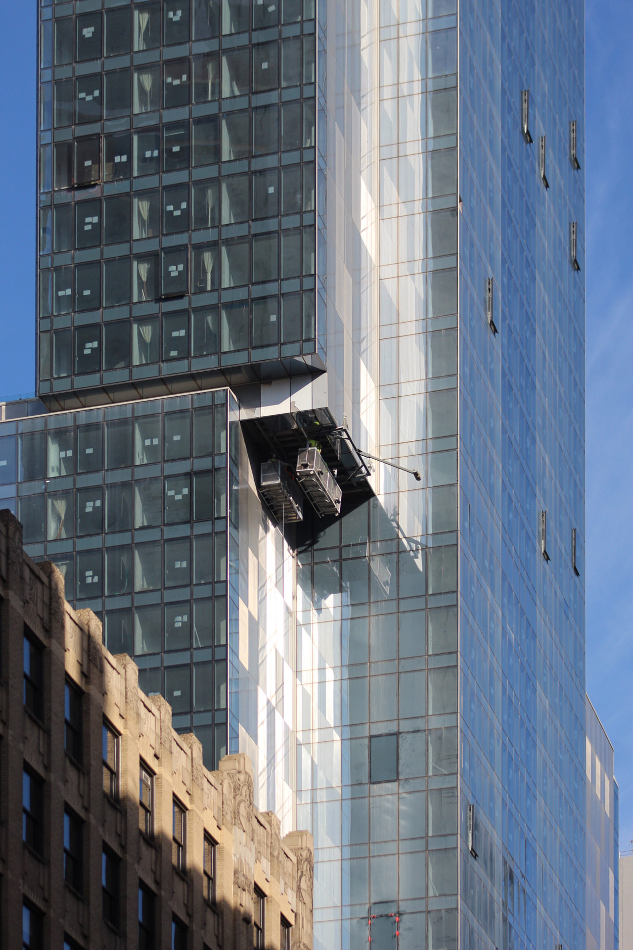
Photographs of the western elevation show the reflective metal panels running the height of the building and surrounding a protruding glass volume that will likely be part of the amenity offerings. These upper levels will provide guests with panoramic vistas of the Midtown and Lower Manhattan skylines, as well as direct views of the nearby Empire State Building.
The same façade system is also repeated on the opposite eastern side.
Few details about the interiors have been revealed, though it’s been reported that the Virgin Hotel would boast an outdoor swimming pool with lounge areas, 90,000 square feet of retail space, and an underground 22,000-square-foot golf store called “Swingers: A Crazy Golf Club.”
No finalized completion date for 1225 Broadway has been announced, however YIMBY predicts the property to open sometime in early 2022.
Subscribe to YIMBY’s daily e-mail
Follow YIMBYgram for real-time photo updates
Like YIMBY on Facebook
Follow YIMBY’s Twitter for the latest in YIMBYnews









Looks like they finally fixed that broken window
The same facade system is also repeated on the opposite eastern side, I agree with its design on a hotel looks. Hotel so hot at this moment, and Empire State Building on direct views so stunning: Thanks to Michael Young.
Why so many hotels in the 20’s and 30’s?
Central location and favorable zoning
A city of hotels
But for the moment, not many guests
Despite the excellent photos, I need to go see this once it’s done.
what an ugly out of context glass box for another hotel that this city doesn’t want or need.
this is so grossly out of scale with the surrounding brick buildings.
this is disgusting and terrible for the surrounding neighborhood
so sad
Totally disagree. That neighborhood was really gross before this and the Ritz went up. Now there will be people around at hours when it was desolate. This neighborhood will flourish because of these projects. The Virgin exceeds my expectations – very handsome building, and I really like how the architect handled the void wall. Well done!
Steveo
1225 broadway in Manhattan is a gross neighborhood? What in the world are you talking about? When is it desolate? At 3 in the morning maybe when people are asleep but that’s it. How in the world will the neighborhood flourish? Please give me one example how putting up a ugly out of context glass box helps a neighborhood flourish when you have exactly zero going on at the base but a bunch of concrete? There is nothing there but
an underground 22,000-square-foot golf store called “Swingers: A Crazy Golf Club.
Will you be visiting this golf club?
What are you smoking because I need some of that stuff please?
Can’t wait to see it lit up. Bet it’ll be one of the best.
lit up with empty hotel rooms
My concern is that they’re very few who visit NYC that fit their stated demographic…
Would love to see that window washer mechanism working.
At least the facade looks better than the Ritz-Carlton down the street.
With a good street level but a strange tower, it kind of inverts the Ritz’s good and bad points.
I still think it has some very odd angles to it, along with some very unnecessary add-ons. The scattered about panels also make the building look a bit cheap. Overall, the building is all kind of a mess. Don’t get me wrong, it has some very nice aspects about it too, such as the side angles. But, the way it looks as a whole is just very unorganized.
This is a good one, but what really makes it work is the contrast with the beautiful old lady across the street