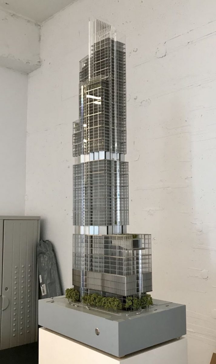
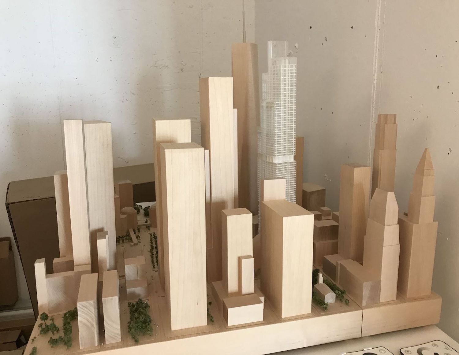
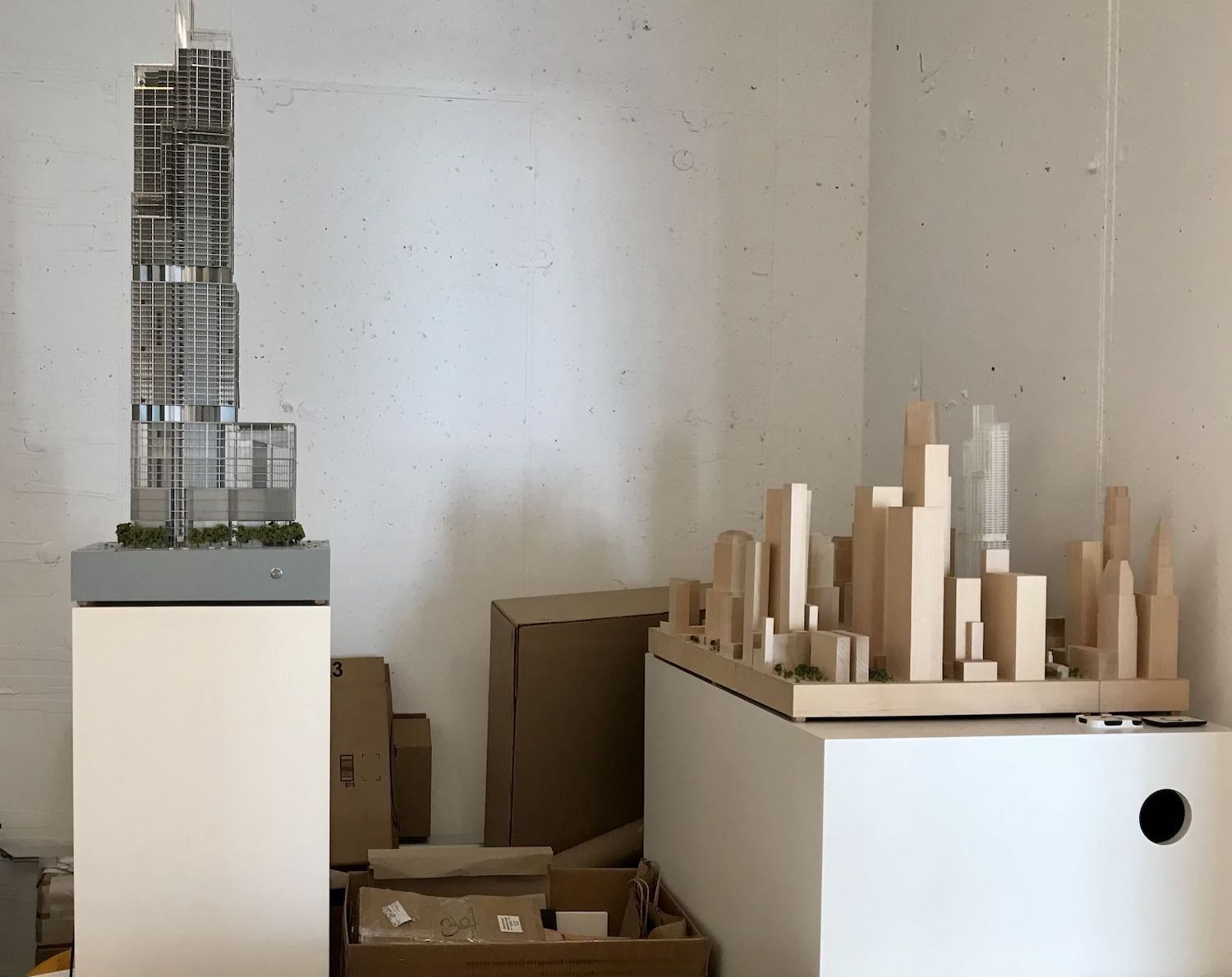
Some recent photos taken by an anonymous tipster of design models for Two World Trade Center (2 WTC) give insight into the possible composition of the highly anticipated skyscraper. Also known as 200 Greenwich Street, the future 1,350-foot-tall office development from Silverstein Properties is expected to be the second-tallest building at the World Trade Center site, and is also the last major component to be built as part of the complex. Located at the southwest corner of Church and Vesey Streets, the site currently sits as an assemblage of columns and mechanical ducts surrounded in muraled walls.
The models show a reconfigured base featuring columns already in place underground as part of the foundation. According to the models, the floors reduce in size as the tower rises. This design characteristic might appeal more to tech and finance companies than to be used as trading floors. It is unclear how recent these models are and if they are an iteration by Norman Foster of Foster + Partners, who returned as the architect for project last year.
The new 2 WTC was first designed by Foster + Partners in 2006, then redesigned by the Bjarke Ingels Group in 2015, before Foster + Partners were once again attached in 2020 to a redesign of the original conceptualization.
2 WTC does not have government assistance for the construction, unlike previous World Trade Center buildings. A construction timeline and expected completion date will all depend on Silverstein Properties securing anchor tenants and construction financing.
Subscribe to YIMBY’s daily e-mail
Follow YIMBYgram for real-time photo updates
Like YIMBY on Facebook
Follow YIMBY’s Twitter for the latest in YIMBYnews





Getting warmer…
Exciting that I have seen the model, this is beautiful to changes skyline. I like and agree with the latest, 1 and 2 World Trade Center keep its iconic forever: Thank you.
Not exactly iconic.
Oh I wish we could get rid of the whole Libeskind graduated height thing and make 2WTC like 1,600+ feet.
Anyone who actually believes that WTC1 is 1794′ tall shouldn’t have a problem with a 1650′ WTC2, right?
Right!
That’d be great.
Why were the models set up in such a durty corner?
Another mediocre design…should be called 2 Non-Tribute Center.
BRING BACK THE ORIGINAL DESIGN
EXACTLY
Please, please, please!
Looks like they were put in someone’s basement. Not encouraging!
So they want to place a near twin of Foster’s Comcast Technology Center (in Philly) at the World Trade Center site in NYC? How lazy, uninspiring and insulting.
Hopefully this was just an idea that was rejected years ago before they built the Comcast Technology Center.
Agree!
Better than the Ingels design, but that isn’t saying much. At least it doesn’t have an exposed spine. Pretty mediocre though. Hopefully that is why it’s sitting in a dusty corner.
Last chance to truly create something aw-inspiring at the WTC. Something our grandkids will continue to marvel.
“Give Peace a Chance”
So why was the original design so bad that they are constantly giving us other designs that are so bloody awful? In my humble opinion the original design would be an absolute hit and instant iconic skyscraper worthy of New York City.
More ugliness
Make it taller. So far no building has reached the height of the original Trade center buildings (not including the stupid masts.)
From what I see from the image it’s the same height as 1WTC, though I can’t tell if that’s a spire or the roof.
Why is so hard to make a twin of Tower two? WTC 1 looks like a Nambe candle holder make another copy and be done with it.
The site isnt the same shape or size.
WTC 1 looks like a great big syringe!
Must be taller!!
20 years after 9/11 and we’re still waiting for something significant.
This is the best design to date for 2 World Trade Center to date! Way to go!
Youre joking?
Whaaaaa…
A complete and utter dud. Barely better than just another boxy tower. To say this is uninspiring and bland would be putting it mildly. Granted, it’s not quite Gene Kauffman-esque, but I, for one, find it very hard to conceive that this banal mediocrity is the product of Sir Norman Foster, for a spot which is truly sacred, hallowed ground. No, no and no. Say it ain’t so!
Damn that looks sexy
Wish they’d just make a twin of 1WTC but this is probably the best one not based on any previous design.
Needs to be taller. At least the roof height of 1WTC.
Looks like it is stored in someone’s basement.
It’s a fair design, but it lacks any emotion or any symbolic traits. This seems to be the common trend now with the WTC, starting with the 5 World Trade Center design. The WTC needs something iconic, especially with a building bearing the name “2 WTC.” I just wish we could get something similar to the original design, and not all of this nonsense. Or, this is actually not the final design. It seems we’ll never know. All in all, this is very disappointing.
Man, I was hoping they‘d bring back the diamond shape.
New York got totally screwed with this new skyline. Everything is about how much money they can generate from the space. The twin towers were iconic, NYC skyline was iconic, the original 2WTC design would have been iconic. Those diamonds were original. Now it’s all an incohesive mess. The twin towers were representative of the NYC attitude. They asked NY to build the tallest tower in the world and they said “how about two?” It was our swagger, symbolic of our can-do attitude. They don’t care what connection the designs have to the community anymore.. and I feel like I’ve seen this design in every developed city. Disappointing.
I like how it looks like its been tossed into the garbage area of a shipping receiving dept.
Well, it is light years better than the horrendous pile of blocks that BIG had designed, but still far away from that iconic diamond top that the original Foster design had.
If the choice was between this or BIG, this wins in a rout. But if the original design was in the running, it wins in a landslide.
It should be the same height as the original 2 WTC at 1,362.
Ugh
Warmer, but not there yet
Please just build the original design.
So many lost opportunities.