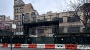
New renderings have been spotted for Two World Trade Center, the final component of the 16-acre World Trade Center complex at 200 Greenwich Street in the Financial District. Designed by Norman Foster of Foster + Partners and developed by Silverstein Properties, the commercial supertall will rise from a foundation built in the early 2010s before work stalled on the initial iteration of the tower. The full-block parcel is bound by Greenwich Street to the west, Vesey Street to the north, Church Street to the east, and Fulton Street to the south. The site is currently being used as a secondary entrance to the PATH trains and subway lines and the Westfield World Trade Center mall within Santiago Calatrava Architects‘ Oculus, and an outdoor beer garden along Church Street surrounded by colorful commissioned murals on the corrugated metal and exposed ventilation ducts.
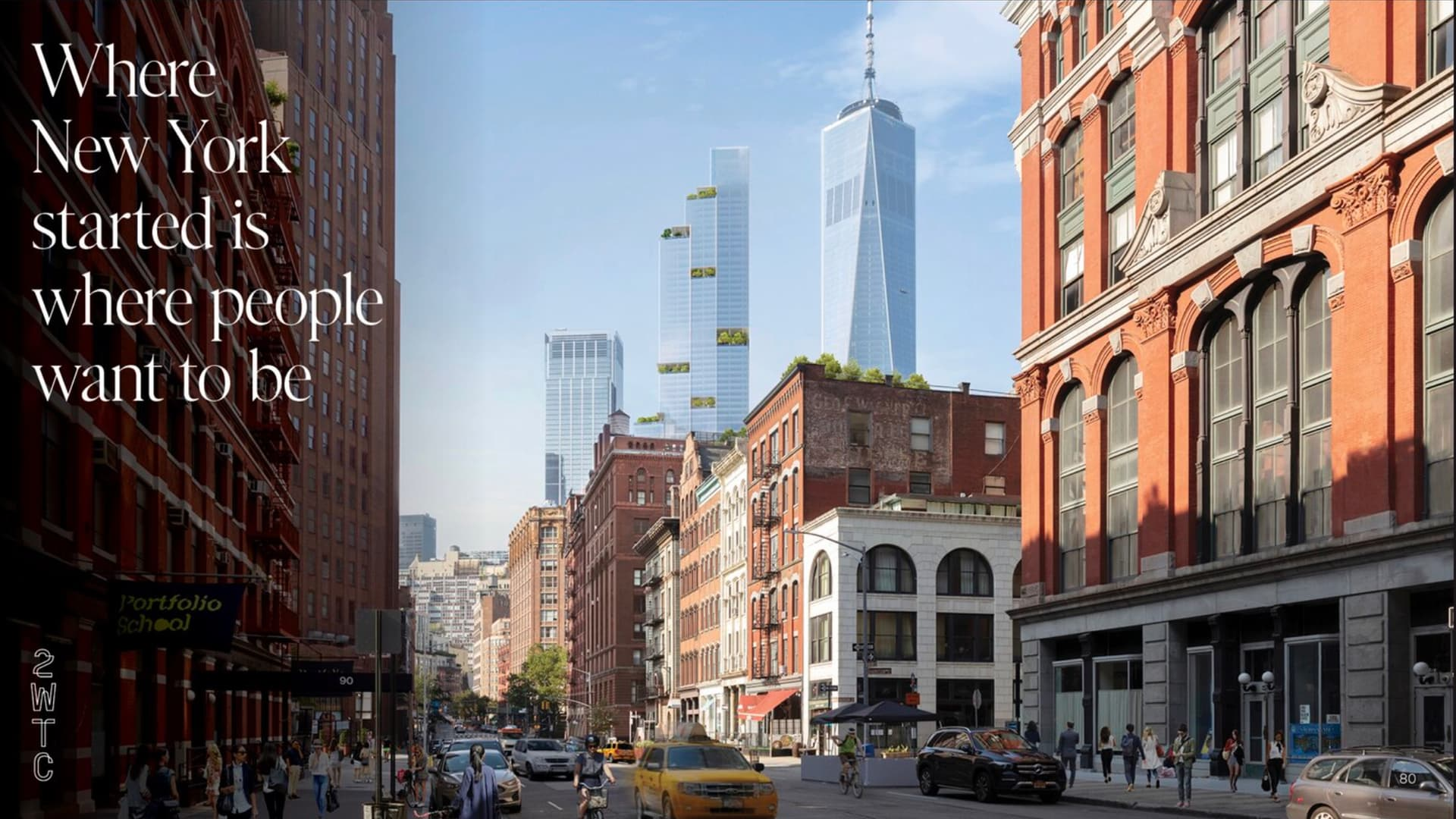
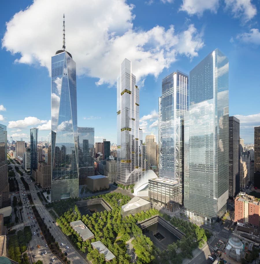
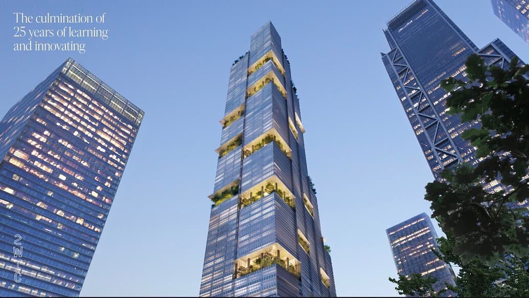
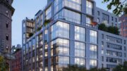
Detailed renderings show the tower clad in floor-to-ceiling glass with horizontal metal strips between each floor, and a multitude of landscaped setbacks across the height of the eastern elevation facing Church Street and St. Paul’s Chapel. The crown culminates with four offset roof parapets shown as green roofs with the highest point estimated to rise around the 1,350-foot-tall mark. An exact floor count has yet to be formally announced, though YIMBY puts it at 88 stories tall.
Further inspection gives the impression that the ground-floor footprint of Two World Trade Center will likely remain unchanged. This wasn’t the case with Bjarke Ingels Group‘s design from 2015, which would have needed a reconfiguration of the steel columns and most likely the core. Unlike that stepped-block design, most of the outdoor spaces in the new iteration are broken up into smaller sections, especially around the upper levels.
The most interesting architectural feature is the pocketed landscaped terraces positioned across all four sides of the skyscraper. These would likely be part of the office amenities for tenants and provide views of the 9/11 Memorial, the Oculus, the Ronald O. Perelman Performing Arts Center, Liberty Park with St. Nicholas Greek Orthodox Church, and the four other office towers. Another noteworthy detail in the façade is the series of vertical bands that run the height of the structure and delineate the various sections of the massing. These metal strips serve to break up the monolithic appearance of the tower’s longer sides and emphasize its verticality, much like the gray aluminum panels on the late Richard Rogers‘ Three World Trade Center to the south.
No details have been announced regarding a start or completion date for Two World Trade Center.

2 World Trade Center, originally designed by Norman Foster of Foster + Partners. Black and white drawing by Michael Young
We hope to see progress begin as soon as possible and optimistically conclude in the latter half of this decade, thus bringing long-awaited closure to the rebuilding effort of this sacred Lower Manhattan site.
Subscribe to YIMBY’s daily e-mail
Follow YIMBYgram for real-time photo updates
Like YIMBY on Facebook
Follow YIMBY’s Twitter for the latest in YIMBYnews





The whole of Two World Trade Center, I’m allowed to see superstructure in here. So make it possible for the progress to happen, time and money will be needed on its purpose: Thanks to Michael Young.
Hideous. Honestly.
Next.
They really should have stuck to the diamond design…
This is so sad. Even the model from the previous article is slightly more timeless and nicer, that would provide a pixelated version of the diamonds. This tower looks too generic, and reminds existing downtown skyscrapers. Worse is how the cladding pattern changes at center point of the tower.
Will it ever be built?
No
No.
I’m getting tired of seeing new renderings for this site every six months, and hearing about new architects every 2 years. Just start building something.
Me too.
At least there are no cantilevers.
I agree they should have kept the original Norman Foster design with the diamond crown. However at this point I just want them to fill that gap downtown. Get on with it already.
I like the design but,will never be built.
With so much vacancy as it is now in WTC, and elsewhere, will this be built – even in the next decade? Doubtful. Why not a public garden there to offset the Occulus and seriousness of the memorial on the other side?
Such doom ‘n gloom. Leasing has been decent for new buildings, including the WTC, given the circumstances (many imposed by government, not the market).
There is nothing hideous or dreadful about this design. What is wrong with all of you?
I like how the glass is broken up by those green spaces. The shape reminds me of the Nema and Sears tower in Chicago. It’s beautiful.
Agreed. It’s fine. Get on with it.
What can you expect from the overly medically depressed segment of this site.
They hate everything
Agreed.
Yes, the original diamond topped design was still best, but this is light years better than the horrendous BIG design.
Beyond all that, let’s just see shovels in the ground and this built.
Put a tree on it!
Coming soon…
“The Hanging Gardens of NY”!
I imagine it will be a challenge to find gardeners to mow the lawns at 1000+ ft.?!
Looks Good!
BRING BACK THE ORIGINAL, I don’t care if it’s out of style or those big floor plates don’t work, this just looks like a mashup of his chase building, the BIG one, and his renderings for Vornado around Penn…
Or the BIG design, but with the stacked “boxes” straightend-up.
It is hard to imagine that someone could came up with such unfitting monstrosity. Substantially inferior to the original design
This is nice!!
I don’t mind this design too much, actually. The stepped design really isn’t that bad, and it ties in well with the rest of the World Trade Center. The only thing I really dislike is all of the greenery. It looks so tacky and unnecessary. If that is removed, then I think we have a winner here. However, it still sadly doesn’t beat the original design.
When will they learn that green roofs/terraces never look as lush and groundbreaking irl…bland
This just shows that the earlier design by them didn’t even stand for six years before the architects felt it needed changing. This is far better than what the original “four-Diamond” design was. But like before, it needs to be architecturally dumbed down before it ever get built in NYC.
More then 20 years since, still not done yet.
Not perfect, but at least it’s architecturally distinct from the bland boxes that comprise the rest of Commercial WTC site. I find the green visually appealing. Build it
Window washing equipment should change the ‘look’ of all those setbacks.
Who is going to water and trim and take care of the trees on the upper floors? They are generally dead from with wind in a few months.
This is quite true. Tree “forests” in the sky are impractical – and expensive to maintain – in the long-term.
HOW TALL IS IT?
It need to have a roof at least as tall as 1 WTC to fully reclaim the height lost with the Twin Towers,and anything less represents an unspeakable surrender to the terrorists (as does leaving the footprints empty,no matter what the memorial’s defenders pretend).
Agreed.
Great article would be to show renderings with their veritable forests of green and then follow up photos after construction. Wonder how much of the greenery really winds up existing and if so, for how long.
Too easy to hide mediocrity with nature.
Looks nice to me. That much elevated greenspace is going to be really striking. For once it’s not just about the glass and steel. Pretty cool.
Unique and welcome if built,however the diamond design is superior.
I like it, the staggered design sort of reminds me of the Sears Tower.
Ugh! Every change has made every building uglier and ruined the original concept for the complex. This one is the worst. Diamond topped design was far nicer and worked well with the Freedom Tower which is the only one with any merit.
2 World Trade should be re-conceived as a combination hotel/residential building. There’s plenty of office space there already, and a hotel/residential building connected indoors with the Oculus would be amazing.
This is the worse one yet, This makes the BIG design look like art. Why not go with the diamonds which everyone actually likes. This new 2 WTC isn’t at all representive of what happened on the site. Looks like trash but what can you expect from Silverstein
It’s amazing how the original of 2 single rectangles columns in the sky had so much beauty and power than any of these trapezoid looking figures, or the fresh look but somehow ordinary Freedom Tower still can’t match to the Twins level. q
Making an already bland and boring site worse.
20+ years later with billion$ to Ukraine aka to slush funds, China & Dubai building much more interesting skyscrapers weekly but we cant rebuild the WTC. Lol
There is a perfect solution to what to build on this site. A WTC 2 that matches the new WTC 1. Restores the site symmetry, allows creation of a welcoming entrance into the complex and allows for the return of a Windows on the World at the top of the tower.
I like this design a lot especially the green spaces. I think this would be a great addition to the site. I hope it gets built some day.